
When it comes to assessing images (I do prefer the term assessing to judging) I like to think about the story and or concept; is the story/concept interesting and in the frame enough to grab my attention?
The treatment and or execution; how has the author improved/increased the story’s impact using in-camera skill and/or post processing techniques?
Can an image with a rather weak story but strong technique/treatment gain honours? Sometimes, the reverse may also be possible.
I may be able to give you suggestions (and they are only suggestions) that I think may help your images become more engaging or stronger be it cropping to strengthen compositions or thinking about lighting; use of depth of field, sharp focus where it needs to be, the placement of the subjects in the frame and backgrounds; do they support or overwhelm the subject/story?
Lastly, remember this is your unique view; as an assessor it is my job to encourage and support your photographic journey as much as I can, not to tell you how to make pictures.
Every picture tells a story and that is what I enjoy most about assessing others images; the opportunity to view YOUR unique views and see what I can learn from them.
Thank you for trusting me with this assessment.
Sheryl.
-
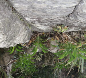
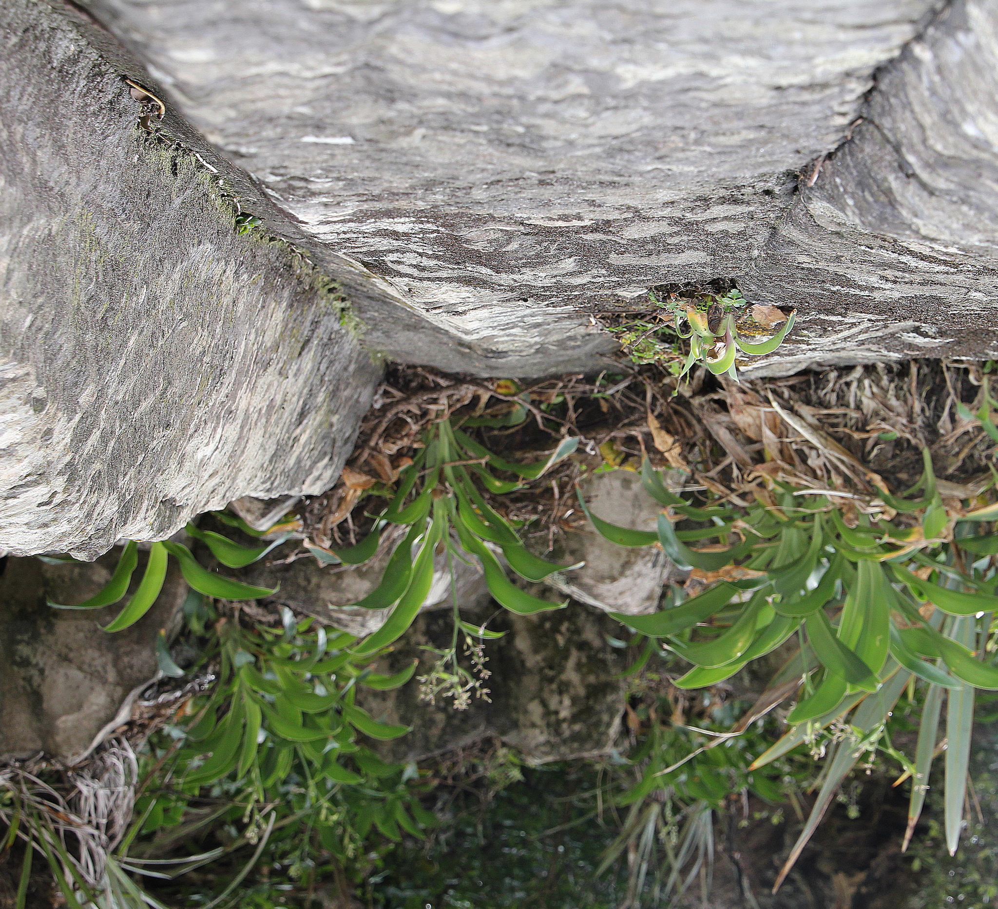
- 01s. Up or down. I rather like the visual playfulness here, taking an otherwise ordinary scene and giving it a twist to make us wonder what we are looking at. I feel the scene could have been made more abstract to really keep us guessing whether it is up or down, perhaps making it a mirror image or including a human element like a pair of hands holding it up may have worked? ACCEPTED.
-
- 02s. A Long way down. Using the diagonal of the gondola takes me on a journey from top to bottom with the perspective of looking down adding a sense of space and height, a breathtaking scene with nice depth and contrast, I feel a shallower depth of field to throw the background more out of focus may have helped the gondola stand out a bit more. I find it a bit lost in the scene and I think the image would still retain that sense of being up high. HIGHLY COMMENDED.
-

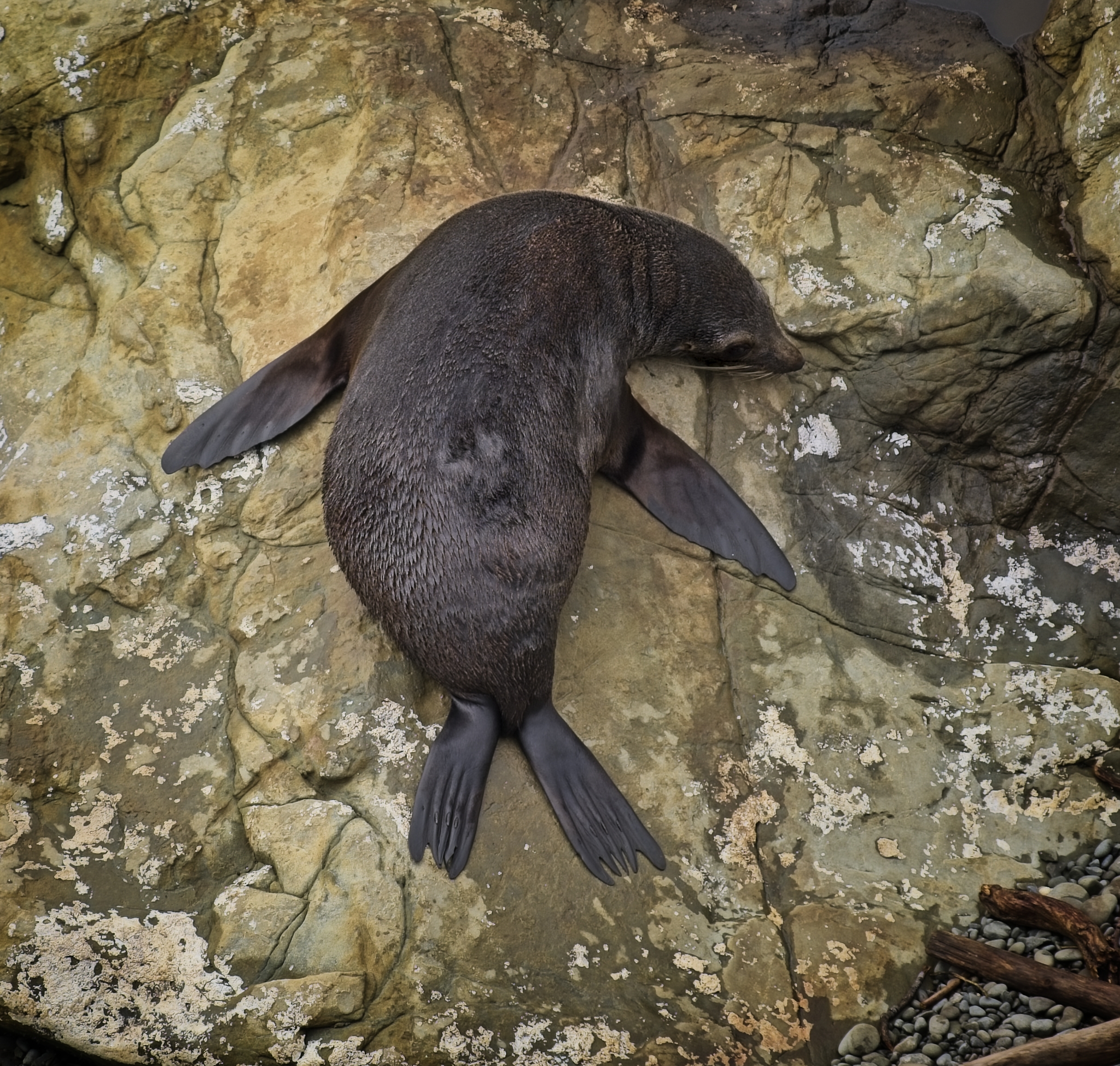
- 03s. Splayed. The focus on the seal is pin sharp and it has a pleasing pose showing lots of information about it. I enjoy the looking down perspective with the background showing good context of its environment. Lovely lighting, depth, colour and detail. I feel a tighter crop would strengthen the composition by bringing the subject more into the frame whilst still retaining the informative background. I find my eye going to that dark triangle bottom left. HIGHLY COMMENDED.
-
- 04s. Ant’s View. A striking shot, great use of black and white to simplify the overall image so we focus on the lines, curves and angles. A nice punchy capture in my view with pin sharp detail and a great supporting sky. I wonder if you needed to include the cherub statue, the interest for me is the tower behind and I think the composition may have been stronger without it. Perhaps you may not have been able to move around so easily however, I think it has very effective lighting and depth. HIGHLY COMMENDED.

-
- 05s. Onwards and Upwards. I like this strong, tight composition using the pleasing angles of the structure to draw our attention up to the nicely supporting sky with its opposing line of cloud adding a dynamic sense of movement and interest. Good lighting with pin sharp detail, depth and contrast on the structure. Great choice I think to simplify this by showing it in black and white; whites are well handled with good blacks. HONOURS.
-

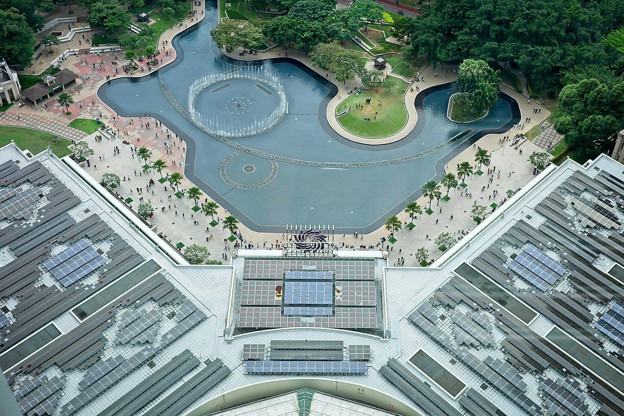
- 06s. Water Display Park. The mild sense of vertigo I felt when I looked at this image really gave me the feeling of teetering on the edge and looking down, phew! I enjoy the colour palette and the inclusion of people has given me a sense of scale and height. Nicely balanced composition, pin sharp with great detail, well exposed. HONOURS.
-

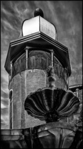
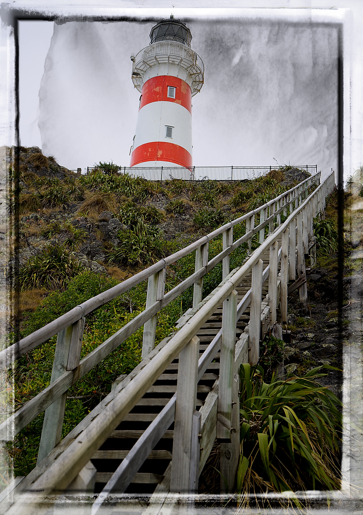
- 07s. Cape Palliser Lighthouse. The splash of red on the lighthouse helps to hold my attention with the diagonal of the stairs giving a good perspective of how steep they are; a reasonably good composition with sharp detail and nice depth. I’m not sure the frame around the image has added anything for me. I find it has cut through the top of the lighthouse which I find distracting. I would like to see all of the top included which I feel would strengthen the composition. Good exposure and contrast. MERIT.
-
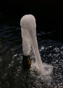
- 08s. Up I Come, Down I Go. Oh this one got me guessing, I was drawn to the lovely action in the fizz and then I realised it was coming out of a bottle. I like the almost abstract feel here and sharp detail in the fizz. Nicely balanced in the frame; a pleasing neutral background with just enough detail to add some context. Great lighting and contrast. An enjoyable capture for me with a dynamic feel of movement. HONOURS.
-
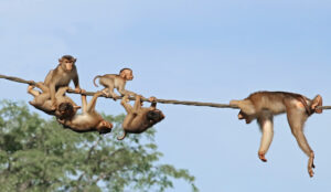
- 09s. Hold on Tight. I like the grouping of these animals particularly the ones on the left; they are nicely lit with good colours and a complementary blurred background helping them to stand out. I don’t think you need to include the animal on the right as the story for me is the group of five. What about cropping to just them as I think it will be a stronger composition? Also I do think the animals could be sharper, I find them quite soft with a loss of detail. ACCEPTANCE.
-
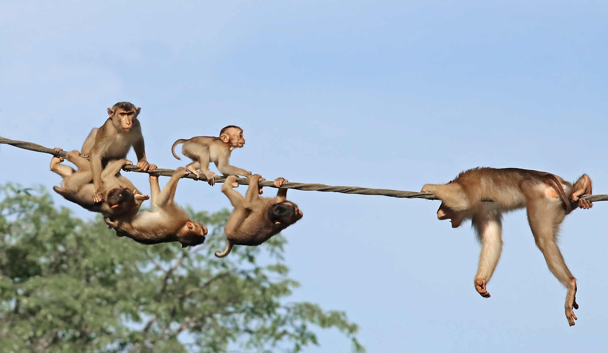
- 10i. Gannet in Flight. The gannet, in my opinion stands out boldly from a lovely supporting, neutral background. I love the sharp detail, exposure and pose of the bird showing good natural history information. Nice natural colours. Good contrast and depth and its position in the frame with room on the right for it to fly into works well for me compositionally. HONOURS

-
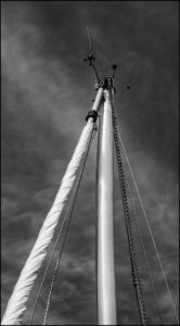
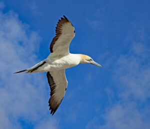
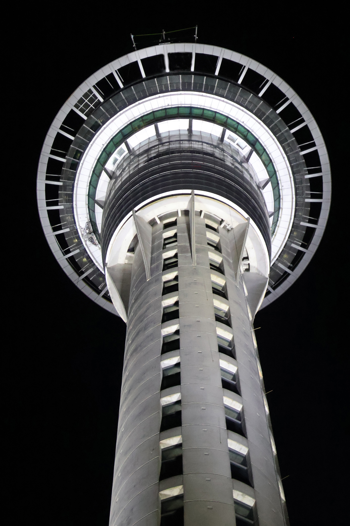
- 11i. Up Sky Tower. Choosing to show the tower from this angle has simplified this image by allowing the lines and curves to tell me a story of the height and strength of the sky tower while adding a dynamic sense of movement. Great contrast, sharpness and depth; I enjoy the hint of green at the top that adds an interesting counterpoint to draw my eye, along with the leading lines up to the main subject. Good exposure, a strong, punchy capture. HONOURS
-
- 12i. There and Back Again. I find this an interesting diptych showing both up and down; a unique interpretation of the set subject, I like your thinking on this. The image on the left keeps drawing my eye and in my view is the stronger of the two. The right image I find rather dark with little interesting detail and I wonder if bringing up the exposure on that one would help balance the lighting and story better. MERIT

-
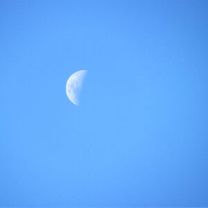
- 13i. Daytime Moon. This image has an elegant simplicity that draws me in, a nice example of minimalism. Using only part of the moon has worked well I think by adding a sense of depth, mystery and a dynamic feel. I like the balance of the composition. I do wonder if bringing up the contrast on the moon would help some of that detail to pop out more? I think it would work nicely along with a tighter crop to bring it more into the frame without losing the sense of space I feel here. MERIT
-
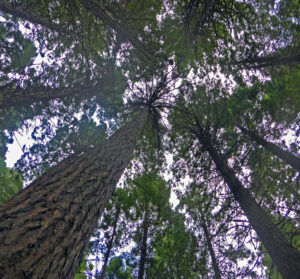
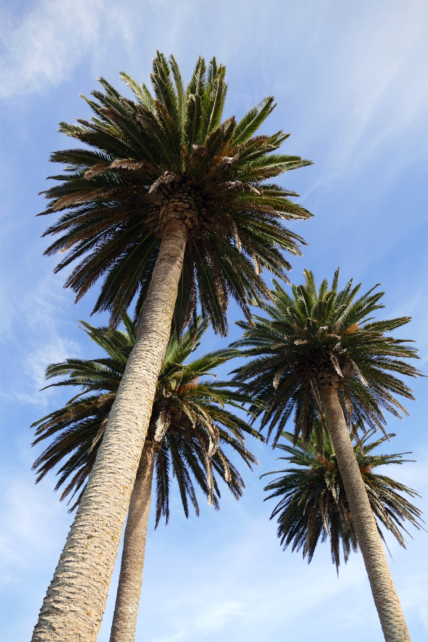
- 14s. Long Way Up. A lovely flow of those converging verticals adds a strong sense of movement and strength through these magnificent trees. Nicely balanced composition with good interest, colours and detail; the exposure has been well handled. I do enjoy the pretty, lacy look of the foliage with the contrast of those sturdy trunks adding a nice counterpoint. HONOURS

-

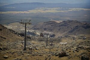
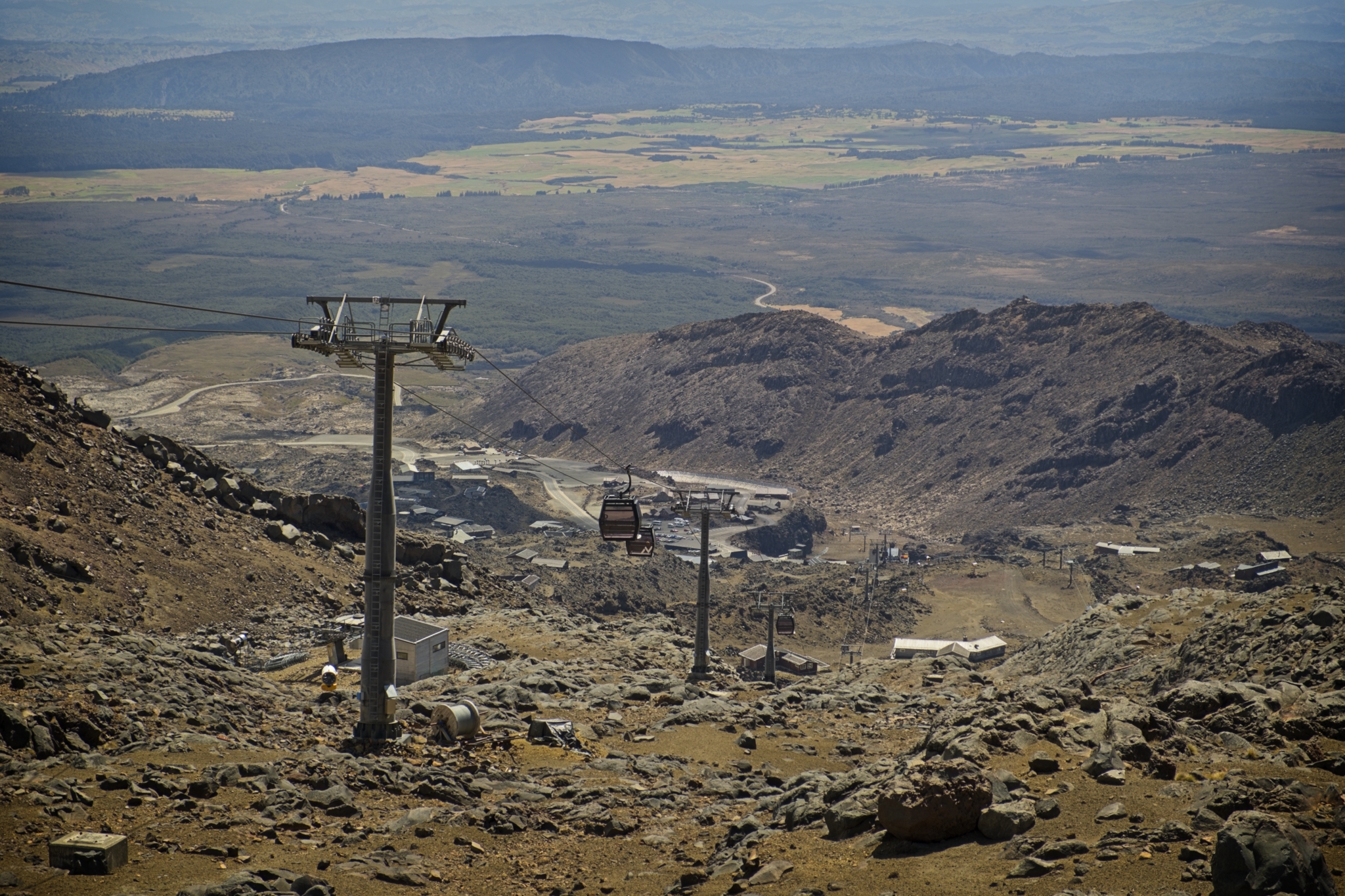
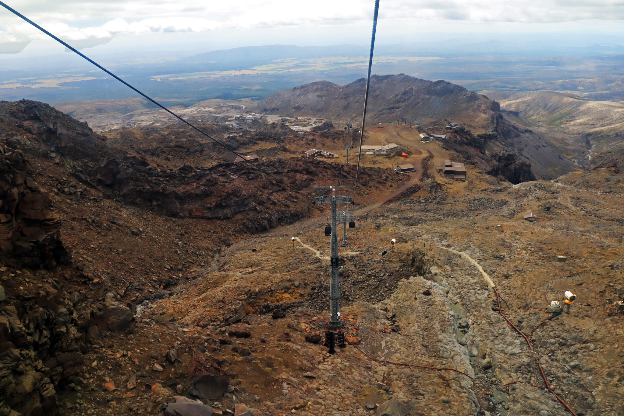
- 15s. Back Down to Earth. Good depth, sharpness and contrast helps this image to pop; I enjoy the colour palette of this rugged and rather unforgiving landscape. The curves of the terrain are nicely positioned in the frame to help my eye travel around and down, down down. In my opinion, the central placement of the gondola tends to block my view of the downhill run. Perhaps placing it more to one side may have strengthened the composition to add a stronger sense of moving downhill? HIGHLY COMMENDED
-

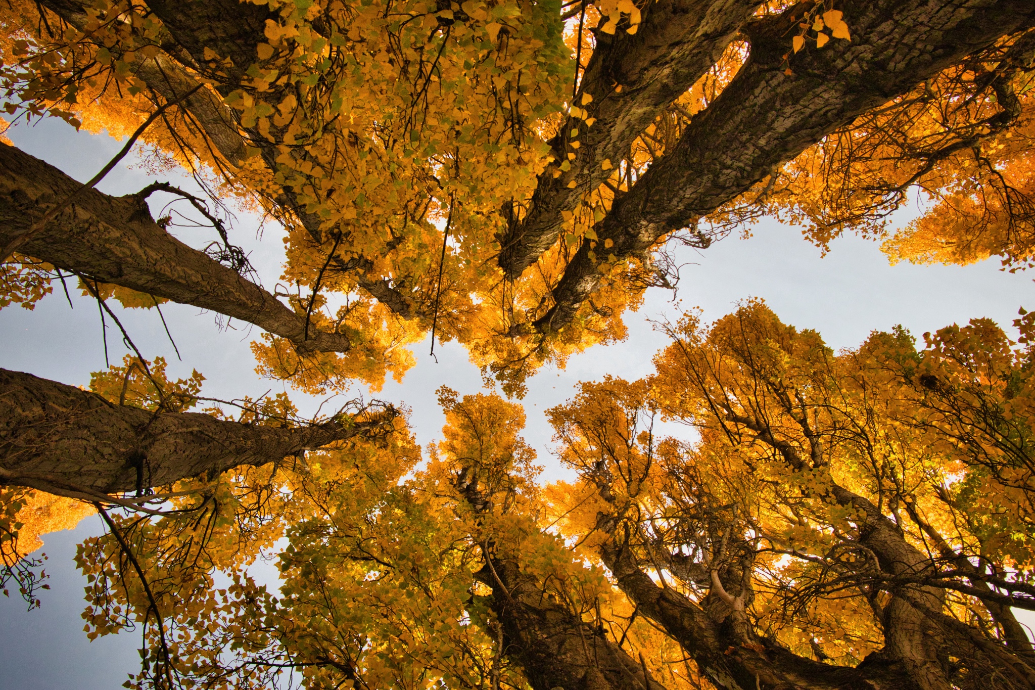
- 16s. Yellow Heaven. The splash of those rich golden yellow autumn colours really helps to hold our attention well supported by the solid strength of the trunks. Lovely, sharp detail and exposure, I love the sense of majesty I feel looking up at this rich autumn tapestry. Bold and beautiful, great use of the converging verticals for me has made for a well balanced composition. HONOURS
-
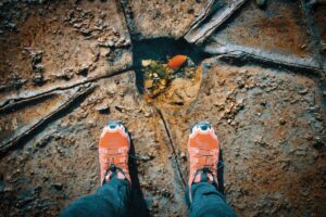
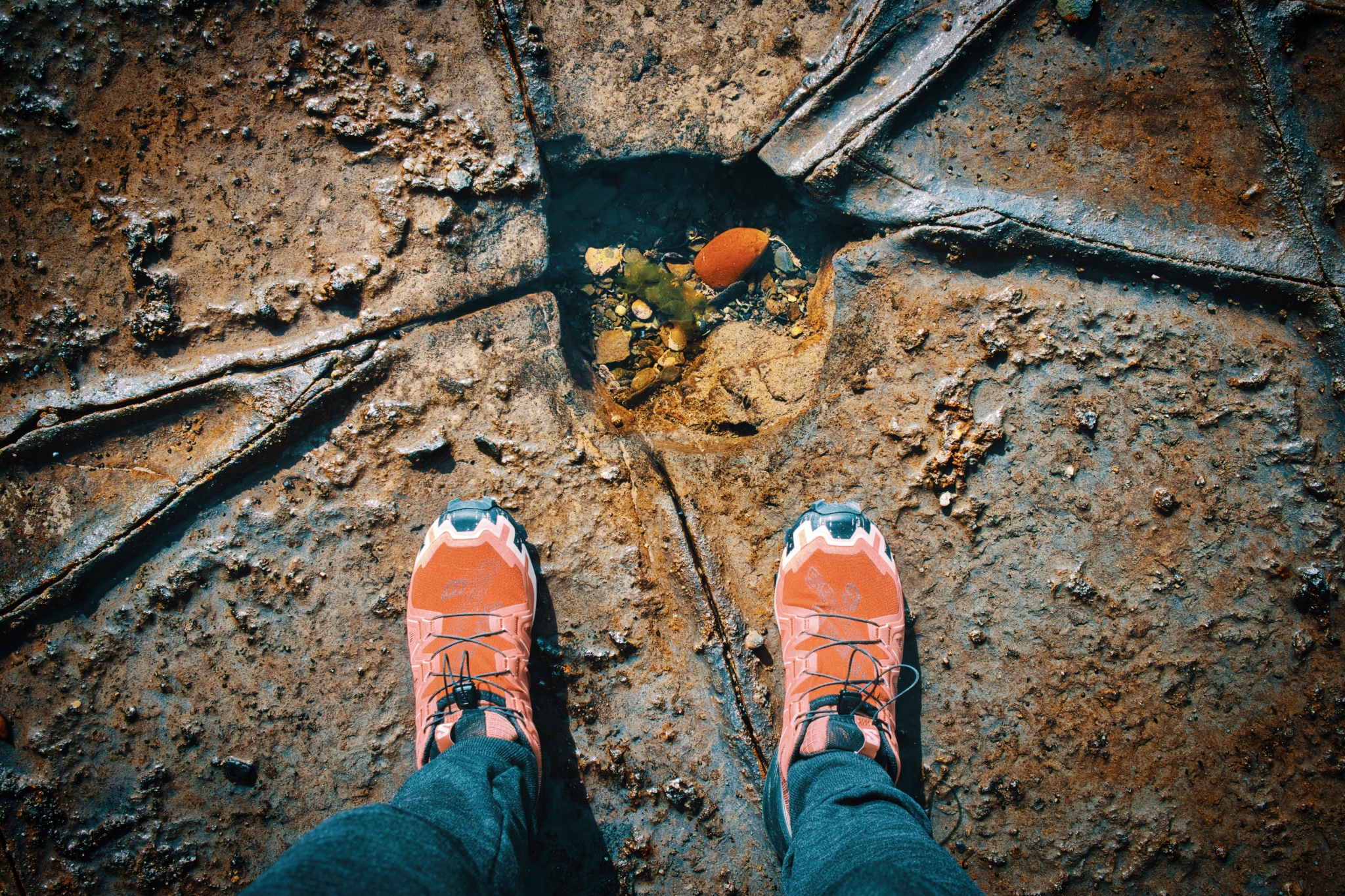
- 17s. What Have We Here? I like the arrangements of the elements in the frame along with the looking down perspective adding impact. A strong, balanced composition using the lines to frame the neat counterpoint of the orange rock echoing the colour of the shoes. I think this is a nicely balanced and well thought out image. Sharp focus and good depth with a vibrant colour palette has helped this image to pop for me. HONOURS.
-
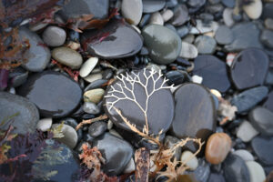
- 18i. Tree of Sea Life. The focal point of the small ‘tree’ really draws my eye, looking down you can see some lovely images waiting to be captured and I enjoy this simple composition with the background nicely out off focus to help it pop out. To make this stronger what about cropping in even closer to the ‘tree’ to bring it more strongly into the frame? I don’t think you need quite so much surrounding it. MERIT.

-
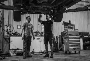
- 19n. Maybe Down. A striking shot, great use of black and white to simplify the overall image so we focus on the story and connection between these two men discussing mechanics. Good, sharp focus on them, I like the background showing good context of their work environment. I feel the lighting could be better balanced if the exposure on the two men was brought up more as my attention keeps going to the bright background first. A great story. HIGHLY COMMENDED.

-
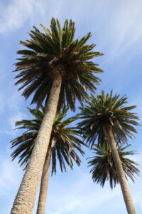
- 20s. Proud Palms. I think the author has done well to fill the frame with these majestic palms. Good, sharp focus with a nicely supporting background; the diagonal of the trunks has produced a strong graphic representation of this simple subject in my view. I wonder if moving around to help separate the trunks on the left a bit more may balance the composition better by closing the gap at the base between the two lots of palms. I find my eye keeps going between them in a ‘ping pong’ effect. MERIT.
-
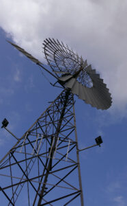
- 21s. Waiting For Wind. The focus on the windmill is pin sharp; I find the lighting on it a bit flat and I think lifting the exposure may help it to pop out more. I like the strong sweep of the subject taking us up on a visual journey to the top; the opposing angle of the white cloud and the soft complementary sky background contrasts nicely with the sharp angles of the windmill. The tight crop works quite well here and I feel a little more room on the left may help move that small, angled structure away from the edge. MERIT.

-

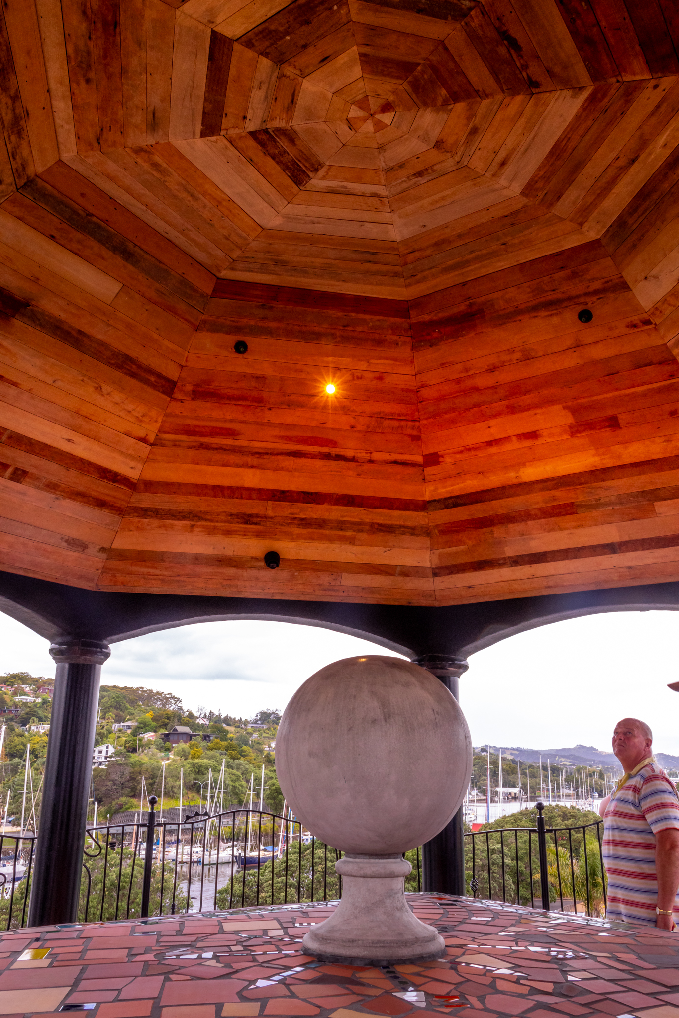
- 22s. Looking Up. The textures, angles and warm colours in the roof are eye-catching in my view and including the spotlight has helped to draw my eye right up there. I do think the image is about looking up at that roof, I don’t think you need the bottom third as I find it rather busy. What about cropping to just the roof? Give it a try as I think it will make a nice abstract of all those angles. MERIT.
-
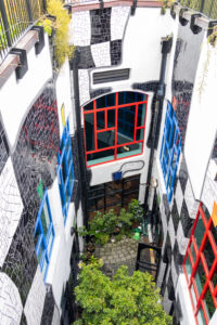
- 23s. Three Sides Down. Some intriguing patterns and texture here; this perspective of an interesting scene has depth and contrast which helps the image to pop for me. Using the contrast of the curves and diagonals is a good collision of shapes in my opinion. Well seen and taken, sharp with good depth, vibrant colours and contrast. What about trying a subtle vignette to help narrow our focus on the subject? My eye does keep going to the top part first which I find a little distracting. HIGHLY COMMENDED.

-
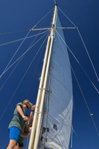
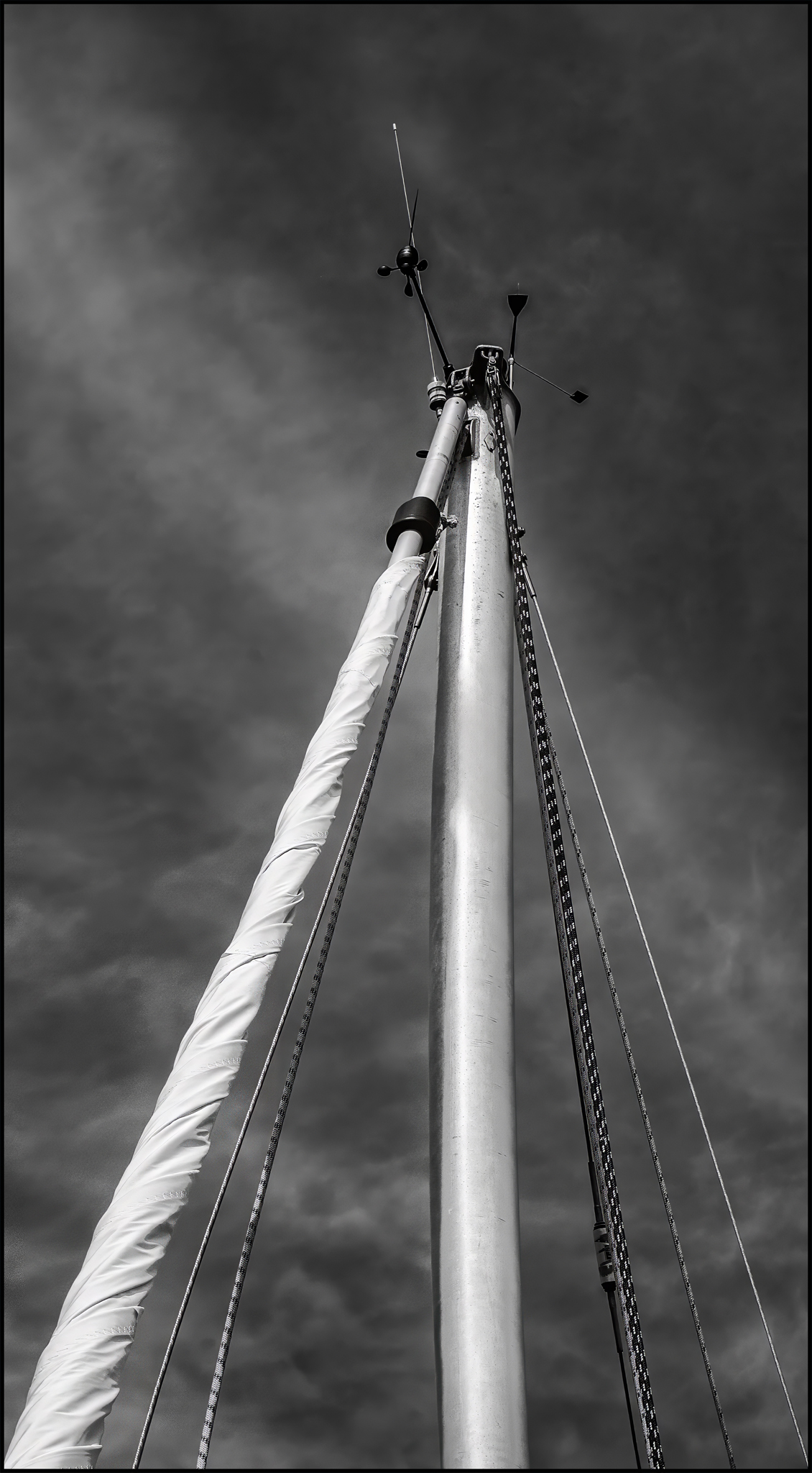
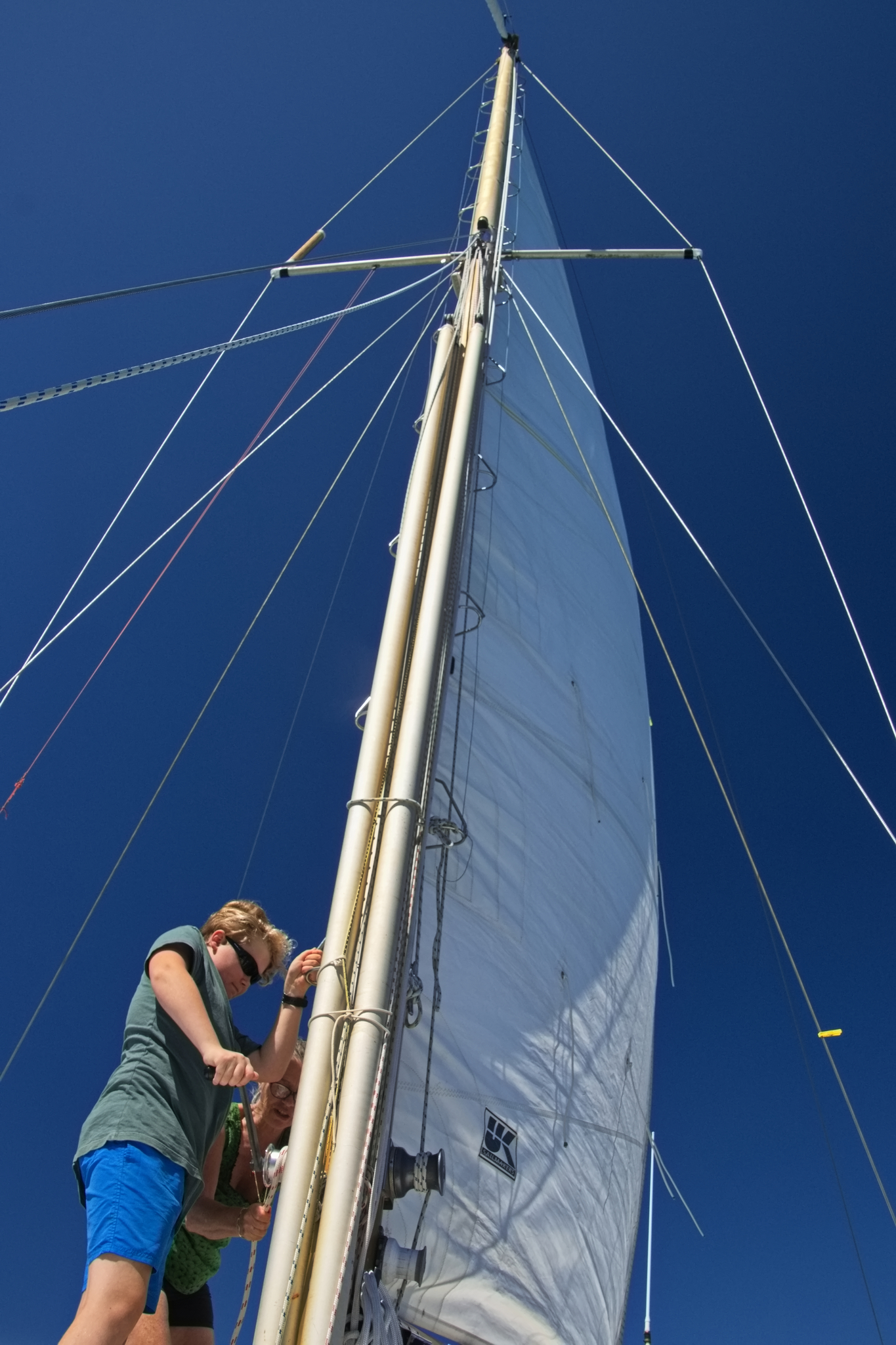
- 24i. Hoist Up. A good image with clarity; sharp and well defined against a lovely blue sky with the concentration of the two people giving me the impression of getting ready to head out for a sail. A nice story with good depth and contrast, great perspective and pleasing lighting helping the mast stand out well. Nice use of the angles to take us up the mast with the people placed well in the frame, a balanced composition for me. HONOURS.
-
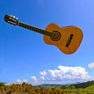
- 25i. Air Guitar. A visually playful image, I like the creative thinking here, sharp subject with pleasing lighting adding depth. The background is well taken and balanced adding to the ‘air guitar’ feel. I get an impression the guitar has been thrown into the frame, which could be stronger if there was a pair of hands on the right side to give that effect? I think a bit more room on the left for it to go into may have strengthened the composition and added to the sense of it flying. HIGHLY COMMENDED

-

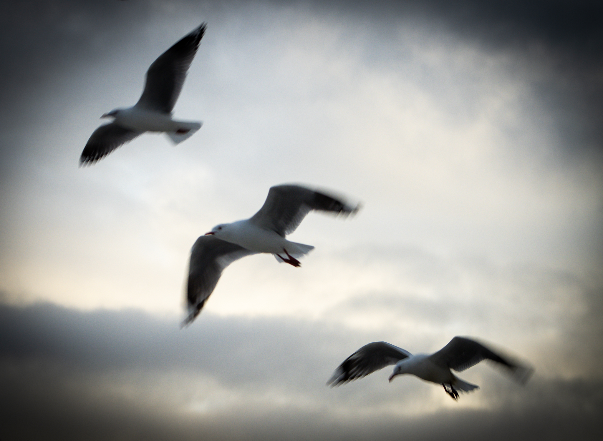
- 26i. Up Up and Away. A pleasing ICM capture of these birds has added a nice ethereal feel to this for me. Using three arranged in a diagonal has made for a dynamic balanced composition backed up by a supporting sky. What about flipping the image so they are coming out from the left? I think that may be a stronger composition. I also find the vignette rather heavy and distracting; what about making it more subtle to help balance the lighting? MERIT
-
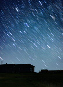
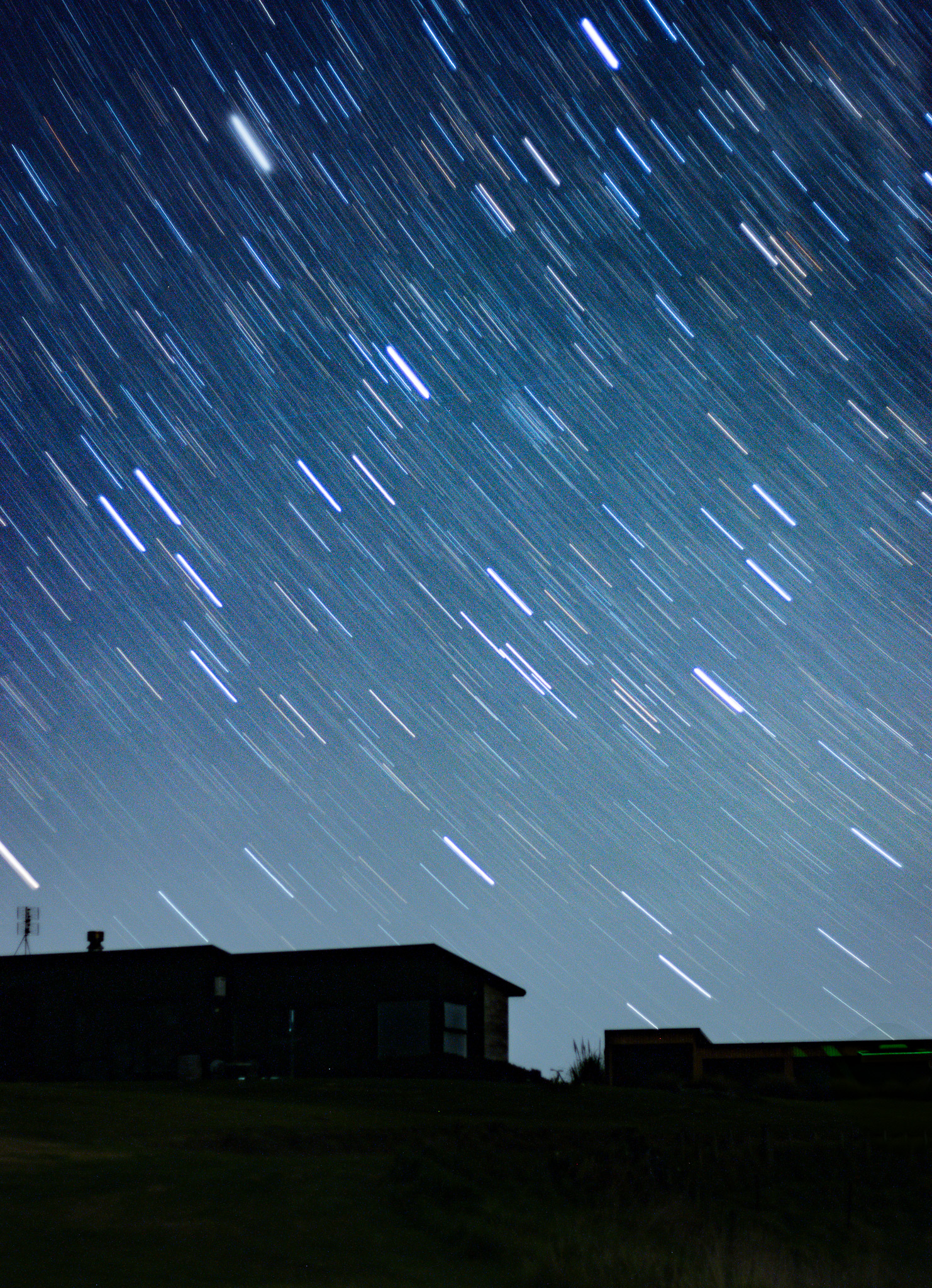
- 27i. What is Above Us. The low light of evening has allowed this long exposure to record the light trails of the stars way above us. The time and patience put in has rewarded the author with a striking image in my view. Just be aware of bright areas right on the edge of your images, I think that very bright line in the sky lower left could be toned down or cloned out to be less distracting. Nicely composed; a small supporting, slightly detailed foreground giving some context to that beautiful sky in the starring role. HONOURS.
-

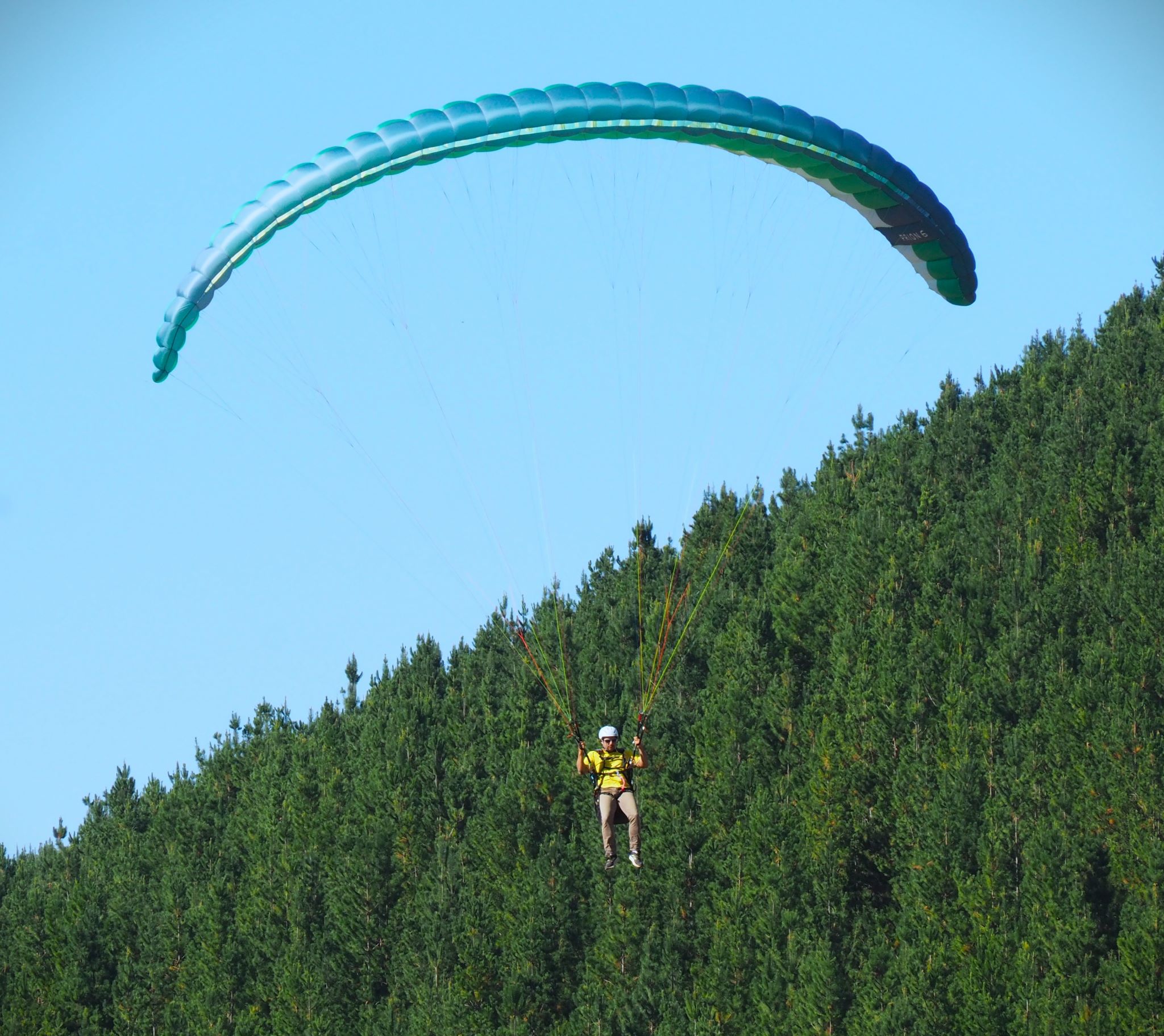
- 28s. Neither Up Nor Down. The complementary colour tones of blue sky and green trees works nicely with the line between them crossing the image on the diagonal; the contrast of the curving parachute adds a sense of balance for me. I quite like where the parachutist is sitting in the frame, contrasted strongly against the trees. I think a small crop off the left may help to shift him off centre, balancing the composition more. I enjoy the vibrant colours, sharp detail and depth. I get a lovely sense of freedom here. HIGHLY COMMENDED.
-
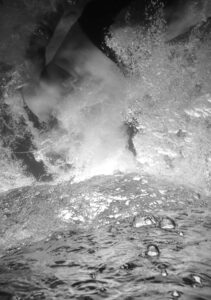
- 29s. Shaken and Stirred. I get the feeling that I am looking down a waterfall of some kind and I can just see what I think is ice. There is a sense of vertigo for me in that I don’t want to fall down here not knowing what it is! So there is a feeling of mystique with a hint of danger. The foaming water bubbles add a dynamic element. I feel the lighting is rather flat and I suggest trying a curve adjustment to boost the contrast and add some depth and impact to add a dramatic twist. MERIT
