
To help me be consistent, I used the following criteria to evaluate your images:
1. Impact: The emotional or visual effect of the image.
2. Composition: The arrangement of elements within the frame.
3. Exposure: The quality of light and detail in the image.
4. Creativity: Originality and artistic expression.
5. Presentation: The overall look and finish of the image.
And applied the following marking scheme. See the table below:
Grading Category
Description
Key
Non-Accepted
The image does not meet the basic competition standards. N/A
Accepted
The image meets the basic requirements for entry. A
Merit
The image demonstrates more advanced photographic skills. M
Highly Commended
The image is considered very good, with strong qualities. HC
Honours
The image is outstanding in all respects and likely to be top-tier. H
I understand that these images are like your children; you’ve watched them grow into the amazing images they are today. So, if I offer some criticisms, please don’t take it to heart—it’s all about helping you improve. You can choose to take my feedback or leave it; it’s entirely up to you.
Just remember that judges are human too, with all the imperfections that come along with being human.
Some overall comments to everyone:
1. This year, the standard was very high, which made judging much harder. Being asked to judge a photography competition is an honour, but it also comes with significant responsibility. The decisions and comments I provide can either encourage or discourage photographers, especially those who are struggling to find their unique voice with a camera. I hope that my feedback on your image is received constructively, as that was my intention.
2. Only four images were displayed with a border. Though this might seem outdated, I encourage you to give it a try; you may be surprised by the difference it makes.
3. Titles play an essential role in guiding the audience about the story conveyed through your image. Take a moment to think before you write one.
4. Black-and-white photography is cherished for its timeless quality and ability to evoke deep emotions by focusing on light, shadow, and composition without the distraction of colour. It often captures the essence of a moment, allowing viewers to connect more intimately with the subject and the story being told. When submitting images, consider using B&W.
.
-
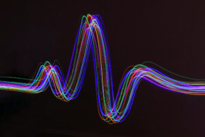
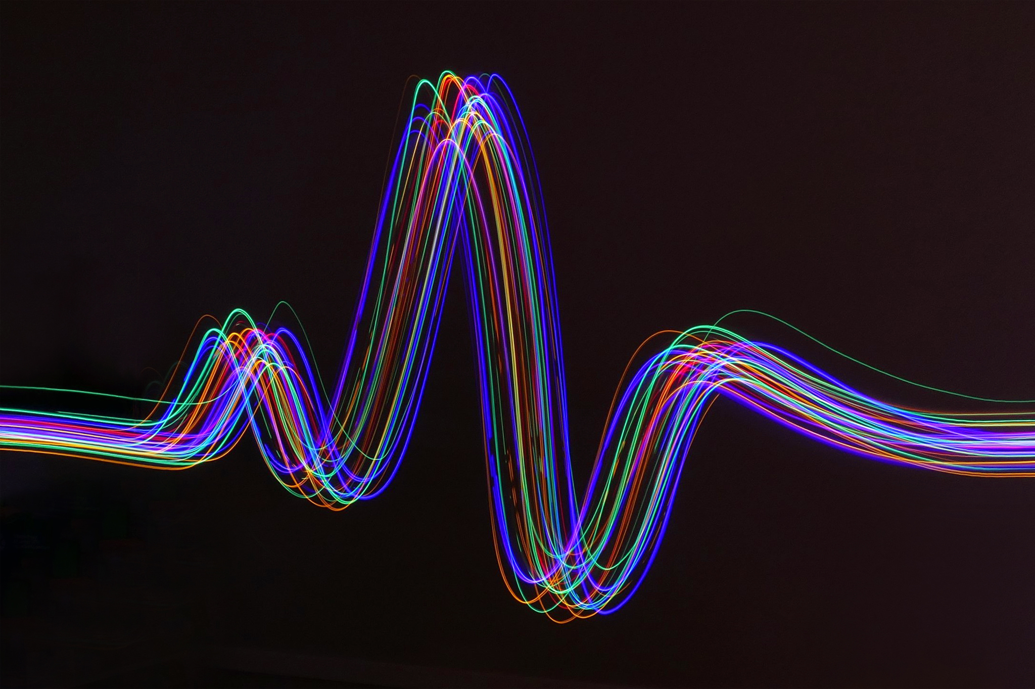
- 01 Almost Perfect ECG This image is simple yet highly effective. I sought advice on the ECG wave, and it turns out to be nearly perfect. However, having so many waves occurring simultaneously in the same time frame could be concerning to the owner. The image flows smoothly from left to right, guiding the viewer’s eye along the image. The thoughtful use of colour makes it easy to engage with. While there is a lot of negative space, it enhances the overall picture, clearly highlighting what we are looking at. HC
-

- 02 Into The Night Be prepared to experiment, as the light streaks add drama to a creative image. Even with the hint of colour, the dominant black-and-white colour scheme goes hand in hand with moodiness. I can see this image in a hotel lounge or a meeting room. A

-
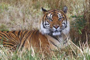
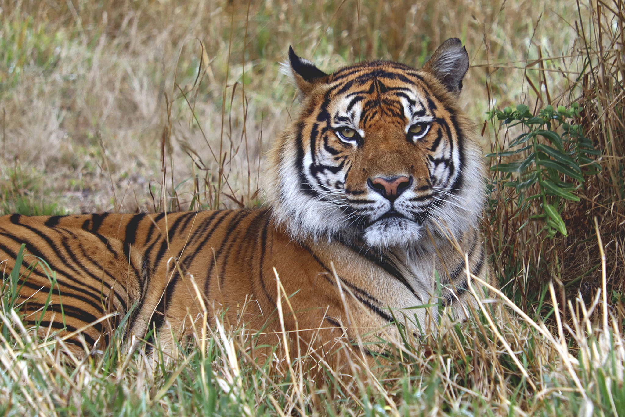
- 03 Magestic Observer Shooting from a low angle makes this image pop, as the hazel-eyed tiger glares directly into the viewer’s eyes. Almost an inquisitive stare, are we next for lunch? It’s pin-sharp, with colours vibrant and true to life. The exposure is balanced, bringing out the details in both highlights and shadows. A lovely portrait of a Bengal Tiger. M
-

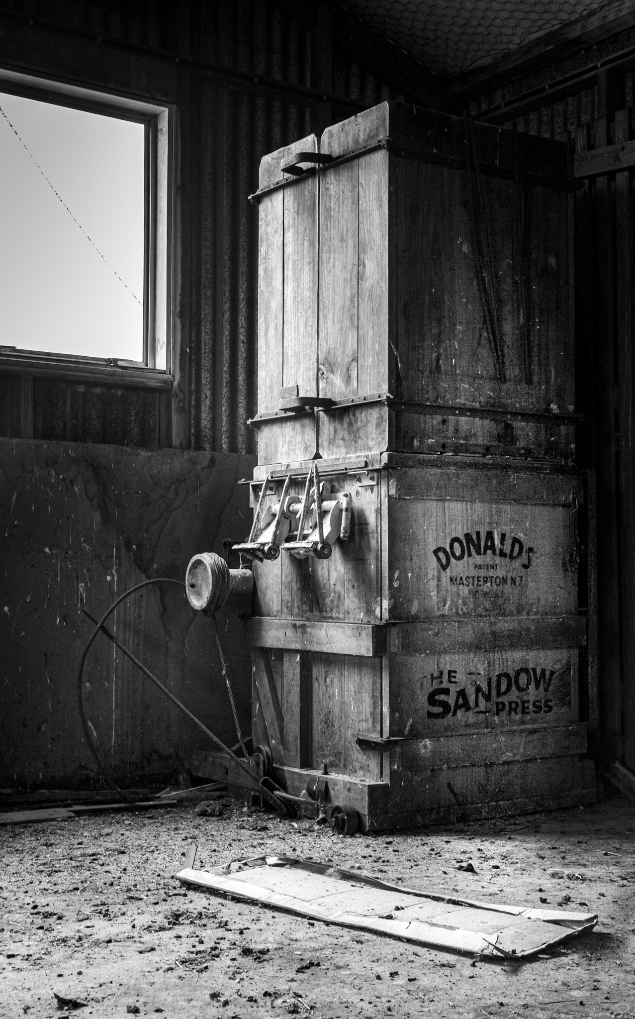
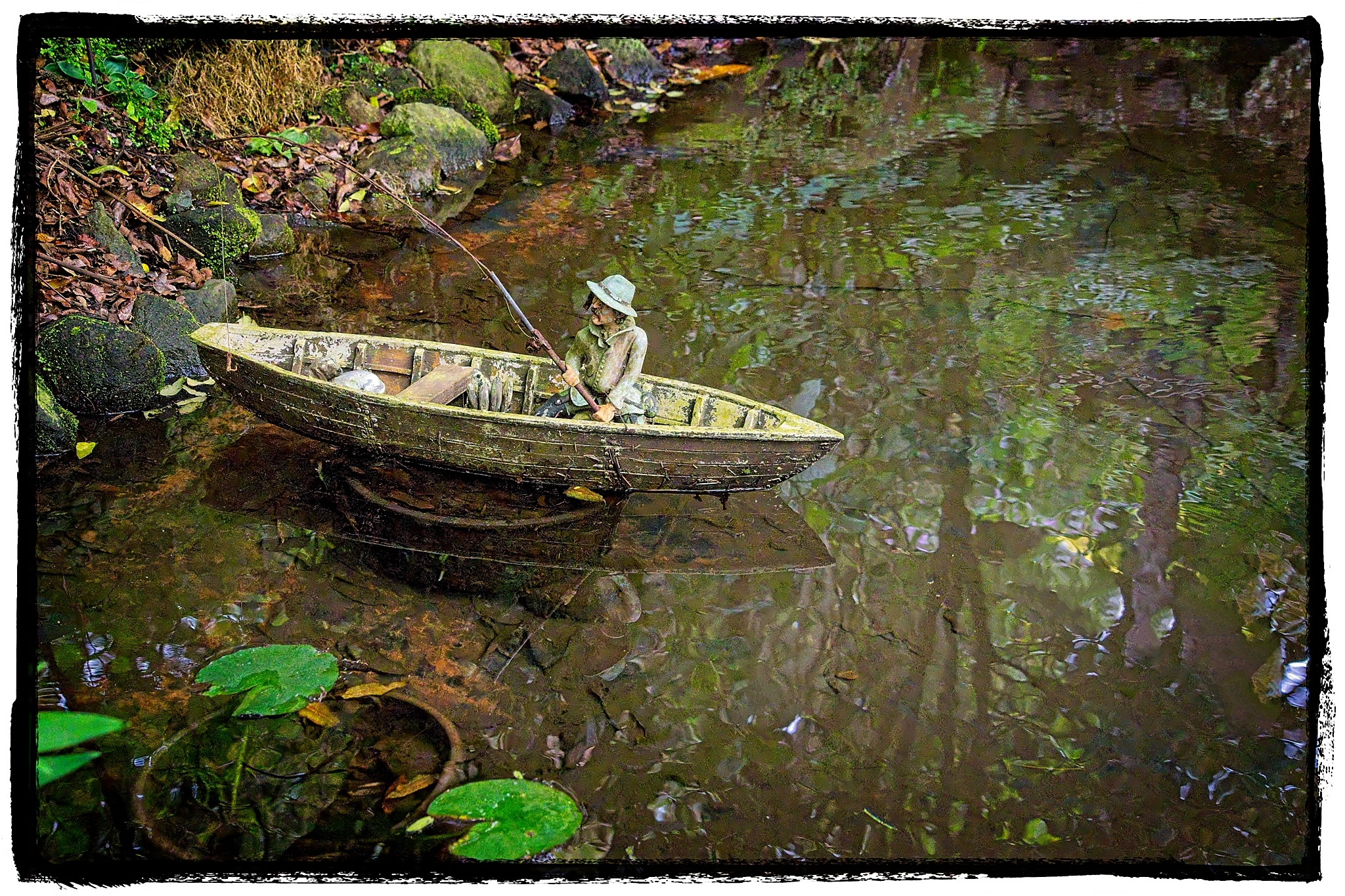
- 04 Wool Press Arapohue m The window in this image dominates the scene; perhaps the photographer could have changed the angle or adjusted it in post-processing. The subject appears old and gritty, giving the scene a rustic grunge aesthetic. M
-
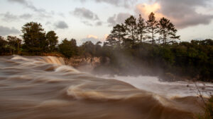
- 05 Wairua Falls Titoki Capturing the dreamy, creamy texture of moving water can be particularly challenging when using slow camera speeds. The photographer has successfully managed the light and exposure in this image. The foreground water flowing into the mid-ground adds depth and context, enhancing the overall scene. However, the vegetation in the mid-ground appears somewhat dark; with careful post-processing, some of the lost detail could be recovered from the shadows. The angle from which the waterfall was photographed creates a reverse lead-in line, which works very well with the composition. M

-

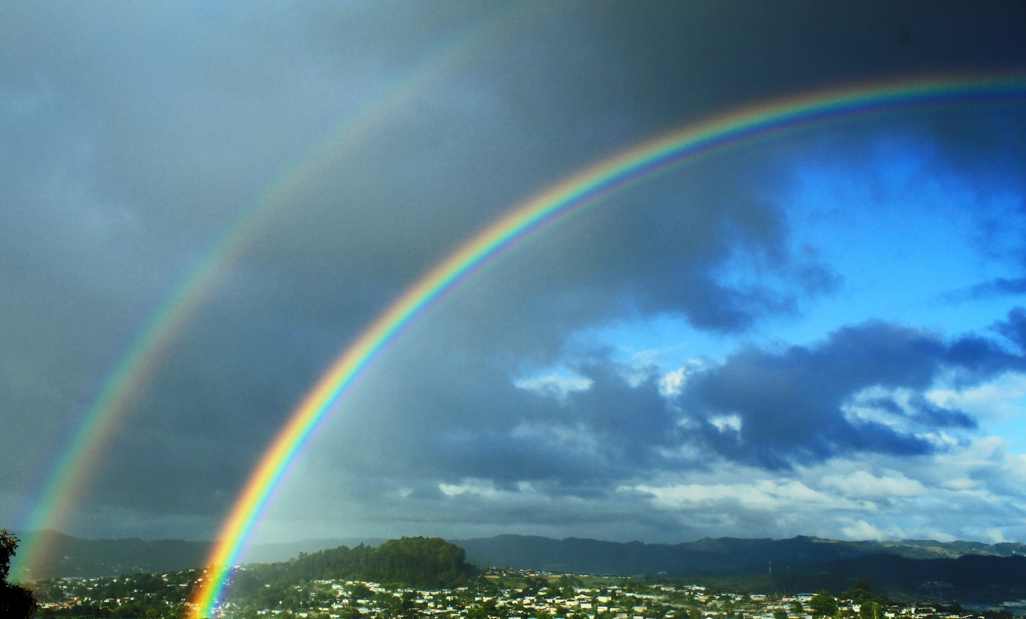
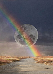
- 06 Rainbows Being in the right place at the right time with a camera in hand can work to our advantage. The image is well-focused, effectively highlighting the subject. But I do see so much empty or negative space that detracts from the composition. Following the rainbows as lead lines takes my eye out of the picture. A
-

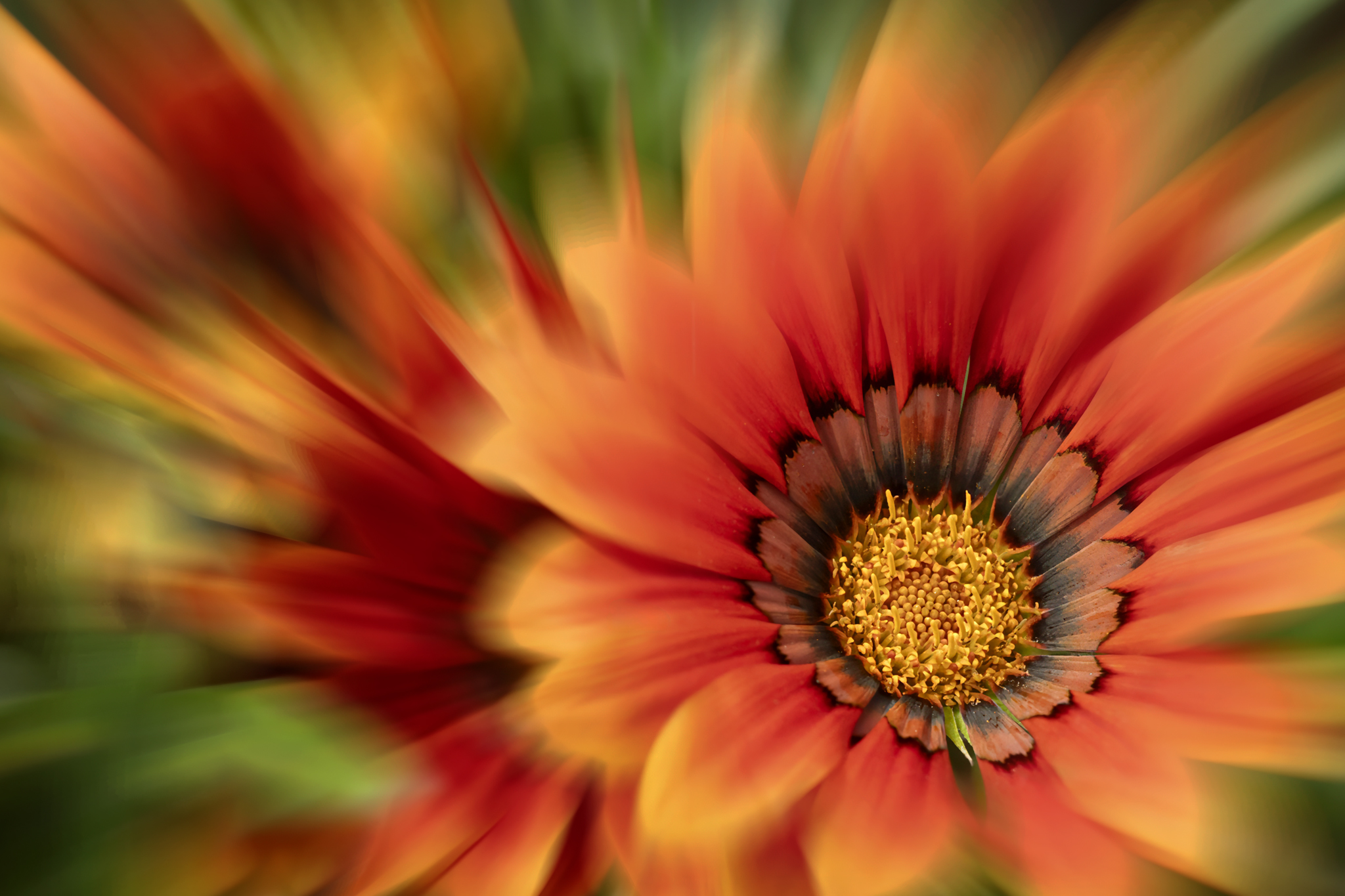
- 07 A Splash of Colour Stunning composition that captures the flower’s essence beautifully, inviting the viewer to explore. It’s sharp where it needs to be, and the colours are vibrant. Well done on the lead-in lines, which are very subtle and gently lead the viewer to the centre of the flower. H
-

- 08 The Luxury Of Time The image creator here is skilled in post-processing, demonstrating both imagination and talent. As I continued to observe, I noticed more and more details, which made the overall composition appear busy. However, the image does capture one’s attention. The effective use of colour establishes the mood, and the title effectively conveys the story being told. M

-
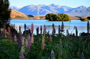
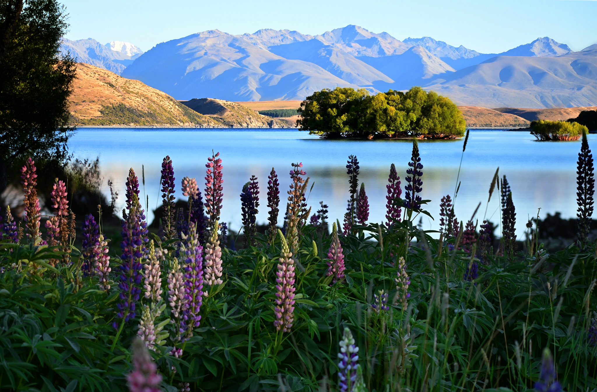
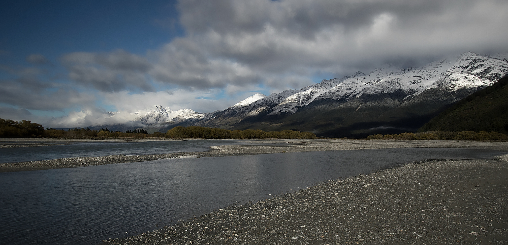
- 09 Lake Tekapo Colours The foreground of this image effectively draws the viewer into the midground, which continues to hold the viewer’s interest. The image creator deserves commendation for this excellent composition. However, the transition from the midground to the mountains does not work for me; the shadows appear too light, and the sky looks too faded. There is a harsh line separating the midground from the mountains, making it seem as though it was edited in rather than a natural transition. If a long lens were used, a “perceived compression” effect would occur because of the greater distance from the subject at longer focal lengths. As you zoom in, you typically move farther from the subject, altering the perspective and making foreground and background elements appear closer together. M
-
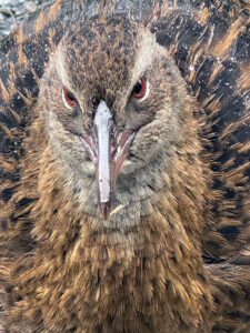
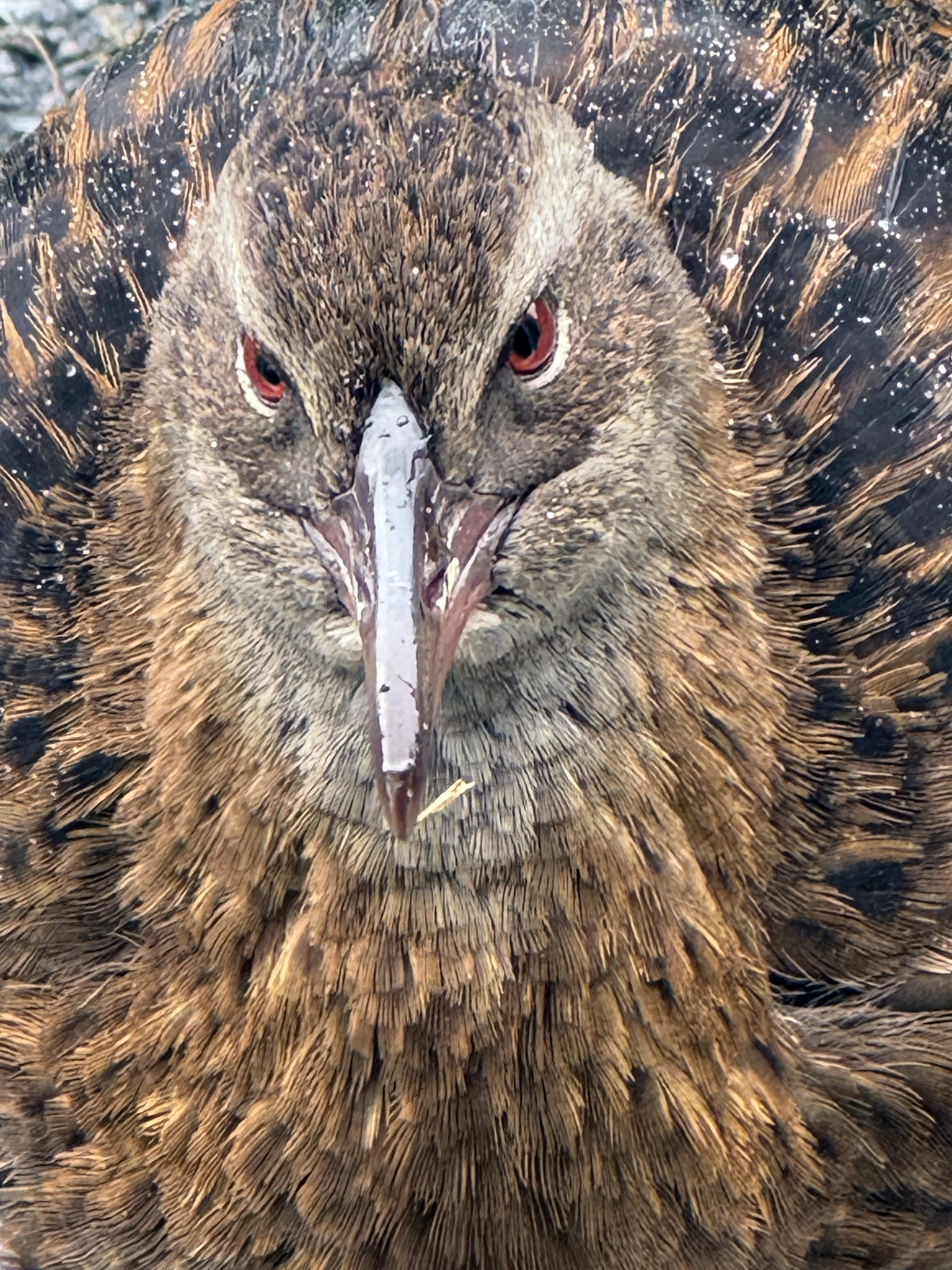
- 10 Weka Close up As noted earlier, shooting from the correct angle can make or break a composition. This composition works because we get to view a native bird with water droplets, which creates a pleasing effect, and it’s sharp. However, the wet reflective beak draws the eye and dominates the subject. A
-
- 11 Looking out H The image presents a compelling story that emotionally engages viewers. With an interesting composition, is this a path we all tread that leads to a pot of gold? This concept is fresh and innovative, distinguishing it from typical submissions. M

-
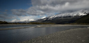
- 12 Southern alps This photo evokes a sense of tranquillity and open spaces, but the weather is about to change, as the dark clouds give tension to the composition. The image flows from left to right, with strong lead lines. M
-
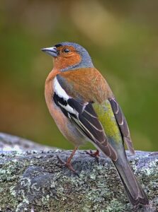
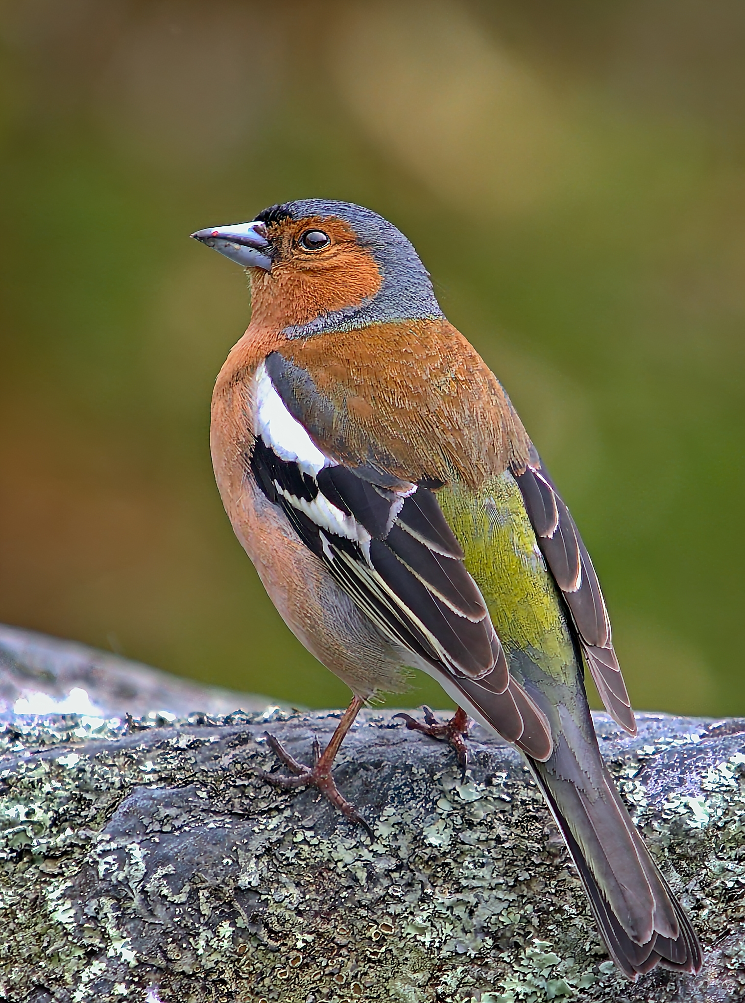
- 13 Chaffinch This is a lovely image of a Chaffinch, with a dreamy bokeh effect singling out the subject. However, the image appears to be over-processed, i.e., enlarged or cropped far too severely, or over-sharpened. There are at least four or five areas in the wings and on the beak where the image is blown out. For these reasons, I’m not accepting this image. N/A
-

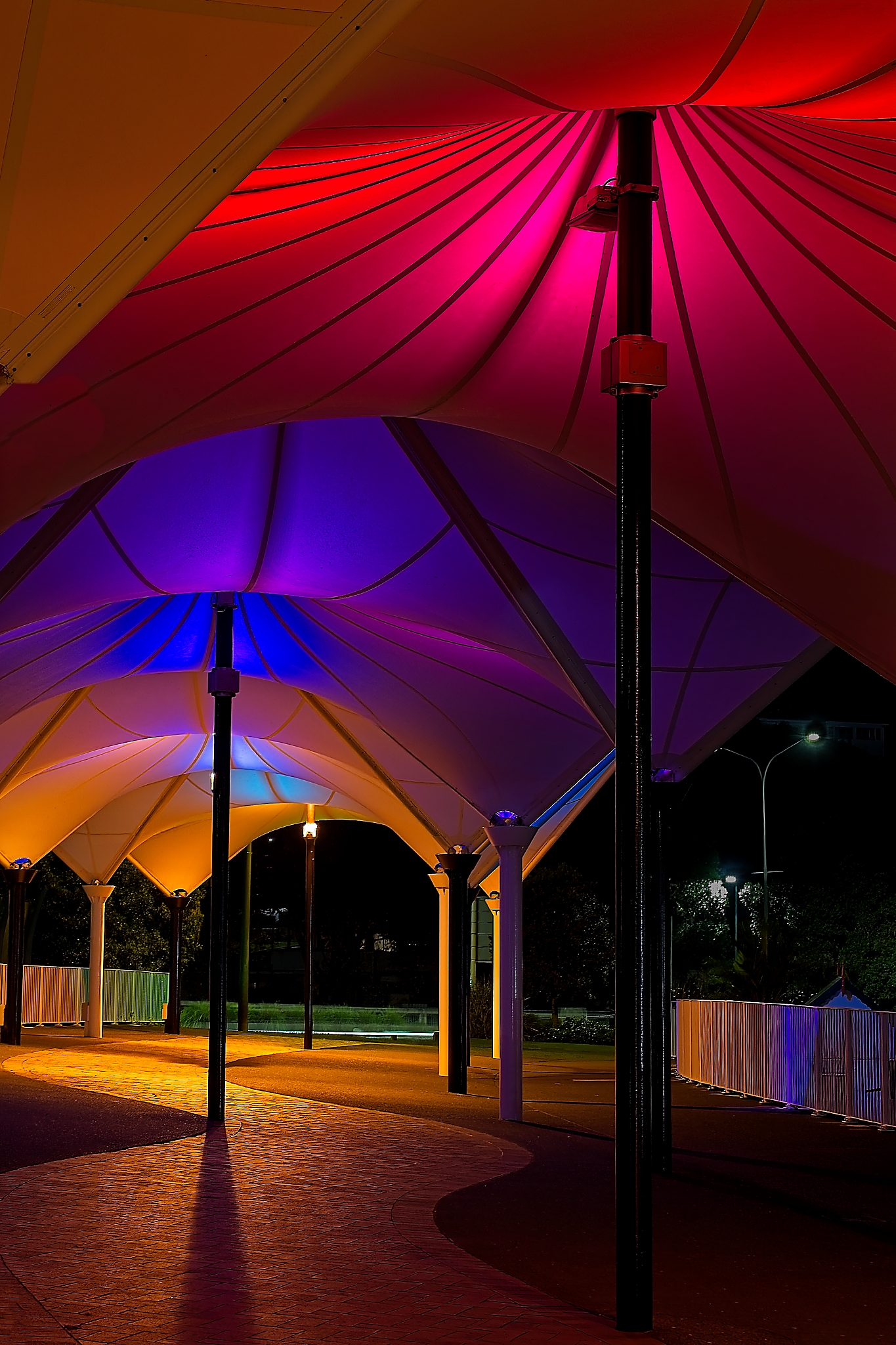
- 14 Canapy Colours Well, this image lives up to its name; the colours are vibrant and true to life, enhancing the overall appearance of the canopy, which is echoed in the safety barrier. The use of shadow-leading lines draws the viewer’s eye to the focal point at the back of the image, while the colours bring the viewer back to the front. The white lights could have been muted down, as they tend to draw the eye and distract. The image had mood and presence. H Runner-up
-
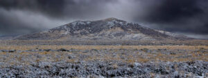
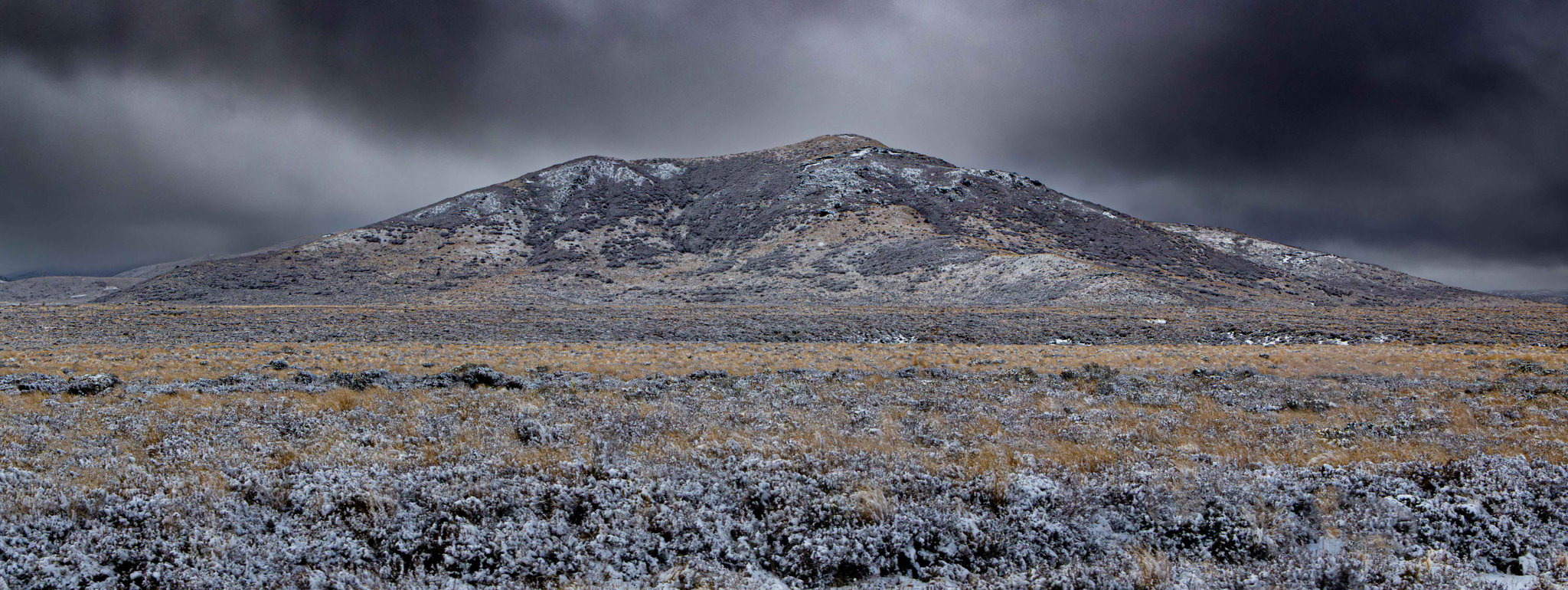
- 15 Rangipo Desert Skilful use of colour in the nearly black-and-white image brings the landscape to life, creating a striking visual impact. The power of the dark, ominous clouds sets the scene for winter, complemented by the frost on the ground. HC
-
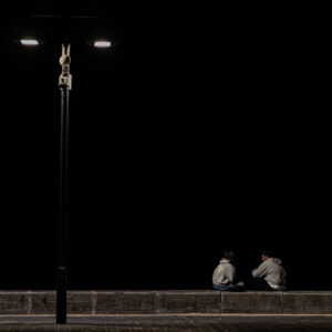
- 16 Nights Conversation The streetlight reveals a conversation between two young individuals. It’s evocative, conjuring up memories, moods, or images—a sense of nostalgia. In this scene, the negative space enhances the emotions expressed in their conversation. The composition is well done; however, a band of dimly reflected light above the street lamps is distracting. The author might try editing this line out and see if they prefer the image without it. H Winner
-

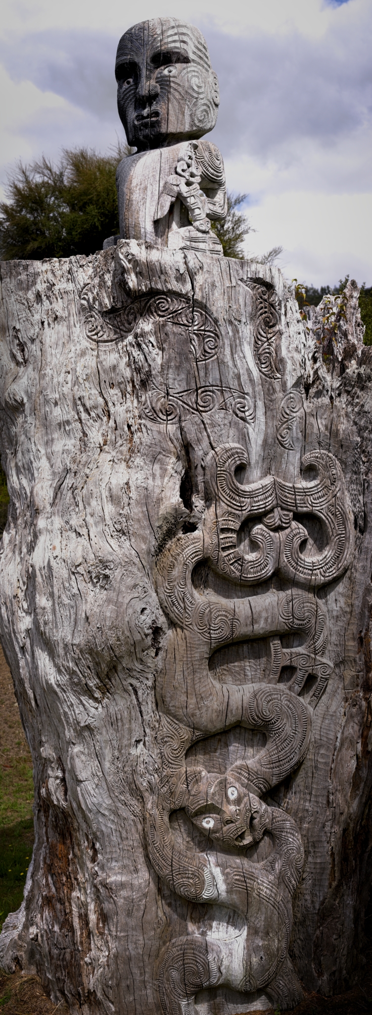
- 17 Kiwiana This is a nice record shot; however, I feel the crop of this carving is too tight. I keep wanting to see what’s happening on either side. So a bit more space around the subject could enhance the composition and provide context. Photography is a powerful medium that captures moments, emotions, and cultural practices. As photographers, we should ensure that these legacies live on, inspiring future generations. I suggest that for images like this, you can either crop tightly around something, for example, the bottom figure or a specific area of the carving to highlight the texture, or alternatively, show the entire scene to provide context. Some cloud detail seems lost; adjusting exposure could bring out more texture. A
-

- 18 A Brotherly Tiff Black-and-white photographs have a special charm, don’t they? They set a mood! When the vibe is already there, B&W photography takes it to another level. The image is slightly off level. To the photographer who was in the right place at the right time, well spotted and nicely composed. HC
-

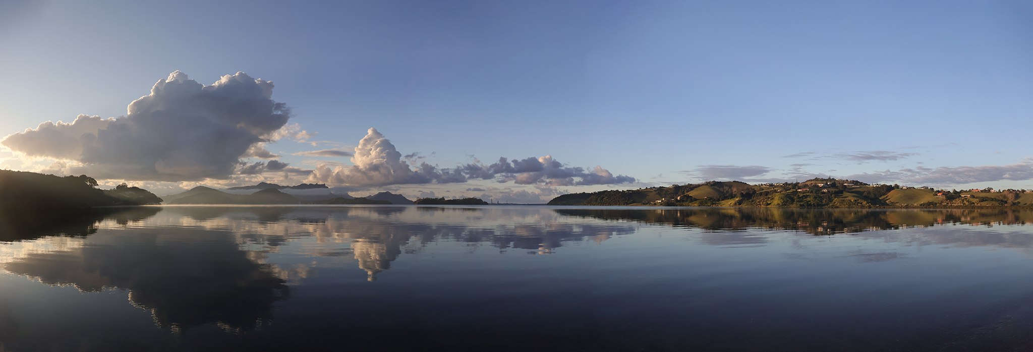
- 19 Early Morning At Parua Bay A serene, beautiful scene at first light, with lovely reflections. The composition is excellent, and the author has managed the light with sensitivity. HC
-
- 20 Theyre Not Biting What a great, gritty, grungy image, what I mean by that is the distressed aesthetic and rebellious spirit. The colours are complementary, as is the border. A good composition, well spotted or constructed. M
-

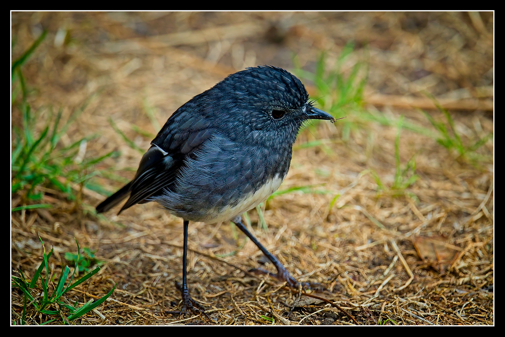
- 21 North Island Robin This captivating shot truly captures the essence of the Robin, making it a standout. The Robin is pin-sharp, and the clarity in the subject’s features is impressive. Your timing was excellent. The surrounding environment adds context to the subject and enriches the narrative. Adding a board to the image lifts the composition. Perhaps adjusting the F-stop might improve the bokeh, which is a bit distracting. HC
-

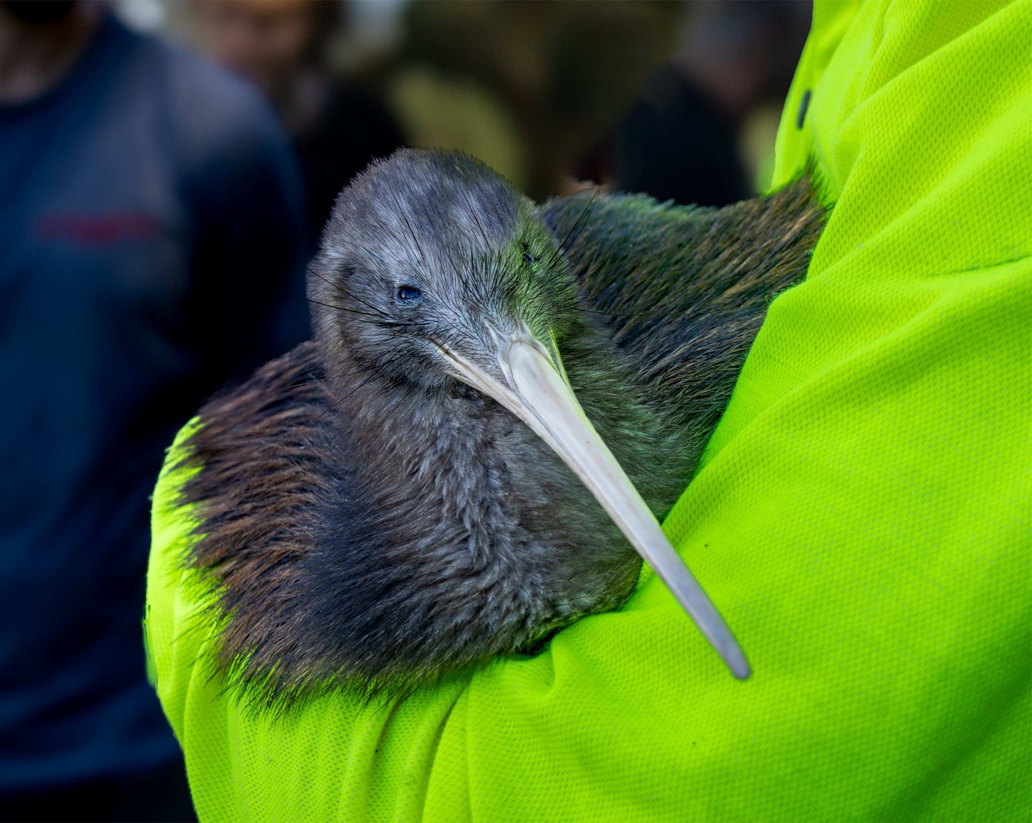
- 22 Ping The Kiwi Ping is nicely framed, giving the Kiwi ample space. The composition is beautifully sharp with good control of the light, making it pleasing to the eye. I might have added a vignette to eliminate the handler’s hi-vis jacket and tone down the fluorescent green colour that dominates this image. M
-

- 23 The Magician This concept is fresh and innovative, setting it apart from the typical submissions this year. It had the potential to be a contender for the competition’s winner; however, the image is not well-focused. If you were aiming to convey motion, adding more motion blur would have effectively communicated that idea. As a result, I have decided not to accept it. To the photographer, my initial feedback still stands: please try again. N/A

-

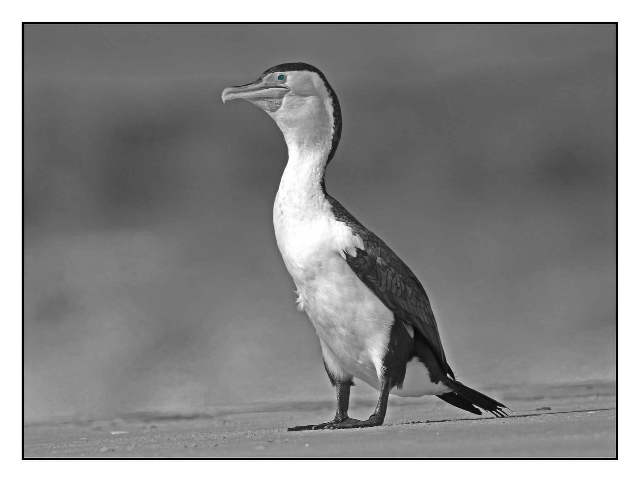
- 24 Resting Shag 1 B&W eliminates distractions and adds emotion and mood, and this image has plenty of drama. This is pin-sharp where it needs to be. The bokeh effect is visually pleasing in the out-of-focus areas of the photograph, and you did a good job controlling your depth of field. The photographer should always check exposure settings, as the area across the bird’s chest is slightly blown out, losing detail in the feathers. If in doubt, always slightly underexpose. M
-
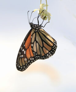
- 25 Monarch The sharpness of the butterfly’s wings is truly noteworthy, beautifully highlighting its intricate patterns. The blurred background enhances the butterfly’s prominence, effectively drawing our attention to the subject. Additionally, the lighting skilfully accentuates the colours, creating a vibrant, engaging image that captivates the viewer. HC
