Judged
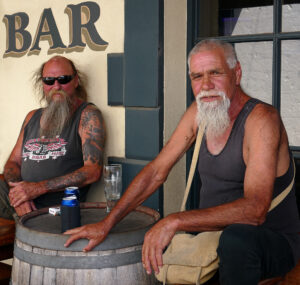
- 01 Days End – The character of the two men seated in a pub is well seen. I can almost here them saying “What are you looking at, Mate!” Well composed with nice sharp detail. Merit
- 02 Eva – A well posed image with nice detail in the sky behind. Perhaps consider cloning out the sunflower heads along the top of her neck and sleeve, and near the rope on the right of the image. Acceptance
- 03 Sistas in the sunflowers – The use of a big picture frame really makes this image “Pop.” It centers the attention onto the two sisters. Nice use of colour. Merit
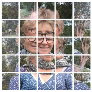
- 04 Joiner Selfie – What an imaginative image. I like the way that each element blends in well with the surrounding tiles. Given the complexity of the composition, it does feel a bit visually dense, which can make it slightly hard to follow. You might consider removing the columns on the far left and right to create a more unified and cohesive overall impression.” Acceptance
- 05 Captains watching eye – A good concept, however I think that the image is cropped too tightly. If some of the surroundings were visible it would perhaps provide more clues as to what the Captain was watching. The bright area behind his head and the reflections on his glasses are a little distracting. Acceptance
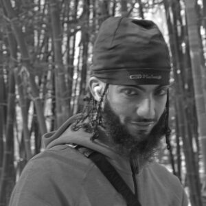
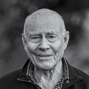
- 06 Kamel – The choice to present this in black and white works well, enhancing the mood. Kamel’s direct gaze into the camera creates a strong connection, and it’s great that you’ve included elements of his immediate surroundings. However, the overall softness in focus detracts from the impact of the image.” NA
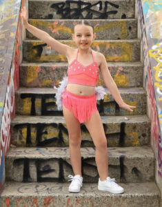
- 07 Indie – Nice bright colours shown off well. The pose is good with direct eye contact with Indie. Perhaps consider placing Indie onto the left side on the steps to create more visual tension. Acceptance
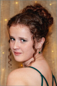
- 08 Tegan – A well posed image. The slight angle of the head works well. I like the soft green background, however perhaps consider cloning out the leaf on the left side of the models head, and on the right hand side of the image. Also consider removing the bright area on the forehead. Acceptance
- 09 Contemplative – The mood of the model is captured nicely and the soft background gives the setting a calm feel. The right-hand side appears to be very slightly soft in focus and the image is a little flat. Acceptance
- 10 Coffee break from the engine room – This image shows potential! The subject’s current pose—with his head down and no eye contact—creates a more introspective mood. A slight tilt of the head and some eye contact with the camera could add a stronger connection with the viewer. Also, since the title references a coffee break, bringing the coffee cup more prominently into the frame could reinforce the theme. Acceptance
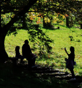
- 11 Family outing – The idea of using a silhouette is a strong and creative choice. With a bit of refinement, it could be even more impactful. Sharpening the edges of the silhouettes and softening the brightness of the background might help the subject stand out more clearly. NA
- 12 A beach day – A tightly cropped image which is well posed. When composing, including more of the environment would enhance the feeling. The title says “A beach day”. Lets see more of the beach! Acceptance
- 13 Smiley Sam – A well lit, nicely posed image. I like the soft, pastel treatment of the background which enhances the model. A slight tidy up of the long hairs on the left side of the models shoulder may improve the overall image. Merit
- 14 Jason – A well composed, nicely lit image. There is a real connection with Jason as he looks directly into the camera. Nice sharp detail and nicely separated from the soft background. Honours – Winner
- 15 Cheeky grin – The monochrome treatment of this image was a great choice. A very engaging image with excellent detail throughout. A nicely blurred background really adds to this image. Well done Honours – Runner-up
- 16 Gardener A well posed and well lit portrait which creates the environmental theme very well. The white blurred area on the right hand side edge could be easily cloned out to improve the overall image. Merit
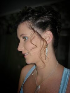
- 17 Sara – Sara is nicely lit in this image, which highlights her features. While she’s looking away from the camera, inviting her to engage directly with the lens could add a stronger emotional connection. Acceptance
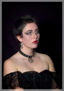
- 18 Kerry – The lighting on this image is very good and the pensive expression is captured well. Nice sharp detail and the muted dark background enhances the image. You could consider removing the bright areas on the nose, cheek and forehead. HC
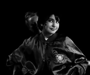
- 19 Showtime – Using monotone was a good choice. Unfortunately there are several areas of bright white which have blown out and degraded the image. The whites of the eyes are a little too noticeable. Over-sharpening has created halos around the subjects jacket. Perhaps consider reworking the image to soften it slightly. NA
- 20 Hollie – The subject is well-centered, drawing the viewer’s eye directly to the microphone and face. I suggest that you remove the bright area at the top of the image, and perhaps tweak the contrast on the subject to separate her more from the background. Perhaps crop out some of the brick wall from the left to enhance the image. HC
- 21 Freddy and his family – This is a beautifully lit and warmly composed image that radiates a heartfelt quality. It reflects the polished style often seen in professional portrait photography. While it’s skillfully executed, I would have loved to see the author explore a more creative or unconventional setting— something that might offer a deeper glimpse into their unique artistic voice. HC
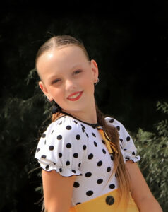
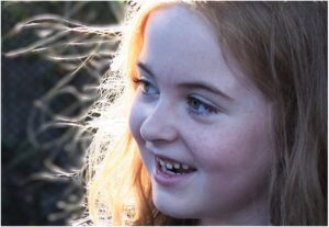
- 22 Halo – The sunlight catching the strands of hair is the star here. It creates a soft, golden shimmer that adds warmth and depth. Nice detail on the young girls face. Perhaps sightly brightening her features could enhance the overall impact. HC
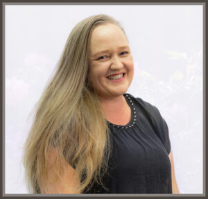
- 23 Kate – The connection with Kate comes through well. The image is well exposed with good detail. That said, the angle of her head feels a touch awkward— if she had turned slightly to her left, her eyes might appear more centered, reducing the prominence of the eye whites.” Accepted
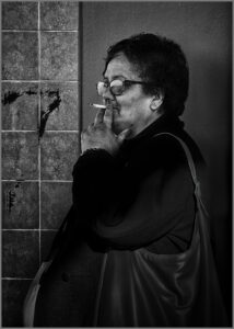
- 24 Smoko – A very engaging image which works very well in monotone. The detail on the face and hand is excellent. The dark shadow on the top of the arm and shoulder is a little distracting. Accepted
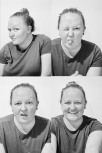
- 25 Her – A creative and playful concept. The composition feels a bit crowded overall—adding a narrow border between the four images could help give each one more breathing room and enhance the visual impact. Still, a strong and imaginative idea. Accepted
- 26 Him – The expressions on the mans face are delightful. Slight separation of the four images would make the image stand out more. Accepted
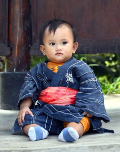
- 27 Judo Master – The subject is well-placed, but consider experimenting with a slightly lower angle or a tighter crop to emphasize the child’s expression and the intricate details of the kimono. Accepted

