Good evening Whangarei. Your assessor is John Boyd and it has been a pleasure to review your work. Normally, what I am looking for is the photographer’s interpretation of the subject and the emotional impact on the viewer with technical aspects that support that. As to process, I view the images several times before making comments on them. It is only at the end that I then rank the images, which in the absence of instructions to the contrary, is pretty much an exercise in relativity.
With a set subject as narrow as panning I don’t think there is much opportunity to effect emotional impact unless you are a car racing follower, because it is largely a technical exercise, but your images are interesting and well executed.
On with the show.
-

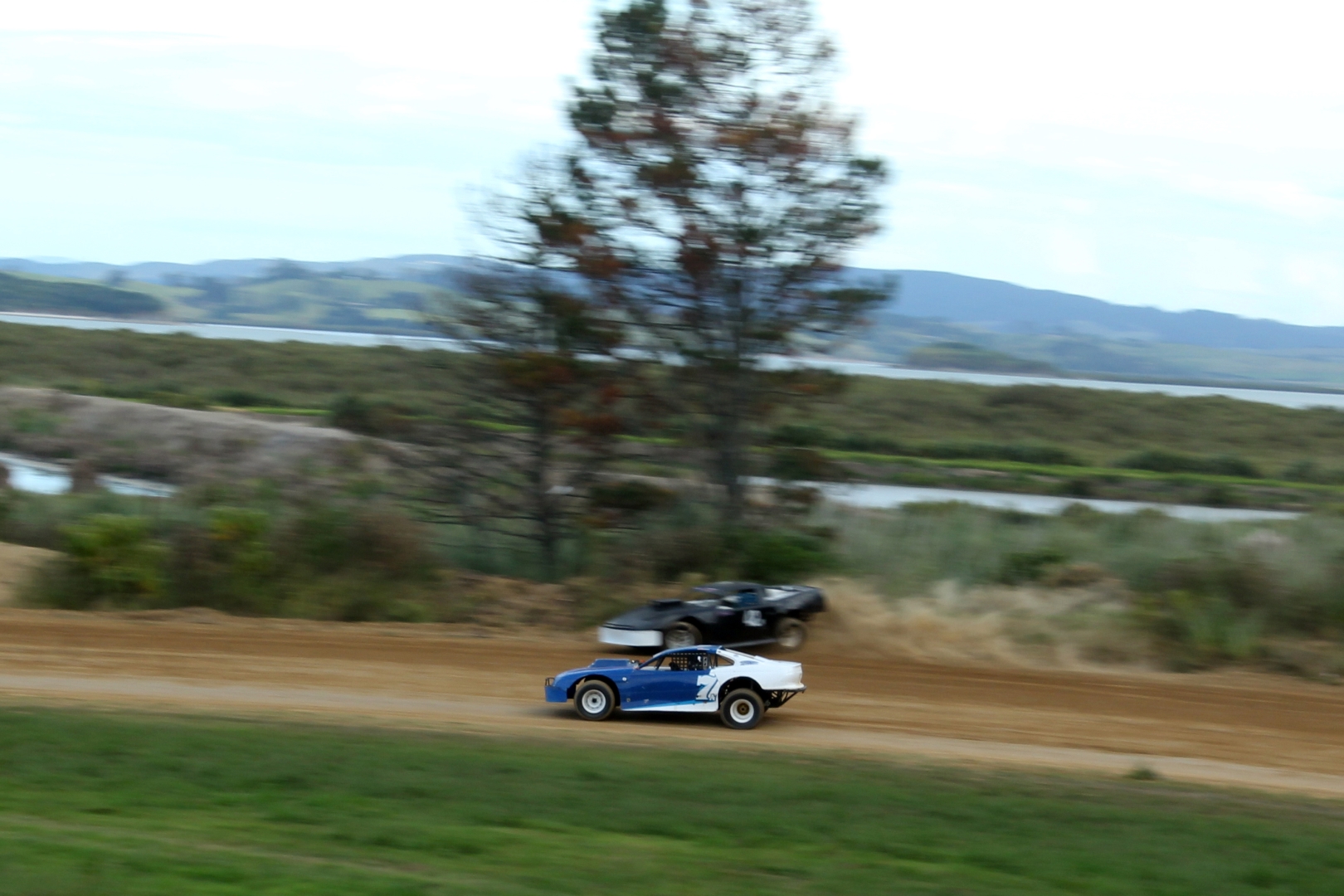
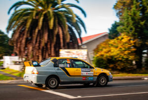
- 0vertaking – Capture of the overtaking manoeuvre introduces a story-line and adds interest. Excellent placement in the frame and an appropriate shutter speed which maintains sharpness of the subjects and very good blurring elsewhere. You could consider cropping from the top to remove the brightness of the water and one of those wires, plus perhaps a little darkening to make more of the colours. Good panning. Merit
-

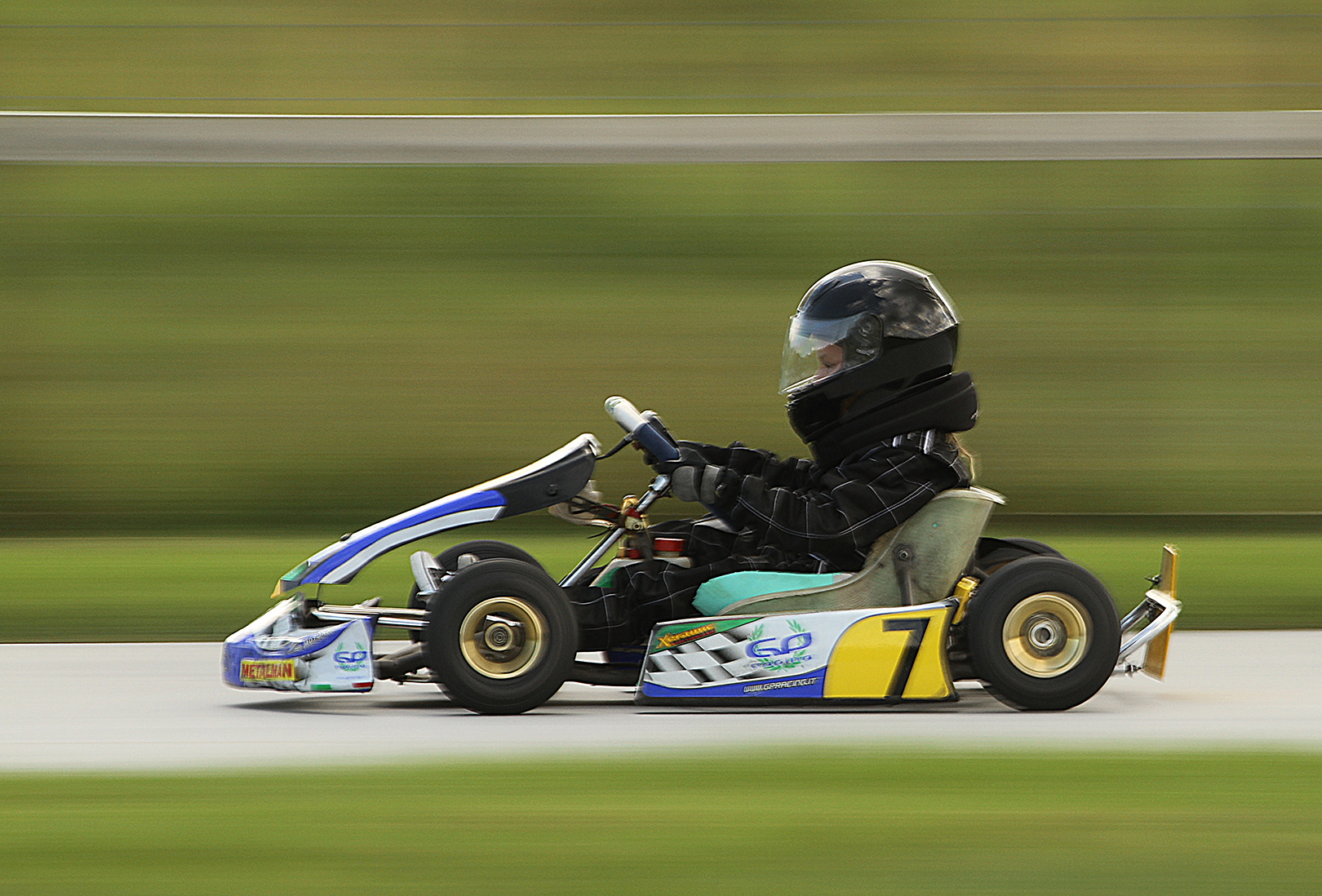
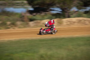
- Go-kart – Very very well done. Frame well filled, the kart sharp and in just the right place, plus delightfully blurred surroundings in muted hues. The grey band above the head just seems to add interest without distracting. I am sure the driver would be delighted with this image. I know I am. Congratulations. Honours
-
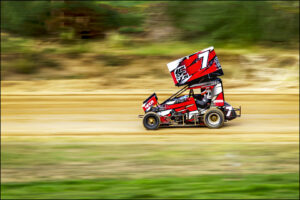
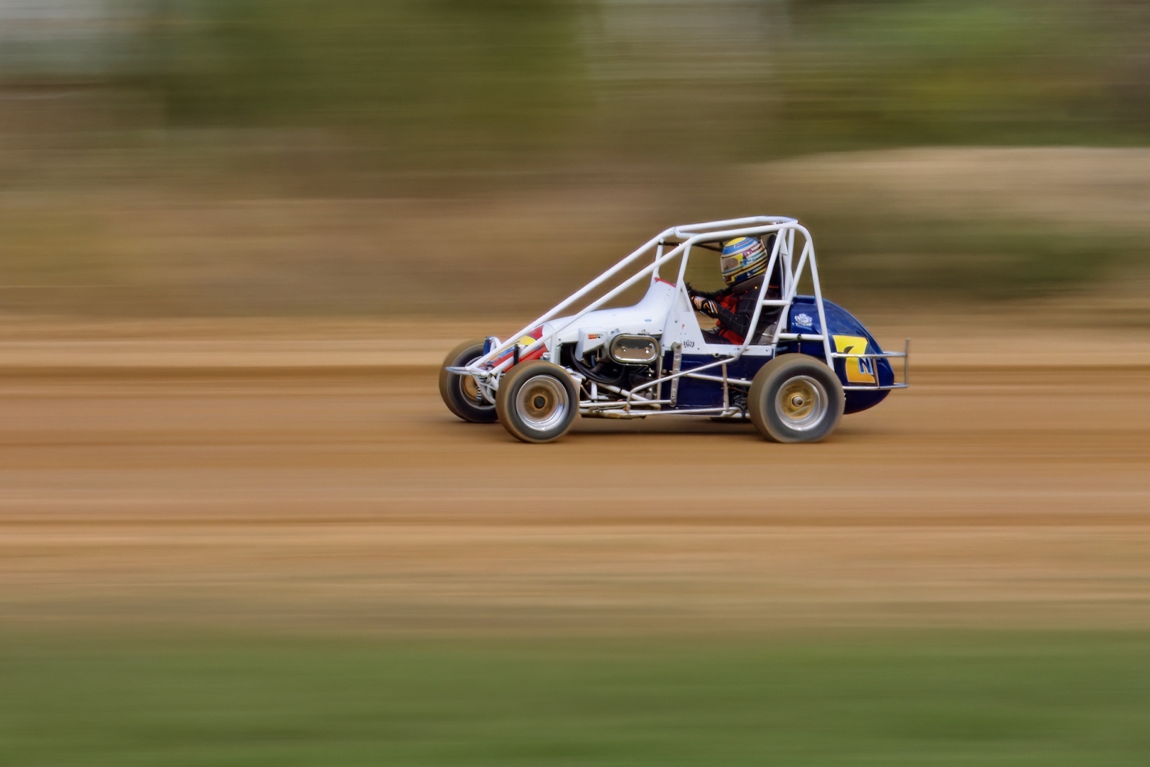
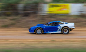
- Red 7 – Pin sharp, so mission accomplished & is ideally placed between the left and right margins. There is a case for a little cropping from the top to place the car a little higher in the frame. I find the foreground green a bit demanding but if entered in a PJ competition you couldn’t do anything about that. Merit

-

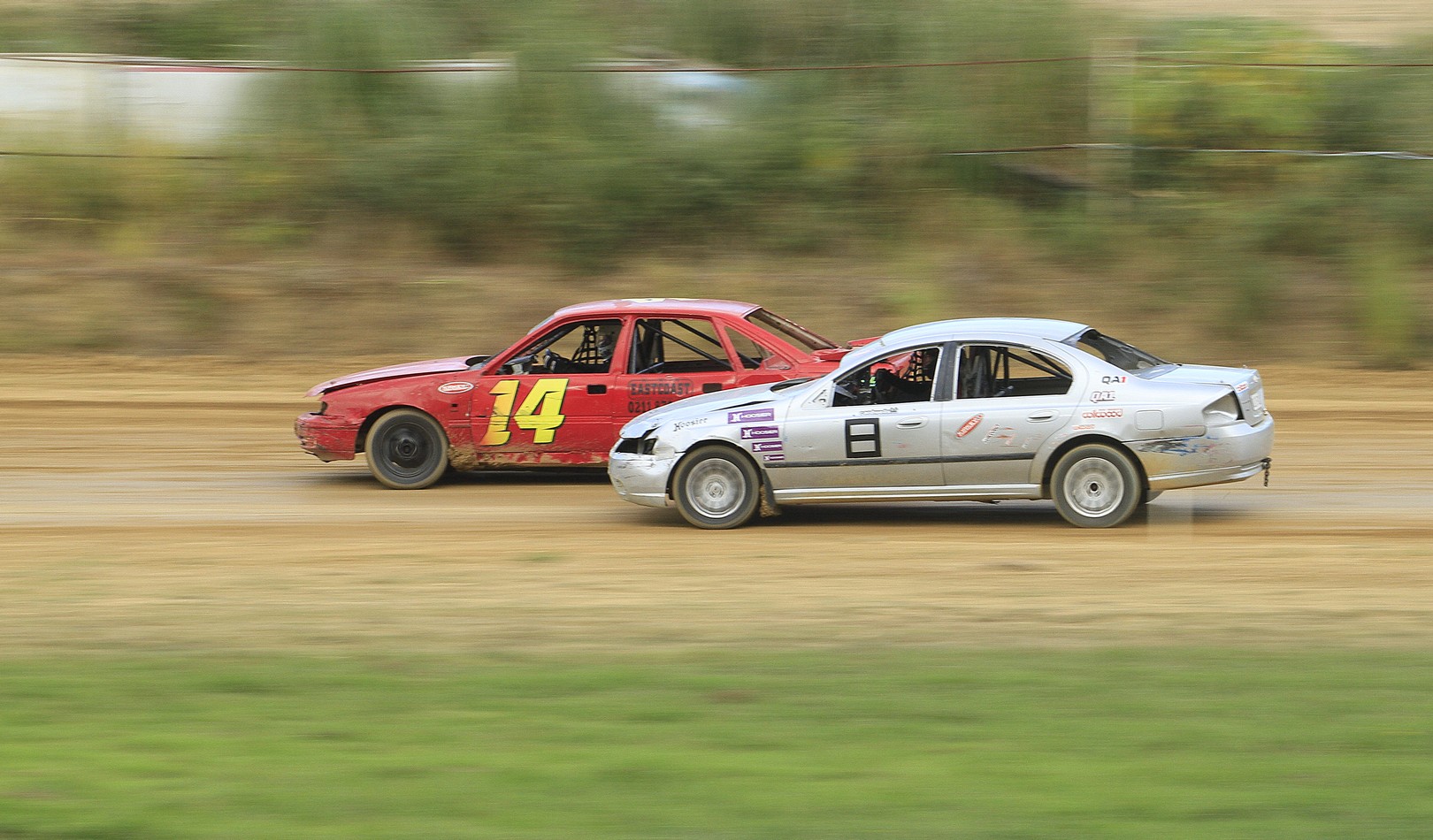
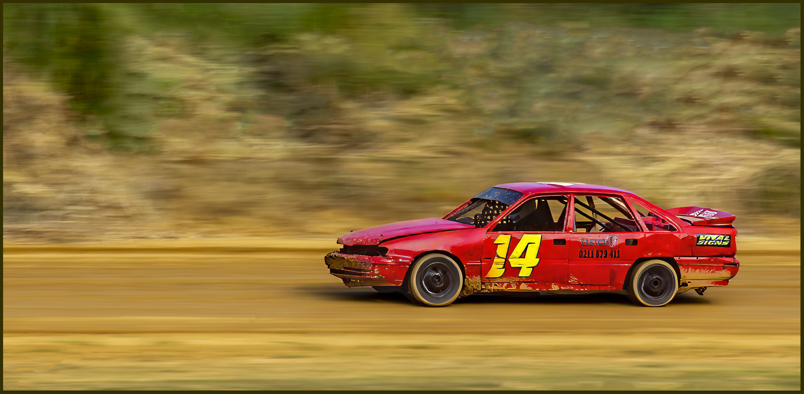
- Red 14 – Excellent placement and perfect shutter speed for this exercise. I suggest that be shared with other members who have had less panning success. Importantly, you have presented in a format that is in sympathy with the subject. H/C
-
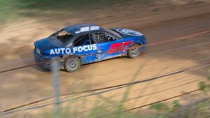
- Go 22 Go – The diagonal adds to the feeling of action. It’s good that the auto focus didn’t pick up the post and wires which are an unfortunate distraction. It’s good that the car is lit and that there is shadow on the right which helps keep the eye in the frame, especially important when where the car is heading directs the eye that way. Good proportions. Accepted

-
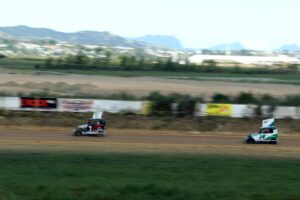
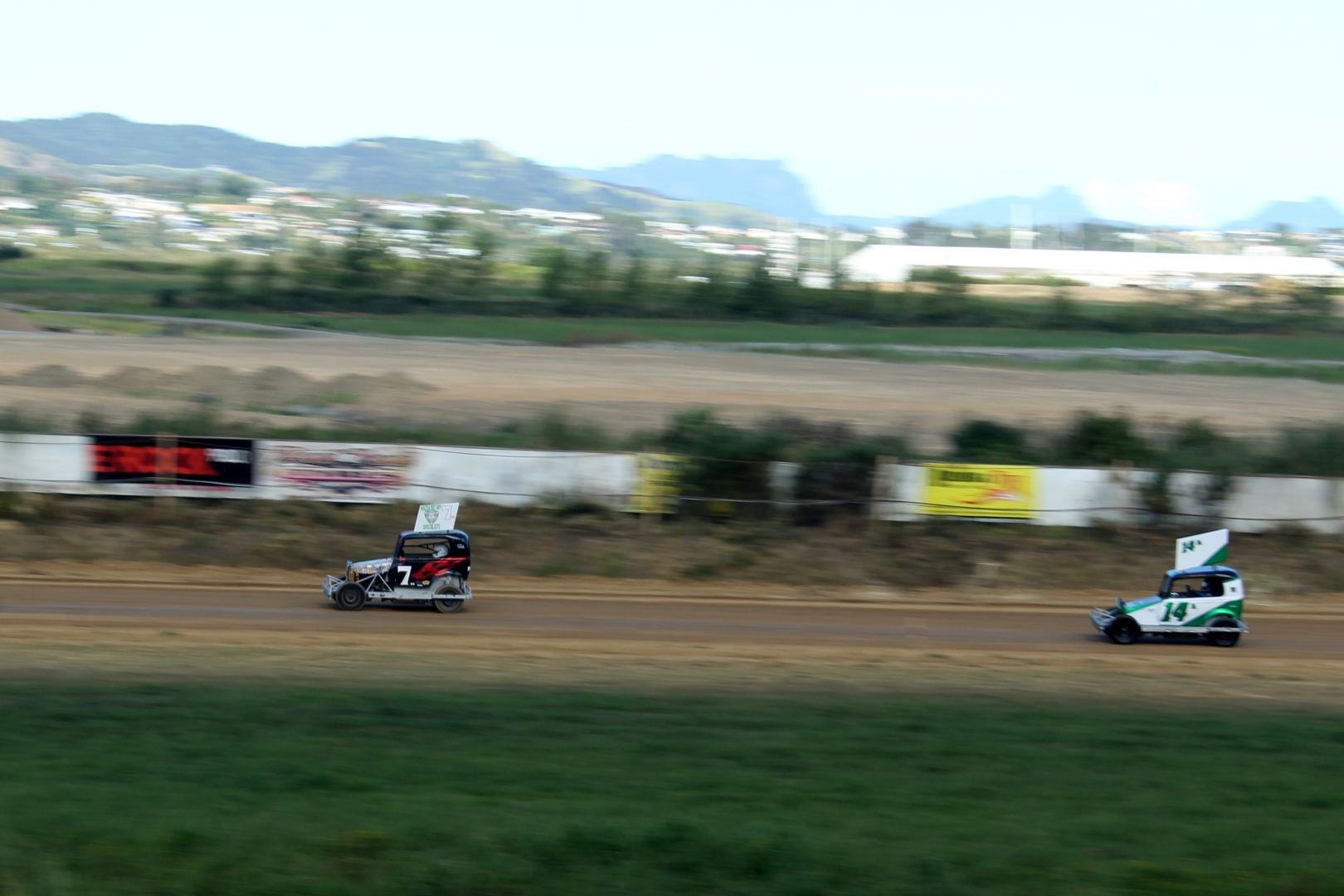
- Speedway 1 – Car 7 appears nice and sharp with the background blurring giving a good impression of speed. Perhaps because of limitations with your gear it is just a little remote, but think the quality is good enough to enlarge it in the total picture area by cropping. I suggest a crop from the top to just the base of the line of trees so that you have green there as well as in the foreground. You might wish to retain number 14, but it is well back and in my opinion doesn’t add much to the story. I’d be inclined to crop from the right, right down the centre which is through the left bush against the hoardings and perhaps half the grass foreground to bring the format back to closer to a 3×2 ratio. Good exposure. Acceptance
-

- Speedway 2 – Another good example of panning. I suggest the image be tilted so that the far horizon is level, then crop to exclude the water and from the right half way to the rear of the car. Excluding the triangles created by the re-tilting should fix everything else. The purpose of the crop from the top is to enable the subject to stand out without the distraction of highlights. The stationary car adds interest without intruding thanks to its blurring. Merit
-
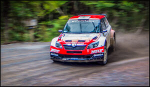
- Sideway Drifting Skoda – The speed at this angle is probably a little more difficult to judge because of the slide, but it is well caught. Nice to see the dust being kicked up and the action is perfectly placed in the frame. I am a fan for borders, but a black on the outside might not always contribute to the presentation if it is being viewed on a black background. A nice variation on the straight panning. Merit

-

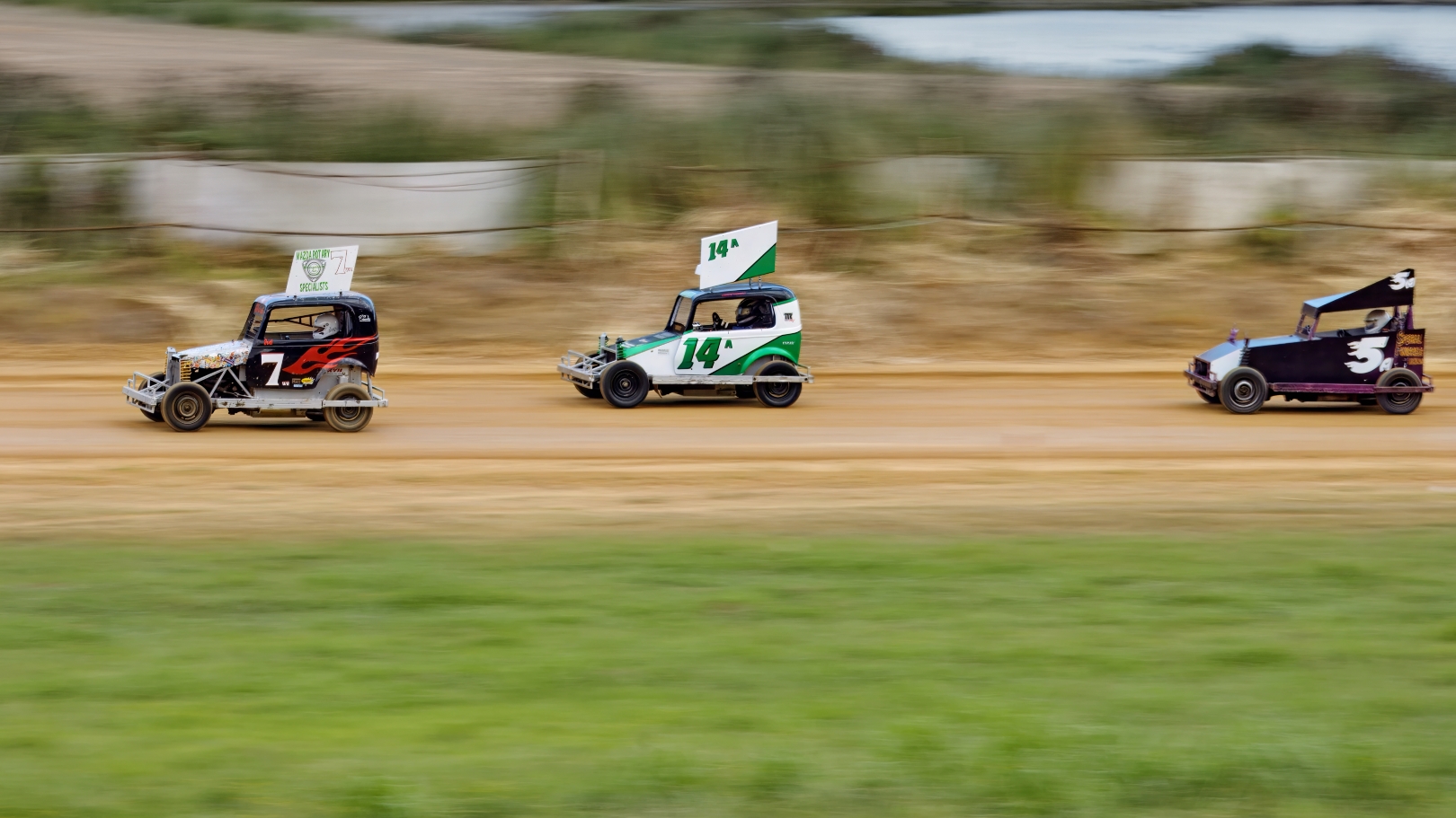
- Seven Fourteen And Five In The Race – The cars are nice and sharp with the background blurred as required. I feel that they are just a little too spread, with the leading one very close to the margin with little room to move. A slight trim from the top to remove the water would allow the viewer to concentrate on the race. Good exposure and choice of shutter speed. Accepted
-
- Sevens Long Road To The Win – In this section, in my opinion this is the best example of panning. The car is absolutely sharp and there is nothing distracting in the blurred surrounds. Placement is spot on although you could consider a little off the top to further simplify the image and place the subject a little higher in the frame. Very good work. Honours
-
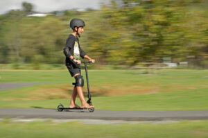
- Boy On A Scooter – Knee pads, elbow pads, crash helmet and bare feet?? Bizarre, but not the photographer’s problem. Good use of the frame and well panned. Exposure showing detail in the blacks is excellent, but it could be livened up a little with slightly more contrast and brightness. If you have Photoshop or similar it’s a good idea to try the auto correct button just to see what the potential is and then either accept that or vary it to your taste. Accepted

-
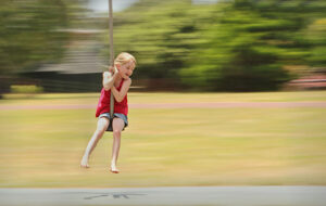
- Hanging On Tight – The joy of the action is readily evident. Ideal for the family album. You could crop in a little, but I rather like the feeling of the freedom the space invokes. Simple and effective. Accepted
-

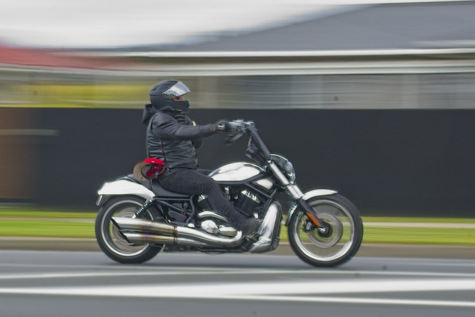
- Black Power – A very slow shutter speed here which has resulted in some softness of the subject and a bobble in the front wheel. The bike is well placed in the frame although a crop from the left would lead to the impression of there being a greater distance in front to travel into. There is more contrast in the image than as presented and you could consider giving it more impact. However, a major consideration in my rating is the half dozen spots which appear to be dust on the lens because they are circular and therefore can’t be involved in the panning. Good title.Merit
-

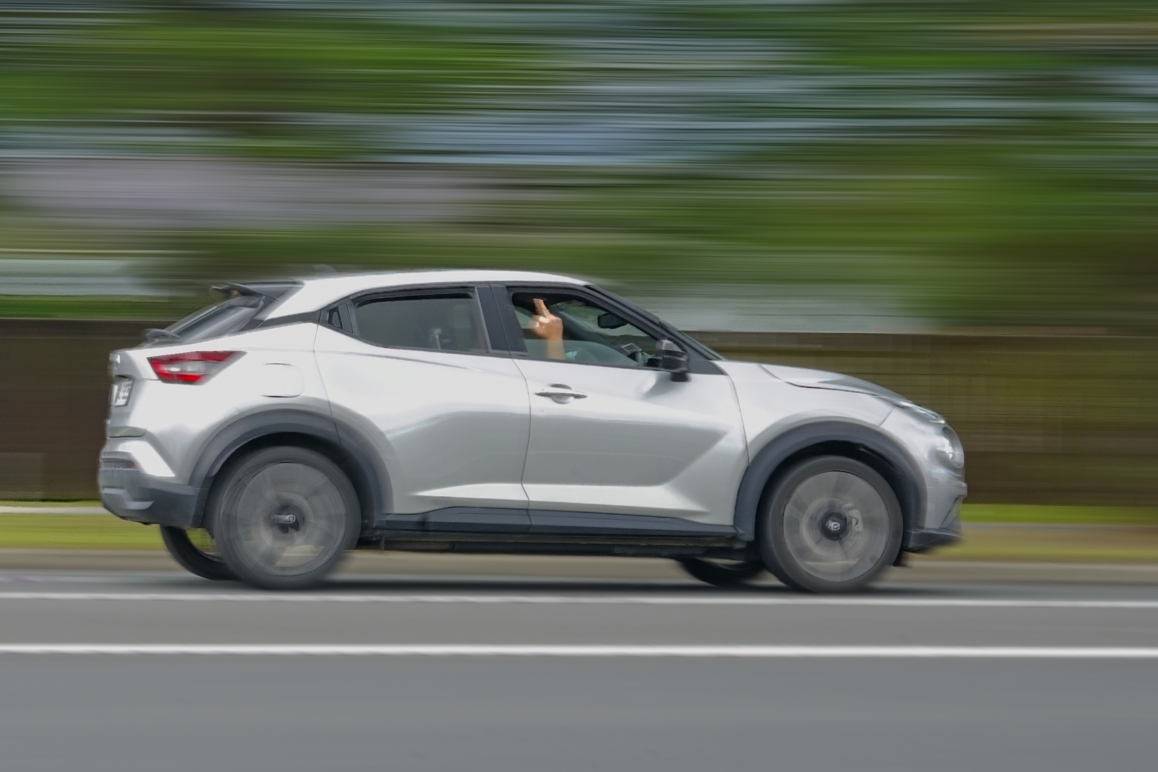
- The Finger – What on earth did you do to get this response? That sort of gesture certainly evokes an emotional response in me. Again, a slower than necessary shutter speed which has resulted in softness of the subject and a blurring of the finger. Good placement and a delightful range of colours in the background. Saturation could be increased if you have the means to do that. Merit
-
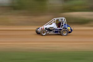
- Lucky Number 7 – This car appears to be the sharpest in this section, but with sufficient slowness of shutter speed to allow background blurring and the wheels to spin. Good colour and nice background here, and again I suggest a crop from the right up the trunk of that right tree to ensure darkness on the right margin and removal of half of the grass to place the car on the bottom right third. You have given it good room to move. Honours

-
- Pedal to the Metal – Well captured and it’s just a pity that the background is so distracting, not helped by the car having similar colours on it. I suggest that the distractions could be mitigated with a crop on the left to remove the bright white area of the building, from the right to remove the white mark on the kerb and all light to the right of the tree, plus a crop from the top to remove half of the sky. The last one returns the format to one consistent with the shape of the subject. The shutter speed perhaps just a little fast to allow for the best background blurring. Not Accepted

-

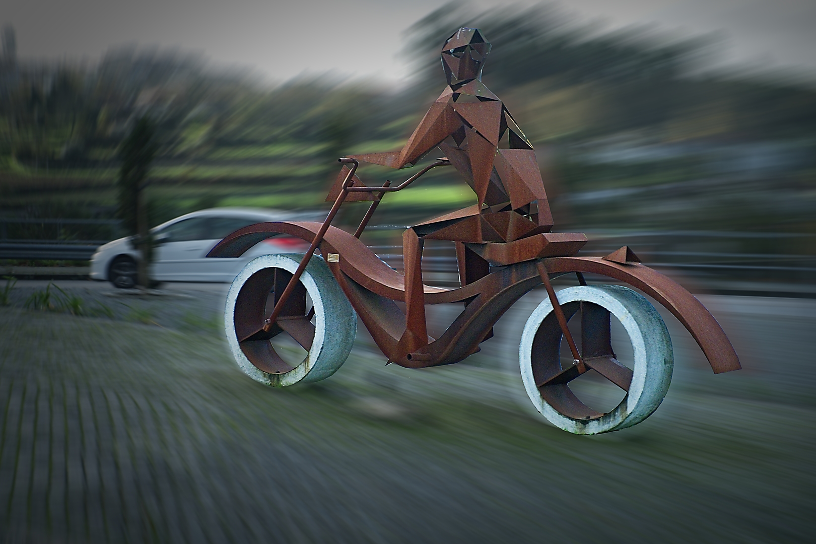
- The Speedy Iron Man – Love it, but zooming isn’t panning so unfortunately, although the effect is similar I don’t feel that in fairness to other entrants I can accept it. The concept is great and the iron has been beautifully rendered. The only slight reservation I have is the halo arising from the brightness of the wheels. Good composition and good story of the bike catching the car. I hope you are able to re-enter in an Open competition. Not Accepted
-

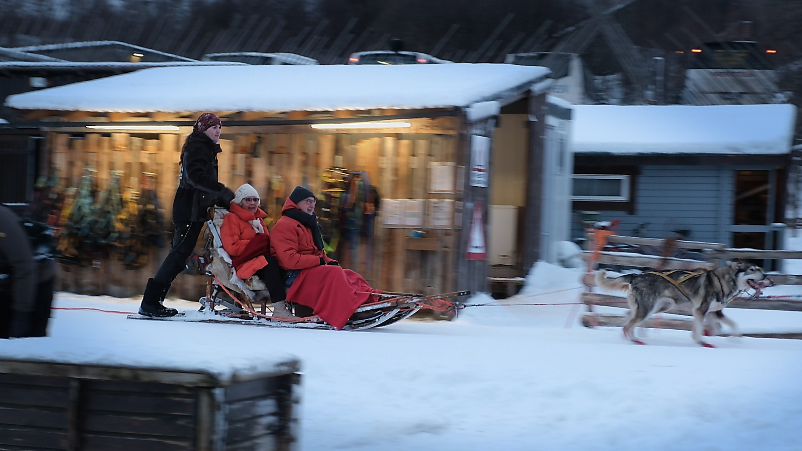
- Sleigh Ride – A good memory of what would have been a great experience, and don’t they look cold. The importance of including the huskies has dictated the distance of the subjects from the camera and that is a bit unfortunate, but you have presented in something of a narrow panel to simplify as much as possible. Difficult circumstances quite well handled. Not Accepted
-
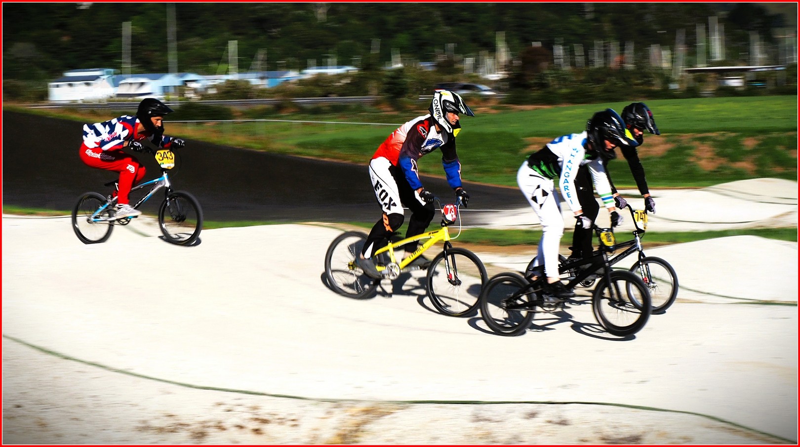
- Getting Serious at Whangarei BMX – Difficult contrast conditions. The brightness of the track is to me a bit too demanding. I think a little play around lowering the contrast and the brightness would give some detail on the track and make it less distracting. The panning has been well done and the grouping of riders with the Fox being the focal point is good. You could consider darkening the white building a little. With the reds in the picture its use in the border works well. Not Accepted
-
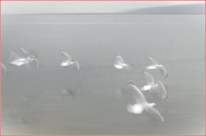
- Flutter of Feathers – I just love this image and that is why I have not accepted it in the hopes that it will do well in a later competition. The task you were set was to pan, but have the main subject sharp which has not worked here. However, there is an ethereal quality to the image, and a softness which does evoke some emotional response, at least in me. It is an effective interpretation of the subject and the monochrome ensures there are no distracting colours. I suggest you consider cropping from the top to half way to the gulls from that line of light, and from the left to just exclude the two gulls. That simplifies the message and importantly leaves the foreground gull as the focal point. I am a strong advocate of narrow borders except for PJ and Nature but care must be taken to avoid their distracting from the content. I feel that here introduction of the red is unnecessary. Good luck in a future competition. Not Accepted
-
- Go Racing – Technically another strong example of panning done well with the focal interest sharp, wheels spinning, and background softened by the blurring. Placement is good, but placement of the advertising less so. You could consider cropping the latter out along with the wires which add little to the story. Excellent colour. Merit
-

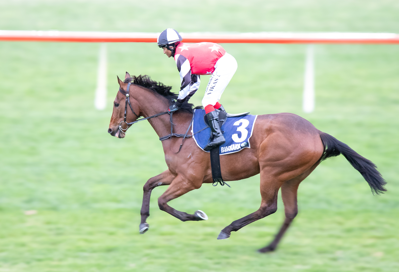
- Still Running – I guess the story is in the title. Has it won or come last to still be going? The placement is good, and although there has been a reasonably fast shutter speed, that is necessary with horses otherwise you start losing legs. Lovely detail of head and muscles. Everything is good except I feel that it is over exposed resulting in loss of detail in the whites and that it would benefit from quite significant darkening. Accepted