Judges – Christine A, Linda and Coen. Scribe – Judy.
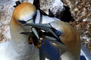
- 1 Nesting S Nice capture of these two birds sharing the nesting duties. Great story within the frame, means it does not matter too much that the birds are cropped quite a bit. There is clear detail in the feathers and other highlights that were certainly not easy with the hard light to achieve. Eyes and beaks are perfectly sharp. DOF is well handled with no distractions in the background. You could try to tone down the centre and left background whites. Colours appear a bit harsh, maybe the days lighting or it was over sharpened. The shapes and busy nature do take a few seconds to truly give this picture meaning. Having just the two beaks and heads without the body would be best. We can however not always direct nature. Highly Commended
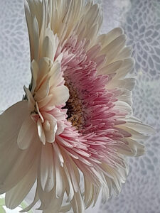
- 2 Feminity in a flower. N A lovely flower presented on white textured background. Beautiful colour palette and interesting perspective opening to the right. Lighting is well-handled; you could have been more creative with the shadows, but it now gives us a great view on all the structures of the flower. The post processing used seems to have also sharpened the parts of the picture that could have been left blurred. The lace background fits with the title but could have been left blurred. Modern tools can distinguish between subject and background and this should have been done. Overall, the image is not perfectly sharp, but this may have been for intentional softness. Cropping the petals feels tight, but as you miss them on 3 sides, it shows you may have wanted the macro look on the centre. Make sure there is a clear structure to your meaning or story, not something halfway. Meaning you could crop tighter or left all the petals in the frame. A plain background would enhance the flower so the focus remains on the flower. Merit
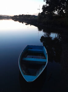
- 3.The ferryman. N Can feel the early morning air coming from this picture. The story I get from this is that you want to show the calmness of the water, the town we live in and the little dingy awaiting the next trip out. This is almost three stories,maybe best to focus on one of them. The bright sky and dark water are a nice contrast on its own. The dingy is great on its own, the calm water and tree are great to show the lack of wind. Showing all three is a bit busy. The tall lamp post leans and adds to the imbalance. Clone out that leaning lamp post and try cropping a bit off the right side. Perhaps try to get a bit more detail in the sky and lower dark area on the right side. Some great rules followed, objects not in the centre and there are lines to all the stories. The blown-out sky where details have vanished is not too disturbing as it complements the calm water. If you check this image with a crop and only focus on the dingy you will see the blown-out sky can just be forgotten while still having the high contrast with the dark water. The early bird gets the shot, keep waking up early! Merit
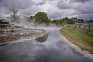
- 4 Wairakei Terrace .S A beautiful view of this volcanic land. Love the moody clouds and leading lines. The wooden fence tells of heritage and days gone by. All the details are there with no area lacking texture. Cropping the fence off would not have changed the story but would have made it more focused on the silica ridges. The crop could have been done while still maintaining the lines of the river. After this crop if you wanted to avoid the picture becoming too square, you could have lost some of the sky. The landscape is beautiful as a story, I hope you took the time to also take some closeups of the reflection of the ridge in the water. This reflection is beautiful. The title gives a clear location, as the terrace is only part of the frame. I am looking to see more of the volcanic features. Exposure well done. Merit
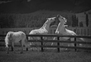
- 5. A brotherly tiff S The three subjects form a great story. The power exchange between the two, while on the other side of the fence, one is just enjoying another day in the paddock, is lovely and well spotted. The mono treatment of this image is well done bringing the horses into the spotlight. With cropping you are also showing skill. You could argue the right side can be cropped just a tad more, but now you keep a nice balance in the background giving the three horses room and not coming close to cutting a tail. It is still a landscape too and therefore leaving the top and bottom in this case is well done. One point to make this even better is the powerline. A little more blur would maybe have taken this line out. Try cloning out or blur the white cloud bit at the top as they draw the eye. The safe F8 used is leaving the line too sharp crossing through the frame. The buildings between the horses could also be a bit more blurred, but as the picture is full of action it took me several minutes to even spot the building. Black and White is beautifully handled as green and white would have been so hard to get right. Highly Commended
- 6 Glasses S A beautiful shot. Very clever. It suits the sepia tone with a splash of colour. The background is very well handled, and the shapes and lines are keeping your eye on the subjects. The back glass is slightly out of alignment creating a wobbly line which distracts. Overall sharp and the tool used is not too overpowering. Just up from the left- hand bottom corner there is a section that could have been blurred as it is the only section with detail in the cloth. The balance of light and colour keeps your eye in the glass. Position in the frame is well chosen. Choosing the top rim of the glass to be flat (eye level) makes the image have fewer lines in it and shows the composition took time to set up. The flowers could be a little brighter. A pleasure to look at. Highly Commended
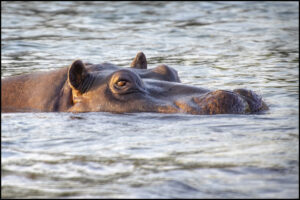
- 7 Hippo S A beast we don’t see here other than locked in a zoo. What a fantastic shot.Glad he was so chilled in the late afternoon sun. Lovely light and nice use of the depth of field. Modern solutions for modern problems do however create modern looks. The over processing makes for very sharp lines on a small screen but on a bigger screen the tools used to remove grain, noise or blur can make an image look like plastic. I doubt this is a warehouse hippo! Some tools allow you to add back a little noise or you can add a light layer to mask this. The eye is sharp, and the animal has room in the frame to move. The ratio leaves a lot of space in top and bottom where we can only imagine the jungle to start or the body of the animal to be. As the foreground water is a bit out of focus, a crop from the bottom to remove this would not detract from the hippo placement. Details in whites and blacks, overall very well done. Highly Commended
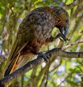
- 8 Kaka.S All technical aspects are there. Bird is in frame; the tail is hidden a little, but we all agree it is kept in frame. The frame is nice and full and the choice of a nearly square frame stops us perfectly and does not let our eyes wander away from the bird. Beautifully detailed feather colouring and definition still stand out against a busy bush background. Sharp eye and the bird is not just posing, there is some action. Light is well handled specially noticing it is taken in the shadow of the forest. To tone down the background select inverse and adjust brightness. Perhaps clone out the white spots. The bird is the subject, and it would have been hard to ask it to sit in a lighter spot. It is sometimes just not fair we can’t control nature, as with a little more light you could have made the bird pop to an ‘honours’. Nearly there! Highly Commended
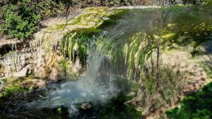
- 9 Greenstream. S 50% of all earth’s oxygen is made by just algae. Sometimes it does not make for a great image, but without the algae, water plants and green slime we would not breathe easy. Turning nutrients into biomass cleaning water that we made dirty. It certainly has texture and atmosphere and is a busy image. There is no real depth of field as the f-stop used is quite high. Lowering the f-stop and focusing on the waterfall would have given you more light to speed the shot up a little higher and get the crisp waterfall. A good crop right hand side to cut out the foliage brings the waterfall into more prominence. Then a smaller crop left hand side and tone down the brightness of the bank. The horizontal edge at the top of the frame keeps the eyes inside. Keeping the top and base of the waterfall in the frame gives us a clear view and sense of size. The only thing to pay attention to is the timing of the day, a little less hard light would make it less busy. You can see if smoothing and dimming the orange and yellow tints a little could create this low light effect. Beside the water I just imagine the cicada chirping. Acceptance
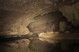
- 10 Inside the Waipu caves S The hidden world beneath us. Wow, so much detail captured in such a dark place. Impressive reflections too. Lighting is done well helping the viewer to experience the size and depth of the cave. The light used has given a small blue reflection in the ceiling and water that could have been removed by removing just the blue tones. This leaves the light in place, just less distracting. The leading lines could have been a little more obvious if we zoomed in a little. It would lose some of the top and side structures, but as the frame is busy, those structures could have been kept for the next picture. The low light often makes us give up the f-stop,asking for every little photon to make it to the sensor. Your choice of long exposure is fine and made for smooth water. To enhance this even more with a 5 to 10 second longer exposure, you could have used a little higher f-stop making the right-hand side super sharp as well. The sepia effect helps to tone down the highlights. Pitch dark is not easy to shoot. This picture is a nice attempt. Highly Commended
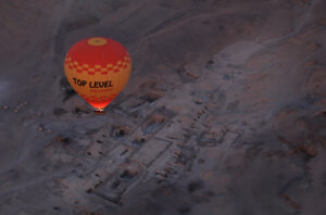
- 11 Over The Valley of the Kings. From surviving on the near barren land to becoming a species dominating the skies. How the ages move us through time. The story is rich and well executed. The leading line in the valley makes you want to travel like this balloon travels over the countryside. The bright orange balloon certainly stands out from the almost non de-script colours of the background. The splash of colour from the balloon burner really pops. With modern technology we have the best tools in our hands, don’t be too scared of the high ISO. Many tools remove the grain or noise subtlety and it can give you that 1 or 2 stops of faster shutter speed. The image is mostly sharp but that 1 or 2 stops would have made the flame a little sharper. You have made use of the third lines like a professional, creating a perfect shot. The light over all is adding to the story of an early morning or late evening mood. On screen or with a projector this works well. if you are printing this it might help to brighten it up a little, or a little higher contrast of the balloon and the land below it. This picture makes us want to travel. Highly Commended
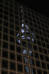
- 12 Tower on Tower reflection. i This is a very clever image. Great spotting by the photographer. The off kilter perspective works well. A little dull in colour, but maybe we are just spoiled that this landmark can change colour every night. This is a picture that shows how far our lens quality has gotten. Composition and exposure are very well done. I’m sure you planned this shot and even when walking around there would always have been the one corner (the top right) that is without a pattern. The lean of the tower is making the format less sterile but try and play with this and straighten the tower to see if it makes the image pop a little more. Rotating slightly will make the” boring” corner smaller. The ISO chosen made for a nice smooth image. The blacks dont have detail, but for a night shot and to enhance the glass panels even more, that detail is not needed. The city does not have to be boring, and this way it sure gets enjoyed. Highly Commended
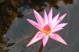
- 13 Water Lily in Pink. I Boom, Colour! in a muddy pond. Lovely colourful bright sharp lily. Well placed in the frame. Good story showing us all the details of the lily. No noise is a good thing, but don’t forget to give our camera a little light to play with. The low ISO has made you choose a slower shutter speed. You compensated for this by sharpening in post editing. With a slightly higher ISO you could have avoided this step. The focal point is good, and depth of field is nice. Composition wise the flower presents itself nicely, uneven number of petals avoids boring symmetry. Placing the big Petals in an even looking star form keeps the eyes in the centre. On the left there is a distinct line, perhaps from a selection action and a fair amount of negative space. A crop from the left will get rid of part of the line and give more prominence to the lily. This line is a shame and a square crop would not have made this a bad picture. Merit
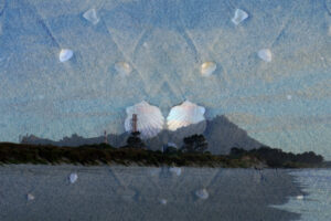
- 14 Shells on the beach i We may have a camera, but we still like to tell a story. Good on you for trying something different. A creative take on a familiar scene, Whangarei Heads. Nice individual photos. The blue tones make the story modern and stylish and step away from the brown and yellow sand colours we associate with the beach. Keeping a few yellow tones puts interest in the frame. The idea is great, if you go back to this spot maybe find a way to eliminate the humans (camera club members?). The symmetry in the shells looks deliberately chosen. Two shells in the bottom third are removed in post processing. The bright spot on the right-hand shell totally draws the eye away from the image. Perhaps try placing the shells over the beach or in the sky area instead. We like the challenge you set yourself here, this opens so many more opportunities. Like to see more of this in competitions. Acceptance
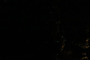
- 15 Cave Constellation. I Why is a glow worm never glum? It’s because the sun shines out of its bum! A magical scene that is tricky to shoot. A good attempt at a difficult lighting situation. Good to see you have sharp unmoved constellations with still a little detail in the rocks. The picture is quite empty.The title lets you get away with this a little, but it is not keeping our focus for long. Very little detail can be seen especially in the left-hand side. The stars are sadly way too tiny in the overwhelming darkness. A tip to remove noise as a result of high ISO, is after you process it, have a detailed look yourself. The pure green and red dots can be easily removed or re- coloured. These happen as the software tries to find noise by looking at red and green dots but if many red dots are in one area the software gets confused and makes it red instead of making it blend in (smooth). You have for example a red in the lower left and green in the middle left. I think the darkness is done with purpose as your title suggests, but a little lighter would have made us feel in the cave. Acceptance
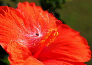
- 16 The seed fairy. S Abstract made by nature showing us it’s not all one species and perfect symmetry. It took me a while to see the true story; A seed born as little wings. These seeds fly everywhere and are just visible against the strong hue of the hibiscus flower. Not especially sharp and the eye bounces backward and forward between the bright seed head and the dominant flower stamen. The shallow depth of field is not making the subjects stand out enough to be forming a story clearly . The reds, yellows and silver are enough to keep the attention. Try cropping both sides, especially the right as the green and petal don’t really add to the story. Colour is well handled and where the depth of field allowed, it formed nice textures. You had enough shutter speed and ISO left to give it a little more depth of field. Realising now that not only bees but also other flying seeds pollinate flowers is just me hoping the seed flew on to the next hibiscus. There are many more opportunities out there to make nature a little abstract. Merit
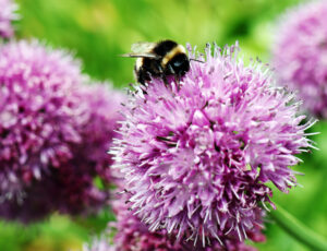
- 17 The Bumblebee S Well spotted bumble. The fuzzy creature busy at work on the fuzzy flower. All the details are there in the black and the whites. Nicely blurred green backdrop. The bright flower parts are not distracting. Parts of his fuzz are in focus but most of the image is not. A shame the wings are not clearer however the eye is in focus. Your subjects are filling the frame (insect and flower), but you have been right not to enter this in an insect competition. The bumble bee forms a nice story here but is not part of the whole frame. It works well to have the background covering half the image. Using this image as background or even printed out will add colour to any device or wall without the bee being the main attraction. Leaving all the front flower in the frame is following some basic rules. And I liked you left a little room on the top as we expect the bumble to fly off at any moment. Merit
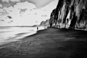
- 18 Light and Dark. S The image tells a story well of a lone walk along the beach. It suits a monochrome treatment. Nice leading lines, human for perspective, lots of texture. The use of just black and white pixels eliminating most greys works very well. The figure is maybe a bit in the middle and the horizon splits the image in half. The sky and sea in the background are very blown out which pulls the eye away from the dramatic cliffs. It could work by getting rid of the top sharp cloud and four dark clouds on the left creates a bit more connection with the human. It would be interesting to see some more detail in the water around the figure. All the more reason to go back to the beach! Merit
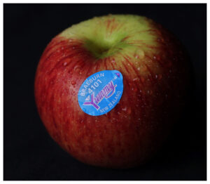
- 19 Yummy. S Yummy indeed. Crisp colour, full, natural, and touchable. Both the apple and the picture. We all know an apple hence it is great to see the choice of leaving the “stalk-bump” out of the sharp field. The water droplets are sharp and add to the story. Well cropped as the subject is super central but it works. It makes the subject feel round and the image pop. We would love to hear more about the setup. About the choice of making it square and how you got away with the label in the middle. Highlights not overpowering. It is an art, product photography and something from which we can learn. The white border is too thick and distracts. A lift of shadows on the right to enjoy the colours of the apple and a thinner border. Perhaps a different colour. Black is maybe more of a stylish choice than a more appealing lighter shade. Highly Commended
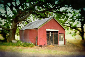
- 20 Flaxbourne Museum. i Human freedom and Open competitions are what keeps creativity flowing. In the years of film these types of edits were also done, Aspherical lenses, textured surfaces and popping colours are still making great fun pictures, even in the days of editing software, where some steps are now very quick and easy to get to. The canvas type filter over the building is a nice idea. The building is well positioned and sharp. The prominent white board with the museum name is not level. Our eye does get distracted a little by the sharp line where distortion starts and stops halfway on the side wall. The left corner of the shed is not 100 % in focus and for some reason the eye wants it in focus. The circular frame used for the blurring effect is maybe too centred as the eye keeps wanting to see the front of the shed sharp. Whites and blacks are very well handled, and composition in general is fine. A thing to play with or try is to make the blurring. By zooming in, this makes for a bit of a streaking motion putting even more attention to the sharp part of the image. A lovely location you showed us. Merit
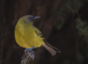
- 21 Bellbird N The bird is focused on the sounds around it; can it hear a mate? or an intruder in its territory? Well done for capturing this Bellbird in his natural habitat. Good composition and background nicely done. No bright or black spots and still full of texture. The bird is well placed in the frame leaving us room to make the story. Eye is sharp and the detail in feathers is amazing. The tools used to keep the image this good are a sure part of photography nowadays. Noise reduction, sharpening and saturation are tools we add to our arsenal. There can be a limit or some trick that can still help us. In this case if the highlights on the leg were dealt with before the sharpening tool was used the halo would have been gone. The halo there is the only thing stopping the image from being perfect. Still for being a Novice this classifies as honours. Honours
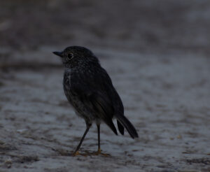
- 22 Black Robin N Nice capture, well seen and good composition. The lighting is a little dark and a fill light or just exposure in general could help. The histogram is a great tool to use. Your current histogram shows no whites in the image. Whites are indeed to be avoided just like the solid blacks but if the graph shows you that there are no whites at all in any of the three colours, you are likely a little lean on the white. The eye is sharp. Your framing could be a little tighter if you enter this in a nature competition. The posing of the bird is a little static. The tiny movement seen in the feathers, the back, the belly and around the beak could be seen as some action if taken slightly slower and to give the bird a story. Background is very well handled and tells us how you preplanned the shot, laying close to the ground while still missing a hard horizon. Well seen, on your next outing we hope the light is there for you. Merit
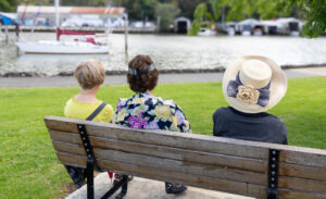
- 23 Looking out S A street photography capture, interesting concept and perspective. Ladies awaiting a sailor to pass by?. The story is there, and the background sure gives us a view of what the ladies are looking at. The saturation is quite high, but you handled the skin colour well. Composition has multiple divergent lines. Foreground feet and concrete distract. River bank horizon and orange roof not level. A nice contrast is used and there is detail in the blacks and whites. The background is blurred however the title infers the ladies are looking out at the view. To give the picture some more balance the bench could have been cropped on both sides instead of one side. You may have to step slightly to the right to achieve this while keeping the yacht in frame. Easy to say from behind a keyboard but feel there was room. Acceptance
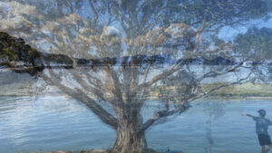
- 24 Over there S Quote from Pep Ventosa. “The world is not to be observed from just one perspective. I (Pep) like exploring the space between photography and painting, using photographs as raw material to create new visual experiences”. A well-balanced double exposure. Not an easy task to do. Setting the scene, taking the shots and re-alignment in post processing are not to be underestimated. From this one shot the tree was standing at the water’s edge, while still having room for kids to play under and cars to drive past. I really enjoy the mixture of the leaves and clouds you achieved. Two distractions. The black line formed by the jetty and above that a white patch which at first glance looks like a horse’s head. Don’t be scared to hold back on the number of shots used in these. A bit more playing around could have softened the dark line of trees on the left. Overall, the image is well presented and has balance. Human elements with nature, water and tree. Highly Commended
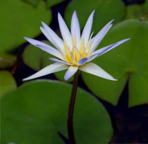
- 25 Victoria Amazonica S A beautiful capture of the stunning water lily In full bloom, with all its beautiful leaves showing. A nicely centred image where the flower gets all the attention. The stem forms a nice leading line, and the bright light gives us the story of a nice day along the pond. Rating would have been highly commended, but there are some easy to fix issues with this image. Focus is a little soft on the back petals. The bottom left corner upwards seems to have the remanence of an added (but removed) border or lacking the fill in on trying to rotate the image. This last is a guess as some fill or correction is also seen in the top right corner in the black. Cloning and auto-fill is accepted in these categories and often saves us from forgetting to check the frame fully before clicking the shutter.Double check your post processing work too. Merit
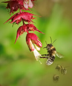
- 26 Coming in for the landing I An action shot well captured of the bee investigating the flower for pollen. The blurred bees in the background are a cute touch making a pleasing soft background. Focus on the main bee a little soft, not surprising if he is on the move. There is a lot of negative space in this image. The top of the flower draws your eye away from the subjects. Suggest a good crop from the top and from the left to correct this. Try the auto sharpen option on just the bee. Merit
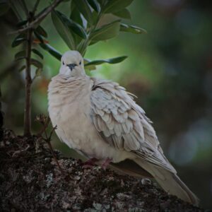
- 27 Watched I Nice natural study in a natural habitat with great feather detail. You can almost feel he has got his eye on you alright. Subject has a good connection with the camera and composition with the bird and log angled across the frame. The white circle by his tail draws the eye to that area. In post processing also use a clone tool to remove the twig from the breast area. Highly Commended
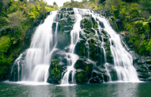
- 28 Cascading Serenity i Lovely spot where did you find it! A well executed slow shutter waterfall. You did well to get the smooth water look. The streaks are dreamy and have still enough detail. The scene is a little flat in colour. Adjustments to the white output levels will tone down the whites. Maybe this is due to raising the contrast in post processing. This may have been needed if it was a cloudy or rainy day. In the middle of the image slightly towards the left top quarter there is a spot that may have been a rain droplet on the lens. Choosing a scene with a waterfall is always tricky as the big ones always make us look up into the sky. Try finding a way to make the sky at the top disappear. Maybe clone some foliage. A good attempt and looking so low over the water gives me almost wet feet feelings. Merit
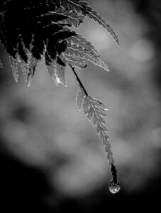
- 29 The last drop I The rain or the early morning mist left its mark on this leaf. A nicely composed image of this fern and it suits the diagonal presentation with just enough space for the drop to fall. A natural vignette that leaves the attention on the small details in the leaf. Monochrome is a great choice here and makes for a lovely moody image. Background nicely blurred but has white circle. Is this water on the lens! There appears to be some noise in the background area. Merit
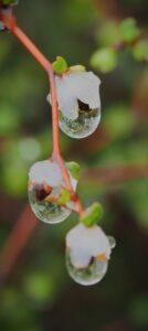
- 30 Delicate S Droplets of mist or rain awaiting to dry or fall to the ground. Nice reflections in the top two droplets. Unfortunately, only the top one is in focus. The shot is well seen but lacks sharpness in the flower. The droplets show a nice sharpness of the surrounding foliage around them, but as this is such a small part of the image it would have been better to have the leaves in focus. The whites have lost all detail. The darker brown branches diagonal lower left and horizontal mid right are a distraction. These two branches could be removed, cloned out or saturation reduced. The choice of crop is playful and suits the “open” competition. I can see a better version of this hanging on a wall quite well. Acceptance
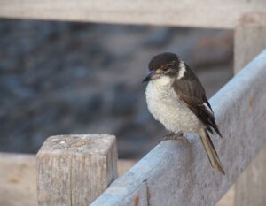
- 31 Butcher Bird Awaits S A good title. Awaiting a next meal? Or awaiting the click of the camera. A well spotted bird image with some details of its place in nature. The fence forms part of the story. The bird could be better presented in a tighter frame, while keeping some of the fence. The top diagonal fence could be cropped out. There is space top left and right that could have been removed to give the bird more of the frame. Nice highlight in the sharp eye. All of the feather detail is not quite sharp. Blowouts in whites and blacks are so well avoided that you could have used this space to dial-up the contrast a little, making the bird pop a bit more. Acceptance
