
Judged by President, Noel Herman.
-

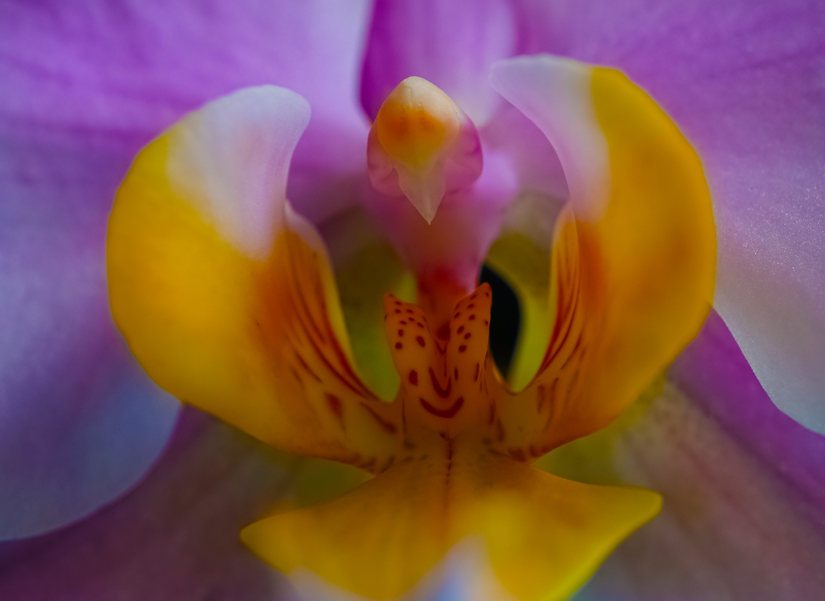
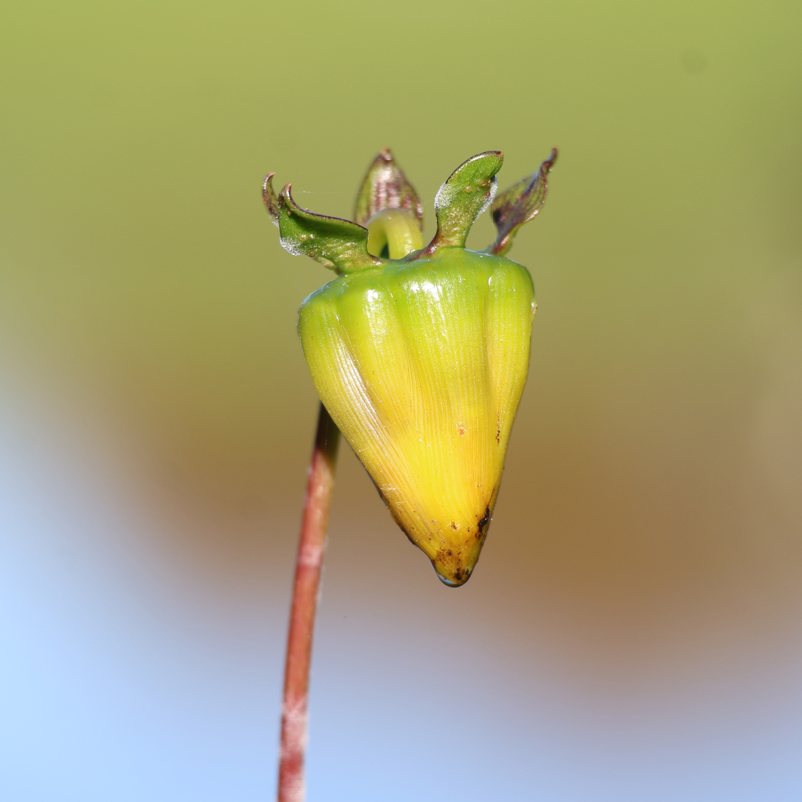
- 01-The Happy Orchid. A beautiful shot with vibrant hazy colours. Not a lot in focus here , though it works really well for this shot. The bright white and yellow area near the bottom is a bit distracting. Maybe a light vignette would take care of that. H/C
-
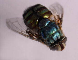
- 02-Burnished Blowfly. Wow that is one big blowfly, colours are surprisingly varied and bright. Body and head are in focus though nothing else. Try narrowing the aperture and or focus stack to get more in focus. Good attempt though. M

-

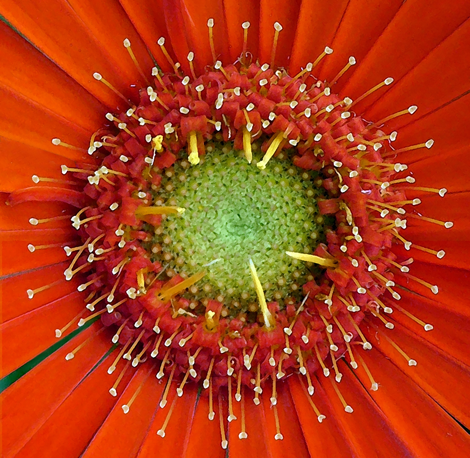
- 03-Gerbera Daisy. A vibrant image with an array of colours. Reasonably sharp throughout and the symmetrical pattern makes for an interesting image even with that slash of green at bottom left which almost acts as a stalk. Perhaps a little too central, maybe move a fraction to top right corner. A good image all the same. H/C
-

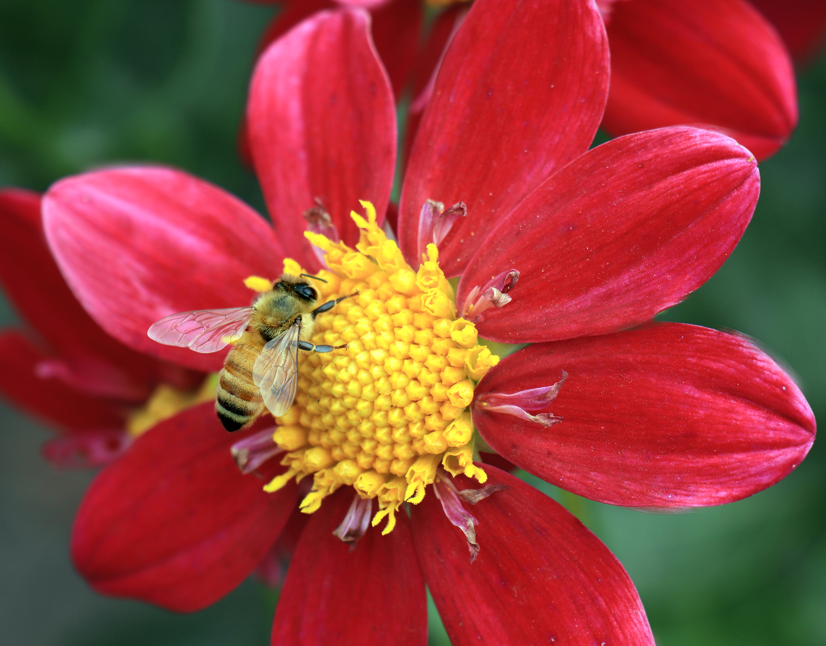
- 04- Busy Bee. This is a great shot of this busy bee feeding on the flower. Every aspect of the bee is absolutely in focus , well done for that. Some of the flower is not in focus but no matter the guts of the image is the bee and the central part of the flower. The image would pop even more with a strong vignette. H
-

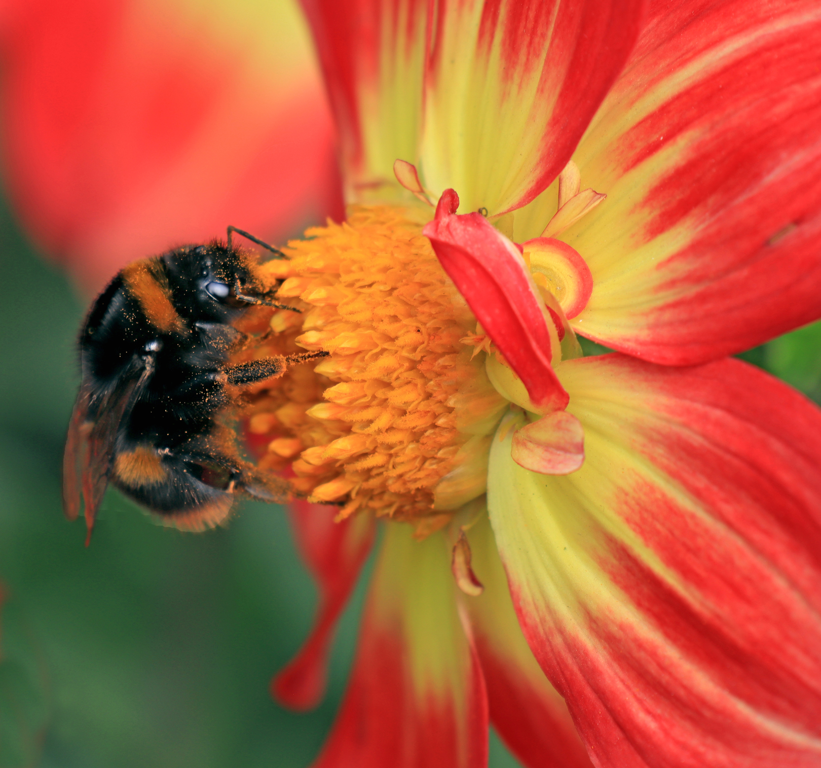
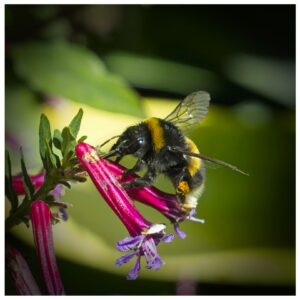
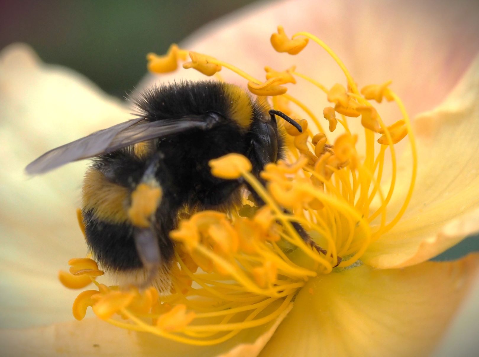
- 05- Pollen Gatherer. A happy busy bumble bee gorging himself on the pollen, the title is very appropriate. It is extremely difficult to get a bumble bee in focus , I think you have given it good shot. The bottom left of the image has a large vacant space which does distract a wee bit of the image overall. Crop some of the bottom off maybe part way up the individual petal. H/C
-
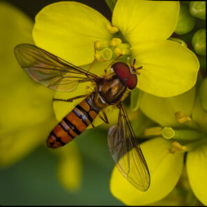
- 06- Bug On Yellow. Wow . In every way this fantastic image has it all. Sharpness, composition, DOF, and colours that complement each other. There is nothing I would change , love it. H Winner

-
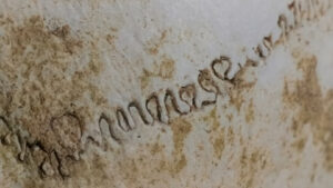
- 07- A Path To Think About. Not sure what this image is about ,certainly had me scratching my head. Maybe someone’s doodling on some ceramic round thing as the sharpness drop off on the left. Colours are natural looking and pleasing to the eye. A vignette would help keep eye from going out of frame. Is there a story here? M

-
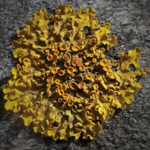
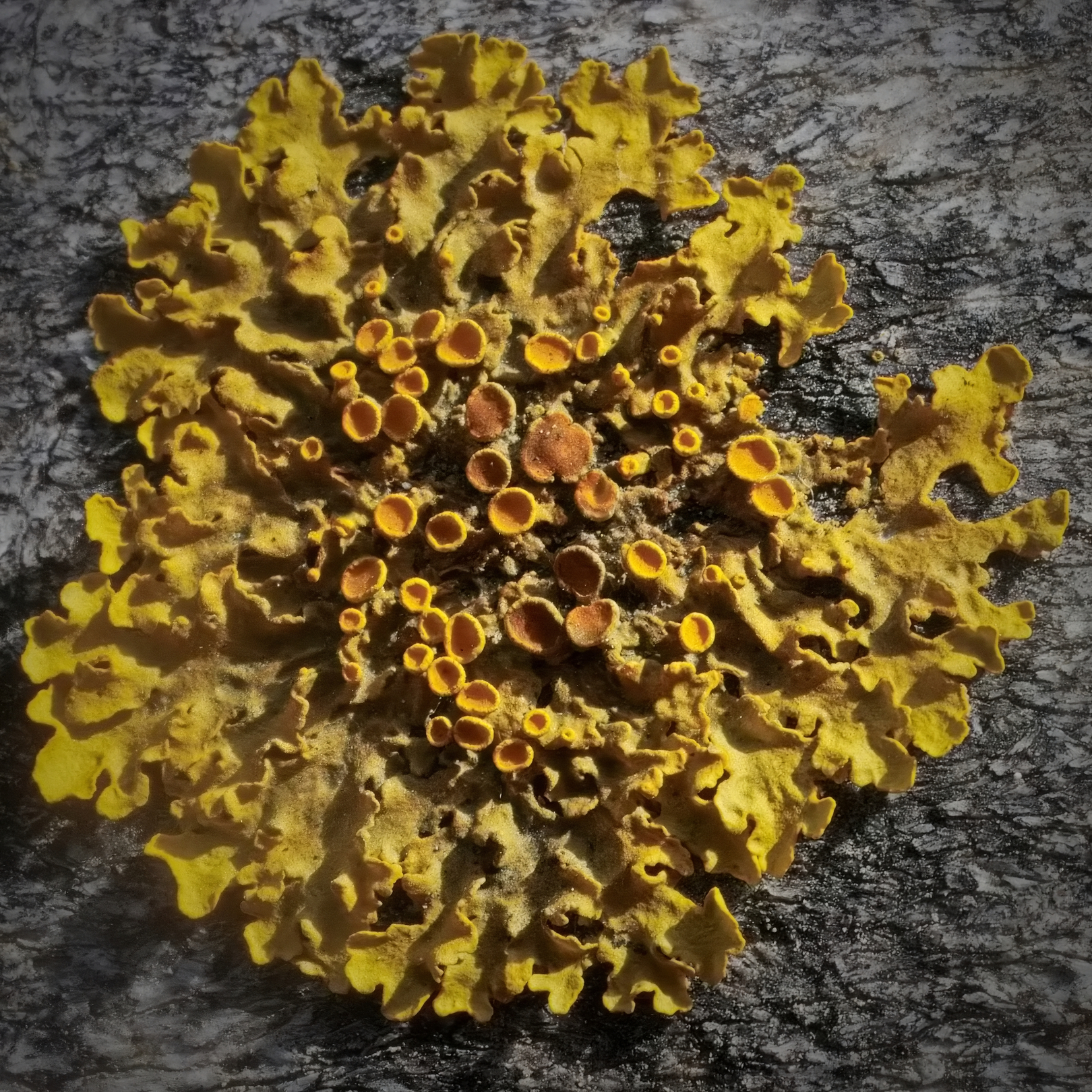
- 08- Life In Dry Place. This natural organism must have great ability to survive harsh environments. The individual parts of this organism come together to form a lovely colourful patterned image. It does lack a strong focal point. I like how you have captured and presented this natural object. M
-
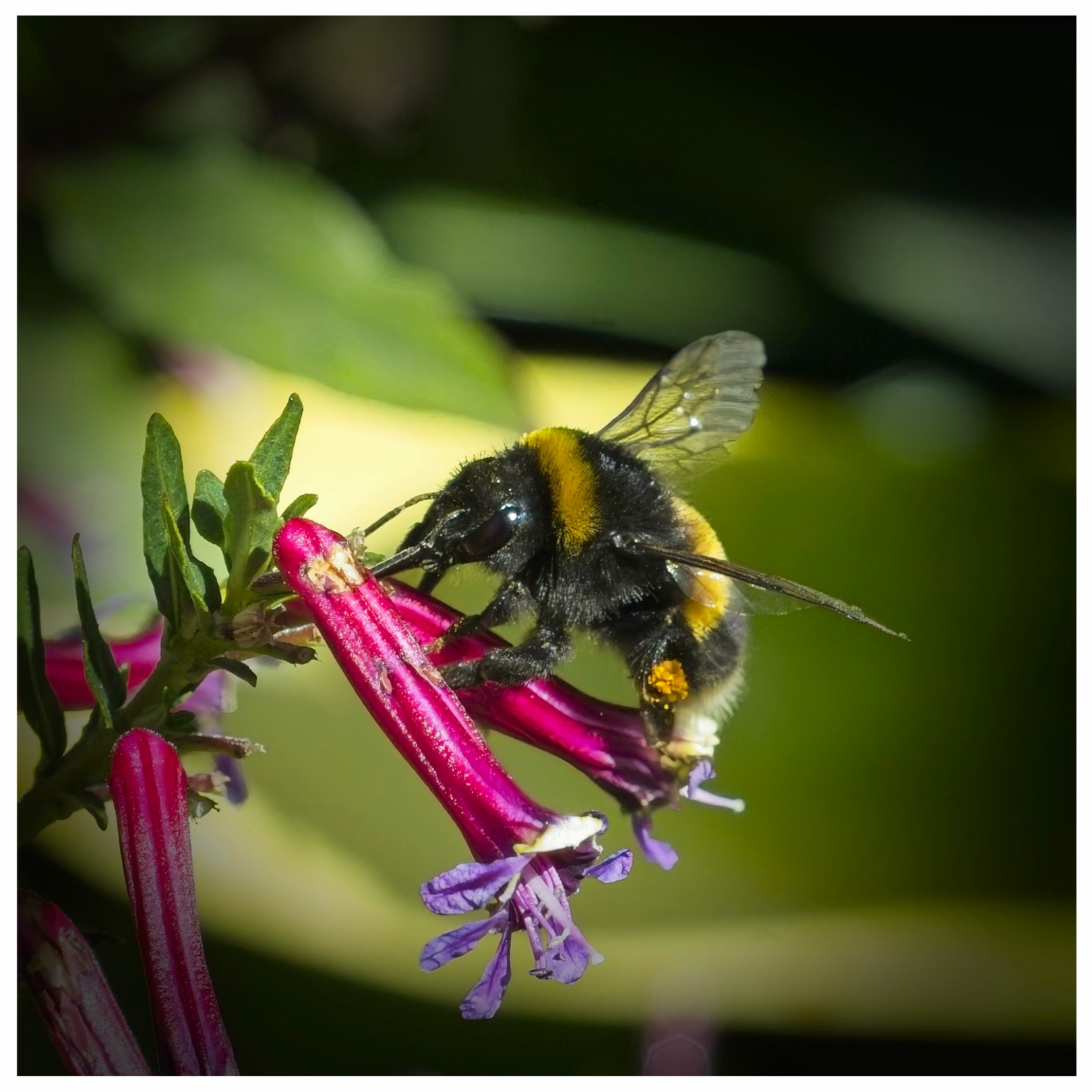
- 09- Bumble. Now this bumble bee is pretty darn sharp , even freezing the wings well done for the capture. There are a few blown out areas but the dark background does help compensate. The border is a bit over powering, just needs to be a little thinner. H/C
-

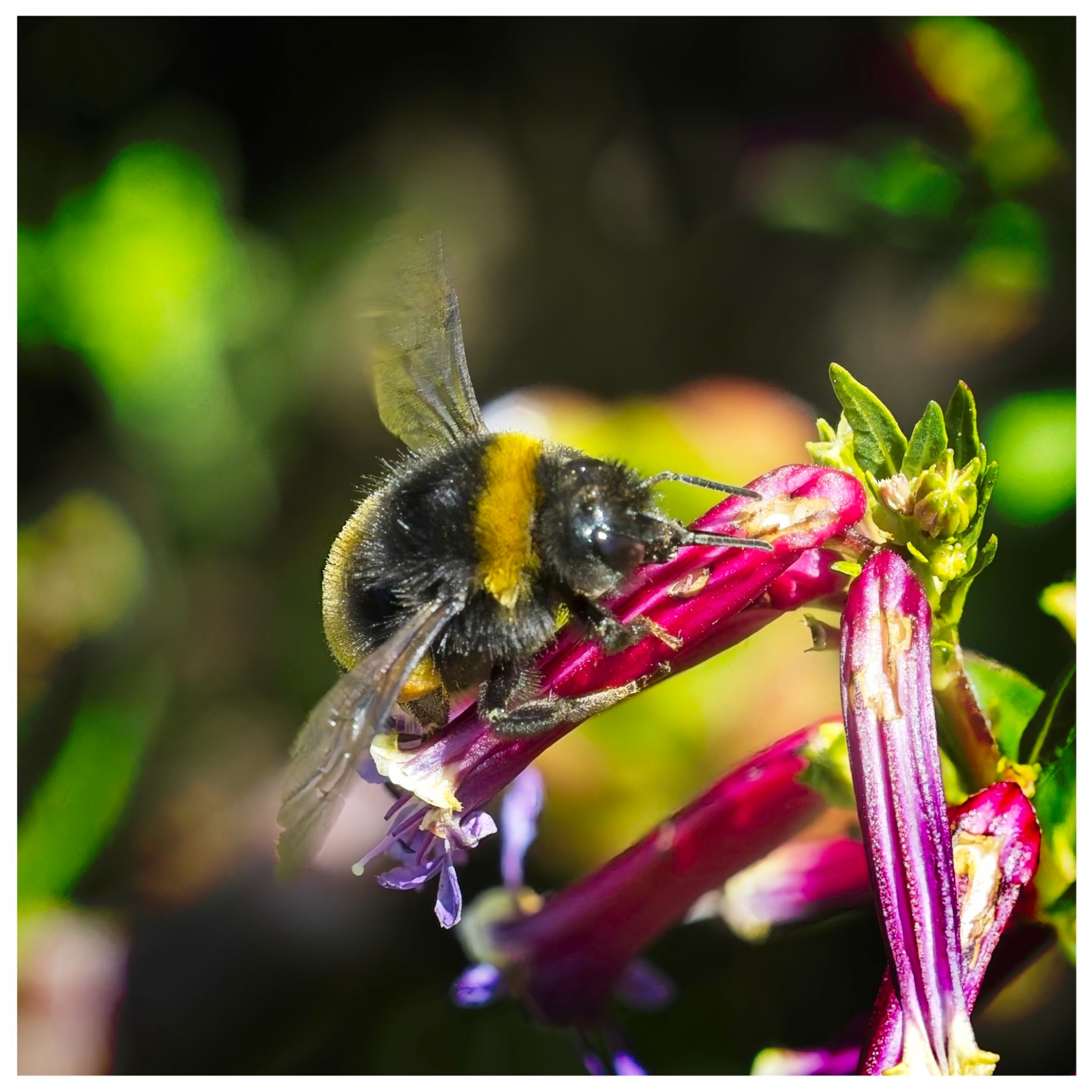
- 10-Bee Clever way to title the two images. In this image more of the bee is in focus and you have managed to use the bee to blot out some of the blown area. To reduce blown out areas try reducing highlights and saturation. Failing that a heavy crop off right and some off bottom. And again the border needs to be thinned. A darn good try all the same. M
-
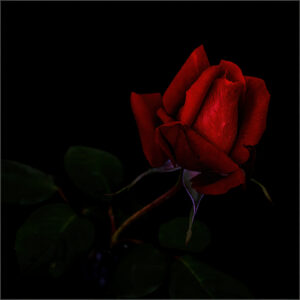
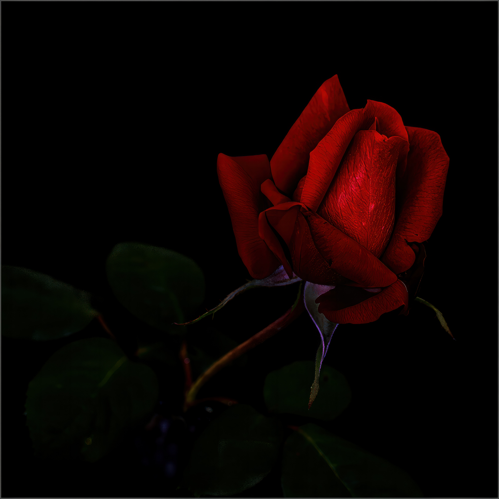
- 11- In Loving Memory. Red is a powerful colour and no less so in this image even though the image is quite dark overall. The rose is sharp with great clarity to bring out the detailed patterns on every petal. Good title and the thin border helps keep the eye in the frame. Perhaps a small crop off top and left to reduce some empty space. H
-
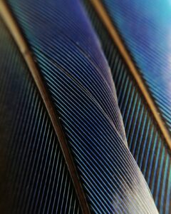
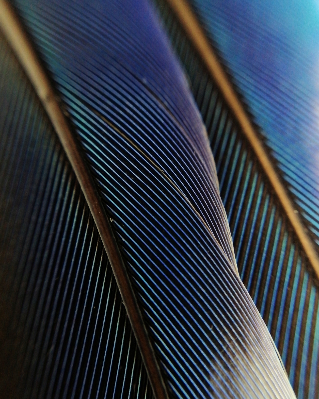
- 12-Feathers Lines in multiple different angles creates an interestingly patterned image. The two prominent almost vertical lines devides the image into a triptych. Not sharp throughout, that is not critical in it self but does distracts as does the light colour area at top right on border. A narrower DOF would help or focus stack. A few dust spots need to be taken off. This image does have potential. M
-
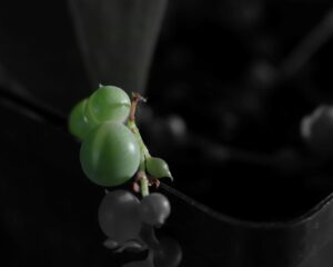
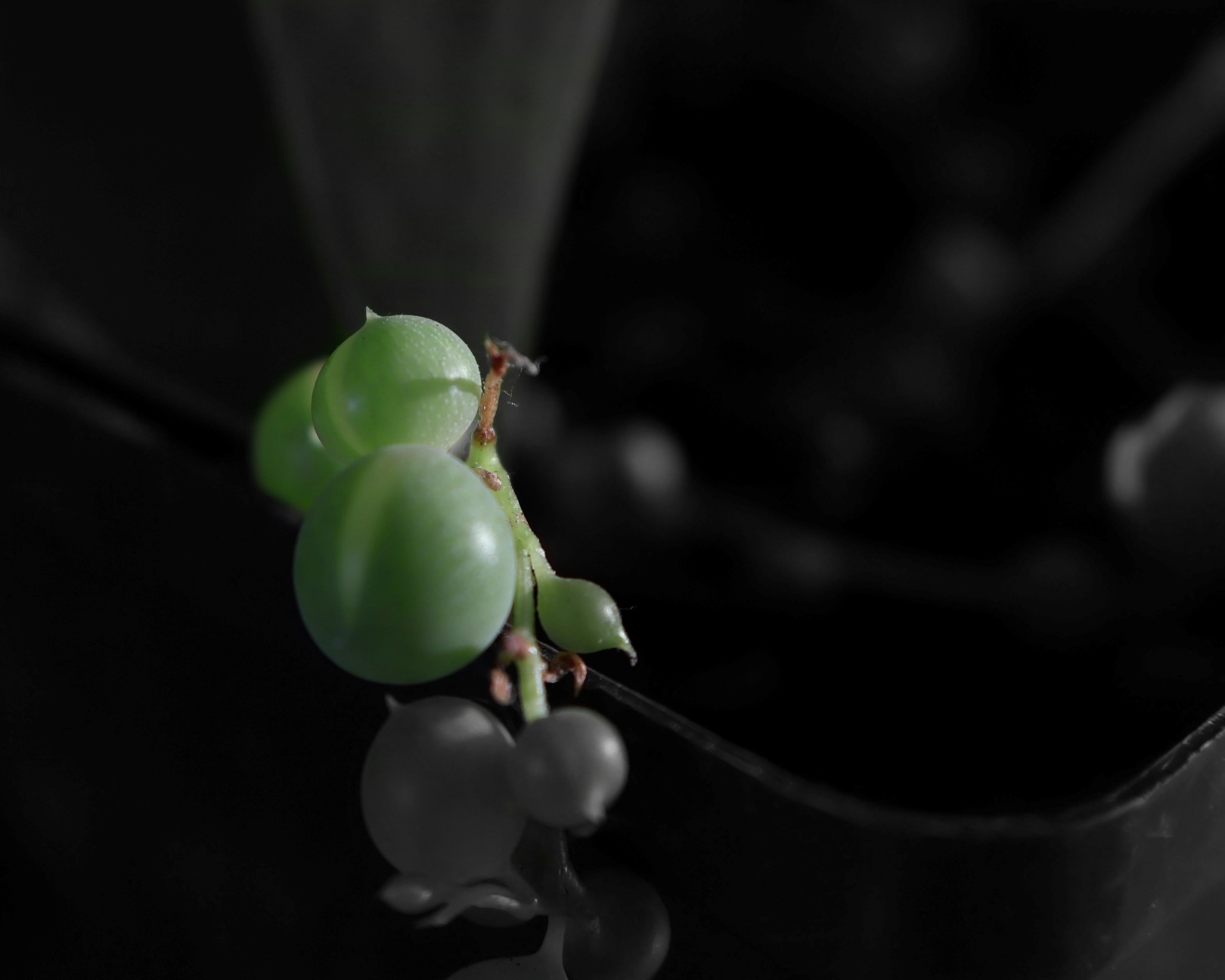
- 13-String Of Pearls. I like the title and the idea is good ,you need to be more careful with the background. The edge of the tray etc. distracts big time , perhaps try turning it into portrait format to help eliminate some of the distractions. The almost mono concept works well and adds interest. M
-
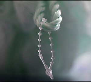
- 14-Close Up Ties. The concept of this image is plain and simple , yet has created a very effective piece of art. The mono format works really well in this case and adds another layer of beauty. The bottom right bright area does spoil the show a bit. Cropping off half , but not all of that bright area would improve the image. Great effort. H

-
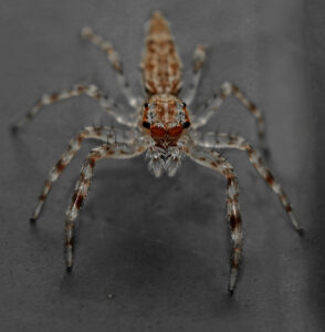
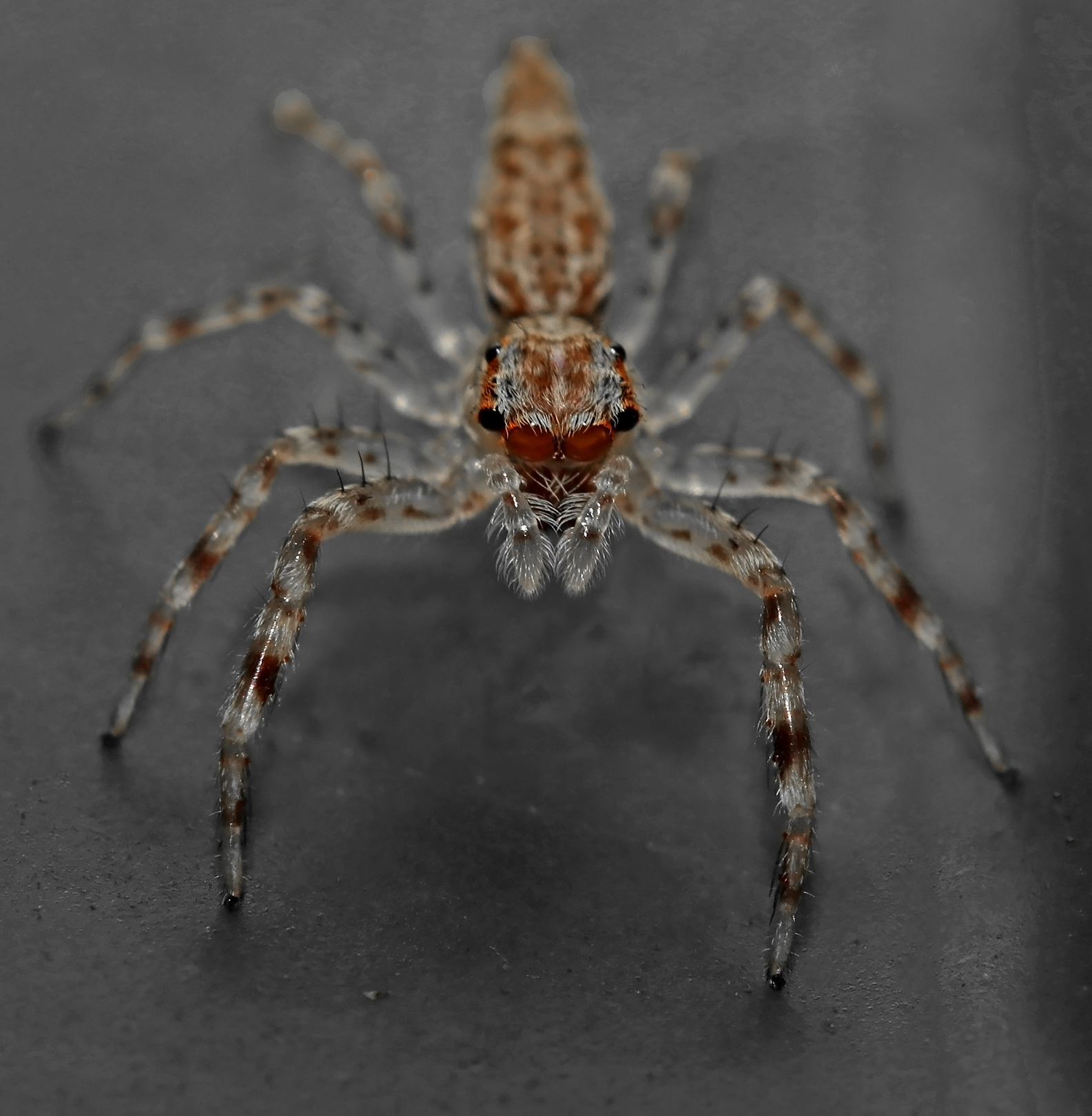
- 15- Arachnid. Yikes I would not like to tangle with this fearsome looking creature, it is well armed. The image is very sharp where it matters, the head, eyes and front feelers well done. If more of the insect had been in focus it would have scored better. A narrower DOF. would have helped . A darn good shot all the same. H/C
-
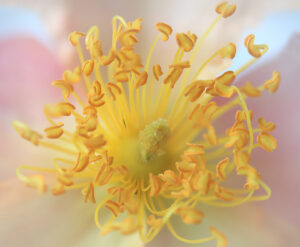
- 16- Flower Centre. This image has loads of lovely dreamy pastel colouring and is sharp enough in the right places and soft where it does not matter. The image overall is a bit too bright , almost glaringly so. A vignette of medium strength would certainly help remedy the over bright areas. A really good effort though. H/C

-
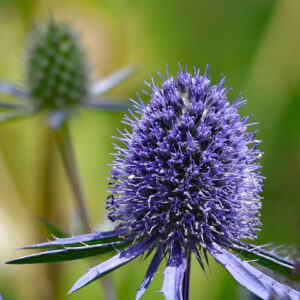
- 17- Blue Hobbit Thistle. The colour palette on this image is pleasing to the eye and with the main subject placed well in the frame. The out of focus background certainly helps reduce the distraction of the 2nd. flower head top left. The main subject is not particularly sharp for a close up. Bottom left corner is bright spot that could have easily been eliminated also bottom right needed some attention, perhaps a strong vignette would have hidden most of these. Good try. M

-
- 18-Tree Dahlia. Simplicity can quite often produce amazing images , this image comes close but subject is not quite interesting enough. Placement in the frame is too central but the background has been handled well. Cropping off some of the bottom and left side would reduced some of the over bright areas there , also it would have bought the main subject away from centre. I have to say the main subject is sharp and showing very good detail. For a close up it is pretty good effort. H/C.
-
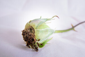
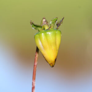
- 19-Gone Dead. I love the title of this simplistic image. You have placed the subject really well in the frame and created a dreamy background that makes the subject pop out. The dead head is very sharp and clearly showing lots of detail where it matters. Great effort. H – Runner-up
-

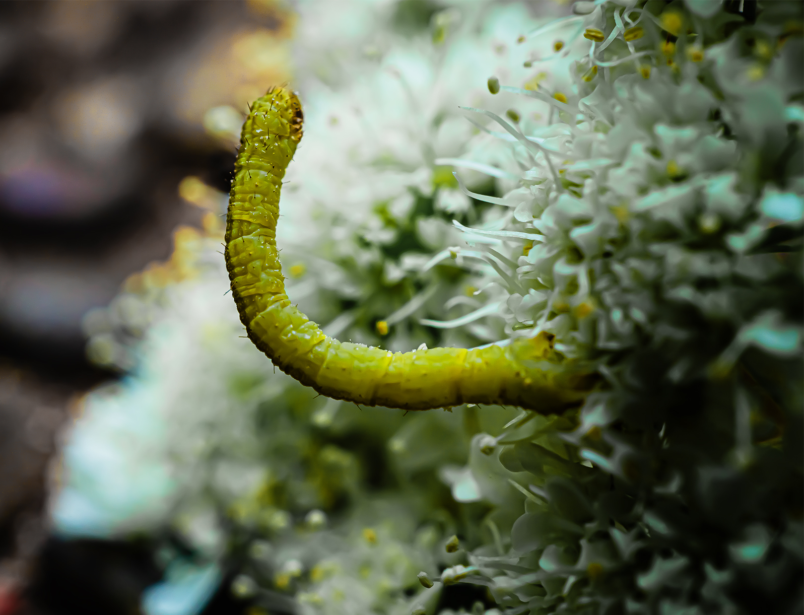
- 20- Tiny Caterpillar. This macro shot has been well captured , showing very good detail of the main subject and at the same time creating a blurred background. The bright blue spots bottom left and mid right are quite distracting , most of these could have been eliminated by turning the frame from landscape to portrait format. Good on you for spotting this wee fella you did well. H/C.
-

- 21- Beekind. The cleverly worded title supports this image of a busy bee. Main subject is a bit soft in the focusing , actually it is quite difficult to get these little fellas in sharp focus. A very high shutter speed is required. The overall dreamy pastel colours of this image are pleasing to the eye and makes the bee stand out , the dark patch top left does dissipate some of that. Good try though. M.
-

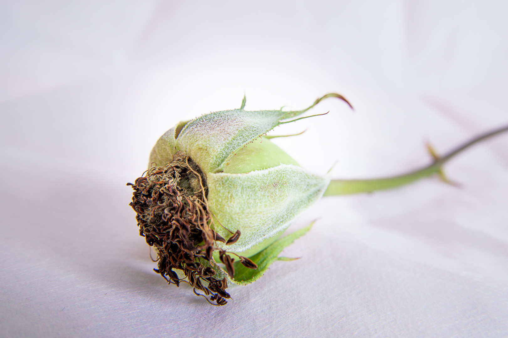
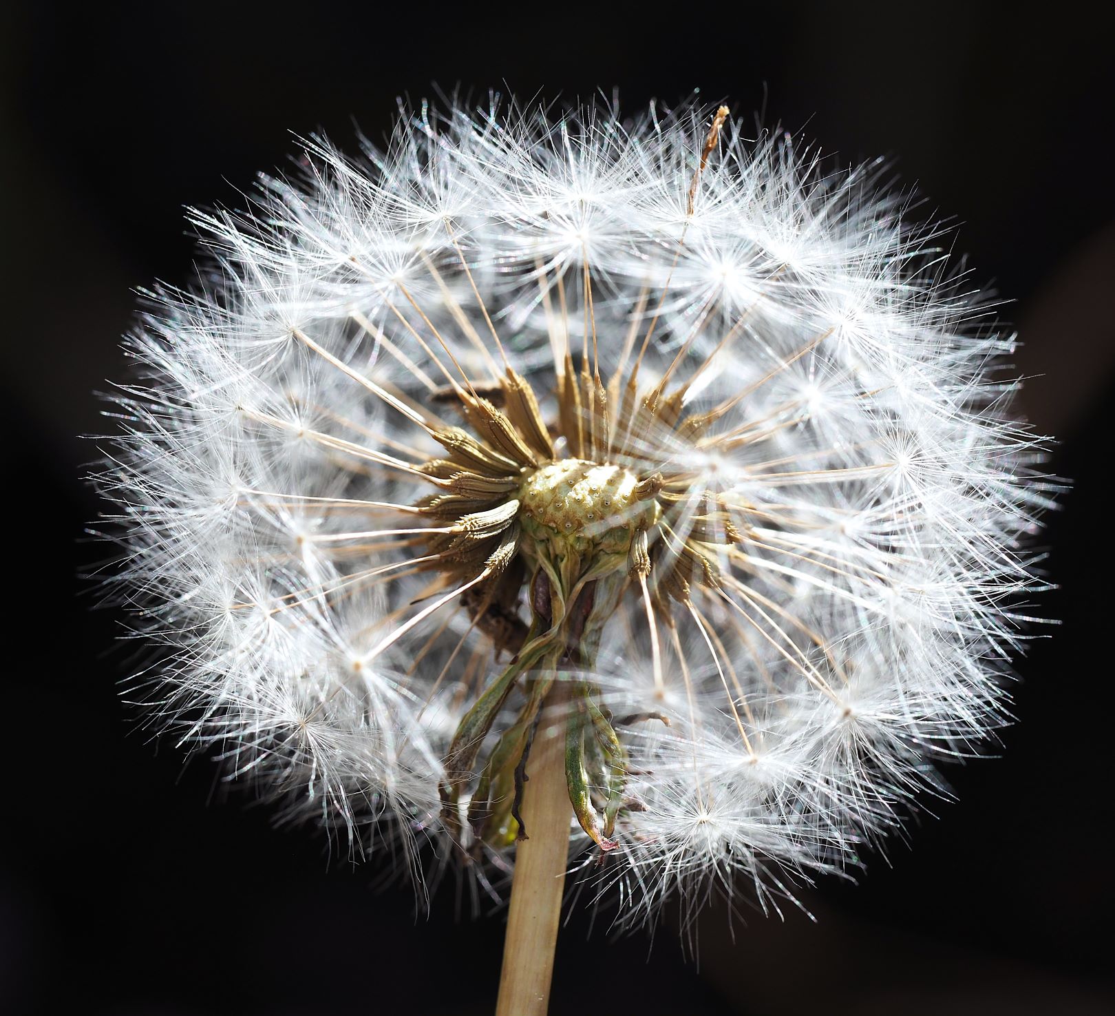
- 22- Inner Secrets. Good title and very apt for this lovely sharp image of a dead dandelion head. I even like the lonely sentinel poking out at 1 o’clock , it kinder balances out the stalk. This macro image really illustrates how we can reveal natures inner secrets if we care to take our time and observe. The dark background does a good job of making the subject pop. Good on you for taking the time to observe and photograph. H.
-
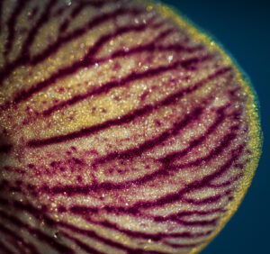
- 23- Glittering Veins. The object intrigues me as I am still wondering what it actually is, to me it looks like veins in a dead fish minus the sparkle. If it is natural then the lines/veins have created a wonderful pattern colour and sparkle. For me it does not have a story line or focal point to hold my interest. Good on you for trying something different. M.

-

- 24- Luminous Tangle. This image has colour and different shapes galore which you have captured rather well, also the title describes the scene to a T. All the lines and shapes have created a crazy pattern that works to produce this unusual piece of art. H/C.
