
Thank you for asking me to judge your images. It was lovely to connect with the group again. The images were interesting and kept me coming back for another look. Not everyone will be happy with my choices and opinions and as we have seen in the past, different judge, different result so if you liked your image and think my suggests are rubbish that is absolutly fine.
The rule book says the Creative Trophy Competition is for images “that have been digitally enhanced or recognisably manipulated to achieve a creative effect”
In this day and age it is much harder say what has and has not been enhanced. There was only one or two images that I felt had not been enhanced and I included this in my marking matrix. If I had any doubt, I went with yes. It is great to see people experimenting with colour and overlays, even if it didn’t receive the grade you wanted, keep going because you will find a style that works for you, I would also say that you don’t always need to use each layer at 100 % especially colour. Remember that hard edges stand out and this may not be the look you are going for.
Don’t wait until next year, start practicing your creative images now, they are often more fun than normal images to create and improve your photoshop skills to boot.
Regards
Pam
-
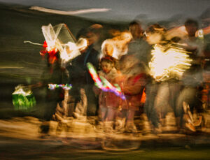
- 01 Matariki Parade The colours in this image are very reminiscent of the old style christmas cards. I love that the child’s face is visible and there is an expression of deep concentration. The light around their feet has created a lovely texture. There is quite a bit of noise in the image – Noise often comes with long exposurers and high ISO numbers. This is easy to control in post processing, I would only reduce it by a small amount 15% for example. The bright white light on the right hand side has very little detail and being the brightest area in the image my attention was drawn in that direction. Your style is great. Merit

-

- 02 Storm Swept Well seen and taken, I am not sure if this is water drops on a window or done in post – either way it has been recognisably maniuIated and I enjoyed the effect. The limited and muted colours help tell the story of the storm. There is enough definition in the scene to hold my interest. Title delivers perfectly. Hon
-
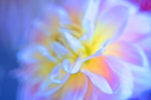
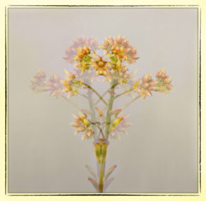
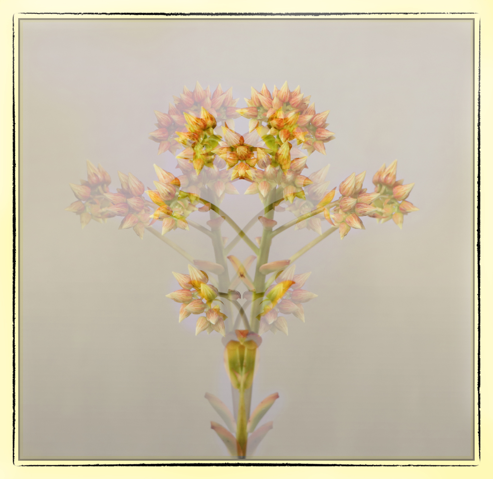
- 03 Delicate Dahlia The colours really pop in this image. It is very creative and I enjoyed trying to work out how you had achieved this effect. It is very abstract and interesting although I did struggle to find a focus point to rest my eye on. Acceptance

-

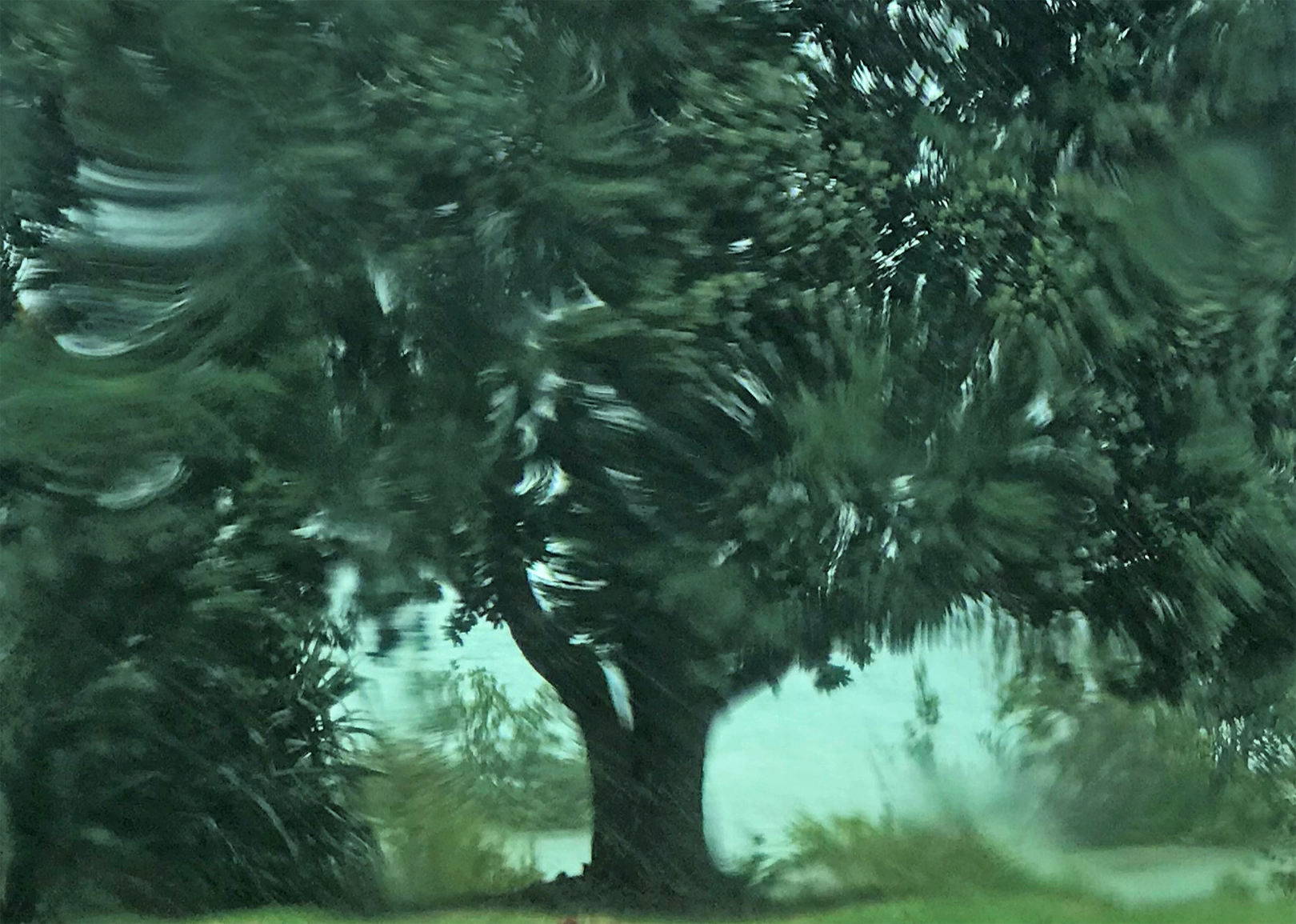
- 04 stream under the bridge A very creative interpretation of this scene. There is a surreal feel to the image and some of the branches almost look like they have snakes twisting around them. The focus of the image seems to be the thicker branches, reflections and snake vines. The lower background is relatively uncomplicated and complements this composition. To aid this story – a dark or matching blue grey vignette in the top Left hand corner to lessen the impact of the tangled tree branches might be good to try. Great to try new processing techniques. Merit
-
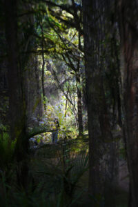
- 05 Bushwalking Lovely bush walk and the subject of the image is well signalled with lighting and position in theimage. The subject is not looking at the camera but this almost adds to the feel of solitude in the bush. I like the definiation of the branches in the front which again adds clues to time and place without being intrusive. Merit

-
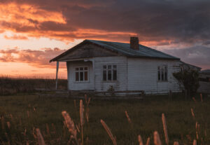
- 06 last sunset The title is great, this house is in its last sunset years, any day could be it’s last. The sunset on this day is lovely and the grasses in the foreground have nicely picked up the colour. My eye is drawn to the sunset but the house takes up the most real estate in the image (pun intended). I feel the house is the main subject and as such could have been lightened just a bit to draw more attention to it. It has a “distressed look” about it that could have much made of it. Acceptance

-
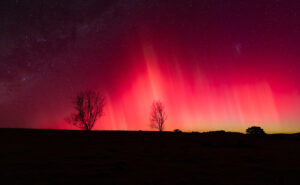
- 07 Backyard Aurora This is a great image, I love the stars as a balance to the bright Aurora. I like the way you have processed the image as it is easy to over- process this type of image. The colours and the light are well captured. Initially I felt the image might not be straight but I wonder if there is a sloping hill to the left. The horizon line is a bit jumbled to the right hand side of the image, but given the circumstances and that raw opportunity, well done for the capture. HC
-
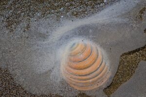
- 08 Natures creativity I have to say that on the first view I thought this was a tunnel entrance going into the ground (like a culvert). The colours on the shell are lovely and I hope you continue to find creativity in nature. Acceptance

-

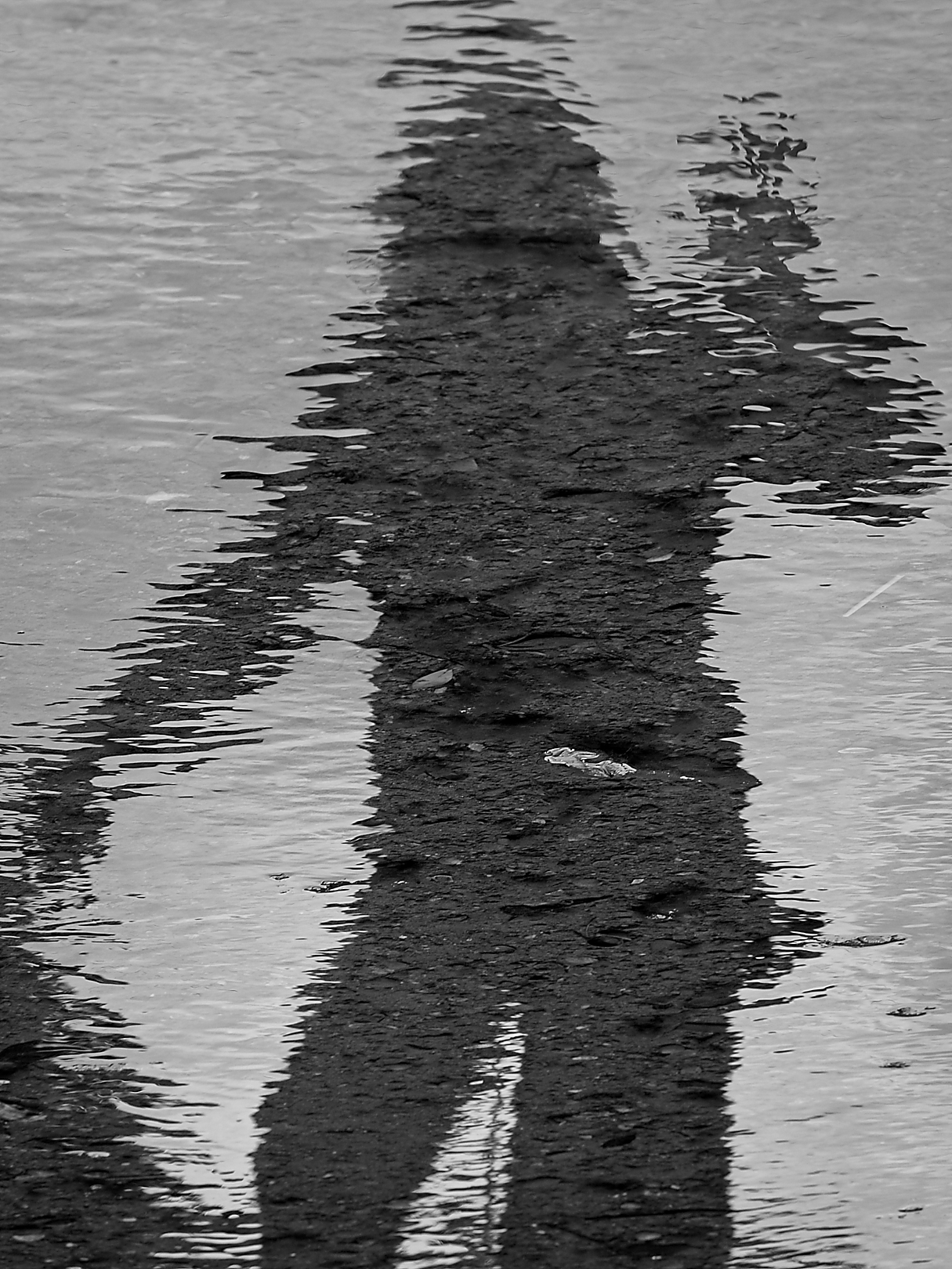
- 09 A Shadow Reflected A selfie with a difference. The photographer did well to spot this on their travels. It almost feels like the figure is shimmering and partly disappearing. There are a couple of distracting elements that could be removed with content aware or spot removal. (under the RH elbow for example) Merit
-
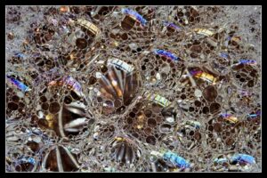
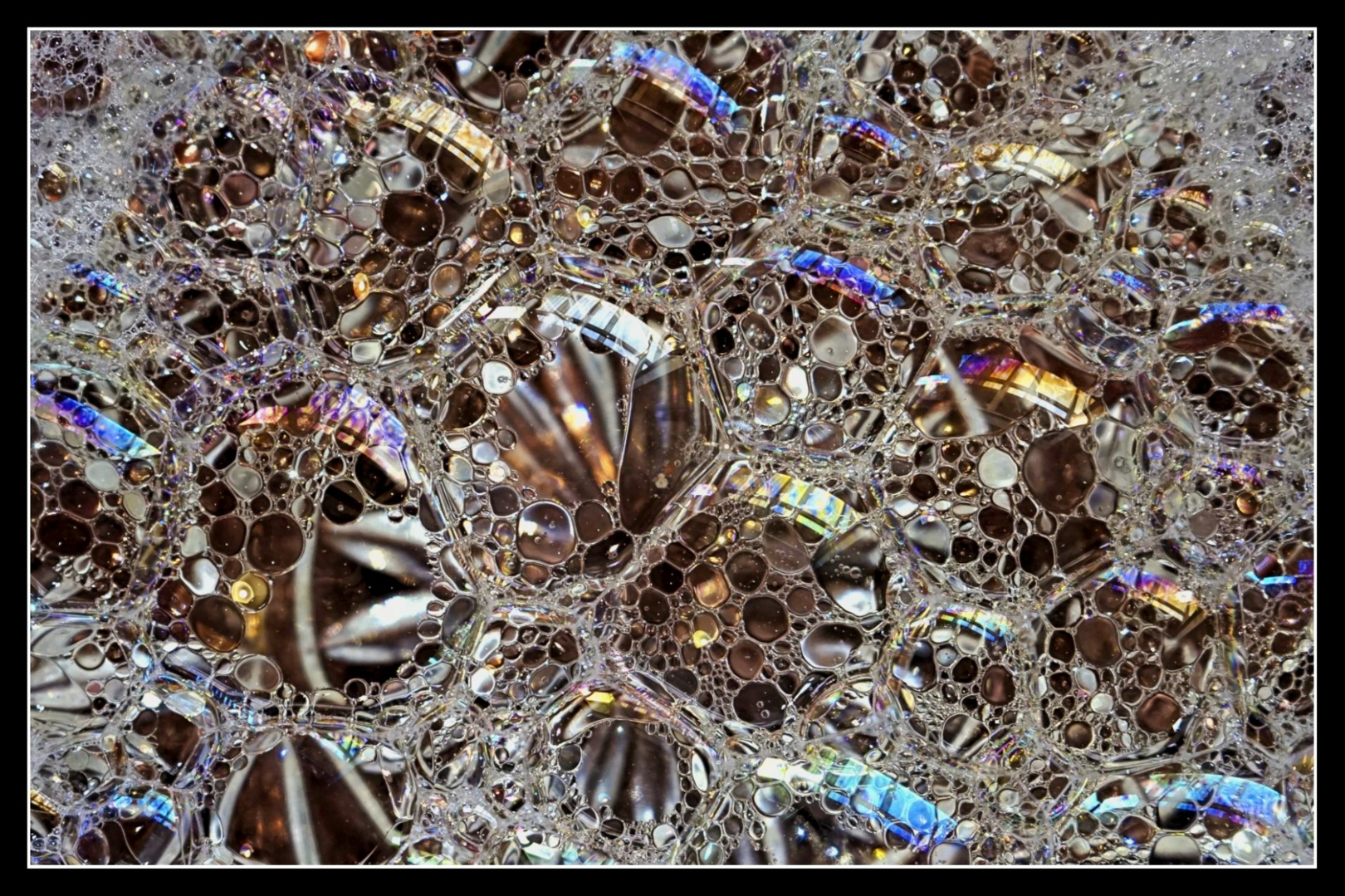
- 10 Reflections It is always interesting how the bubbles add different colours to an image. The reflection is impressive. Looks like a high end hotel balcony with an amazing sunset behind it. I hope so for the photographers sake. Having the pattern repeat gives a sense of composition. Merit
-

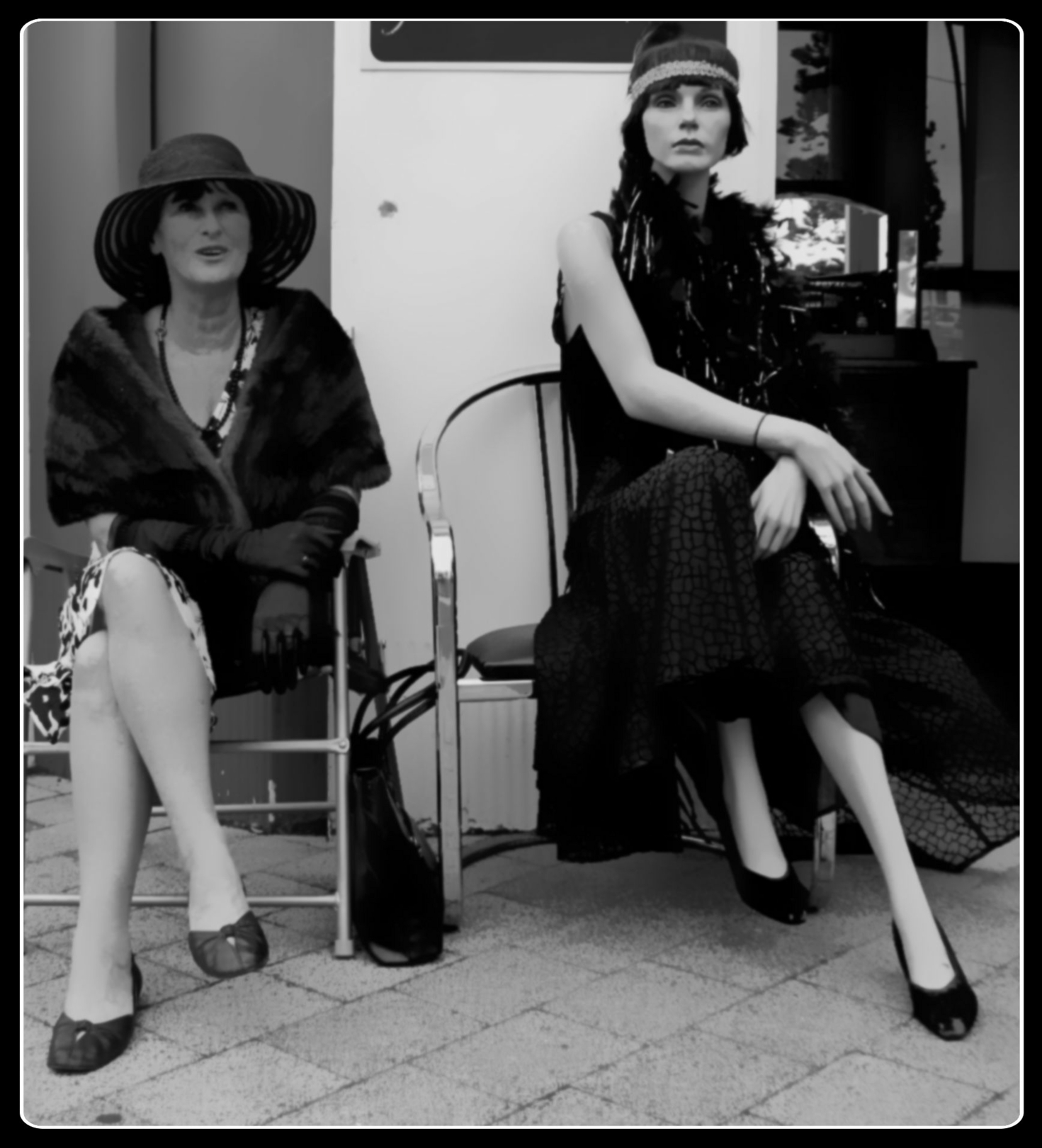
- 11 Seeing Double Well seen, I am hoping the model on the left is a real person or I have been fooled. They do look similar and of the same era. The composition looks a little tight, especially on the left hand side. It is a bit difficult for me to know if the photographer has intentionally left the image soft (in keeping with the era) or if the focus was off (the chair arm appears to be the sharpest part of the image) the image looks good as a black and white. Acceptance
-

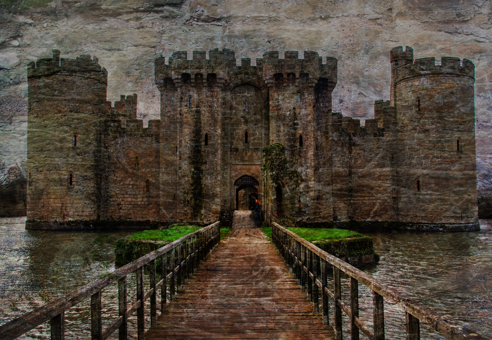
- 12 spooky castle This is a spooky castle, it is also a very interesting place, I hope you were able to walk around and admire it. It almost looks like there is a guard from a previous era looking back at you from the doorway. It is a well composed image. My eyes follow the light through the middle of the entranceway, where there is a good play with light and shadows. I would like to have been able to see more of the details on the castle walls. For me I felt the overlayed texture stole more than its fair share of the attention from the viewer. Maybe you could try knocking back the opacity of the overlay or masking out 50% of the overlay from the castle to give a more nuanced use of the texture. Great image. image. HC
-

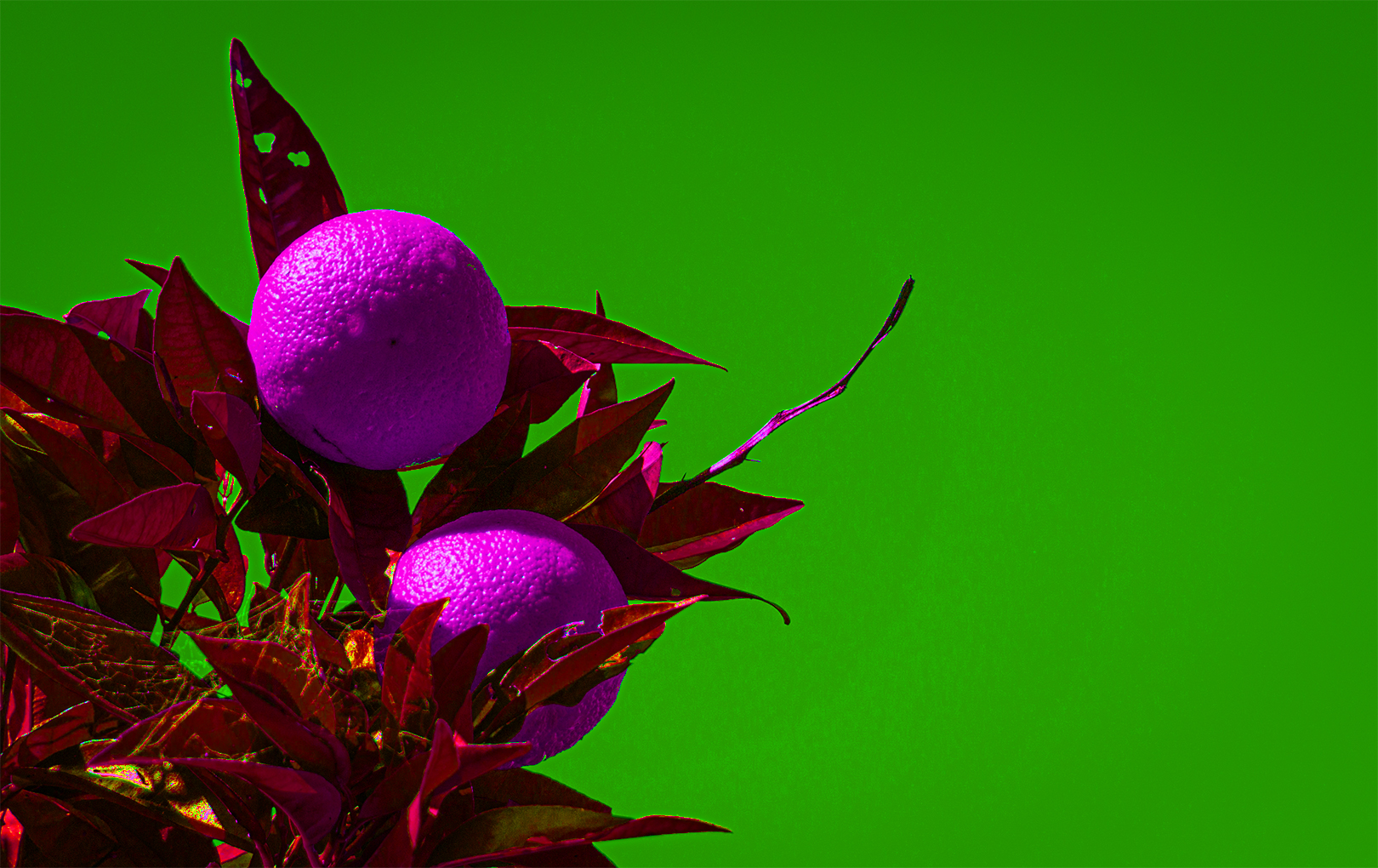
- 13 Oranges The colours are very creative. I am not sure I would like my oranges this colour. Well done for playing with the colours, experimenting is how to move forward. The oranges are sharp and look like the main subject, it is however, always a good idea to ask how each element in the frame supports the overall story being told. The choice to use green as the background did not surpport the main actor as it is dominant in the image and draws my attention away. Acceptance
-
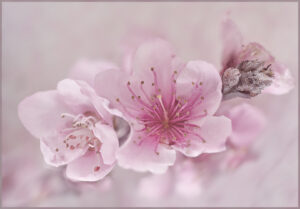
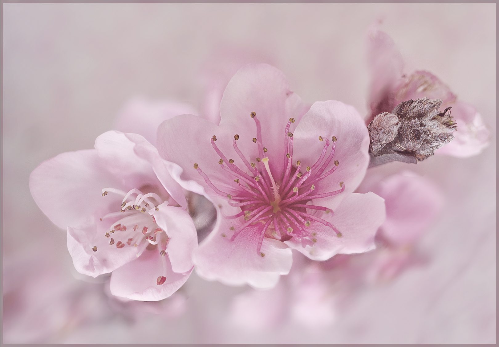
- 14 Pink blossom A Beautifil image and very topical at the moment. The post processing is well handled. It looks as if you have stacked several images to give a wider area of sharpness or worked out how to get most of the image on the same focal plane. I like that the image gives a range of buds from before the bud opens to full bloom. The pink blush in the background sets this image off. I looked for recommendations to make but came up with very little, the composition is on a diagonal the colours are great. There maybe a bit of ghosting from a petal under the Left hand side that could have been cloned out but if it was my image, I don’t think I would bother. Honours
-
- 15 Adouble exposure There are some images that need to be looked at several times. This double exposure image has been nicely lined up with a lovely well balanced feel to the centre of the image where the two exposures meet. The colours also are well suited. The photographer has chosen a bold style to frame the image. Meaning the frame is more than a supporting component. Given the colours match I have assumed this was intentional. It looks as if some of the colour/texture overlay has been masked out around the flower creating a halo effect, the halo has quite hard edges and if this was your intention then using a softer and lower opacity brush on the mask would help to ease and blend the effect. This is especially noticeable around the lower stem area. Merit
-

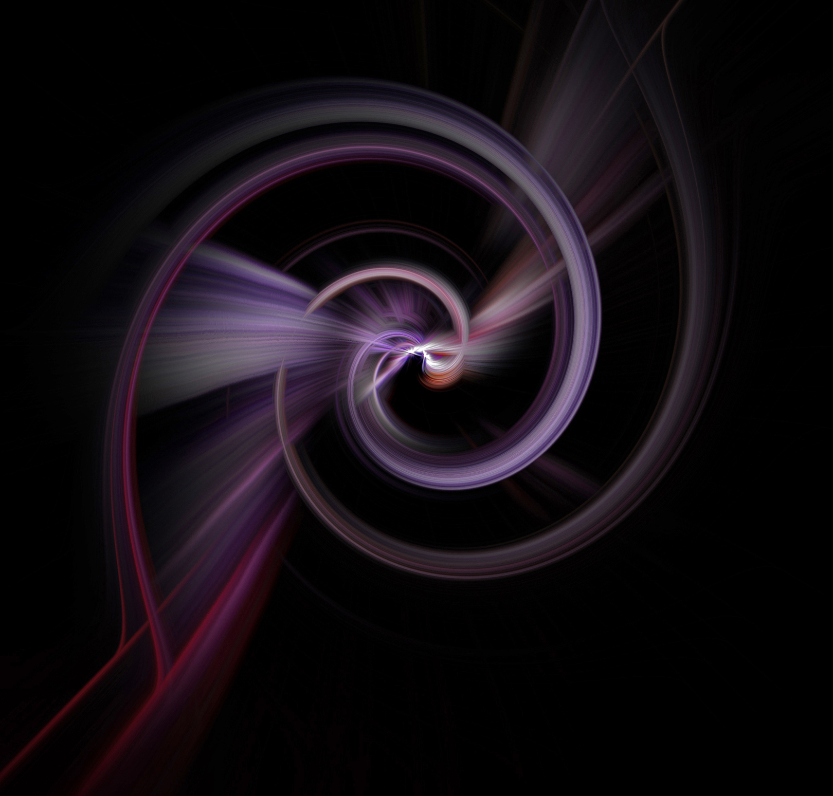
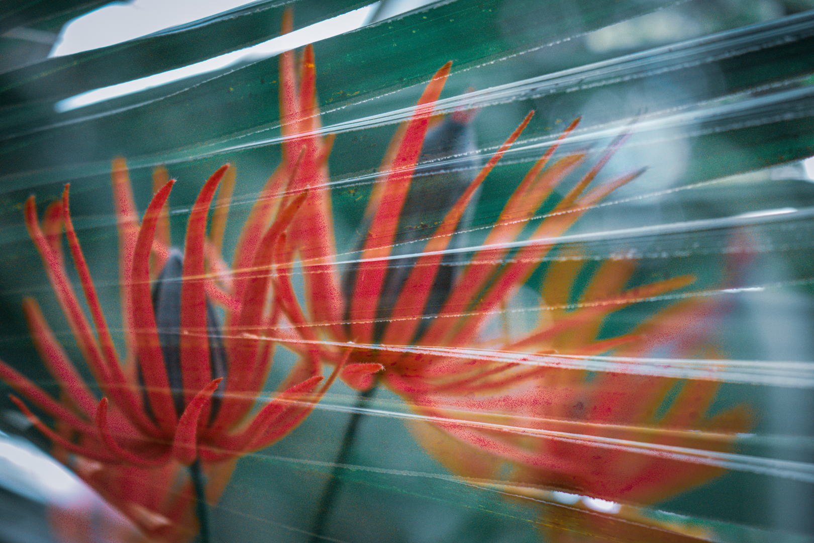
- 16 smoke and light twill I really like this well executed twirl. The colours are lovely and well matched, while the white in the centre adds a great contrast to the softer colours. My eye was drawn to the bright light and then I followed the spiral back . Great composition on the diagonal, which suggest movement and energy My only comment would be to consider how you name your images. I can see the light and the twill but the artistic effects and post processing have changed this from an image with smoke to something else. Without the title I would not have been able to identify smoke as the main subject. Hon – WINNER
-
- 17 The clutch This does indeed look like a clutch of eggs. Great composition – you have included enough to create the story without clutter. The rock with crack lines is sharp and looks like it is about to hatch. Acceptance

-

- 18 Bloombehind the lines It was a good idea to combine these two images, the colours work well together. The highlights at the top and LH corners do draw the eye away from the main composition. I wondered if the photographer could have added another layer of flax and filled in some of the highlights or a smaller crop perhaps. I am not sure how the image was composed as it altop. Acceptance
-
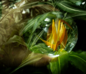
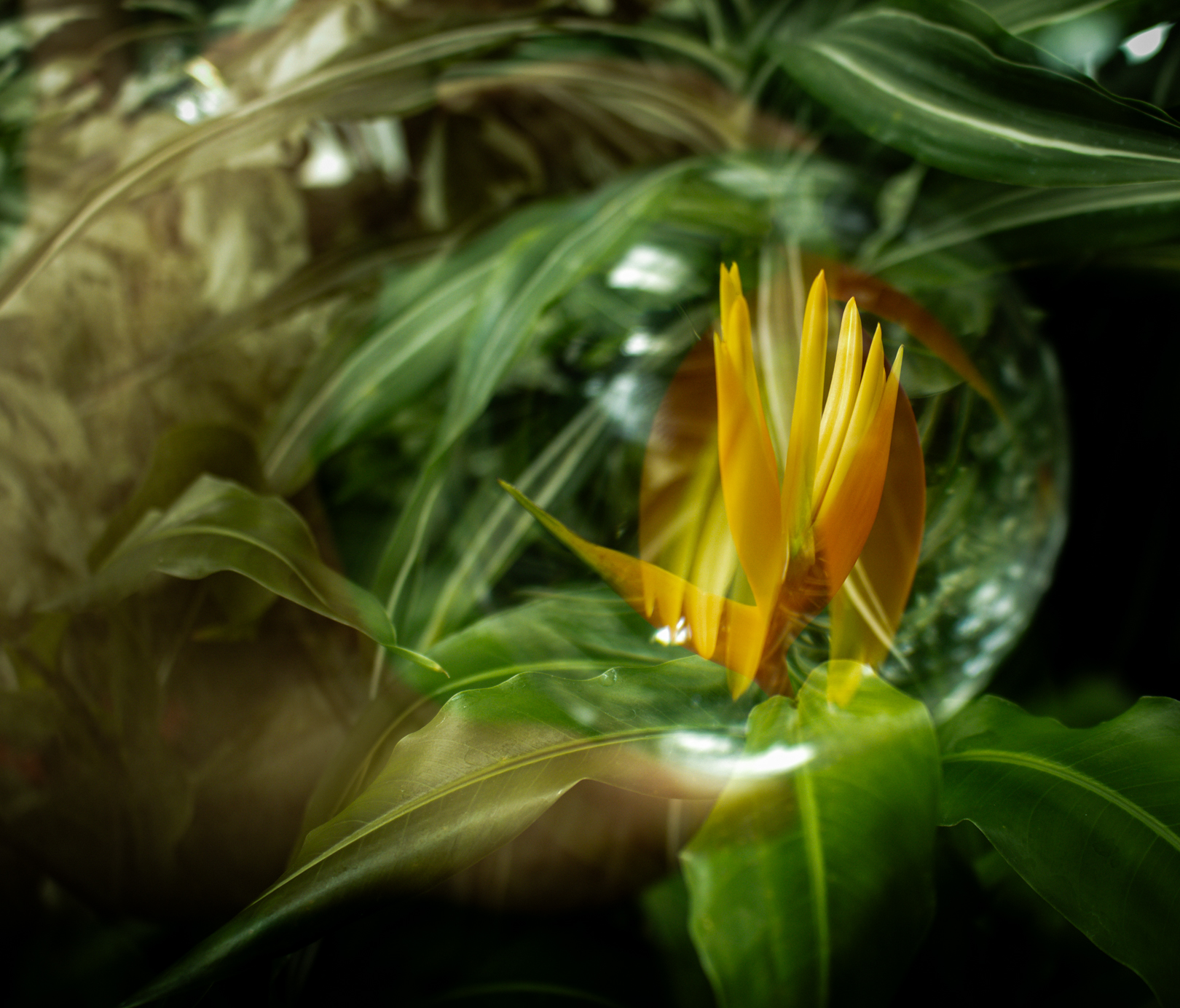
- 19 capturing nature From a distance the bubble looks like an eye with the orange being the pupil. A dinosaur maybe? At first I thought this was a double exposure with the image flipped, but after a couple viewings I think it is a different plant but the same colour as been added. My apologies if this is incorrect. I like the bubble shape you have created on the RH side.I can see how this is “capturing” or “holding” the nature as the title suggests. The Left hand side seems less distinct and the colour is not as effective as the black, it also seems to peter out towards the top of the image. Acceptance
-
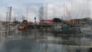
- 20 Across the river I can see you have used multiple frames to create this image. It is colourful and gives a good representation of the town basin. For me, the main focus of the composition is the red roofed building and the tower. Consider cropping a third (or less) in from the RH side (which is very busy) and the same on the LH side. This would bring the focus more on the items with colour and simple lines (Band Rotunda, tower, red roof building and green hulled boat.) Also consider using a feathered bush (at a lower opacity) on your mask to soften the lines of the layers you have overlaid. Acceptance

-

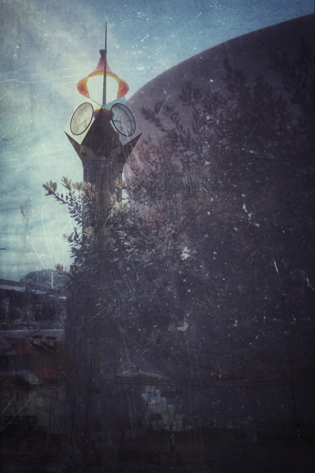
- 21 An evening walk A combination of images is used to create an almost surreal image. I really like the tower and the scratches you have added go some way to tie the elements into a cohesive image . There is a lot to find in this image for example there is what looks like a whole town in the centre bottom. Merit
-
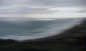
- 22 MuriwaiMagic This is an interesting ICM image. You have captured the movement in the waves and clouds well. The light on the water draws my attention and is magic. There are two spots on the image. They are either water drops on your lens or on your sensor. (one just below the light spots and one on the bottom third) these are easy to remove in post with either a spot remover or content- aware full. Or a sensor clean. Merit
-

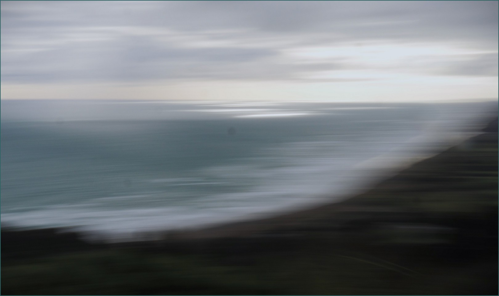
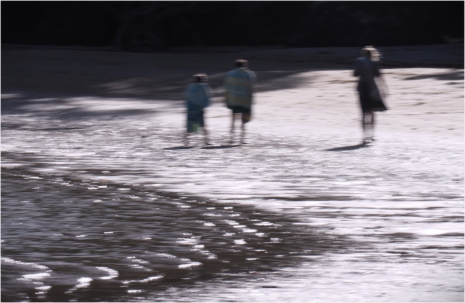
- 23 of winds and waves I like the way the movement of the waves has been portrayed. The three people are walking into the light and they have cast interesting shadows on the ground. The person on the end has a flowing skirt and hair moving in the wind. It is hard to have people in the frame and not be a major part of the image. In this case, they do add to the story by supporting the effect of wind against the bright waves. Merit
-
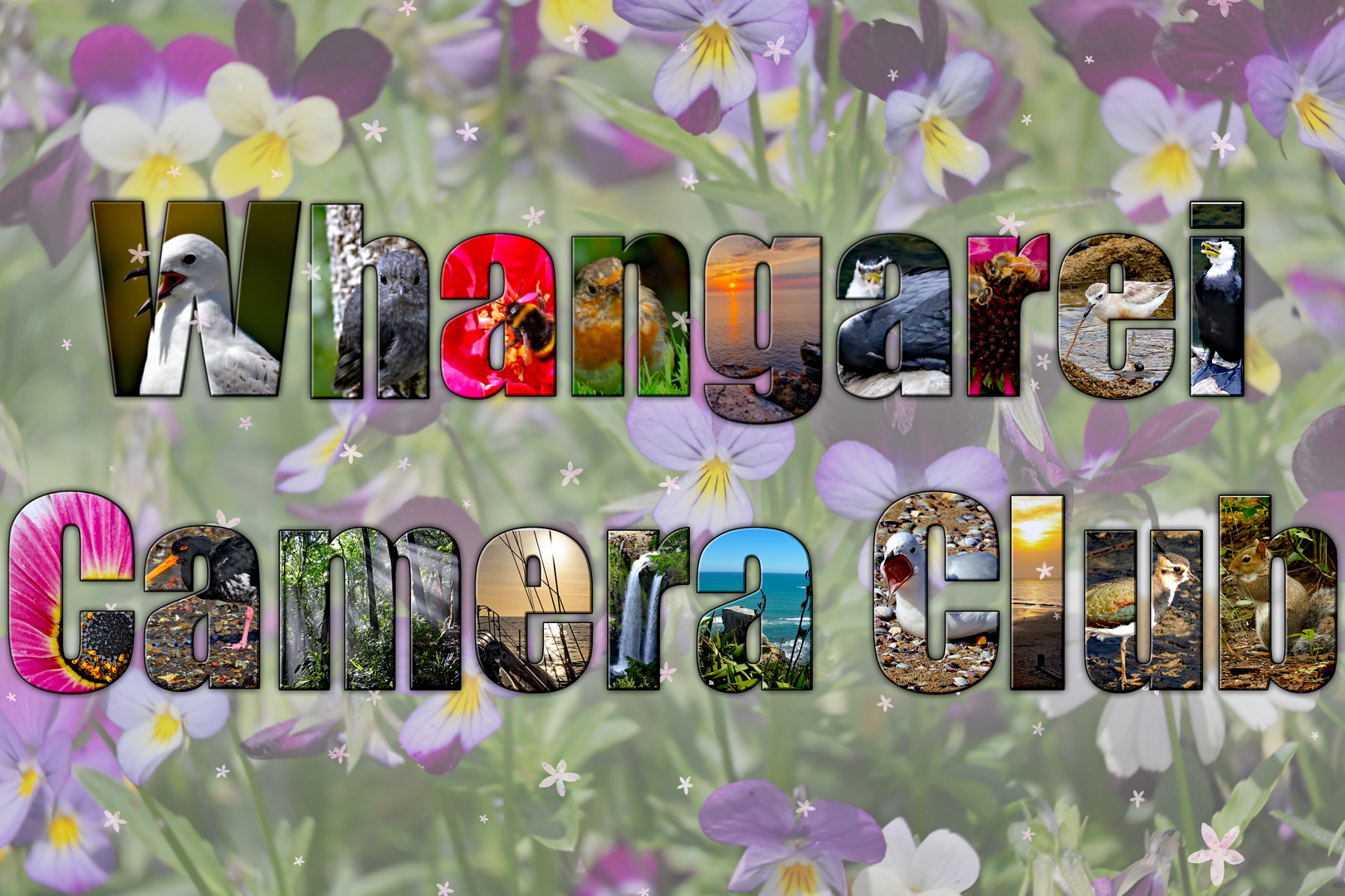
- 24 letter collage I can see that a great deal of work and effort has gone into this image. The background has at least two blended layers. Each letter has a subject that has been placed so it is clear to see. Each time I look at this creation I find different aspects to like. I wondered how the image would look with a less busy background, to give it space to really shine. Great work. HC
-

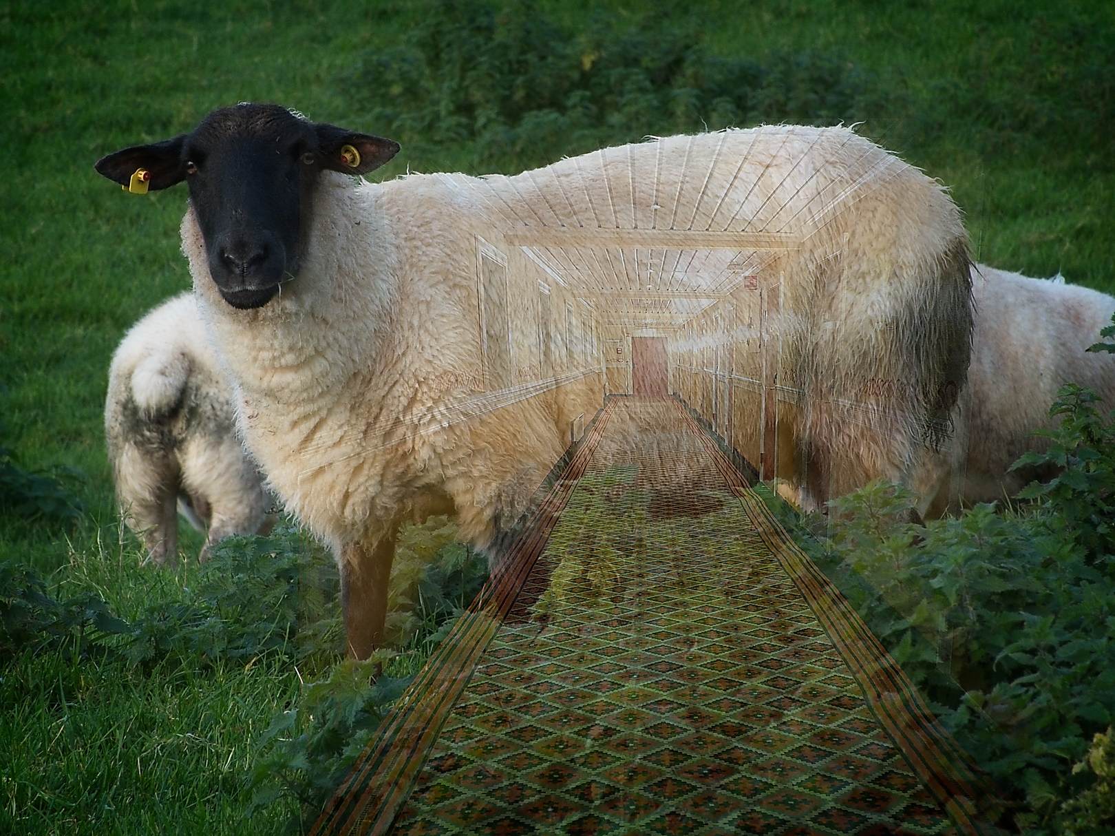
- 25 from wool to carpet Excellent double exposure, either by in camera or post processing. I love the title and everytime I look – new details emerge. I found this to be a very creative image, with a bit of humour (for me anyway) thrown in for good luck. It is amazing to think the wool starts off looking so bedraggled, dirty and wild and ends up looking beautiful and very contained within the walls of a gilded cage. Hon – RUNNER-UP
-

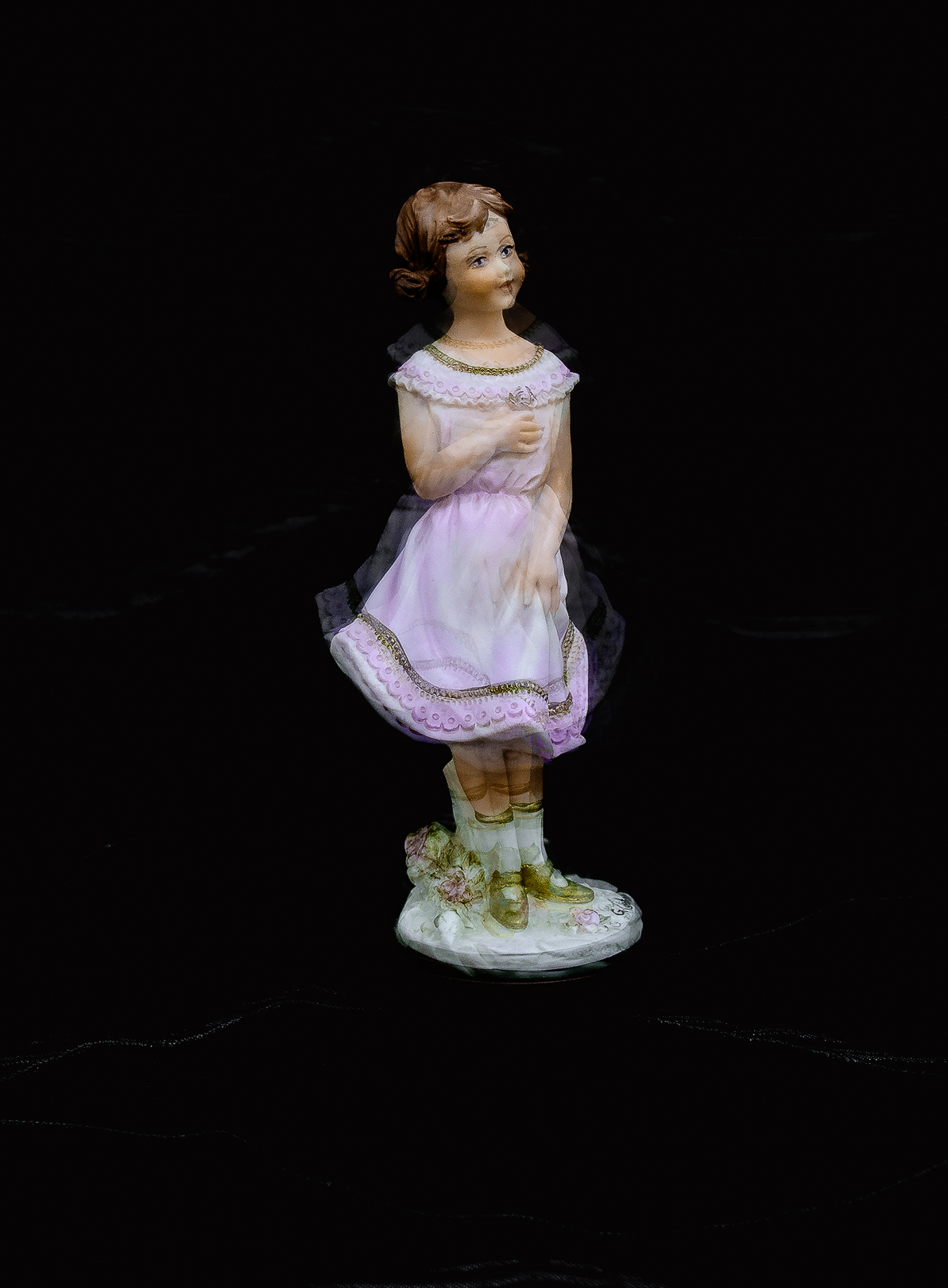
- 26 Dancing Princess This is a lovely ornament, very sweet. This is either a double exposure or ICM. Because her feet are so firmly grounded it is hard to get the feeling of dancing. Perhaps if you masked out some of the double exposure, except for the skirt, it would look like the skirt was swirling from side to side. Acceptance
-

- 27 WineGlassFilled Yes the wine glass is filled with wine and sunset – both great things in life. This image is a happy place. There are white or wine -coloured marks on either side of the wine glass stem. These could be removed in post. I am not sure if the glass is sitting on a glass shelf or if it has been layered in post. It looks like it is floating without purpose and needs to be anchoured somehow. Maybe a hand, making a toast to the end of the day? Acceptance
