Annette Johnston FPSNZ
Thank you for inviting me to assess your Book Title images.
Whilst you were not asked specifically to design a book cover, in many ways a book cover is
what I had in mind as I approached these assessments. I was looking for an image that
would make me stop and look; that certain ‘something’ that would entice me to pick up one
particular book from within the many on offer.
I also spent time considering the choices authors make with their titles. I think titles speak.
Sometimes they speak in whispers, sometimes in a loud voice. They can insinuate or infer
what is within a book, they can deceive or deflect from the truth, and they can declare with
precision what the pages will reveal.
I therefore spent time researching each title, finding out as best I could, what the original
author was communicating.
Whilst some of you took a literal approach to an actual book and its title, others branched
out and reimagined the title in another way entirely. Some of the images I have been
presented with have been taken with real purpose, and others I suspect are part of your
catalogue of images, and were maybe near enough to, or caused you to find, a book title to
suit. Whilst both methods have merit, I find that setting myself a task to go and photograph
something with intention, as in the first option, is when my strongest images are created.
Lastly, assessment or evaluation of images is something akin to a conversation. I have given
what is intended as a thoughful, considered, opinion that I hope, you will receive with an
openness that will allow you to consider my words, and then freely, come to your own
conclusion as to the validity of my opinion.
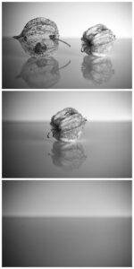
- And then there were none – Agatha Christie: This much acclaimed book has been variously titled Ten Little Niggers, Ten Little Indians and then in 1940 for the US Edition, it was released as ‘And Then There Were None’; the last five words of the 1869 minstrel song that inspired the original title. With the history aside, this is a different take on the idea of diminishing numbers. Two, then one, and then no Cape Gooseberries! Speaking photographically, the placement of the Gooseberry pod/pods intersecting the horizon of this composition is for me, somewhat of an irritant, and I wonder if the photographer would consider a change in perspective – slightly higher so that pods sit within the darker colour – or lower where the gooseberry is grounded on the darker portion but seen cleanly in the lighter area. Another alterna.ve might be to have used a seamless backdrop. I appreciated the reflections, and the concept. MERIT
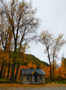
- The Cabin in the Woods by Sarah Alderton: People and car free, I enjoyed the glimpse within the shadows to the inside of this cabin. I appreciated the vibrant autumn colours on display, and in particular, I loved the trickle of leaves on the roof of this cottage. The image overall, has a focal softness to it and I wondered if some of the decisions made by the photographer with shutter speed choice and perhaps whether to use a tripod or not, have led to an image that sits as neither soft as in impressionistic, nor sharp. ACCEPTANCE
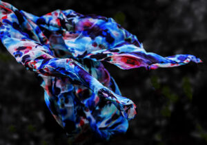
- Gone with the Wind: A classic movie of course, but Gone with the Wind, was first a novel. I enjoyed this reinterpretation of the words of the title; the scarf with its saturated colours, blues and reds dancing on a windy day; not quite gone, but perhaps the potential is there. With this thought in mind, the anchoring of the scarf on the left-hand edge, had me looking for a hand or perhaps a peg on a clothesline, and whilst it may have been very difficult, I wondered what this image would have been like if the scarf was entirely free. I then had another thought, perhaps this image is a conceptualisation. Is it an interpretation of the underlying narrative of Gone with the Wind – the story of breaking free from restraint, the broader stories of race, class, and gender? HIGHLY COMMENDED
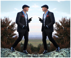
- Mirror Image: There are several books with this title, but they all have a cover that does indeed have a mirror image – some more subtle than others. This smartly attired gentlemen, is a literal mirror image of himself, with perhaps a slightly non-subtle ‘flipping’ evidenced within the final render. It is between the two figures that my eye tends to return to, and I am disappointed to find a ‘smudge’ there rather than something crisp. This is an interesting concept for this set subject that with a little more attention to detail this image would have received a higher grade. ACCEPTANCE
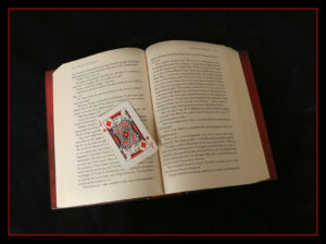
- Jack of Diamonds: This tableau effectively reflects the book title, Jack of Diamonds by Bryce Courtney. Nicely lit, and appropriately focused, set on a seamless black background and doubly framed in red, it is a simple, yet classic, render. Jack of Diamonds is described as a spellbinding story of chance, music, corrup.on and love and I couldn’t help but wonder if a little more emotion could have been bedded into this arrangement. MERIT
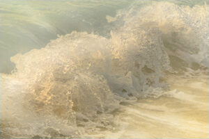
- On the Beach by Neville Shute: This ‘in-close’, angled view of a wave as it crashes upon golden, sun-lit sands is as an image reflective of nature’s beauty. The relationship to the book’s apocalyptic premise, the story of a post-war radioac.ve cloud gradually poisoning everything in its path, is perhaps not where the photographer was heading. I very much enjoyed the colour, the ripples, and the textures within the unbroken portion of the wave. The maelstrom, that is the breaking water takes up the bulk of the frame, and I found myself regretting the lack of sharpness in the bottom left-hand corner – it was a bit of a bumpy ride into the middle of the wave before I found the in-focus portion. This is a nice idea for a reimagined title. MERIT
- Behind the Little Red Door: I discovered two distinct books with this title. The first, a children’s picture book authored by Coy Bowles, the second, a haun.ng thriller by Megan Collins, where a woman who believes that she has a connection to a decades old kidnapping, begins a frantic investigation to find out what really happened when the victim goes missing again! This sunlit, white house with its bright red accents, looks benign, although I could imagine something sinister within; trouble wrapped in innocence perhaps? The house is very tight within the frame; likely, there are distractions the photographer is trying to omit. If possible, the inclusion of a little visual breathing room would be appreciated. The darkened lawn, bottom front of the frame, feels somewhat unnatural, and I wonder if a vignette or deliberate darkening has been used with a little too much exuberance. MERIT
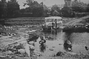
- River Rules my Life: There is a book with the title, A River Rules my Life, by New Zealand Author, Mona Anderson. This book, written in 1960 chronicles Mona’s life on a high- country sheep station in Canterbury; the river of the book is the braided Wilberforce. This very old-looking, grainy, noisy, black, and white image, featuring a school bus as it fords a river seems of that time (although, my first school bus looked something like this, and I don’t feel THAT old). The image looks very much like something from an old shoe box, or perhaps an old poster or magazine, and I can’t help but wonder how a photographer, in the digital age of today, has rendered it? MERIT
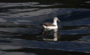
- The Ancient Mariner: I remember reading the ‘Rime of the Ancient Mariner’ by S.T. Coleridge at High School, with a hint of the modern added in when our teacher played us a recording of Richard Burton beautifully reading the story. This particular albatross seems very much alive; set on inky black water, its reflection rippled, it looks accusingly towards where I imagine the photographer to be – I wonder (imaginatively perhaps), if it too has heard Richard Burton read the line: “it perched through vespers nine…” Returning to just a photographic assessment, there appears to be a loss of highlight detail in the feathers on the neck and body of the bird, which I don’t think will be recoverable in post- production. Whilst I do enjoy the sense of an open ocean, the placement of the bird with more behind it than in front, adds a certain unease. I wonder if the photographer might like to look at reframing this composition to see if a change in the birds position rela.ve to the frame edges would improve the image as a whole. MERIT
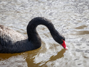
- Swan Lake: In another life, I worked as a Ballet Wardrobe Mistress – responsible for making tutus and other costumes for Ballet companies. I am very familiar with Swan Lake, the Ballet (lots of white tutus and one black one) and am aware that the Pyotr Ilych Tchaikovsky story has been reproduced in many guises. This (real) black swan has been photographed doing just what swans do, and I wonder if it is just too ordinary to stand in for the very decep.ve Odile. This bright, sun shiny day has none of the darkness or moodiness that I imagine would represent the iconic tale of good and evil. As an image of a swan, there is nevertheless a good range of light, through dark, feather detail, and I love the pin-sharp head, eye, and beak. MERIT
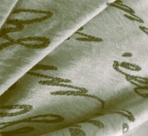
- The Lost Words: With seemingly nothing at all to do with the delightful book of illustrated nature poems by Robert Macfarlane, I was intrigued with this image. The woven, printed, fabric, carefully folded on a near diagonal, plays with the idea of light and subtle shadow. I tried in vain to make out the script, not even being able to tell which way up I should read it – Lost Words, indeed. There is some detail loss on the edges of the folds which may be because of the angle and strength of the light. I wonder if the photographer would consider a black and white conversion which may negate this poten.al distraction. I appreciated the thought that has gone into the creation of this image. HIGHLY COMMENDED
- Creative Chemistry by Edwin E Slosson: First published in 1919, partly in response to the huge scientific advancements seen in the Great War, this acclaimed book was introduced by Julius Stieglitz, a former president of the American Chemical Society, and professor at Chicago University. This careful arrangement of chemistry styled equipment could be a more modern take on the cover for this book. The choice of aperture/focal length has resulted in something like a ‘visual trip hazard’, that is where the foreground elements are softer than the background elements, and I needed to ‘get over’ or ‘through’ these before I found the in-focus elements. A different choice of focal point, a smaller aperture (larger f-stop), or even a focus stack are ways to overcome this. With in this composition however, I particularly liked the added touches of detail – the wet liquid in the chemicals of one beaker, the test tubes with different colours, complete with water drops and of course the blue pipette, all set on a seamless black background. MERIT
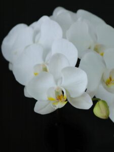
- Fertilisation of Orchids by Charles Darwin: Fertilisation of Orchids is a book by English naturalist Charles Darwin published in May 1862 under the full (very long) explanatory title “On the Various Contrivances by Which Bri5sh and Foreign Orchids Are Fer5lised by Insects”. The original book has a graphic pressed into the book cover and overlaid with a gold/silver leaf. As a modern alterna.ve, I think this image would have done nicely. I enjoy the choice of the diagonal composition and the par.al inclusion of the second line of blooms; the latter appropriately in less focus. I wonder if the photographer might like to extend the black canvas to the le^ of the image and above – just to give the orchids a little more breathing room, and perhaps somewhere to put the title! HONOURS
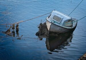
- After the Storm: There are any number of books with this title, however, they all seem to have a non-literal meaning e.g. The changing Military Balance in the Middle East. I did wonder whether this small boat, that I think is named Tiger Lily, may have been in situ for more than one storm. I enjoyed the sunny-day reflections and with them the thought that after a storm, the sun does come up again. I considered, several times, the inclusion of the small triangle of jetty in the bottom corner and I concluded that it may have been worthwhile including more of it or omitting it entirely. We can understand from the ropes that this vessel is ‘tied up’, so perhaps the latter option may be the best? MERIT
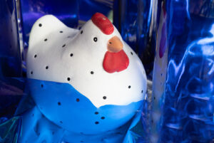
- Blue Chicken: There is a children’s book by Deborah Freedman with this title. Published in 2011 it is described as “A mind-bendingly clever farmyard romp”! The actual book cover shows a white chicken stomping in a blue puddle – the resulting splashes appear over the white background, a little like the inkblots in the Rorschach Test used by Psychiatrists. I suspect that the photographer has made a real effort to replicate this book cover, using items they had to hand. Whilst I don’t think it has been 100% successful, I do applaud the imagination that has gone into a reproduction. ACCEPTANCE
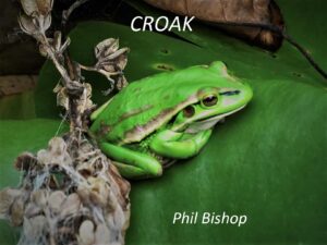
- Croak by Phil Bishop: Somewhat similar to the original, this image would absolutely work as an alternate book cover. These frogs are very small, particularly when one compares this particular one to the leaf in the background. Macro focus is always a challenge, and, in this case, the most focused part of the image is unfortunately the seed pod behind the frog – our frog sitting within the area we could refer to as no-man’s land; that is, as the subject, it is not quite in focus, enough. MERIT
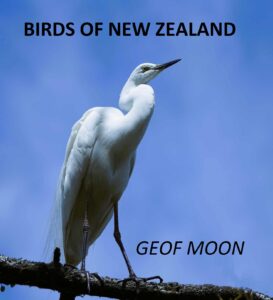
- Birds of New Zealand by Geoff Moon: Nicely placed on this reimagined cover, the white heron takes up just the right amount of space to allow for title and author to be arranged sympathetically. I do have to note that the author’s name is misspelt. The blue sky, with its hint of white cloud, makes a lovely background but is spoilt a little, when one notices some not so perfect photoshop work, bottom right-hand corner, and quite a bit of digital banding within the blue – the latter is likely attributed to the very small file size (206KB). ACCEPTANCE
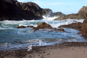
- Rising Tides: There are a number of books with this title – many, but not all, feature the sea on their covers. I could not make out from this image whether the .de is incoming or outgoing. That aside, it is a blue-sky day which presents photographers with exposure challenges. This image contains both some very dark shadow regions and some over bright portions in the waves. Whilst the shadow regions could be lightened in post-production, the too white, near featureless portions of the brighter areas would be more difficult to repair. It would be very easy to suggest that the photographer limit themself to morning or evening photoshoots however, if you need to be there in the middle of the day, some focus bracke.ng, is a good option. I enjoyed seeing the three seagulls in the front of the image and spent a few moments imagining the conversation they may or may not have been having. ACCEPTANCE
- The Ruins: I have heard ruins described as history preserved in decay, and I wonder if this is why people are so often attracted to such sites. This image has been presented with space above the ruins which would, quite neatly, accommodate a book title and author’s name. The ruins themselves, are cloaked in shadow, nega.ng the poten.al for longer exploration of both the old bricks but also of the bushes, the latter an example of the inevitable reclamation of nature. The photographer might like to further explore this image with a li^ in the shadow regions and a corresponding decrease in the highlights; I am sure that once this is done another, stronger image will emerge. ACCEPTANCE
- In Their Element_ Chemistry: The introduction of a hand, with eye dropper complete with a nicely .med drop, give this scene a sense of action. On the assumption that this is the same author as the previous Crea.ve Chemistry image (the elements are the same) here the focus is precisely where it should be, that is, at the very front of the image, with any fall of in focus natural. The photographer might like to increase the overall contrast a little, just to give the image a little more of the proverbial ‘pop’. HIGHLY COMMENDED
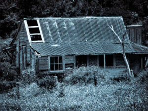
- Bleak House: The Bleak House is a novel by Charles Dickens. Published in 1853, it is a story of a disputed fortune, that by implication criticises the English Court of Chancery, in which cases could drag through several decades of convoluted legal manoeuvring. This blue-hued monochrome processed image does suggest bleakness, and whilst not perhaps what Dickens had in mind, it could be appropriate for a darkly themed novel. I enjoyed viewing this house over the long grasses, the remnants of a garden fence and through to the blackness of empty window frames and front door. As presented, I feel as though this house is jammed somewhat mercilessly into the frame; the window overhang on the le^ is all but touching the edge, and the right-hand front of the building is cropped away. I hope that the photographer has a wider shot of this scene as it is a space that has a lot of interest. ACCEPTED
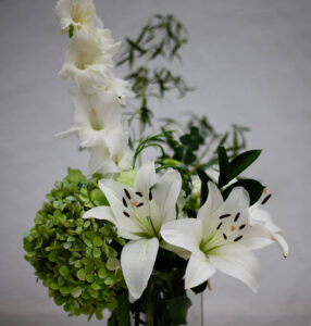
- The Lilies of the Field: Written by William Barrett this book is a story of two unlikely friends, a black ex-GI and the head of a group of German nuns. The Lilies of the Field tells the story of their impossible dream—to build a chapel in the desert. This still life arrangement does have lilies, along with a hydrangea, gladioli, and a variety of foliage. The composition of the image is tight within the frame, and in my opinion caught somewhat in-between too little, and too much. The photographer could, if possible, have taken a step back to get the whole subject in the frame, or perhaps used a wider lens. Another alterna.ve is to have to focused closely in on the lilies, making the story only about them, and thereby giving us a greater connection with the title of the book that has been chosen. ACCEPTANCE
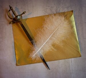
- The White Feather: The 1907 P. G. Wodehouse novel The White Feather is a story about cowardice and the efforts a schoolboy goes too to redeem himself by learning the sport of boxing. During World War One, a white feather was handed to, or sometimes mailed to, a man who is considered a ‘coward’. To place the white feather overlaying both a sword, and an envelope neatly combines the ideas behind this unfortunate and damaging practice. I enjoyed the top-down view of this tableau, which is set on a fitting rough, yet unobtrusive, textured background. I did however, wonder if a plain, non-glittery envelope may have served better in regard to the overall narrative. The lighting is harsh, and whilst it bothered me at first, I reconsidered, with the notion that this is the very harshest of stories, and as such it can be told without any softening. MERIT
- The Magical Forest: There are several children’s books titled The Magical Forest, all taking children on a journey of adventure, wonder and enchantment! This scene seems to meet all these requirements. Deep within the shadows, there are some figures; one even looks to have a camera – but I chose to ignore this. I did happily dwell in this colourful scene and could easily imagine it as a magical forest. I have an aversion to coloured borders on images, however, in this instance I think it works. I would like to suggest however, that the photographer look at the image again with a few less pixels on the border, and limit it to just the pink, just to see if this is a case where less, is more. MERIT
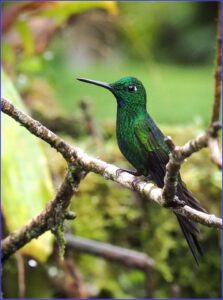
- The Hummingbird: There are several books with this title, but the one that the photographers might find the most interes.ng, is titled simply Hummingbirds, with a by-line “A Celebra5on of Natures Jewels”. This Hummingbird portrait encapsulates the idea of a jewel of nature; the eye is beautifully sharp, and the colour and textures on the feathers are superb. There is a touch of detail loss on the branch. However, no doubt the conditions, and the speed these birds move, make photographing them with perfect exposure difficult. I concluded that on balance this small detail didn’t overly bother me. I am sure the photographer will be very pleased with this capture; I know I would be. MERIT
- Katie the Kitten: Katie the Kitten is one of those wonderful Golden Books. Whilst I don’t remember that title, I remember my mother reading others, and I certainly read some to my own children. This Katie has been portrayed with something of a painterly feel, and I found that looking at the image from a step back, easier than with on the computer screen at the usual distance. That aside, Katie is a beautiful ball of fluff, her ears, eyes and even whiskers are perfectly ‘at attention’. Sitting on what I presume to be a white covered bed, there are no visual distractions in the background, although I do wonder what damage those claws could do. This image is a good candidate for consideration for a book with this title. MERIT
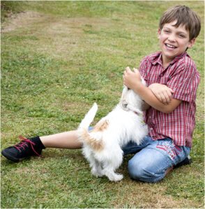
- The Puppy Wants a Boy: The Puppy who Wanted a Boy is a children’s book penned by Jane Thayer. This image completely encapsulates the idea of a puppy and boy, and the love they share for one another; from the first and yes, to the last. The portrait of the boy is lovely – nice skin tones, a happy, toothy smile and whilst tight in the frame I get the feeling that the frame is in fact, supporting the boy. The wee puppy, busily sniffing, or perhaps licking, the boys hand looks to be a wire- haired bundle of fun. The bright light has clipped the detail of the puppy’s fur, and whilst this technicality can be construed as a photograph fault, it doesn’t take away from what is a lovely story. MERIT

