Judge –
-
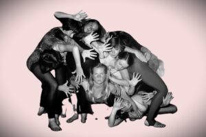
- Judgement day I was advised the brief for this competition was the image should show a human form or human trait but should not actually be human so on those grounds this image sadly is not accepted. As an image I felt the unravelling faces works quite well although I felt the girl at the very bottom right and also the persons body that’s on the right hand side we’re probably unnecessary for this image to work. The increasing revealing of faces works quite well from the left going in a circular motion to the girl whose full frontal face is on the bottom. In addition I felt the graininess of the girls needed to be matched in the background or alternately some of the graininess removed from them in the post processing if possible to help unify these two areas..

-
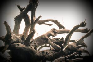
- The Holocaust I thoroughly enjoyed the creative take in using washed up trees to suggest the form of skeletons and felt this works very well. I thought for this image to be more successful there may needed to have been some selective editing done as some of the trunks particularly the large dark area that goes up the top of the frame don’t quite tie in with your concept. You have captured some lovely lighting on the stumps which adds a very strong sense of mood and I felt the trunk on the far left hand side in particular was very reminiscent of a skeleton. Some of the area on the lower right is also very much in keeping with skeletal forms and also works well. I also enjoyed the lighter background as this helped draw my eye through all the intertwined logs and added a sense of depth to the image. I’ve awarded this image a merit.

-
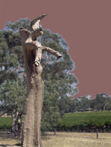
- Halt sayeth the guardian I felt the tree stump you’ve captured in the foreground is very strong and looking like a human form albeit a slight alien version of one. I felt the treatment that you’ve applied on the background tended to compete with the figure in the foreground for my attention due to the heavy cross hatching and re-colouration that you’ve applied to it. I felt the image would be stronger if you sought to subdue the background rather than it compete with the alien figure. I have awarded this image an acceptance

-
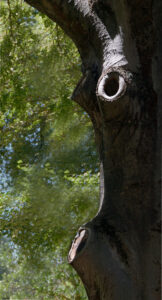
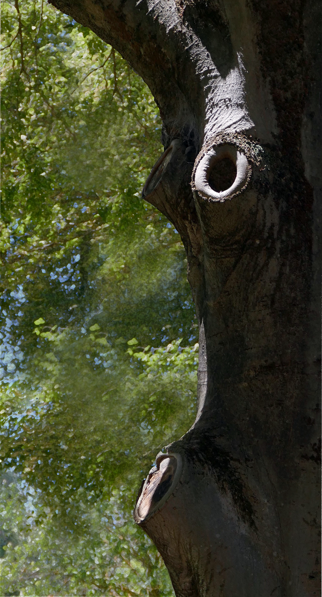
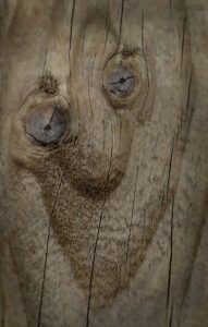
- OMG I thought you had spotted the human like eyes and mouth and expression very well in this tree and made good use of the lighting to help accentuate a couple of small parts of it. The green leaves in the background also helps isolate the features of the trunk. I felt this image could have been improved slightly if there had been a little bit more light on the whole trunk as a matter of course and in particular on what represents the left hand eye area. In isolating the trunck in the frame I felt your image works quite well overall and was happy to award this image a merit.
-
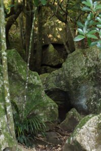
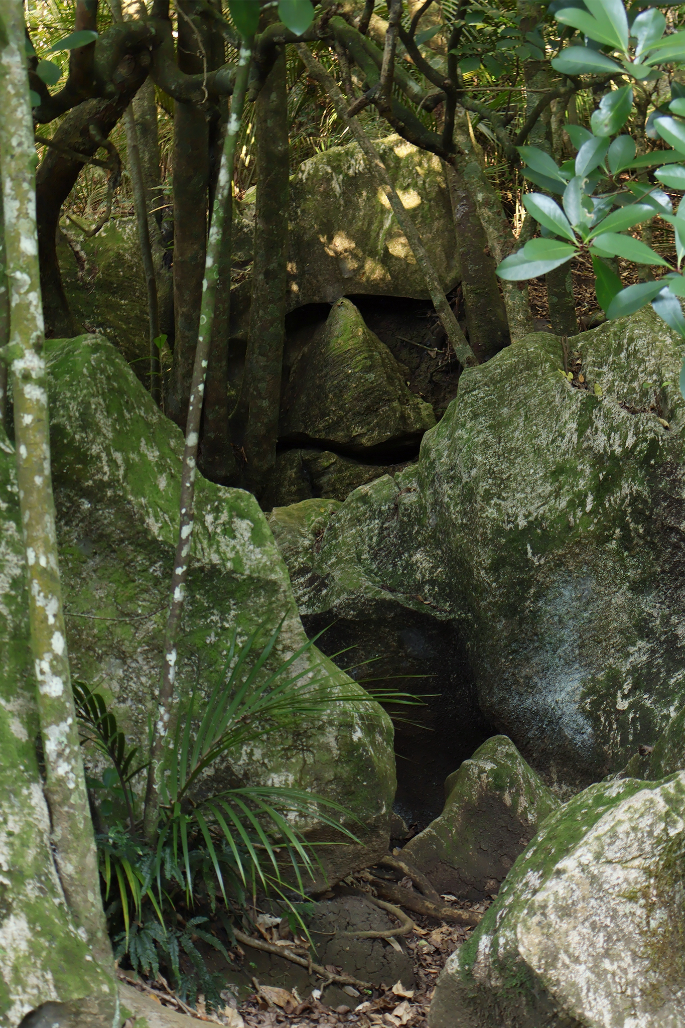
- Forest guardian It took me a while to spot the human form in this image given it’s in the background. I felt this was because you’ve included quite a large amount of the foreground which almost disguises the face in the background. I felt that to have cropped the image almost in half to the bottom of the curved piece of rock would have helped emphasize the face in the background and in doing that still would have left enough other foliage and tree trunks to add some interest to the frame. Leaving all the foreground in as you have I felt only serves to obscure the face and make it harder to find. You have definitely captured the human form in the background though so I was happy to give this image an acceptance.
-

- A woman’s grief I definitely enjoyed the colours that you’ve captured in this image and the slight repetition of shapes within it. With the help of the title I also was able to make out the shape of an eye in the larger brighter section and thought that the smaller loop of the lighter area was possibly representing a tear. I felt that the tear section needed to be at the corner of the eye for this image to come together. Due to the very abstract nature of this image, without the title I don’t think I would have recognised this as part of a human form or necessarily associated with human trait or emotion. For that reason I have not accepted this image.
-
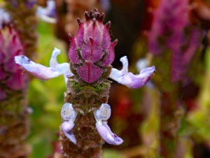
- Fun little guy I thought you’ve captured this bloom very nicely and there is a substantial depth of field which helps show up the intricate details of the bloom itself. The angle you have positioned yourself to has also made this flower definitely look like a human figure with arms outreached and I felt that works very well. I felt your background has been blurred sufficiently so as to not dominate the image but still give a sense of the surrounding area. I was happy to award this image a highly commended.

-

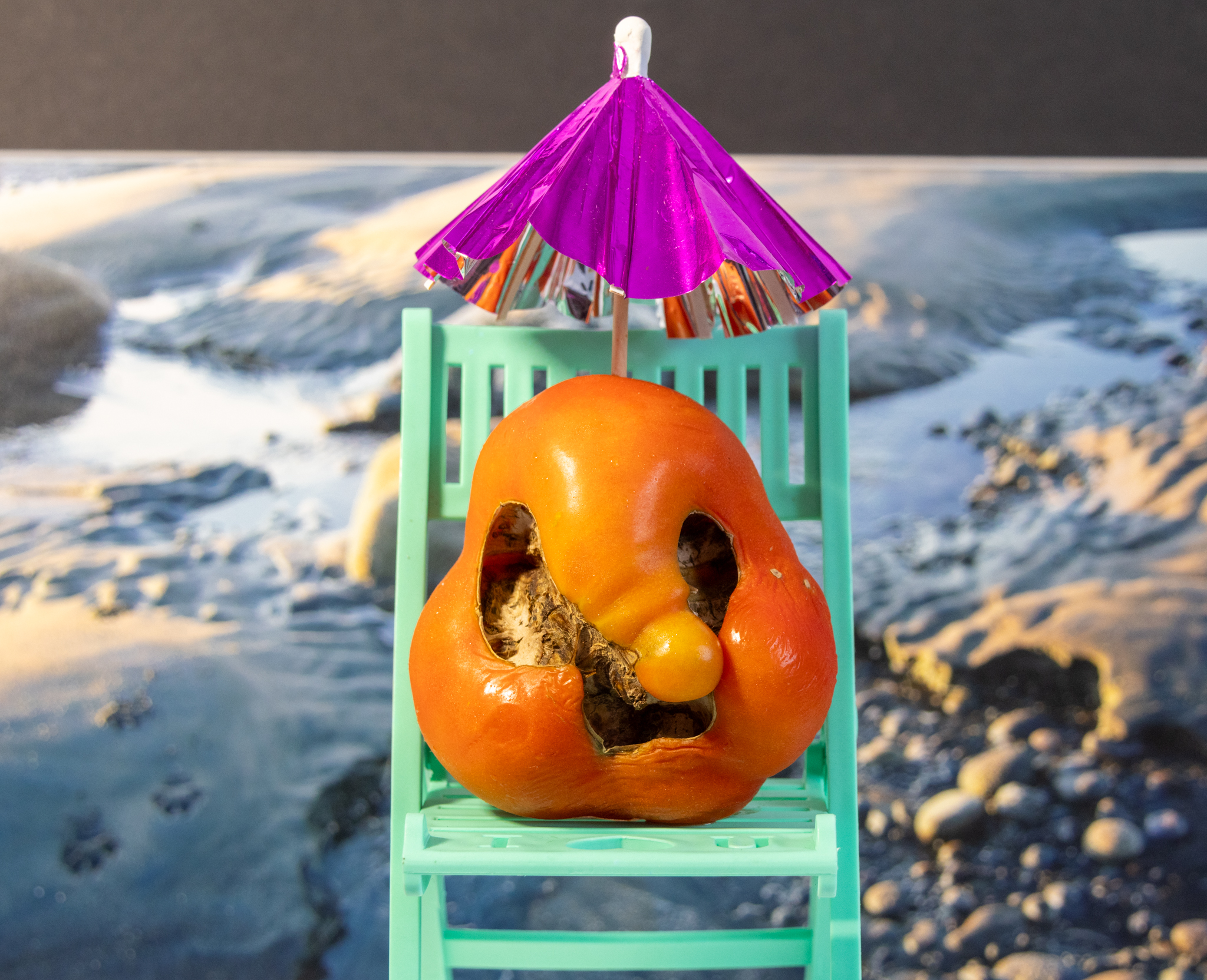
- Shrivelling up I thought you’ve done a wonderful job at piecing this image together and all the elements come together to create one whole scene. I like the fact that you have used a blurred background and then kept the chair, tomato and the umbrella nice and crisp so as to make them the more dominant features. Your editing on all the different elements has been handled extremely well and I even liked the central positioning of the tomato and the chair. I feel this central location works quite well given the unevenness of the background and it stops the chair and tomato becoming too much of a bullseye. The expression of the tomato also is very well captured and not only portrays a human form but in a lot of ways also a human emotion and or trait. I was happy to award this image a honours.
-
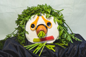
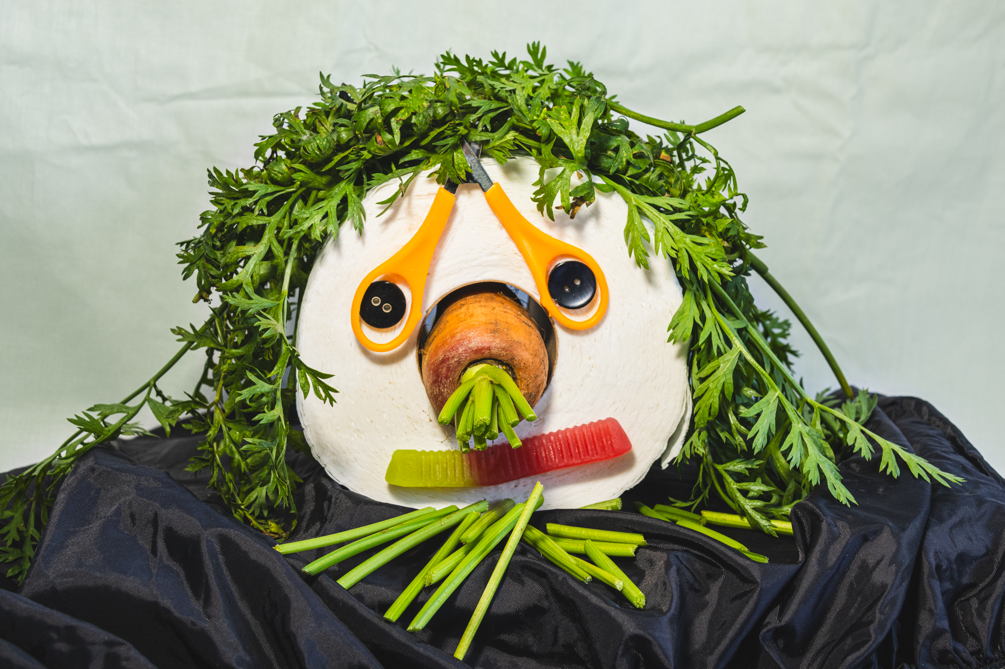
- Vegi facelift I felt you obviously put in quite a bit of effort to make a human face out of all your different parts and feel that you’ve done a pretty good job at pulling all the different bits together. I felt to improve this image you just needed to change the foreground cloth that you have used as I felt the shininess of it competed somewhat from my attention. I feel if you used a little bit more of a matt finish and also fashioned the cloth to appear as the shoulders of this head then that would have worked a little bit more so. I was happy to award this image a merit.
-
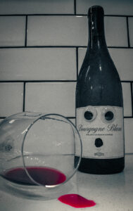
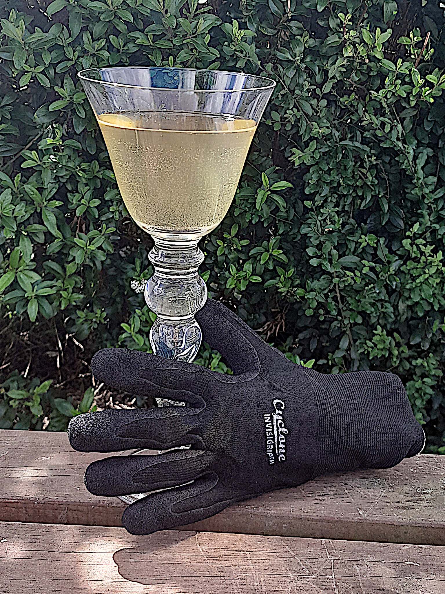
- Don’t cry over spilt wine I felt you’ve done that some good work thinking through a concept to create a human trait in this image. I thought to improve this image a little bit more focus needed to go into your lighting as the upper area is quite dark. In addition the wine that is spilled out of the glass also doesn’t look quite right in that the shape of it is a little bit too square. As this was a still life I felt a little bit more work could have been done with it to improve some of the elements. Your focusing and depth of field have been handled well. I definitely appreciate the thought you’ve put into coming up with your image design. I was happy to give this image an acceptance
-

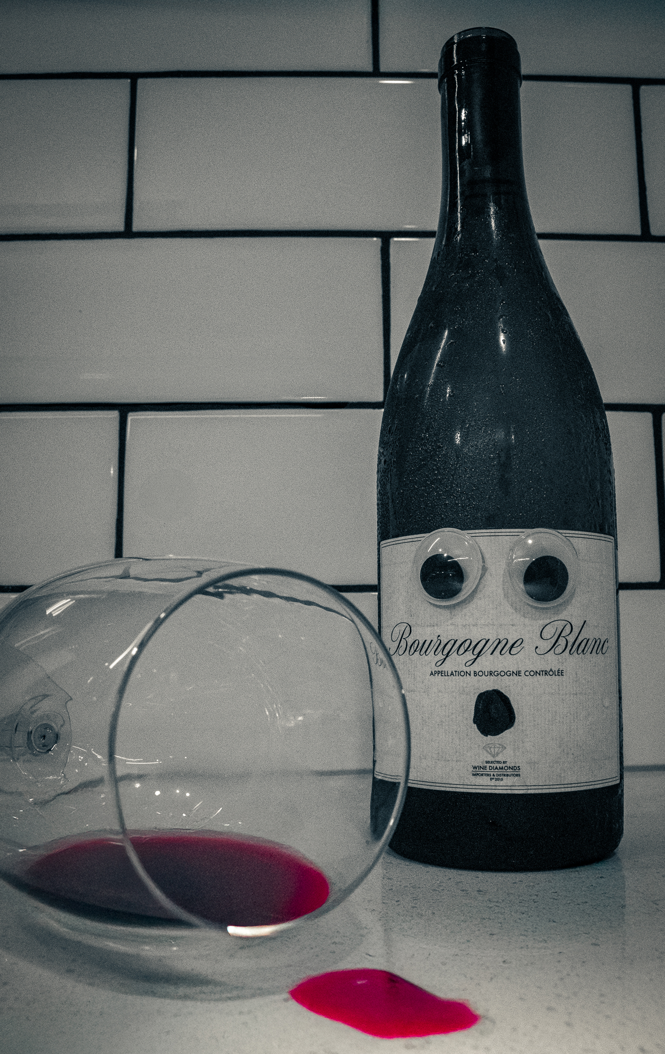
- Quiet contemplation I very much enjoyed the simplicity of the elements that you’ve used in your framing in this image and felt the simplicity helps make the character feel stronger and also more dominant to the scene overall. You have also successfully used the rail that the figure is sitting on and lighter area in the background to create a convergence on the right hand side of the frame which draws my attention to the main character. I felt to lift this image a little bit higher, ideally the foot that is in the most foreground position needed to be sharp as it is the only part of the image that is not sharp and given it is at the forefront of the scene it’s quite distracting. I was happy to give this a highly commended.
-
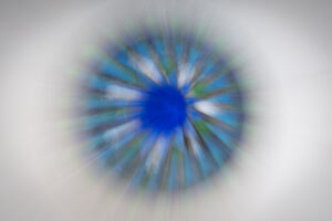
- Eye Aye I quite liked the abstract take you have created with this image as it does give the strong impression of the iris of an eye. There is a little bit of variation around in the detail of the outer area which prevents the image becoming too much of a bullseye. I felt to have improved this image including a sense of an eyelid or even eyelashes may have helped add a little more interest to the frame overall and helped my eye journey around the frame. I did feel your abstract treatment and also the lovely colours warranted a highly commended award.

-

- None shall pass I thought you’d done one well to turn this statue into a human like figure and have backed that up with your choice of title. On my screens the frontal area of the statue is a little bit on the dark side and I felt to emphasise the “none shall pass concept” ideally this should be lightened up either in post processing or possibly you could have used a fill flash or reflector when you were photographing it. In addition I felt to crop some of the sky off the top and also trim a little bit down the right edge would have put greater emphasis on the figure in the frame. You have done very well to compose this shot and pull it together so I was happy to award this an acceptance.
-
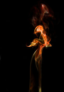
- Dancing lady I felt this flame has been captured in a very timely and convincing fashion to convey an abstract vision of a Lady with swirling arms. The dark background also works very well to isolate the forms and the placement of her within the frame has created a sense of being led towards her. I did wonder whether the small flames above her head were really necessary although I felt they add a sense of a head dress or similar and that without these areas the image may have become too simple. To that end I felt you’ve done a very good job and by your placement and also design of this image and was happy to award it a honours.

-
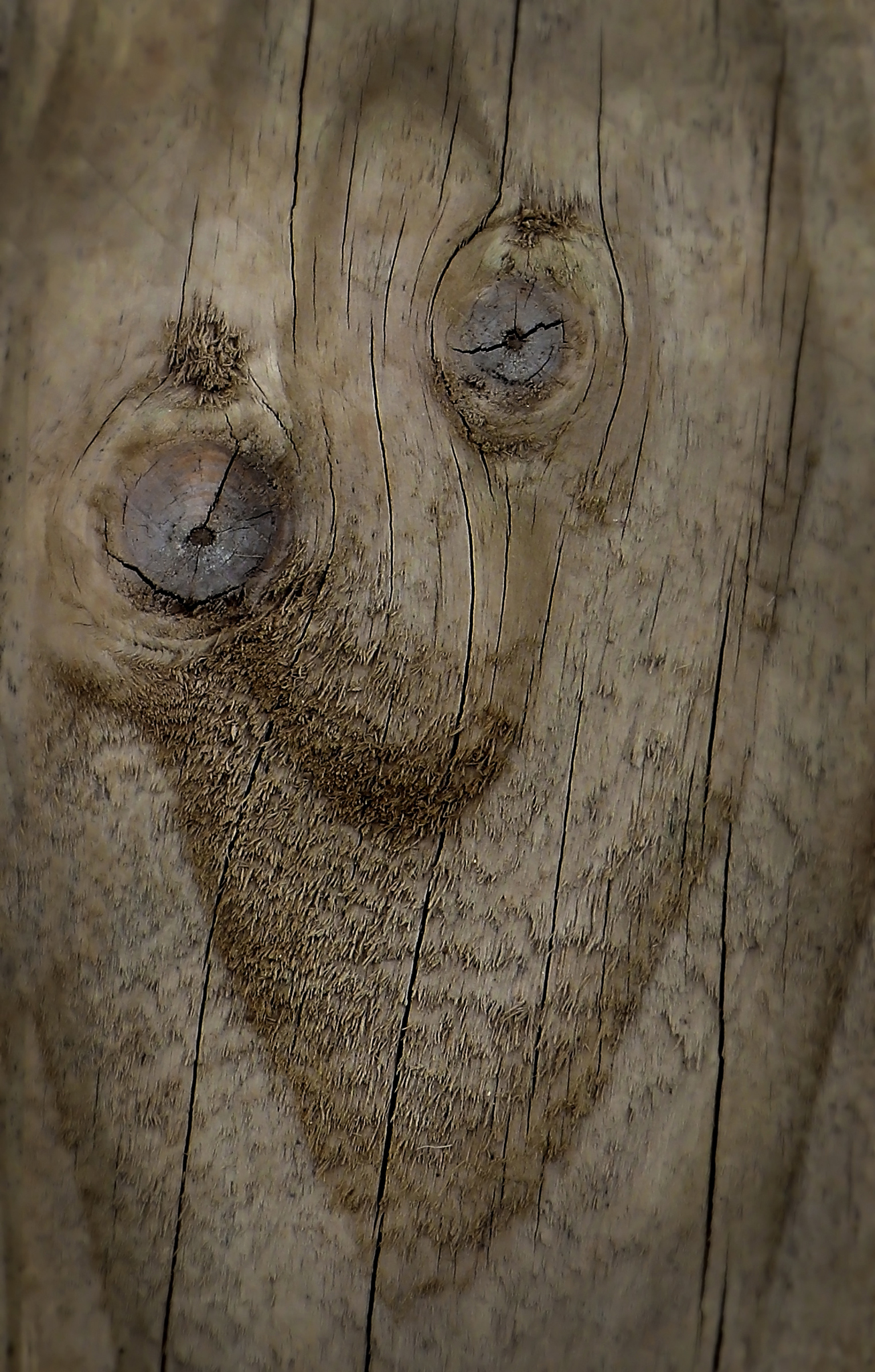
- Uncle Sam I very much enjoyed this image of either the tree or the plank whichever one it is and felt you’ve done very well to spot it and also take an angle of view you have as it definitely makes it look like a face with a strong expression. The rough little bits of wood above the left side eye and also the smaller peace above the right create an emotion in this image that would otherwise be missing. The rough wood below the nose area also gives a sense of a beard which also works quite well. The lighting on this has also been handled very well and all the detail can be readily seen and the subtle tones of the image also create a lovely mood. I was very happy to award this image a honours.
-
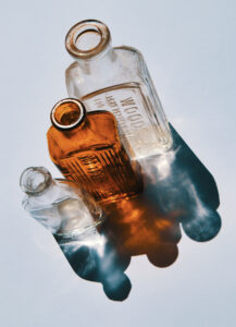
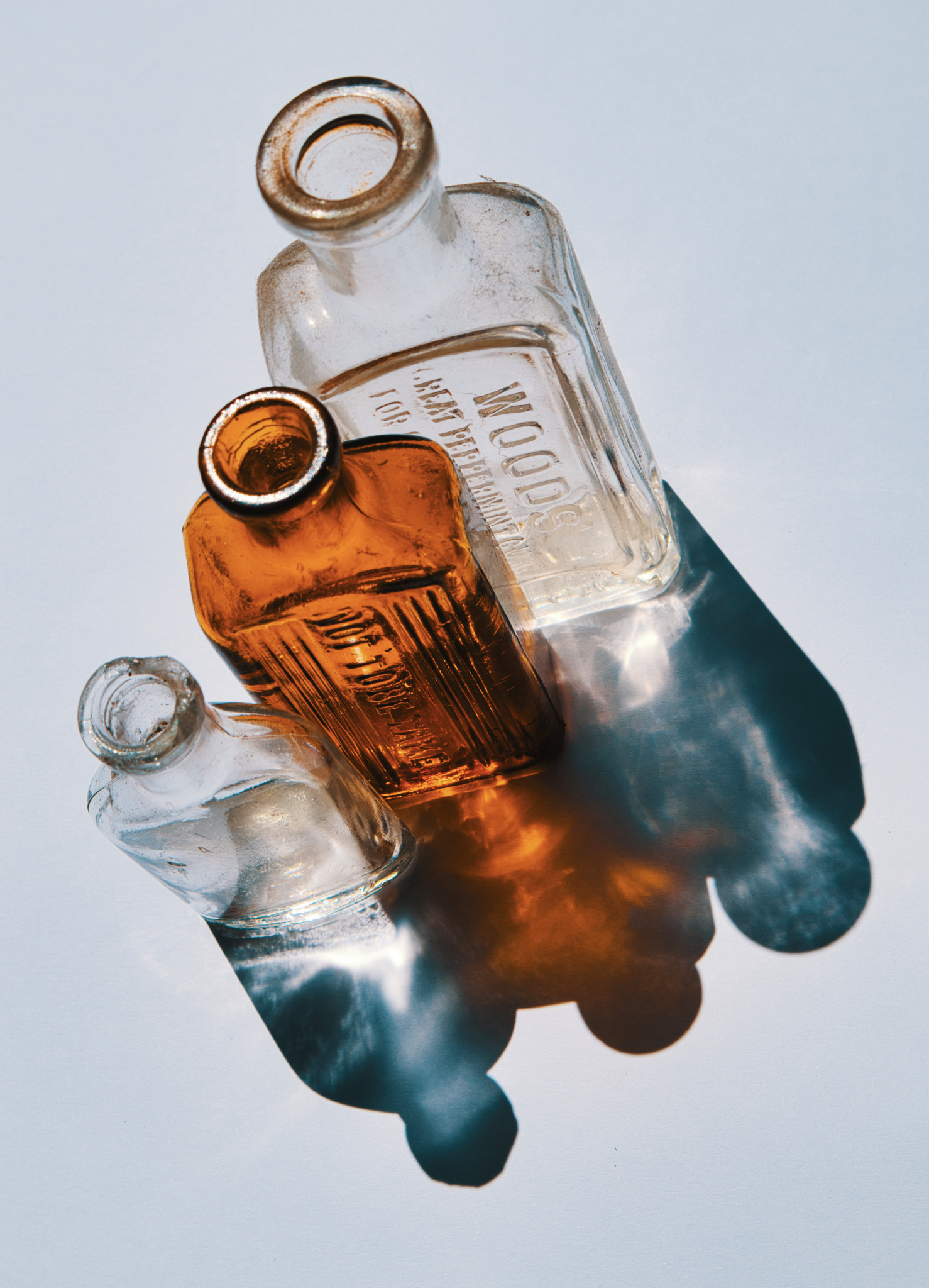
- Heads shoulders no knees and toes I very much enjoyed your framing of these objects and also the lovely tonal quality of the scene as a whole. I felt the just slightly grey background has worked very well to allow the clear bottles to stand out. The reflections also definitely look like abstract images of people although I did wonder whether or not these might have looked better if they’d been at the top although when I rotated the image that then made the bottles look slightly awkward. The slight angle you have taken on everything I felt works quite well from a conceptual viewpoint and I was happy to award this image a merit.
-
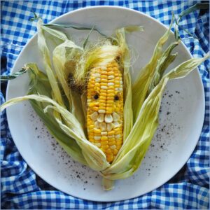
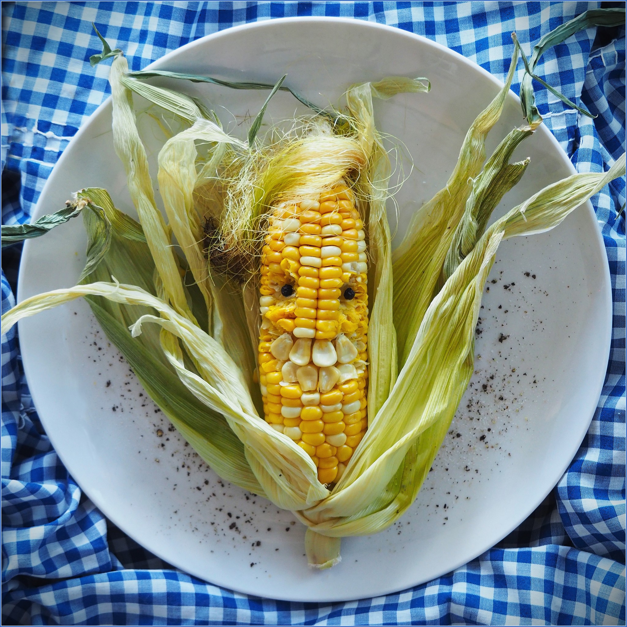
- Combover Cobb worried he may have corn stuck in his teeth I felt you’ve done very well to create this image with the cobb and have obviously put a good deal of thought to create the wispy hair, the eyes and also the teeth. I felt for this image to be a little bit stronger are you could have avoided the outer leaves of the corn going out the edge of the frame on both the left and right hand side as in both cases this has tended to lead my eye out of the frame. The corncob itself is quite strong though so I did come back to it and I felt the lighting you have used on it has worked very well. Your use of gingham in the background also creates a sense of a picnic tablecloth which I felt would quite well too. I was happy to award this image a merit.
-
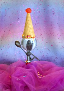
- The hokey pokey Princess I very much enjoyed the way you’ve bought all your different colours together in this image as they create a united feeling between the background and also the foreground pink veil. The item you have turned your ice cream on upside down also works well to create a sense of off centeredness. Your lighting and focus has also been on point and creates a sense of depth in the image. I felt to lift this image a little bit more you could have slightly altered the angle of view to use the sparkles that are sitting in the foreground cloth as a little bit more of a lead in to the ice cream itself. This is just a minor suggestion however as I felt you’ve done a quite successful job of pulling this image together and was happy to award it a merit.

-
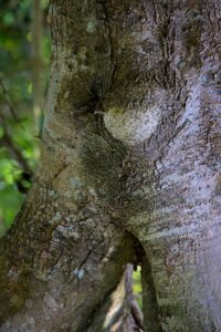
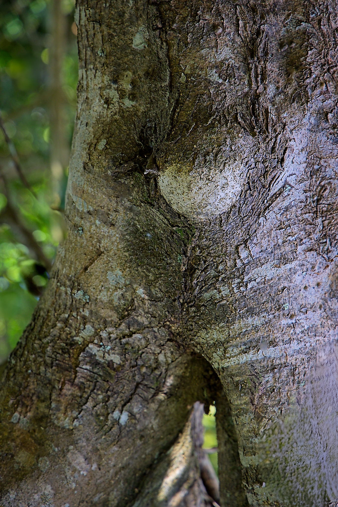
- Human pot belly I felt your lighting on this tree trunk has been quite successful as has your choice of depth of field as it conveys quite a lot of detail in the bark. Your framing has also made the two lower areas appear to be limbs which works well. The indent in the tree I felt looks like a belly button but I felt the knobby section to the right of that almost looks more like a hernia than a pot belly and in that sense isn’t quite in keeping with your title. I also felt you could have trimmed up from the bottom slightly just to avoid the slightly out of focus area at the very base and possibly exclude some of the small shadow that appears between the legs there. You have done very well to spot this in nature so I was happy to award this image an acceptance.
-

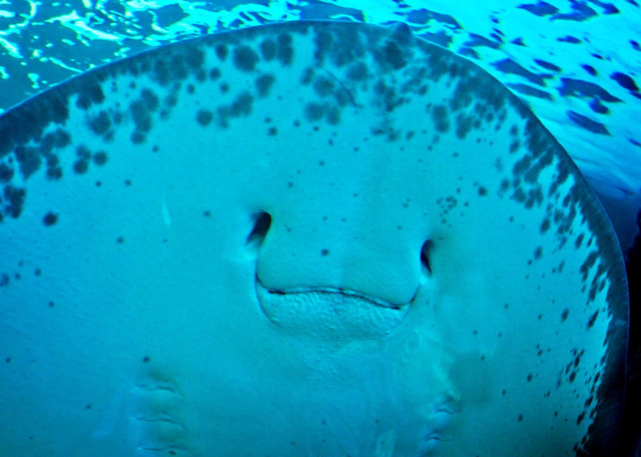
- Manta ray human smile I thought you made a good effort to capture this image underwater and the mouthparts of the manta ray do have a human look to them. The area of sharpness in this image is to the right hand edge of the ray and as such the eyes and mouth parts of the manta ray are actually quite out of focus. As they are probably the most important part of the image to create the human smile I felt this has let the image down and therefore did not accept it. It maybe you could bring up some of the sharpness in post processing but I definitely felt it would need to sharper in this area given those parts are key to the image working.
-
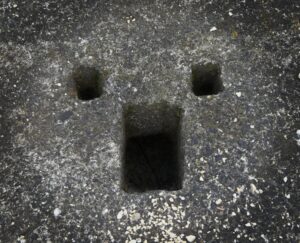
- Surprise I felt the holes in the concrete have worked very well to create a human face and also emotion. The somewhat dim lighting has also worked well to allow the darker areas of the image to show up and also create a degree of darker framing around the outer edge of the frame. It has also allowed the centre of the eye and mouth areas to become quite dark and in that sense add quite a bit of emotion to the frame overall. Although the facial features are quite central I felt the details and texture in the concrete create enough interest to stop this being a bullseye and therefore was quite happy to award this image a highly commended.
-
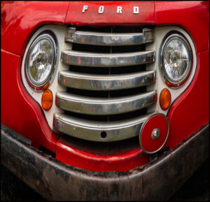
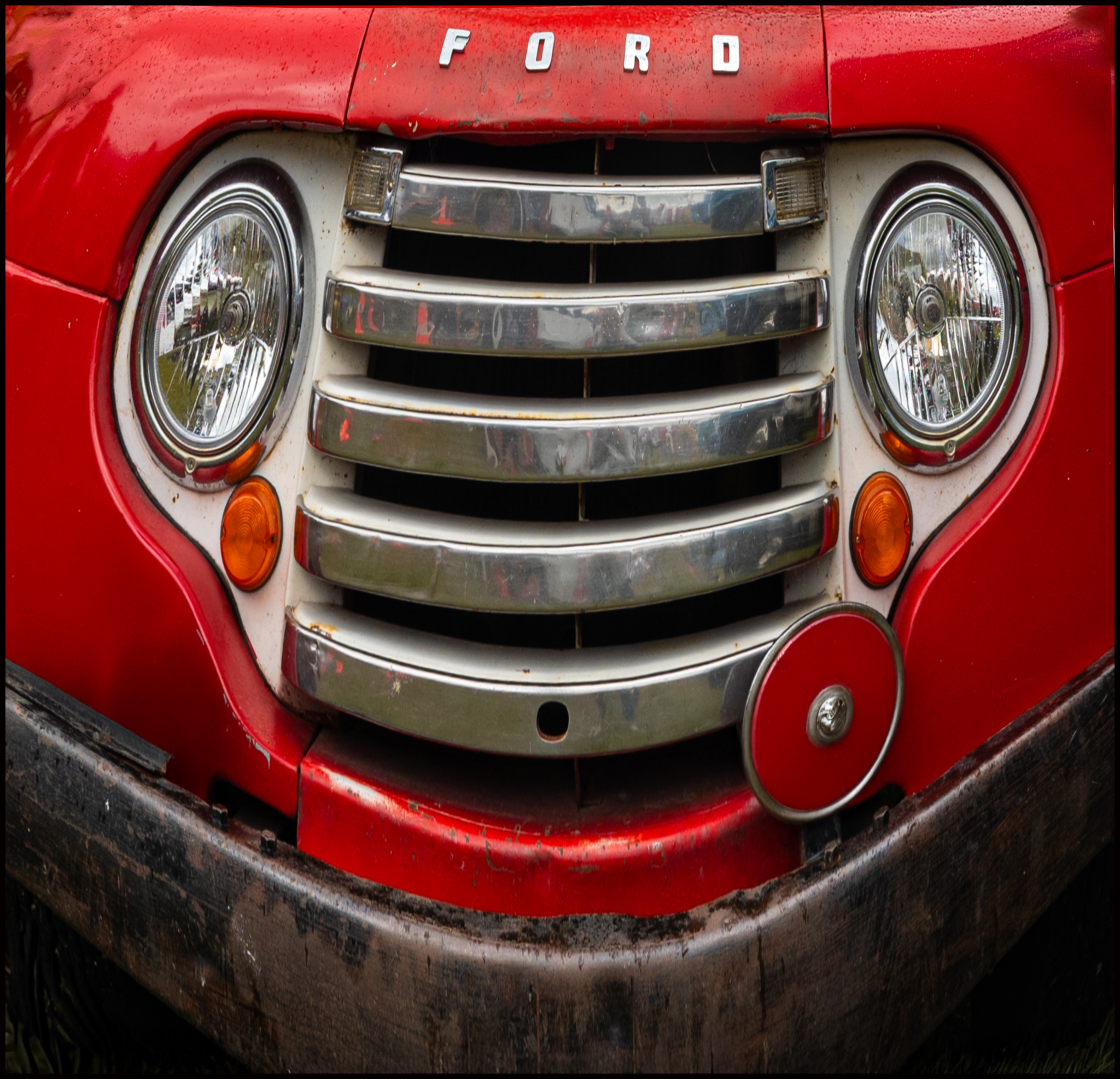
- Smiling since 1948 I very much enjoyed the way you have composed this image and used the headlights the grill and the red disc on the right to create a sense of a face and felt that anybody seeing the image would recognise the sense of a human face within it. The lighting has been quite dull which allows to red to show up as quite saturated although I felt to lift this image a few more highlights may have been needed to go along with the sense of smiling. You have composed your frame very nicely to avoid unnecessary distractions and the little red disc in the lower right has helped offset the image enough to stop it being too symmetrical. I was very happy to award this image a highly commended.
-

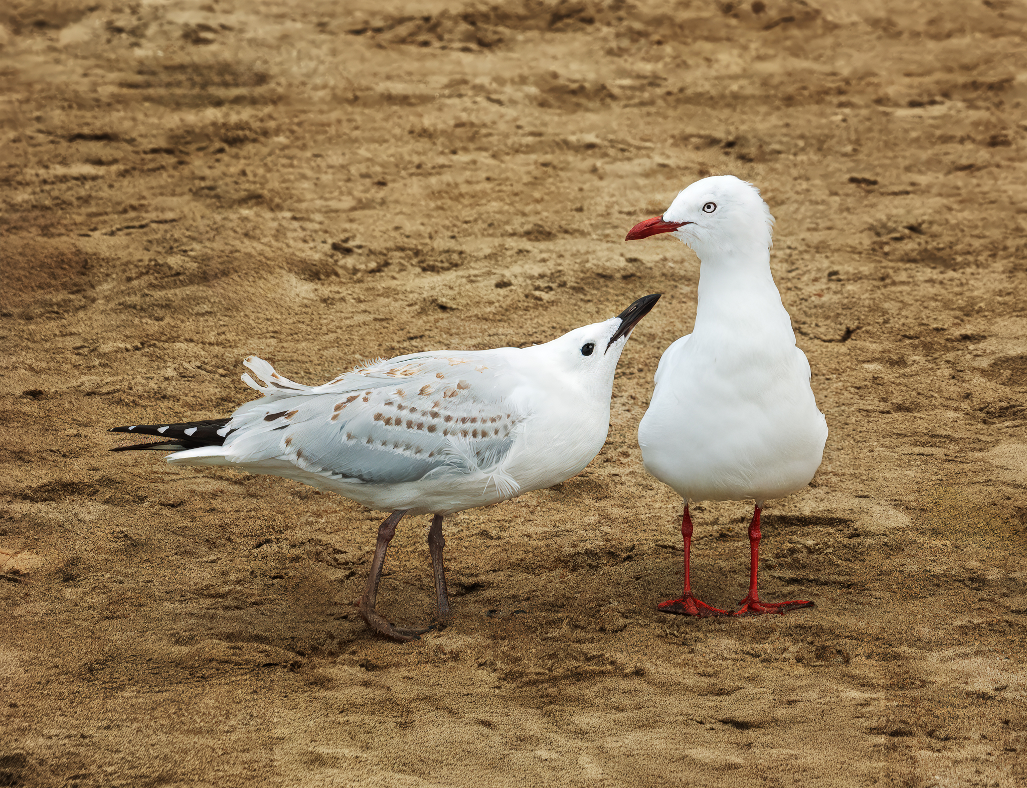
- You are not my type I felt you’ve captured both the seagulls in this image very nicely as there is still some detail visible in the whitest areas of their feathers and they are nice and sharp. The bird on the left is showing some quite strong emotion although I felt the angle of the head on the bird on the right wasn’t quite as convincing emotionally speaking. You’ve done quite a nice job at simplifying the background so as to avoid unnecessary distractions and I was happy to give this an acceptance.
-
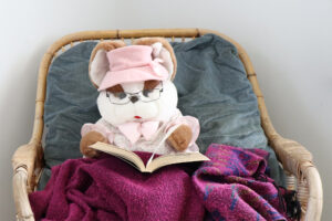
- All tucked up with a good book I thought you’ve done a good job at putting together the beer, the book and the cloth into a chair and have obviously thought through your conflict very well. Your focusing and depth of field have worked very nicely for you to keep everything sharp. Your lighting has got up a little bit high particularly on the right side of the beers face and I also felt that your placement of the chair against a white wall wasn’t perhaps the best choice. As the background is quite light, it tended to draw my eye away from the beer itself and actually became a bit of a distraction. Possibly zooming up onto the beer a little bit more so as to exclude some of the background would have created a stronger image overall. Given the thought you’ve put into bringing your image together I was definitely happy to give this an acceptance.

-
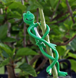
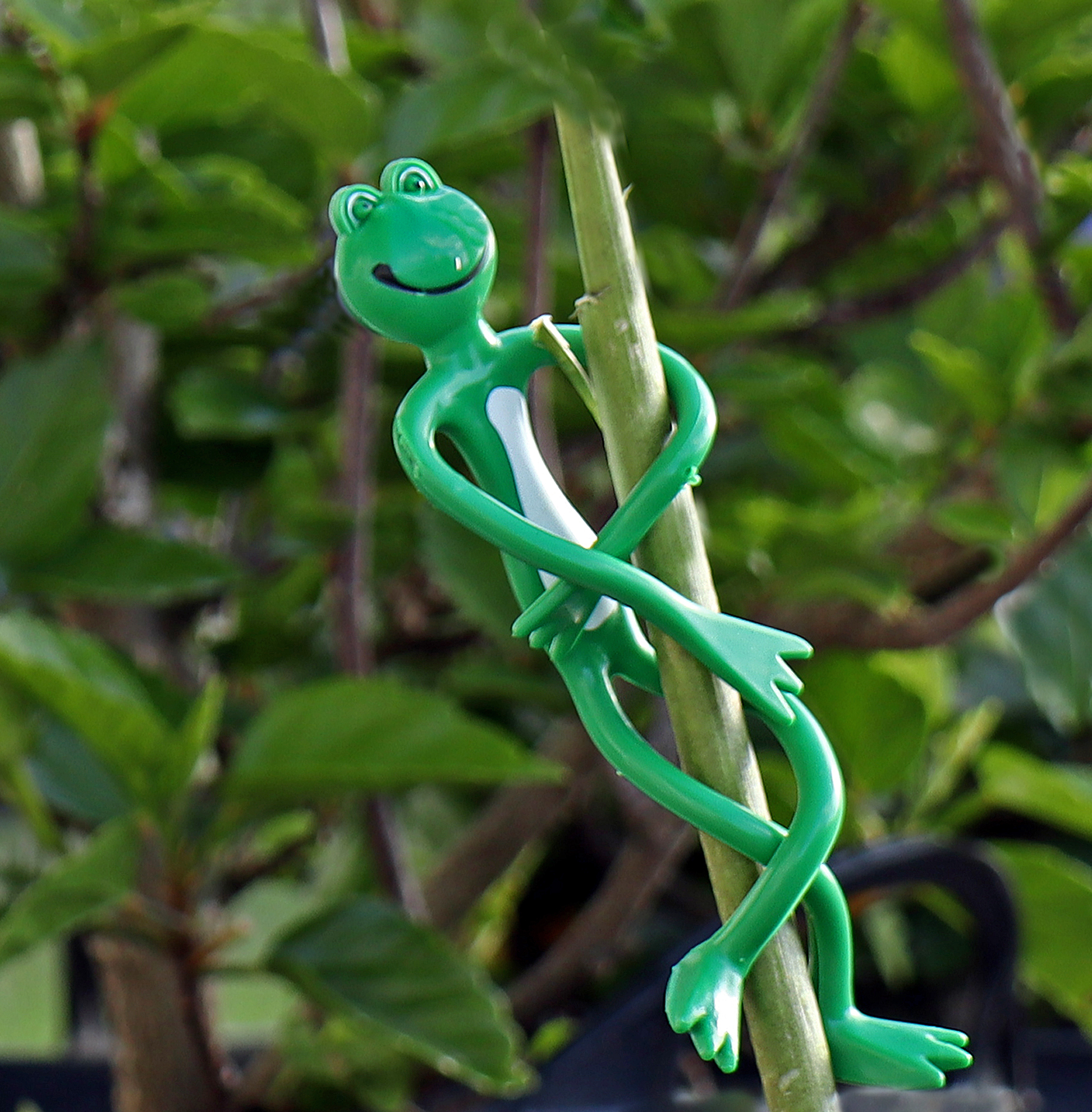
- Hanging in there I thought you made good use of this figurine and found a good place to put it out in your garden. Your lighting has also been quite successful to give a sense of three dimensions to the figure and also the garden that it is sitting in. Your depth of field has worked well to provide some blurring to the background but still reveal other plant life. You have also cropped and framed the image as a whole quite nicely to avoid distractions around the edges and focused my attention on the figurine. I was happy to award this image a merit.