
Thank you for the opportunity to comment and judge your Splash of Colour competition. The standard of photography across this diversity of images was high and it gave me food for thought to select the higher placing images. Well done to everyone who has put time and effort into making images and entering the competition.
Judge – Anita Kirkpatrick
-
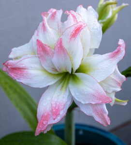
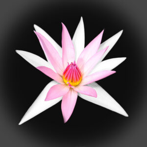
- 1s_LilyBlush Wow, what a stunning lily with beautiful pink dappling. I find the central position of the lily within the frame, whilst slightly tight, works well and suits the square crop. In my opinion the flowerpot in blue is a distraction and could have been excluded by changing its position when taking the photo or by editing it to a different colour, possibly green which would help it blend in. I note there is good sharpness throughout and the addition of the water droplets adds interest. A lily that any gardener would be proud to display. Accepted

-
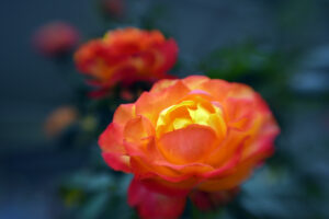
- 2i_BlenheimRose A beautiful blast of colour in this Blenheim rose. I find this image very impactful with the striking colours. I like how there are more blooms behind and out of focus, which really helps the flower stand out in the front and give a perceived diagonal in the composition. I feel the darkened background works well. I hope you have taken more photographs of this lovely rose. Merit

-
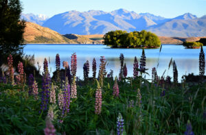
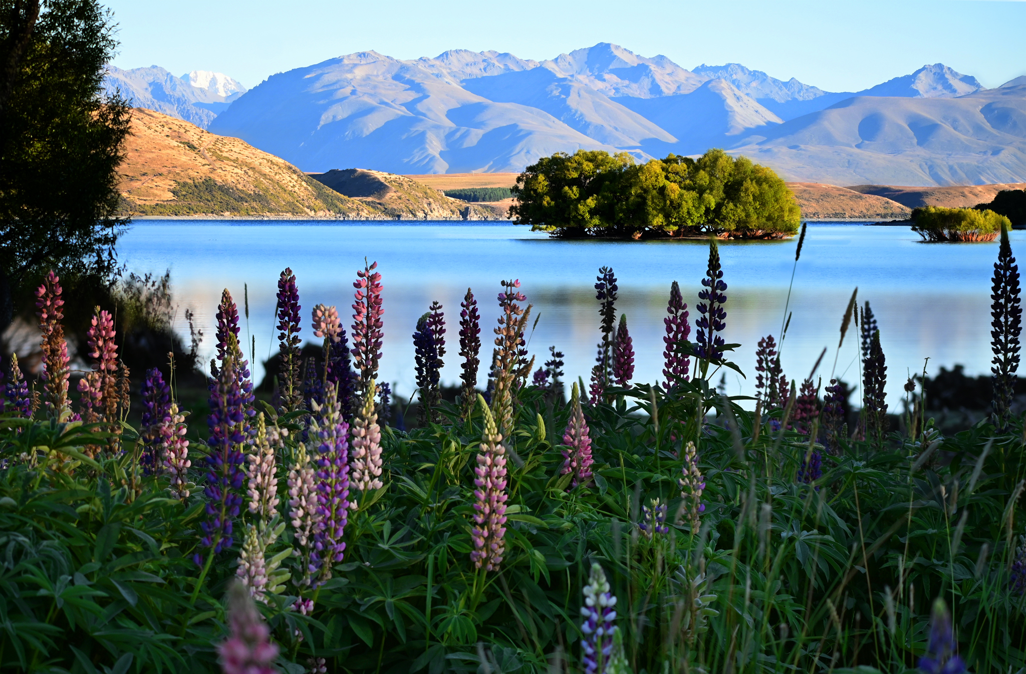
- 3i_Lake Tekapo Colours An absolutely stunning viewpoint over Lake Tekapo. I remember being totally amazed by the extent of lupins growing in areas of the South Island. I find this image has great depth and interest from the lupins in the foreground, to the tree island in the middle and the mountains at the back. I think the time of day and light direction has really emphasised the relief of the mountains. The photographer has captured a nice selection of lupins showcasing various colours and the dappled light across them has revealed some more than others. A really lovely landscape with prolonged interest. Honours
-
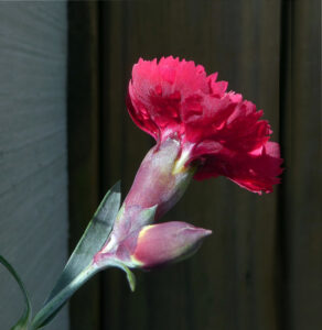
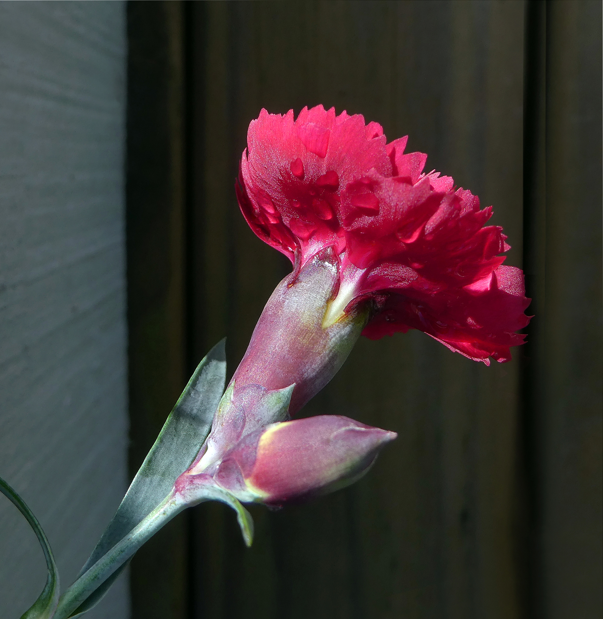
- 4s_CrimsonCarnation Crimson for sure! I find this an interesting angle for the photograph as I believe the photographer was trying to portray the contrast between the flowers and the stem area. For me, I would like to have seen the lower bud sharp too which may have been achieved by turning the flower to the right which would have brought the flower and bud into the same plane. I would be curious to see the left lighter side of the background removed from the image as I think this is distracting for the viewer, and results in a more complementary background being the carnation. I feel the water droplets are an added interest. A simple yet effective photograph. Accepted
-
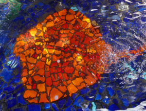
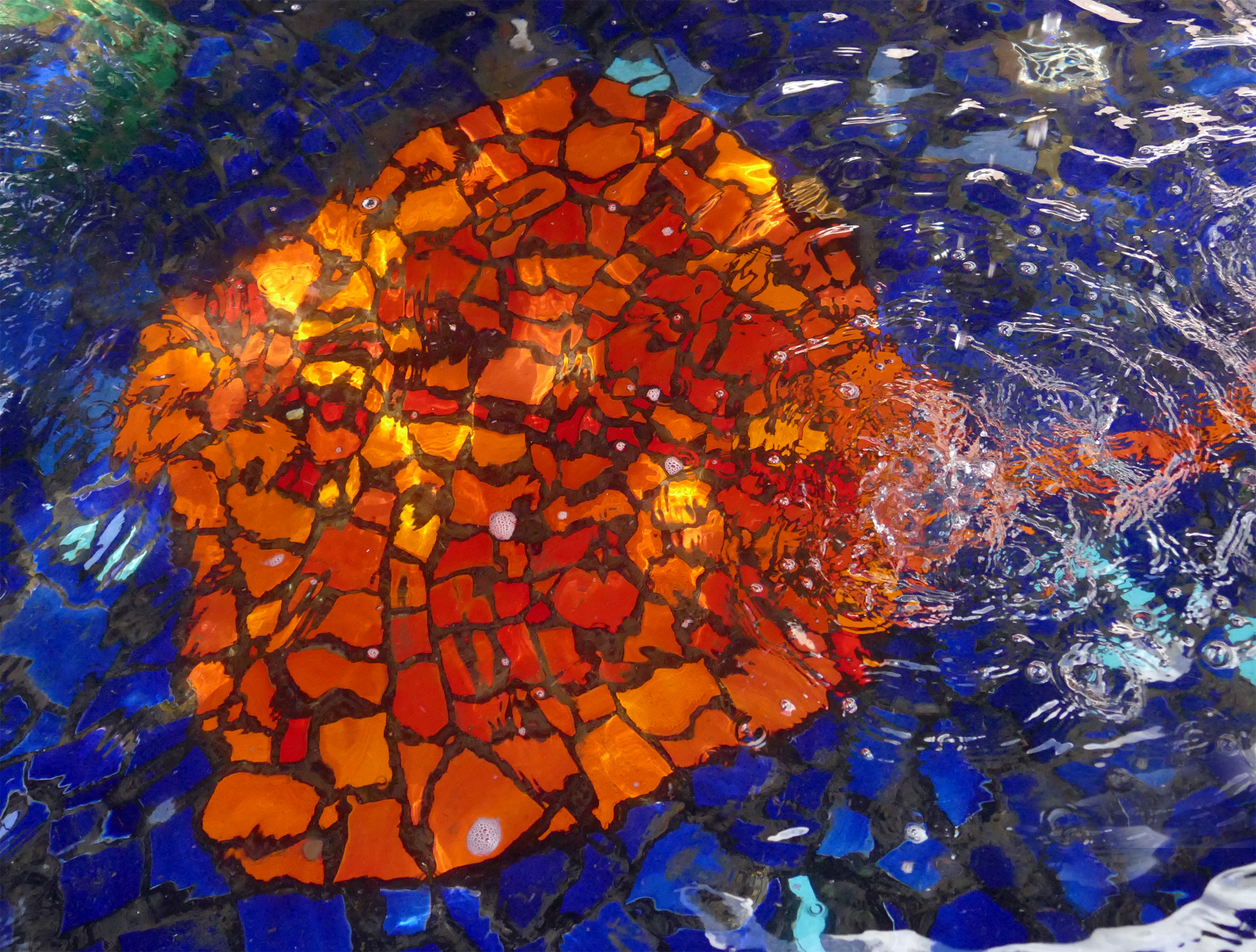
- 5sThe Fountain’s Radiant Ray A photograph to brighten the day. I am enjoying the strong saturated and complementary colours of orange and blue in this Ray artwork under the fountain. I feel the photographer has embraced the theme of a splash of colour well. I think this is almost an abstract photograph with the addition of the rippling water on the right side which gives some indication of the environment. I would be interested to see the top left and bottom corners darkened slightly though I feel they are important in the composition giving a stronger diagonal composition. I think there are other photographs within this photograph as well. Highly commended
-
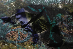
- 6i_Painted Waro Rocks I am curious to know how this photograph has been created. I think the rock could be painted but I can’t see how the vegetation is coloured as well. This makes me think that it could be a multiple exposure image or an overlay in post-processing. I note some colour in the vegetation above the rocks too. I feel this image would be stronger if only the rock was coloured. A creative image. Accepted

-
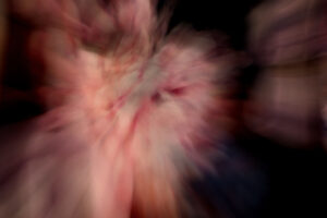
- 7i_Pink in Motion A pink abstract. I believe this could be a flower with intentional camera movement and zoom burst to create the effect. I feel this image would be stronger as a square crop to eliminate the area on the right side. For me, I think my eye keeps on circling the image and I would like to see a more definite focal point to rest on. I see interesting patterns within the pinkness which look like veins running through the subject. I think you could play further with this. Accepted

-
- 8i_Pink Splash Water Lily Another lovely lily with gorgeous pink colours. I feel the central positioning of the flower works well, especially set against the black background which helps the lily stand proud. I think the lighter vignette takes away from the image and I wonder if just the plain black background would result in a stronger image overall. The flower is sharp and the contrasting texture of the central flower and the petals works nicely. I note the lighting is even across the flower with a subtle shadow behind the innermost flower. A pretty lily. Merit

-
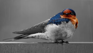
- 9i_Welcome Swallow in rain Remarkable birds and so lovely to capture one stationary. We had one fly into our home this week and I caught it to release it. I observed that the colours were really stunning especially the blue. I like the photographer’s choice to colour pop this image and find that very interesting and unusual. Colour popping, or spot colour as it can be known as, also highlights the colour of the head plumage, making it a strong focal point, whilst desaturating the remainder. I note how the background, whilst mostly plain, is dotted with raindrops adding interest. In my view, the sharpness is good and the water droplets a nice addition to the plumage. I wonder if this swallow is a regular visitor to your property. Merit

-

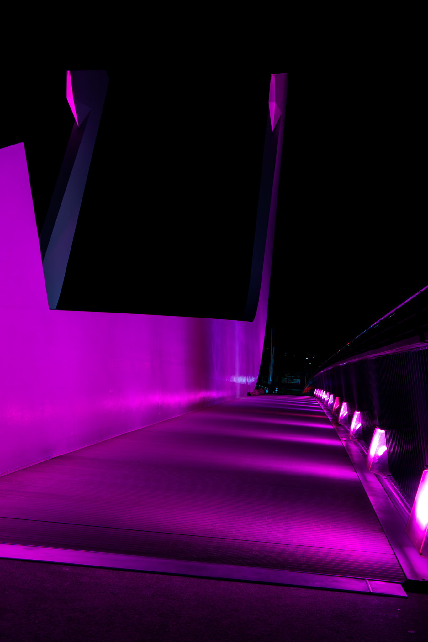
- 10s_Bridge Lit Up I can just imagine myself walking across this bridge. The photographer has found an unusual subject for a splash of colour and I think it’s very effective, and one of those locations that would work best at night when it’s lit up. I find the bright white light at the bottom right distracting, this could be cropped out or darkened. I find the patterns created by the brightness of the lights adds linearity to the photograph and it could almost be described as graphical. A good subject for this competition. Merit
-
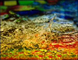
- 11s_Natures Splash A creative photograph with lovely complementary colours. I believe these are oil droplets in water which are photographed over a subject with bright colours. I often find that colourful gift bags work great for this. I find the circle the stronger focal point with the other shape pointing to it. For me, the sharpest focus is only at the base of the shapes and I would have liked to see this sharp right across it and this could be achieved by having the camera totally perpendicular to the container rather than at an angle. I like how the colours bleed across the image, though I find the brightest area on the top left to be a little distracting. I wonder if removing 1/5th of the left side, to give a 10×8 crop roughly, would eliminate this. Well done on the creativity, I hope the photographer keeps trying out this technique. Accepted

-
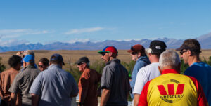
- 12n_In Line I wonder what they are queuing up for. In Northern Ireland, we live on a farm and we host ‘farm walks’ where local farmers come to see what we do on our farm. This photograph reminds me of that, where most people wear shirts in darker colours with jeans and dealer boots (brown slip on boots) and are set in an agricultural landscape. The photographer here has recognised that most people are dressed darkly and that the Westpac rescue t-shirt is indeed a splash of colour amongst this. I would be curious to see the photograph cropped by the gentleman in the blue chequered shirt, just to the left of his hat, and about 1/4 from the top to reduce the extent of the sky where there are no clouds, which I feel would leave the colourful t-shirt more dominant. I note that the lighting is on the faces of the people which works well. An interesting take on this topic. Accepted
-

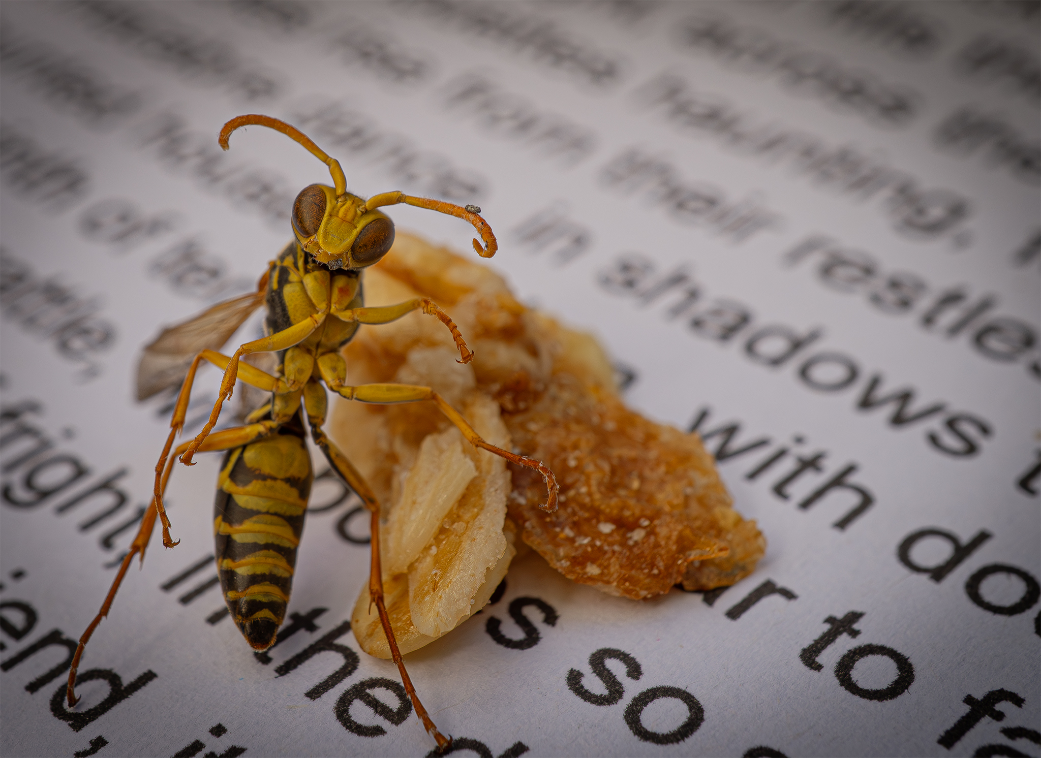
- 13n_Paper wasp A paper wasp on display. I like how the colour of the wasp and the substance behind it are similar. I believe the photographer is trying to tell as story with the paper behind the subject, though I feel the text is distracting within the photograph. I find the wasp is displayed at an unusual angle revealing the underside and with a shallower depth of field, sharpness is best on the head, and outermost parts of the legs and less so on the body which could be improved with a higher aperture or by focus stacking. I am aware that this could result in even more of the text being visible but an alternative source of paper could be trialled. Having said all that, I still enjoy the simplicity of this image and the strong triangular shape of the focal point and diagonal lines created by the text. Merit
-

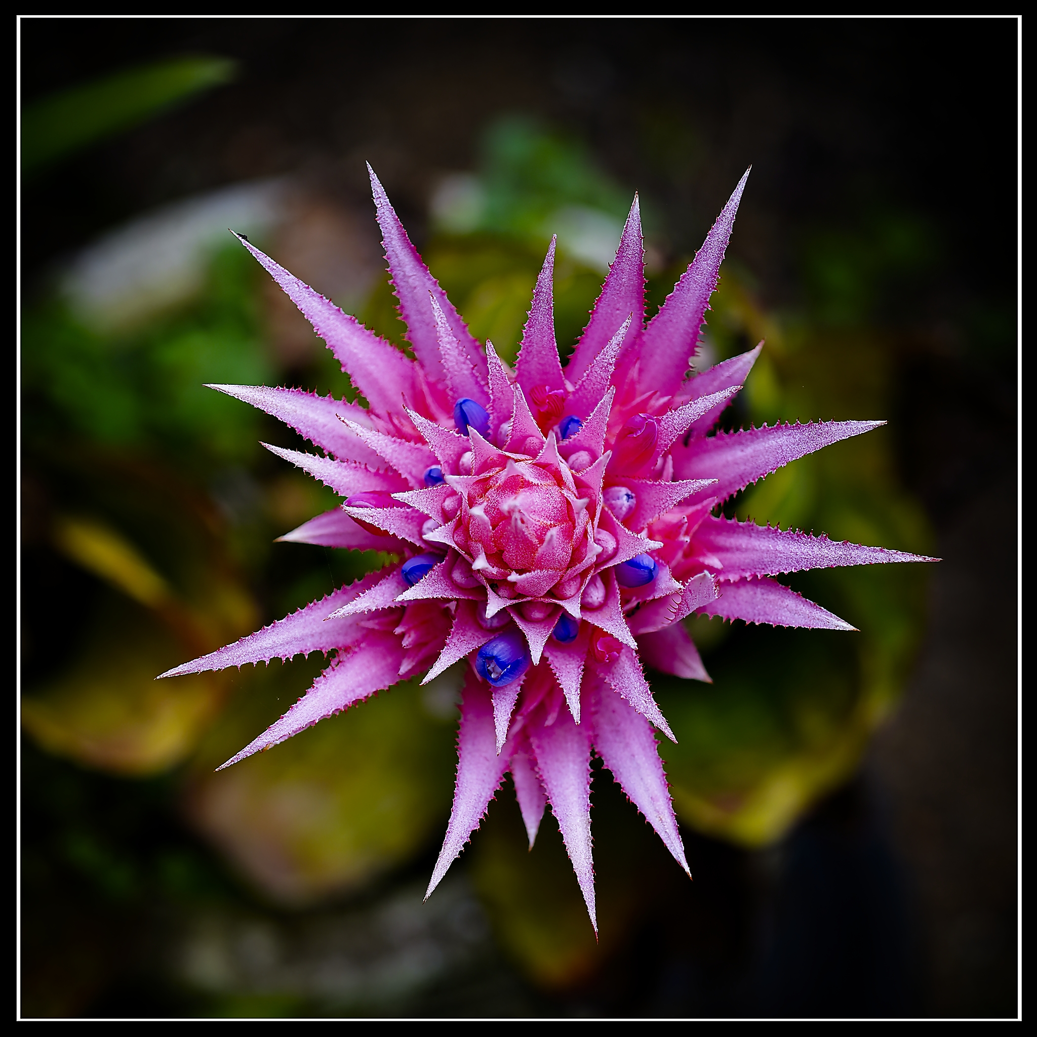
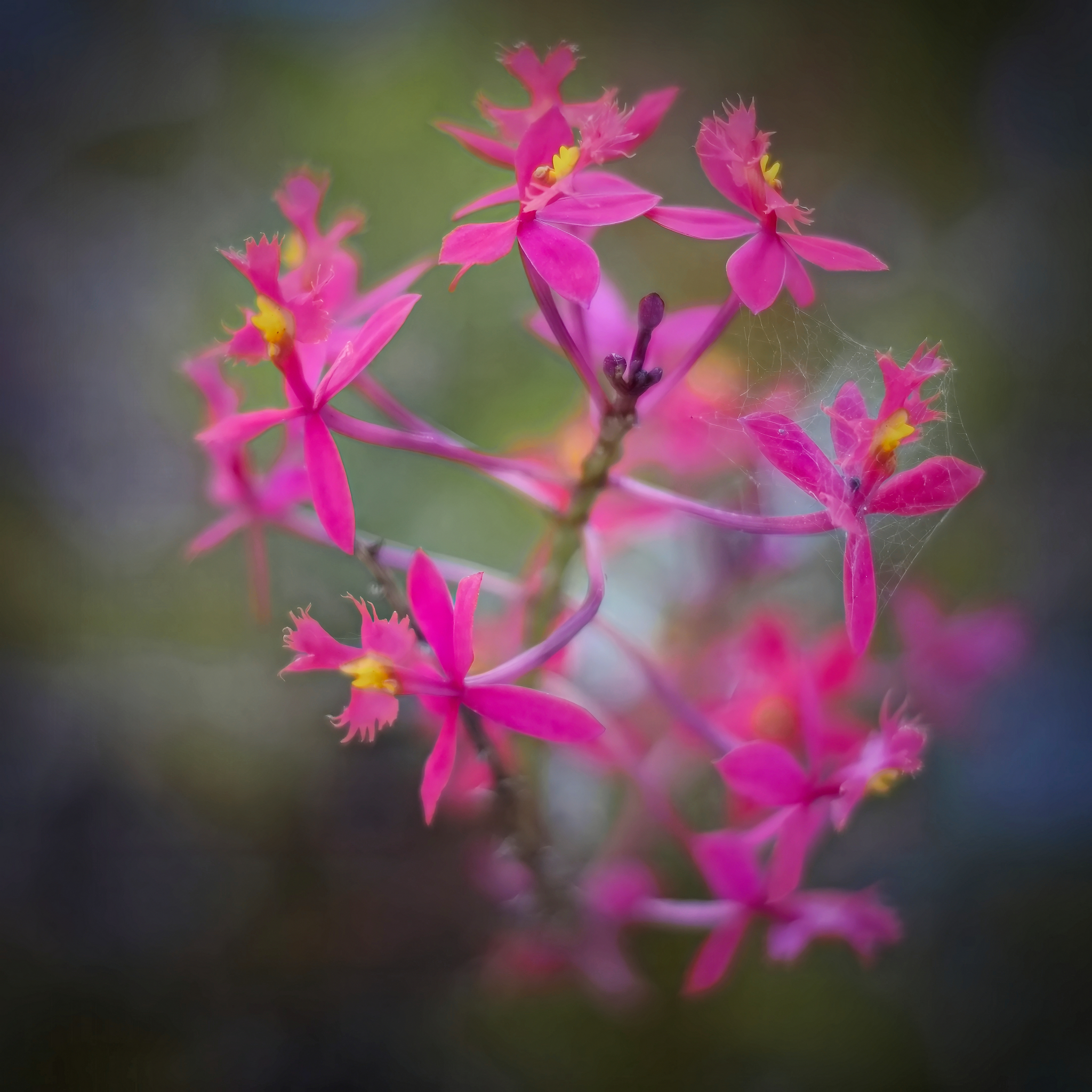
- 14i_Aechmea fasciata What a striking shape and colours. I find this pink and purple plant very impactful, particularly with the jagged edges to the leaves. I feel the central position works well, and is approximately symmetrical within the square crop. I wonder if the amount texture on the leaves is genuine or if the image has been over sharpened. I like the inclusion of the foliage behind the flower, though I note some lighter and whiter areas towards the top left, top centre and bottom left, which would be better toned down to remove distraction. A pretty subject to photograph. Accepted
-
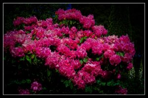
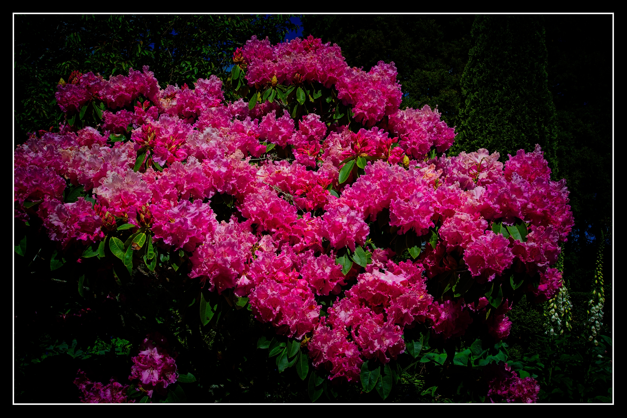
- 15i_Rhododendrum Splash 2 What a stunning display of pink flowers on this rhododendron! I recall fondly the masses of blooms of rhododendrons when we lived in NZ. It’s not something that I notice so much in Northern Ireland though we have one at the end of our driveway and it’s currently in bloom (May). I think the photographer has photographed this well to capture such a distinct bunch together without much distraction. I appreciate that there is a heavy dark vignette around the edge to help bring the viewer’s attention to the flowers, though I feel the photograph would benefit if it could be reduced a little. I note that the lighting is from an overhead position and works well. A superb display of flowers. Accepted
-
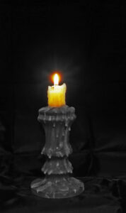
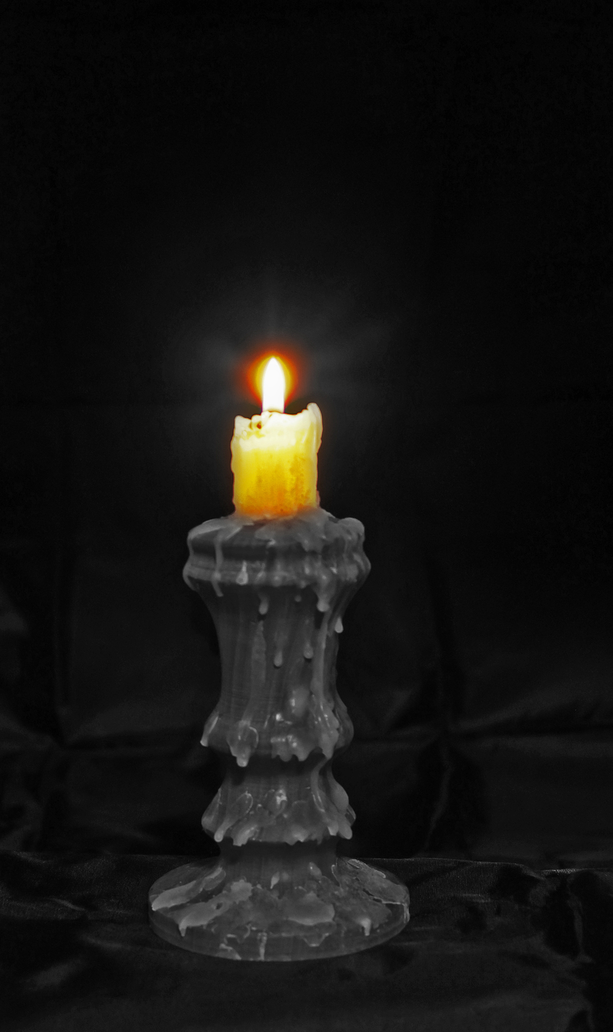
- 16s_Flicker of Light Candlelight which reminds me of the harsh storm we had at the end of January this year where our power was gone for 7 days! I find the colour popping makes the candle a strong focal point and I like how the texture and lines of candle wax work well in black and white against the black background. I note some overexposure in the flame and I think this is to be expected. I know a little off the right side would make it totally central in the frame, though the off set position does work fine too. I don’t know how people managed to do so much by candlelight years ago! Accepted
-

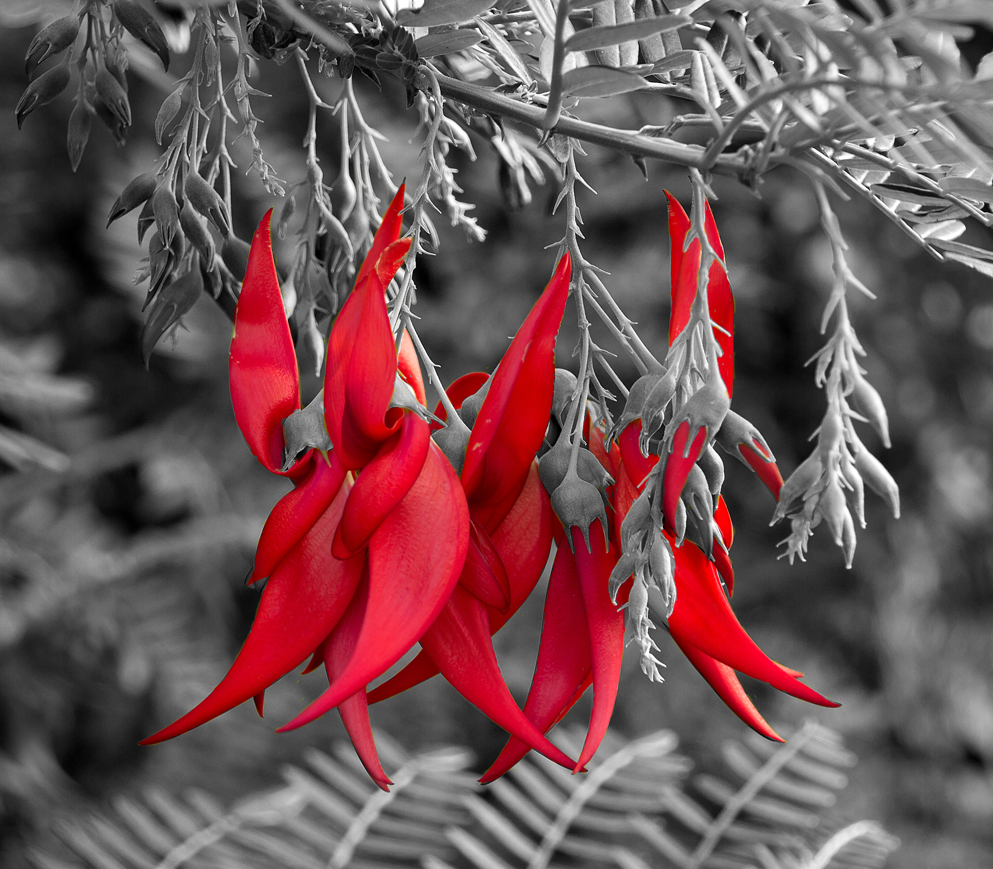
- 17s_Karkarbek A stunning colour on this endangered kakabeak plant so named because of its similarity to a kaka’s pointy beak. I note the use of colour popping again, though I do wonder if the greens in the background would have worked well to provide the complementary colour. I would be interested to see the photograph of just the lower half of this photograph as I feel the balance of the lower flowers with the contrast of the fern shapes at the bottom makes a striking photograph by itself with the strong shapes and linearity. A very striking NZ plant. Accepted
-
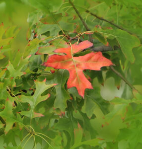
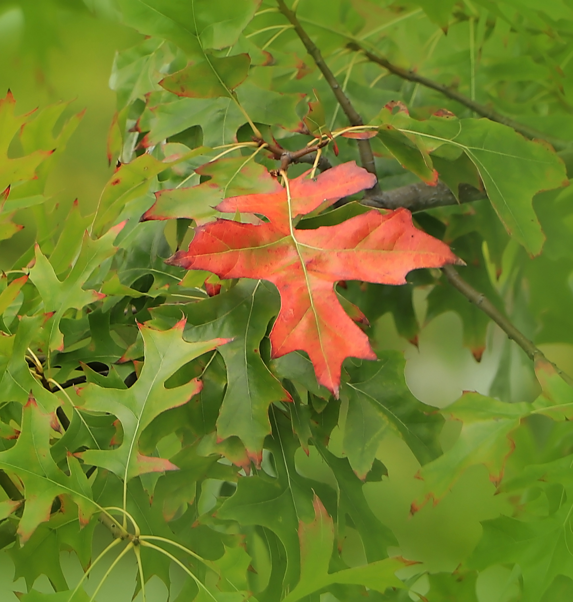
- 18s_One Orange leaf As the title, just one orange leaf. I am attracted to the simplicity of this photograph with the isolated leaf against the all the green. I note a softness to overall image which may be due to camera shake or leaves moving in a breeze. I feel there’s a ‘hole’ in the image, in the lighter area just bottom right of the orange leaf which is a distraction when noticed. The photographer has made a great observation of this scene for the competition topic. Merit
-
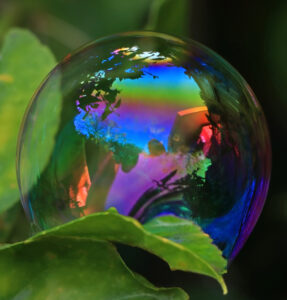
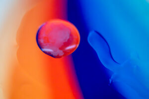
- 19s Reflections in a soap bubble Soap bubbles are hard to work with, so this is a good achievement to get it before it popped. I like how the composition of the bubble sphere within the square crop draws the viewers eye to the main subject. I note the colours within the bubble are diverse and reflect the environment of the garden and house behind. The photographer has been creative and I’m sure there were many bubbles let loose before this photograph was finally captured! Highly commended

-
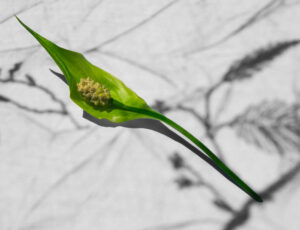
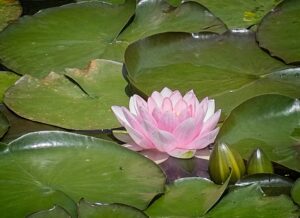
- 20 Peace Lily Peace lilies are lovely plants and this has reminded me that mine haven’t flowered in a while now. I am drawn to the diagonal position of this across the image, in contrast to the background monotone lines which run in the opposite direction. I have been trying to work out if the monotone background is a pattern on a table or background, or if the shadows are created by existing plants in the area. I feel the strong lighting on the subject works well to make the peace lily stand out. I also like how the base of the peace lily intersects with a darker line in the background. A great subject to play with. Highly commended

-
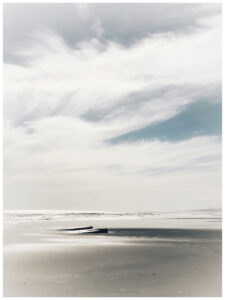
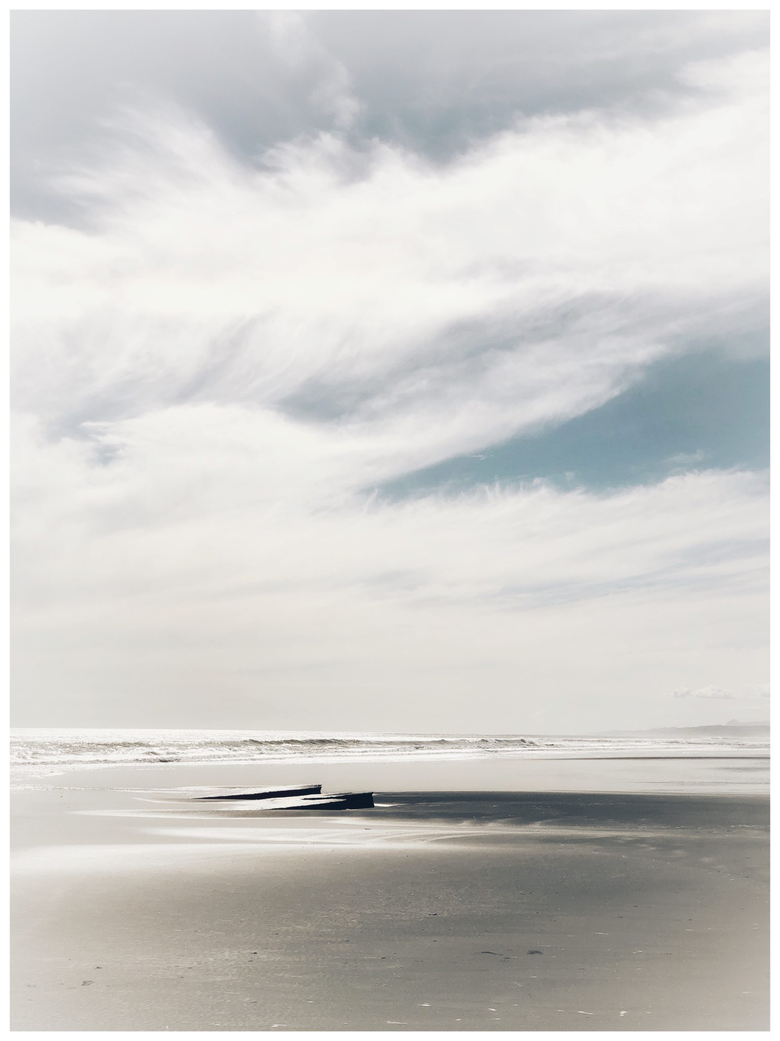
- 21s_Tongaporutu beach A peaceful beach scene with wispy clouds. I am drawn to the muted colour palette on this image with just the hint of blue sky and grey beach. I feel the focal point is the rocks just protruding from the sand and despite their small size within the frame, they hold my attention. I believe there’s a white vignette around the image and I’m not convinced that it’s necessary. It’s hard to beat a walk on the beach! Accepted
-
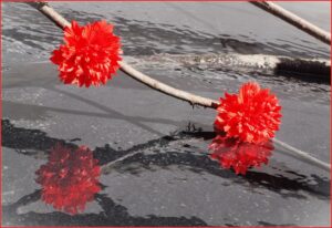
- 22s A splash of red Red is always a dominant colour. I find a number of things pique my curiosity in this photograph, I wonder if the flowers belong to the plant and I wonder if it’s a beach reflection in wet sand, which has created the ‘third’ flower as a reflection. I note that three is a powerful number of elements within a photograph and these three flowers form a strong triangle composition in the image. I don’t think it’s colour popped but the image is more monochromatic in the background than I would expect. I would like to know more about the creation of this image. Accepted
-

- 23s Splash of Green A striking underwater image. I like how we are immersed in the water with the subject and the inclusion of the surface helps the viewer understand that we are just below the surface. I like how the subject’s hands are outstretched and the person is positioned in the lighter area of the photograph and in the top third. I am enjoying how the darker bottom left coral/rocks area, sets the scene for what the snorkeler is looking at and brings viewers the fuller story. I hope the snorkeler and photographer had fun in the water! Honours

-
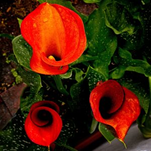
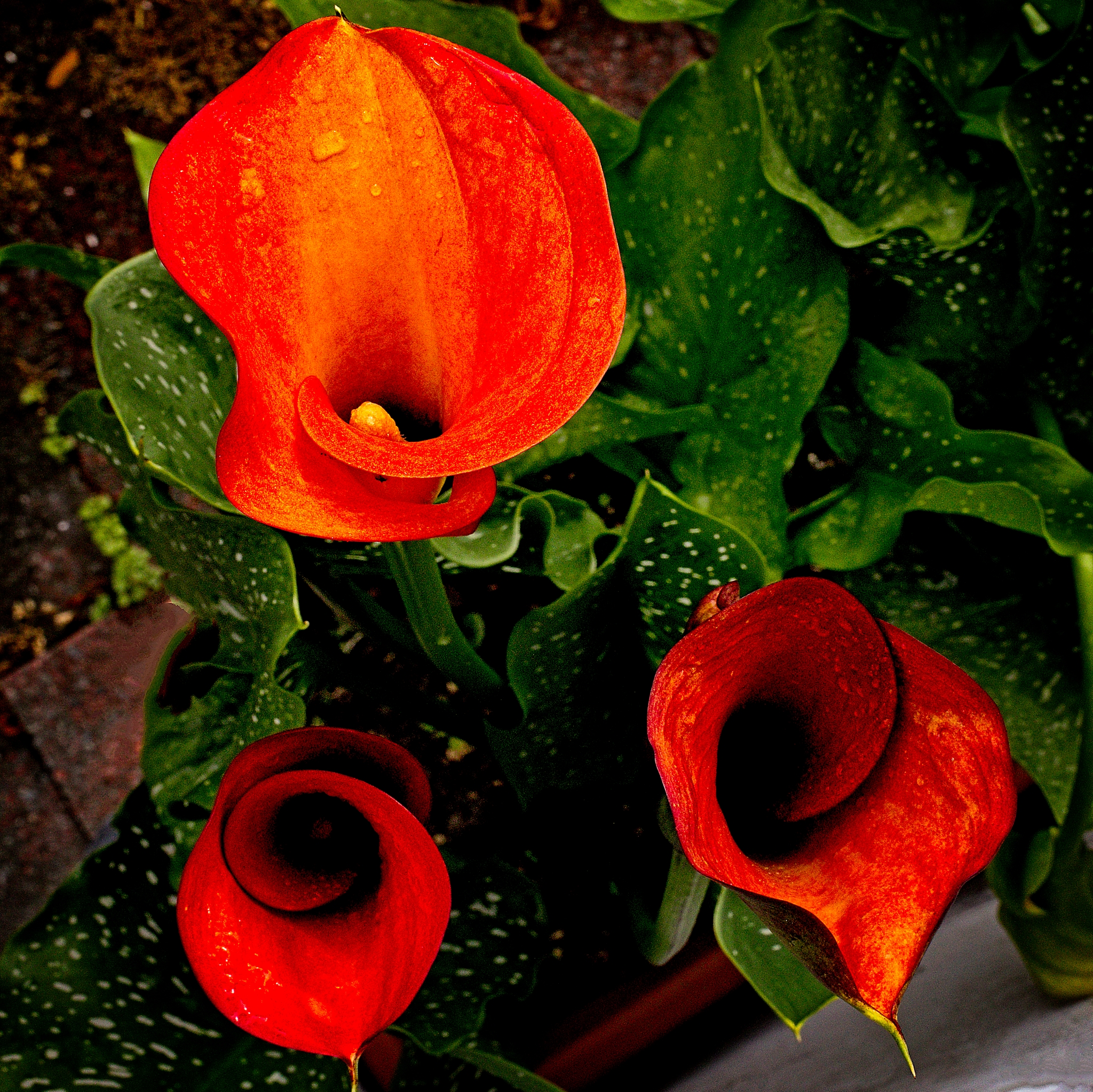
- 24s Calla Lillies Lillies are so wonderful to photograph. The photographer has chosen an overhead view here, to showcase the lovely spiral shapes as well as the bright red colour. I find the strong triangle formed with the three flowers appealing with one flower having more visible contents that the other. I feel the background has distracting elements on the left side and a container/wall along the bottom right and I think the image would be stronger if they were not so visible. A pretty floral arrangement with lots of opportunities for photographs. Accepted
-

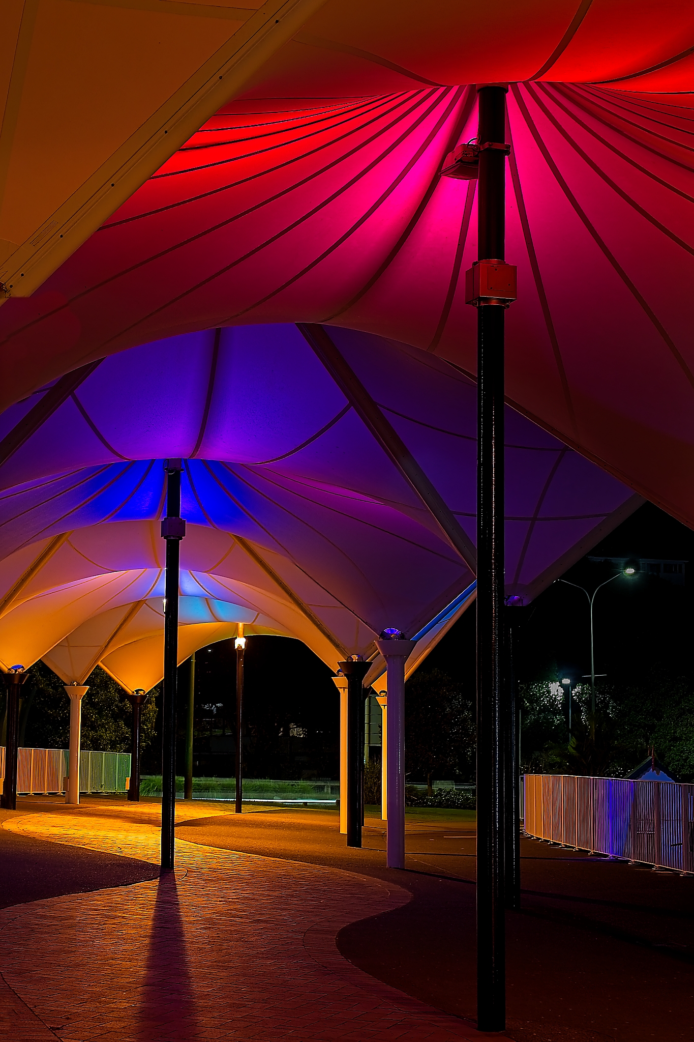
- 25s_ Canopy Colours A cacophony of colours fill this image. I find this very striking with the repetitive canopies, each in their own colours. I note the strong lighting from the back of the image, and cleverly hidden behind an upright, has cast a strong shadow towards the camera. I feel this shadow adds emphasis to the meandering pathway through the canopies and adding interest to the lower part of the photograph. I believe there’s another photograph within this image, if the photographer was to crop off at the base of the canopies just above the light, with a roughly square crop. An interesting photograph of such a simple location perfect for this competition theme with the addition of the coloured lights. Honours
-
- 26s_An almost hidden gem A beautiful water lily peeking out from amongst the leaves. In my opinion, the presence of only one bloom in the centre of all the leaves makes it a strong focal point and a successful composition. I feel the lighting is behind and to the right side of the viewer and this direct light is resulting in a flatter image, when side lighting would have given more texture and contrast, resulting in more depth. I would like to suggest a crop from top left so the flower is not quite so central. I think the two buds peeking up from the right side are also important as they break up the flatness of the leaves. I believe there’s another photograph tighter to the flower and inclusive of the buds within this image. Lots of opportunities within a small area. Accepted

-

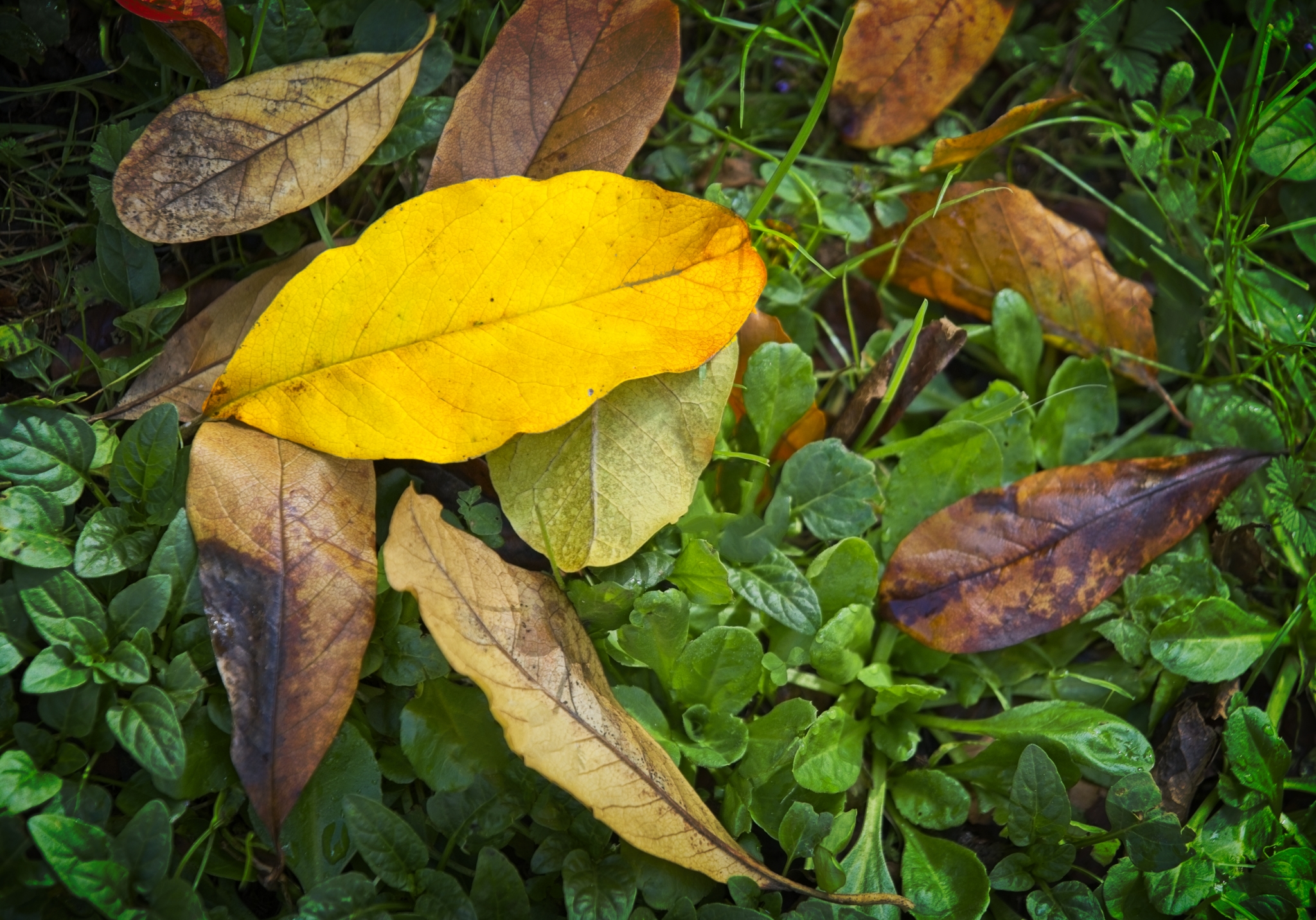
- 27s_An autumn standout I love all the autumnal colours, especially the fallen leaves. I notice how the yellow leaf catches my attention amongst all the other brown leaves in this found still life image. I like how the leaf is at an angle and there’s a repeating leaf on the right side. I would be curious to see this image as a square crop too, to include the bulk of the leaves on the left side. I feel the colours are true and I would like to suggest an increase in contrast or clarity to bring out the texture within the leaves. Enjoy the autumnal colours, we here in the northern hemisphere are enjoying the spring colours. Accepted
-

- 28i _Rainbow bridge Another cacophony of colours created by the lights on a bridge. I feel this is more of an abstract photograph and initially I thought it was more of an intentional camera movement image but I now think the lights are beaming across a wider area. I note the presence of a person on the left side near the blue area which I feel gives scale to the bridge. I see overexposure in some lights which presumably point towards the camera, and may be unavoidable even with a faster shutter speed. A worthy subject for this competition. Accepted

-

- 29i Spanish dancers What gorgeous pink flowers, which indeed look like Spanish dancers as per the title. I note a softness in the sharpness which will be due to the photographer’s choice of aperture, though it does give the background a lovely bokeh. I feel the inclusion of some spiders web on one flower adds interest to the composition. I’d love to know the proper name of this plant. Accepted
-
- 30s A splash of colour_2 Literally a splash in this case! I like the photographer’s use of a fast shutter speed to capture the bubbling water, surrounded by the underlying colours. I note the background has a selection of bright colours too. I feel the composition works well with the position of the top droplet as a focal point. A lovely capture of the water intermingled with colours throughout. Honours

-

- 31s A splash of colour Wow, this image has a lot of impact for something so simple! I am really enjoying the vibrant colours within the flower and then extended to the left side. I feel it’s a zoom burst photograph taken with a zoom lens and extended as the photograph was taken. I think it’s been very effective and the colours in the background will be due to foliage and other flowers. I note the sharpness in the centre of the flower. I do appreciate this could also be created within some editing software too. Regardless of how it was created, I feel it is a stunning photograph and very representative of the topic. Honours
-

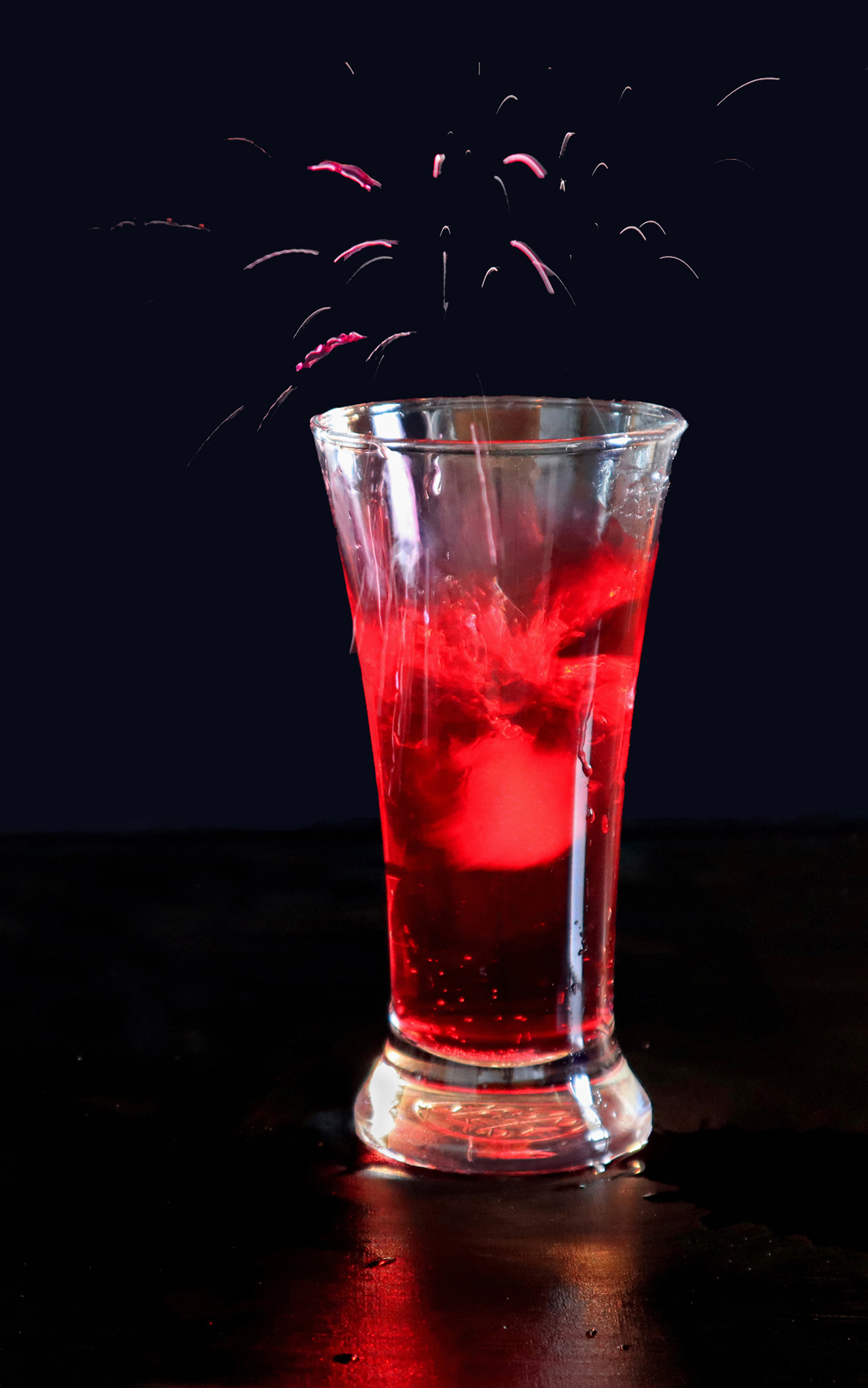
- 32s A splash of colour This makes me feel thirsty! I think it looks like fireworks in a drink, with red such a dominant colour in this composition. I feel this is a nicely thought out photograph and is a play on the word splash as well. I find the simplicity of the composition with the black background and side lighting very effective. Thirsty work all this photography and judging! Highly commended
-
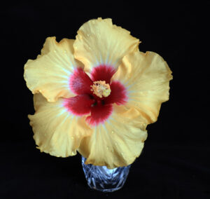
- 33s – Yellow Beauty Warming colours in this lovely flower. I feel this front lit photograph has represented the flower nicely, showcasing the warm yellow and red colours and sharpness across the face of it. I like how the addition of droplets make it feel fresher. In my opinion, the glass vase takes away from the image, partly due to its rigid structure in contrast to the soft undulating flowers, and an odd perspective in size, but mostly I feel due to the cold tones of the blue/grey glass. I wonder if a warmer coloured and smoother faced vase would have complemented it better. I feel the black background encourages the flower to bloom in front of the viewer. I would like to see it more central in the frame by cropping off some of the right side. This is a great subject to take photographs of. Accepted
