Judged by Jill Cliffe
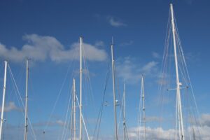
- 1) Sail into the Heavens This is not your usual perspective of yachts, by excluding the boats and including only the masts, the image is more about the lines and the sky than the boats themselves. Technically the exposure is good, and the image is nice and sharp. I am a little bit hesitant about the mast on the far left, when viewing the image. For me, this mast is a little bit too close to the edge of the frame and I would suggest cropping in a little bit to remove it. Aside from this the image is a nice and I like the artistic twist the photographer has put into the image. Merit
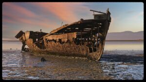
- 2) Janie Seddon This image has lovely colour tones with beautiful golden light on the side of the boat. The colours in the sky are lovely and the detail across the whole of the boat is also nice. My only reservation is that I do find the foreground a little unattractive and I think the image could be simplified, if there was water in the foreground. Water in this space would have softened the image overall. The boat is positioned very well in the frame, and I like that there is space in front of the boat for the boat to move into, even though the boat can no longer move. The horizon is very central in the frame, however in this case I think this works. Overall, this is a lovely photo. Highly commended.
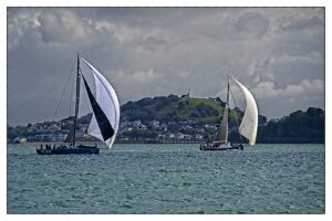
- 3) They are Racing. There is a lot of detail in this image. I like the way the wind is fulling out the sails on both yachts, this makes the image very dynamic and adds to the atmosphere. The clouds have lots of detail and drama in them which is also good. There is a fair amount of detail in the land mass in the background, which I do find a little distracting, and for me it is a bit of a shame that the boats are not a little better isolated from the background. This may have been achieved by using a shallower depth of field or been closer to the subject and using a wider-angle lens, or by panning at the same speed as the boats are moving. Panning would make the background and foreground water more blurred and softer, while still keeping the boats sharp. Compositionally, the boats are well placed, and I like that there is space for them to move into on the right-hand side of the image. Merit.
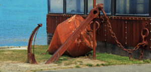
- 4) Landlocked Anchor. There is nice detail in this image. The rusty colours on the anchor contrast beautifully with the blues and greens. I think the subject itself is very nice. I do find the angled bit of concrete in the foreground distracting, however removing this now would be difficult, short of cloning this out. This is something to consider when framing an image, move around the subject to determine the best angle, and look into the edges and corners of the frame, then frame the subject to remove or minimise any distractions as much as possible. I believe that there may have been some cloning or something done to the water on the top left, as there is a blurred effect in both the water and on the edge of the building. While I do not mind photo manipulation, it is important that this is done in a way that it is not visible. I do think the colour tones are genuinely nice, and overall, the image has been well exposed and well captured. Merit
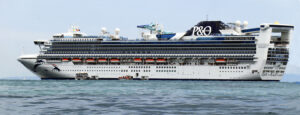
- 5) Nautical on a Grand Scale. This is a good capture of this cruise liner. The long narrow almost panoramic crop suits the subject nicely, resulting in not too much negative space in the foreground or in the sky. There is nice detail in the boat and there is space for the boat to move into. I believe the image has been taken from quite close to water level which gives quite a nice effect. There is not much I can fault with the image, however does it jump out and grab me, not really? It is a nice capture of what may be the photographer’s holiday home and would be a great reminder to the photographer of what was probably an amazing trip. This said, it is still a nice photo that from a technical aspect I cannot fault. Highly commended.
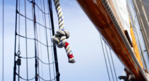
- 6) Sailing Ship Knot This image is very creative, by picking on this very small detail of the boat and letting all other aspects of the boat become soft, works very well. The knot itself is lovely and sharp and well positioned in the frame. There is a leading line that draws the eye down to the bottom right corner and because there is nothing there, my eye then travels back up to the knot. My only suggestion on improvement would have been for the photographer to position themself so that the knot is isolated from the rigging in the background. I do like the rigging and would not want this removed, just moved to the left a little. Because the rigging crosses behind the knot it does not make the knot as bold as it could be. This said the image is highly creative and the subject was well seen and captured. Highly Commended.
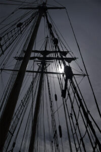
- 7) Rigging silhouette. This is an interesting image that uses light and dark to create a photograph that is more about lines than it is about the mast of the ship. The image is intentionally under exposed, which I assume has been done to reduce the impact that the sun has in the frame. I think this works well, as it means the sun and the area around it, are not completely blown out. The image is very artistic, and I like the way the lines all lead up to the top of the mast, creating lots of triangles. Overall, a very well captured image that is a little bit different. Highly commended
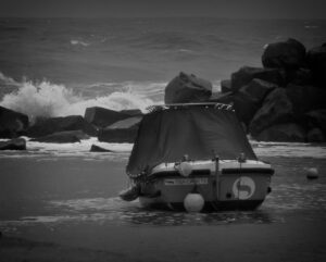
- 8) Waiting This image has quite a depressing feeling to it. This is due to the dull greys and the way the boat is all covered up. It is certainly very sombre. Initially I thought the boat was sitting in water, however on closer inspection, I believe that the boat is sitting on sand. I would suggest cropping the bottom of the image to remove some of the foreground sand. Doing this may strengthen the feeling of the boat floating more. The title is good and suits the subject well. I like how rough and angry the water appears and the darkness of the rocks that separate the boat from the sea. The image has emotion and speaks to you, so works well. Highly Commended
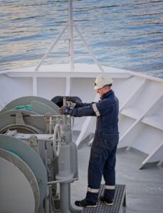
- 9) Checking This is a nice image. It’s been well captured and very well composed. I like the way the subject is positioned in the frame and the light on the ocean is very nice. I did wonder if the image needed quite so much space above the subject, however cropping into the mast at the front of the boat would cut through the triangle which would not be good, as this is needed in the frame. Ideally, I think it would be nice if the subject was turned slightly toward the camera, or was more animated, however there is lovely light on the subject himself and overall, the image is very good. Highly commended
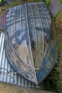
- 10) Scaly bottom. This image had me twisting my head in all sorts of directions to try and figure out exactly how this boat was sitting, and whether the photographer was standing above the subject or if it is just that the image has been rotated, so that instead of the boat looking like it’s leaning against the fence on the grass, it is standing on its nose. I’m not sure if this works very well, as the image does make me want to twist my head to view it. There is nice detail on the boat with the cracked paint and I think getting closer to this detail with a wide-angle lens and allowing the lines on the boats bottom to become leading lines would have made the subject much more dynamic. Merit
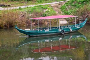
- 11) River Taxi. There is a nice reflection in this image with the reflection itself being almost as sharp as the boat. Unfortunately, this image is not quite sharp and there is some movement, especially in the canopy of the boat. The background is also distracting to me and unattractive, although I realise that this adds to the image in terms of what the environment was like. I think that zooming in on the area near the tyre and eliminating some of the background may have helped improve the image. Maybe adding a vignette and softening the background somehow, would help the viewers eye to stay on the boat a little more. Merit
- 12) Rescue Ready. I really like this image, it’s nice and artistic and I like the use of colour. I assume that the brick wall has had the colour taken out of it to make it black and white, if so, this has been very well done, the bright orange against the greys and blacks of the brick wall make the life buoy really pop. The buoy is nice and sharp and well positioned in the frame and I like the angles and lines of the bricks. Very nice. Honours.
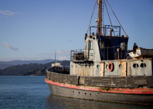
- 13) Wellington Harbour Sentinel There is lovely light in this image, and it appears that this was shot either late or early in the day, when the light from the sun is low, this has lit the side of the boat very nicely. Compositionally I think the positioning of the boat in the frame is good and I like that the boat is facing out toward the open water and headland. I think it tells a little bit of a story of a boat that is waiting to get out on the ocean. There are some quite dark areas and some of the detail is lost, especially on the cabin area. I also think it’s a little bit of a shame that there is a white building right at the front of the boat, as your eye does get pulled into the space. Other than this the image is good and due to the light, it has a nice feeling to it. Highly Commended.
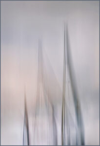
- 14) Masts You either love or you hate intentional camera movement. Personally, I’m a fan. Without the title I could not guarantee that I would know that this image is an image of masts. There is a nice amount of movement and lovely colour tones especially the pinkish area on the lower left third, this gives a lovely painterly effect, and I like the way the masts are positioned within the frame and there is a nice amount of space at the top of the image. I think the image works very well and has a lovely soft palette. Highly Commended
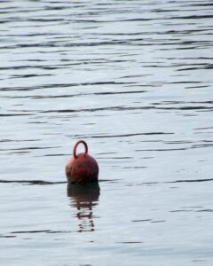
- 15) Mooring Marker. I like the composition and the way the buoy is well positioned in the lower third with a lot of negative space in the upper 2 thirds. This adds a sense of space to the image. I also like this simplicity. I do find the shadow below the buoy, and some of the shadows in the water just a little dark, so I would possibly suggest lifting the exposure in the shadows a little. This is a simple image that is well composed and well photographed. Highly Commended
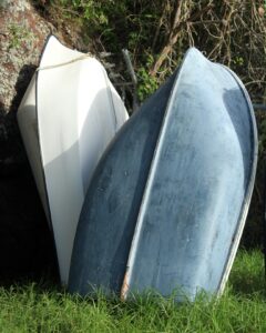
- 16) Tenders There are nice angles and lines in this image. I like the way that the dinghy on the right is positioned and the angle of the spine on the boat, and how it runs through the image. I also like the blue colour tones on the same dinghy, this colour contrasts nicely with the grass in the foreground. I do however find the background at the top a little distracting and wonder if a tighter crop, darkening, or blurring this space would help to remove this distraction. I also think the crop is a tiny bit tight on the right-hand side, and a little bit of extra space here would better balance the image. This is still a nice image that has been pretty well composed, is nice and sharp and has good exposure. Merit.
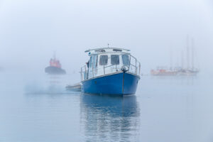
- 17) Arriving Home. This image has beautiful atmosphere and tells a lovely story, the blue colour tones through the whole image blend nicely with the blue hull of the boat. I like the boats in the background with their hint of red. This adds a bit of contrast into what is otherwise a very blue scene, I also like that they are not sharp. I think this is a beautiful photo that has great composition, exposure, and atmosphere. Honours – Winner
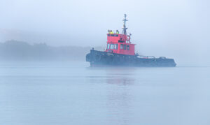
- 18) Tug in the Fog This image also has lovely atmosphere with the early morning mist coming off the water. There are lovely blue tones in the water and hills and the red of the boat stands out nicely. I’m not sure that quite so much of the foreground is needed in the image, however it does position the boat nicely in the upper third. The exposure is good, and the image is nice and sharp. Highly Commended
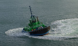
- 19) Tug in a Spin There is nice drama in this image, and it is very well cropped. Due to the white water, you can tell that the tug has just come out of, or is still in a spin, this adds drama and a story to the image. There are no other distractions in the background which has made this tug a hero in the shot. I can’t fault this image. Is it a beautiful piece of art, probably not, however it is a nice moment in time and has been excellently captured by the photographer. Honours
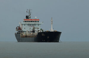
- 20) Anchored This is a nice capture of this vessel. It is positioned nicely in the frame, and I like that the horizon is down on the lower third. The image is quite static with very little movement. Due to the weather, which appears to be a heavy grey day, the image has a bit of a sombre feeling. I think this is mainly due to the brown tones in the water. Technically the composition and exposure are very good, and while I can’t fault the image at all, the conditions at the time of capture have made the sky and water a little flat. Highly Commended
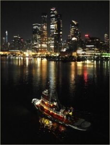
- 21) Tugboat M welcomes U 2 NYC This is a very well captured image. The position of the tugboat in the foreground with the city in the background is great. The lights across the water from both the city and the tugboat are lovely. I’m not sure that it is 100% sharp, however I assume that it was taken from a moving ship and that the tug was also moving, so this tiny amount of movement is expected, and does not distract from the scene. I think the background would also work if there was more blur, as the image also looks good without my glasses on. Very well done. Honours
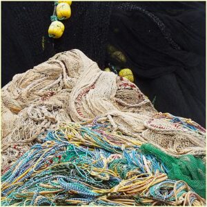
- 22) Mount Fishmore This image has a very creative and appropriate title. There’s lovely detail in this mountain of nets and ropes, and if you squint a little the pile really does look like a mountain. My only suggestion on improvement would be to remove the buoys that are just touching the side of the nets. I do find my eye keeps going to this space and believe that if this area was empty, there would be a nice smooth clear line down the side of the pile of nets, strengthening the feeling of the mountain. This said I still think this has been well seen and I love the creativity, not only in the image, but also in in the title. Highly commended
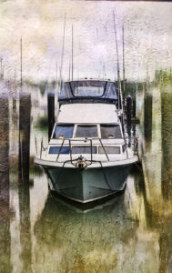
- 23) My Dream Boat I like that the photographer has taken the time to work on this image, adding his/her artistic expression. This has made the image into more of an art piece. For me photography is all about capturing beauty and making art out of it. By capturing an everyday moment, or subject, and turning it into an art piece is very much something I love to do. I think the boat has been very well positioned in the frame and I like the way the mooring posts have framed the boat. I do find the dark strip at the top edge distracting, and I would suggest cloning or cropping that out. I also wonder if having a little bit more of the artistic filter on the boat itself, may help it blend better with the background. As the image is, I do feel like the boat contrasts a little too strongly with the surroundings, however I do think the title of the image suits the subject very well and I like that the photographer has put their own artistic flare on the image. Highly commended.
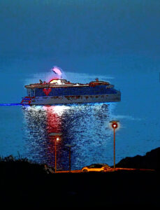
- 24) Spaceship. This is another image that has been heavily manipulated in post processing and has some sort of filter applied. It is an interesting image to look at. Does it work for me? I’m not sure that it does, but I do like the artistic flare. I do wonder if the composition is just a little bit off and I would suggest cropping some of the solid black from the bottom, and maybe even a little bit from the top, to make the image squarer. I do find the artistic effect a little too strong, especially on the steam coming out of the boat. It is not my place to say that anyone’s artistic expression is right or wrong, it just comes down to what the photographer/artist likes. And I like that the photographer has taken the time to do something with the photograph to make it a piece of art that they are happy with. Merit
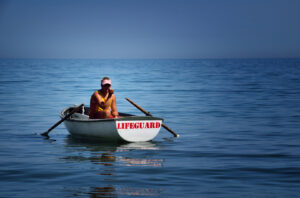
- 25) Ready to go. This image has me perplexed. It seems completely out of place to have a lifeguard sitting in a dinghy stationary in the middle of the sea. This is not to say that this is bad, in fact the strangeness in the scene adds to the image. I think the composition is very good and I like where the boat is positioned in the frame. The colour tones are very nice, and the image is nice and sharp. I do find some of the shadows a little bit too dark, especially the shadow on the lifeguards’ face. I would have loved to have been able to see just a little bit of detail in the face. However, from another aspect having the face in the shadow does add a bit of mystery. I really like the image. I think it’s very cool and just a little different. Honours – Runner-up
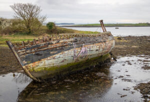
- 26) Nautical Past This looks like a very cool subject, and I like the way the boat is positioned in the frame. However, I find the background distracting, and it is hard to see a clear separation between the hull of the boat and the land in the background. Shooting from a different angle so that water was behind the boat, waiting till the tide was further in so that the boat had water surrounding it, using a shallower depth of field so the background was not quite so sharp, getting closer or lower and using a wider-angle lens may all have helped to get the separation that is needed. This said I do think the subject is very cool and I think that an amazing image may be hidden in this scene. From a technical aspect the boat is positioned very well, the exposure is good, and the horizon is nicely situated on the top third. Merit
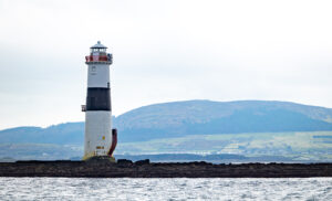
- 27) Show the way. Compositionally this image is very strong. The lighthouse is placed perfectly in the frame, the horizon is nice and low and the rock formation that the Lighthouse is sitting on is horizontal in the frame, all of which are great. I think the only thing that lets the image down is the atmospheric conditions at the time of capture. This has made the background and sky a little flat. Using a polarised filter at the time of capture may have helped make the background pop more. For the image as it is, adding a little bit of dehaze and contrast in post processing would help make the landmass in the background less flat. Other than that, I think the image is good and has been very well composed. Merit
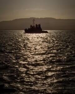
- 28) Coming back at the golden hour. This image is very dark. I assume that this has been done intentionally to suit the photographer’s preference and to create a silhouette without having too much light on the water. I’m not sure what type of boat this is, possibly a small naval vessel, but it certainly looks like an interesting one. The boat is positioned very well in the frame and within the light of the sun. The light on the water leads the viewers eye directly to the boat, and then up to the hills in the background, which is good. I do wonder if the image is just a little bit under exposed and whether lifting the exposure in the shadows may bring out some of the detail in the solid black boat and lift the dark edges of the image. This said I like the atmosphere within the image, and I believe that’s probably what the photographer was aiming for. Highly Commended
- 29) Ocean Globe Race There’s lots to look at in this image. I like the panoramic crop that has been chosen, this suits the subject very well. I do find the background a little bit distracting with what appears to be a Marina behind the yachts. The masts from those boats do distract the eye a little bit from the yachts in the foreground. I think the yachts themselves are lovely and wonder if panning at the same speed as the yachts may have removed some of the background distractions, while keeping the yachts sharp. That said I still think this is very well captured. The composition is very good with the boats low in the image. Highly Commended
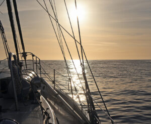
- This is a nice image to finish with. It has a lovely feeling, and you can almost imagine yourself sitting on the boat looking out to the horizon in the evening. Compositionally I think the image is very strong and while the sun is very bright, it does add to the atmosphere and feeling in the image. There are lovely details in the boat, and the cables and ropes have created nice angles across the scene. I do find the ropes that are close to the left edge, with some sort of pulley on it, and a small rope sticking into the image a little bit distracting as my eye does keep going to that space. I would suggest seeing if cropping in to remove this would help. Or maybe cloning out the busiest area to simplify this edge. Other than that, I think the image is beautiful and has a lovely atmosphere. Highly commended.
