Skip to content
-

-
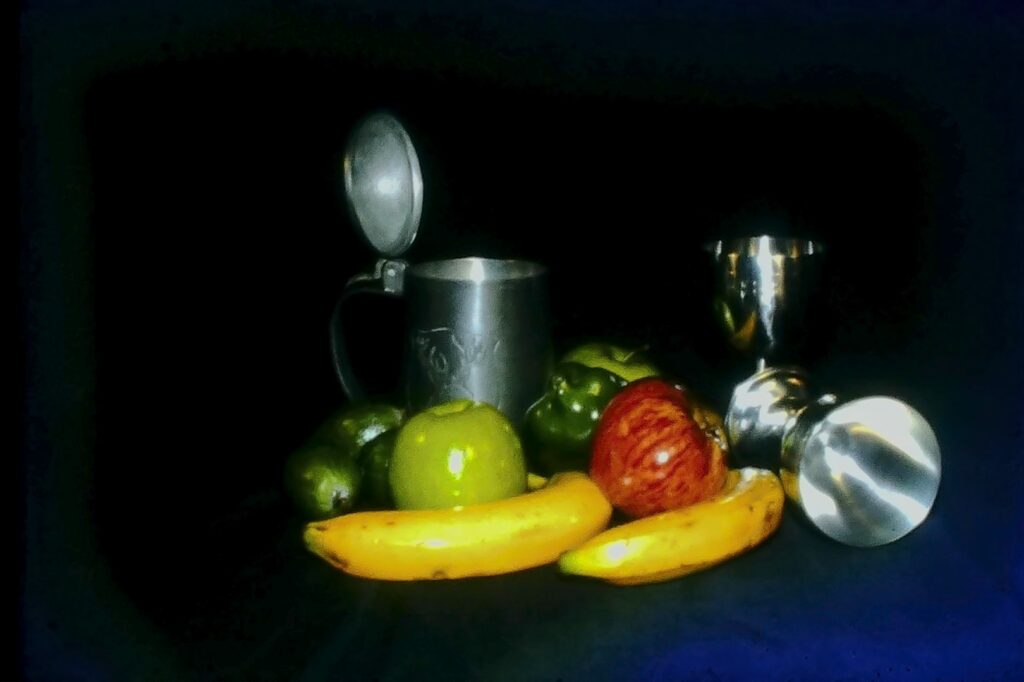
01i – REMBRANDT LIGHTING STUDY – ACCEPTED.
The Rembrandt style technique of the strong contrast between light and shadow is apparent here. The subjects are nicely grouped and composed, bold colours and depth. I think a crop off the left side would help balance it by bringing the subjects more into the frame. My eye is drawn to that very dark area first. Overall I felt the grainy technique was not quite as well done as it could be; it seems to me more of a blur and I find the hotspots on the objects rather distracting.
-

-
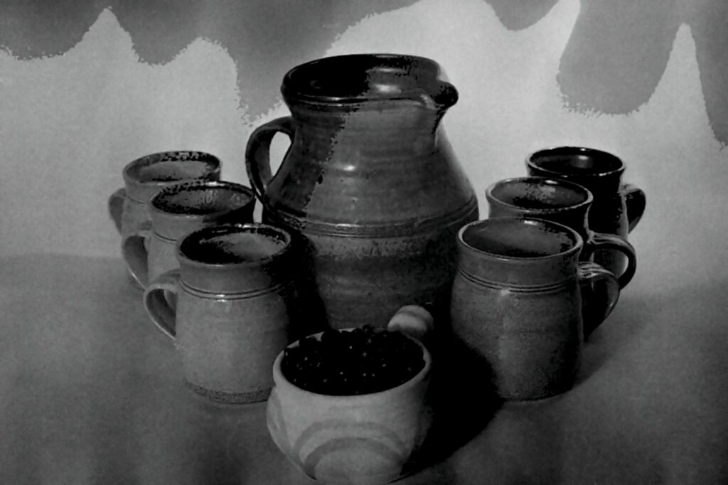
02i – COFFEE TIME – MERIT.
The arrangement of the coffee set as a triangle has worked well to keep the eye moving around and on this area. Good lighting with nice modelling on them but I find the background rather distracting taking my eye there first. I think to make it more of this style it needs to be darker with a bit stronger light on the subjects to help them pop and bring out more grain on that pottery, especially the cup in front, I would like to see more detail on what is in there.
-

-
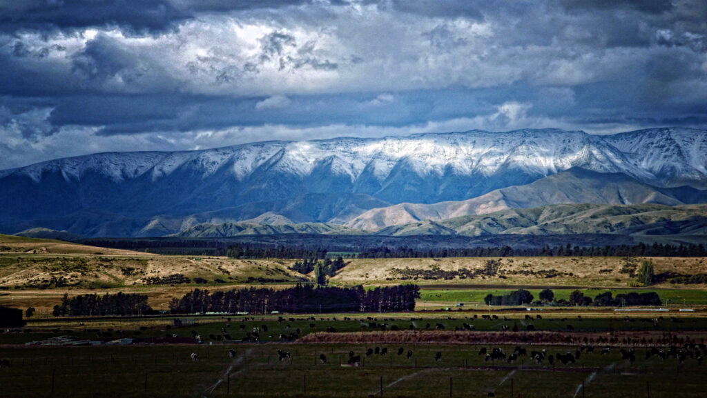
03i – SOUTHERN RANGE – HONOURS.
I think this has captured Rembrandt’s landscape style rather well, I particularly enjoy the three horizontal panels that make up a balanced composition, the dark foreground, lighter middle ground and the dramatic sky. A punchy capture with good depth, strong contrast and lighting which covers the set subject. It looks like a painting. Very well done.
-

-
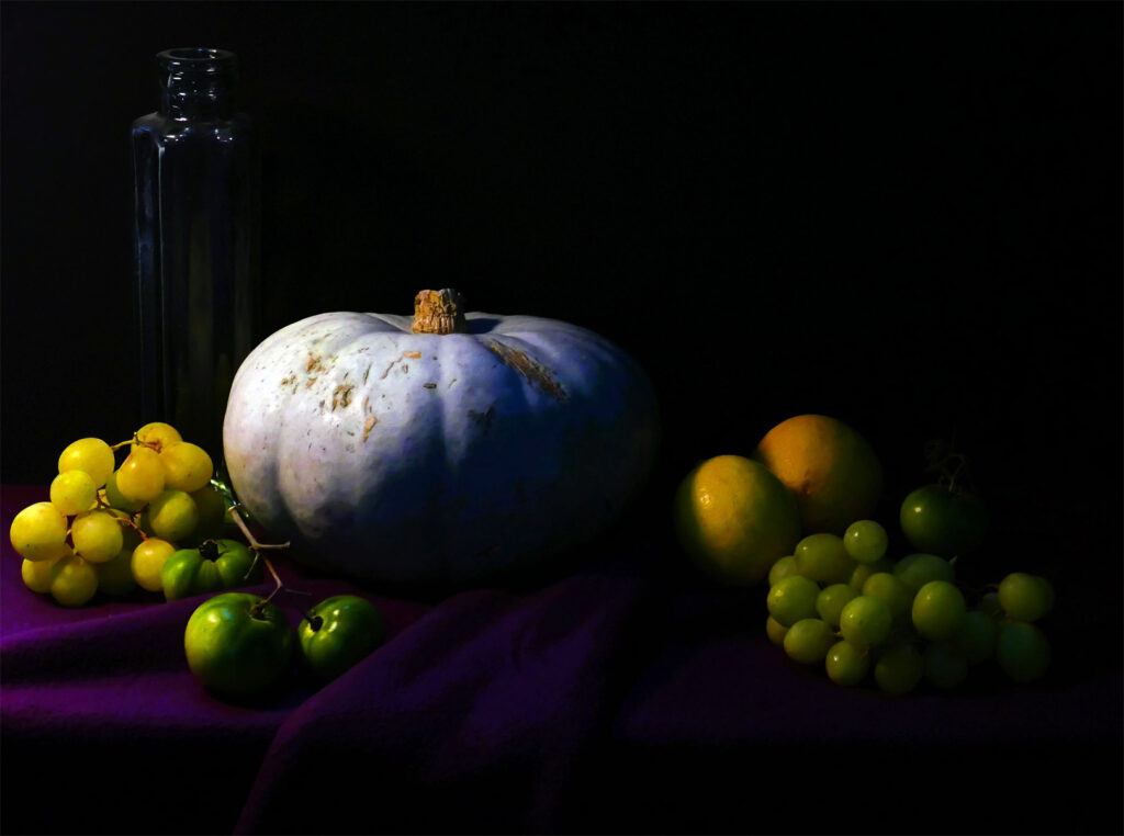
04s – WINTER’S BOUNTY – HIGHLY COMMENDED.
The strong contrast between the darks and the lights have been well done here in true Rembrandt style. Great side lighting and depth, love the sharp detail and vibrant colours. The hint of light on the glass top left acts as a good counterpoint. A nicely balanced composition that works quite well, however, I would like to see a bit more room on the left as the grapes are quite bright and close to the edge which creates some visual tension and takes my eye out there.
-

-
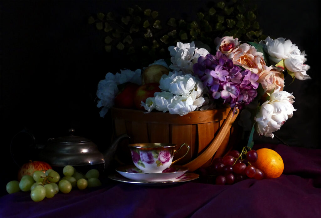
05s – TIME FOR TEA – HONOURS.
I like how all of the elements have been arranged in a pleasing diagonal from corner to corner, with that hint of subtle background detail at the top to help keep the eye in this clever study. Sharp detail, vibrant colours, great lighting, depth and contrast help this image to pop well in this style. I love the elegance of this capture.
-

-
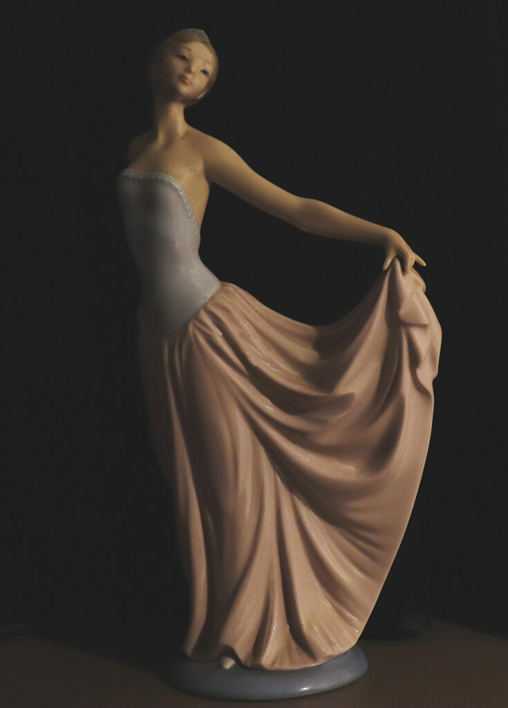
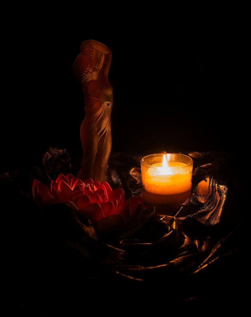
06s – GRACEFUL DANCER – HIGHLY COMMENDED
The contrast between the lights and darks is imparting a nice feel in this image with the side lighting bringing out good modelling and depth on the dancer. It’s rather tricky photographing someone else’s art but I feel the author has made it their own with the softer more muted Rembrandt style treatment here. For me the crop feels a bit tight at the base, I would like to see a bit more room there.
-

-
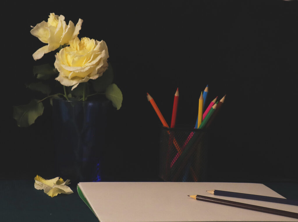
07s – THE SKETCHING – MERIT
I enjoy the detail and lighting on these subjects, the colour palette is vibrant and eye catching with good depth and contrast in adherence with the style. I did wonder if you needed so much of the sketchpad? I find it rather distracting and draws my eye first. There is not much interest there for me. I suggest cropping half of it out and try toning it down to help balance the lighting, that may strengthen the composition in my opinion.
-

-
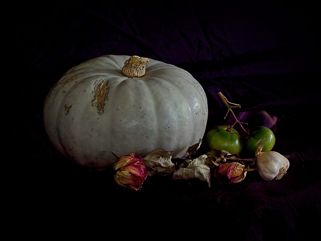
08s – VEGETABLE MIX – HONOURS
The subjects are well balanced in the frame, centre stage and well lit, nice punchy feel to them with good sharpness, contrast and detail. The dark, background has enough visible detail and supports them nicely. The style has been very well captured. Nothing I would change here.
-

-
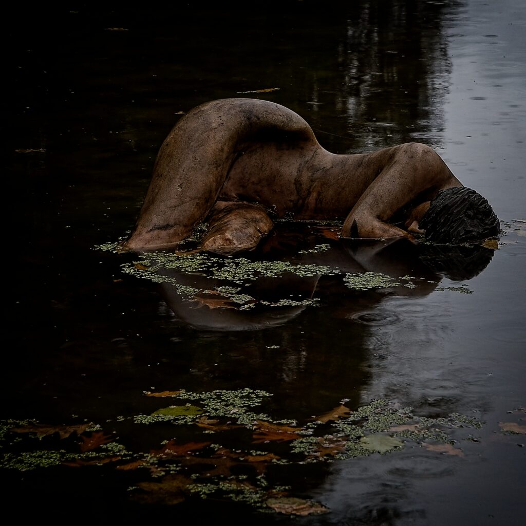
09s – STATUESQUE – HIGHLY COMMENDED.
I find the poignancy of this capture appealing with the detail of the raindrops adding interest for me. The style is quite well captured, sombre with the hint of colour on the statue and waterweeds giving a little pop. Good contrast, depth and detail in the subject. I think that cropping the waterweeds off the base would bring the subject more strongly into the frame. I find my eyes going between the two lots of weeds and I don’t think you need the bottom ones there.
-

-
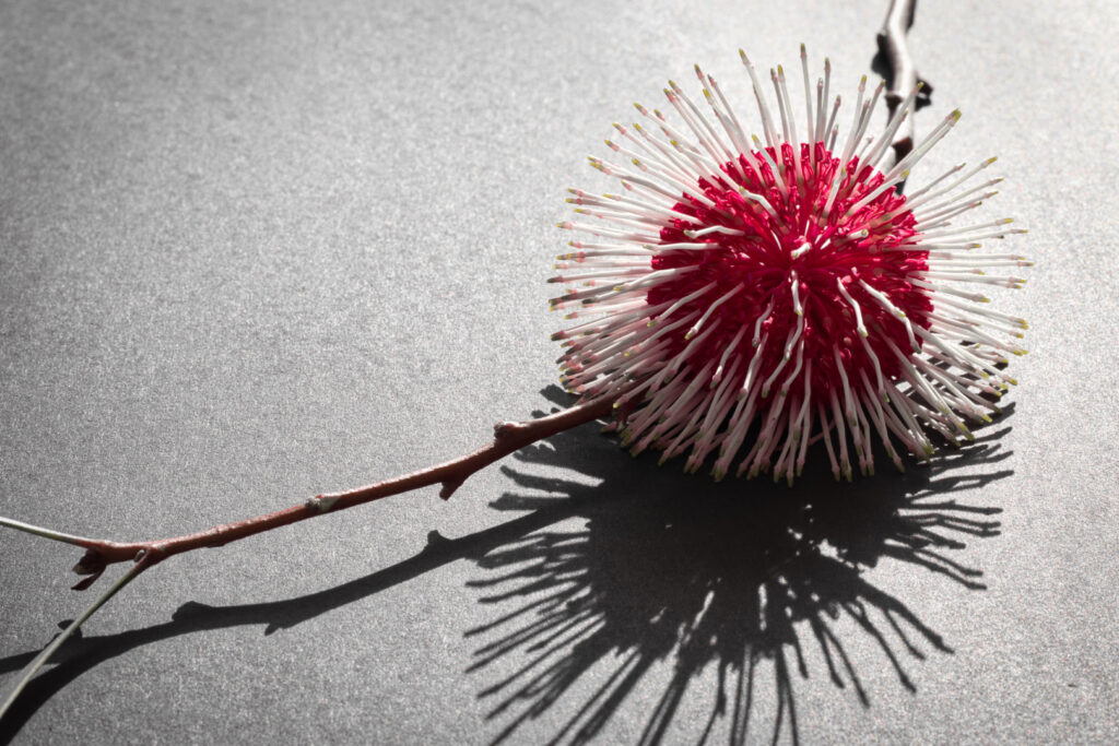
10s – POMPOM LAUREL – MERIT.
I like the striking colours in the flower ball, it adds a nice pop of colour along with good depth and sharpness, lovely detail. The diagonal line from corner to corner is a strong composition adding pleasing a sense of flow through the image. I feel that to make this more in the style, a stronger contrast between the shadows and lights by darkening the background could add some punch and help that flower really and out.
-

-
11s – SHREK’S FORGE – MERIT
The side lighting has worked quite well here to add punch and mood to this capture. It has brought out nice modelling and depth on Shrek and the dark background adds to the Rembrandt style. I do find the ‘forge’ area bottom right very bright with some distracting hotspots; I suggest toning it down to help balance the lighting, bring in more detail and strengthen the style.
-

-
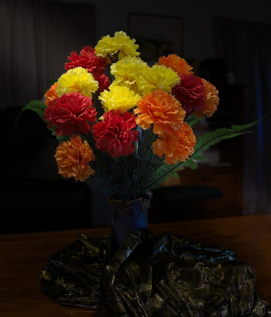
12s – AUTUMN COLOURS – HIGHLY COMMENDED
These sharply detailed flowers stand out, their vibrant colours are brought out by the lovely lighting supported by the dark background. They are composed strongly in the frame. I like the curve of the leaf on the right adding a good counterpoint to the composition. The detail and depth in that foreground material is pleasing though I think it would work better if the whole table had been covered in it in my view. Give it a try.
-

-
13s – NO TITLE – HONOURS
I find this a great example of the Rembrandt style. Strong contrast with a dark moody feel and then the beautifully lit subjects arranged in a balanced composition with the lighting adding great depth and detail and drawing the eye. I really enjoy this study. Nicely done.
-

-
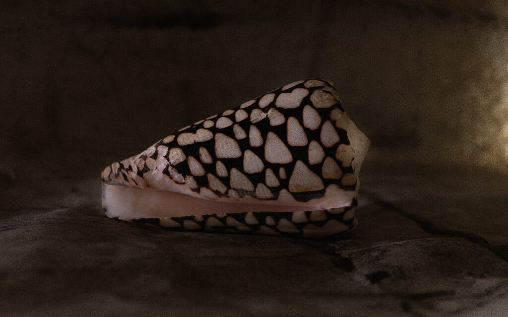
14s – CONUS MARMOREUS SHELL – MERIT
A beautiful shell and quite well captured in the style. The lighting is adding some modelling and nice detail. I like how it is arranged to see the lovely soft pink inside. I do find the central composition a bit static and I think cropping some off the right side to bring it more onto the right third may improve it. Try bringing up the whites on the shell to add contrast and help it pop out more. Nice, subtle detail of what it is sitting on adds to this capture.
-

-
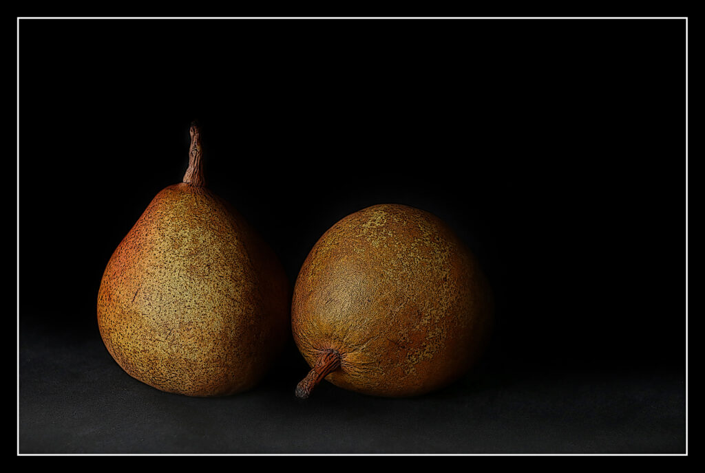
15s – PEARS – HONOURS
This image definitely has the wow factor for me; striking. Beautifully detailed, sharp and well lit. True to the style with great contrast and grain. I like the hint of detail I can see of what they are sitting on and fading in to that lovely dark, background. I think they are filling the frame nicely. I can see this in a lovely old country kitchen. Very well done.
-

-
16s – HEART OF ROSES – HONOURS
The arrangement of the roses into a heart shape has made for a strong composition that keeps the eye right on them. Great dark and light contrast and vibrant detail in the subjects, they pop nicely with vivid colours. Though the crop feels a bit tight, it works for me as the rose on the left is curved back inwards. The set subject has been done well here.
-

-
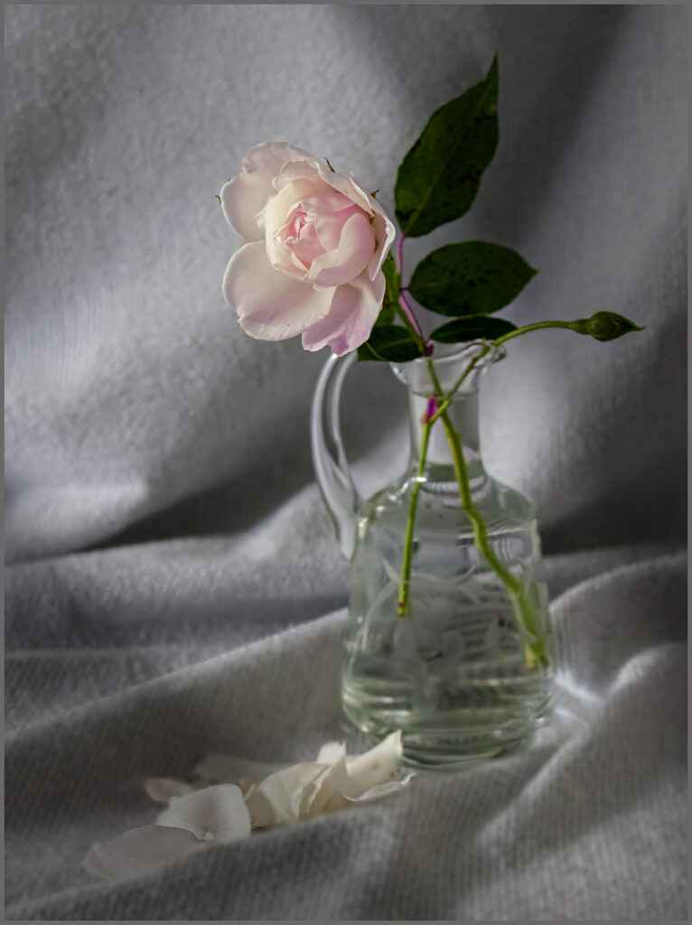
17s – THERE’S STILL LIFE – MERIT.
The subtle lead in line of the rose petals and the blanket folds to the pretty pink rose has worked well here, a balanced dynamic composition. The side light on the rose and vase is just beautiful with nothing blown out. I find the background is rather busy and drawing my eye first. I suggest making it much darker to help the subject to stand out to make it more of a Rembrandt style of stronger contrast between the dark and the light.
-

-
18s – MUTABILIS – HONOURS
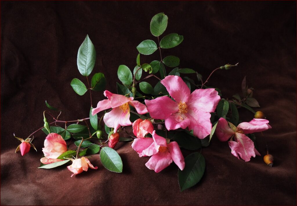
Mutabilis is one of my favourite roses, there is something so appealing about its old fashioned beauty and this capture has been handled well. Great depth and contrast. The composition is good, the lighting, colours and detail are spot on. Love the leather look background, it really adds a touch of ‘olde worlde.’ Very true to the style of Rembrandt, stunning.
-

-
19s – THE EMPTY NEST – MERIT.
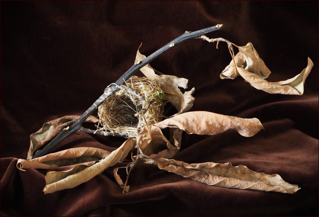
A pleasing triangular composition with the subjects filling the frame supported by that detailed brown velvet cloth fading off nicely into darker moody tones. Great tones, depth and contrast, but I find my eye is drawn to the two out of focus leaves in front of the nest. A greater depth of field may have helped along with a bit more room on the right for the leaf to move into, there is some visual tension there for me.
-

-
20i – TRAVEL TROPHY – ACCEPTED.
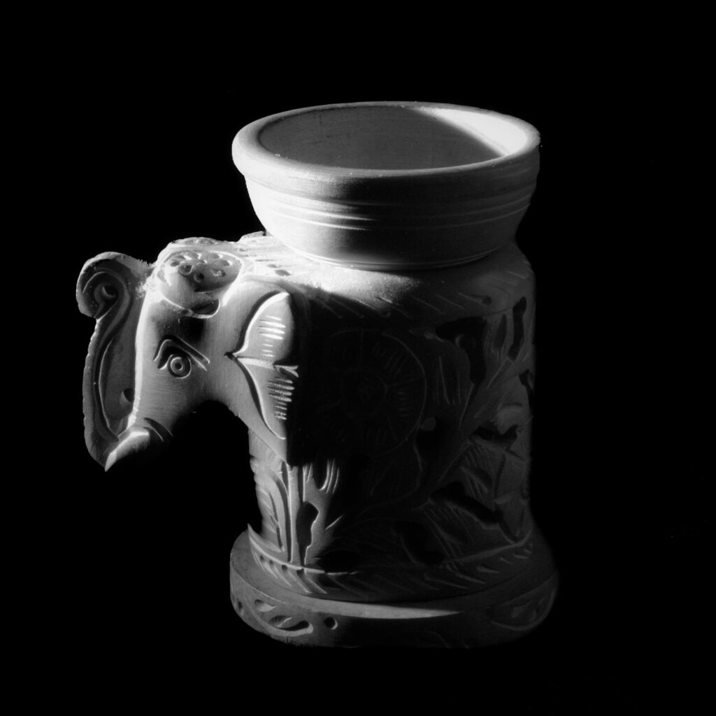
The contrast between the lights and darks has given this image a great low key effect. The low, lighting has helped the trophy to pop out nicely with good depth and detail. I would like to see a hint of detail of what it is sitting on, it feels like its floating, also more room on the right for it to look into. I think it will help the composition by moving it off centre onto the right third. The central placement feels rather static for me.
-

-
21i – STILL LIFE – MERIT.
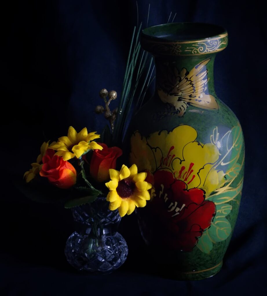
A nice vibrant image, good contrast and side lighting. Sharp and detailed with beautiful rich colours. I can see a hint of detail in the background that is helping to balance it nicely to add a bit of context. I think a bit more lighting on the vase may help it stand out and strengthen that nice triangular composition of the subjects. The lighting just feels a little flat there for me.
-

-
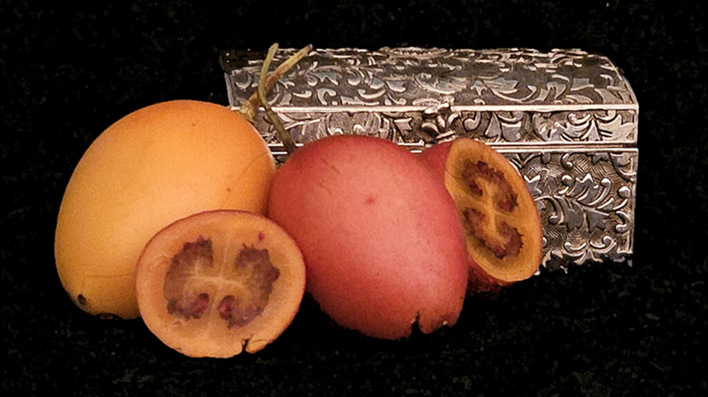
22n -ANTIQUE SILVER WITH TAMARILLO – MERIT
I love Tamarillos and I feel I could just reach out and take one, good rich colours adding to their appeal, nicely composed and lit with a hint of detail visible in the background. In my view I find the subjects are rather flat, soft and blurry, I like the grain on them but I would love to have seen them sharper with more depth to help them stand out. Good contrast and true to the style I feel.
-

-
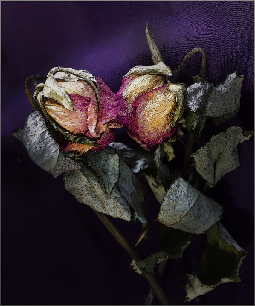
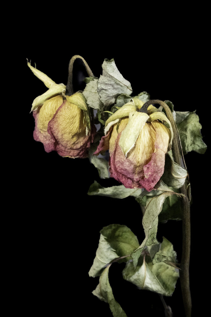
23s – DROOPING COLOURS – MERIT
The sharp detail and colour palette is just lovely here. The lighting is spot on and has added good modelling and depth to the subjects. I enjoy the feeling of the roses making one last stand with their faded beauty. My one suggestion would be to try cropping some off the top and bottom to more of a square crop, I feel that will strengthen the composition by taking out some of the background and bring the rose heads more into the frame.
-

-
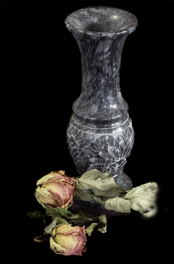
24s – THE VASE – HIGHLY COMMENDED
I like the way the subjects have got nice balanced lighting on them with good contrast and detail. The colours are lovely and the depth and detail is pleasing, nicely composed in the frame.I find the crop a bit tight at the top I would like to see a bit more room there along with some detail in the black background to give some context.
-

-
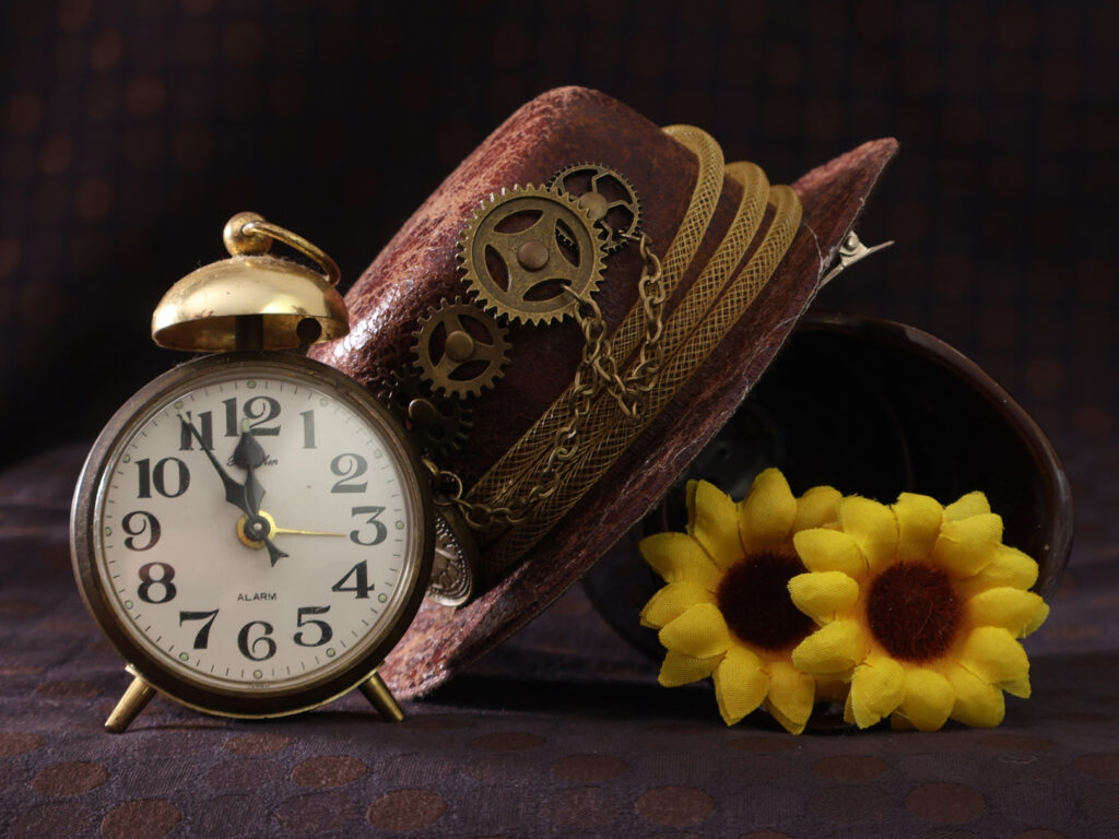
25n – FIVE TO MIDNIGHT – HONOURS.
The subjects fill the frame in a well balanced composition, standing out well. Great contrasting side lighting bringing out depth and detail, sharp with appealing colours. The background is nicely muted and complimentary. A good Rembrandt style study.

