Judged by Roger Thwaites APSNZ
The winning images were chosen because of the very strong composition and visual quality of them. There wasn’t much between the two. Both had very good balance of the elements – the winner just pipping the runner-up with a slightly better ‘visual interest’ castor.
-

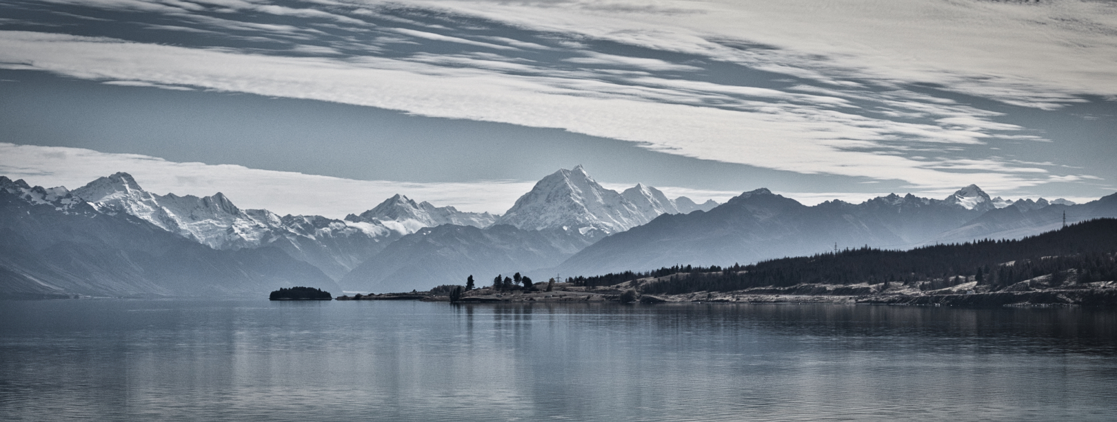
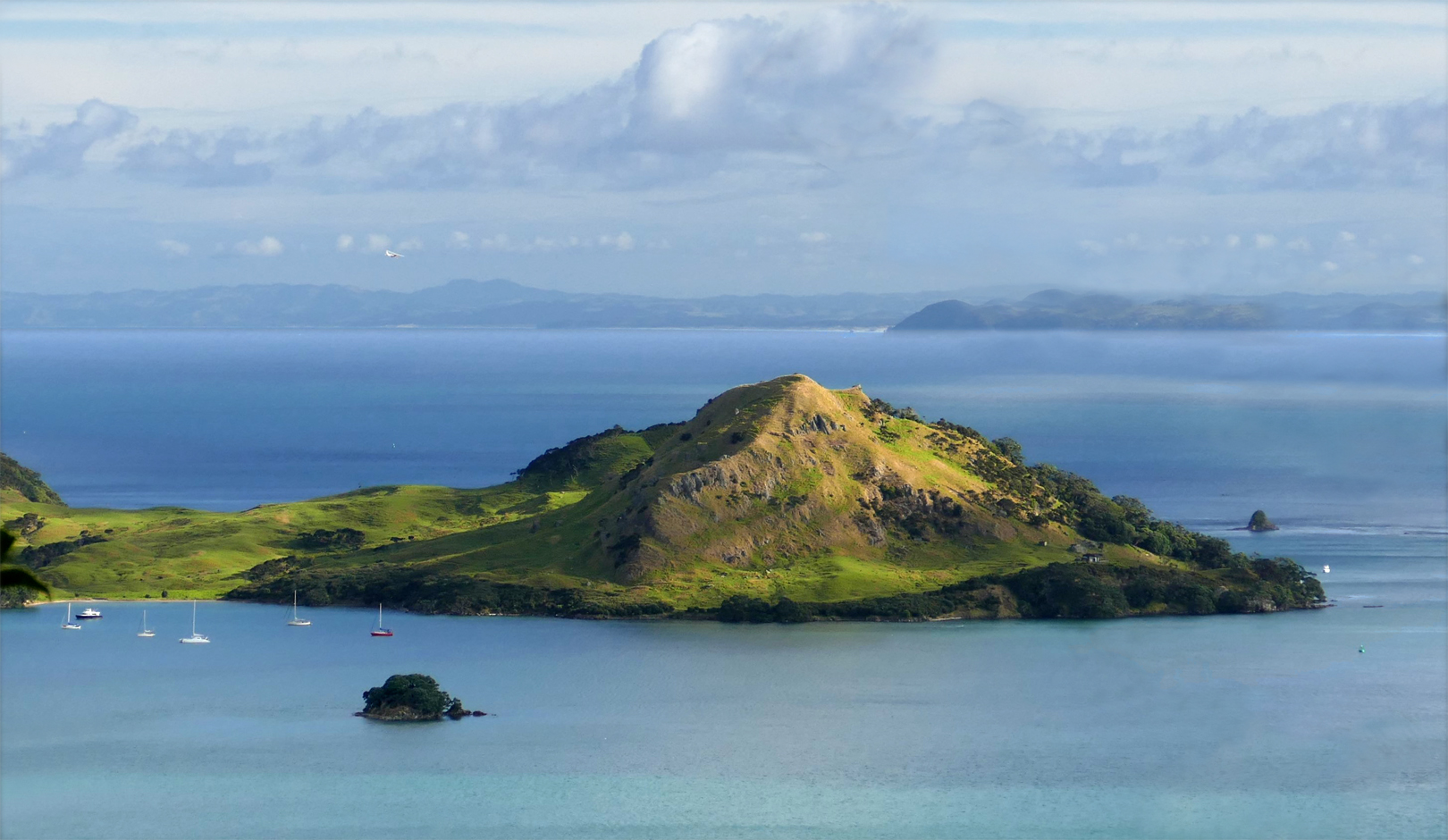
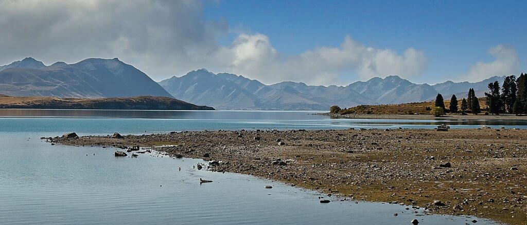
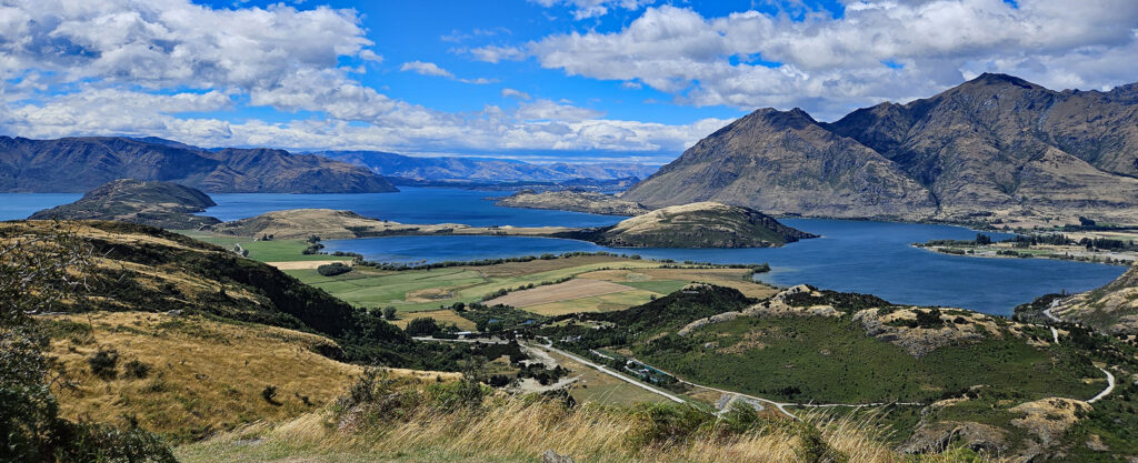
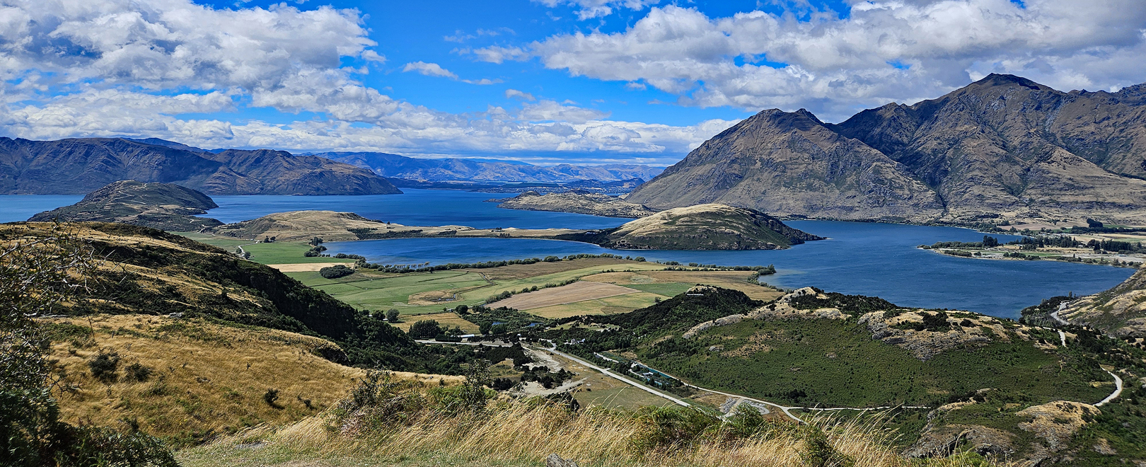
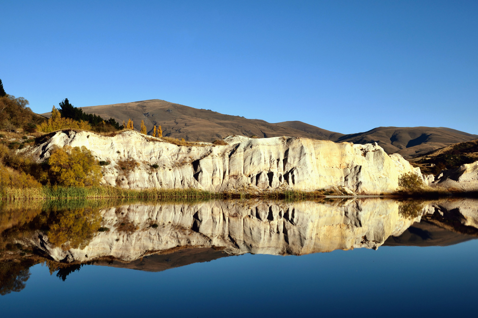
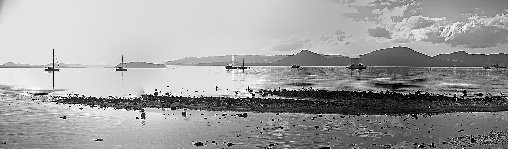
- (1) UP THE LAKE : Well balanced image with a panoramic panel, and an interesting sky. The stretch of land in the foreground pulls the composition together, resulting in a strong landscape image. HONOURS.
-

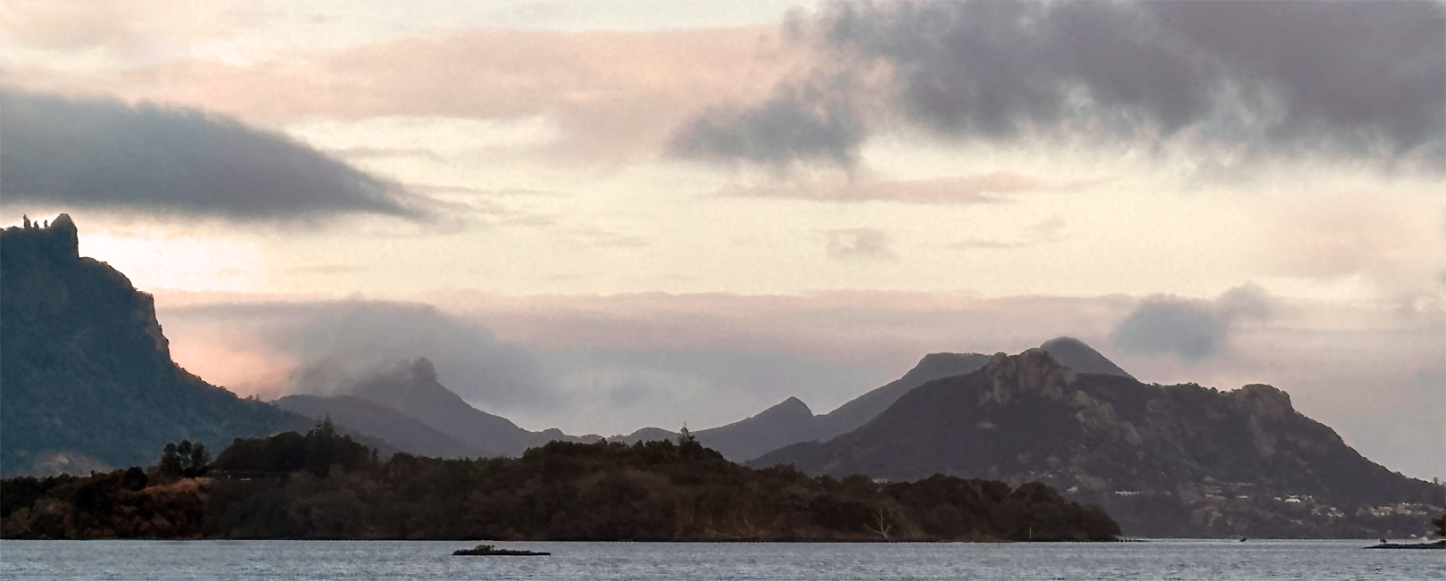
- (2) DUSKY HEADS: This image is made up of lands and clouds mostly. I think that it is more of a jumble of the elements, with the disjointed clouds working against it rather than for it, with a little bit of colour, here and there. Better lighting might reveal more detail of the land mass in the foreground. NOT ACCEPTED.
-

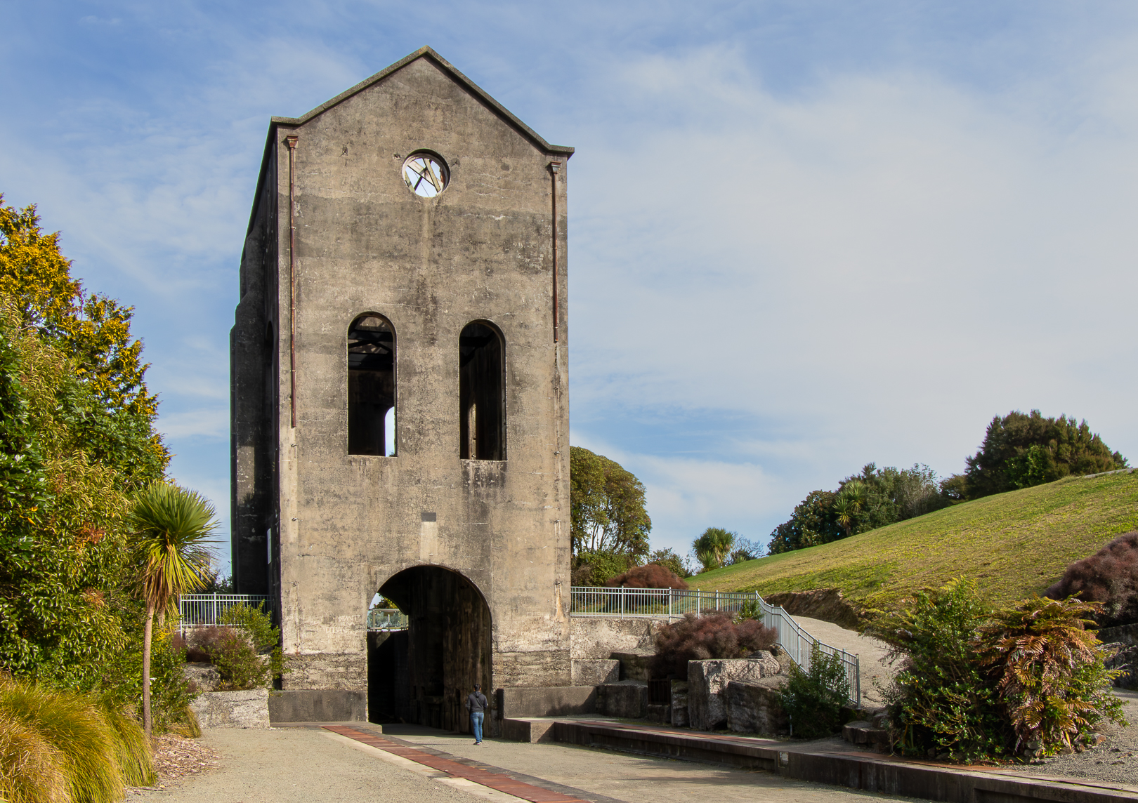
- (3) MARTHA MINE: I thought that this was more about the tall structure than the landscape, and would fit in better as a “pictorial” or “architectural” subject. (Would also maybe work better as a vertical image?) NOT ACCEPTED.
-
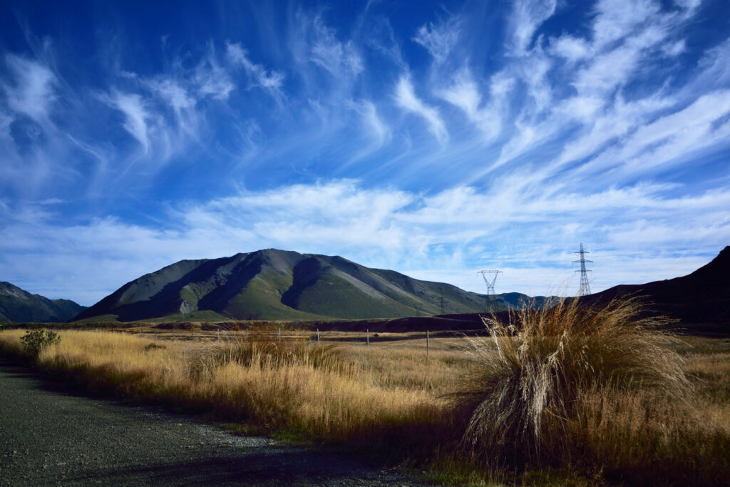
- (4) RAINBOW TRAIL: An interesting sky (not often seen in this area). A simple composition which works quite well (except for the power pylons). The strong cloud patterns, is what makes this image interesting. MERIT.
-
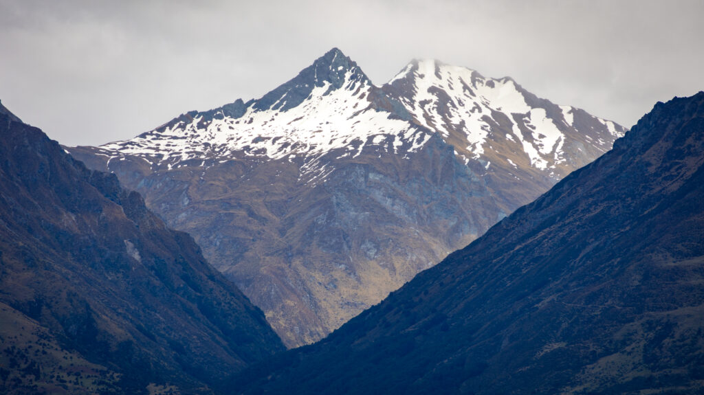
- (5) DIAMONDS IN THE ROUGH: Strong mountain landscape, which is made visually strong by the “triangle” shapes of the hills. There is a window of vision between the hills, on either side of the image, which makes it stand out well. The snow is the finishing element. MERIT.

-

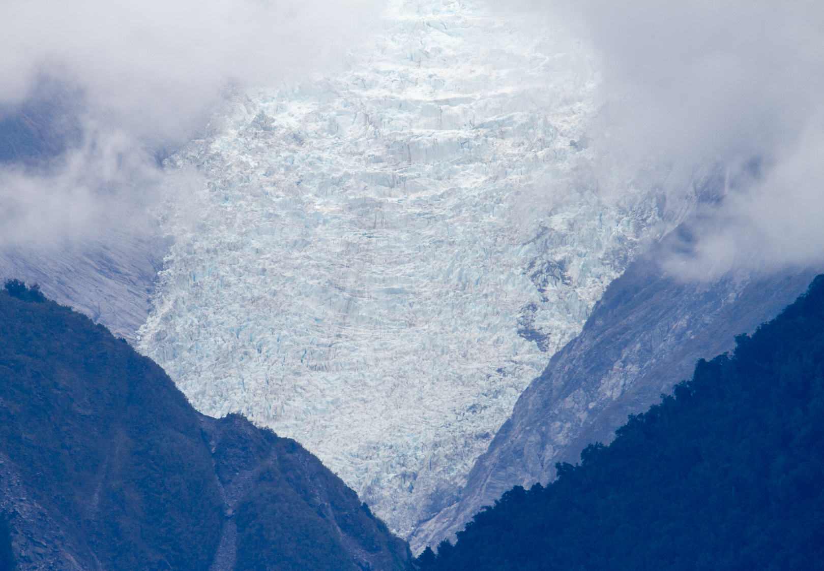
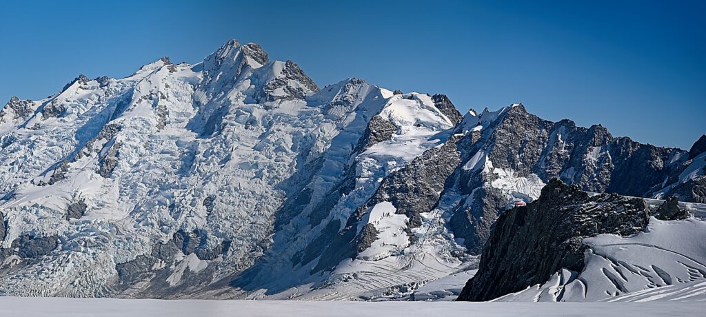
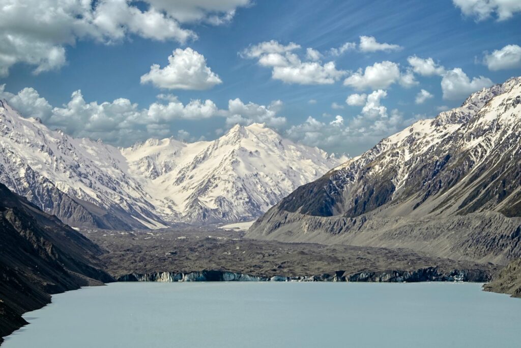
- (6) FOX GLACIER 2: This is an image which shows the textures of the “frozen River” exceptionally well. It is well composed and is bordered by the mountains on both sides and the clouds above. The eye is drawn to the glacier, by the triangular shapes, which makes it a strong landscape image. Well seen and photographed. HIGHLY COMMENDED.
-
- (7) THE HEADLAND: The landform is well placed within the frame, and has beautiful colour, which stands out well in this lighting. The rest of the picture compliments it nicely, giving good overall balance. Interesting shot. Well done. MERIT.
-

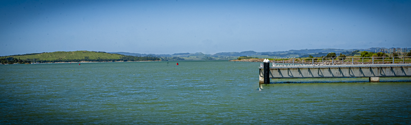
- (8) DOWN THE HARBOUR: My eye is drawn to the structure on right, and then to the red buoy in the centre of the image. After that, where to look?! Maybe a boat on the water would add some interest? It can be a real challenge to make a strong panorama, and I think that this one did not quite work. NOT ACCEPTED.
-
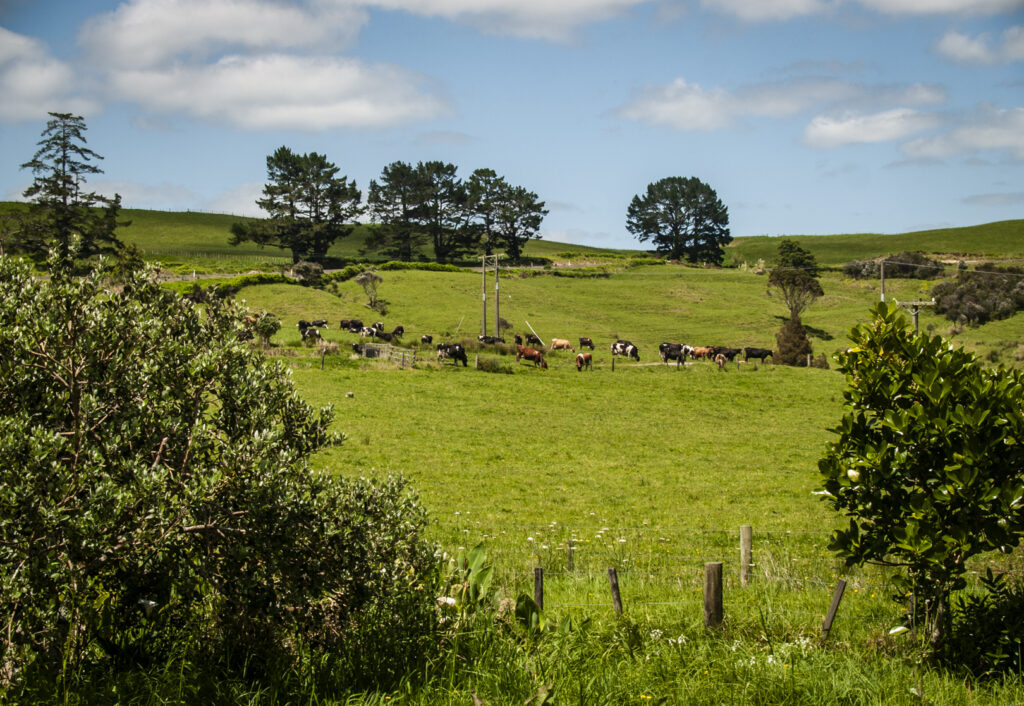
- (9) HEADING HOME: A very pleasant scene, with cows ambling down to the milking shed. A pity about the power poles in the centre, and to the right. (They look so out-of-place). The overall picture does have a nice balance to it, with good colour. ACCEPTANCE.

-
- (10) SOUTH ISLAND SCENE: As I look at this scene, I think it is bright and visually appealing, but the beach full of gravel and stones, makes it out of balance with the rest of the composition. The cloud, the hills, and the water, all fit together really well, but the “scrappy” looking foreground beach, kind of spoils it for me. ACCEPTANCE.
-
- (11) MT. GREEN: A rugged scene, which is pleasant enough to look at. The rugged looking mountain against the clear blue sky, is attractive, but as landscapes go, it needs something more. There is a visually annoying strip at the bottom, which is distracting and has an unfortunate effect on this image. NOT ACCEPTED.

-
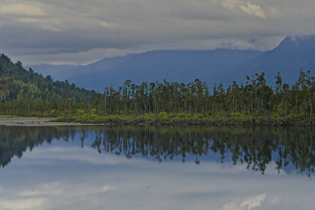
- (12) REFLECTIONS: The cloud cover has caused the lighting to be dull and flat. I like the composition, but wondered whether you could crop most of the cloud off, and how much this would improve your image? The row of trees and their reflections are attractive. ACCEPTANCE.

-
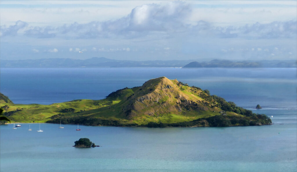
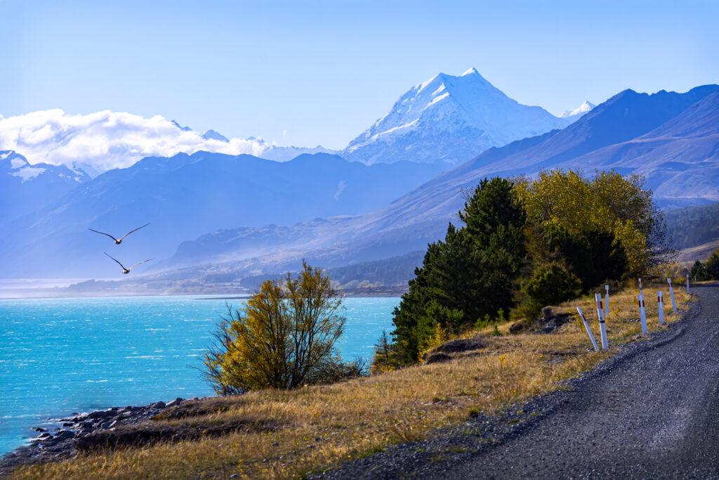
- (13) TASMAN GLACIER: A well balanced composition, with wonderful sky, and snow-covered mountains. An excellent landscape that shows not only the edge of the glacier, but also that magnificent sky. It’s a winner! HONOURS. (This image is the runner-up)

-
- (14) ON A CLEAR DAY: Good flow and colour in this image. All the elements come together in a strong composition. The view (being left to right), makes this an attractive landscape which is worthy of a MERIT. Well done.
-
- (15) GLENHU: Good lighting and good depth-of-field, adding strength to the sky. Even though this looks to be cropped down to a panoramic panel, it unfortunately, has a lot to look at, and the main point of interest is difficult to depict. This is what I call a very good record shot. ACCEPTANCE.
-

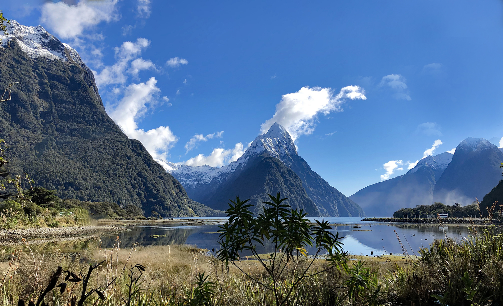
- (16) MILFORD SOUND: There are so many pictures of this scene, and this one rates well in comparison. My only beef is the distracting foreground shrub which dominates the composition. Apart from that, the scene is bright with good colour, with the white peak being the main point of interest. MERIT.
-

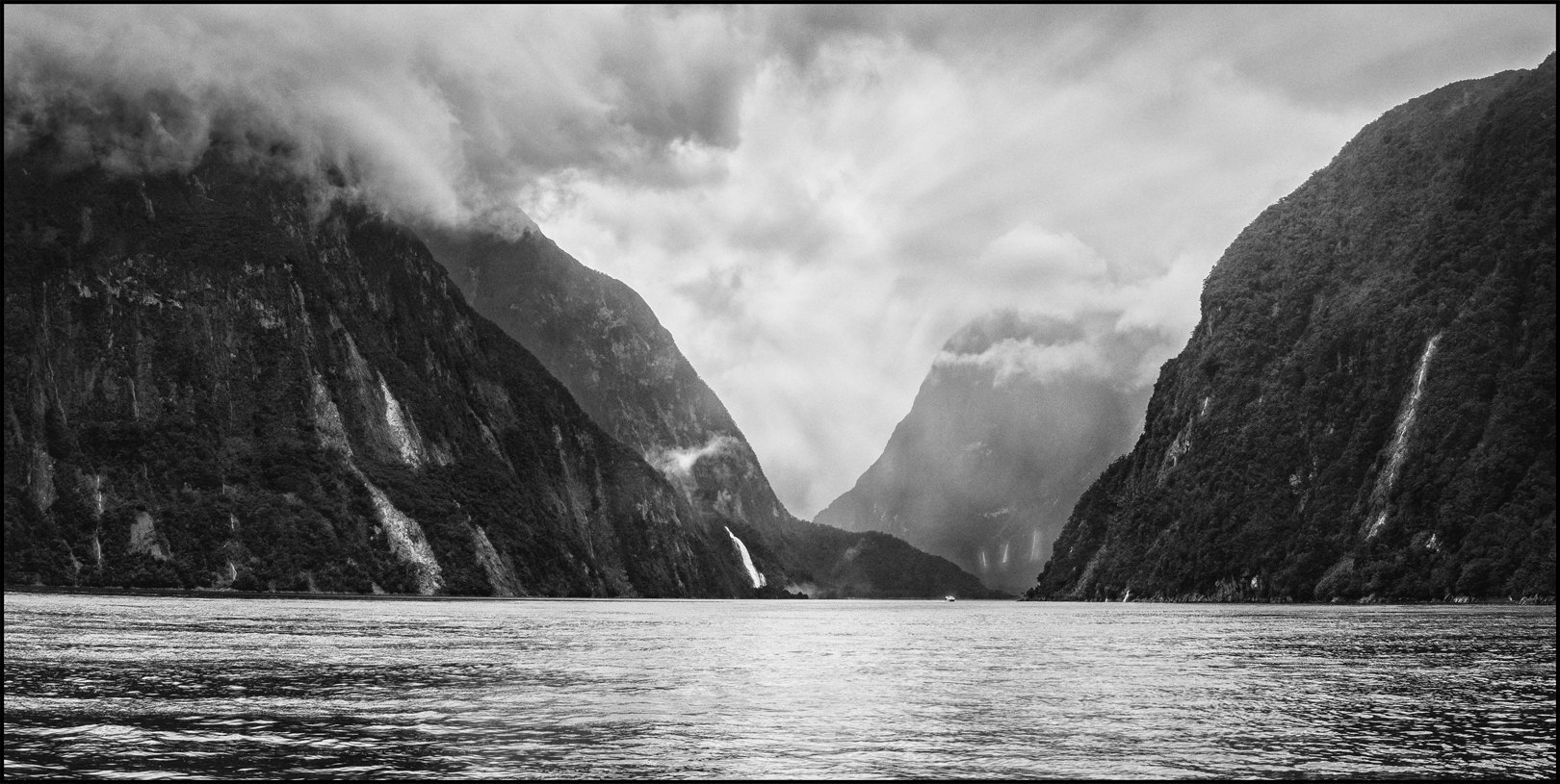
- (17) EVEN ON A CLOUDY DAY: This is a very moody composition (of what looks like Fiordland). The black and white medium really does wonders for this shot. The water, giant cliffs, and sky all work superbly well together, and give it great perspective of size, etc. Good work. MERIT.
-

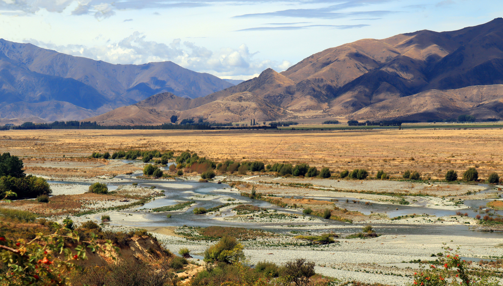
- (18) McKENZIE COUNTRY: The small braided river in the bottom half, is really the stronger view of this picture. If you made this into a panoramic panel with just the bottom half of the image, I believe it would score higher, otherwise it is too much to look at – a very busy composition. ACCEPTANCE.
-
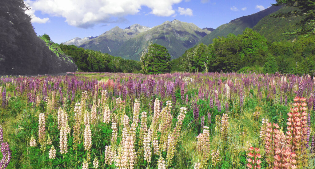
- (19) A FIELD OF LUPINS: Even though Lupins are regarded as a weeds, it does have attractive flowers which make a great photographic subject. I felt that the lighting in this picture was slightly flat looking. I think I would be inclined to cut out the sky and hill-tops, to make your image stronger. ACCEPTANCE.

-

- (20) St BATHANS BLUE LAKE: Nice image except there is too much blue sky with very little in it. You could crop a quarter of the image from the top to rectify this. Wonderful photographic opportunities at this location – just a case of looking for the right composition and the right moment. This image is attractive, but you need to be closer for a stronger photo. ACCEPTANCE.
-
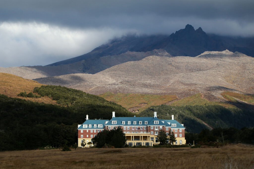
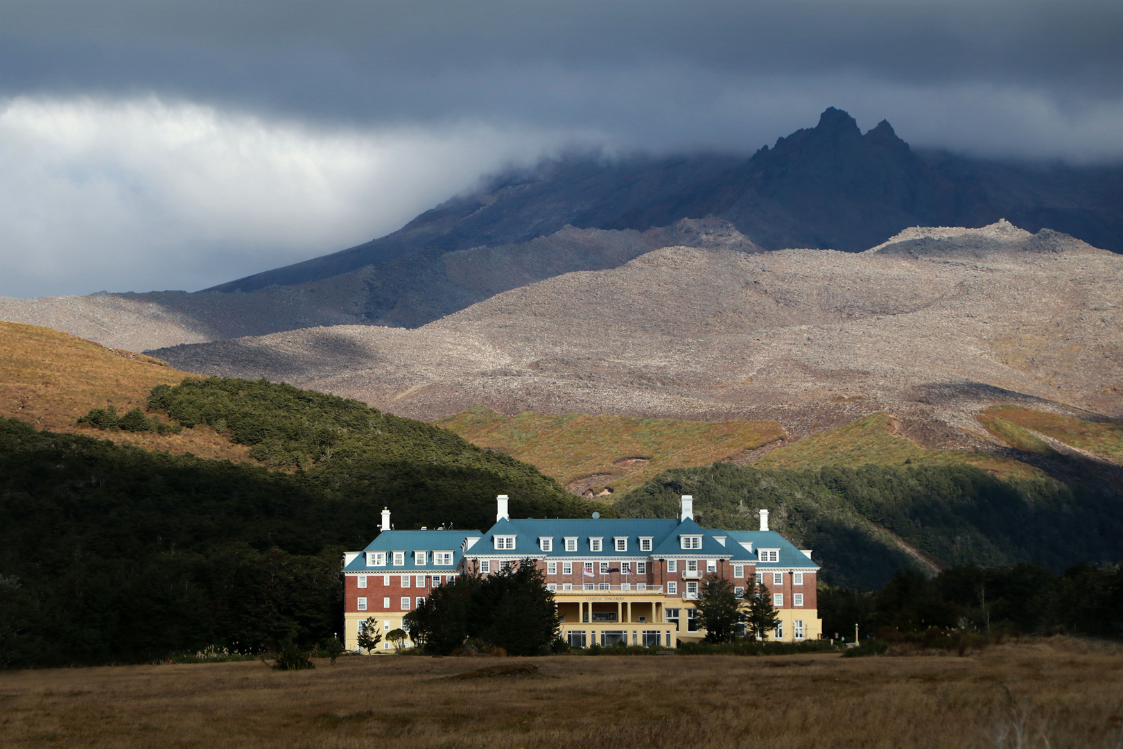
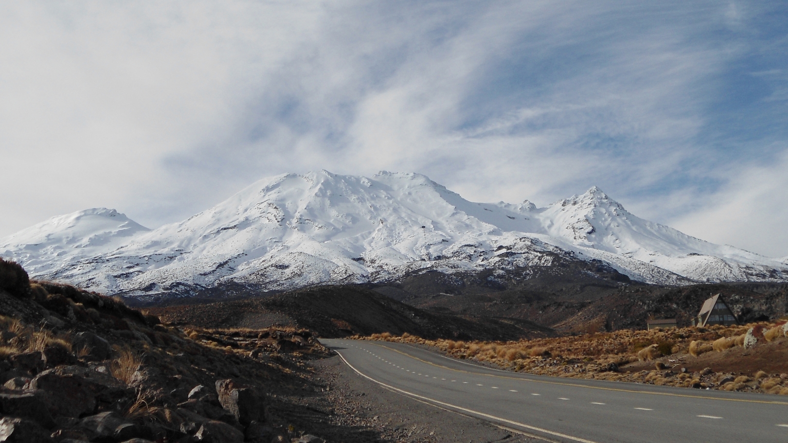
- (21) CHATEAU RUAPAEHU: At first, I thought that this might be Chateau Tongariro, But I might have that wrong, and need to be corrected on that! A nice tourism photo, which would be right at home on an advertising pamphlet, but as a competition photo, I don’t think it quite has the strength to succeed. NOT ACCEPTED.
-
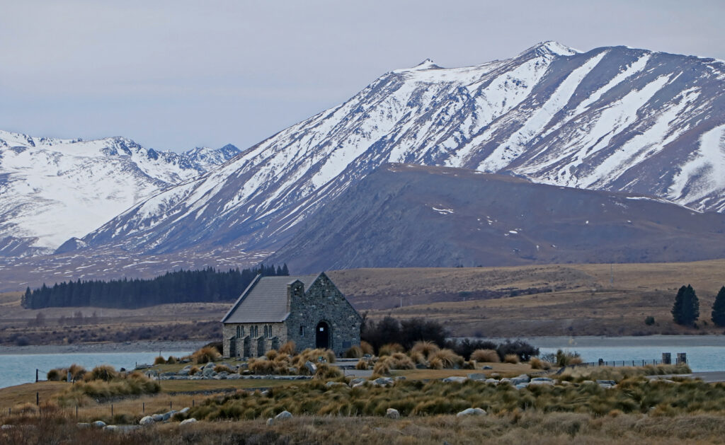
- (22) TEKAPO IN WINTER: Certainly different in its effect, being a wider expanse of the area. While the church is a main point of interest, other parts of this image spring to mind. With the church being in a central position, it helps to make it an interesting landscape image. ACCEPTANCE.

-

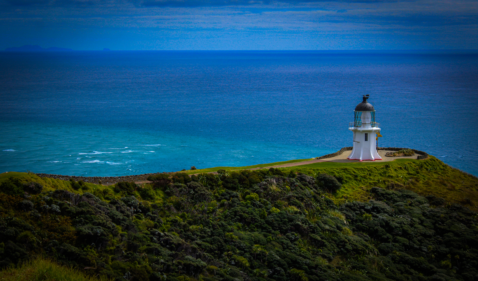
- (23) WHERE LAND MEETS SEA: The lighthouse stands out strongly, as the main focal point. A simple composition with good colour, being divided into a foreground, middle ground, and background. Good straight horizon. It appeals more as a record shot, than a competition shot and would be regarded more as an interesting tourism image. ACCEPTANCE.
-

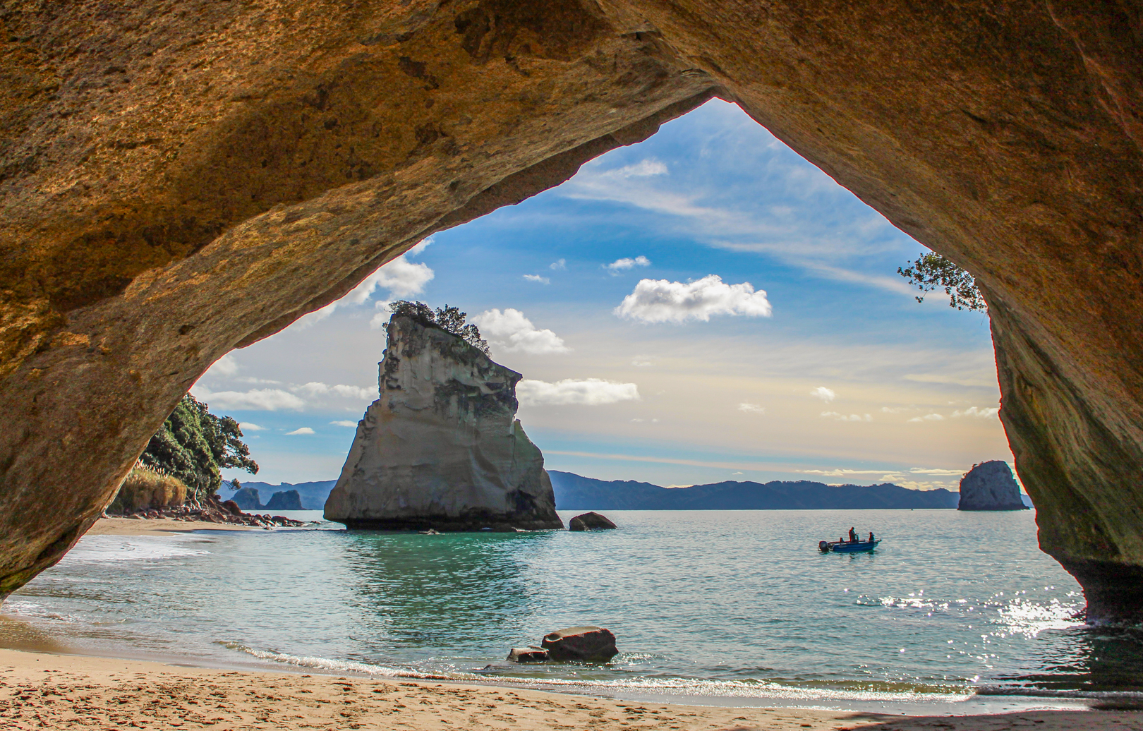
- (24) NATURE FRAMES CATHEDRAL COVE: This is a great composition, with beautiful colour and good balance. The elements all go together well to knit up as a strong landscape image. The reflected light into the cavern interior is spectacular, and adds to the excellence of it. HONOURS (Selected as the winning Landscape). Well done!
-
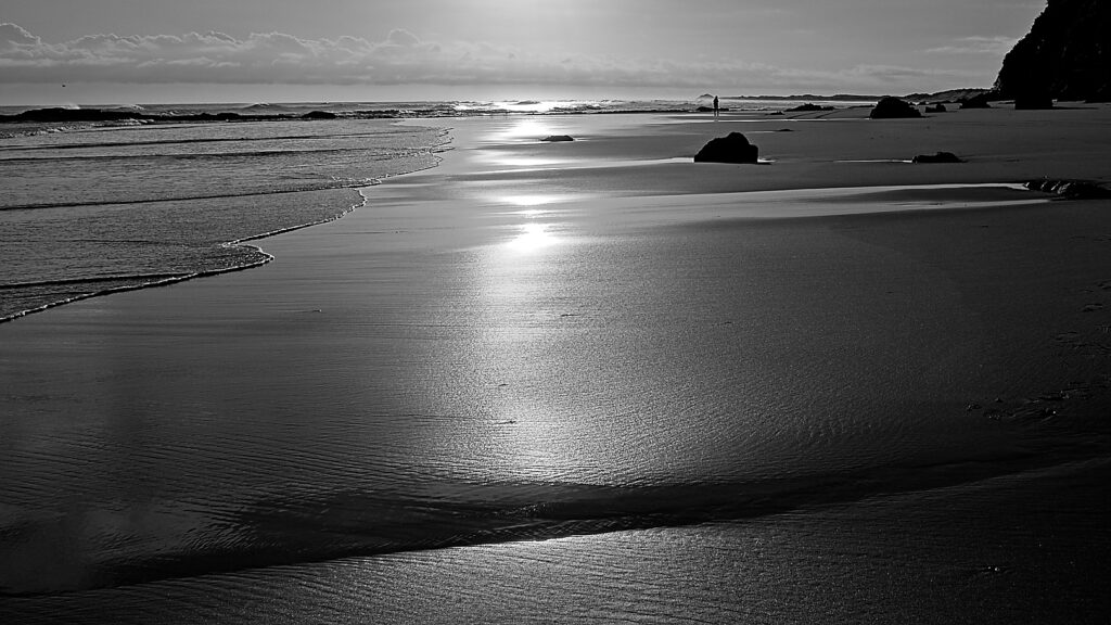
- (25) FAREWELL SPIT: The Black & White medium is well suited to this image. A good record shot, with good lighting. Perhaps the composition does not come across as being strong, but it shows the Patterns, Shapes, and Textures, of the tidal area. I think a small crop from the bottom would be an improvement, and would get rid of the dark shape in the foreground. ACCEPTANCE.

-
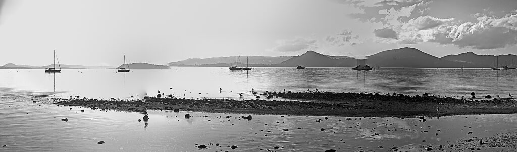
- (26) WHANGAREI HEADS: The distant hills and the boats are interesting, but the foreground is quite messy with lots of distracting stones everywhere. I like the panoramic format, but sorry to say that this has not quite worked, with all the distracting material in the foreground. A rising tide might work in your favour, and make it a tidier composition. NOT ACCEPTED.
-

- (27) SUMMERS DAY: A “little” landscape with an interesting sky. I was going to suggest a crop from the bottom to get rid of the scruffy foreground, but the image size is already quite small, and I doubt whether this would improve it in the long run. However, the image does have nice colour. ACCEPTANCE.
-

- (28) A QUIET ROAD: This is a picture with an interesting sky, and great snow-covered mountains. The highway provides a good lead-in, and the composition does have a reasonable balance to it. Good detail throughout. MERIT.
-

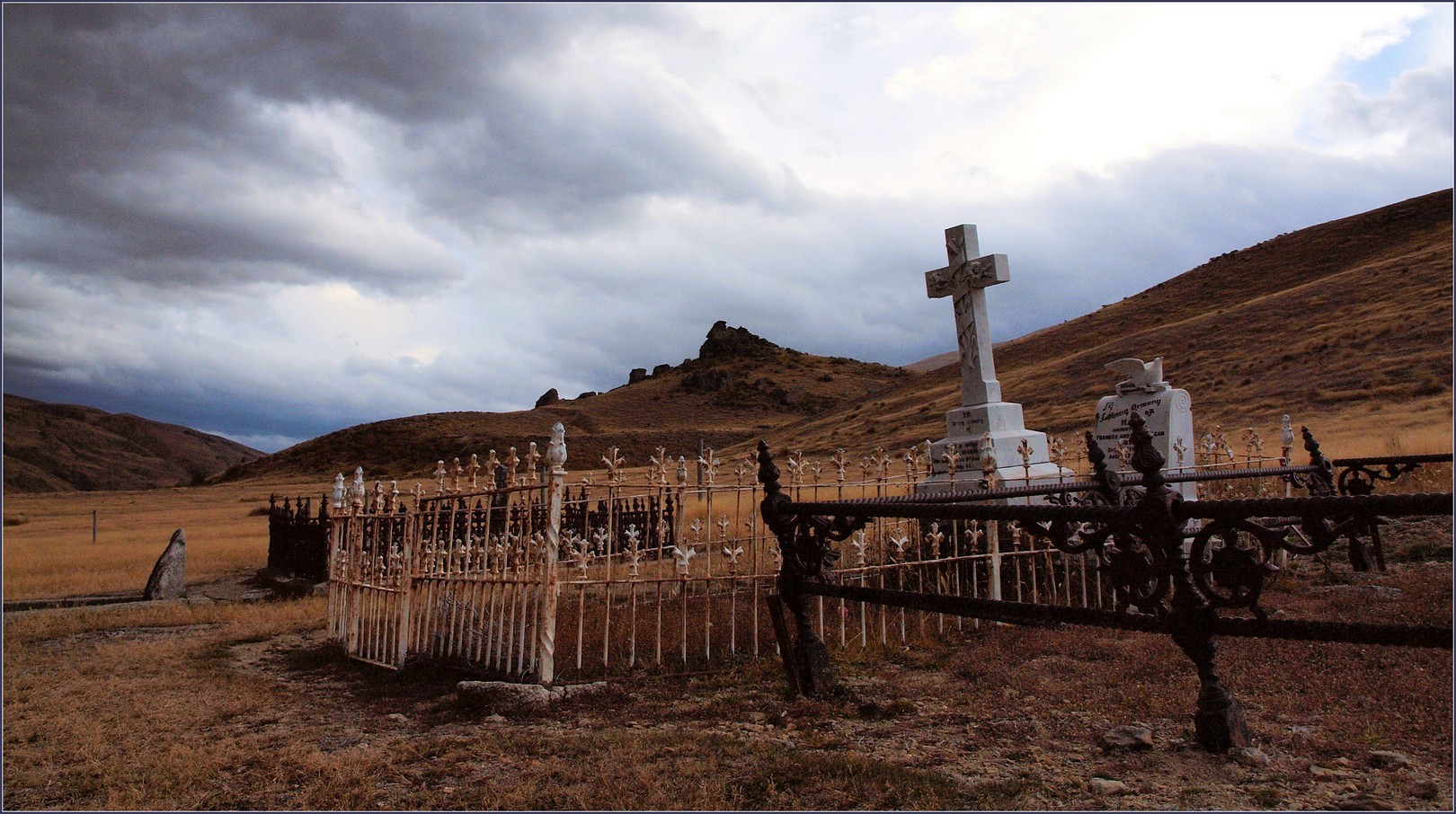
- (29) REMEMBER THE NEVIS: A very moody looking scene, which is dominated by the ominous dark clouds in the sky, but it is the graves and the fences around them which shows strongly in this image. You can bet that there is a story or two to be told about its occupants!? MERIT.
-
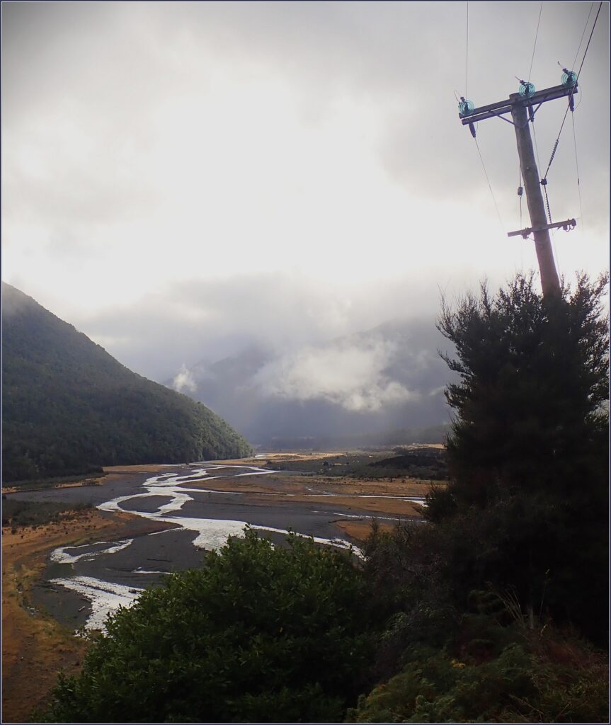
- (30) OVER THE LEWIS PASS: The interesting meanderings of the braided river, is the strong part of this composition. I cannot see why you decided to include the very distracting power pole, but….there it is, in all its ugliness! Unfortunately, its inclusion adds very little to the image, as does the bland looking sky. NOT ACCEPTED.

-
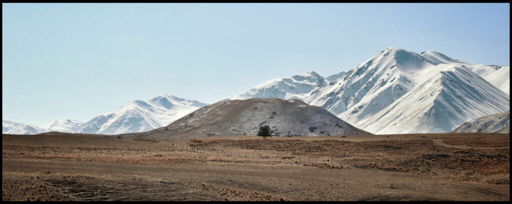
- (31) LONE TREE: Although the “lone” tree is somewhat small within the picture, it does act as a focal point, and the snow-covered mountains do the rest. Excellent landscape image. Nice work. HIGHLY COMMENDED.
-
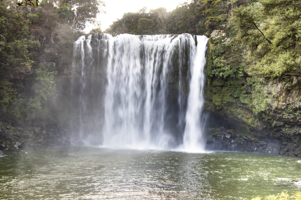
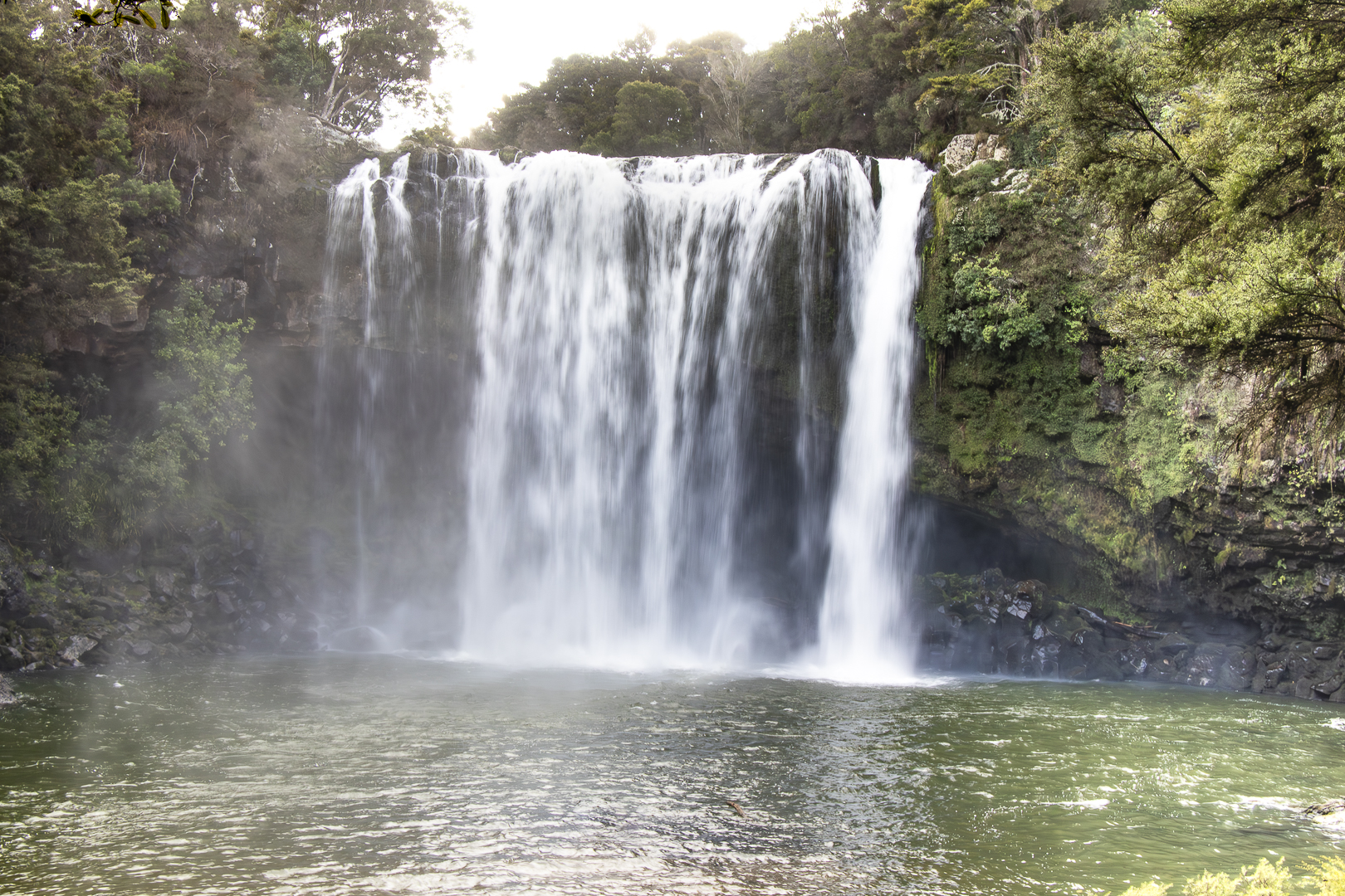
- (32) RAINBOW FALLS: The flat lighting does not help this image, and tends to defuse the look of what is normally a very strong waterfall. However, there is quite a bit of misty stuff that comes into the scene, and this tends to weaken the overall effect. NOT ACCEPTED.