Skip to content
-
-
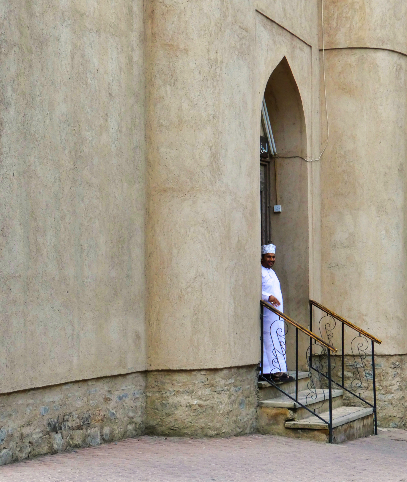
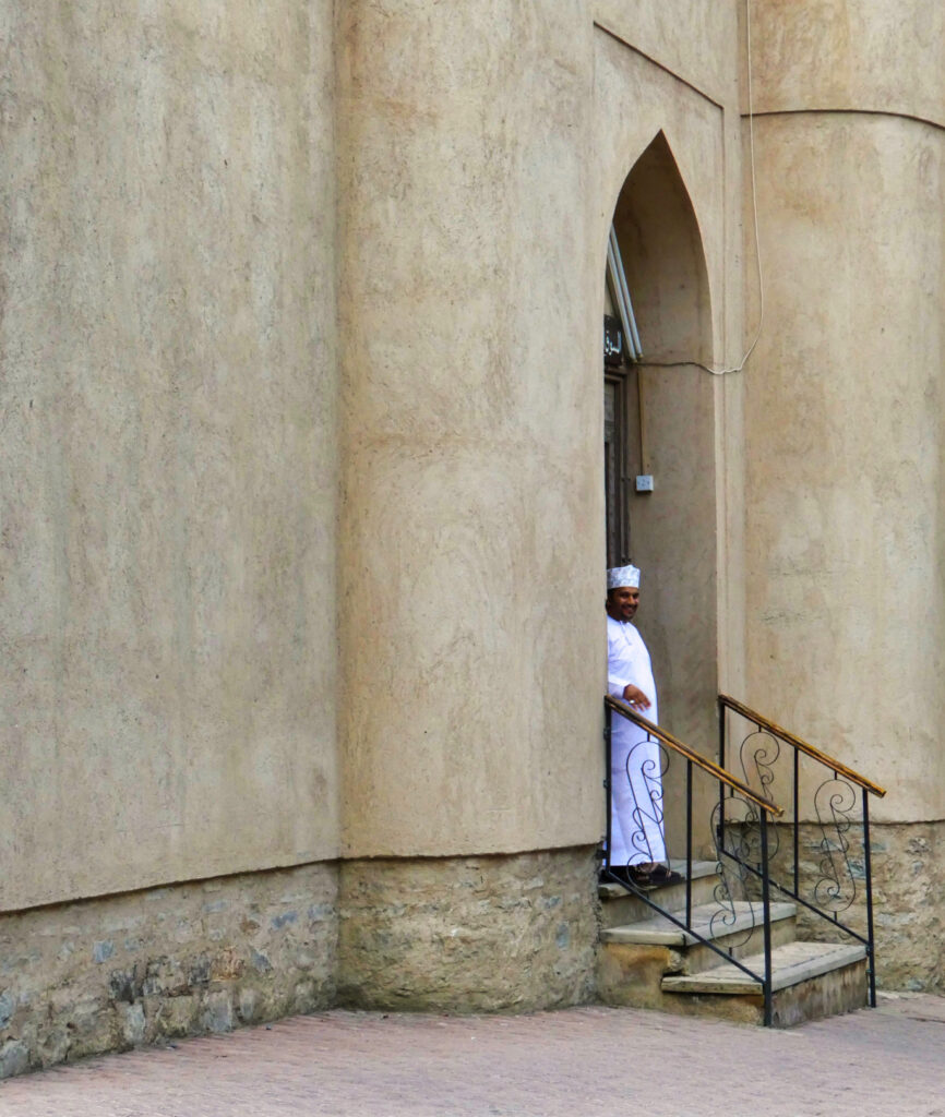
01s In the doorway Nicely composed image which effortlessly takes theeye from left to right to settle on the man in thedoorway. Nice colour palette and good details in thesteps and lower part of buildingMerit
-

-
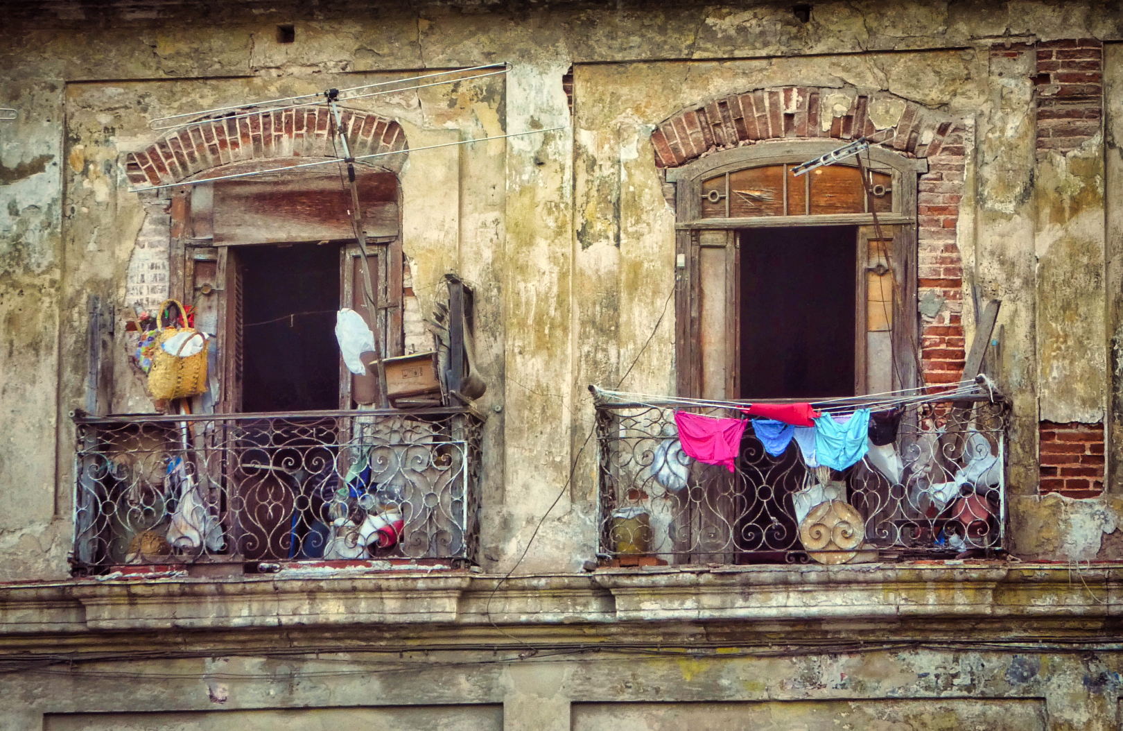
02s Fully employed A very colourful image with crisp detail shownthroughout.Each doorway has its own story to tell andI find this image very intriguing.Honours
-
-
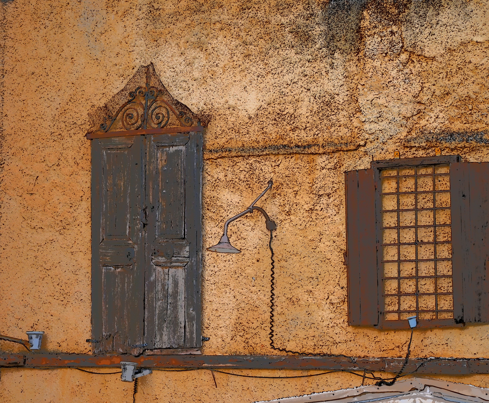
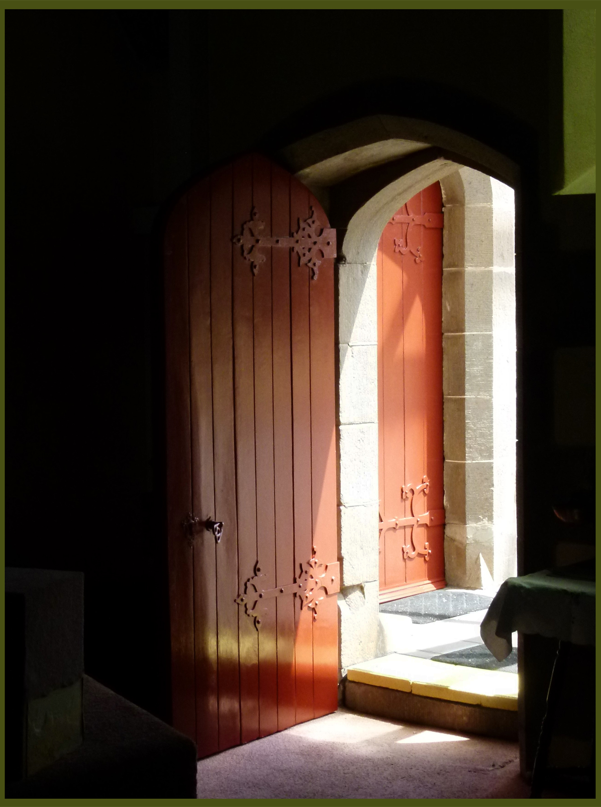
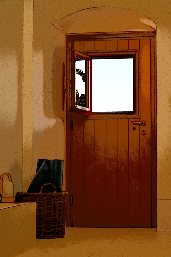
03 i Closed but open The composition of this image is outstanding. I love
the warm color palette you’ve chosen. The use of
posterization adds an intriguing element that really
captures my attention. You might want to consider
reducing the brightness of the window slightly.
Highly commended
-
-
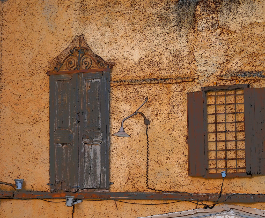
04 i Inert doors Interesting shapes in this image. I think that the
background colour is quite overwhelming and the
image has been slightly over-processed.
accepted
-

-
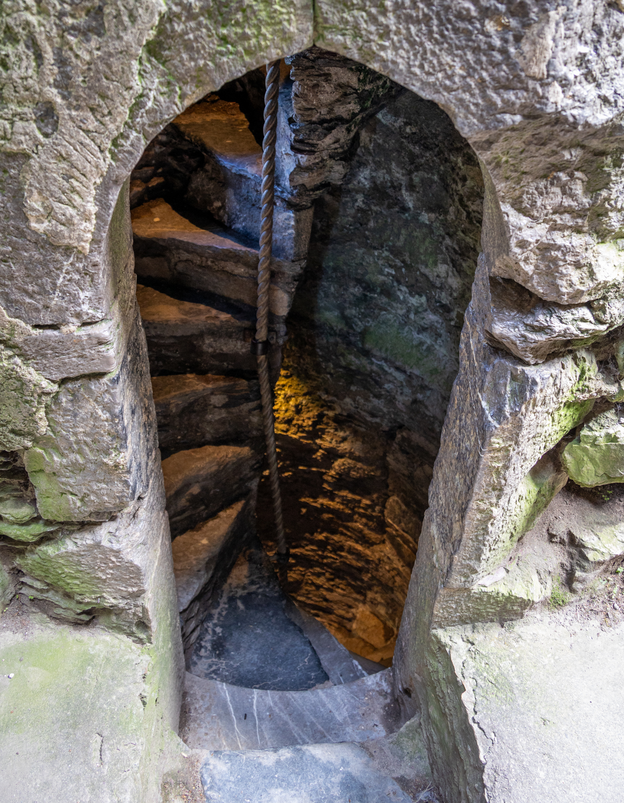
05 s Blarney castle door I notice that the focus inside the doorway is slightly
soft, which somewhat detracts from the image.
Recomposing to highlight the interesting patterns
inside the enclosure might enhance the overall impact
Not accepted
-
-
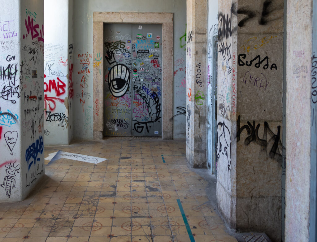
06 s Elevator doors The way that you have composed this image is
excellent. You have made full use of the beautiful light
and have captured the detail of the graffiti very well.
What a well balanced, beautifully composed image.
Honours
-

-
06 s Elevator doors The way that you have composed this image is
excellent. You have made full use of the beautiful light
and have captured the detail of the graffiti very well.
What a well balanced, beautifully composed image.
Honours
07 s Sanctuary for those
who seek
Nicely seen, however I feel that the light is too bright
for my eye. Some of the whites appear to be
overblown. Perhaps you could tone down the bright
parts and extract more detail in the darker areas. I find
the rather thick green border a distraction.
Not Accepted
-
-
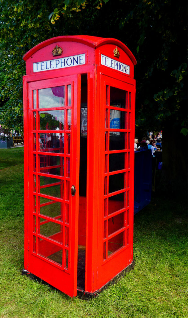
08 s Call me The vibrant colours used are slightly too overcooked
for me. The bright red appears to be slightly unnatural,
as does the brightness of the grass. The people in the
background on the right are a little distracting.
Not Accepted
-
-
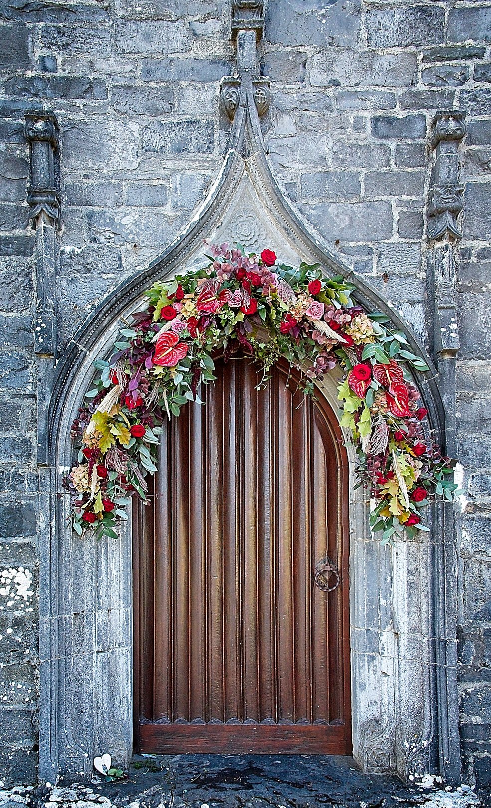
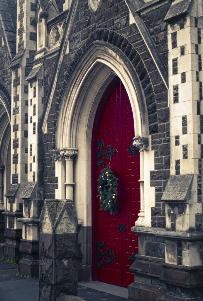
09 i Yea old red door You have captured the texture of the door and the
surrounding stonework very well. However, the base
of the image had been cut off, which I find a little
distracting.
Accepted
-

-
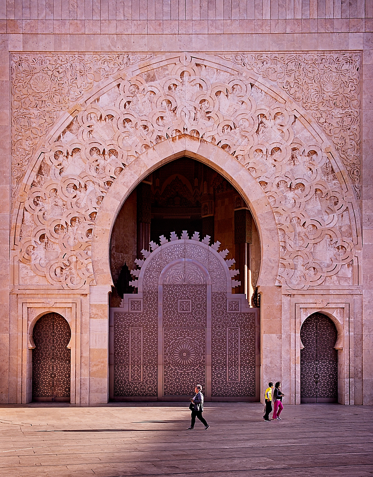
10 s Hassan11 Mosque Excellent detail in this image. You have added interest
with the inclusion of the people walking by. Having the
single lady walking to the left and the other couple
walking to the right, adds a nice amount of tension to
this image.
Highly commended
-

-
11 s Ready to celebrate The colors in this image are beautifully captured, with
great detail. However, the flat lighting on the wall
feels a bit mundane. A slight adjustment to the
contrast might enhance it.
Accepted
-

-
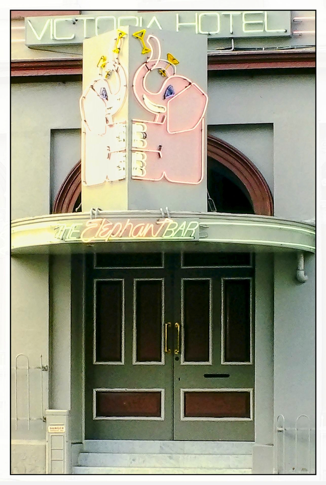
12 i The elephant bar An interesting subject however I think that the
exposure settings could be improved. The darkness
and tonal contrast on the doors is about right,
however the left hand side of the elephant neon sign
seems to be slightly overblown with a loss of detail.
Accepted
-

-
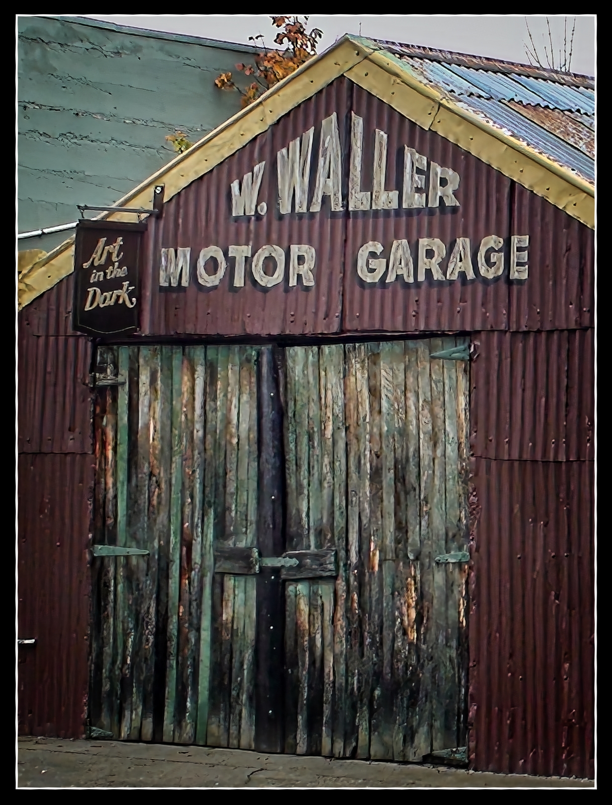
13 i W Waller I really like the way that you have captured the
distressed wood of the garage door. That, combined
with the contrasting texture and colour of the roof and
the green wall make this a very cohesive image.
Honours
-

-
14 n Secret garden There is something about this image which really
draws you in to explore the secret garden, The
composition is excellent and the leading lines takes
the eye directly to the bright display of yellow and red
flowers. This is beautifully balanced with the lush
green leaves on the left of the image.
Honours
-

-
15 n Infinity The composition of this image is excellent and you
have seen and presented a very crisp and intriguing
infinity scene.
Highly commended
-

-
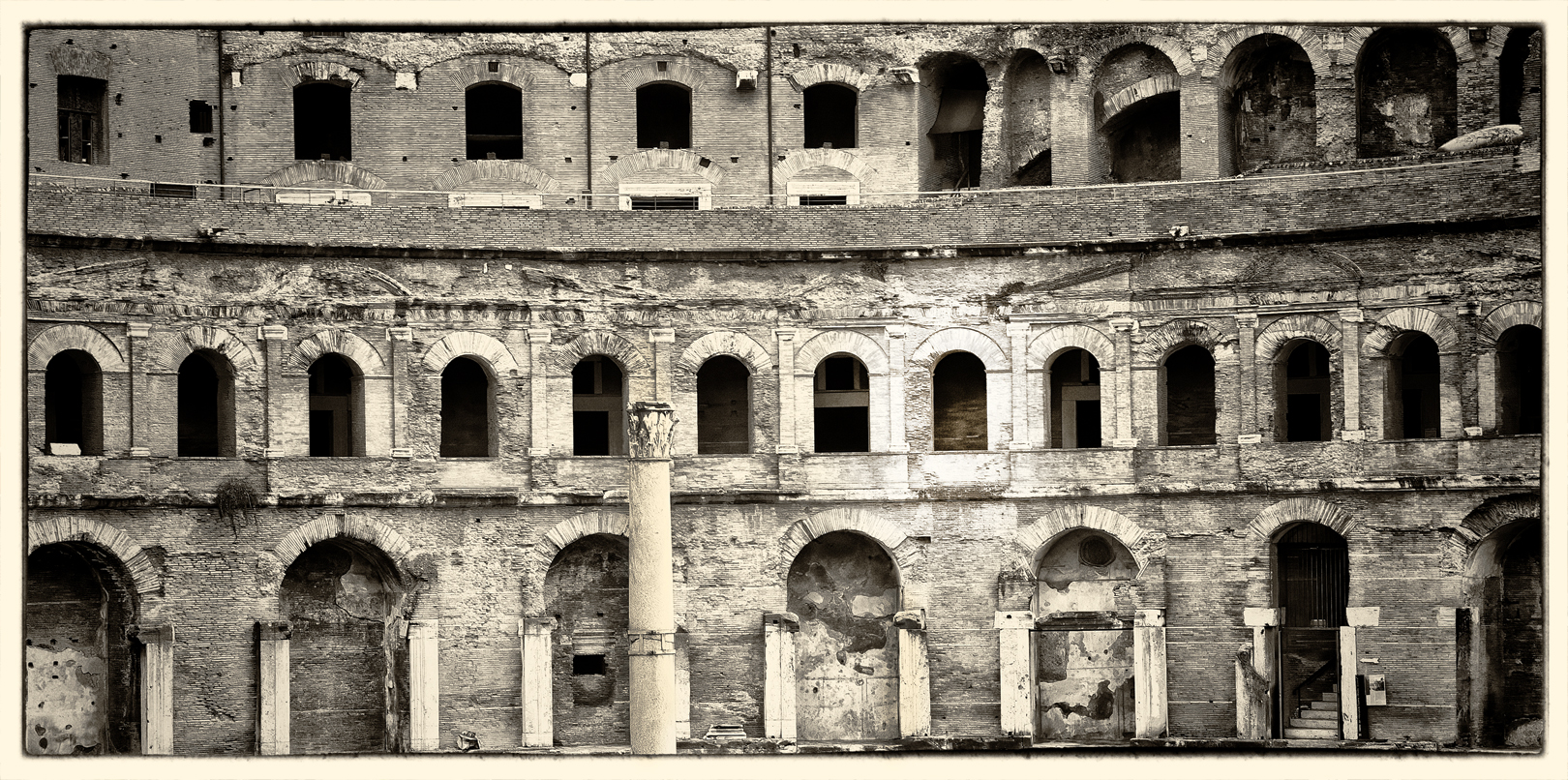
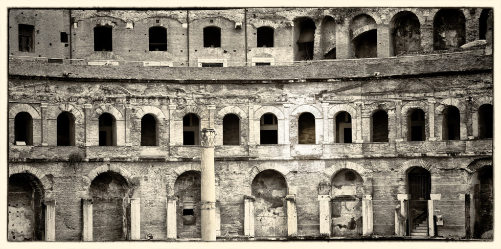
17 s Ancient doorways The panorama treatment of the image works well and
the monotone also enhances it. There is a lot to look
at in this image and my eyes wanders around with no
obvious focal point to settle on. The points of interest
to me are the large column in the middle and the nice
tonal contrast in the right third.
Merit
-
-
17 s Ancient doorways The panorama treatment of the image works well and
the monotone also enhances it. There is a lot to look
at in this image and my eyes wanders around with no
obvious focal point to settle on. The points of interest
to me are the large column in the middle and the nice
tonal contrast in the right third.
Merit
-

-
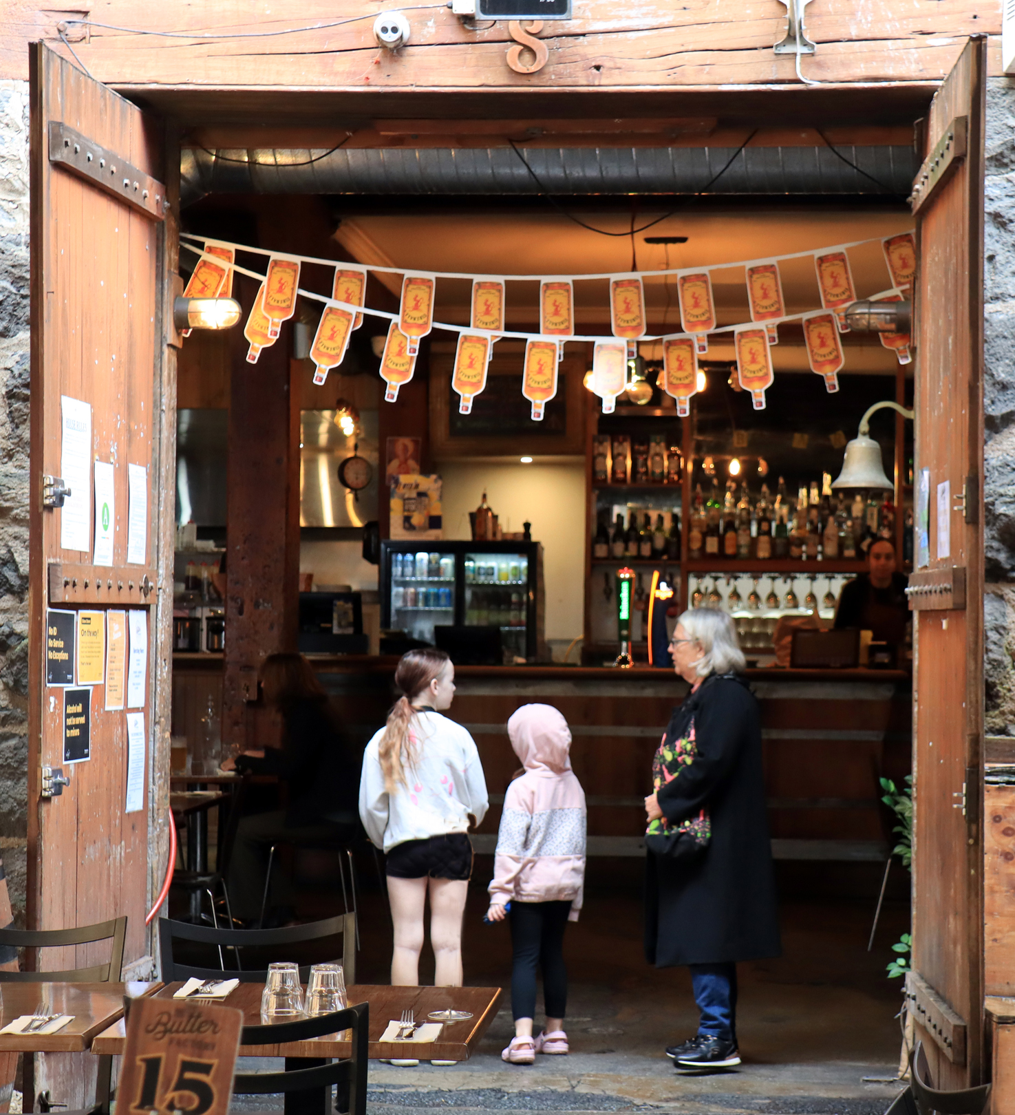
18 s What do they have to
eat in here
I’m not sure if this image is successful. The focus is soft
throughout and there are many competing elements.
As the customers are back or side on to the camera,
there is a disconnect between them and the
photographer.
Not Accepted
-

-
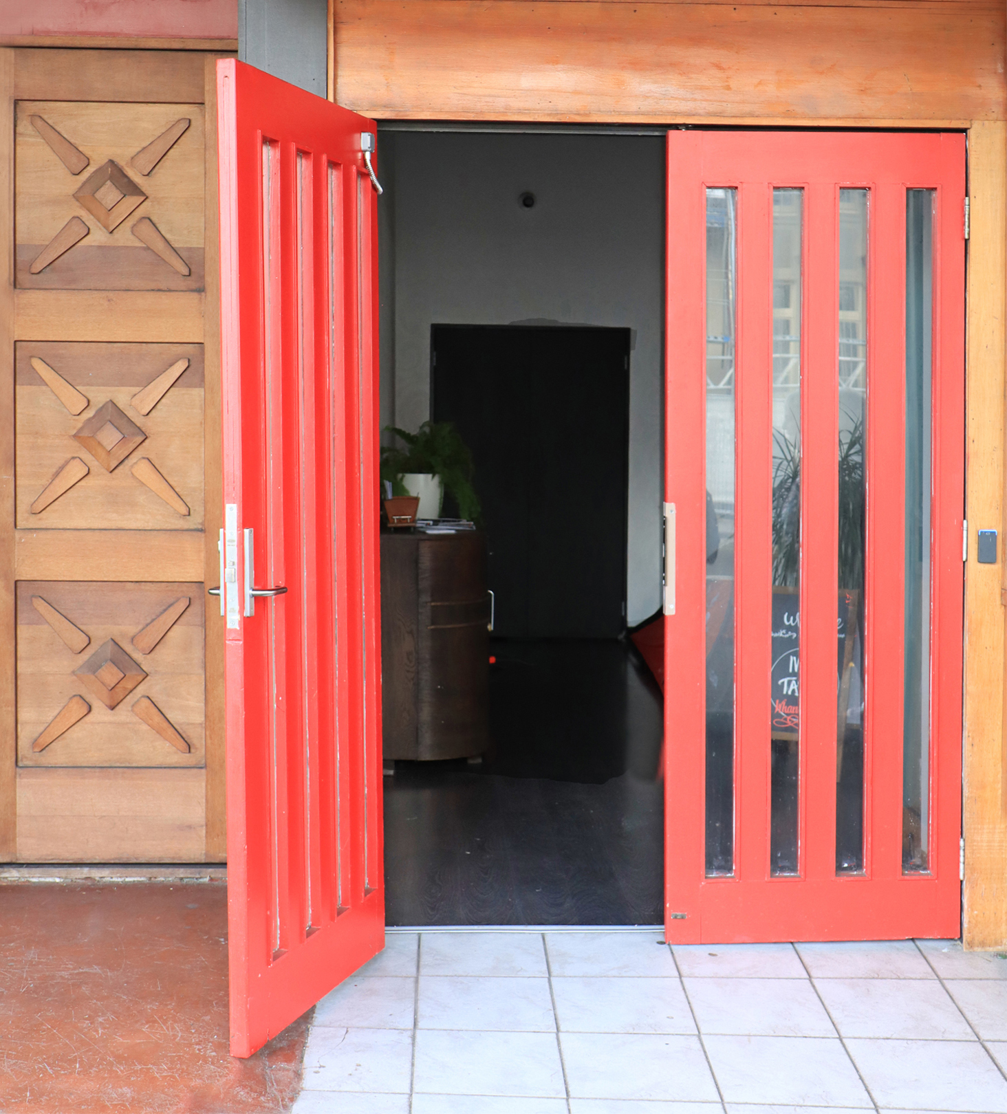
19 s Doorways The exposure of this image does not work very well.
There is very little detail in the background beyond the
red doors, and the doors and tile floor appear to be
too bright. Also there is a distracting red dot below the
handle of the piece of furniture.
Not Accepted
-

-
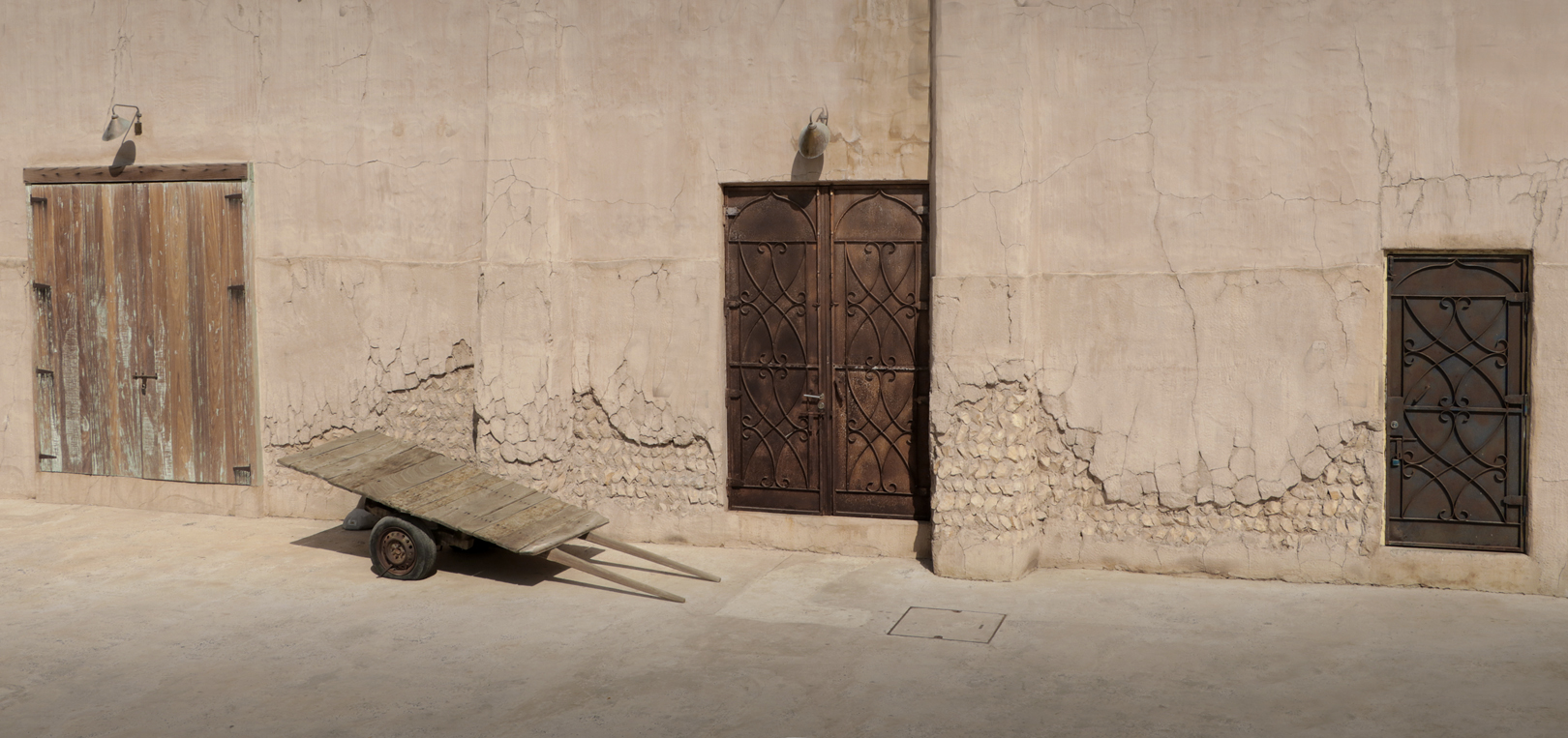
20 s Three doors Nice detail of the texture on the doors and the wall. I
think that a slight adjustment to the contrast may give
the rather flat lighting a bit of oomph.
Accepted
-
-
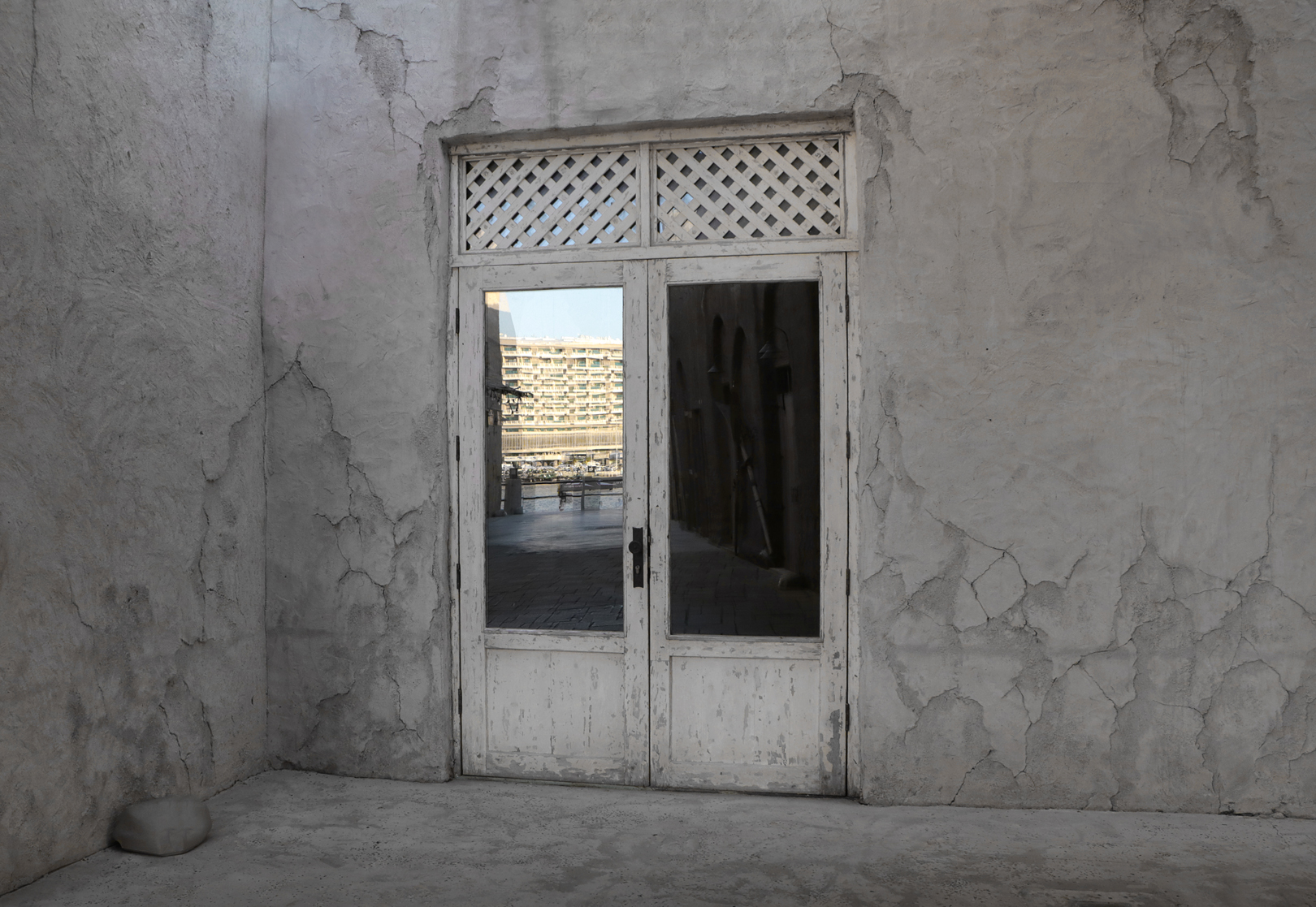
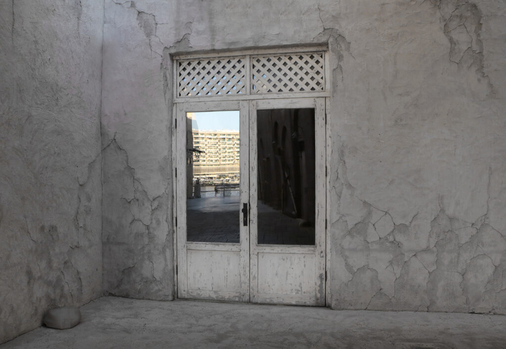
21 s View through the
door
The tonal contrast and the subdued lighting is well
captured in this image. The boulder in the bottom left
adds interest to the image and the placement of the
horizontal and vertical lines is very well done.
Honours
-
-
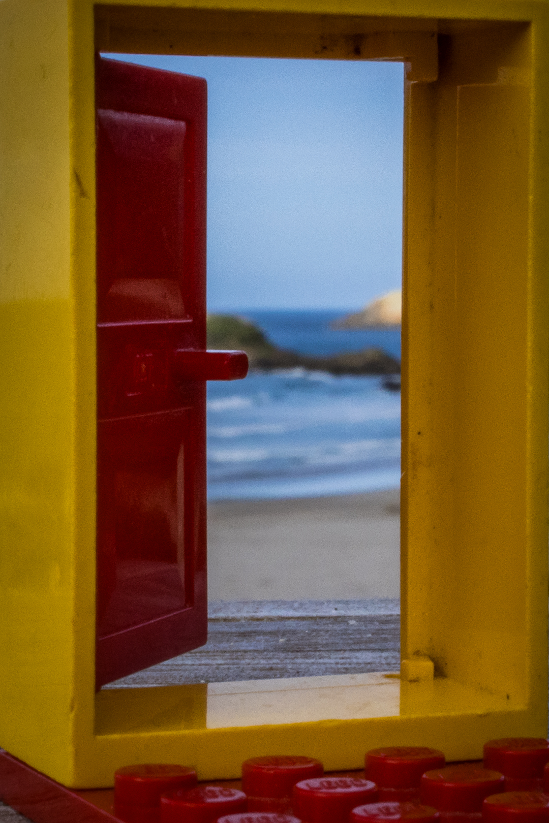
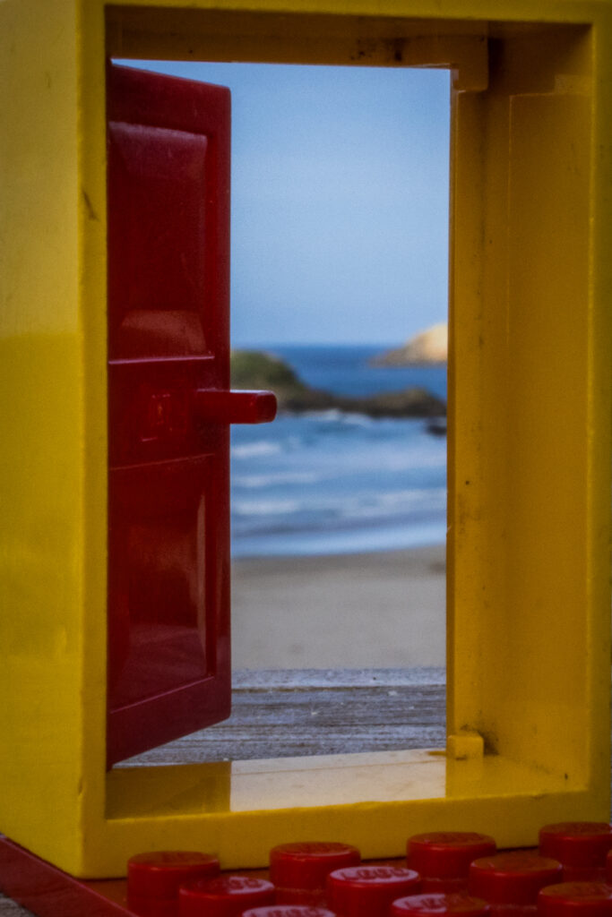
22 n Beach beyond the
bricks
You have used good imagination in this image. Nice
composition and good colour palette. Focus is slightly
soft on the lego surround.
Accepted
-
-
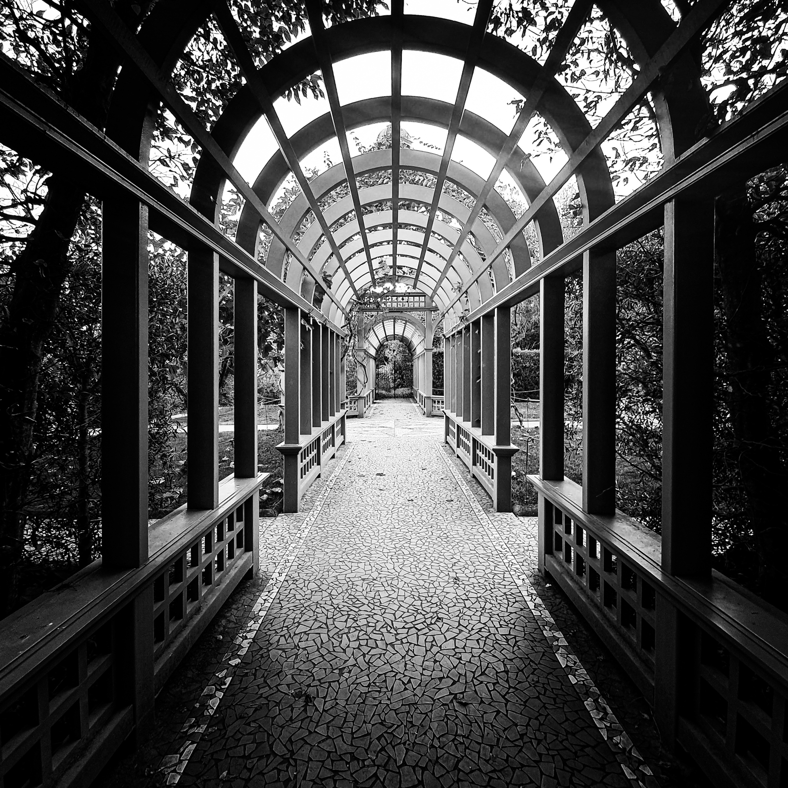
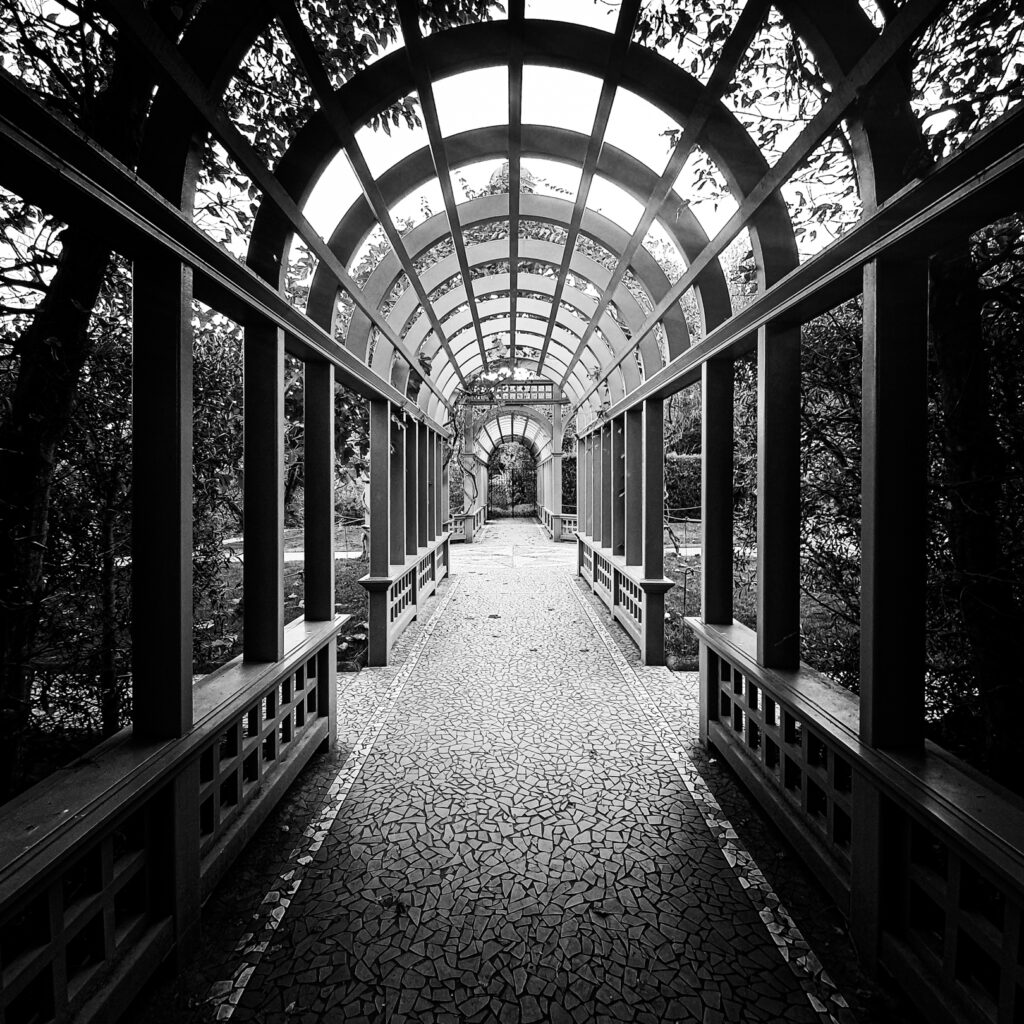
23 n Symmetry in shadows The monochrome treatment suits this image
perfectly.You have captured the tonal contrast
between the light and shadow very well and the detail
is very crisp. Your understanding of and use of leading
lines is excellent.
Honours
-

-
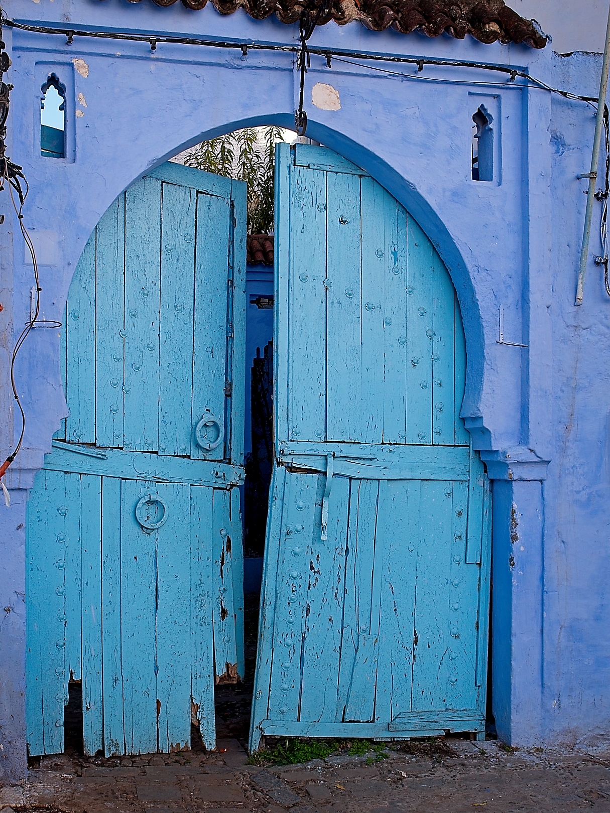
24 s Blue city doorway The dilapidated condition of the doorway gives the
image a lot of interest and is well captured.
Composing with a slight lean also adds to the tension
of this image.
Merit
-

-
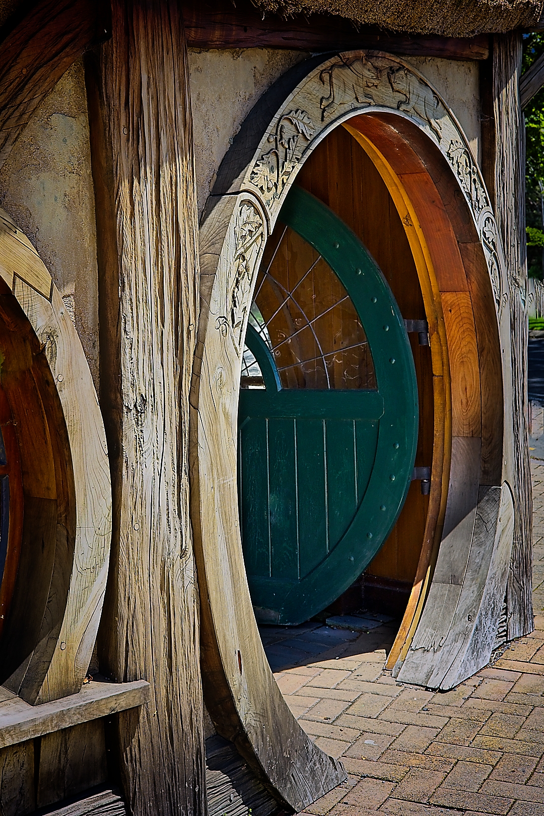
25 s Hobbit house To my eye, there is too much in this image. I think that
the curved window frame to the left is unnecessary
and that if this was removed, it would direct attention
more to the interesting shapes and patterns in the
doorway.
Accepted
-
-
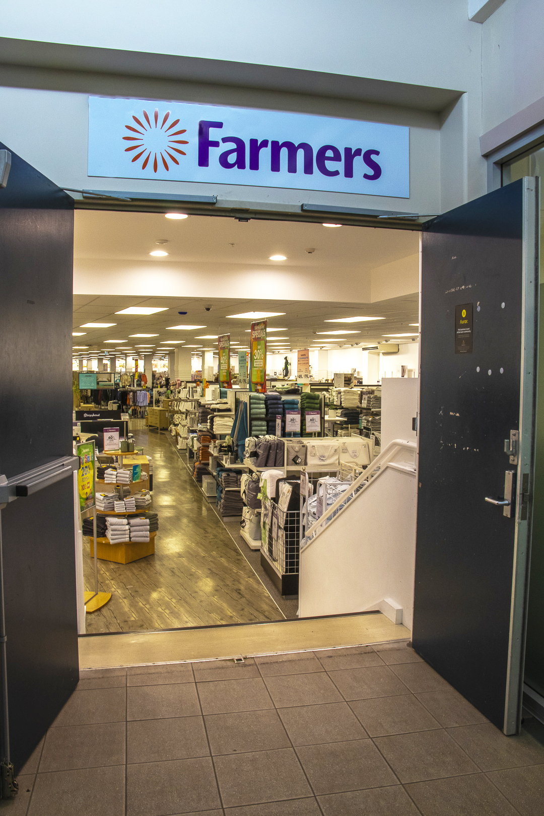
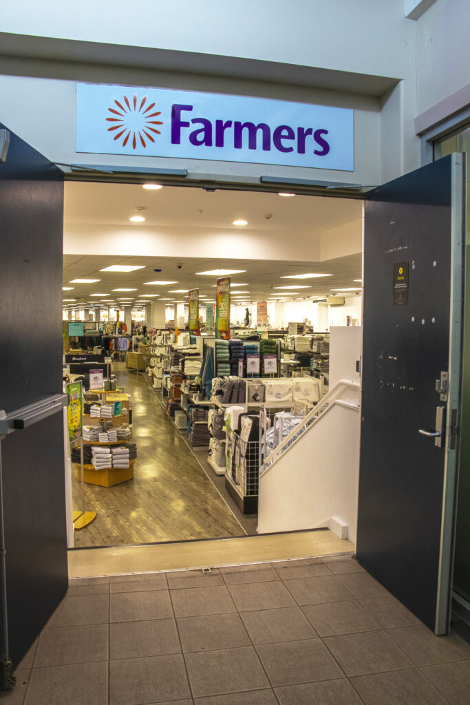
26 s Lets go shopping I find little to hold my attention in this image. The
doors are slightly cropped out, and the shop beyond is
uninteresting. The bright lights are also quite
distracting.
Not accepted
-

-
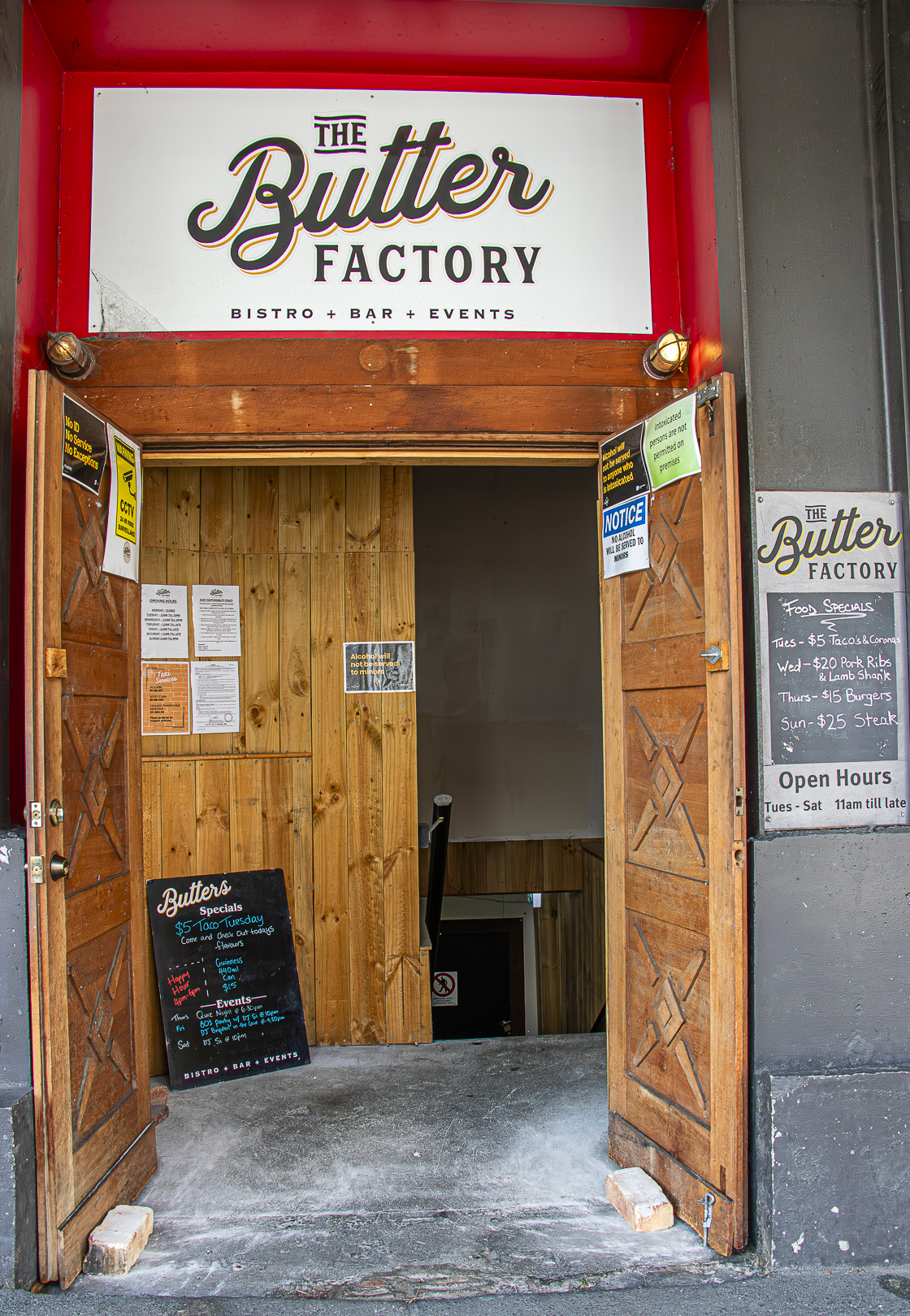
27 s Upstairs entrance I find my eye wandering around this image with no
obvious focal point. The notices and signs spread
throughout the image make it all rather confusing.
Perhaps recomposing and concentrating on one area
only may improve the image.
Not accepted
-

-
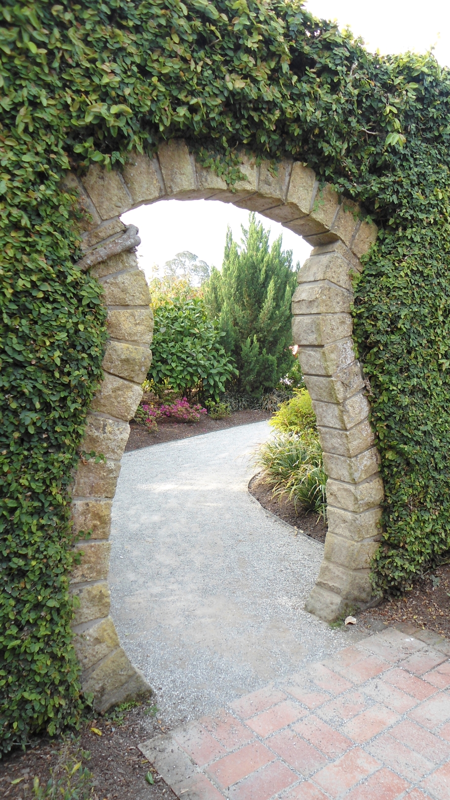
28 n Through the hedge You have used leading lines very effectively. The eye is
drawn naturally through the doorway and down the
path to the right.
Highly Commended
-
-
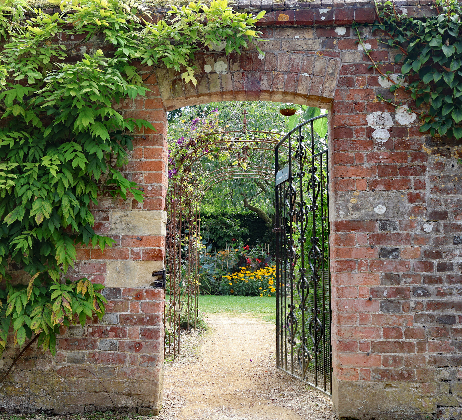
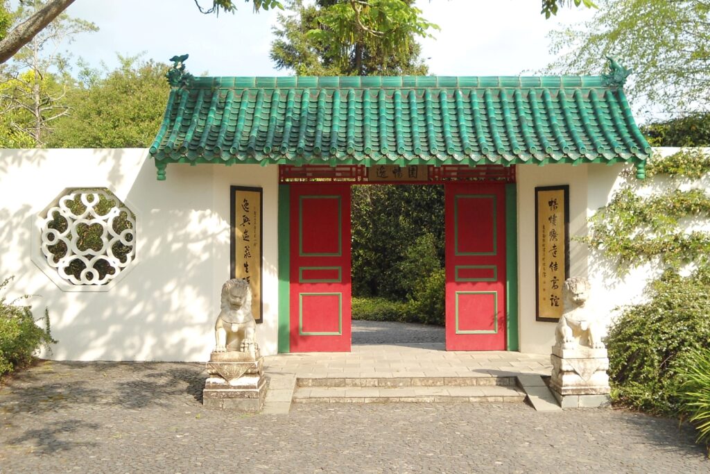
29 n Garden entry Well composed, however I think that if this image was
taken at a different time of day, the light and contrast
would be richer.
Accepted
-
-
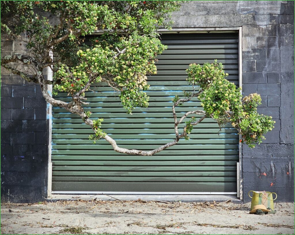
30 s The boat shed I like the way that you have included the bag and hat
on the bottom right. This balances the image nicely.
Accepted
-
-
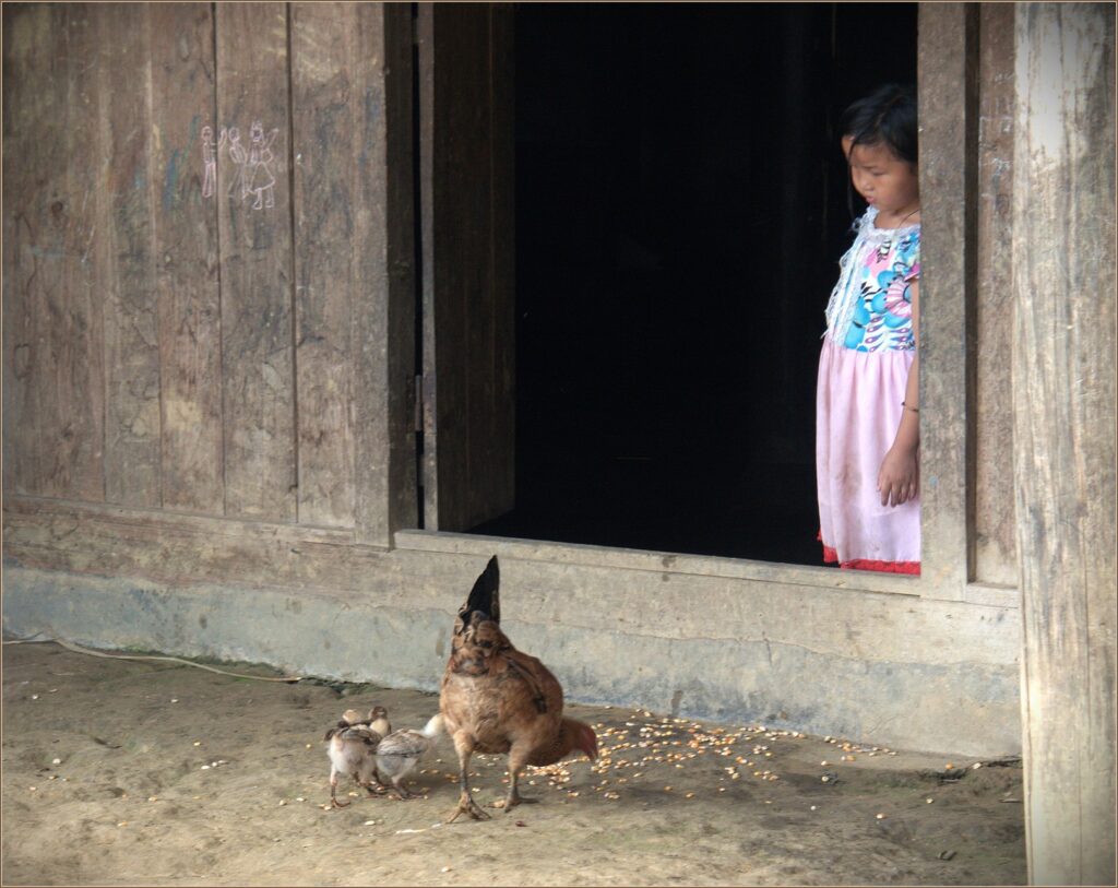
31 s Your home my home The concentration of the child on the hen and chicks
works well. Nice use of angles in the composition of
this image
Highly Commended