Assessed by Judy Stokes
Thankyou for the privilege of assessing your images and letting me enjoy the creativity from your perspective. When judging other’s images, I usually try and give helpful, technical comments and tips – I like to show you my point of view about your image – the things I love about it and the things I feel would improve it. Creative Photography for me is one of the joys of life and I find it is such a
wonderful way for us to show our individuality and show how we see and feel about things around us. I have also included a few of my own images for you to see so that you can get a feel for my style of work. If you don’t enjoy my images then you may also not enjoy my comments about yours – that’s OK -we are all individuals and have our own view of the world…and one thing I have learnt during my photography journey is to stand strong and believe in your own work and the way YOU see the world.
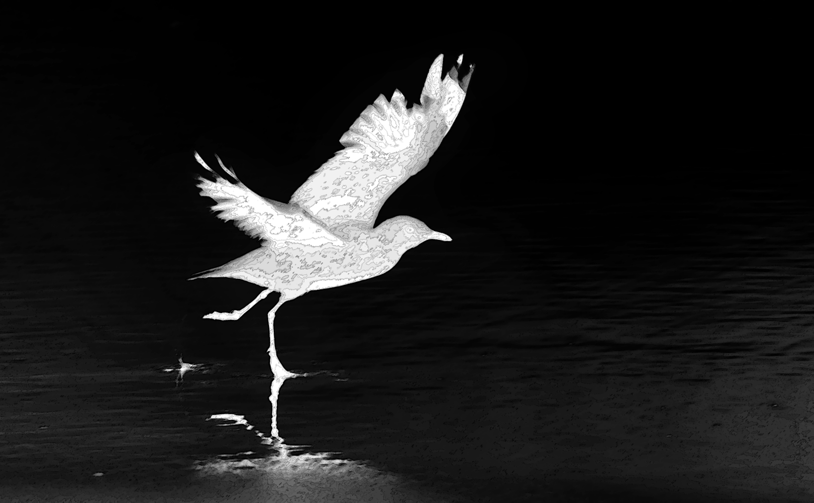
My winner from these images is Number 12 – SEAGULL ON THE SKIP and the runner up is
Number 8 MEMORIES OF MEXICO
-
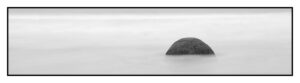
- 1. LONE BOULDER – Merit. I enjoy this beautifully balanced ethereal image of the boulder. I do unfortunately notice a dust spot in the image to the left and just above the boulder and do encourage you to please zoom up 100% when processing your image and remove these with the clone or spot heal tool. They do drop the quality down a notch. To push the image more into the creative set subject I would encourage you to think of a different title to get our creative juices flowing…perhaps “Lost planet in the mists of time” – even though this doesn’t change the image it does show a creative concept for the image. I`m also not sure the heavy black border adds to the image. I really like your thin letterbox crop for the image and feel the black and white treatment for the image is successful.
-
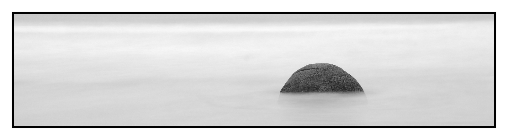
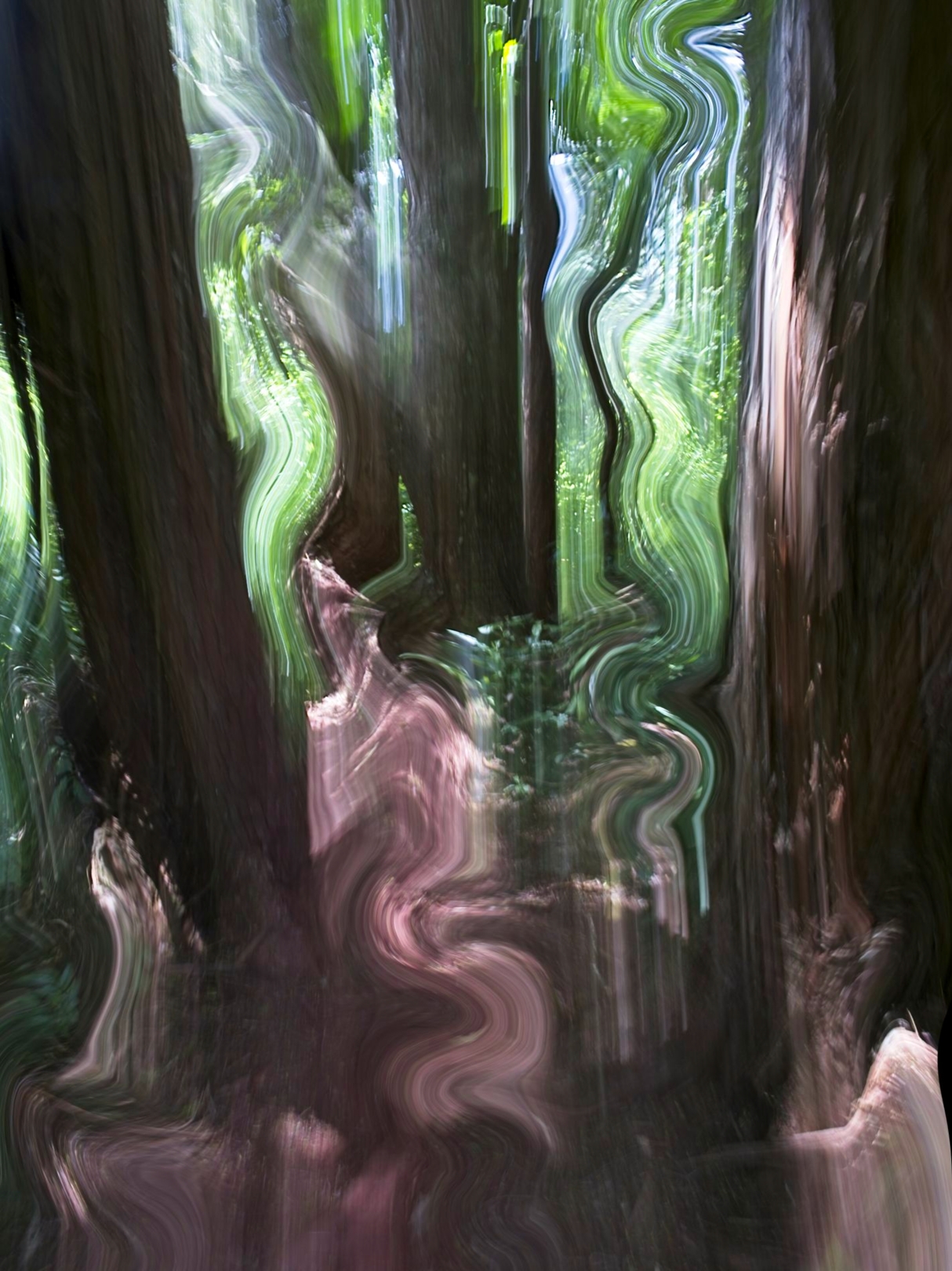
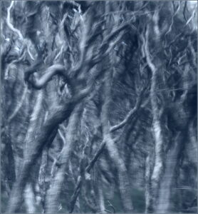
- 2. WONKY FOREST– Accepted The liquify tool has led to a bit of creativity here which I enjoy. Our eyes as viewers are naturally led to the brightest parts of images and this can be a good tool to use, or sometimes also ends up as taking our eyes to distractions. In this case my eye is drawn to the bottom right corner, the brighter left edge and parts of the top of the image. I feel the top parts work but I do find the bottom and left distractions – it’s useful to notice these and then either fix them or crop them out. I also find the very dark tree trunk on the left a jarring solid distraction. For me the gems of the image are the wiggly pink path into the image from the bottom and the wiggly segment on the RH third. Good on you for your creative playing!
-

- 3. FLOWER OF THE UNIVERSE- accepted I enjoy your unusual concept for this image and feel the gem of the image is where the flowers are reflected in the bubble. I do find distractions in the bottom of the image and also wonder if you have reached your optimal composition. I`m not sure all the dark area around the focal point adds to the image. It’s often useful to squint when you are trying to figure out balance for an image or make the image small in the scree and look from afar. I feel the bits of yellow pollen on the bottom of the bubble are a nice touch.
-
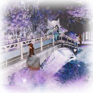
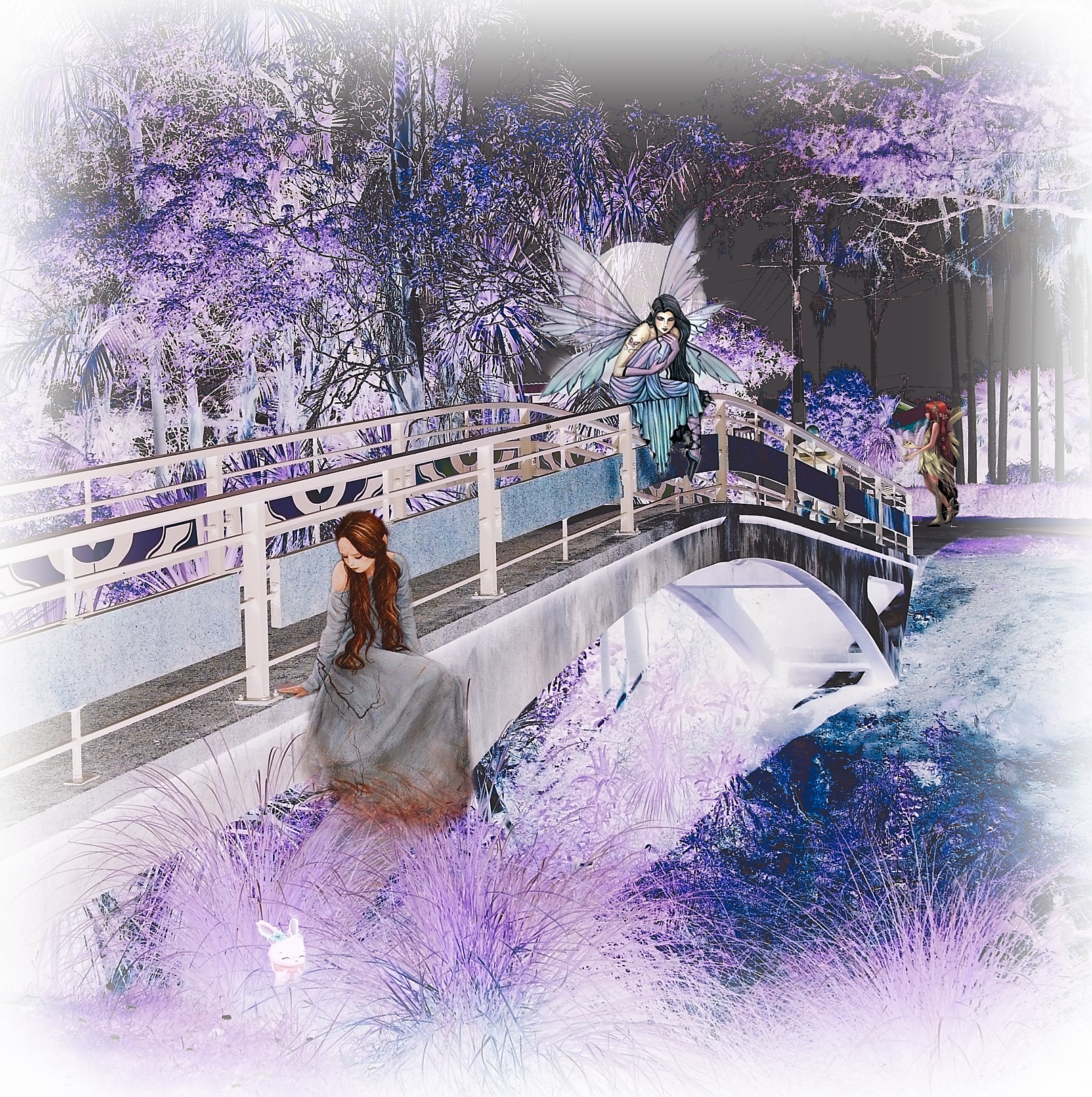
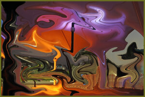
- 4. FAIRY WONDERLAND – merit It looks like you had great fun post processing this image. I do feel the purple toning works nicely with your theme. I`m not sure the rather bland grey block in the background on the RHside back works with the fairy/wonderland theme and I find it jars a bit with the white vignette. I also find the style of the bridge a little at odds with the theme too. I like the way you have created a sense of depth with the three people getting smaller through the image. For me the central fairy on the bridge is the gem of the image.
-
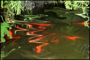
- 5. REFRACTED IMAGE – merit I enjoy the effect you have created through the centre of the image and I feel the green and red pop each other nicely. I am not sure the juxtaposition of the rocks at the back against the more abstract area is successful and I suggest it might be worth trying a crop off the top. The leading lines created with the distortion I feel are nicely successful.
-
- 6. ABSTRACT– HC I feel your combination of the orange tones and purples work well together to create an image with zing. The bland grey patch on the right hand edge for me is at odds with the rest of the image and I feel a crop off the right, creating a square image, could perhaps lift the image.. I like the way the distorted pipes create leading lines through the image and the fact that there is lots to look at through the image.

-
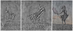
- 7. BLOOPER REEL -merit I enjoy the monochrome treatment for your concept. For me this is an image where less could be more – I`m not sure having this as a triptych adds to the image. I find the edge of the grass lines between images catches my eye. As a whole I feel just choosing one of these and having it is a single image might be stronger. I enjoy the texture of the backgrounds and the sense of movement within the segments.
-
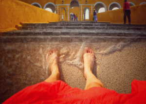
- 8. MEMORIES OF MEXICO-honours I feel this image has immediate impact with its unusual concept and colour mix. I do find the person walking on the right with their head cropped is a distraction and might be worth taking out of the image. I enjoy the smaller people at the top and for me the bottom of the image hits a real sweet spot.

-
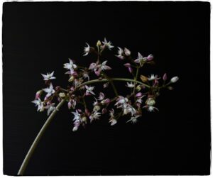
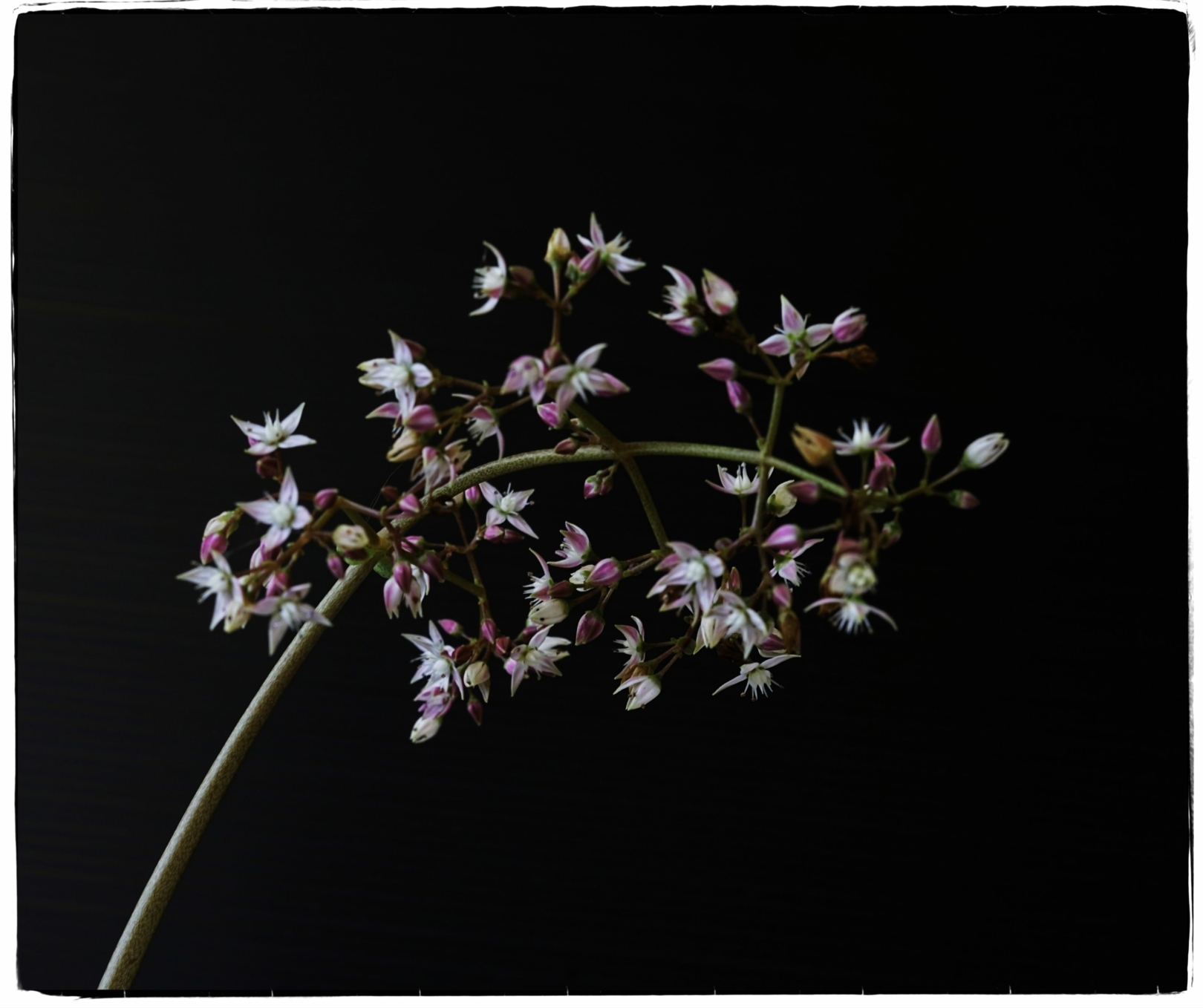
- 9. CRASSULA- accepted The leading line of the stem and the balance of the subject matter within the frame works well in my view. I do feel though that this image errs on the side of not being creative enough to do well within this category. I like the border you have chosen.
-

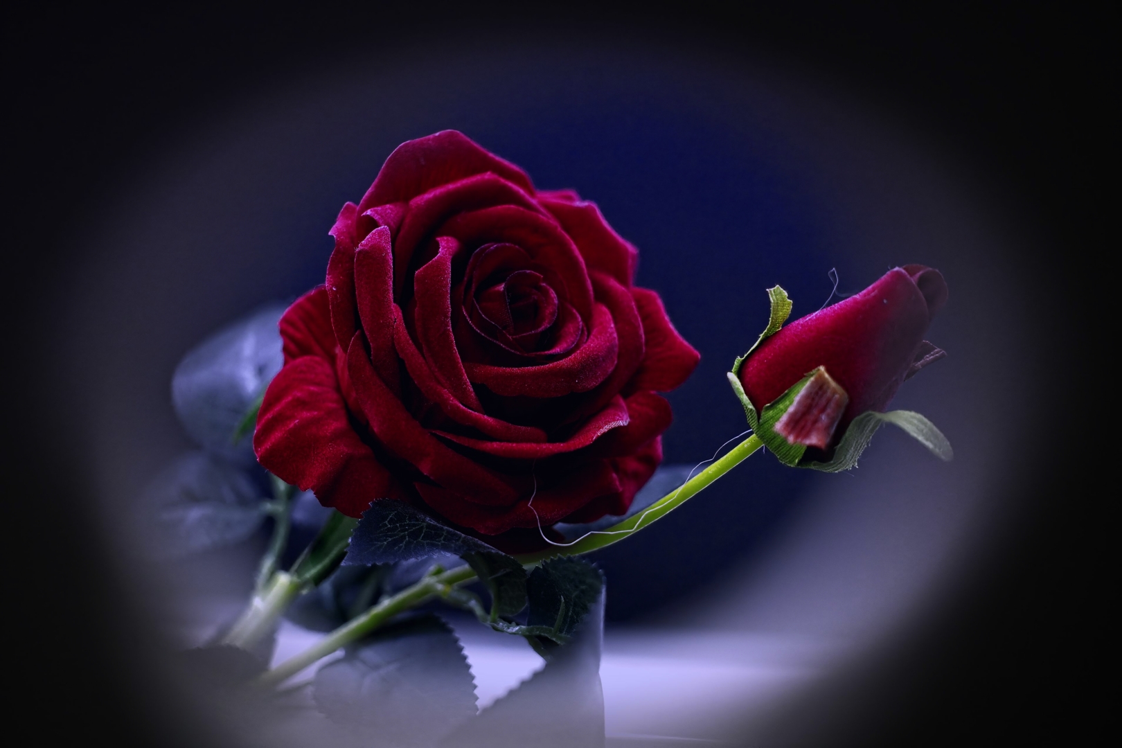
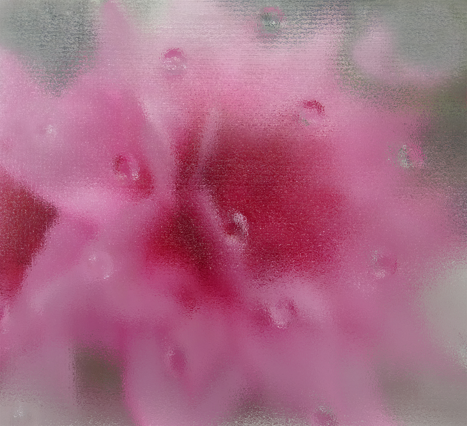
- 10. THE ROSE- accepted I enjoy the tones of the rich red rose against the almost magenta background. I feel adding a vignette to an image is potentially not enough to push it into the realm of doing well as a creative image. I do find the lighter parts of the image near the bottom a distraction. I enjoy the velvety feel of the petals.
-
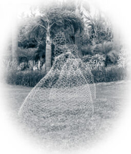
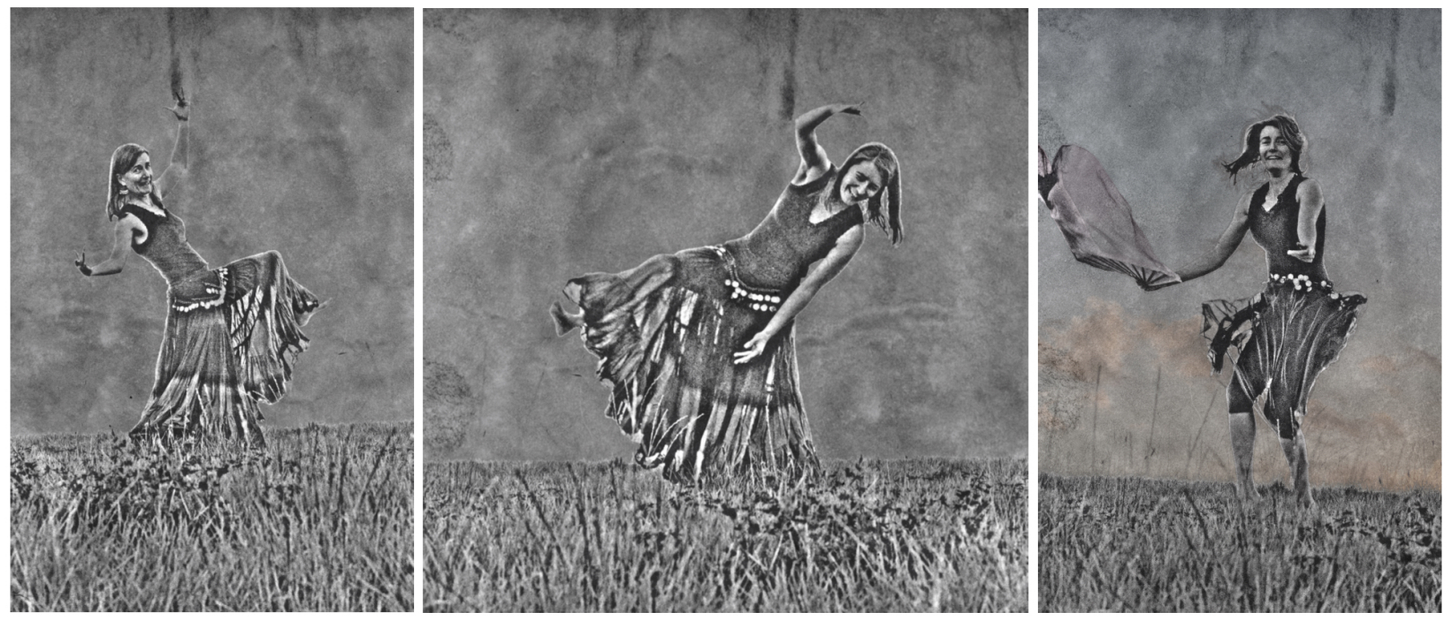
- 11. GHOST DANCER– accepted I feel having a double dress does work well with your concept of suggesting dance. For me the foliage and trees in the background of the image form a strong part of the image and I feel your subject matter gets a bit lost against it. Its always a question when using sculptures or other’s art as your subject matter as to where the creativity comes from…it might have been fun with this concept to have an actually model moving with a slow shutter speed.. I feel the white vignette works for your ghostly concept.
-

- 12. SEAGULL ON THE SKIP honours For me this image ticks all the boxes for a creative image. I enjoy the feeling of action and the patterning within the seagull’s wings…I do get a little distracted by the grey segment across the top wing. I enjoy the simplicity of the image and it’s uniqueness.
-

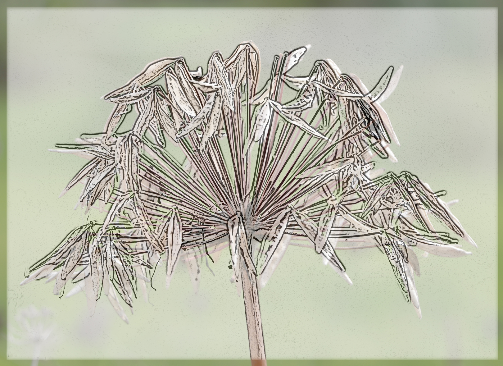
- 13. A WILD SEED HEAD – HC I feel your mix and layering within this image puts it neatly into the creative set subject. The composition feels a little static to me and it might be worth playing with it a little more to push the boundaries. I do enjoy the contrasting tones you have through the image.
-

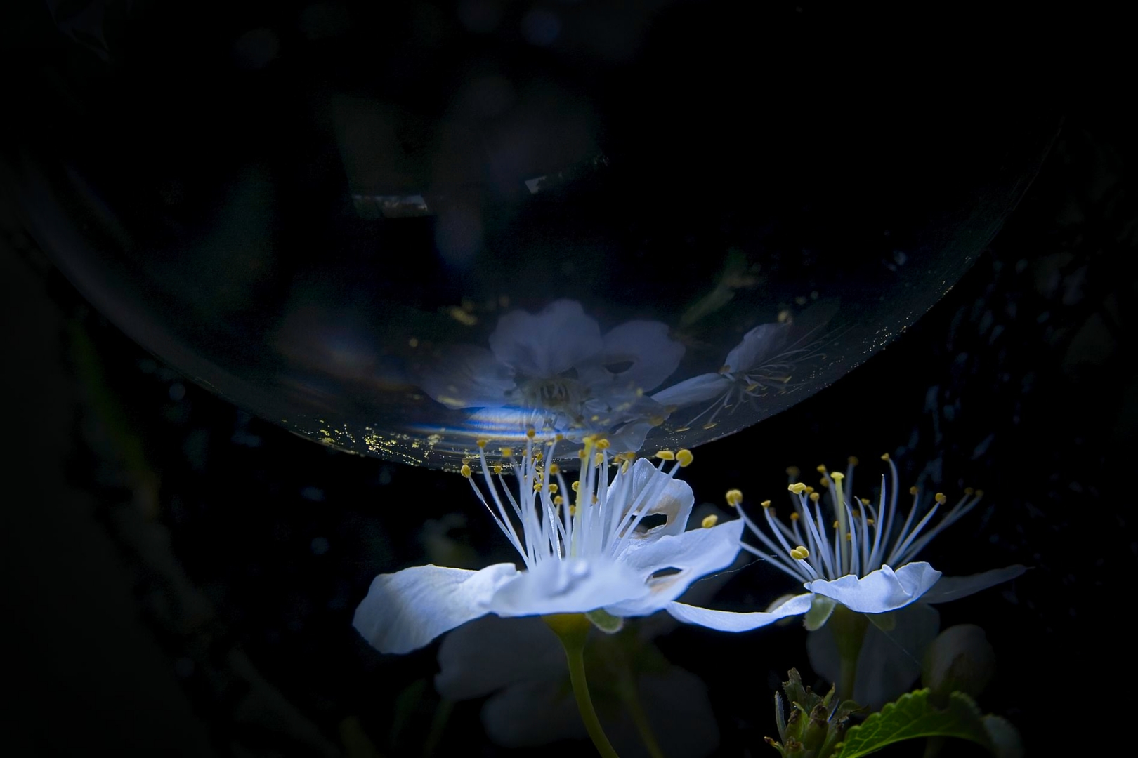
- 14. THROUGH THE GLASS SOFTLY- honours Your creativity with your camera has worked well for this image. I do feel my eye wanders a little to the bright area at the top and it might be worth bringing that down and the middle of the flower area up a bit…but I commend you on your concept.
-

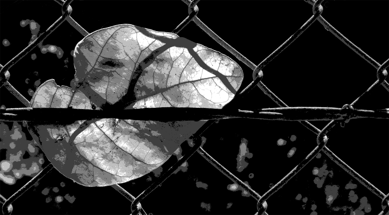
- 15. EMESHED- accepted I enjoy the shadow of the mesh across the leaf in this image and appreciate your work in post processing to lift this image creatively. I`m not sure all of the RHside of the image is needed to tell your story and wonder if a crop might lift the image. I do find the very strong line of the fence wire through the centre of the image a strong leading line for my eye as a viewer, whizzing me through the centre of the image and out the side. I wonder if potentially having the leaf still in colour against the mono background would help keep the leaf as the focal point.
-
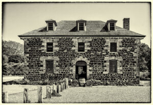
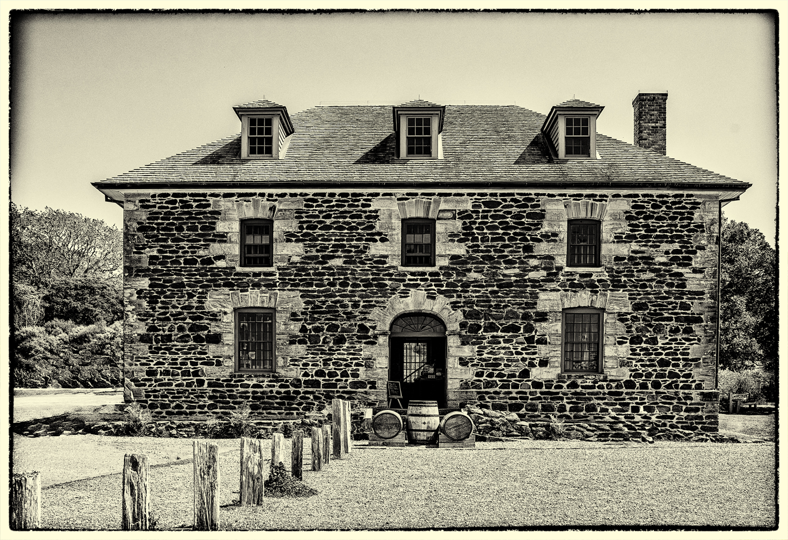
- 16. TRADING SINCE 1836 – HC I feel you have created a successful old worldy feel for this image and that all your elements work together. Is it creative enough to be a top notch creative image? In my view perhaps not quite creative enough but still a well polished and finished image.
-
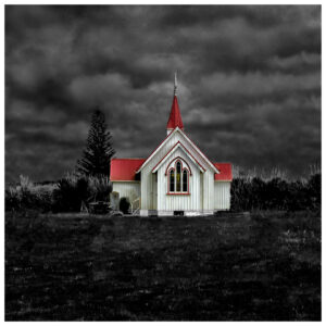
- 17. SOMEWHERE IN NORTHLAND -HC I feel your concept for this image to leave the church in colour and have a moody background is successful in the way the church really pops in the image. I`m not sure the thickish white border adds to the image. I do question whether the creativity in this image is enough to be a top level image in a creative category. I really enjoy the central placement of the church in the frame.

-
- 18. WHERE THE WILD THINGS WERE – honours I feel your title leads us cleverly into what your concept for this image is. I enjoy the feeling of movement in the image – enough to make it creative and mysterious but not too much so we can’t enjoy the subject matter. Be careful there are a few brighter distractions in the image and I feel a vignette and lightening the middle of the image might lift it…but as it stands I enjoy your creativity and feeling of wildness suggested in the image.
-
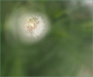
- 19. WISHES – accepted I feel your blurred green tones successfully take our eye to the dandelion hero of the image. In my view the focus of the dandelion itself – not sharp enough to be sharp and not soft enough to push it into the creative realm lets the image down…and I find the blending between the green and the dandelion distracting. I enjoy your very thin border.
-

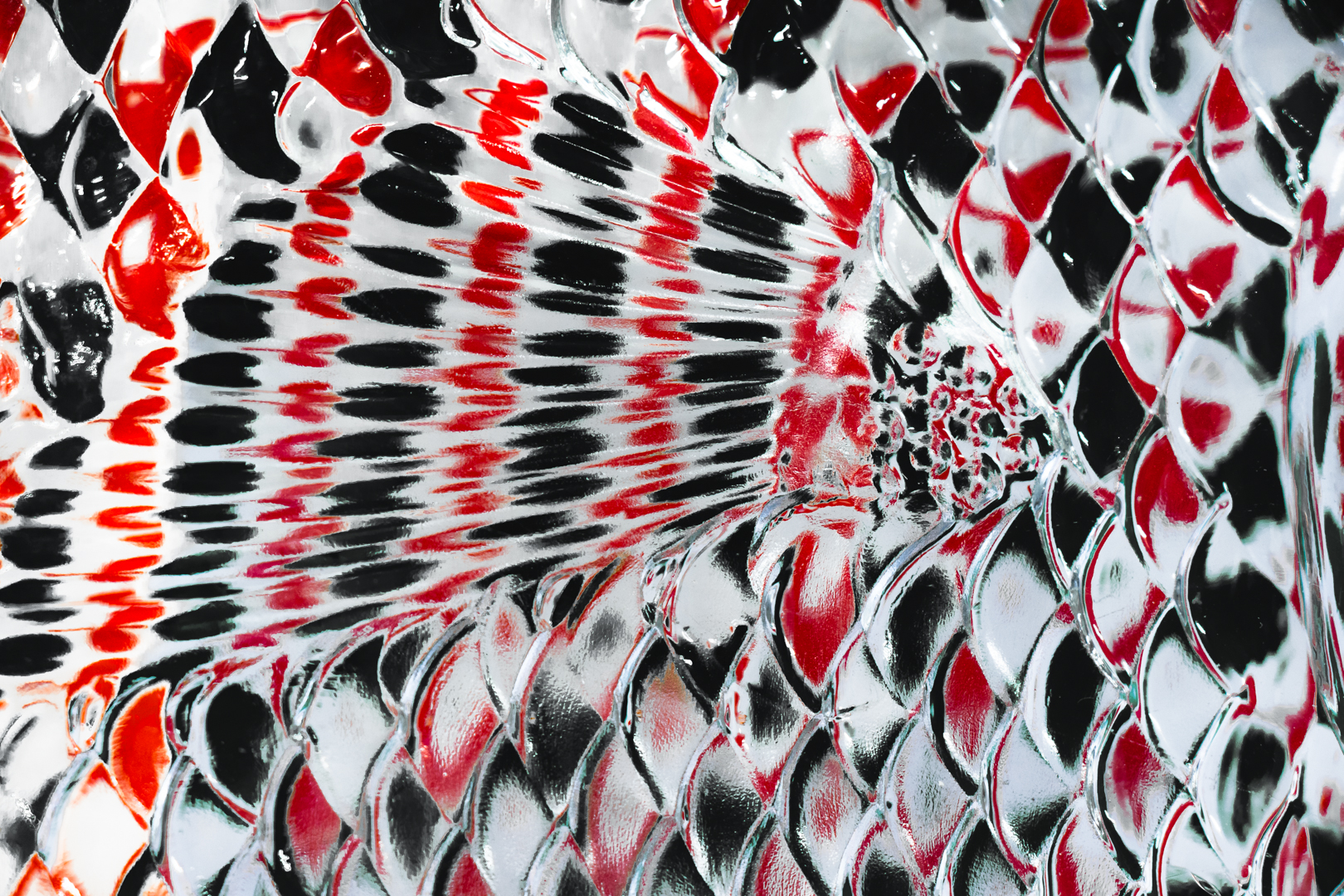
- 20. FISH FIN -HC I enjoy the way you have stylized the subject matter in this image. I wonder whether rotating the image to the right and having it portrait shaped, might push it even further down the path of being abstract and more creative. I find the balance of brightness between the LHside and RHside a little uneven. I feel the red, black and white colouring successful.
-

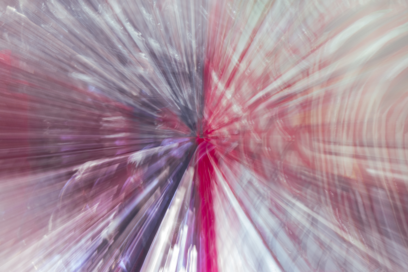
- 21. ROLL THE LENS – merit I feel your tones of purple, red and white work together nicely. And the zoom effect gives us a crisp focal point. My eye is distracted by the very bright bottom edge and I feel potentially either cropping this off or taking the brightness down and lightening the pinpoint centre might strengthen the image. I commend you on your creativity with your camera.
-
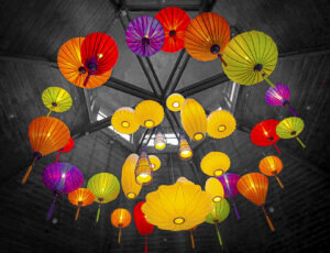
- 22. COLOURFUL LANTERNS – accepted What a lovely array of colourful lanterns – I do find quite a few distractions in the background -the structure of the roof above them and especially the white stripes of the light through the high windows. I feel really blackening their background completely might lift the image. I also feel perhaps playing with a bit of camera movement in this venue would have given you all sorts of interesting abstract and potentially more creative images.

-
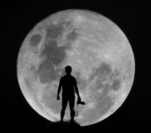
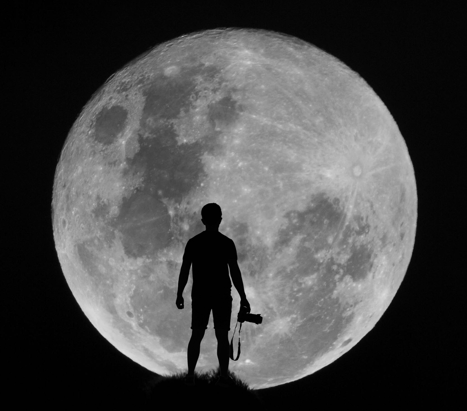
- 23. SUPERMOONED-HC What fabulous quality you have in your moon and I feel the silhouette against it works beautifully -For me a creative category is all about pushing boundaries and presenting an image that gets others asking questions – How was it created? What is it? Or just simply…wow how did you even think of that…I find this a strong image with great balance and presentation – but just a wee bit under creative in my view.