Judge – Noline Skeet
-

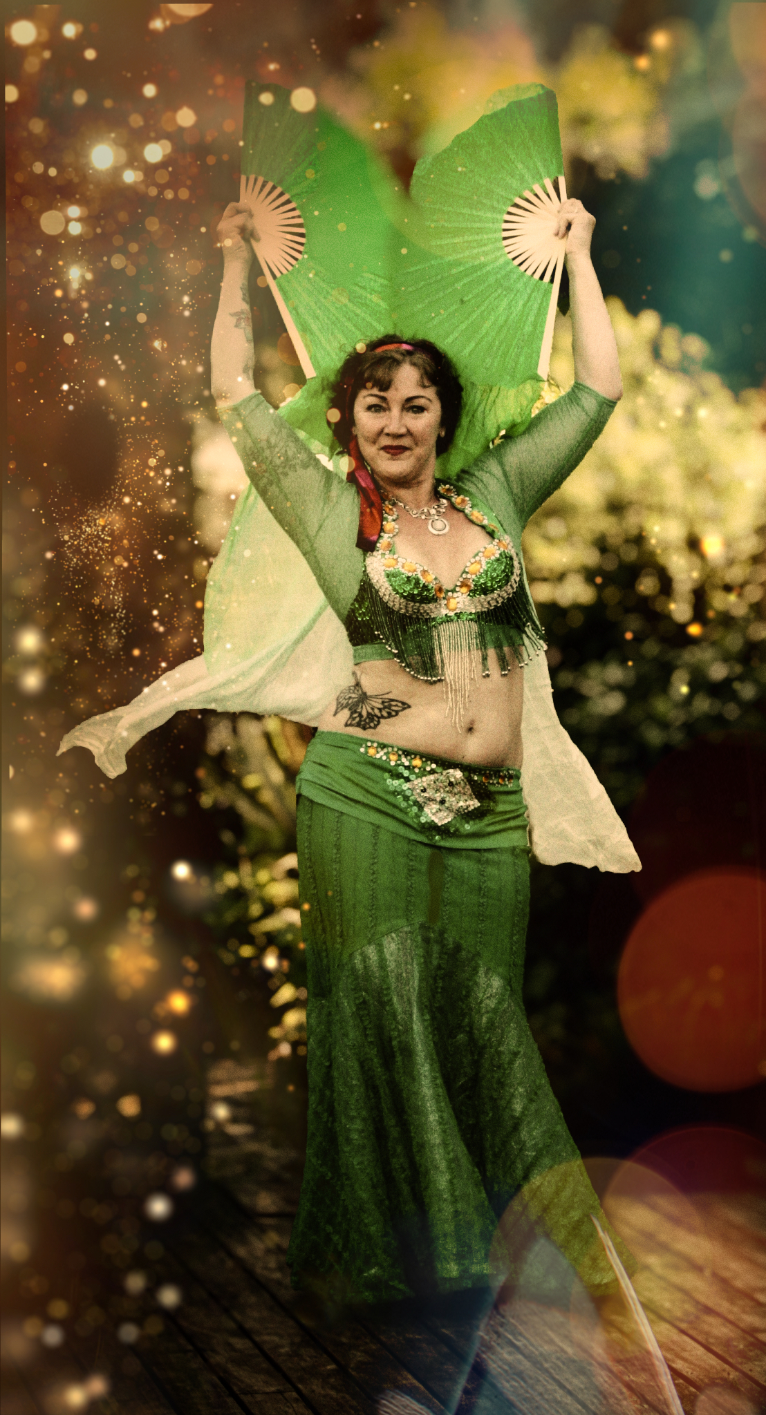
- The Green Queen 1 Merit Very pretty dancer with a lovely smile looking at the camera. The sparkly background adds to the story but I find it rather distracting. Getting more movement might have made this more interesting and creative.
-

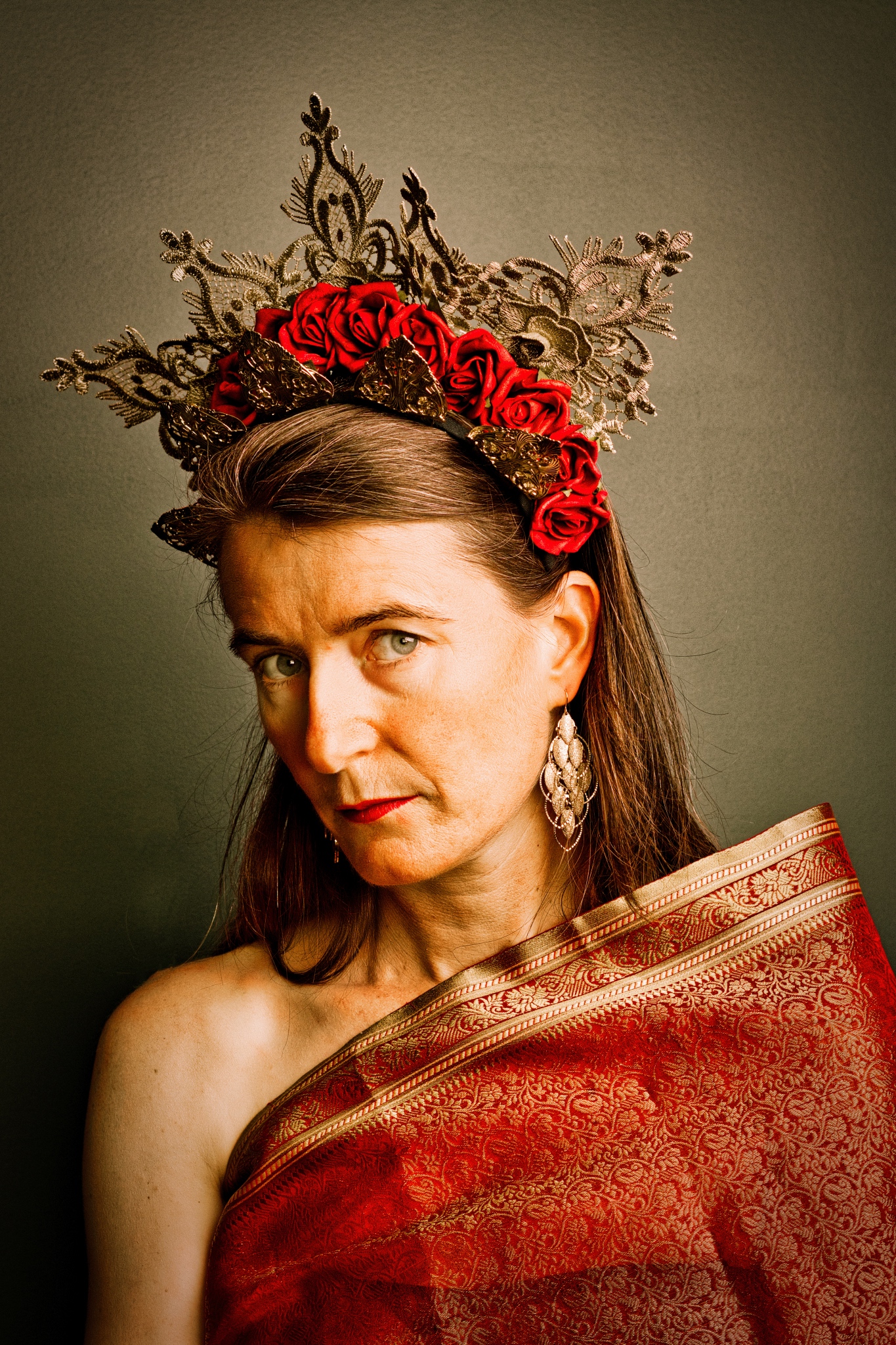
- Dolly and the Sprite 3 Acceptance Intriguing image in the way the author has chosen the lighting to make an unusual impact on the image. I’m not sure about the composition and it doesn’t really appeal to me
-

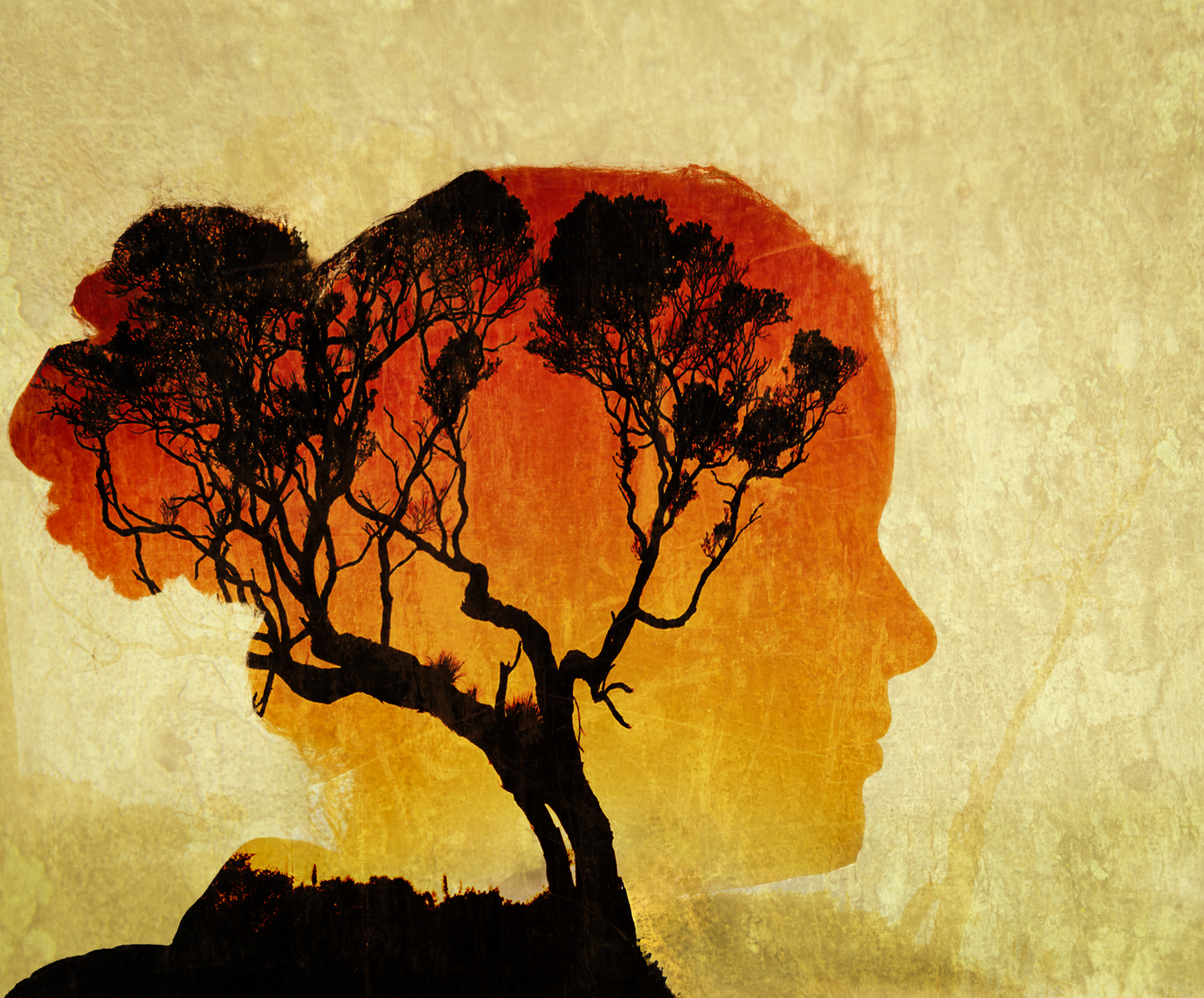
- Inner Strength 4 Honours A double exposure that gave instant impact. for me. The use of dark and light with texture adds to the interest. The hair line taking on the tree branches is effective. Makes me think the girl is getting herself into a tangle.
-
- OtamateaDreaming_ 5 Acceptance A creative use of colour with the black and white. Im not sure where my centre of interest is and find myself going all around the image. Perhaps you could have the fence leading in from left to right and choose a different accent colour to be more in keeping with a landscape.
-

- OnceWereCoathangers 6 H/C Abstract and creative. I enjoy the colour combination. Cropping it could add to the drama.

-

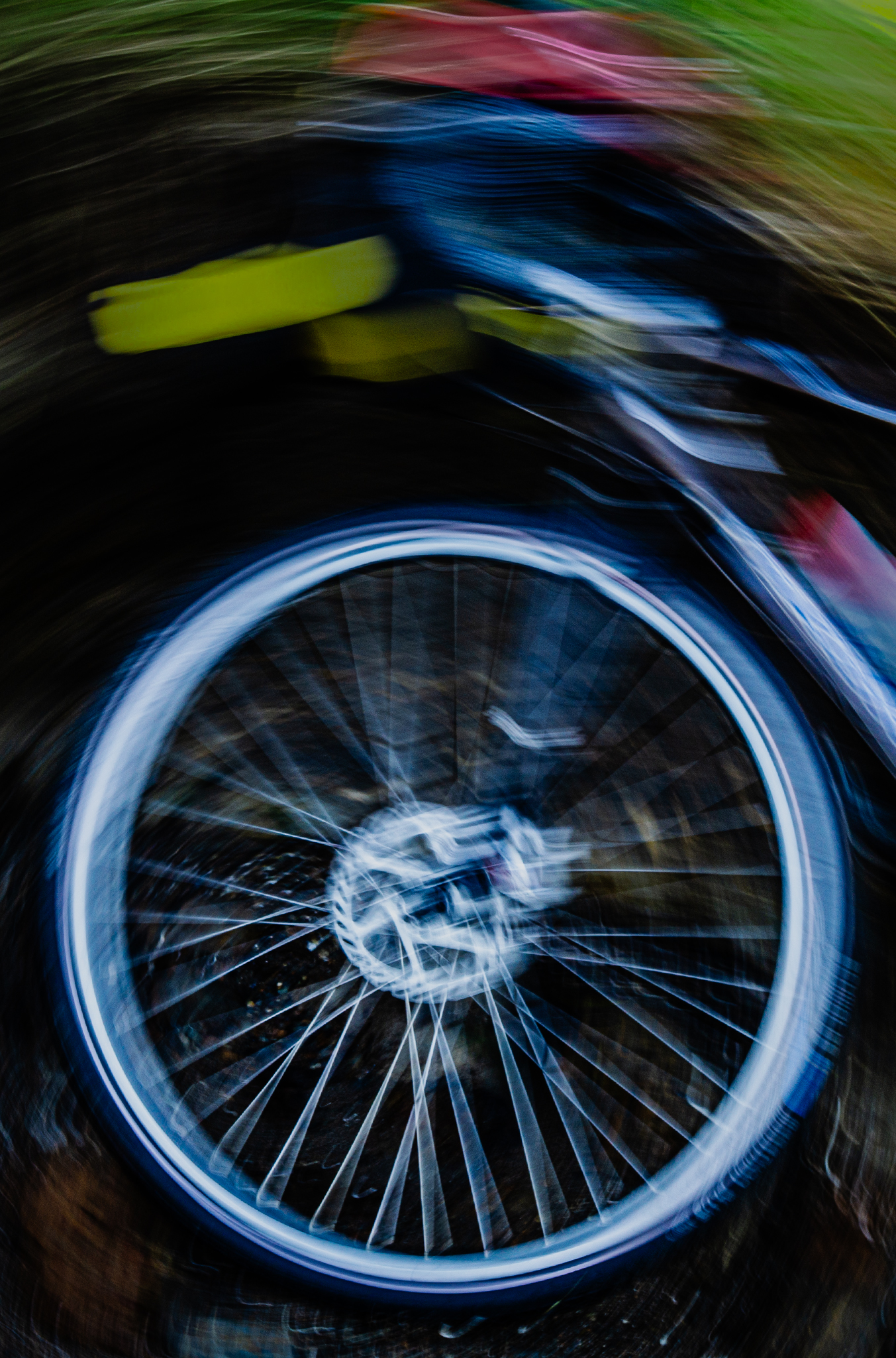
- YouSpinMeRightRound 7 Honours Runner Up This intrigues me and I’m wondering what the rider is up to. I like the slow shutter speed on the moving wheel, and the spokes are sharper to lead you into the image. The colour in the rider (I’m presuming) adds to the story of speed.
-
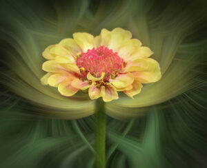
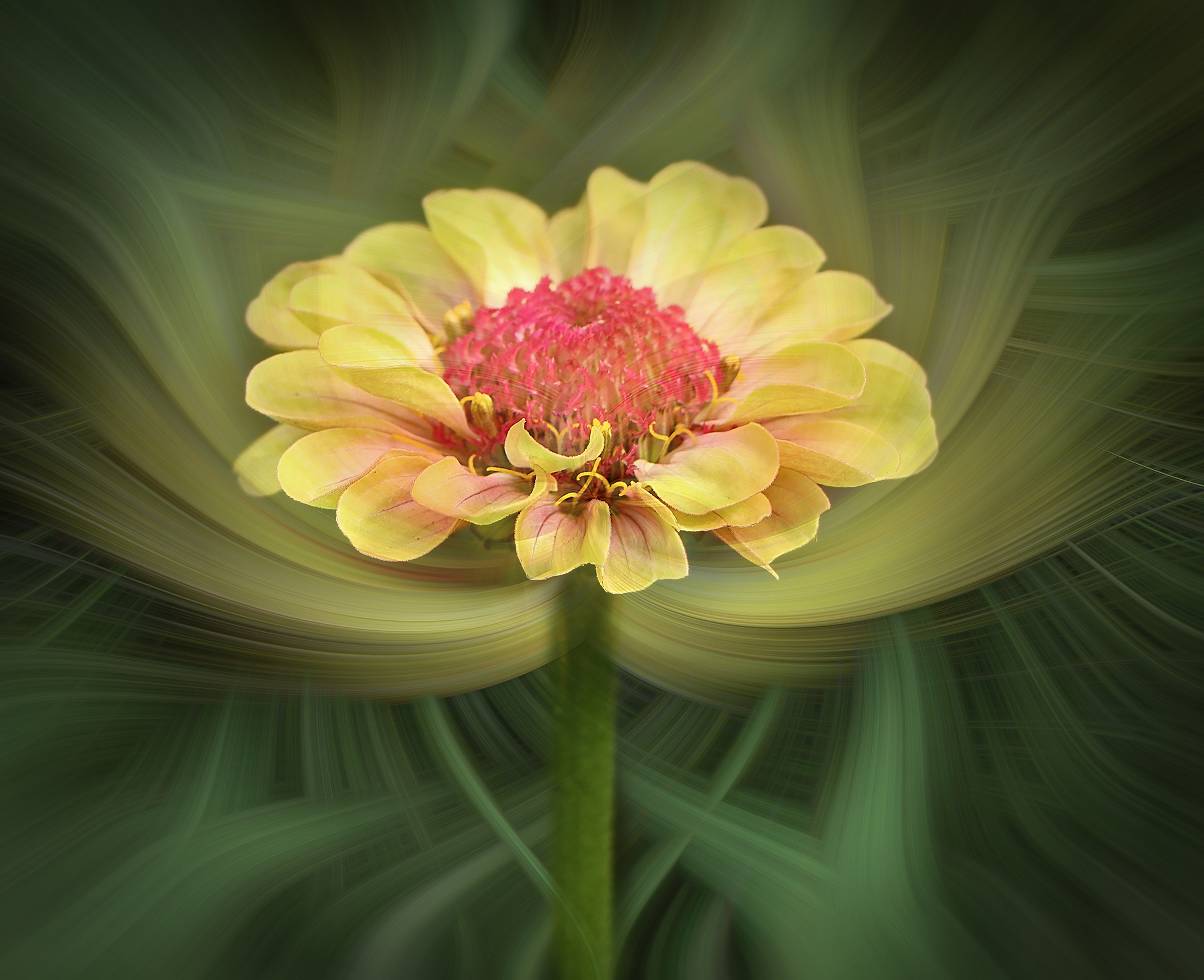
- ZinniaBloom 8 Honours Beautiful capture of a zinnia.I like the creative background that surrounds the flower. I probably would cut off more of the bottom to focus more on the flower and the background enveloping the flower.
-
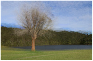
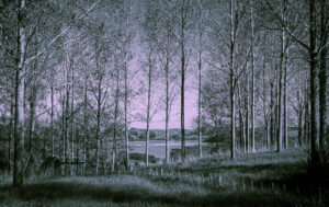
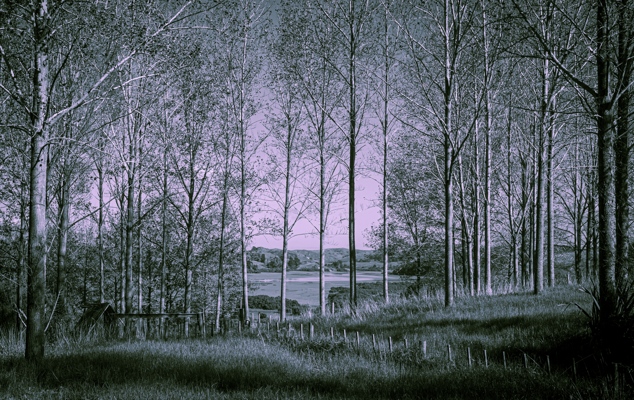
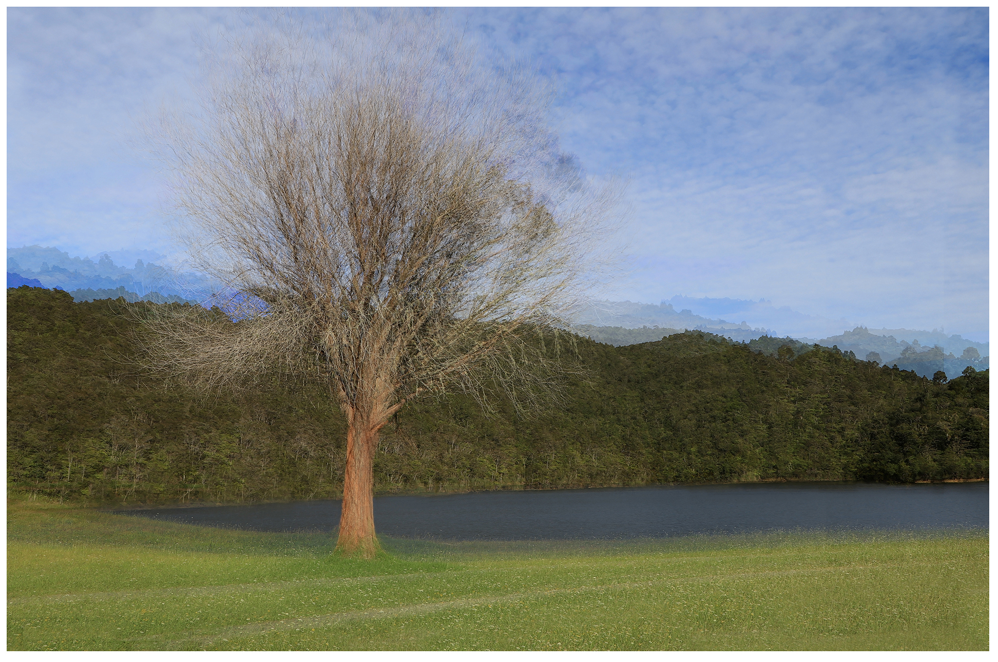
- LoneTreeATLakeEdge 9 Honours The Pep Ventosa technique is very effective with trees. The author has done a good job of this technique and included a scene that becomes very painterly.
-

- Stargate 10 Highly Commended Conjures up feelings of excitement. Very graphic and symmetrical with effective use of complementary colours. Perhaps it could have been turned 90 degrees to get more impact with added space.

-
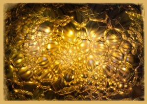
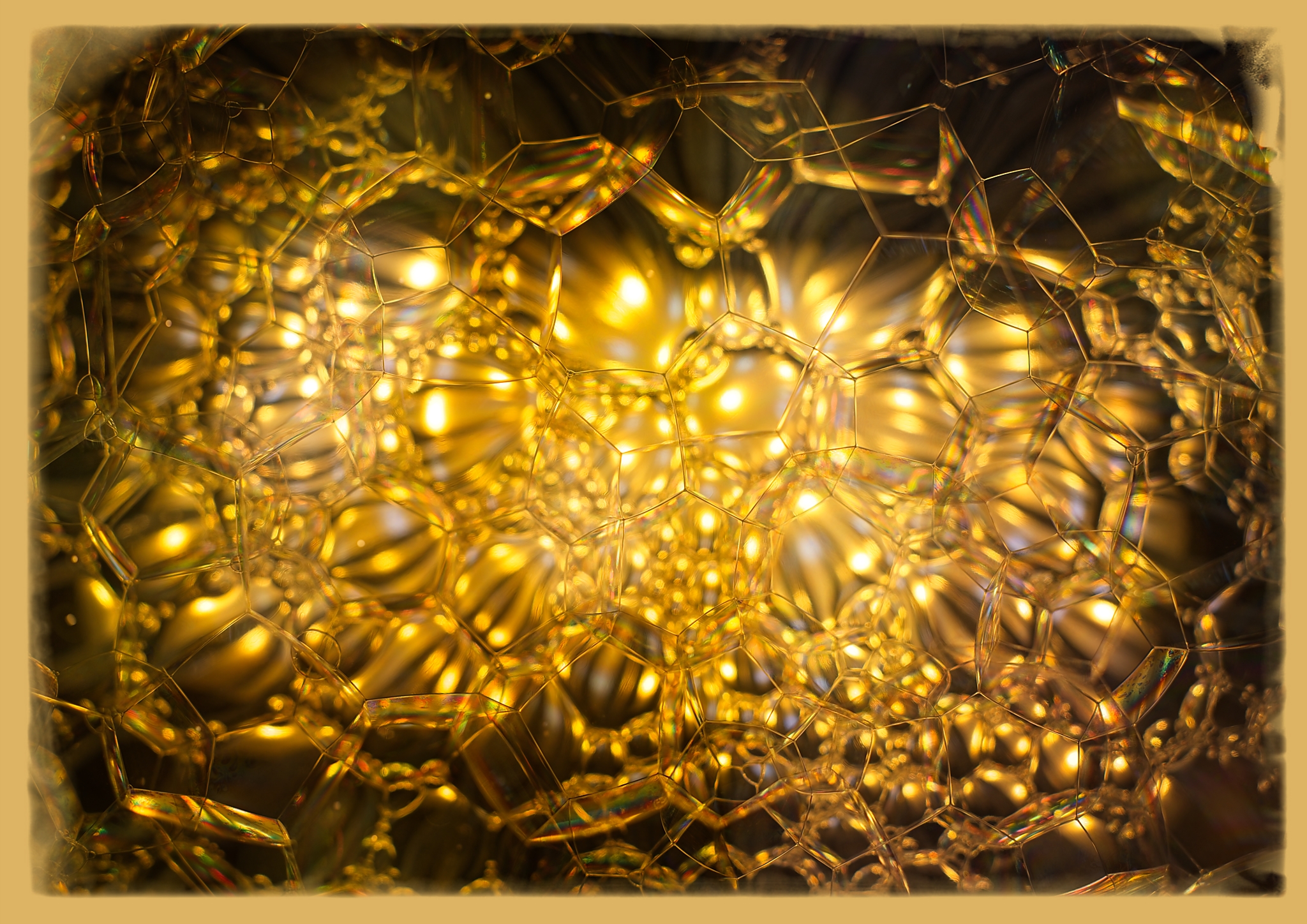
- GoldenDreams 11 Merit An abstract image with geometric shapes using tones of gold is interesting. I’m trying to find a focal point to get me started in understanding this image. The frame adds to the golden warm colours. Perhaps tone down a few of the over-exposed bright spots.
-

- OtherWorldlyArches 12 Merit Lovely colours that complement each other. I’m not sure about the composition to give this image more impact.
-
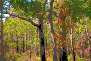
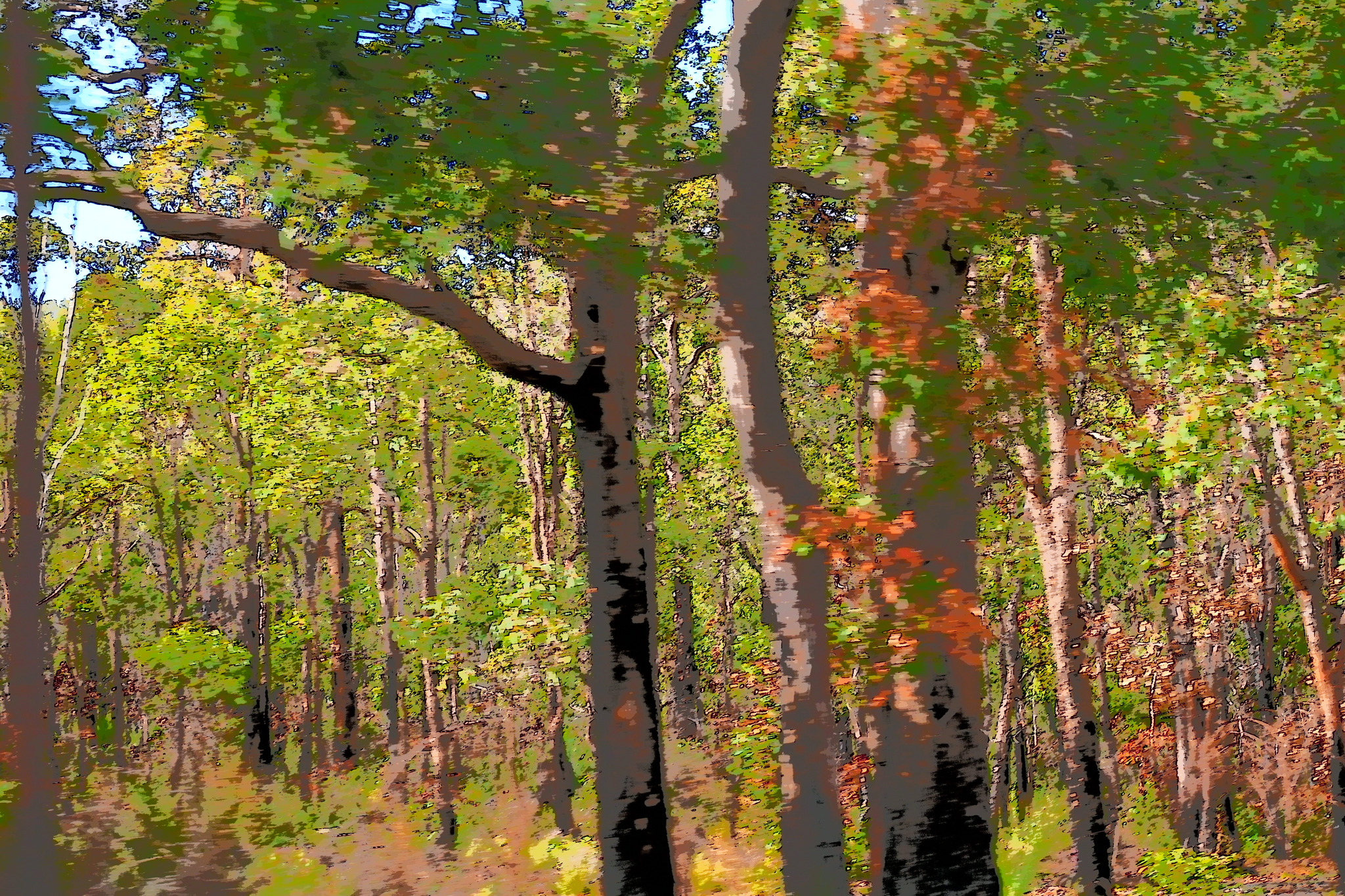
- Jungle 13 Merit Certainly a jungle of trees. The treatment you have given allows a creative look. I am wondering if the larger trees in the foreground could have been moved off to the side to allow the eye to carry on through the jungle.
-

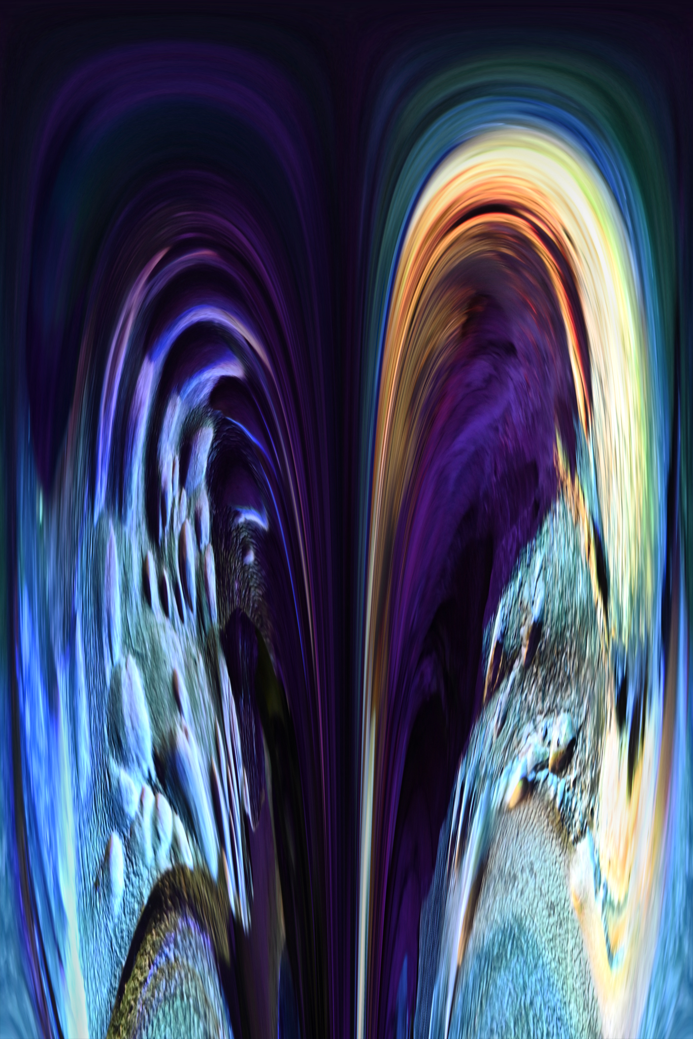
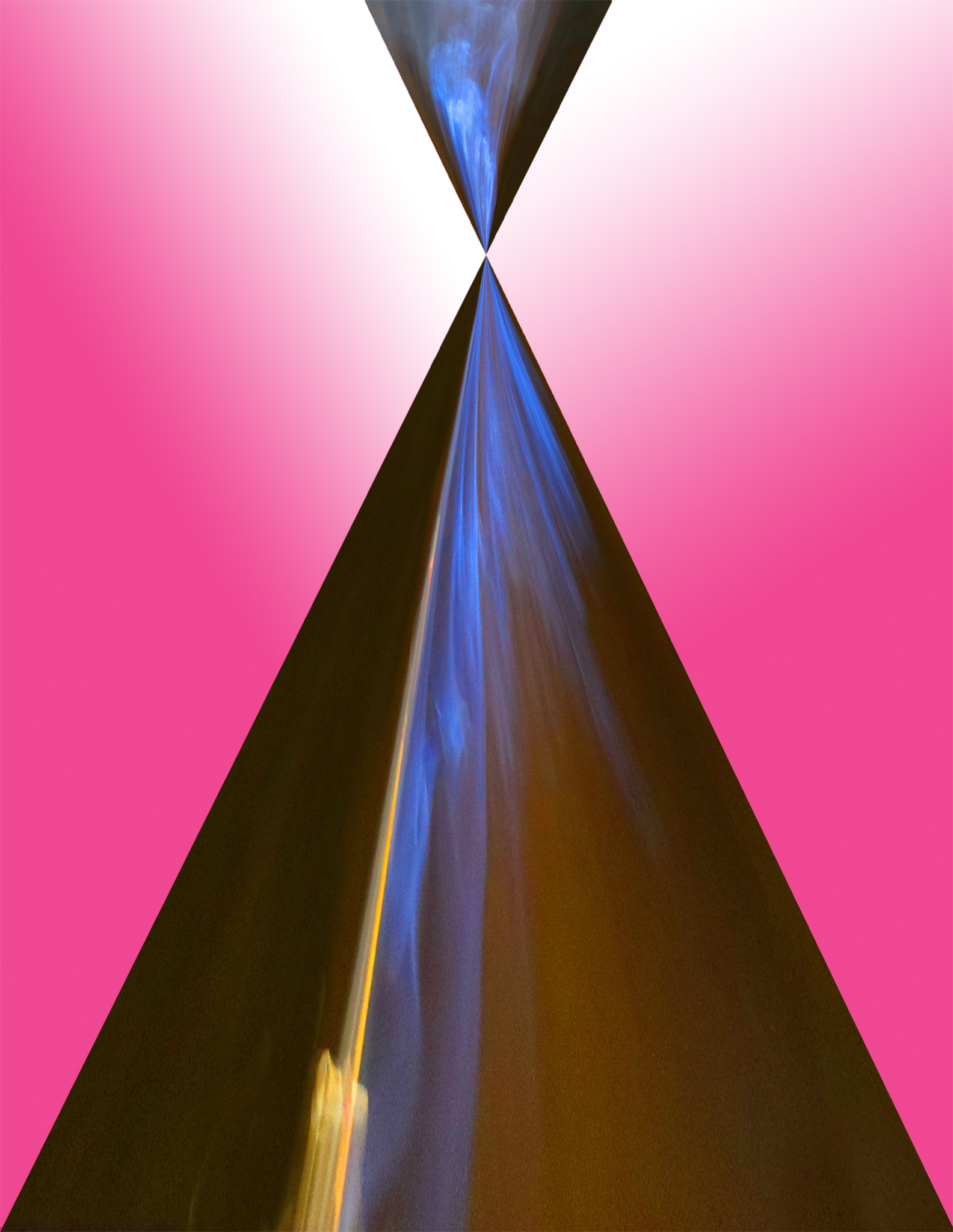
- MeetingPoint 14 Highly Commended The colours took my eye immediately. – very effective use of complementary colours. I’m drawn to the point where the two triangles meet and thinking of a younger person coming together with their mother.
-
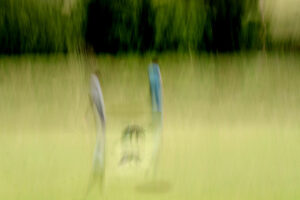
- Walking the dog 15 Merit This ICM image gives a painterly effect and with the green colour palette, adds to the freshness. i think it could have been cropped to focus more on the people and the dog. Perhaps a little more detail in the people would have given more impact.

-

- FromTheDarkIntoTheLi ght 16 Acceptance I can see that the author wants to show the light to the dark in this image with the star being the focal point. Nice capture of the texture in the tree and bricks. The light areas are a little too bright to add impact.

-
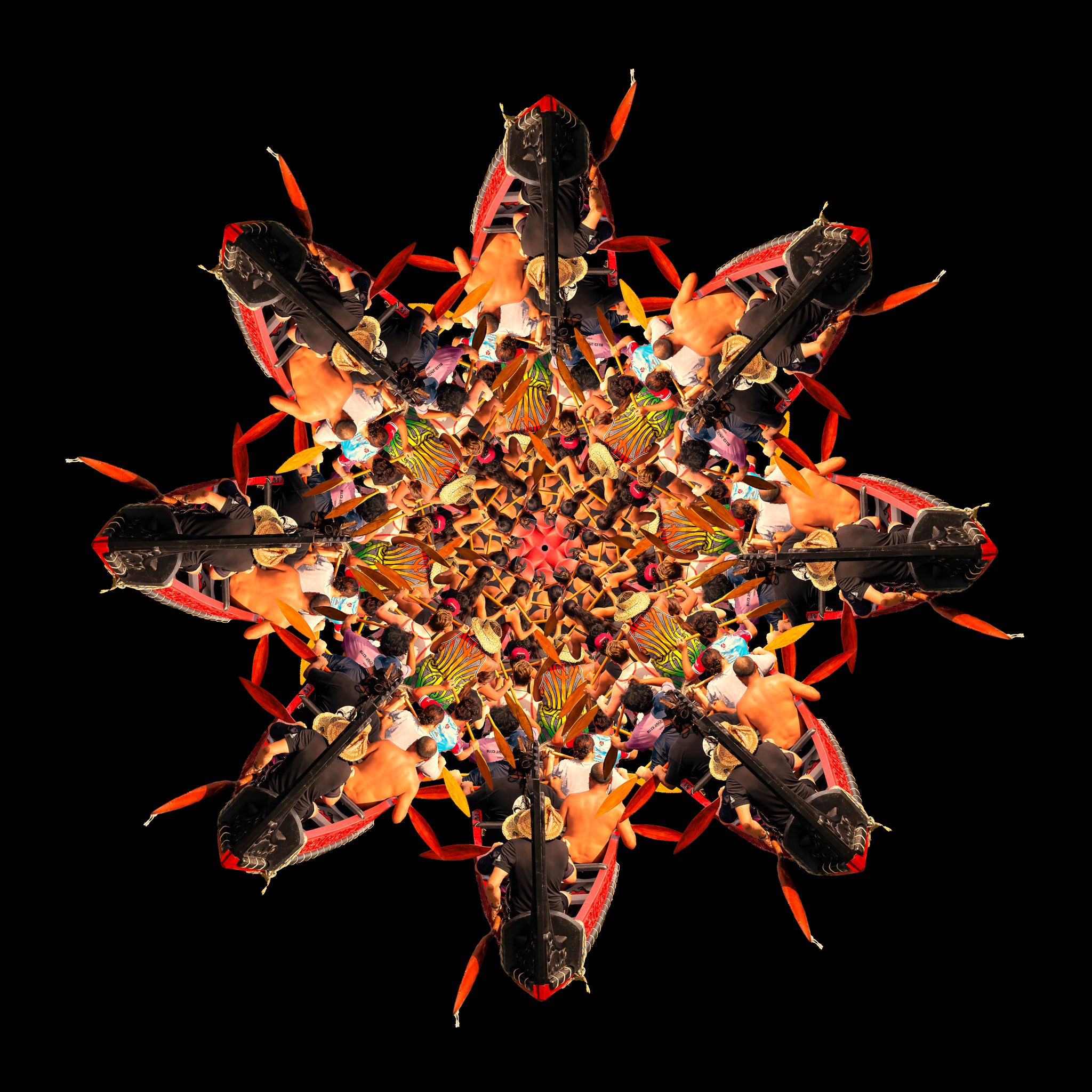
- WakaNui 17 Honours This repetitive pattern initially reminded me of bugs coming into the centre of a flower. On further inspection, very fascinating use of people paddling to the centre. Whilst quite busy, the repetitiveness of the image adds impact. We are all in this waka together!
-

- TheirLocalSpot 18 Merit Made me laugh. Rather gimmicky use of gnomes having fun. Very imaginative. I’m always mindful of using static ornaments that don’t really show the action in a scene like this.

-

- Glamour 19 Highly Commended Black background enables it to stand out. Water drops and stamens are sharp and draw attention to middle. Variagated yellow fading to white is most effective. However I dont find it overly creative.

-

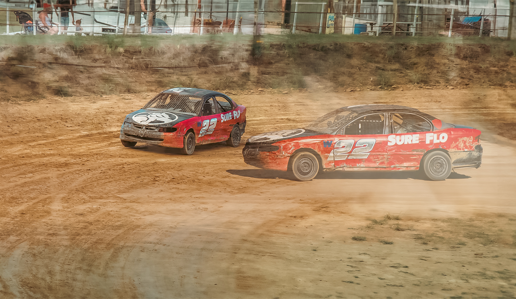
- StockCarTechnique Merit A real happening image makes you wonder what is going to happen next. Cropping the top would have kept the focus more on the cars .You could make it have more contrast to be more punchy.
-

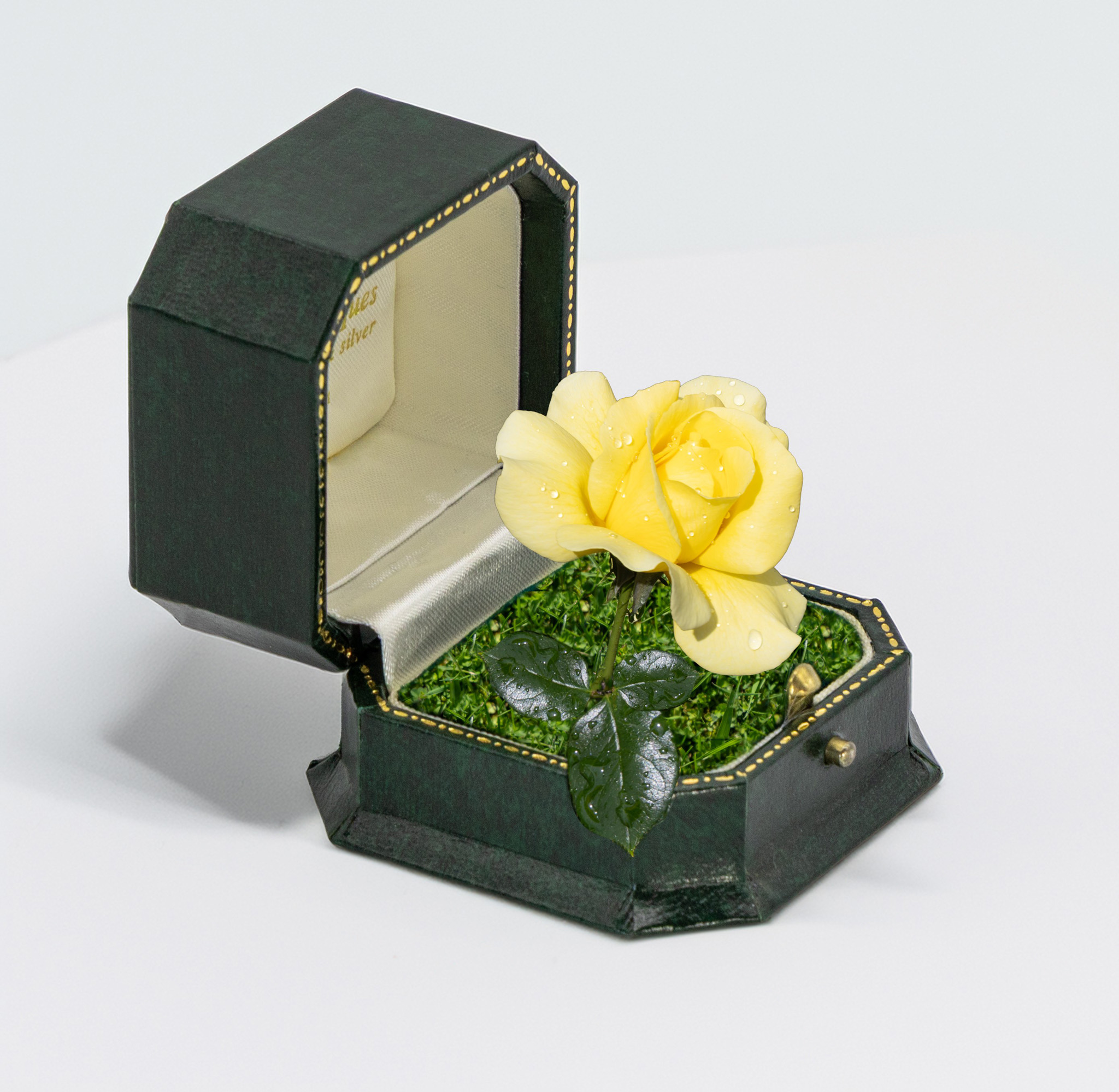
- Will you Bloom with me Highly Commended Still life that is rather different. The rose is nice and sharp and takes your attention. Perhaps the author could have added something more creative to fit this category.
-

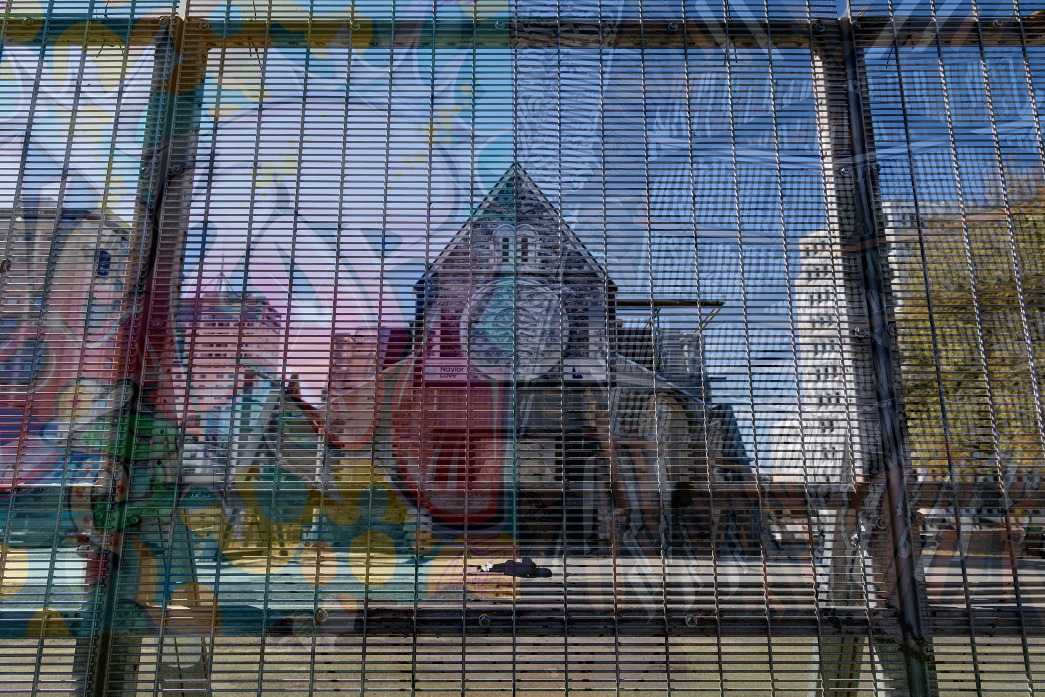
- LyingInWaitOfRepair Acceptance Find it rather busy and would liked to have focussed more on the church through the textured fence and graffeti
-

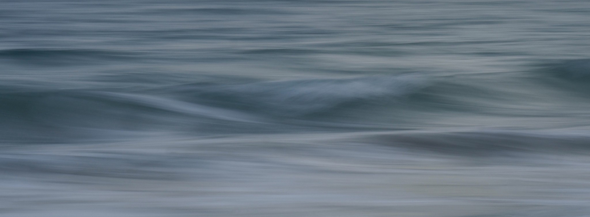
- SilkenSea Highly Commended ICM that gives a very serene feeling. I like the shades of blue/grey. I would like to have had somewhere that had more of a focus to keep my eye in the image.
-
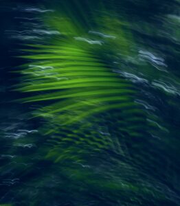
- RipplesofMigrationsPa st Honours – Winner – Very intriguing and clever use of of ICM. Makes me think of green tinted sea with birds flying through. The colours really grab me. Very creative.

-

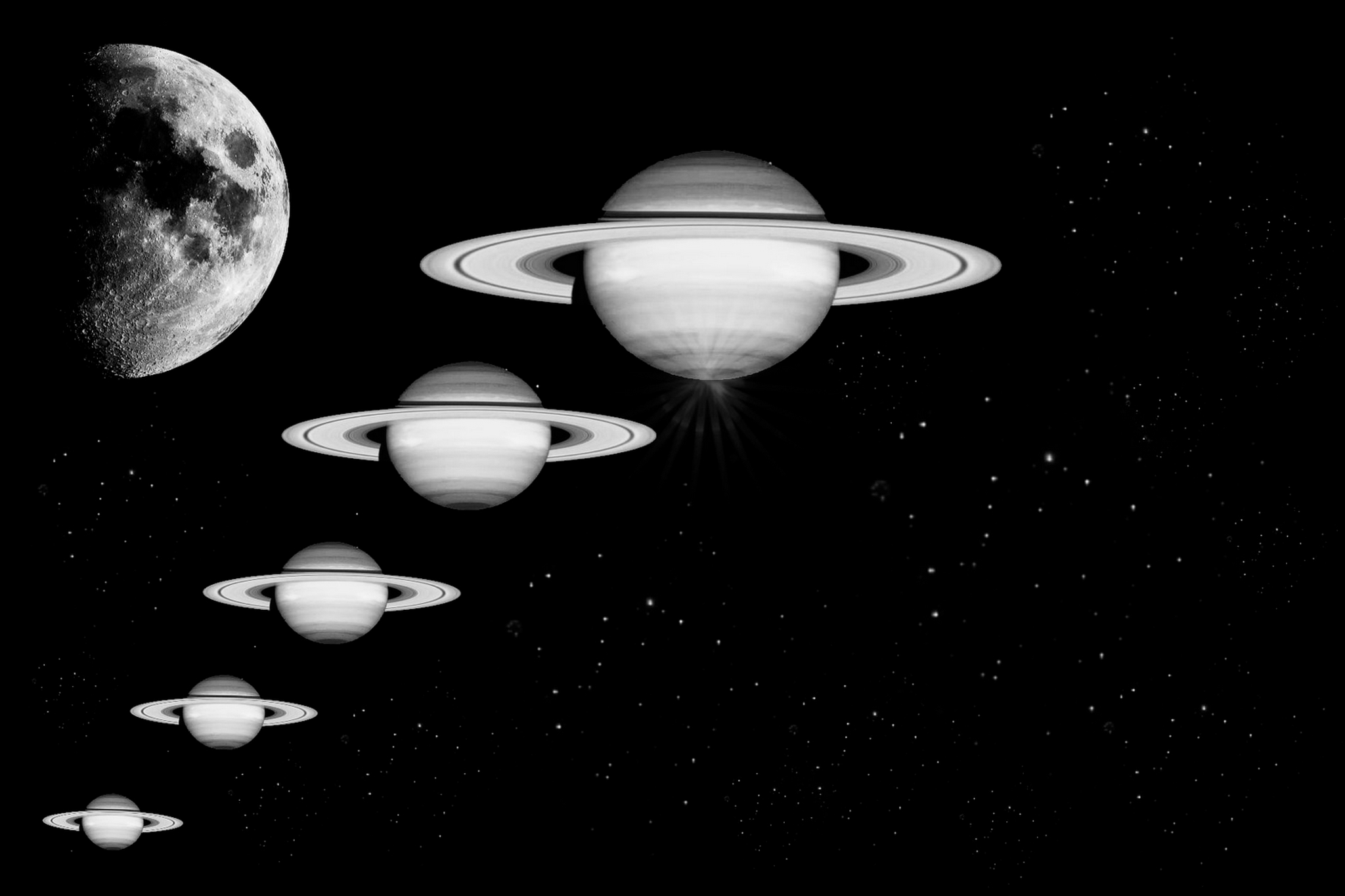
- SaturnOnSteroids Highly Commended Intriguing capture of the moon and planets. Very effective in black and white. The repetitive planets growing in size in a star-lit night reaching to the moon. I was thinking perhaps bigger to smaller and reaching the moon in the top right-hand corner. could have had more impact.
-
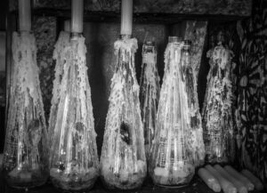
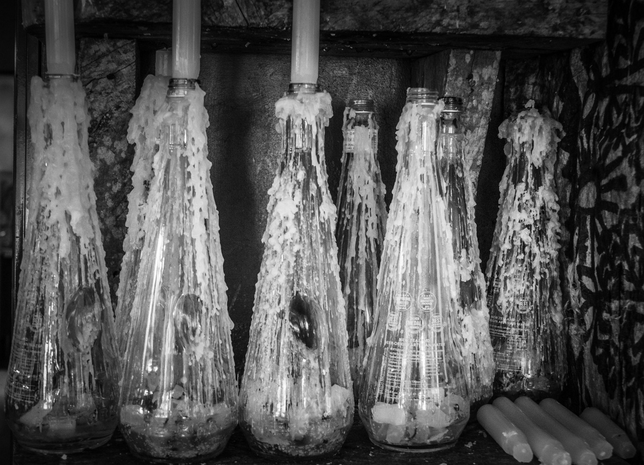
- CandlePower Merit Great spotting to see this image. Good use of black and white with good exposure not to burn out the whites. I would have liked to see the top of the candles but guess the height would have taken away from the rest of the bottles