
Judge – Margie Sutherland
-

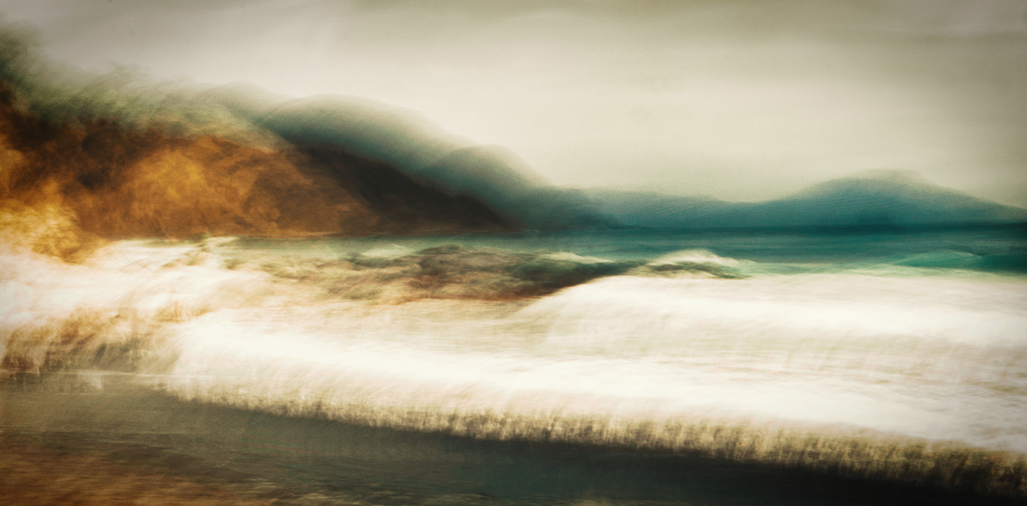
- 1. Across the Heads – Salon – I am enjoying the rawness of the scene and the painterly colour palette which for me gives the image a moody feel. I find the gold colour on the cliff in the top left takes my eye initially and leads me down into the sea to the right. In my view the waves in the foreground are over exposed and I wonder if the photographer could bring down some of the whites and highlights to retrieve the detail. For me the panoramic crop works well for this image. Highly Commended
-
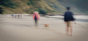
- 2. Mangawhai Promenade – Salon – In my view this image has such an iconic kiwi flavour. I find the pop of watermelon colour on the central subject’s jacket and the way the parka hood is blowing in the breeze tells me it is windy. I find the panoramic crop works well for the image but suggest the photographer might consider a crop of the image from further back to give some height to the hills in the background. This I feel would give some perspective to the surroundings. I am especially enjoying the lovely eye contact the dog has with the photographer. Merit
-
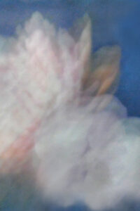
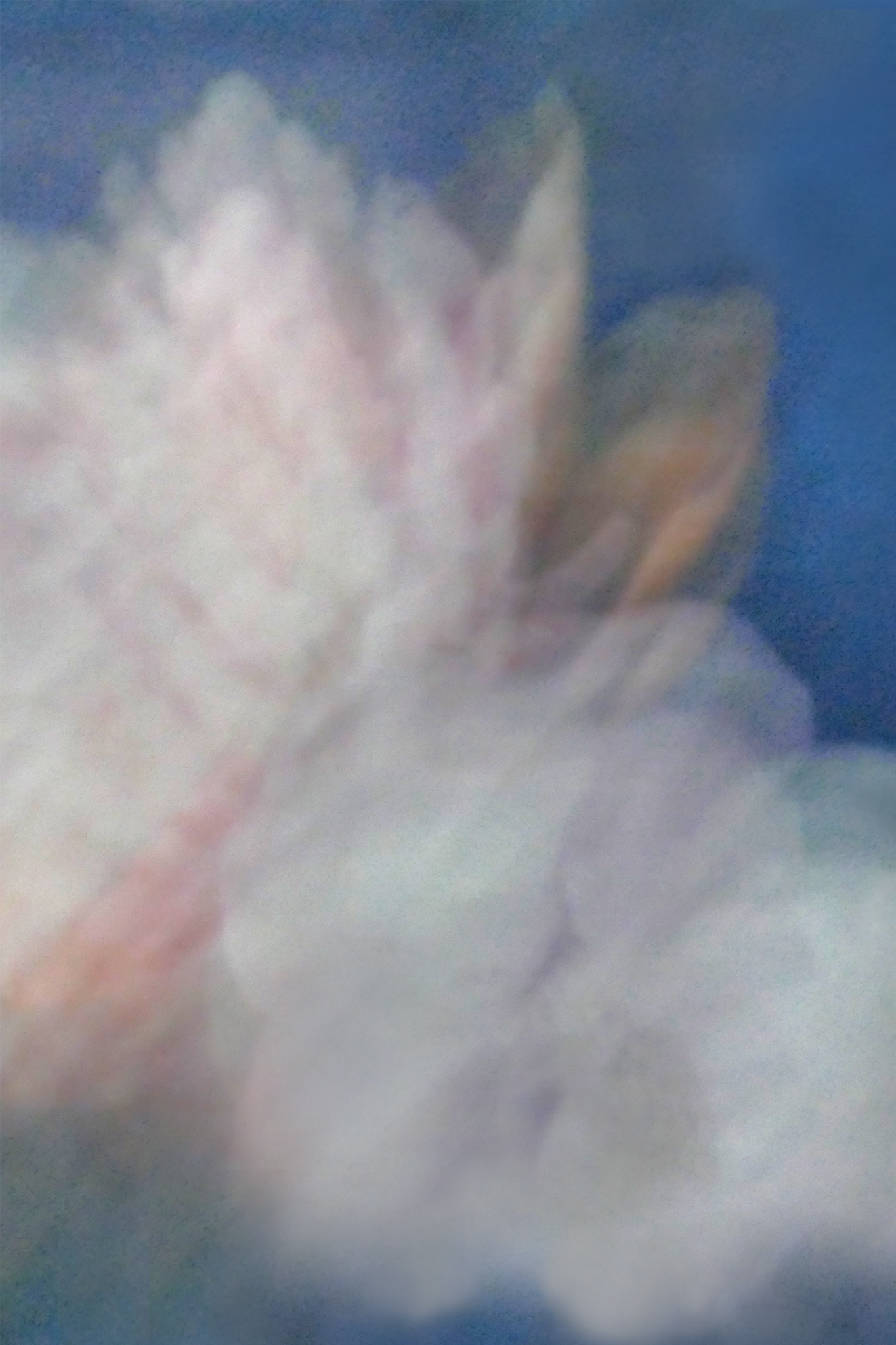
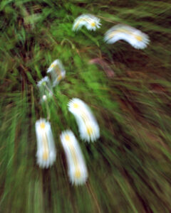
- 3. Softly Seen – Salon – The muted colour palette and the angle of the two blooms works well for me. I feel the texture over the image has however taken away the softness. Maybe lessening the effect might strengthen the image. For me there appears to be too much camera movement as I find very few details in the blooms. Experimenting with raising the contrast to retrieve some colour and detail could be a solution. The gold leaf to the right side is a lovely colour contrast for me. Accepted
-
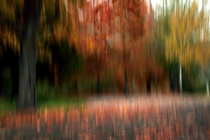
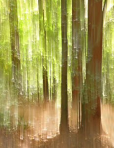
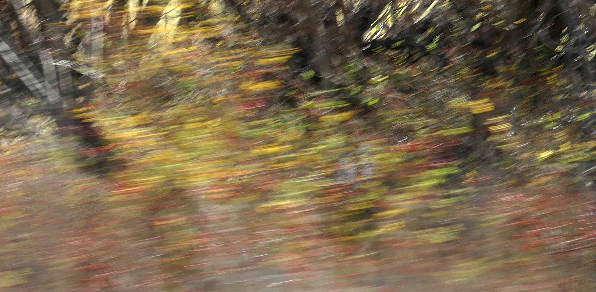
- 4. Autumn – Int – This for me is Autumn in a nutshell. I am finding the colour palette rich and strong and the ICM technique used has worked well. In my view the area at the bottom could be cropped up a little to place more emphasis on the trees, and I feel the trunks of the trees could be straightened slightly. The white tree trunk to the right for me is distracting and maybe the photographer could lower the highlights to darken it. I feel the scene could have some more saturation added but I appreciate that the photographer may enjoy the more muted shades better. I am enjoying the way my eyes are led into the inner depths of this image. Highly Commended

-

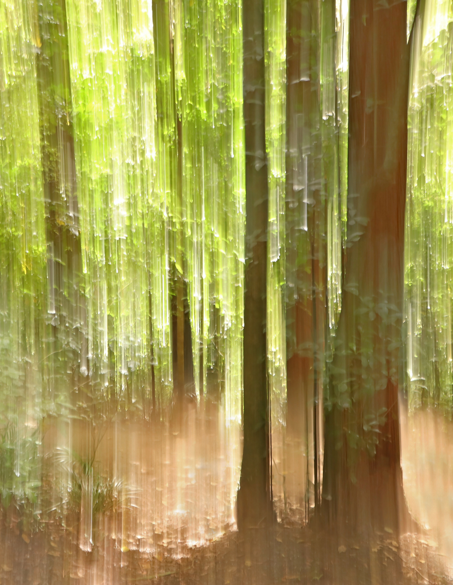
- 5. Restful Trees – Int – In my view, the technique the photographer has used to move their camera has created a great texture and curl of the leaves. I find the yellow tint within the greens and the shadow in the foreground tells me it is a sunny day. For me the tree to the left side is my initial focal point and then it takes me into the pool beyond giving the image a subtle depth. I am finding the area of bush to the lower right side dark, and feel that perhaps the photographer could lift the shadows of the image a little to strengthen the image. In my view there is also an area of brightness to the right of the base of the tree that needs some exposure lowered. This appears to me to be such a tranquil spot. Merit

-
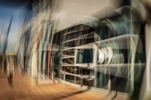
- 6. Library Visit – Int – For me this feels like being sucked into the vortex of the library. What a treat that would be. My eye goes straight to the central green square then follows the circular lines around it. I am enjoying the repetition of parallel lines both straight and curved in so many places and especially the three coloured upright lines of the structure on the left third line. A tiny OCD part of me feels it needs a slight straightening and some added vibrance, but I accept that the photographer may find it great, just the way it is. Honours

-
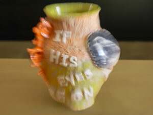
- 7. If His Eyes Are On You – Salon – I found this message quite interesting and found myself searching for eyes. I feel the colour palette is quite lovely blended with the background although I find the lines across the background quite distracting and wonder if the photographer could blend the warm shades together to soften them. For me the vessel feels cramped in the frame and awkwardly placed. In my view the image could have been taken from further back with some flowers or foliage in it to give it a sense of purpose. I am quite intrigued by this vessel and am sure it has a great backstory. Accepted

-
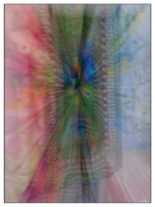
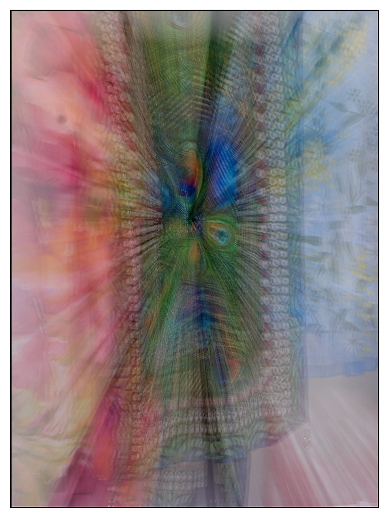
- 8. Are You There – Int – I found myself exploring this image for a while before I found the face in the centre of what looks to me like a lot of beautiful fabric. I feel the colours work and in my view the movement from pinks to greens through to blues on the right work well. I find the area of floor on the bottom right distracting and thought perhaps the photographer may choose to remove it or clone some of the surrounding fabric onto that area. I find the white frame distracting, and I feel the image works well without it. I see a dust spot on the top left and the top centre which could be removed. There also appears to be two areas of white highlights on the bottom left and right that I find could be removed. For me this an intriguing story and I feel there may have been a lot of fun in it’s creation. Merit
-
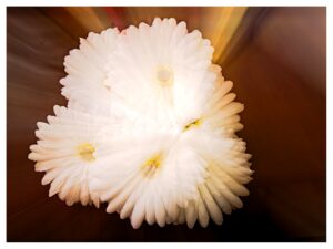
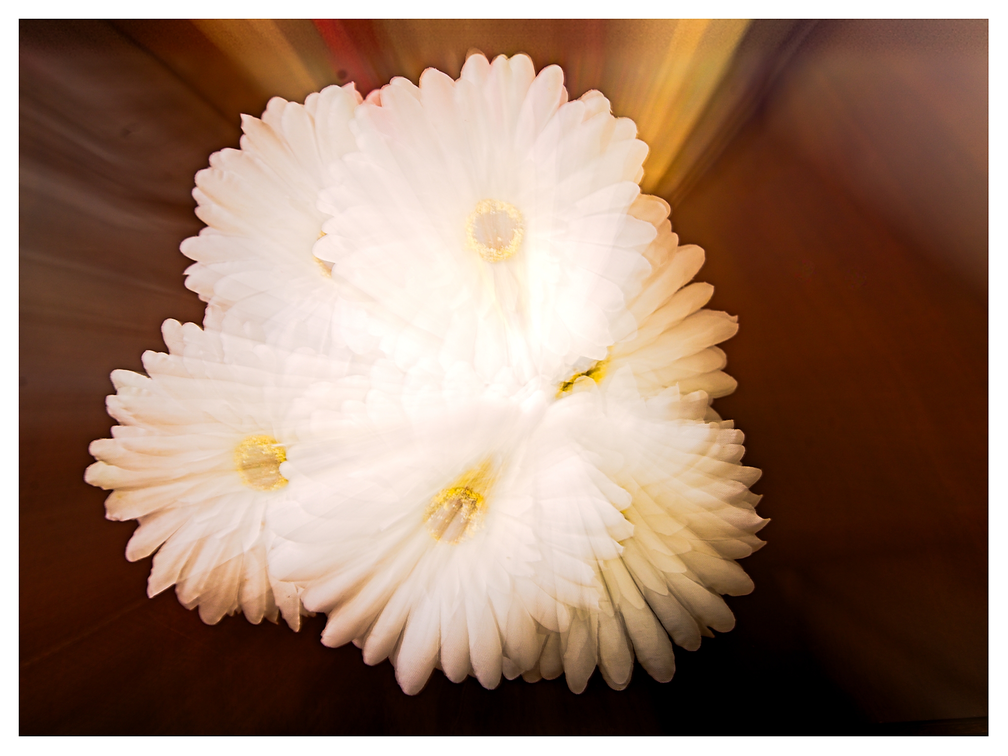
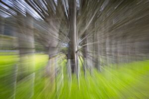
- 9. Flower Burst – Int – I feel the arrangement of flowers works well and the overlapping petals give a sense of depth. For me the white in the flowers is overly bright and I feel that by reducing the whites and highlights, some of the definition of petals would be retrieved. In my view the white frame is distracting, and I find myself looking from frame to white flower and back. I feel the image background works well without it. For me the flowers may work better centrally placed in a square crop, as presently the composition appears slightly off balance. There are some dust spots in the top left that could be removed. The background of lines for me, appear to be sucking the flowers in. Accepted
-
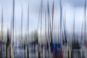
- 10.Masts at Marsden Marina – Int – I find the domination of the masts from top to bottom of this image that intercept each other quite compelling, however in my view the bottom half of this image appears very dark. Perhaps the photographer may like to increase the exposure on the lower half and remove some of the blacks over the whole image. I find the saturation of blues gives me a sense of coldness. I wonder if this was the photographer’s intent. For me, some addition of warmth could give the image more tonal balance. but I appreciate that this is the photographer’s story. I feel the whites have been handled well and I find the pop of blue sky in the top right tells me that it’s a day for sailing. Merit
-
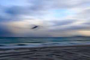
- 11. Seagull At Sunset – Int – I find this image gives me a sense of urgency. I am enjoying the sense of movement in all areas of the image and the way the bird looks to be racing toward the brightness of the yellow light. For me the Seagull appears too centrally placed and perhaps the photographer could crop some off the bottom to place the seagull onto the bottom third line. The colour palette and the moodiness of the image work well for me. Merit
-
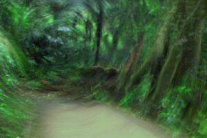
- 12. Out in the Bush – Salon – I am enjoying the presence of the leaves in front of the trunks and the trunk elongation due to an upward camera movement. For me the very bright white areas are a distraction. I wonder if the photographer had thought about cloning them out. I find the soft colour palette works well and gives me a sense of being in the bush, however, I feel some contrast could be added to give the image more depth. For me the foliage on the forest floor looks like a lush carpet. Accepted
-
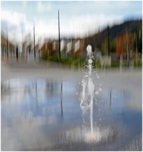
- 13. Fountain In An Open Space – Salon – This image creates a story for me with the emptiness of the open space and focal point of the fountain. The soft and earthy colour palette appears to contrast well with the blue of the sky and reflection. I find the repetitive vertical lines in the background replicate well with the vertical stream of water in the fountain and in my view the specific camera movement technique works well for this image. I particularly enjoy the reflection in the puddle and the soft curved form of the water in the fountain, in contrast to the angular geometry of the structures behind. I found two white areas in the puddle, one to the bottom right and one on the left third line that the photographer could remove. For me the longer depth of field and the square crop were good choices for this image. Honours
-
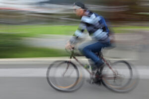
- 14. Man On A Mission – Salon – I find the concentration on this gentleman’s face and the title are a good match. I feel the camera movement technique works well and the white lines that swirl in front of and behind his face give me a sense of speed. In my view the subject appears cramped within the frame, and perhaps the photographer could crop more space on the top and left side to give the impression of the subject riding into the image. I found many dust spots throughout the image which could be removed. ICM tends to magnify these and they become more obvious. The back wheel for me is a humorous touch as it appears to be falling off. Merit

-

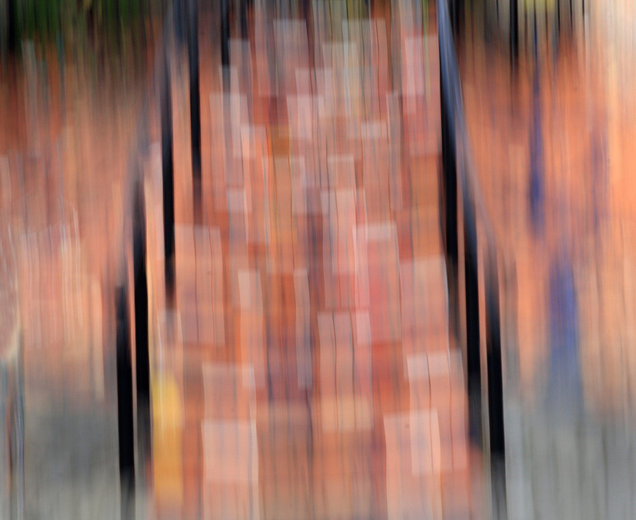
- 15. The Stairway – Salon – I am finding the warm palette and the geometric elements in this image captivating. For me the side railings give the sense of a stairway and the geometry in the centre feels to me like bricks. There are some large spots on the left side and some dust spots through the central area that catch my eye. In my view there is not a strong focal point, and I find I am looking for something to rest my eyes on. Maybe the photographer could have waited for some subjects to move either onto the stairway or to the side of it to create a point of interest. I feel the ICM movement has been used well. Merit
-

- 16 Striking Steps – Salon – What a vibrant creative energy in this image. For me the pops of primary colours and geometric lines add interest. The central orange rectangle is well placed for me, and I find the increasing blur towards the outer area of the frame works well. In my view the crop may have worked better as a landscape rather than portrait shape, focusing on the central area of steps only, to take some of the busyness away. I feel the bright saturation works well. Merit

-
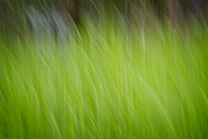
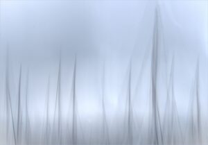
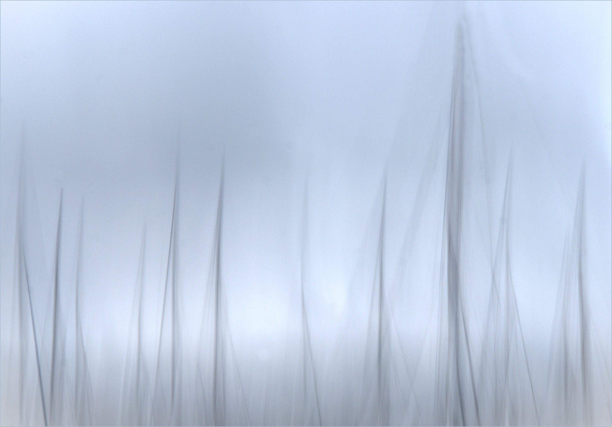
- 17. Our Back Lawn – Salon – For me the grass has a wonderful energy and vibrance and in my opinion the photographer has used the ICM technique well. I feel the image lacks a main focal point and I am wondering if perhaps the photographer could have included more of what look to be trees in the background. In my view the lack of a focal point gives the image a flat feel. I do enjoy the grasses all swaying however which suggest a slight breeze. Accepted

-
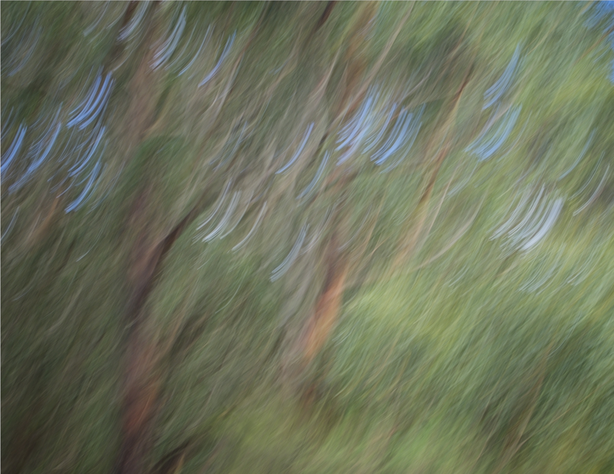
- 18. Windbreak Trees – Salon – My eyes were instantly drawn to the knot in the large tree which radiates lines from it giving the image a sense of movement and energy. In my opinion the fence posts have created a leading line for me along the windbreak and lead my eye from left to right. For me the deeper perspective has enhanced this line. For me the lines that go in opposing directions to the straight radiating lines in the upper half of the image are distracting and the photographer might consider removing them to maintain the symmetry. In my view the saturation of green in the grass feels overwhelming against the trees and perhaps reducing the saturation of green on the grass and raising the blacks in the trees to give more balance For me the Windbreak Trees look like a force to be reckoned with. Merit

-
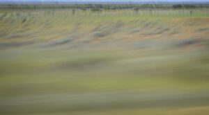
- 19. Outback Colours – Salon – I am enjoying the subtle earthy shades and the layers of land, trees, and then sky and I find the camera movement has created a leading line for me to travel up the curve toward the sky. In my view the addition of an element in the image to act as an initial focal point would elevate this image as presently my eyes are moving around the image looking for a place to rest. I feel the image is quite flat and perhaps the photographer could add some contrast and blacks to add some depth. The trees sparsely spread in the landscape appeal to me. Accepted
-

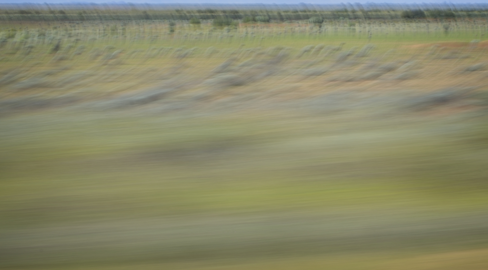
- 20. Gum Trees – Salon – The title Gum Trees immediately brought back to me the wonderful smell they give off. I find the lean of this image to the right gives a sense of movement, but I also feel that adding some contrast would help to give the image some depth. In my view the blue lines which I’m thinking were tiny chinks of sky have taken over the image and become the main point of interest. I feel that by removing these and increasing the contrast, the image will come to life. Often by reducing the amount of movement created with the camera reduces a lot of unwanted elements in the image. I suggest more editing of this image as I believe it has great potential. Accepted.
-

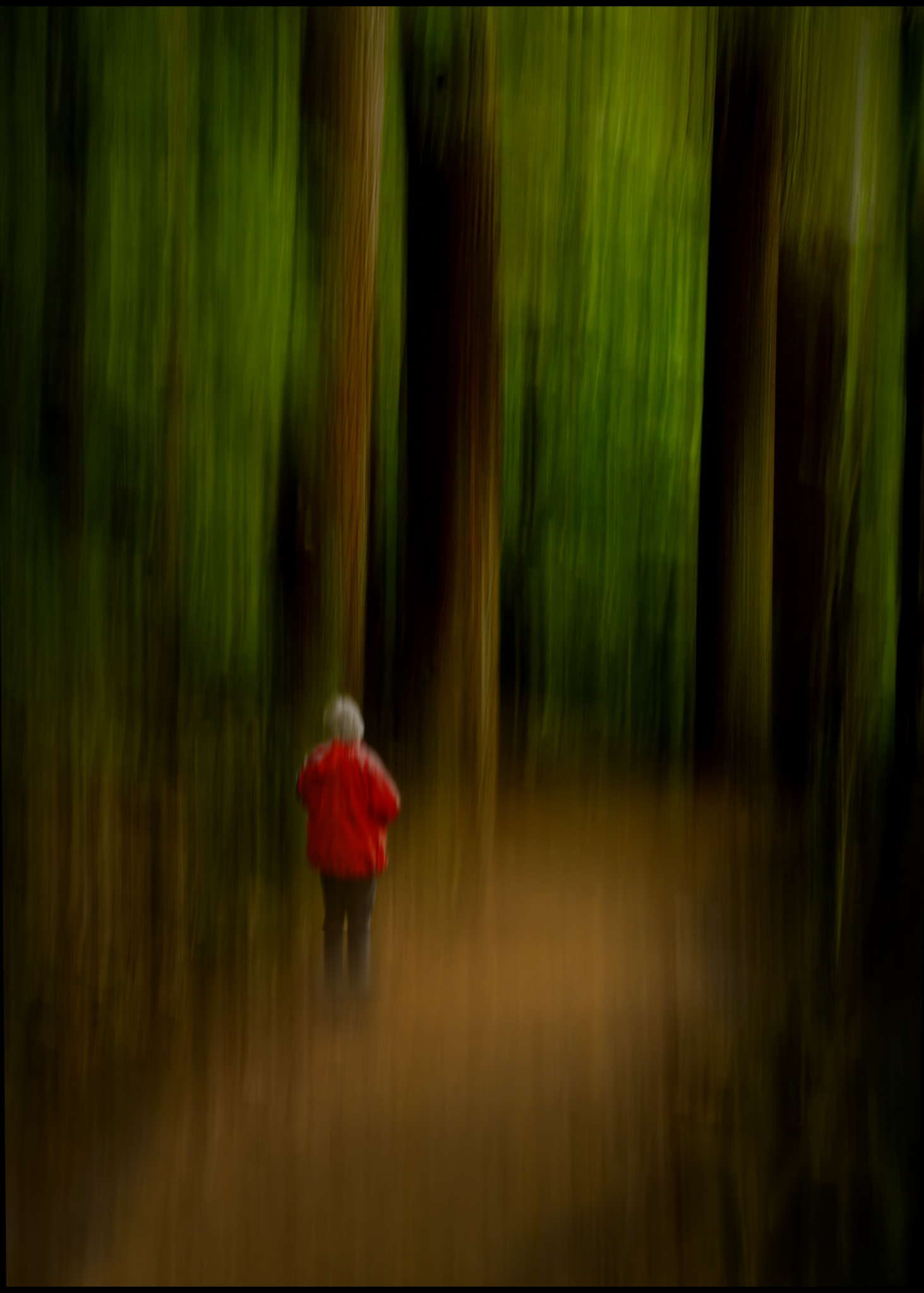
- 21. Into The Forest – Salon – I began to think about Little Red Riding Hood when looking at this image, but the forest doesn’t look that scary. I find the red jacket on the subject a strong visual anchor and placed well on the third’s lines within the image, on the path leading us into the bush. For me the tree verticals give a sense of height and perspective and echo the vertical upright of the subject. The colours of red, green and gold and their varying tones work well together. A lovely image that gives me a sense of solitude and quiet. Honours
-
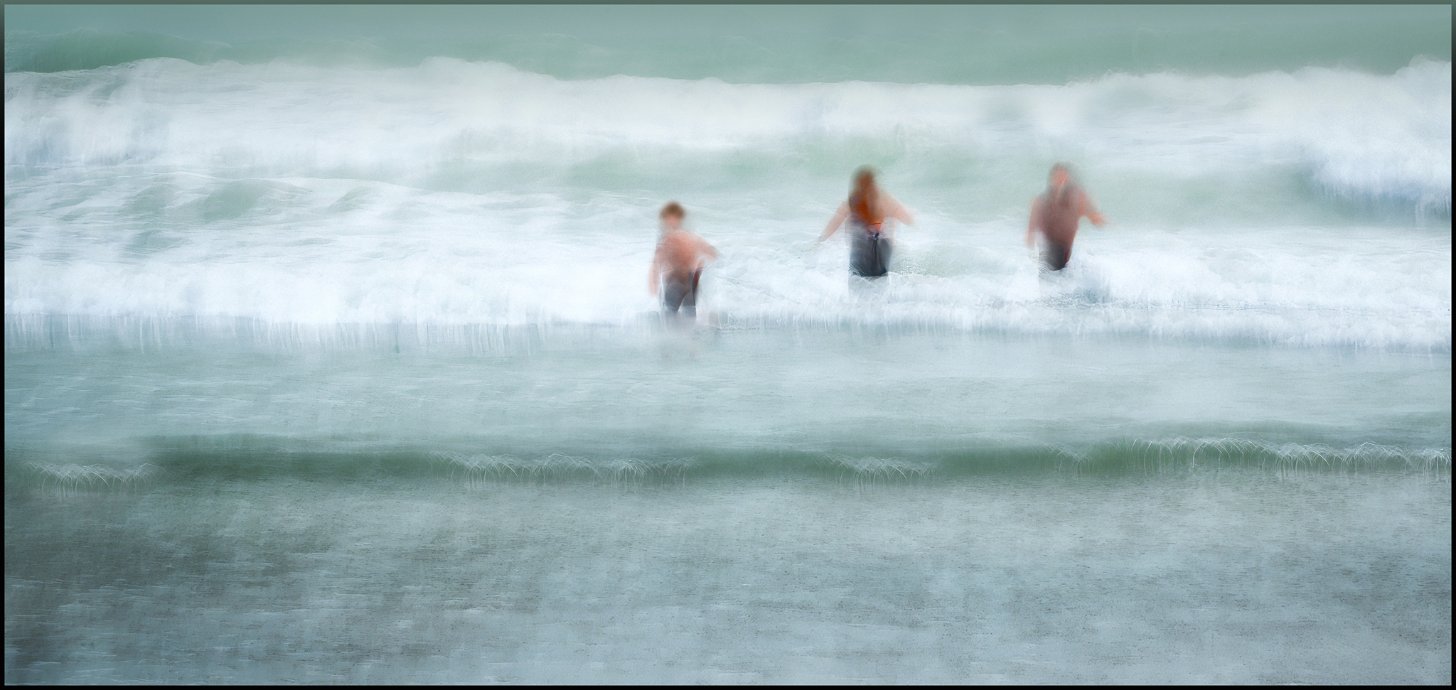
- 22. Winter Swim – Salon – I think for me a Winter Swim is a great idea until you get in. I find your group of an uneven number of hardy souls is aesthetically pleasing but for me the subjects are placed slightly too high in the image. I feel the lower edge could be taken up to the first wave or more of the sea could be added to the top edge. In my view the whites are overexposed and maybe the photographer could lower the whites and highlights to retain some more detail. I am enjoying the way the man to the right seems to be hastily retreating. Highly Commended
-

- 23. Autumn Aglow – Salon – Autumn is certainly prevalent in the lovely colours in this image. For me there appears to be too much camera movement although I appreciate that camera movement is subjective to the photographer. I find myself looking from one side to the other trying to find an area that I can focus on. In my view, finding a specific subject such as the tree in the rear area to focus on could give the image more structure. Maybe the photographer could try cropping into a smaller area of this image to include the tree at the back. I always find that bush areas are a good subject for ICM. Accepted
-
- 24. Leaping Daisies – Int – Indeed, these daisies do appear to be leaping. I find the yellow lines appear to be leaping from stamen to stamen. For me the image appears crowded, and I wondered if the photographer had thought about cropping to include the top two bunches of daisies in a landscape crop. I also find the image has a lot of noise which the photographer could remove by using the noise reduction tools. I am enjoying the various shades in the grass. Accepted

-
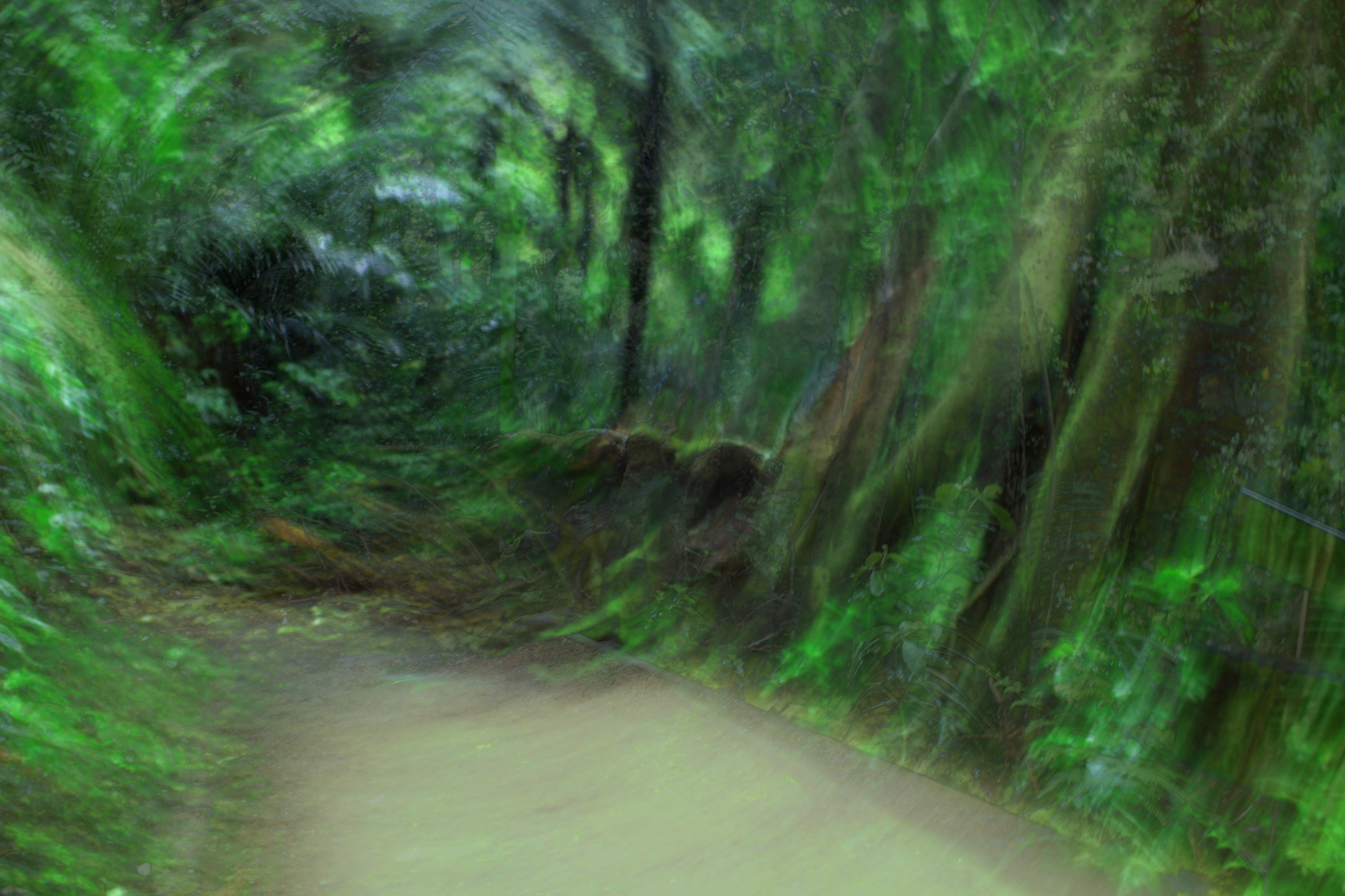
- 25. The Forest Path – Int – This image makes me feel as if I am going to be sucked into this green tunnel.I feel the curved tree trunks to the right and the depth of field allows me to look into the distance to see that the trunks have straightened out. The high saturation of green feels quite overwhelming for me. I appreciate that we all view saturation of colour differently but wondered if the photographer had tried lowering the saturation and adding some warmth and blacks to give the image some depth of colour and tone. I feel the line coming in from the right side could be removed. I find this image, with some fine tuning, has potential. Accepted
-
- 26. Mist Morning masts – Salon – I appreciate the minimalism of this image and the interplay of lights and shadows. The repetitive vertical and slightly curved lines work well in my view and the taller mast acts as an initial focal point for me. I found several dust spots throughout the image which you might want to remove and wondered if the photographer had thought about reducing the darkness of the area on the left third line. I feel some areas of white in the lower centre are too bright and for me, are distracting. Perhaps the photographer could lower the highlights in that area. I find this image has an ethereal and dramatic look. Merit
-
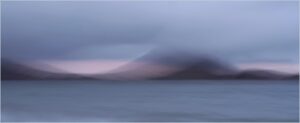
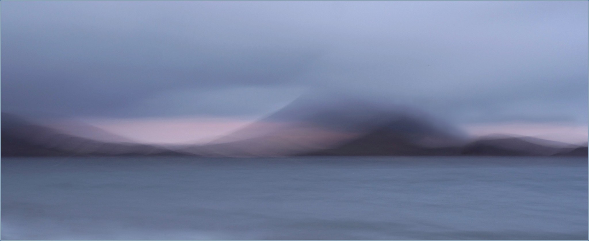
- 27. Daybreaker – Salon – I feel the mood this image creates, with the soft colour palette and the soft curving lines of the landscape quite lovely.. The photographer in my view has used camera movement skills that work well with the subject. There is a large dust spot on the upper left third line and another smaller one on the upper right third line which could be removed. For me the overlapping curved lines on the land area add interest as do the areas on the sea that imply water movement. Honours
-
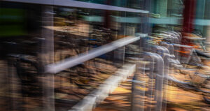
- 28. The Bicycles – Int – For me this image has layers of depth through use of repetition colour, reflection and line. I find the warm tones work well with a good contrast created by the blue beam through the centre. In my view the image could be straightened to line up with the front vertical poles on the right third line. I also find the white light trails above the bicycles in the reflection distracting and add little value to the image. Perhaps the photographer may choose to remove them. This image for me has a great vibrance. Highly Commended
