Skip to content
-
-
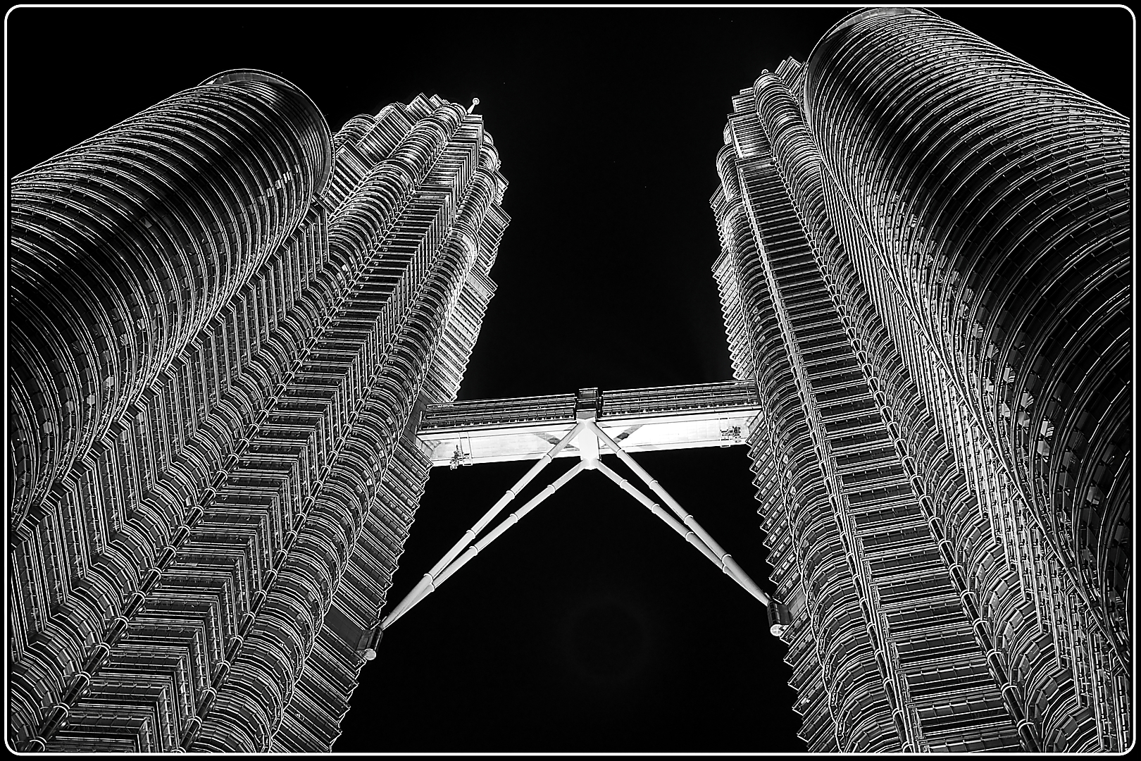
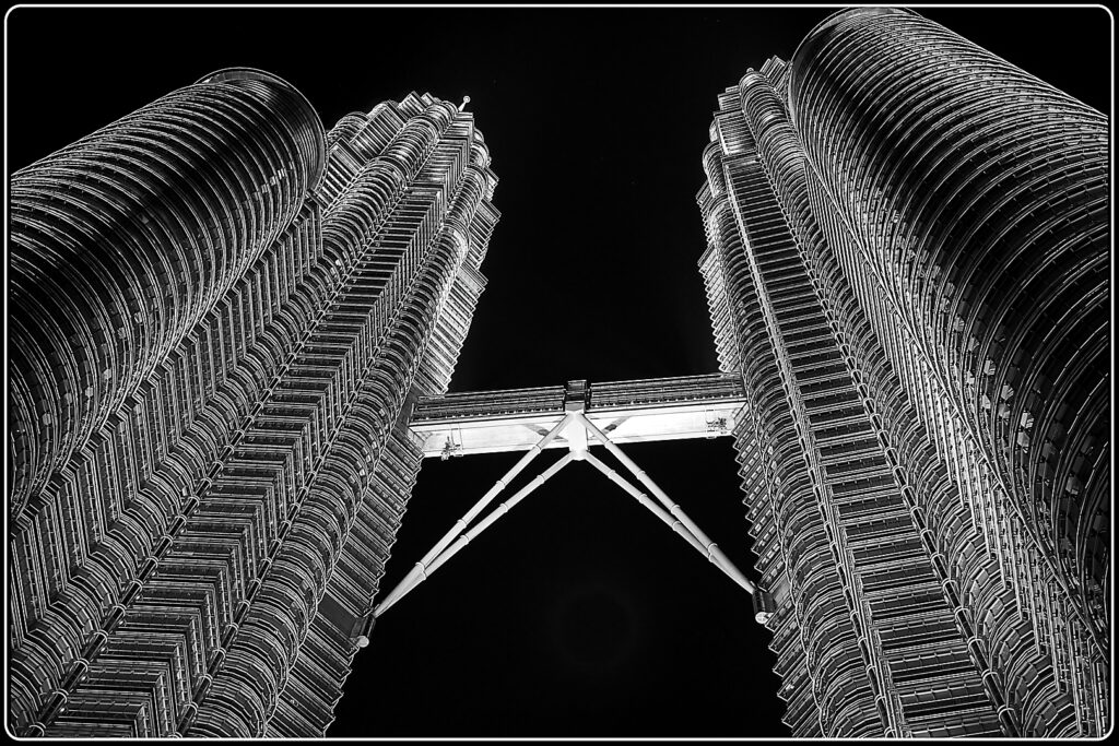
01A –Petronas Towers – I like the graphic nature of this image. The towers soar high into the sky. The only thing that is jarring to me is that the bridge between the two towers is not level. A dramatic image.
-
-
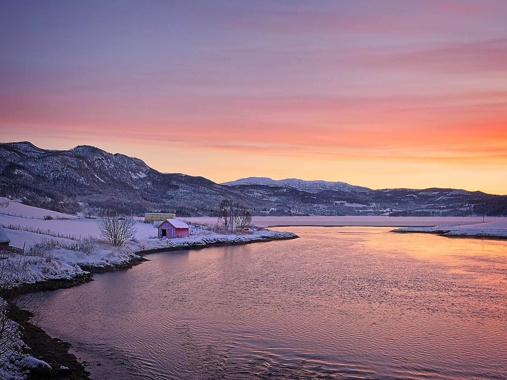
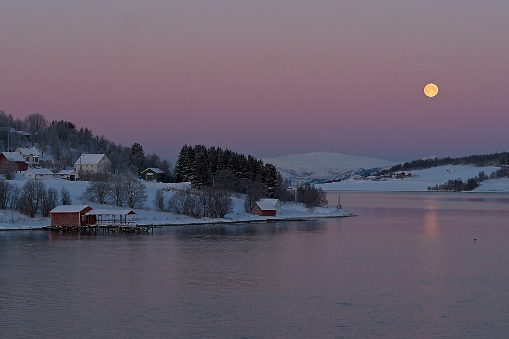
01B – Living Within The Artic Circle – This image is so serene. The calm water compliments the soft light on the landscape. I find the land is very central and a crop off the bottom would help. Lovely colours and setting.
-

-
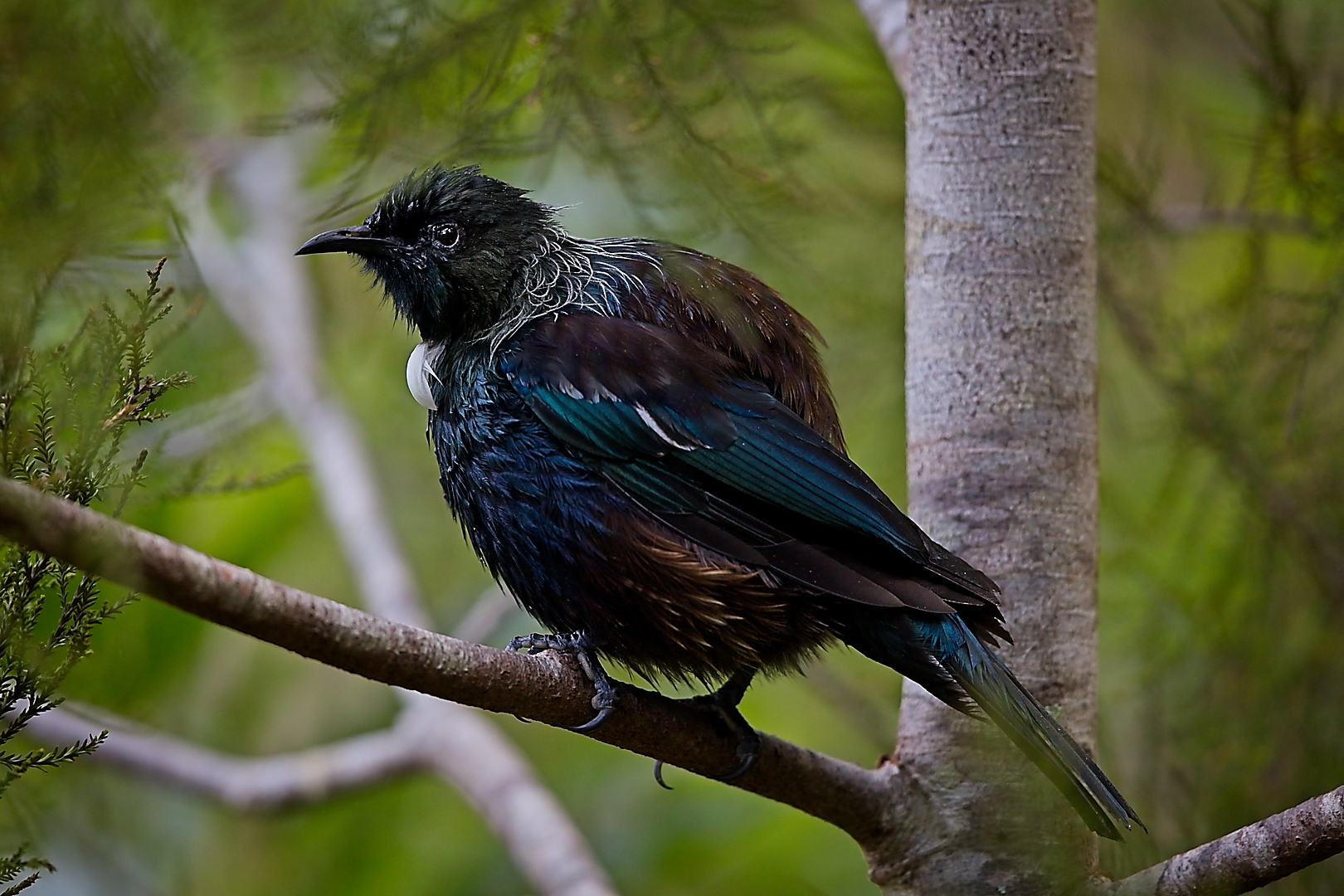
01C-Tui After Bath – I love the way the Tui is all plumped up and rounded. I find the blacks are very dense and heavy. The bird is nice and sharp.
Award for Set 01 – Acceptance
-
-
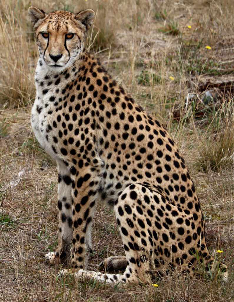
02a_Cheetah – What a beautiful animal. The cheetah is nice and sharp but the balance of the image is not right. The cheetah’s head is too squashed into the top left corner. A bit more space around it would give the image a better balance. The animal looking at you is a good thing.
-
-
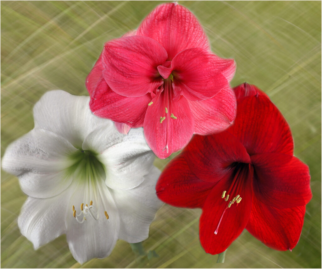
02b_Amarylis Trio – I like the triangular layout of this image. The flowers have not been cut out very well as there are dark and light edges around some petals. Also the stem of the dark red flower is cut straight but could have been blended into the background. The three colours work well together.
-

-
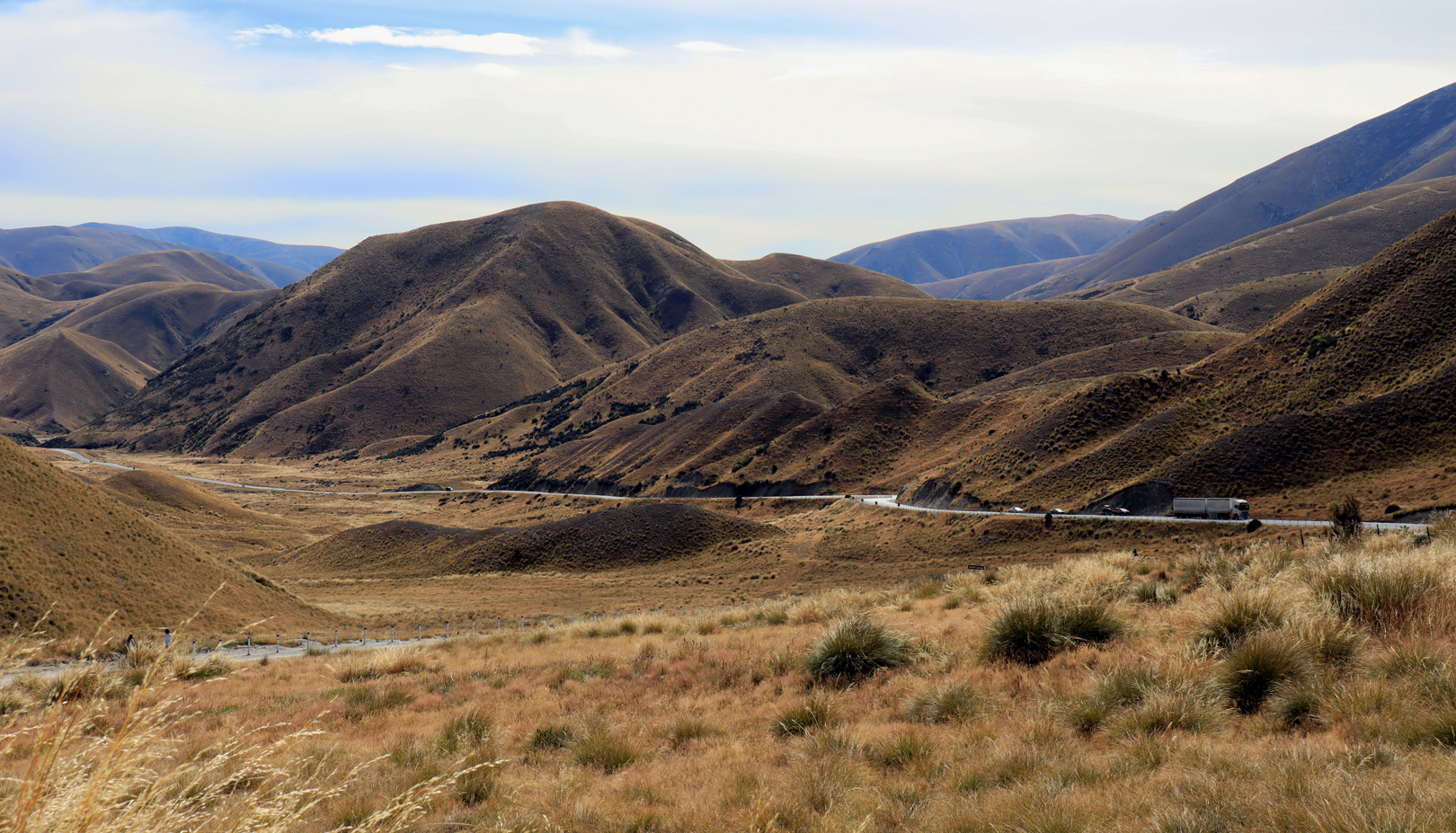
02c_Lindas Pass – The Lindus is a great place for photography. Unfortunately, the day you were there was not quite the right day. These hill look amazing in dramatic light. The road, and the little S curve, runs nicely through the bottom half of the image.
Set 02 Award – Acceptance
-
-
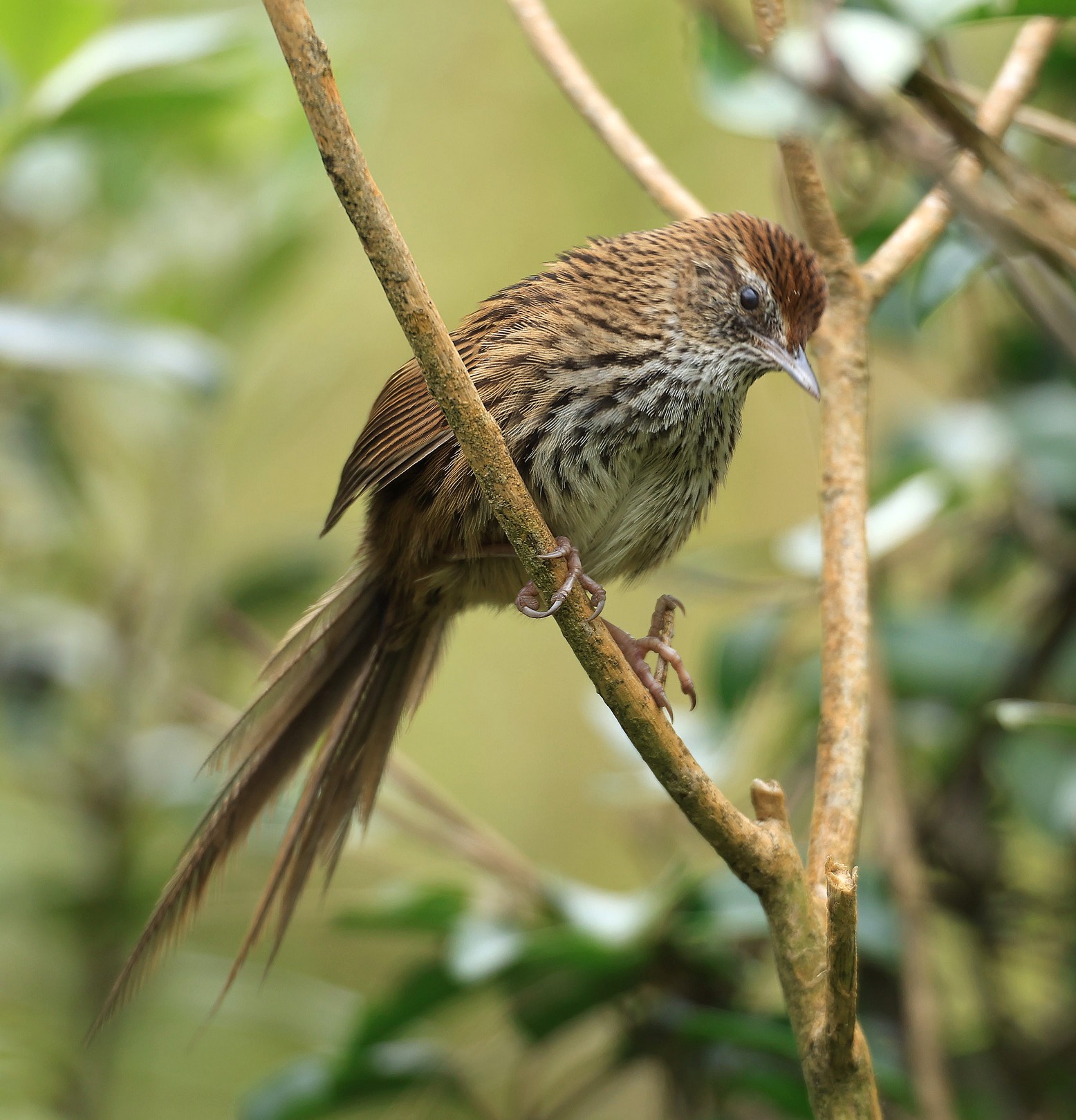
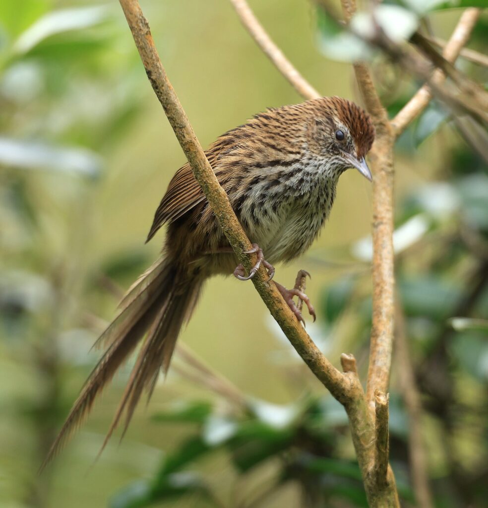
03a – Fern_bird – This is a lovely looking bird. Your area of sharpness is falling on the body of the bird and the head is going out of focus. It is better to have the head in focus. The bird is in a nice position in the image and is looking down at you. There are a few highlights in the background that are distracting.
-

-
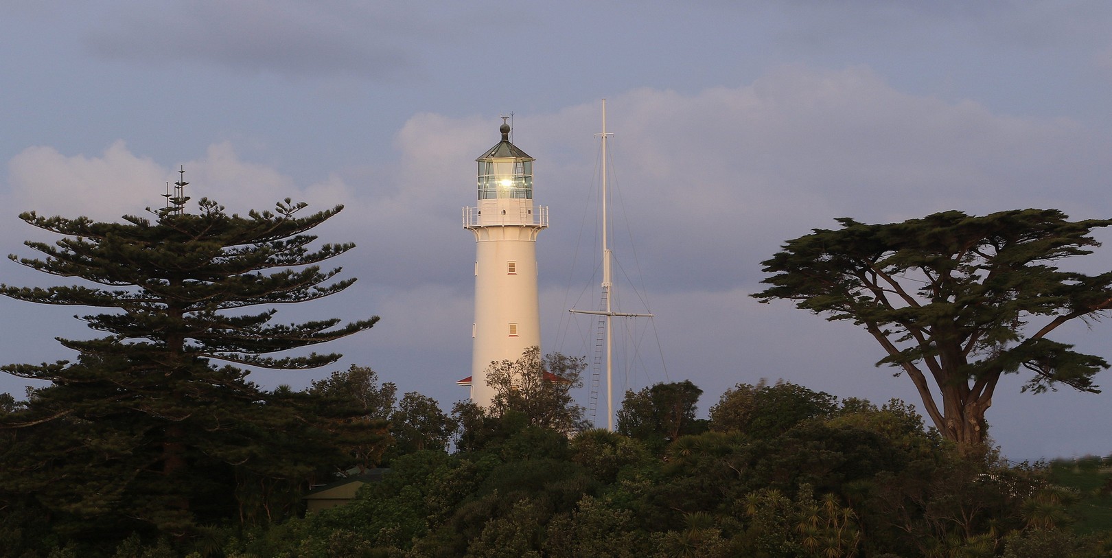
03b- Light at Night – The way you have framed the lighthouse with the trees works well. I like the light being on in the lighthouse but feel that the sky is a little too light for a night shot. If it is night then it should look like it is night time. The image is lovely and sharp.
-
-
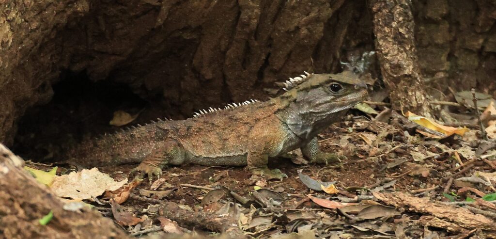
03c – Tuatara – I like the way the Tuatara is coming out of the tree base. You have shown us where it lives and what kind of conditions it likes. There looks to be a slight bit of camera shake or perhaps you lightened it from a very dark image as the Tuatara is slightly soft. The crop suits the subject.
Set 3 Award – Acceptance
-
-
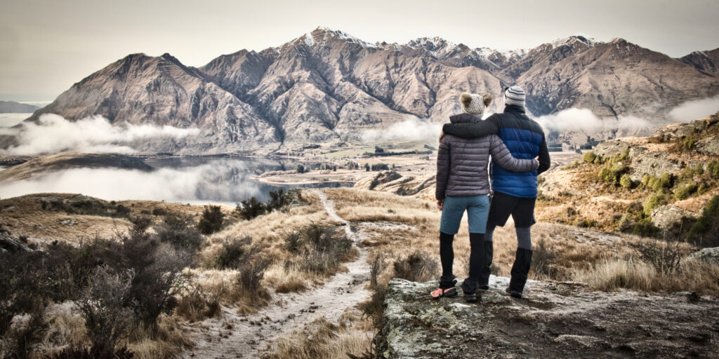
04a_Worth the Climb – The people in this scene set it off nicely. You can place yourself in their shoes and survey the countryside. There is a good balance of background mountain, midground flat land foreground hill. The people also give the image a more 3D effect but I do detect a light halo around them.
-

-
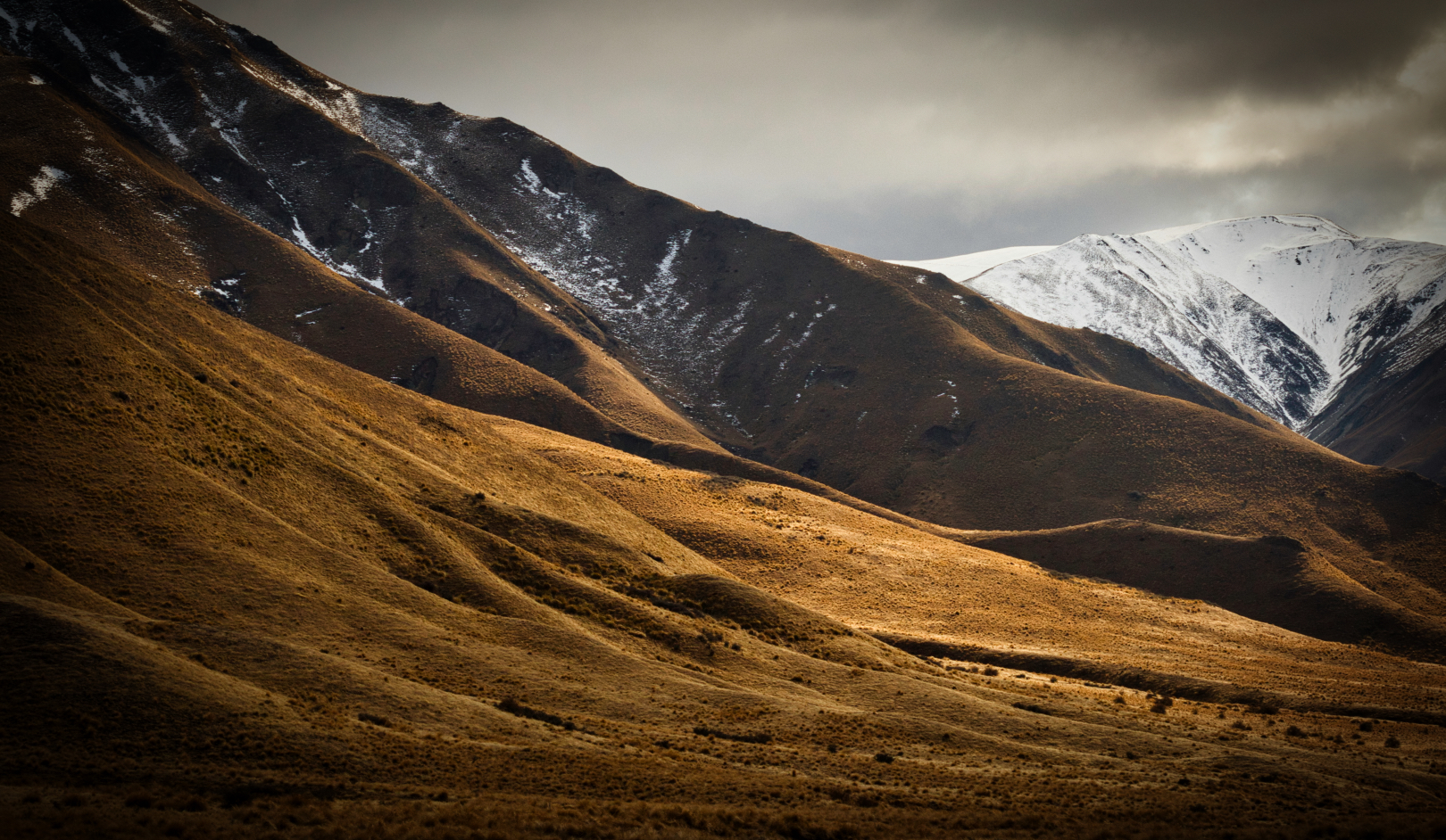
04b_Lindis Slopes – You have captured the light beautifully here. I love the way the foreground is lit up then there are the darker hills then the lighter snowy ones in the background. The vignette is a little heavy but not too bad. The sky has interest in it.
-
-
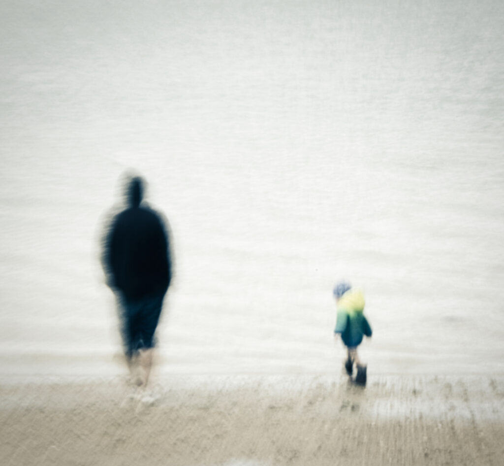
04c_Father and Daughter – I love the way you have captured these two on the beach but I do wish they were a little closer together so I don’t keep looking from one to the other. Actually the little person would be rather lovely on his/her own. Try covering up the Adult with you hand an see how good the minimalist image is with only the little person. The movement works well.
Set 4 Award – Honours
-

-
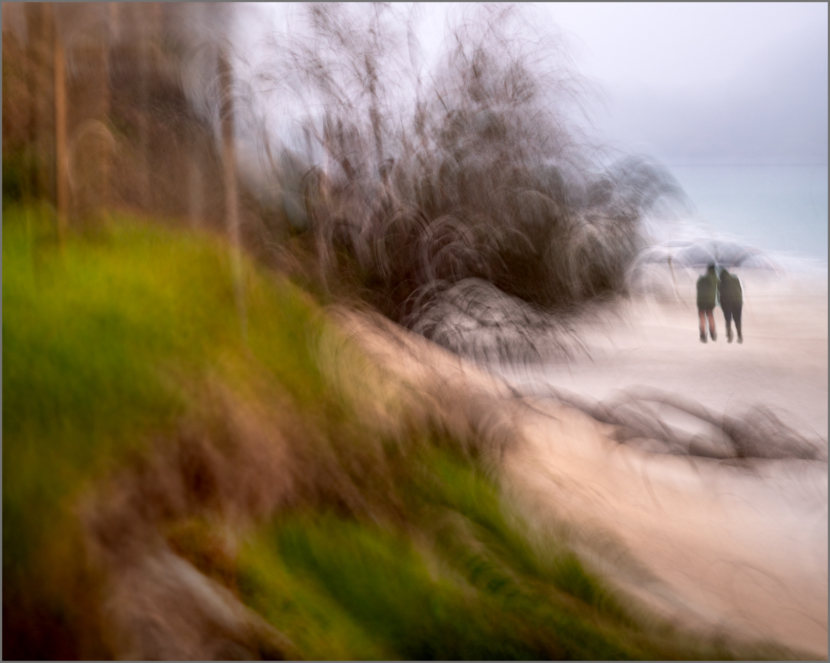
05a_Bush to Beach – I love the way my eye travels around the image. I enter the frame at the bottom left and move along the brown line onto the sand and then to the two people. I do wish that the people had a light shadow under them or something to anchor them to the ground. I love the way you have moved the camera creating interesting arch shapes.
-

-
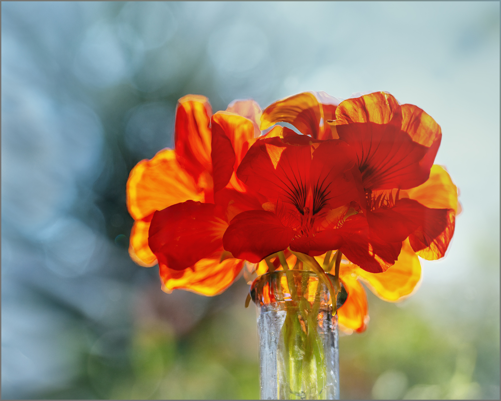
05b_Nasturiums Against the Day – The light coming through the flowers of quite lovely. There is good detail in the front flower which is on the shadow side. The bokeh in the background works well and the blue and green colours compliment the bright orange/yellow of the flowers. The flowers have been placed just off centre which I like.
-

-
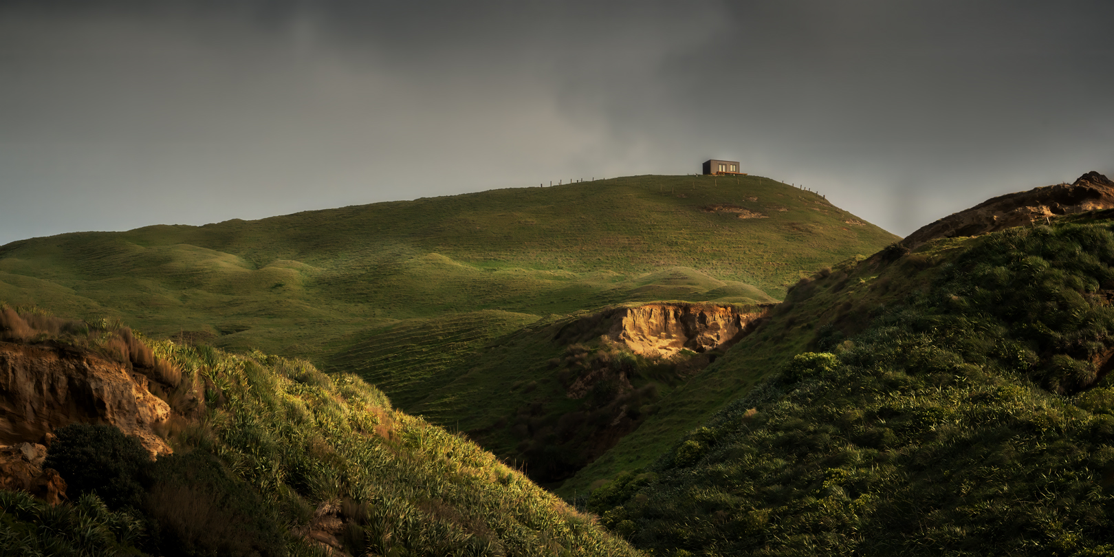
05c_Room With a View – The composition of this image is great as is the light. I like the way the light catches the ridges and the eye zig zags up through the image to the little house at the top. At first I thought the dirt bank below the house was a bit bright but then thought that it helps to lift that area that is in darkness. A nice moody sky.
Set 5 Award – 1st Place
-
-
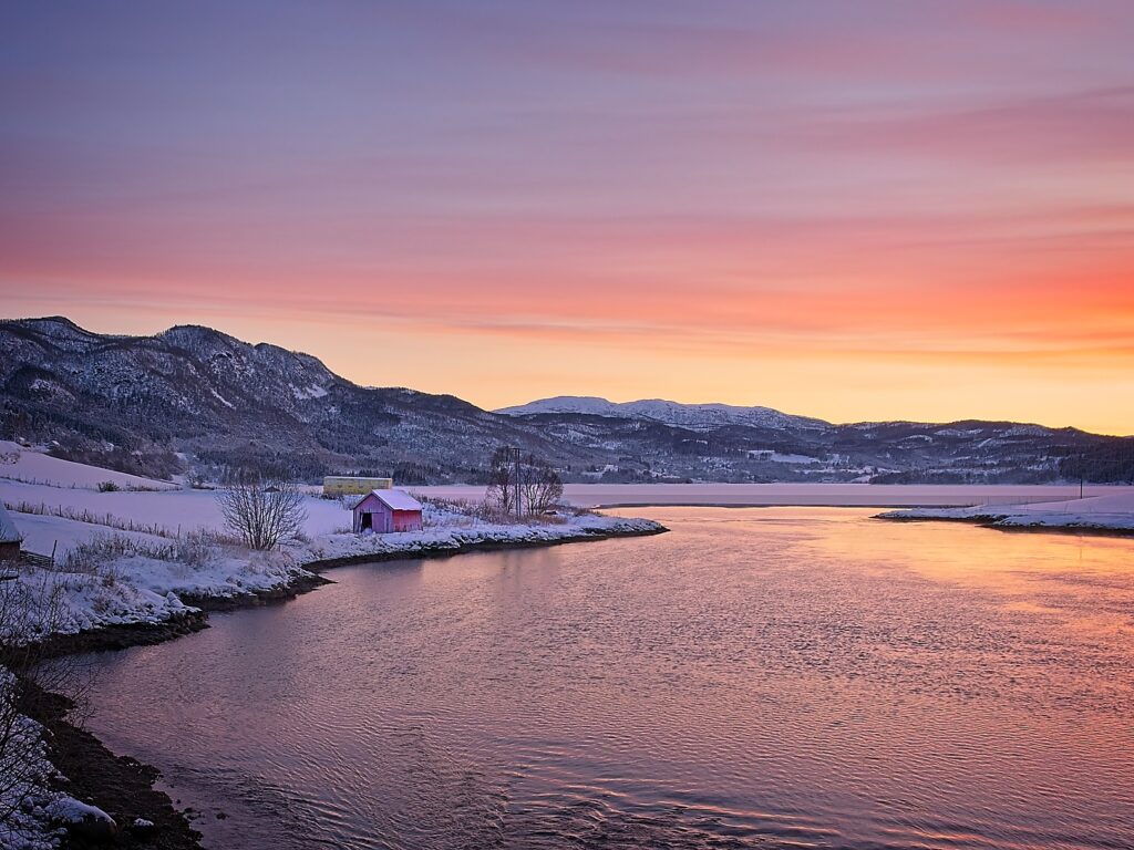
06a_Arctic Winter – This is another image with great light. It is subtle and not overpowering but lights the land in a soft way. I feel that the land mass is right through the middle which doesn’t work for me. A crop off the top would bring that line of land up the frame more. You could take some off the bottom instead but then you would lose the lovely texture in the water. There is also a white halo along the top of the mountains. It is a lovely place taken at the right time, just needs refining.
-

-
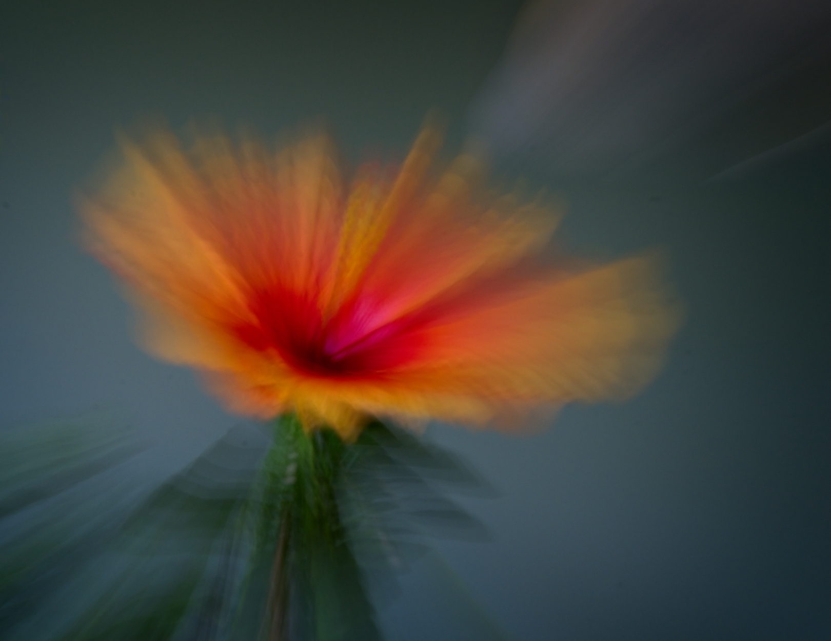
06b_Floral Art – The zoom burst looks great with this flower. It has been placed nicely on the thirds. I feel that the dark colours make it look too heavy for a delicate flower. The whole image could be lightened up which would give it a more joyous feel.
-
-
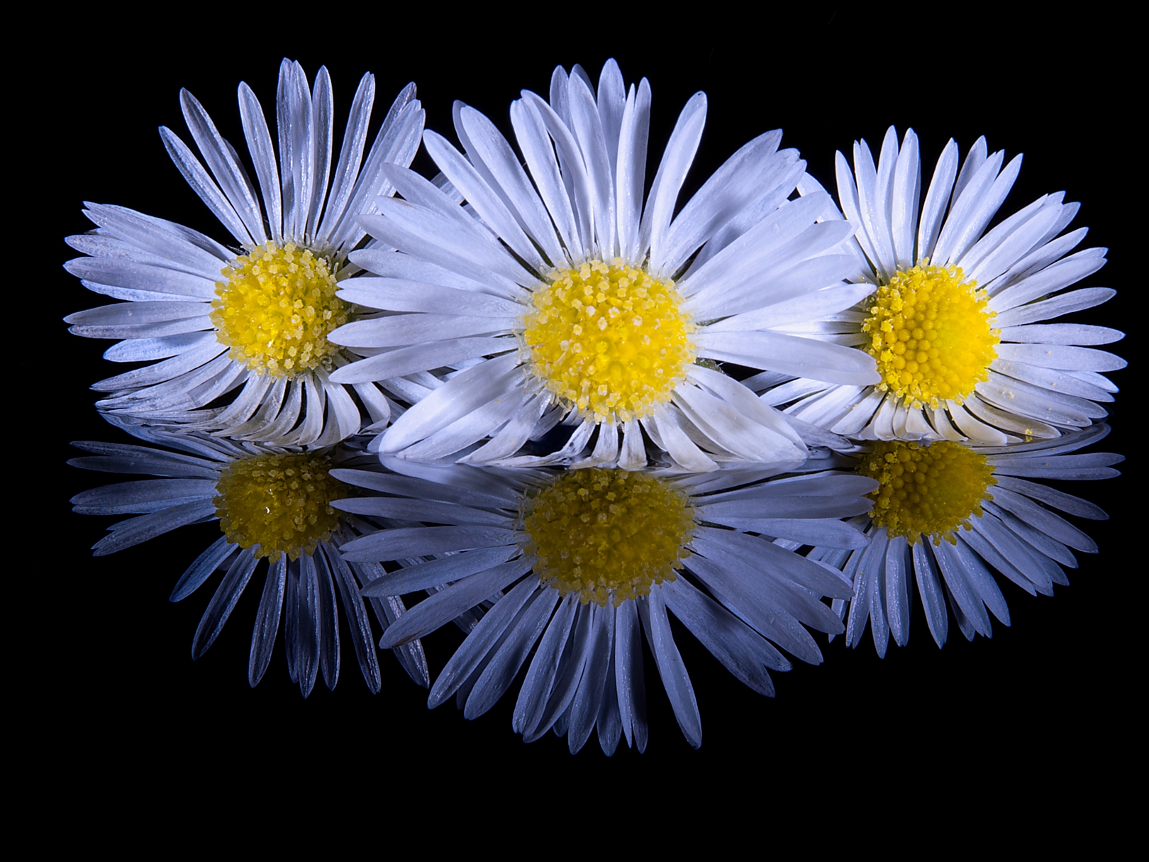
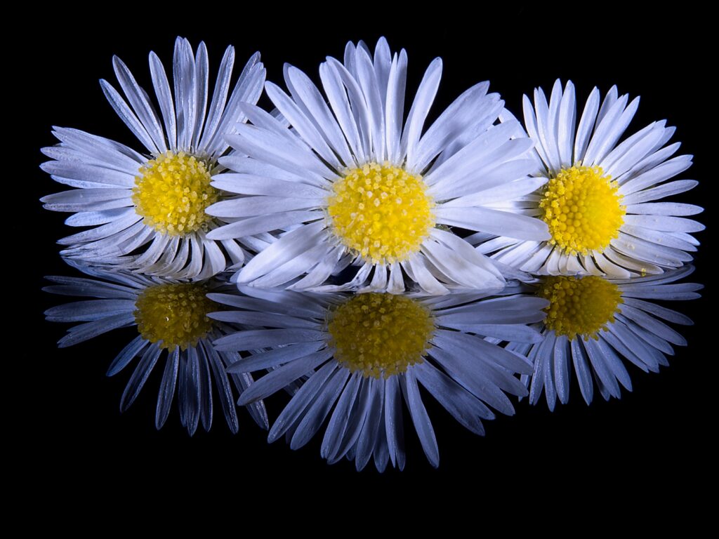
06c_Daisy Trio – This image has impact. The white and yellow really jump out at you. I am wondering how you did this as it doesn’t seem to be sitting on glass. Maybe it is water? What makes me wonder is that the reflection of the petals of the right hand flower do not line up with the actual petals. Anyway it is a great image. Nice and sharp too.
Set 6 Award – Highly Commended
-
-
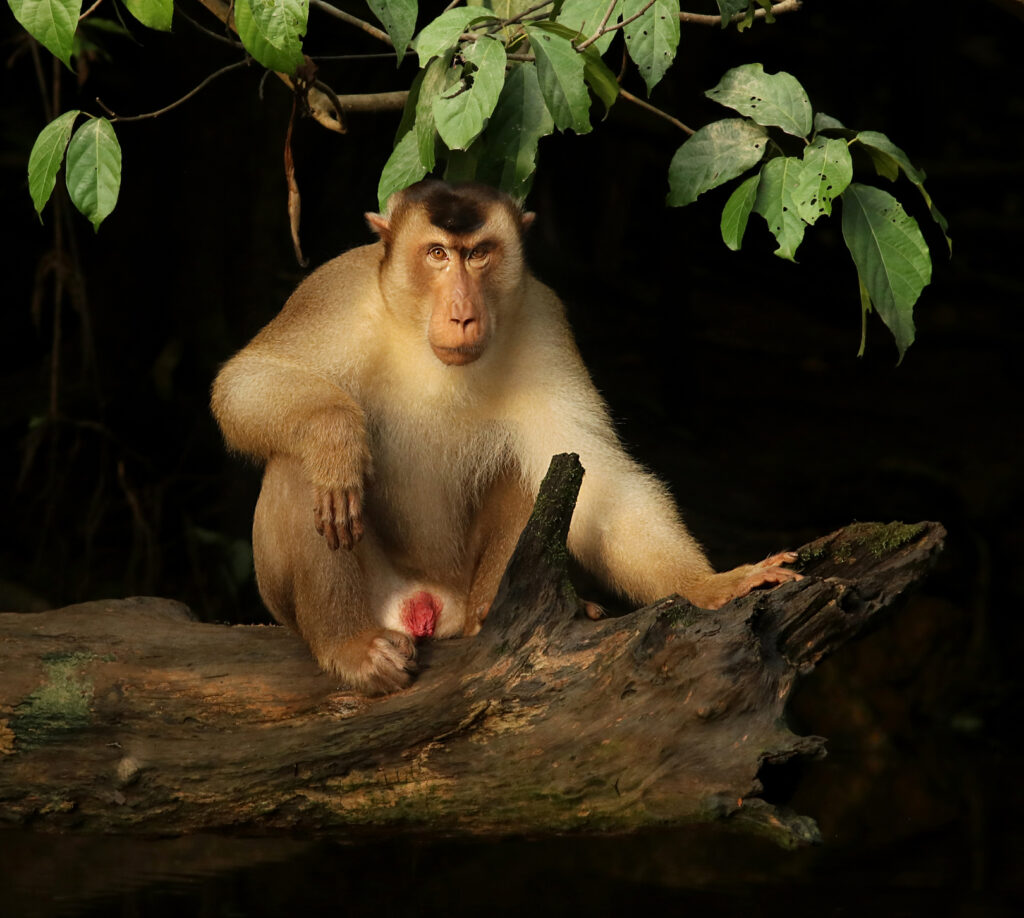
07a_Big Boss Macaque – Oooo – The Look. The direct stare is great. The monkey is sharp throughout. The fur looks so soft and fluffy. The light on the monkey is great and the tree leaves frame the top and gives us context of it’s environment.
-

-
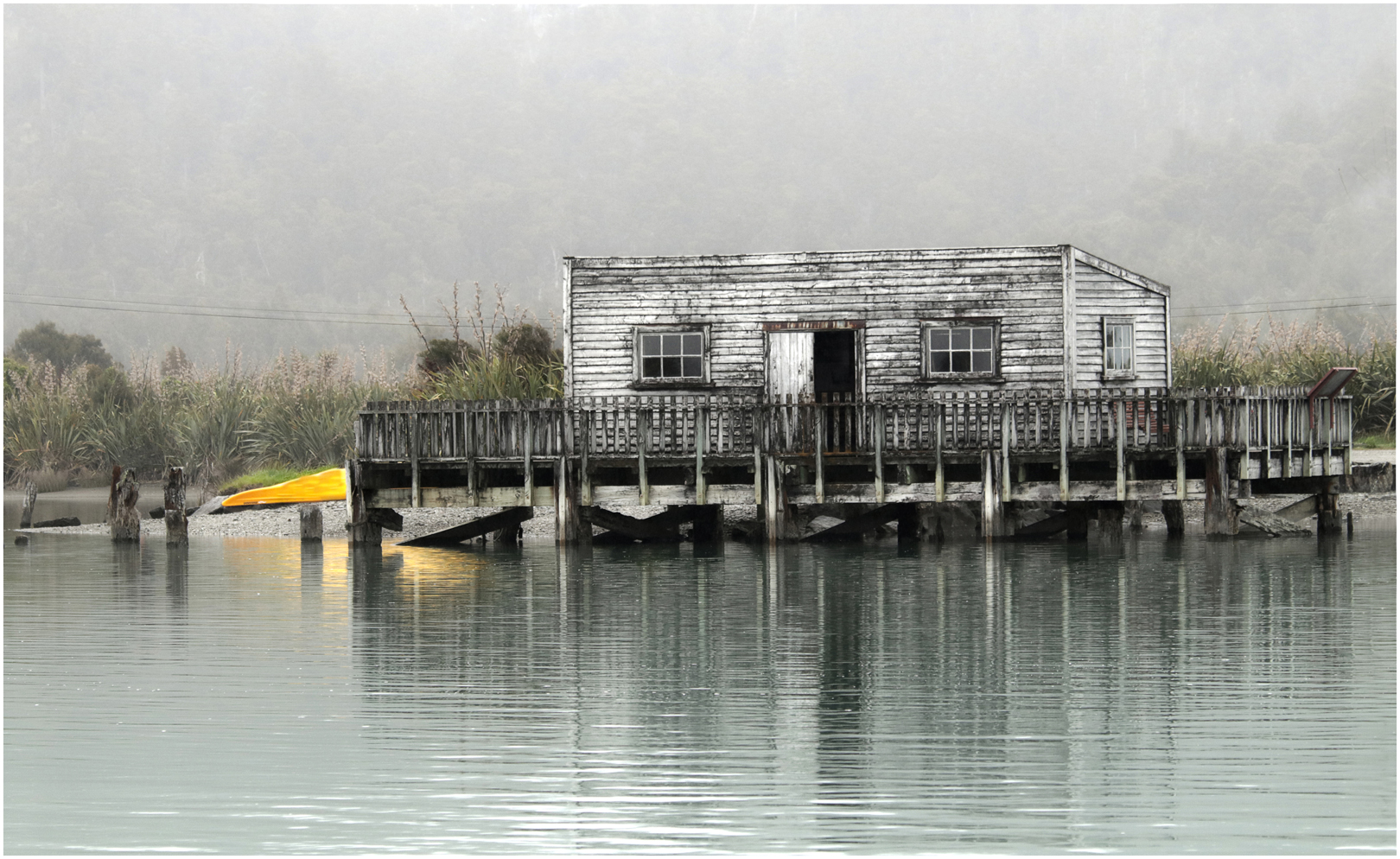
07b_Okarito Boat Shed – The grey misty day gives this image feeling. The composition is good. The yellow kayak on the left is very distracting and is drawing my eye away from the boathouse. It is a different perspective on the boathouse which we normally see from the other side.
-

-
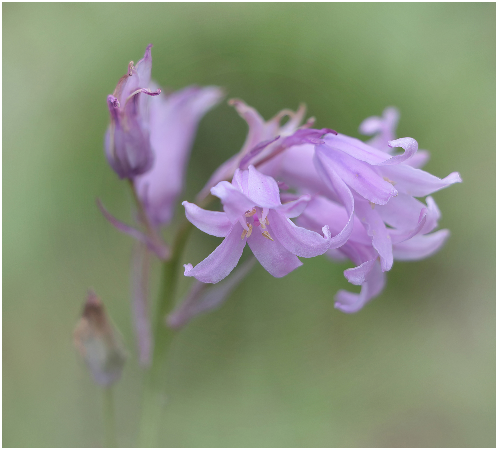
07c_Pastel Lilac Flower – I really like the way you have handled this image. The flowers are very pretty and delicate and you have added to that softness by using a shallow depth of field. There is only one thing with this image and that is the in focus flower tips in the top left. Try blurring them out to match the other flowers there and then the eye would not be drawn to them. The sharpness of the front flower is great and then the sharpness just tapers off and the flowers float off into the distance.
Set 7 Award – 2nd Place
-
-
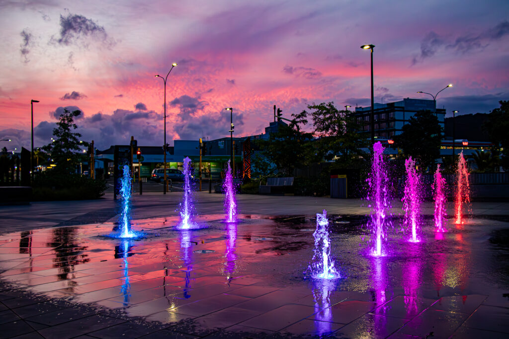
08a_Glowing Water – You have captured the water well and I also like the refection of the sky in the wet pavement. I find that the building are very dark and wonder if you could lift a bit of detail out of them. The colours of the fountains work well with the colours of the sky.
-
-
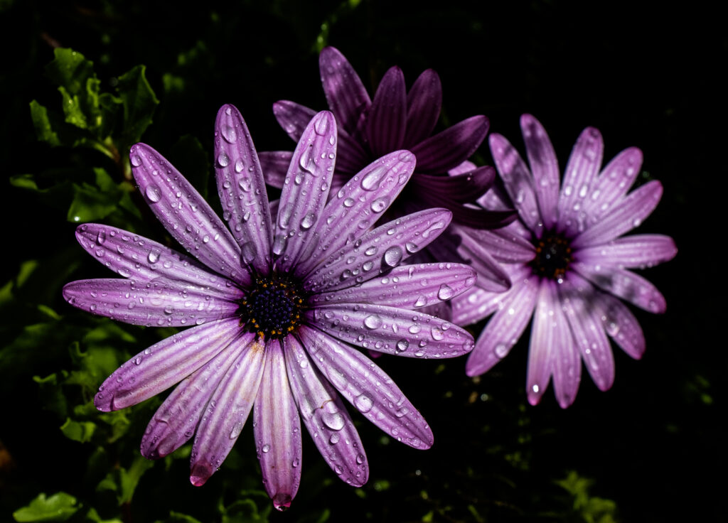
08b_Floral – The trio of flowers look good with just the one flower in focus. The water drops add to the interest of the image. The green leaves are a little distracting and could be toned down a bit. Try flipping the image and see if it works better with the in focus flower on the right hand side, which is the stronger side of a frame – just a thought.
-
-
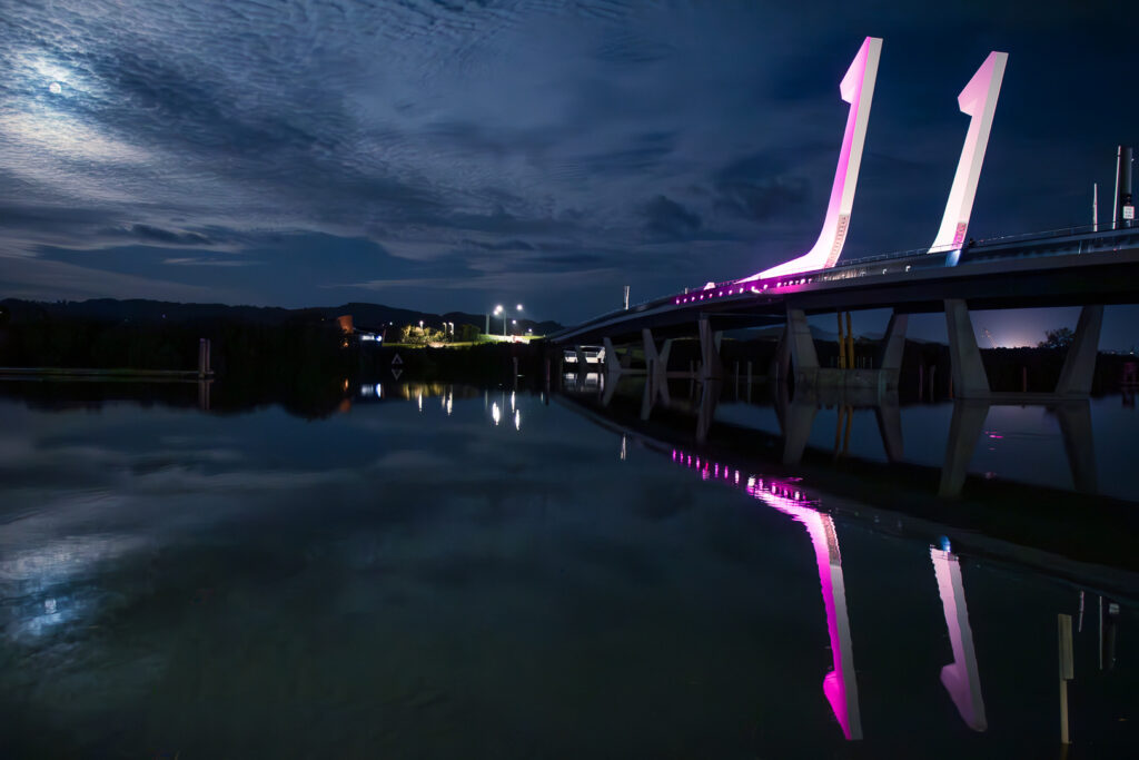
08c_Moonlight – The fact that we can see the moon in this image gives it more interest. The clouds have nice texture to them. The bridge stands out but I would like to see a little more detail in the shadow area under the bridge. I don’t mind the landform being dark as it separates the sky from the water. The horizon is in the middle but in this image it works because of the symmetry.
Set 8 Award – Merit
-

-
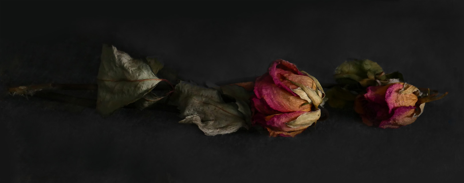
09a_Rembrant Roses – I find this image to be very moody with the low lighting. I think the composition could be improved by placing the right hand flower closer to the main flower. I like the way the light picks out the shapes and textures.
-
-
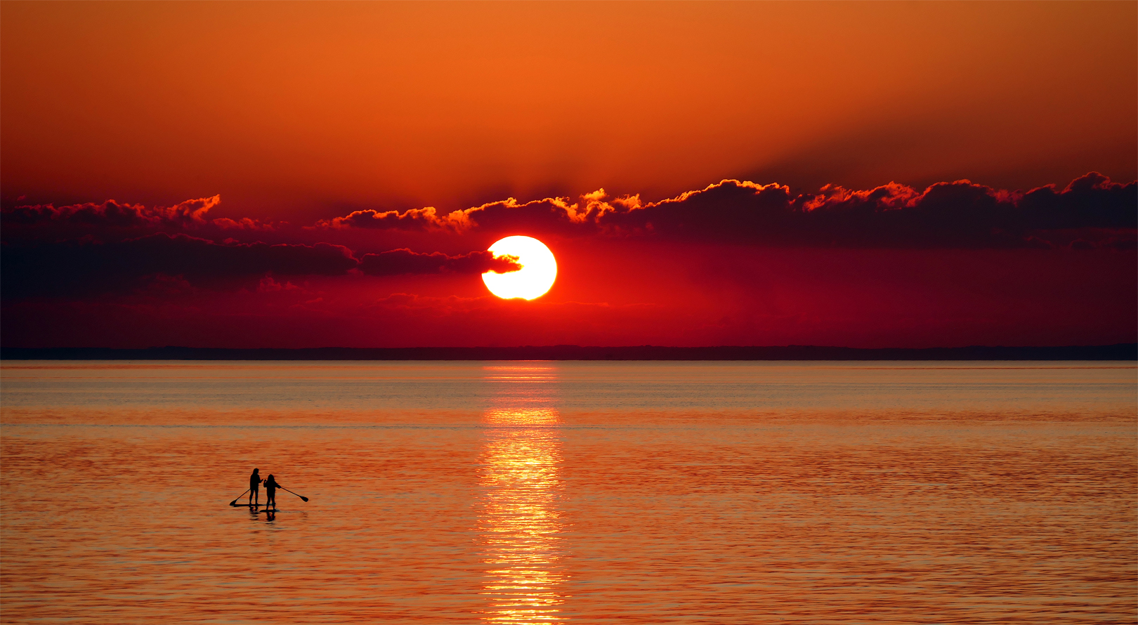
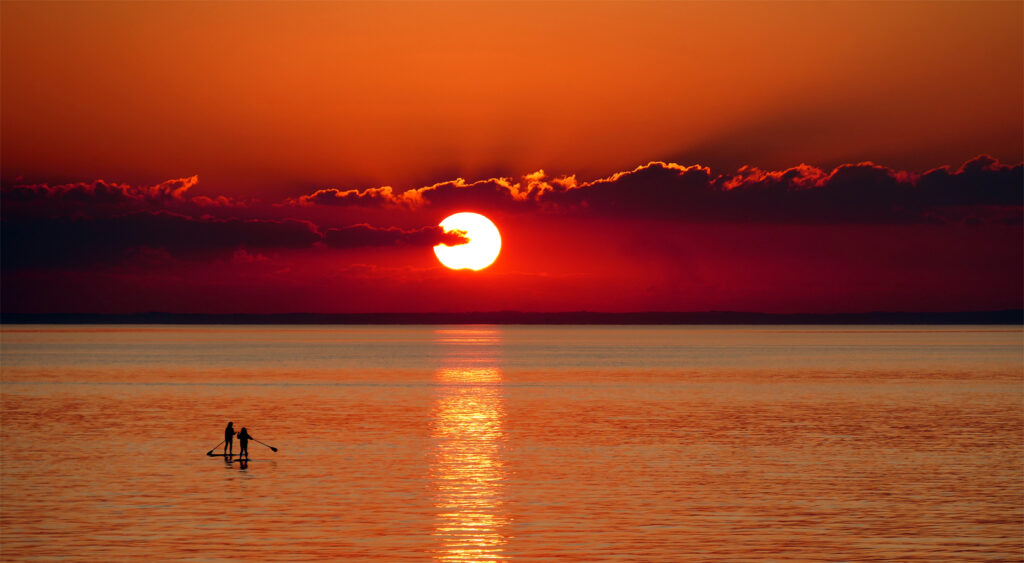
09b_Sunset Serenity – This image is beautiful. Having said that, to get a better balance you could crop off the right hand quarter, or even third. That would take the sun over to the right of the image with the paddlers going into the sunlight. Other than that it is great. I don’t even mind the blown out sun. It makes a nice focal point.
-
-
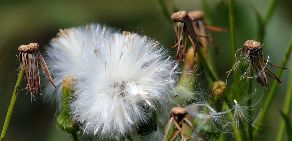
09c_Taraxacum Officinale Life Cycle – There is a nice little story being told here of the different stages of the plant. The image is looking a little crowded and I wonder if you could have removed some of the stalks in the background before you took the shot. The crop is not bad but a bit tight at the bottom as the seed head is touching the bottom of the frame. The exposure is good with no blown out highlights.
Set 9 Award – Merit
-

-
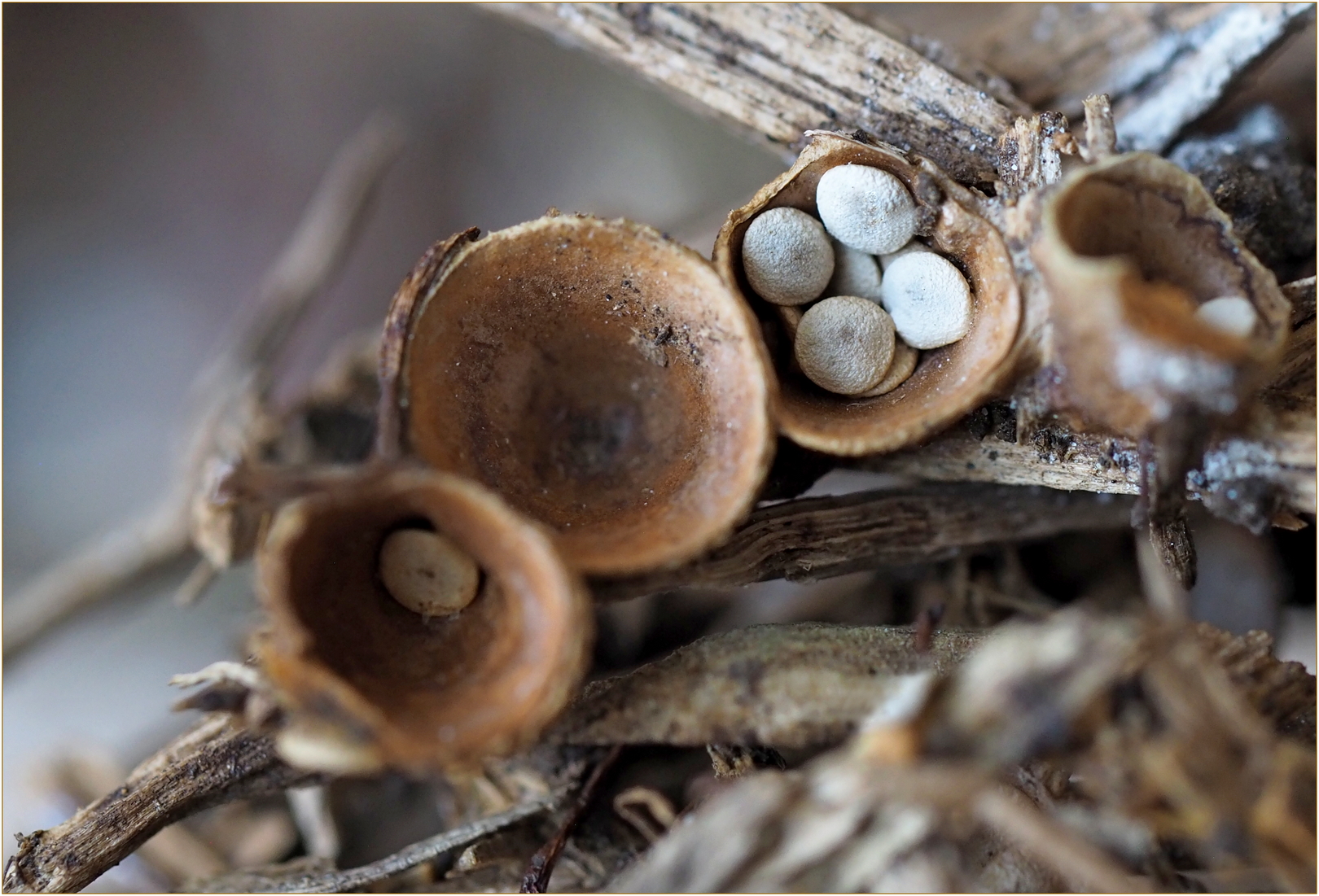
10a – Birds Nest Fungi – Crucibulum Laeve – You have found a birds nest fungi that shows various stages of its life. I do like that you have given sharp focus to the cup with the ‘eggs’ in it but I feel that you needed more depth of field so that the edges of the cups were in focus too. I know how small these are so you may have been at your maximum depth of focus so this would be a good candidate for focus stacking. We can see where and how the fungi grows. The exposure is good and the fungi has been placed so as to create a diagonal composition.
-
-
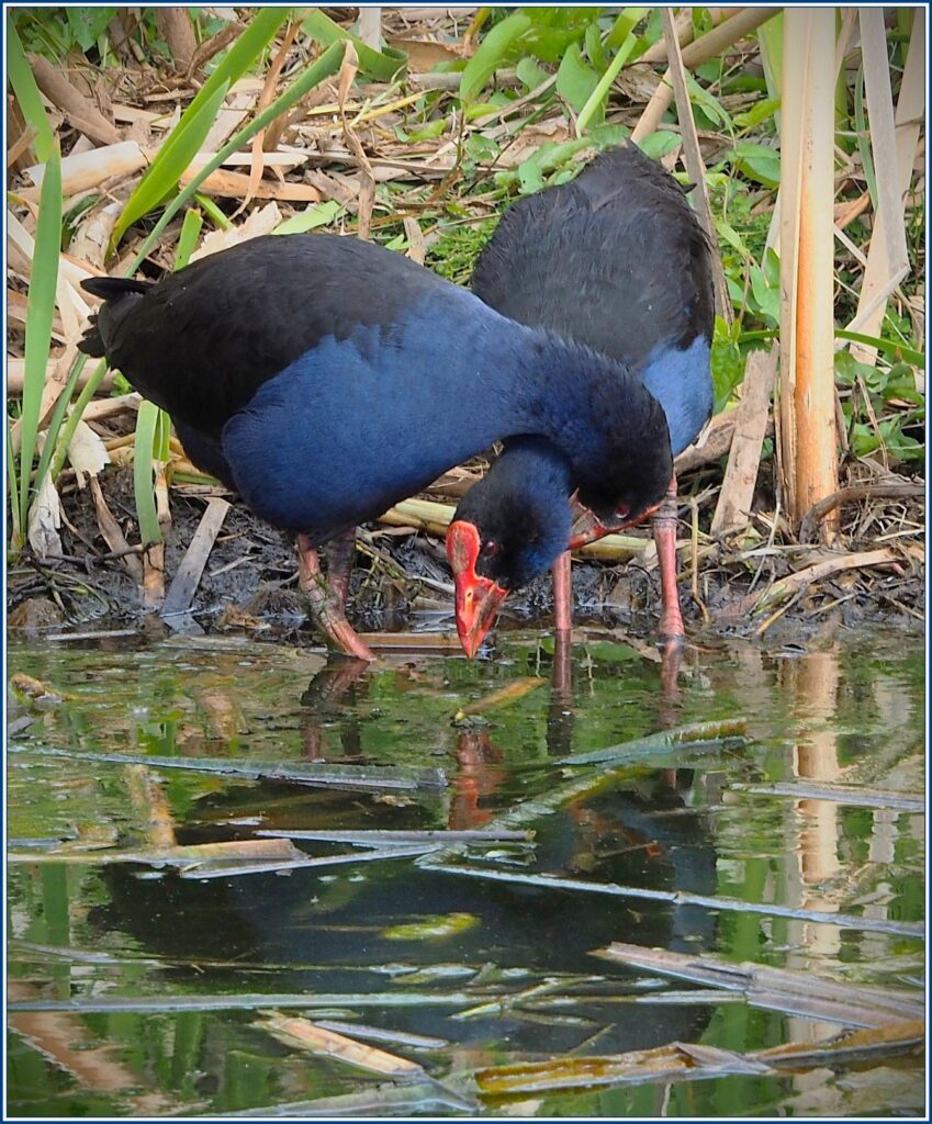
10b – Pukeko Kanoodling – This is a lovely moment you have captured. The birds are sharp and well exposed. I like the water foreground and they are in their typical environment. The contact between them gives us an Ahhhh moment.
-
-
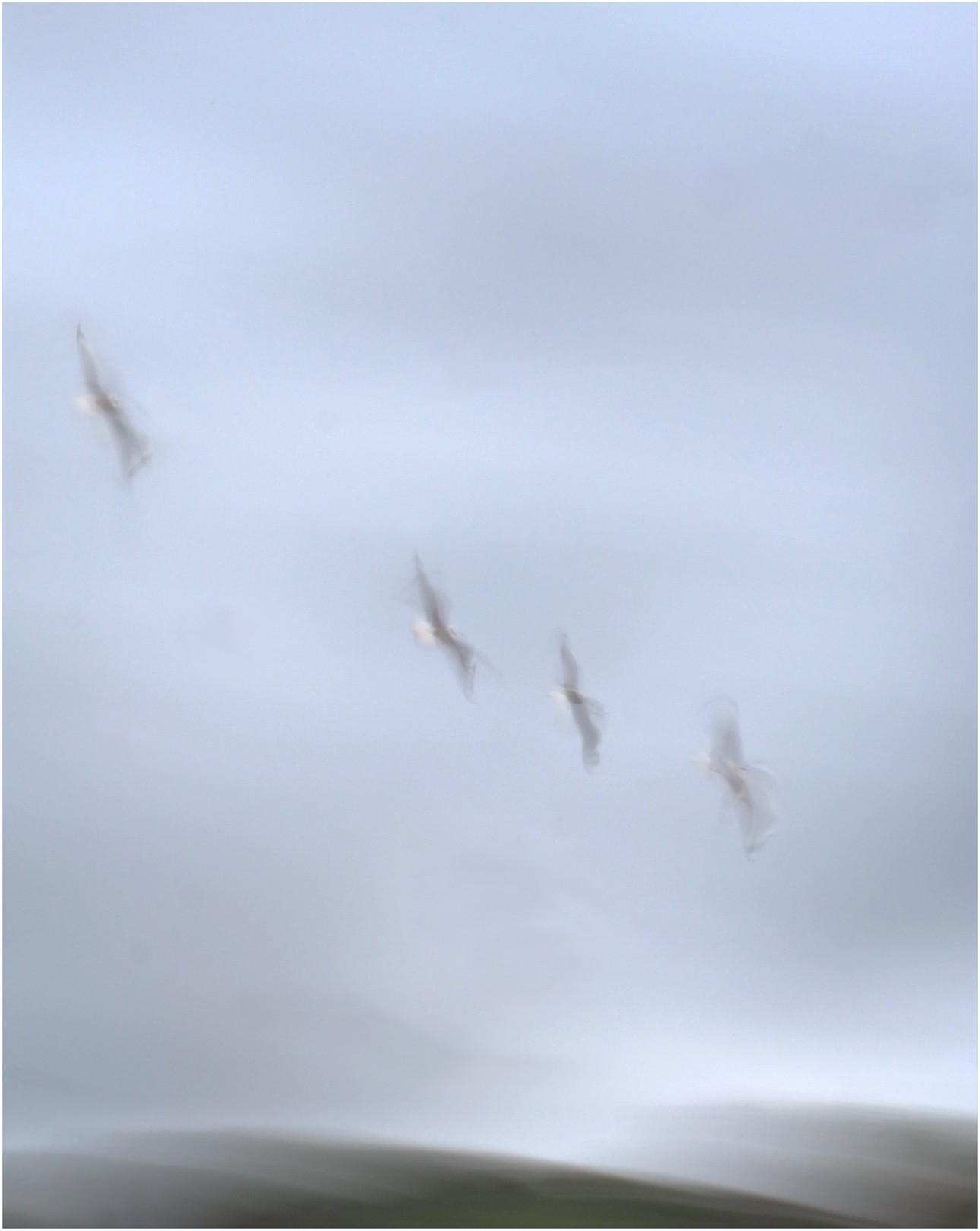
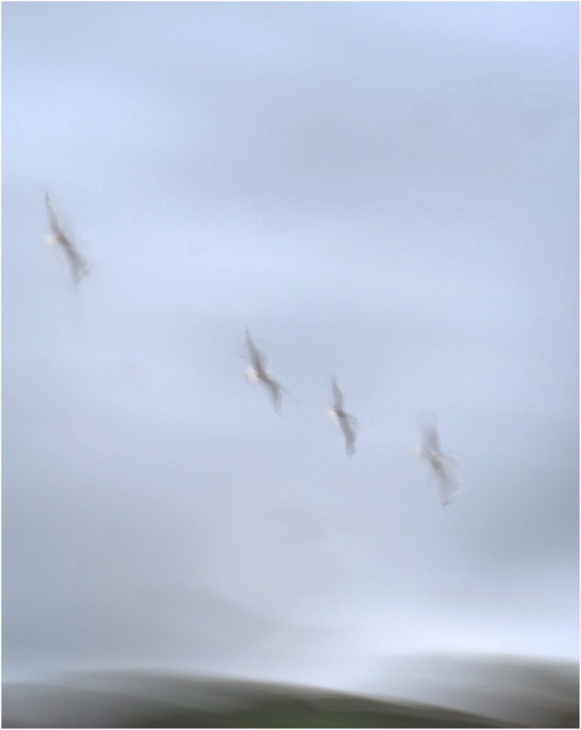
10c – Flight – I like seeing something different. The camera movement here gives us movement but we can still see the form of the birds. I feel that this image would work better as a square crop so that the left hand bird was in the corner of the frame. The muted colours are nice and give it a calm feel. The image flows nicely.
Set 10 Award – Merit