Judged by Simon Forsyth.
Winner – Kate 1 – Jenny Dowling
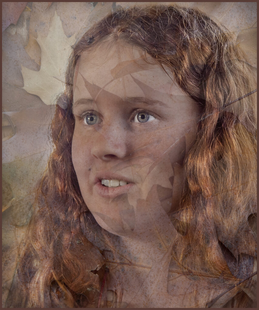
Runner-up – Golden Girl – Jenny Dowling
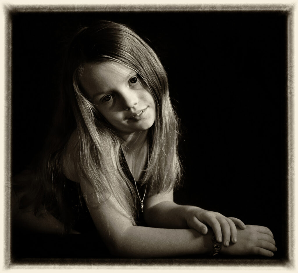
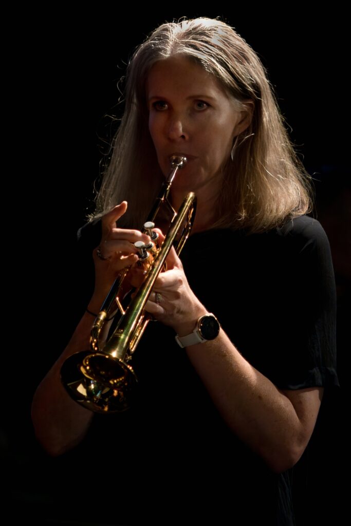
- Tegan – The composition and cropping are good here. Back and White suits the subject well. I would lighten the shadows on the subject’s face slightly, but the Rembrandt lighting is good. The shadow on her lip is a bit odd. I would lighten it when processing.Ideally if you could get the subject to take her hand back off the wrist so that not so much of the fingers are showing it would make them not so dominant. Fingers and hands are difficult things to get right!If you could turn the subject slightly more to the camera that would help, and I would get her to not angle her head quite so much. It looks a bit odd! You could also get her to raise the chin slightly.Merit
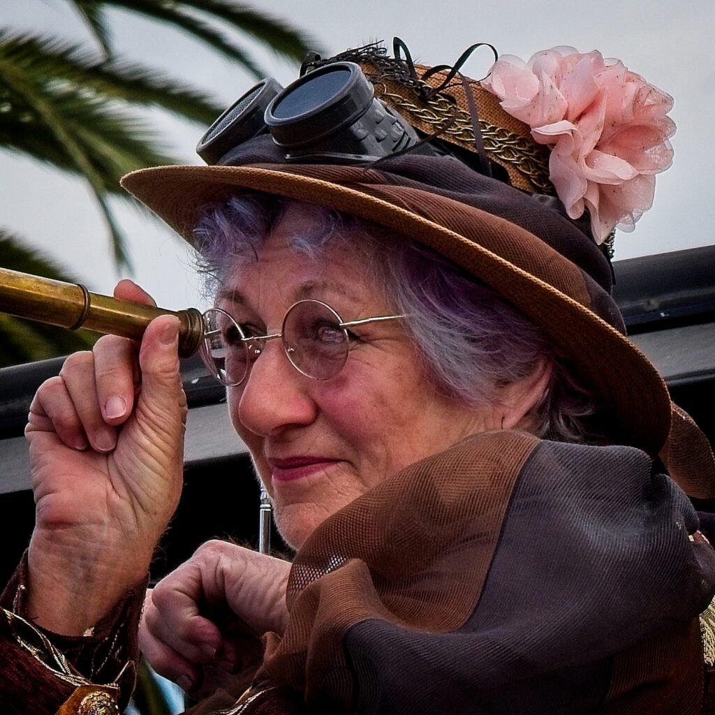
- Spy Woman – The framing is nice and tight here! It has ensured that the face is dominant.I suggest that you could have opened the aperture more to throw the roof line out of focus more as it cuts through the picture.I am guessing this was taken at a Steam Punk event which would explain the hat and telescope.I wonder if there is more to the left of the crop as I’d like to see more of the telescope which may help lead the viewer into the image.The subject’s left hand is distracting and the way it is positioned looks odd. Also, the skin tone on it is different to the other hand.There is a reflection in the near eye which is distracting.If you look at the histogram, there is some clipping in the blacks, which where they are doesn’t matter, but there also aren’t any whites so I suggest you could raise the whites a little.I would also raise the shadows slider to lighten the bottom right area. This will make it not so distracting.Accepted
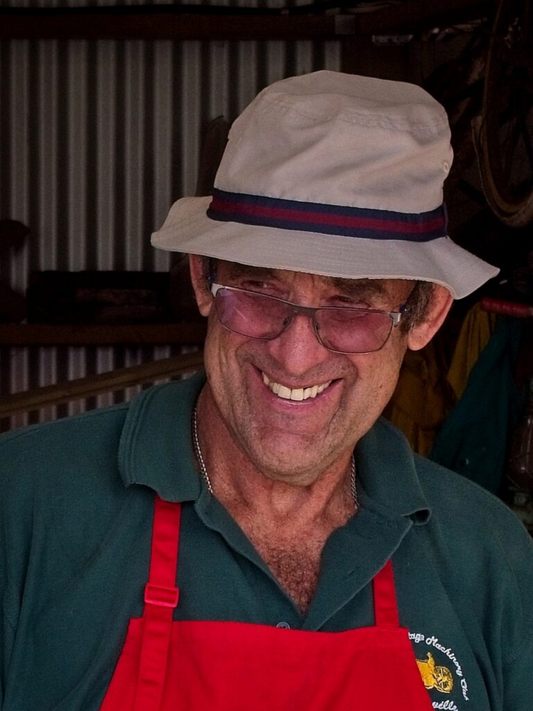
- Happy at his Work -The framing is ok here; however, the red apron is dominant as red always is! Have a look to see if you can crop it out and remove the straps! If you were to convert this to black and white the red wouldn’t matter.Exposure is good with good tones.I suggest that next time you lower the camera height as it is almost level with the peak of the hat. If the eyes were level with the camera, it would work better. Maybe you will have to ask him to lower or raise the glasses so they don’t intersect the eyes, but you will end up with a better image.Accepted
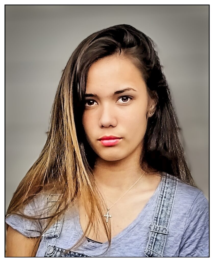
- Nichole – This is a nice portrait. I like the fact that you have put some thought into it by putting a white frame with a black keyline on it! Have a look at whether cropping the left so the bare arm is removed helps the image. The skin there does tend to draw the viewer away from the subject.Next time ask the subject to tilt her head slightly to camera left to break the line. Processing is good; however, I would lighten the shadows in the hair to soften the image slightly. The hair at the back of the right side as seen from the camera looks a bit strange due to it being out of focus and I would remove it if you can!Merit
- Bruce – This picture works well in black and white.Composition is good however the black area at the left on the background is distracting and I wonder if you could have moved him to the right slightly, so it wasn’t in the background?If you look at the image, the camera right side of his face is lacking detail. I suspect there may have been detail in the original file, and it would improve the image if these were revealed. I would also lighten the shadow area on the camera left side of his face. If you could have turned Bruce slightly to the camera right, I suspect that you could achieved this without needing to reprocess! Remember that while you can see detail in the shadows and highlights at the same time, the dynamic range of the sensor cannot. This is something that you only learn with practice!Accepted
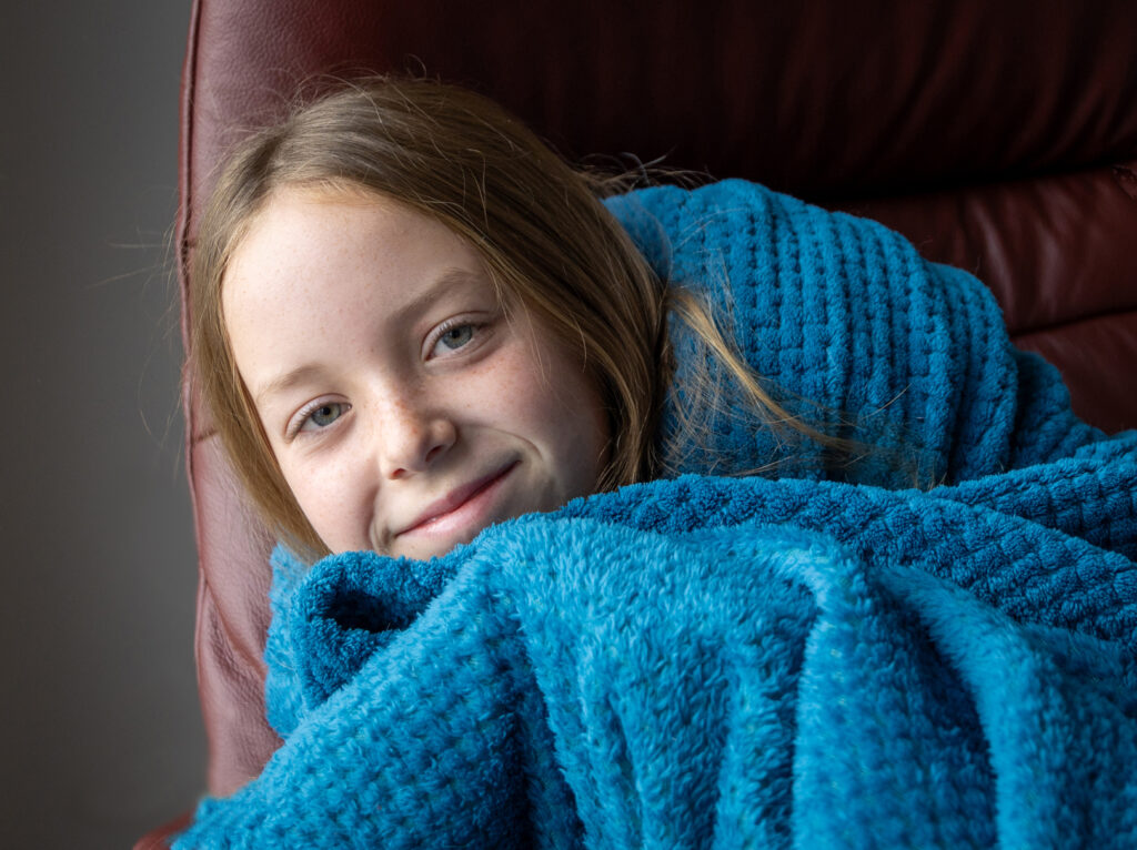
- Drew on a Sick Day – Exposure is good here, although I would tone down the highlights on her forehead slightly, so they aren’t so distracting!The subject’s expression is great, but she doesn’t look too sick!!I suggest that some cropping would help here. I would crop most of the left side gray area as it doesn’t add anything to the image. I would also look at cropping some of the right off as well. This will ensure the blue of the blanket isn’t so dominant and allow the face to be more dominant. You should end up with almost a square crop.Merit
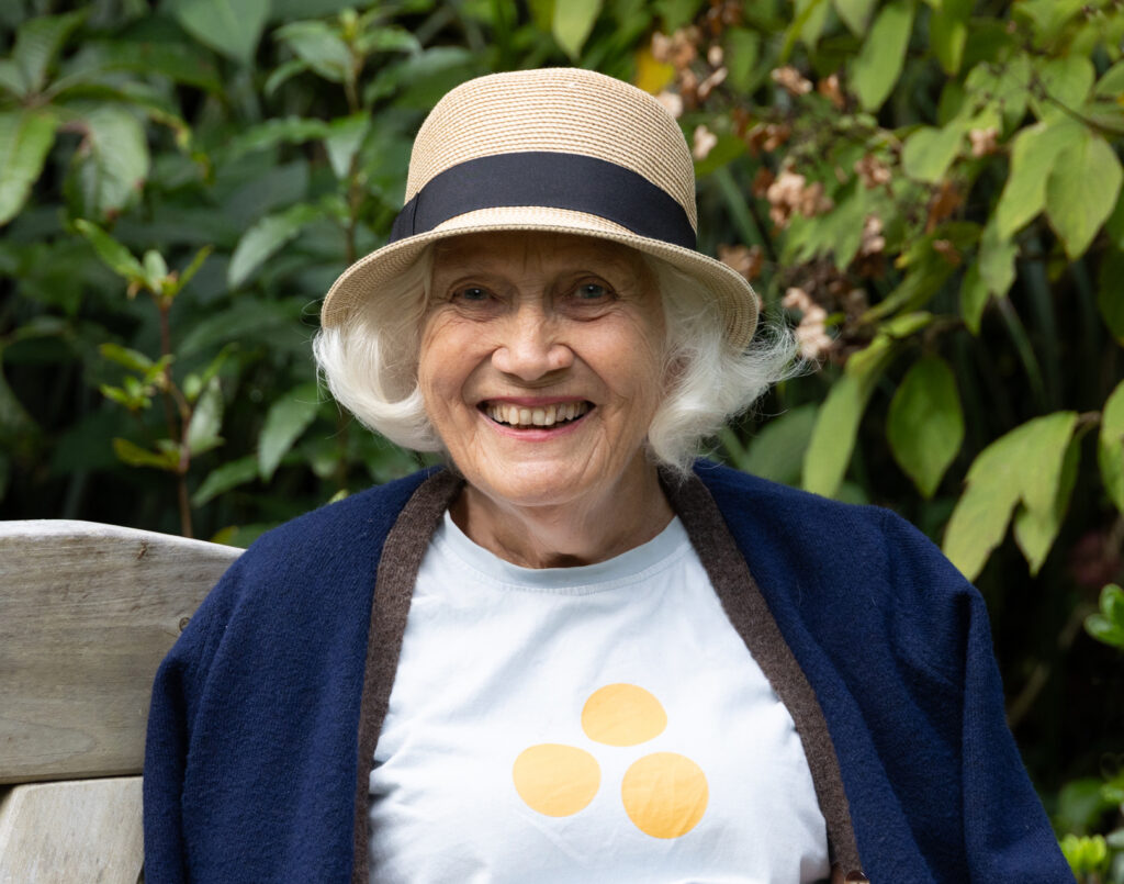
- Jackie – Exposure is very good here. Also, the use of a wide aperture helps throw the background out of focus, so it isn’t distracting.You have managed to capture a lovely natural smile on her face which is a surprisingly difficult thing to achieve as most people tense up when being photographed.The image could be improved if you had got the subject to turn her body to the left. This would create a more pleasing pose. Shooting someone straight on to the camera is not the most flattering pose and should only be used for passport photos and mugshots!You could lighten the area under the brim of the hat slightly, so her eyes are lighter. If you use a brush as a mask over that area, then raise the shadows around 20% this should work.Finally, I suggest you have a look at copping the left and right sides of the image to make it tighter.Accepted
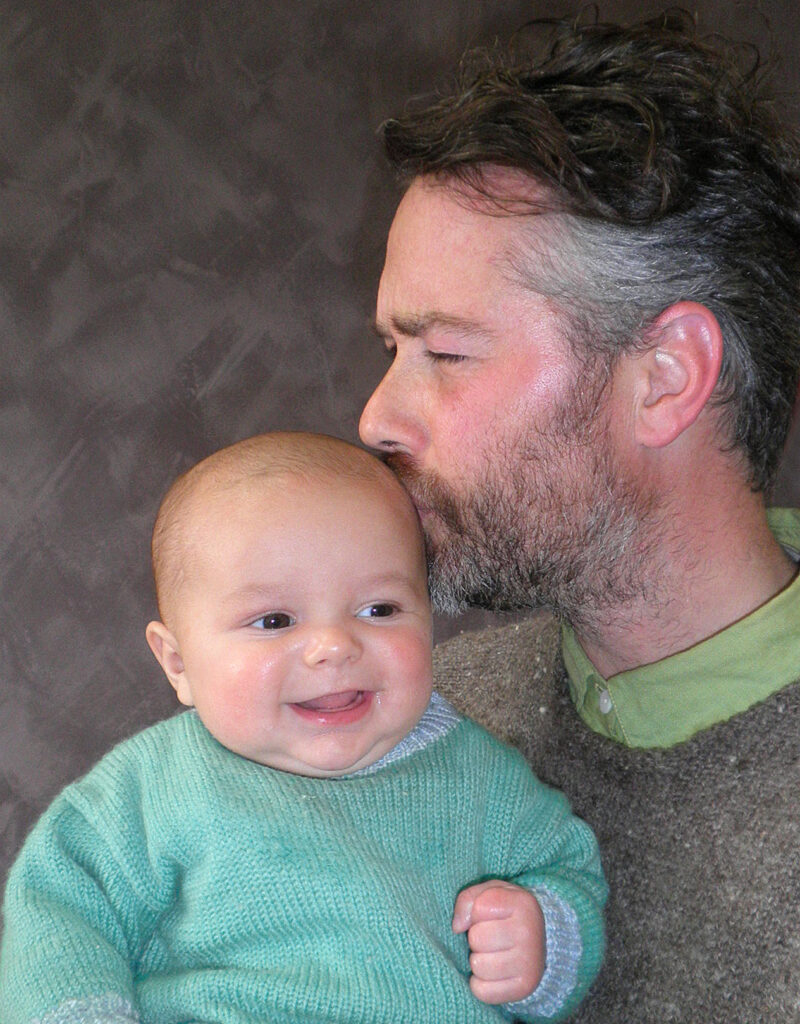
- My Boy – This is a nice image. The framing is nice and tight ensuring that man and baby are the centre of attention. Exposure is good though I would darken the background slightly to make the subject stand out a bit more. This can be done easily by masking the subjects then inverting it! I feel that if the man had his eyes open it would help. Also, if you could have got the baby to look at the camera that would have helped, but it isn’t always possible! Highly Commended
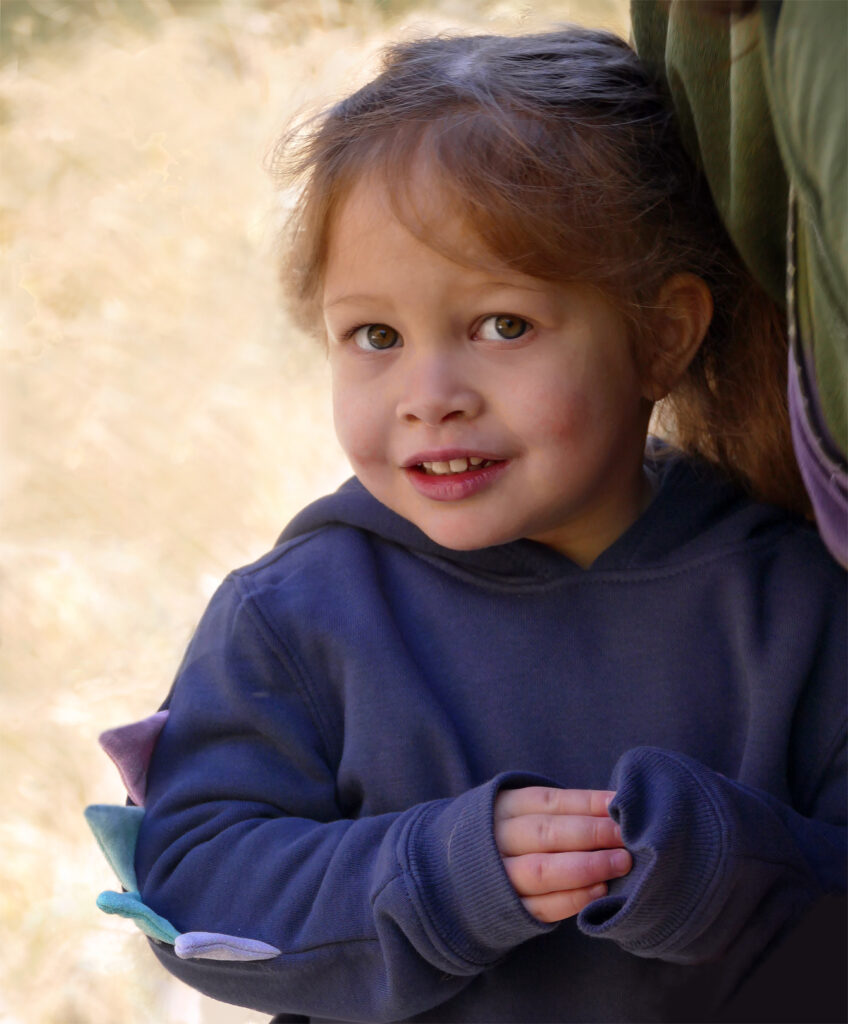
- Shy Little Dragon – This is a nice image of a shy subject. The expression is great as it shows that the little girl is not too sure about what is happening. There are a few things I think would help improve this. The background is very bright and therefore draws the viewer away from the subject. By masking it and then reducing its brightness the focus would thebe brought back to the girl.Ideally, the part of the person at the right should be removed and while you may be able to do this, it helps create the sense of shyness.I suggest that you lighten the shadows to reveal detail in the hair at the subjects right as there is detail there.Accepted
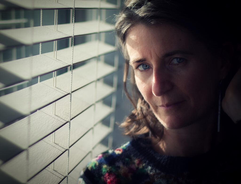
- Self Portrait – Self-portraits are very hard to do because as photographers we are used to seeing what is happening from behind the camera! Since we usually can’t unless we use a mirror near the camera, we don’t have a good idea of expression etc.Because of this, this picture is quite well done and good use of window light to split the lighting on the face.I suggest you crop the left to make the window smaller as being bright it tends to command the viewers’ attention. If you crop the left to the middle string this would help.I would also lighten the subjects shadow side of the face slightly to reduce the contrast. Use a brush to paint over the face and shoulder on camera right and raise the shadows slider by around 15-20% as I feel that will just reveal enough without changing the overall mood of the image.Merit
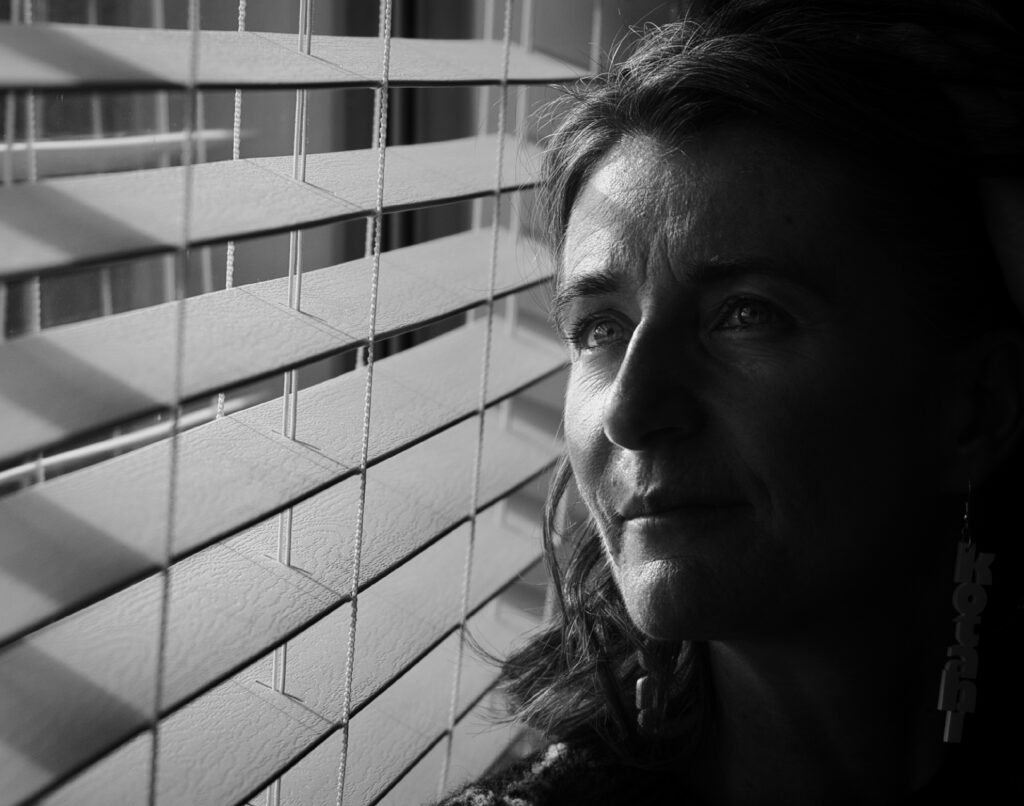
- Mono Self Portrait – Another good self portrait this time in black and white.Again, I would crop the window, so the focus is on the subject.Again, I would lighten the shadow side of the face especially the eye. This time you may not need to mask the area to achieve this.For me the fact that the subject is looking away from the camera adds mystery to the image and works well.I suggest that next time you remove the earrings as they are not bright enough to be seen and the highlights on the edges only makes them distracting. Merit
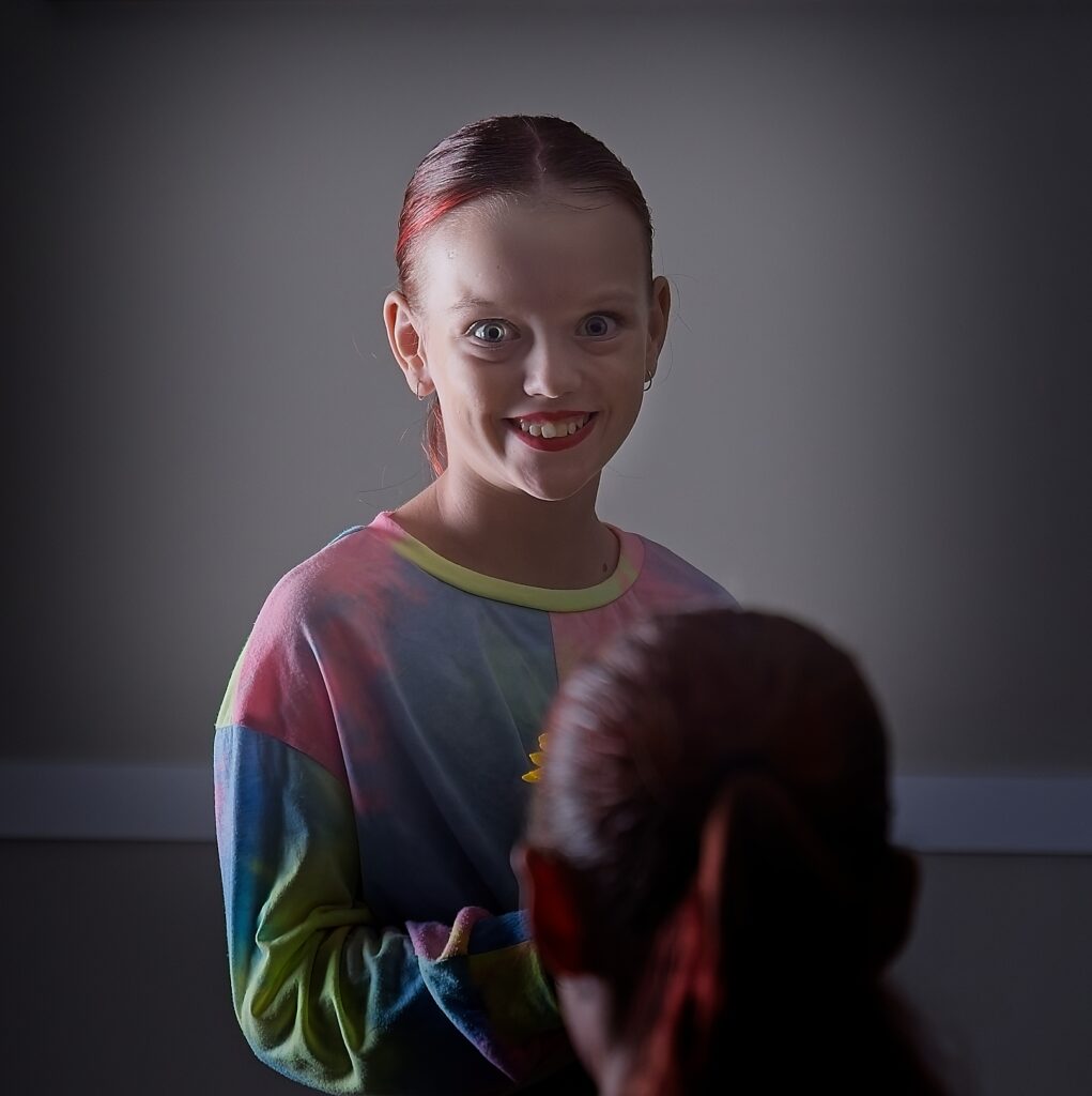
- Young Ballerina – The expression on the girl’s face shows she is happy about something and is well captured.I like the fact that the outer area of the image is darker as this means the viewer is lead to the subject.I suggest you lighten the face somewhat and reduce the highlights on the camera left side of the face. For me the image is let down by the out of focus head in the image. While it may a judge giving the girl a favourable review, its inclusion distracts from the image. If you had been able to move to camera left so there was some separation between the subject and the other person this would work better. Not Accepted
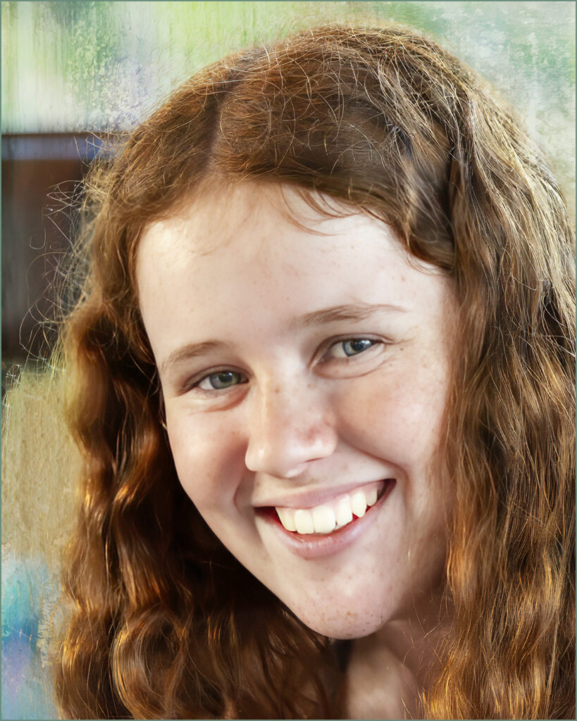
- Kate 1 – A very nice portrait and one both you and the subject should be proud of!Exposure and composition are great. The only thing I would do is reduce the highlights slightly to reduce the brightness of the teeth. Depth of field is very shallow, and I suspect you used the teeth as a focus point which means the eyes are ever so slightly soft. The background is nicely out of focus and the choice is good.You could look at masking the hair in shadow on the left side and lightening it slightly to revel more detail.Well done!Honours
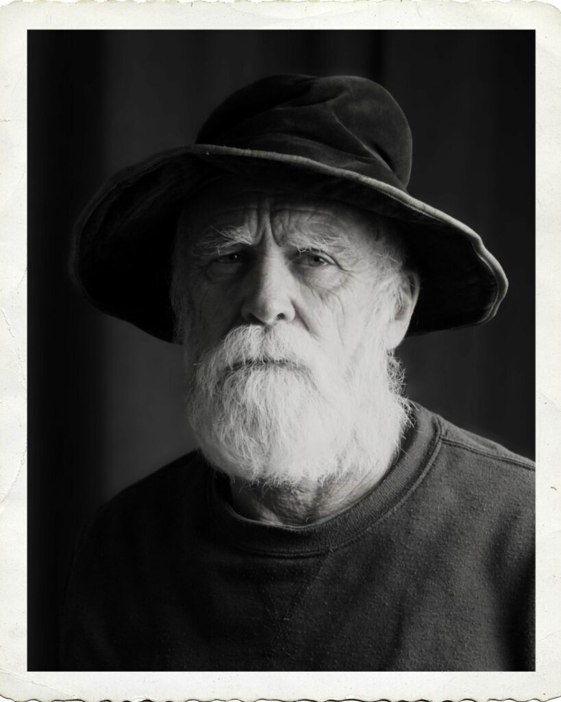
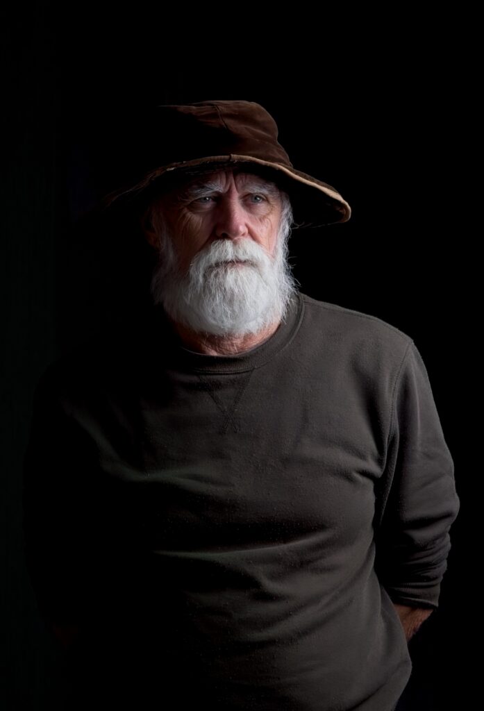
- Contemplative – The subject has a weathered rugged face which I would use to better effect. If you had cropped so the face was dominant, I feel this would work better.The lighting is good and the exposure of the shadow side of the face is good with a highlight around the eye. Also, the light side is well controlled so there is detail in the beard.I suggest you could have used a reflector or a fill light at camera left to slightly lighten the body. The blacks in on camera left are clipped. I would crop this so that the head is dominant. Cropping everything below the V on the sweatshirt will help as well as also cropping the left, right sides and the top. This will make the head large enough to reveal the character!Accepted
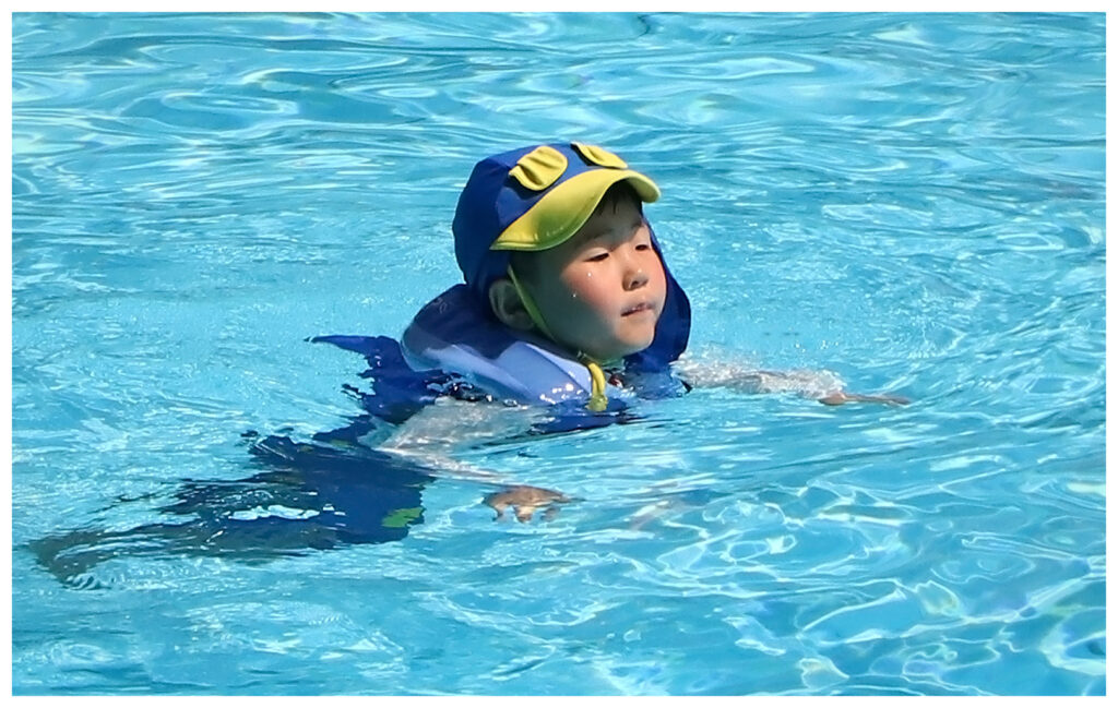
- Gaining Confidence – This isn’t really a portrait but more an action shot!Exposure is good and as an image it is well captured. Composition/cropping is good with space at the right side giving the boy room to move into.If you look carefully at the face, it is slightly soft. If your camera has tracking turning this on would ensure the subject stays sharp as it moves.Not Accepted
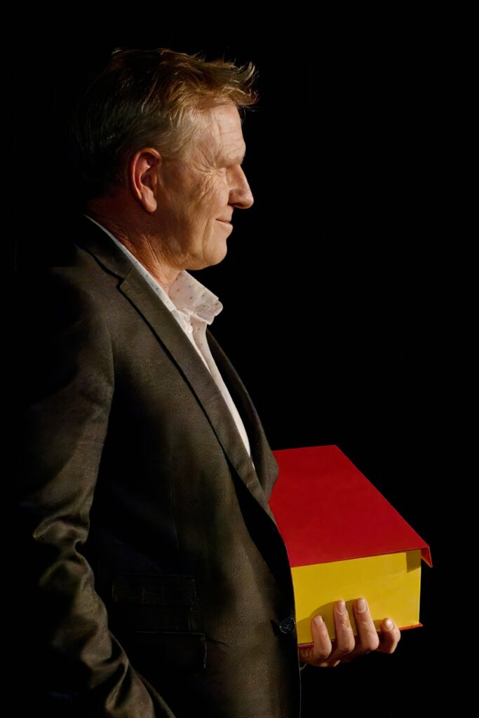
- What’s in the Box – The pose and lighting add a sense of mystery to this image. Th lighting is good revealing the side of the face and lighting the box. The fact that the man is looking somewhere else and not at the camera at all creates a sense of mystery leaving the viewer wondering what he is looking at and whether it is related to the box.The black background creates good separation of the subject. Although there are no whites in the histogram, it is still well exposed.The face is slightly soft due to the focus point being on the box, I think. At a normal viewing distance this wouldn’t matter though.Highly Commended
- The Note – The composition is good, although you could look at cropping the bottom to the bottom of the elbows. I suggest that you look at reprocessing this as it can be somewhat brighter without losing the mood.Increasing the exposure by around 60% then adjusting the rest of the sliders will make it brighter but maintain the same effect.The look of the model and the hand position makes me think that this is very posed. The index finger pointing up, while it may be normal looks odd! If the subject was looking at the camera the engagement would be better.Accepted
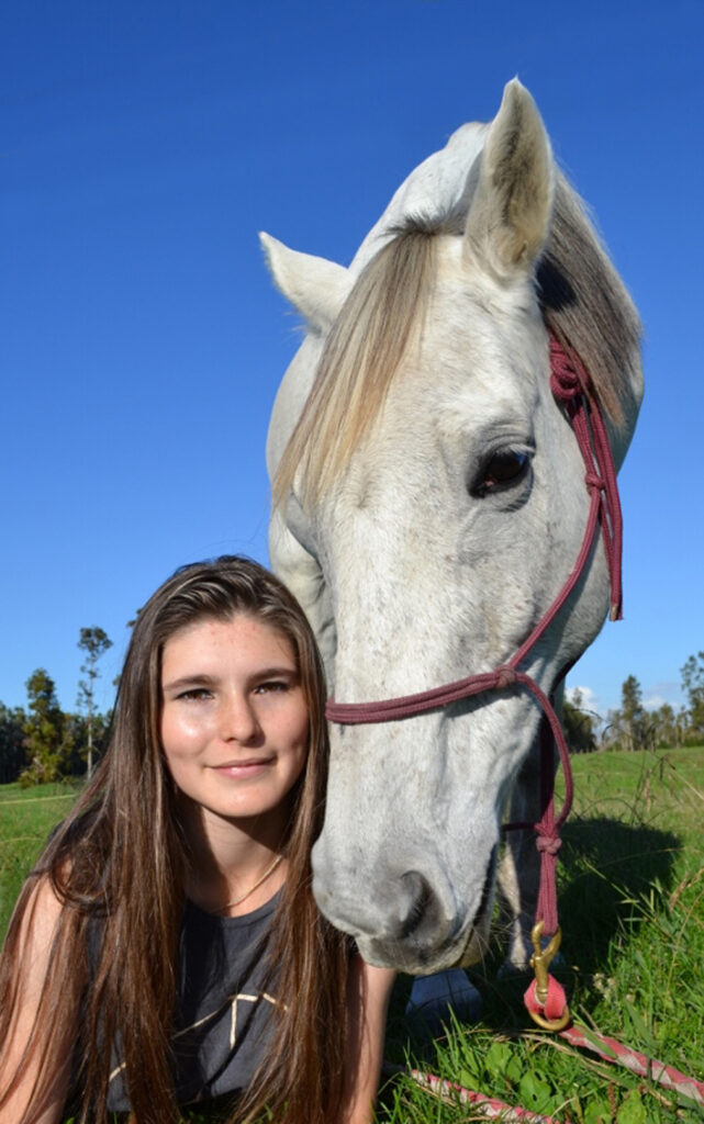
- Girl and Pony – Exposure and focus are good. Framing is ok, but I would suggest that a longer lens would be better. It appears that you have used a wide-angle lens which has made the horses head much larger in proportion to the girls. A longer lens and stepping back would minimise this distortion but retain the pose.If you could have got the girl to stand up beside the horse versus what looks like the girl being on a lower-level things would look better.Accepted
- Mr B – The expression is good showing a happy person. It appears that you have used a wide lens as even though you are close to the subject, there is lots of sky around him. Portraits usually work best if a longer than normal lens is used, unless you are creating an environmental portrait. As there is nothing in the image that says anything more about the subject it really isn’t an environmental portrait.As the image is presented, I would crop it extensively to make the subject much more dominant and removing the sky.Accepted
- Ollie – I like the expression on the kids face. Exposure is good though raising the shadows slider slightly will lighten the hair.I suggest a wider crop so that the hand isn’t cut off. Also, I suggest you darken it, so it isn’t so distracting.The orange area at the left is distracting. Being a bright and warm colour against cooler colours means that it becomes dominant. You could look t trying to remove the orange in Photoshop which would help here.Not Accepted
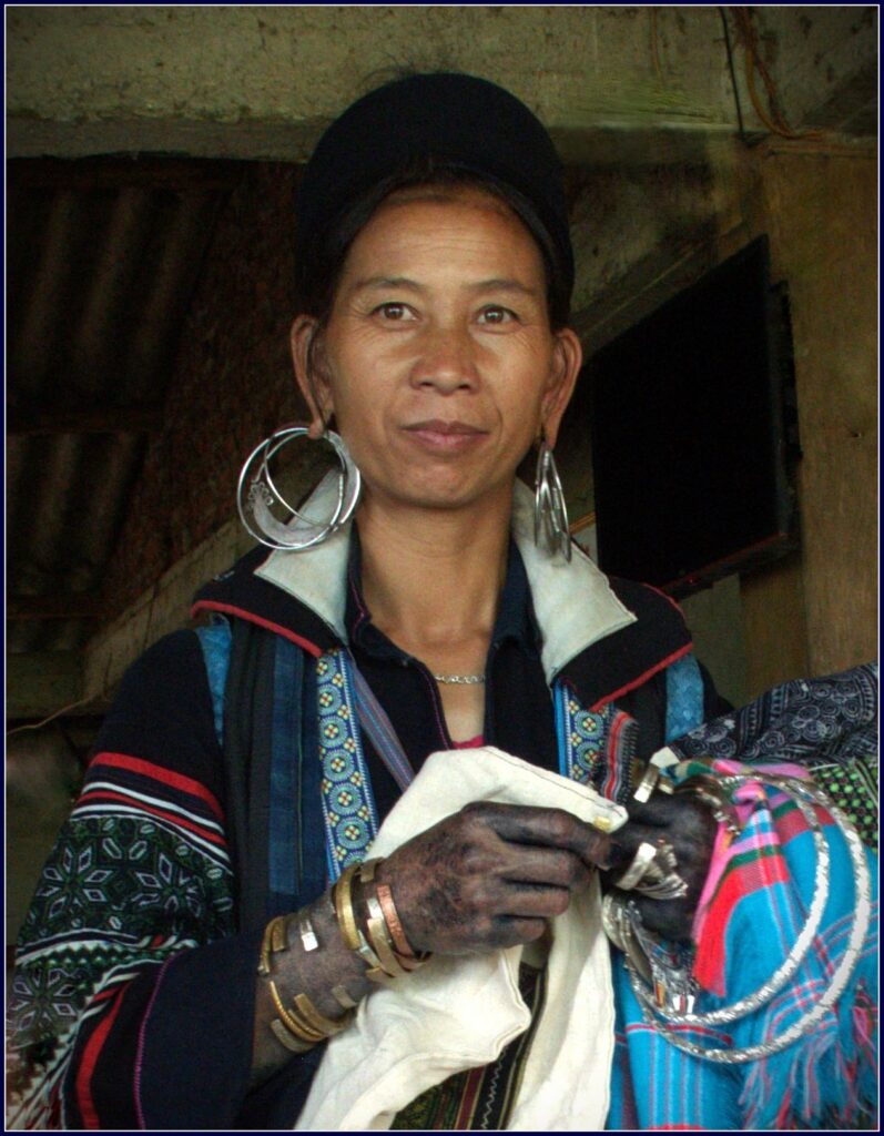
- The Indigo Dyer – This is a nice portrait that says lots about the subject with the clothes and earrings.Composition is great and the lower camera angle works in showing some of the environment while removing anything that might be distracting. The fact that there are lots of brighter colours show some of the culture.I suggest that increasing the exposure by around half a stop will lift the image especially the face.There is some colour noise in the image, but this can easily be removed in Lightroom or Photoshop or any other processing software.Highly Commended
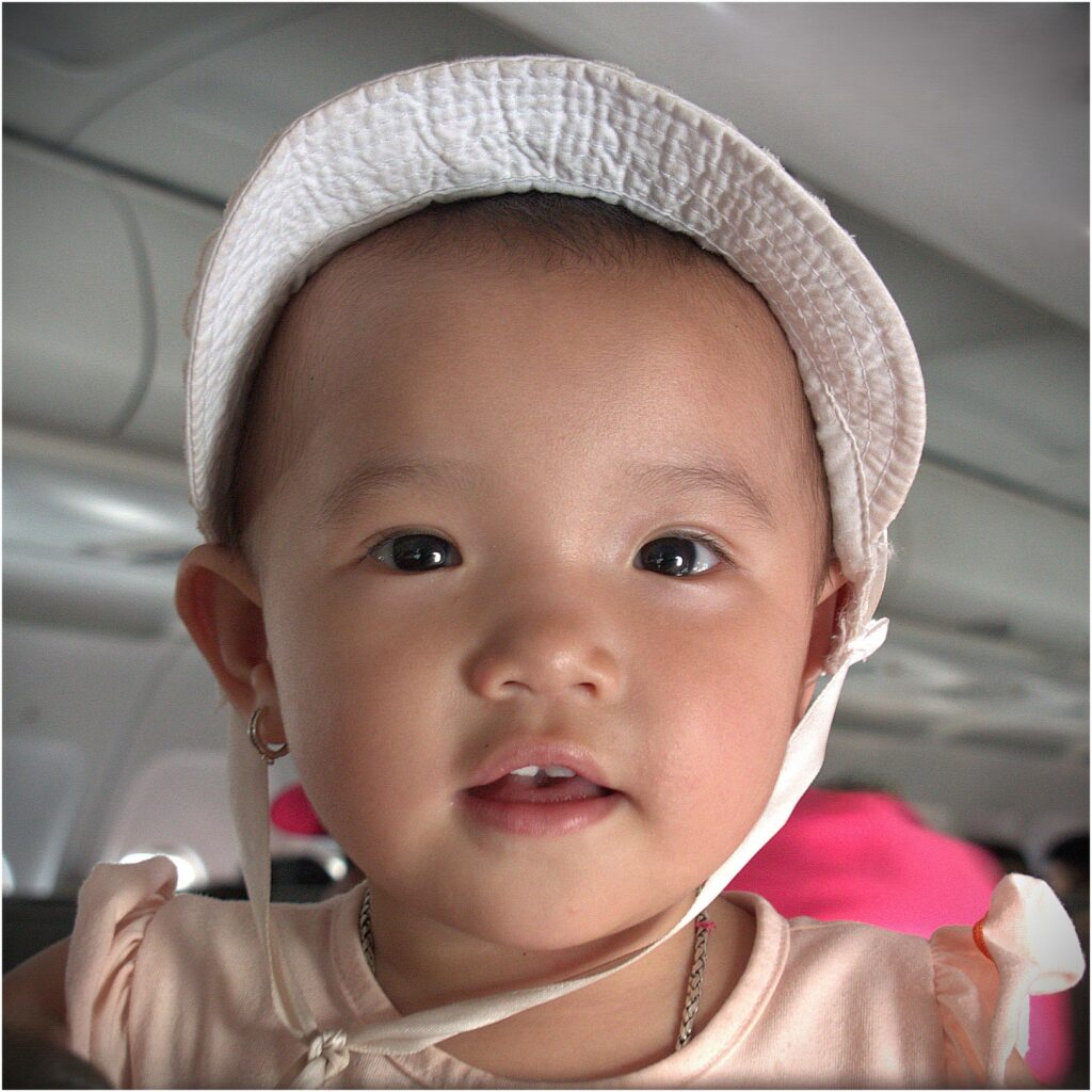
- The Travel Companion – What a lovely portrait. It is nice and tight and sharp. By the looks of it, this was taken on a plane which is usually cramped.Exposure is good and the only thing I would do is warm up the white balance a little. I would also tone down the highlight on the camera right shoulder.Depth of field is good with the background nicely out of focus ensuring good separation.Highly Commended
- Golden Girl – This image shows that you have given some thought into creating it.I like the overlay leaves; however, I would make it slightly more transparent.I suggest that the exposure needs to be increased by around 60%. If you look at the histogram there is nothing in the right end. The whites of the eyes should be there. I suggest you start by using the auto develop function in your processing software to see what it produces.I would change the line around the image from brown to an off white.Honours
