I’ve really enjoyed judging these images and where they have taken me. Yes, It was quite challenging, and I certainly don’t claim to be an expert on the topic. I am not a strong technical photographer or editor so the potential creativity and story telling of this topic appeals to me.
Yes, Minimalism can still tell or create a story, or evoke an emotional response. Maybe Both!
I certainly found stories in these images.
It is all about “less is more”, generally relying on negative space, simple shapes, and reducing clutter.
You may find some of my comments contradictory! The usual rules don’t apply so much in Minimalism and are different for each image.
Often negative space adds to the image, but the balance it creates remains an important factor. When is too much too much? Does it increase the tension of the story Or perhaps add to the sense of tranquillity in a scene? Is your image more about Impressionism or Realism? Minimalism encourages rules to be broken for the right reasons. Tension can be created by not following conventional rules eg placement on a 3rd , but the image still has to ‘work’. I find a lot of images are strengthened by making the proportions more panoramic, and the hint or suggestion of Fibonacci balance, which Google tells me perfectly complements the Minimalist aesthetic.
I hope you enjoy this journey with me. Please don’t be offended by suggestions I make that I feel would strengthen your images. I could have completely missed the story you were telling. As always, judging is subjective, with objectivity and encouragement my main purpose.
-
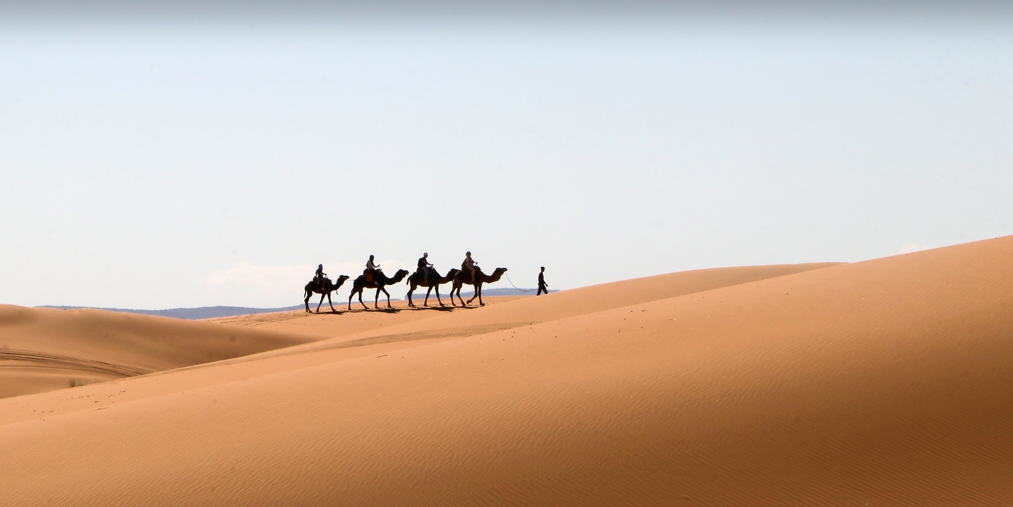
- Camel Riders. Salon. HIGHLY COMMENDED Lovely image with a strong silhouette, which is a good foundation for minimalism. There is a great lead-in line with the main dune. A slightly lower angle of view would have removed the background hills and helped declutter for a more minimalist image. I suggest a crop to behind the last camel, to remove the grassy area between the dunes and maybe a bit less foreground, placing the camels around the lower third. Nevertheless a beautiful desert image.
-
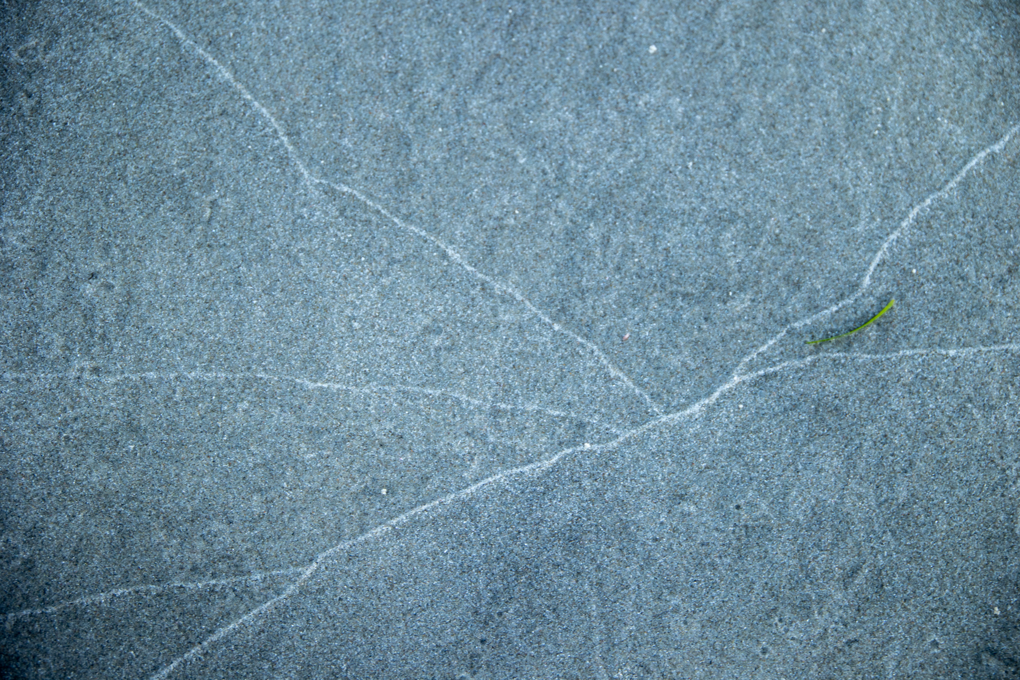
- Tideline. Salon. HONOURS The first impression I felt when I saw this image was that it was a piece of marble floor tile or wall. Lovely lines created by the retreating tide with a strong leading line coming in from the bottom left and across the frame, and the other lines converging onto it. The focus is slightly soft at the top of the image but this does not detract from the overall strength. I had a meaningful debate with myself as to whether the green seaweed was a distraction or a strength but I think overall the image is strengthened by having that small pop of colour. The vignette is possibly slightly stronger than it has to be but still a useful effect. A great minimalist image.
-
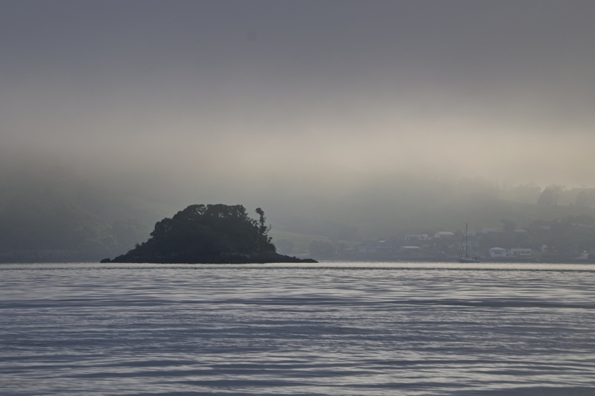
- Harbour Atmosphere. Salon. MERIT A lovely Moody shot Perhaps from a favourite fishing spot? Lovely Shades of Grey Creating the mood. There is a bit too much visible in the background Mist With the mast of the yacht and the houses being too Noticeable. The minimalism is in the island and sky and hint of trees in the mist. Whilst some of the sea gives context to the island, cropping off two thirds of it would push focus to the top of the image, where the strength lies, and reduce the attention that the sea currently demands. Well seen and a good subject for the subject.
-
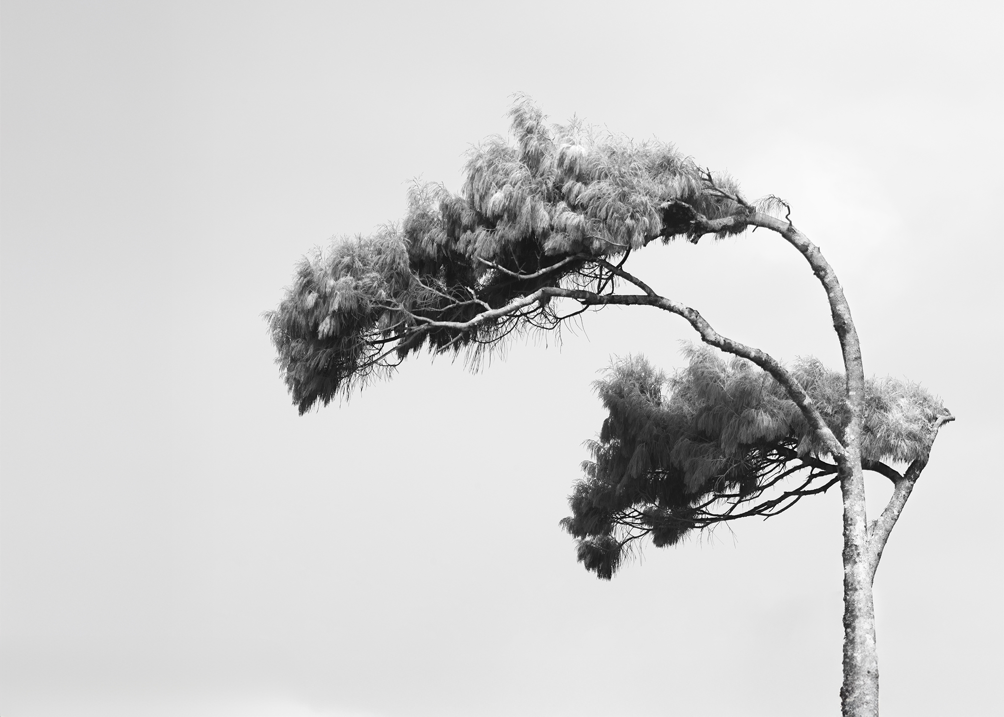
- Windswept. Novice. HIGHLY COMMENDED Wow. I can feel the wind making it hard to balance to take this image. I love the sense of harsh elements captured here, enhanced by use of monochrome. I’m enjoying the texture in the foliage and trunk, and the fabulous form of the bending tree. My question is whether this is a cropped image?, and if so, is there a little more trunk for the tree, and more sky to the left for the wind to blow into? Ie a bit more negative space. This would reduce the dominance of the tree in the image and increase the tension in the story of fragile tree vs elements. Great image.
-
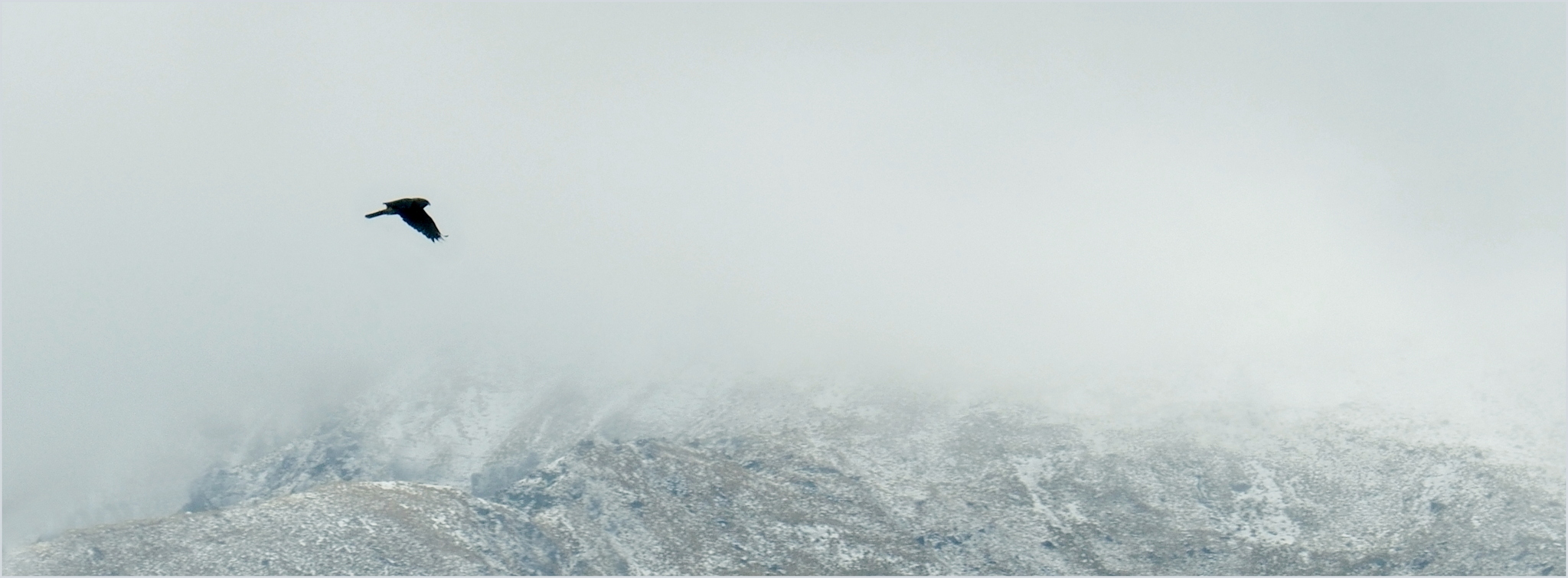
- Flight into White. Salon. HONOURS I created this image to tell a story of the battle for survival in harsh, heavy conditions. I like the work in the wings of the hawk, needed to fly into the heavy sky. The shrouded, snow touched mountains add to the weight and gloom, anchoring the image and giving some perspective to the small sihouette of the hawk. I deliberately placed it off the 1/3 to increase tension. There is plenty of uninterrupted sky for it to venture into. On reflection it may be even stronger with a bit less weight of mountain.
-
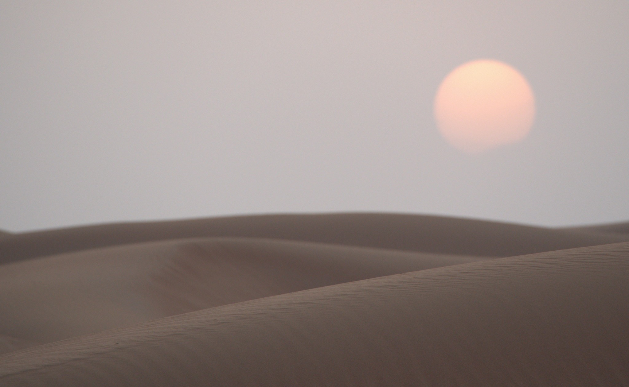
- Last Light. Salon. HIGHLY COMMENDED This image suits the genre well . The leading line and shallow depth of field adds texture to the front dune and there are still some pleasing pastel colour gradients beyond. A bit of a play with levels and contrast could enhance this even more. Tricky with the low light conditions.
-
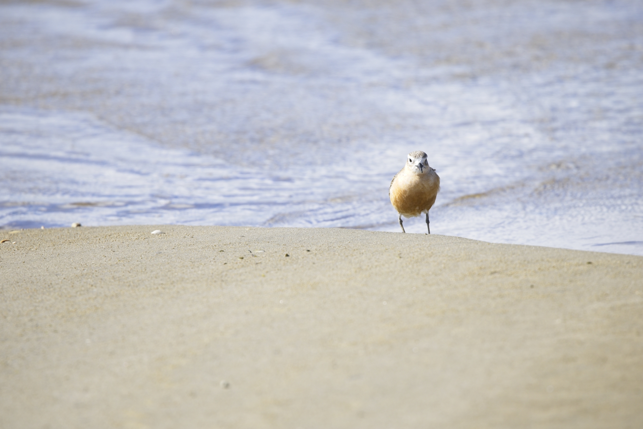
- Fairy Tern. Salon. MERIT There is a lot Right in this minimalist nature image. A good use of depth of field to blur the foreground and background leaving the bird on focused sand. Nice placement of the bird on the 3rd with negative space to the left. Improvements for minimalism would be to clean up the sand so there are no distractions there. In this image, because the bird is looking at the photographer, the amount of negative space around the bird doesn’t really enhance the image strongly, except to suggest isolation perhaps. A crop from all sides creates a lead in line from the top left and allows the Dotterell to star. Whilst it’s a good catch of a bird in its natural environment It doesn’t really evoke much response.
-
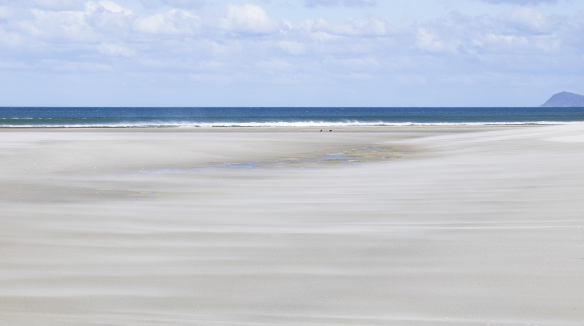
- Shifting Sands. Salon. Accepted. I see a beautiful minimalist image within this photo, but as it is there are too many elements in this beach landscape for Minimalism. The middle section is a serene image of soft textures and colours, with the diagonal hint of blue, and contains a peaceful abstract painterly image.. This part of the image truly matches the title. Try a large crop from the top to just below the birds and you will hopefully be pleasantly surprised. Less is definitely more here. Gorgeous Colour palette and textures.
-
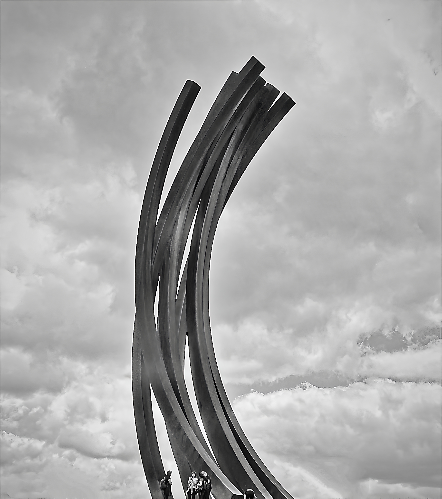
- Sculptured Steel. Salon. Merit. This black and white image creates a strong first impression with the two main elements of Structure and Sky. There is good tension in the image with the strong curves against the cloudy sky. It makes me imagine an energy that wants to erupt from the top. Whilst the people at the bottom of the frame add perspective to the size of the structure, they do reduce the minimalism, and for me, change the story. They are easily removed with a crop from the bottom without effecting the balance. I feel it is a stronger image without them. Well handled black and white balance. (Without detracting, I’d love to know if you had added or changed the sky, as the clouds don’t seem to be continuous in the gaps? Clever if you did! )
-
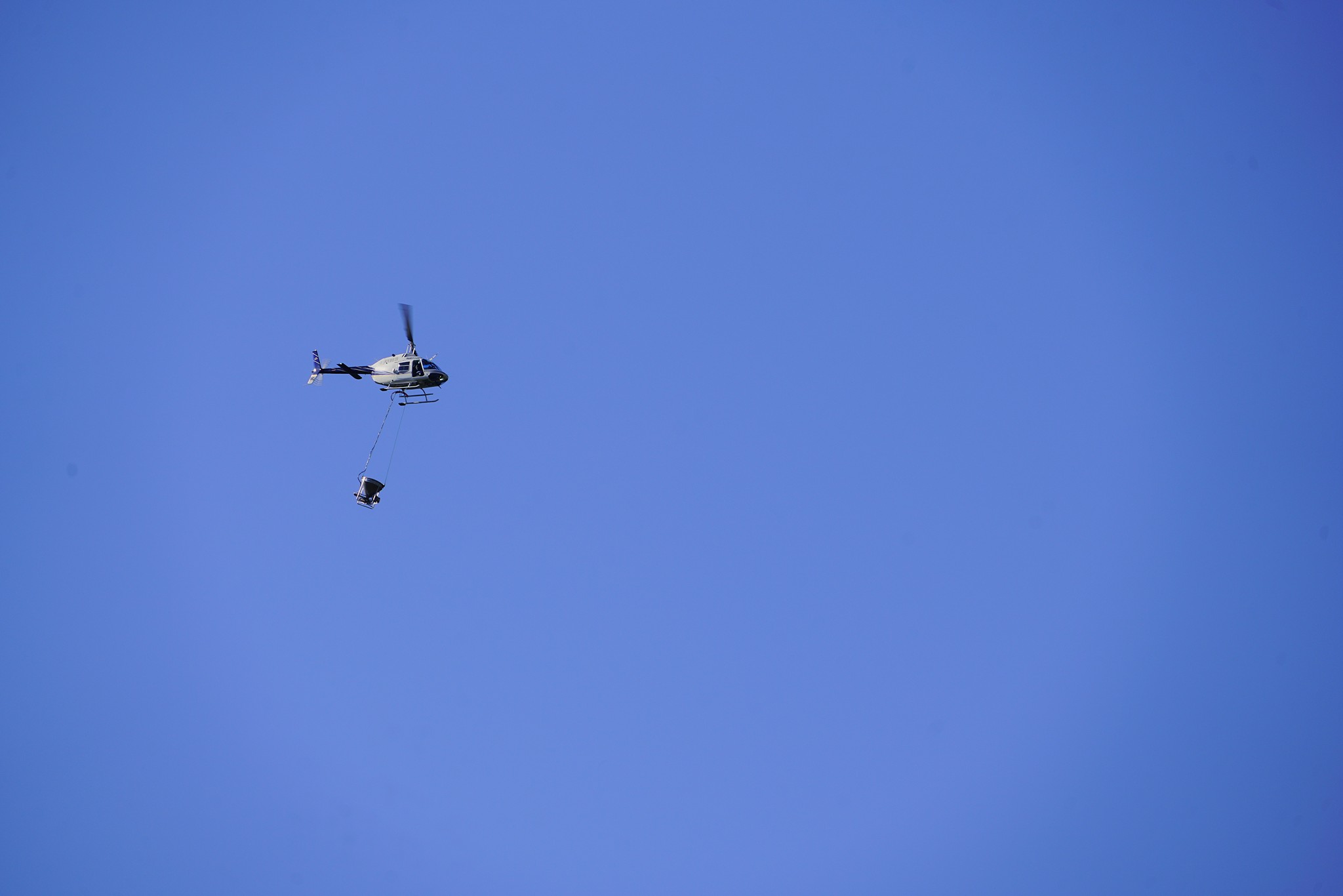
- Spraytime. Salon. Merit. A good, minimal photojournalism Image. There is certainly lots of negative space for the chopper to work in. It does make me ask questions about what job it is doing. I like the shutter speed that has allowed some movement in the helicopter blades, and the angle of the bucket below creating a sense of urgency. Whilst maintaining minimalism I do feel the image would be stronger if the helicopter was more dominant in the image. At the moment it is a little overwhelmed in the big blue sky. The vignette helps contain the image. Nice capture.
-
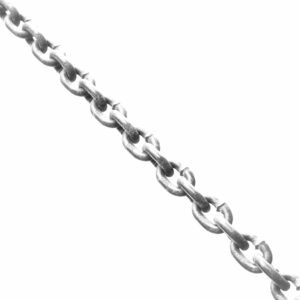
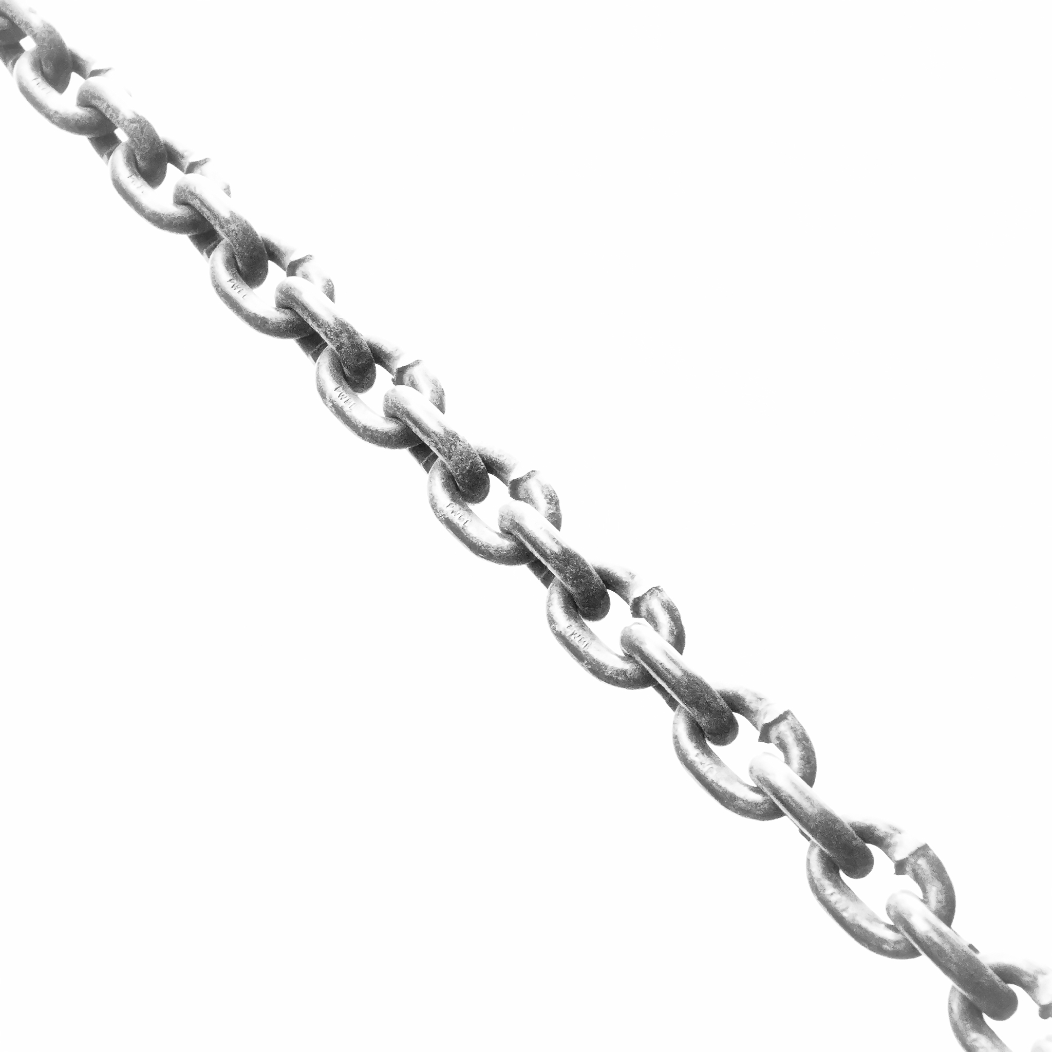
- Down the Chain. Intermediate. MERIT This is strong bold graphic image well suited to monochrome. There is an increased tension with the blown out highlights and stark background. It does make me ask what is down the chain? I like the top links being slightly out of focus bringing the viewer to the foreground. My one question is “ is there enough of a story?” Is there an emotional response to the image? The 50:50 split in the image is possibly too balanced. Perhaps a crop to move the chain from the dissecting diagonal, messing up the balance, would create more reaction. It is definitely minimalism. Well done.
-
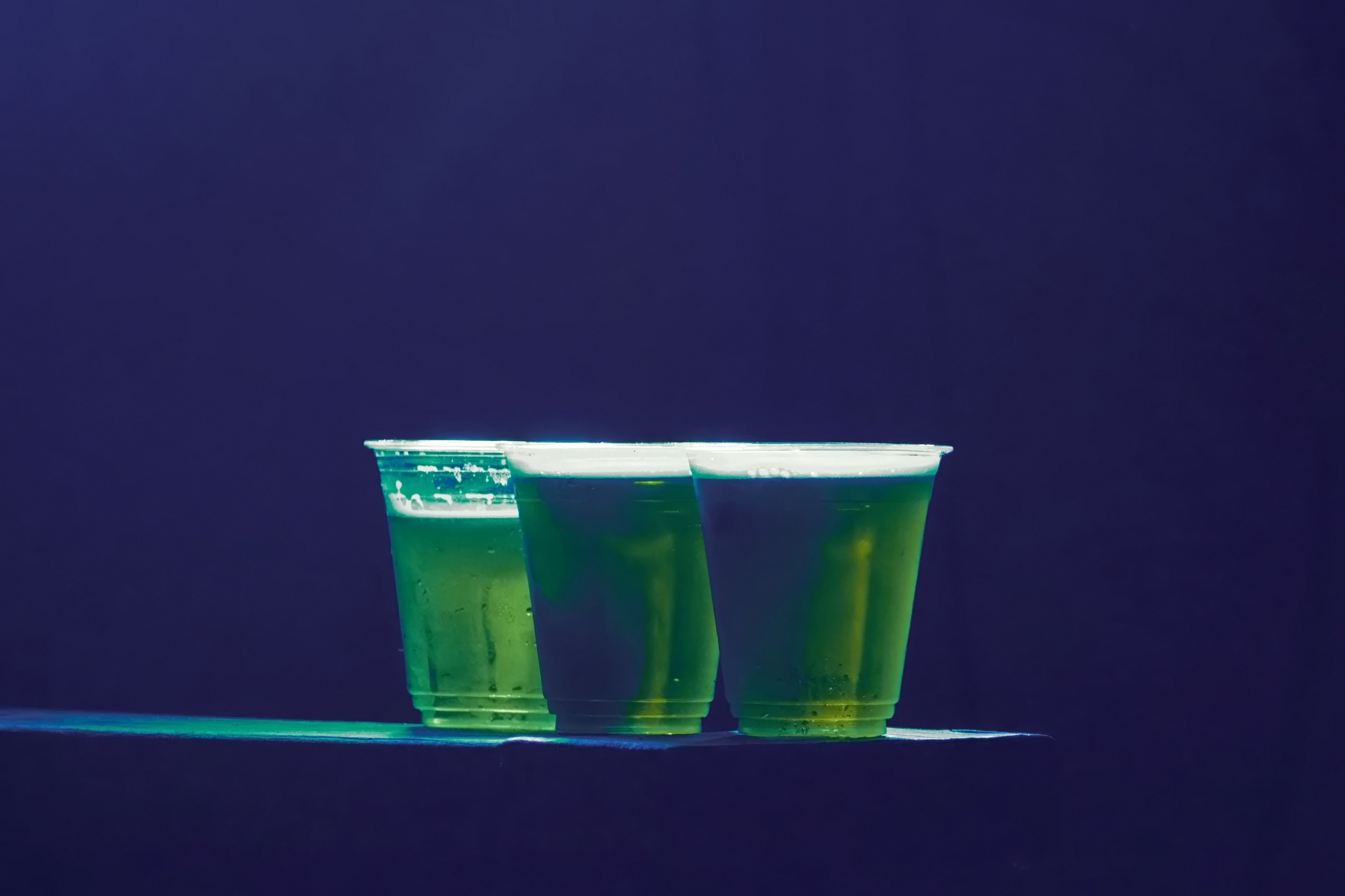
- Order Me Another One. Intermediate. HONOURS I love this image, with the restricted colour palette and lighting. The bright highlights add another strong element to the image, and the cups appear to be floating on a beam of coloured light. Clever. It is a fabulous image. Definitely fits the minimalism category. A definite Honours [ A picky improvement could be a small crop off the top and the right to shift the cups less centrally. Tell me what you think. ]
-
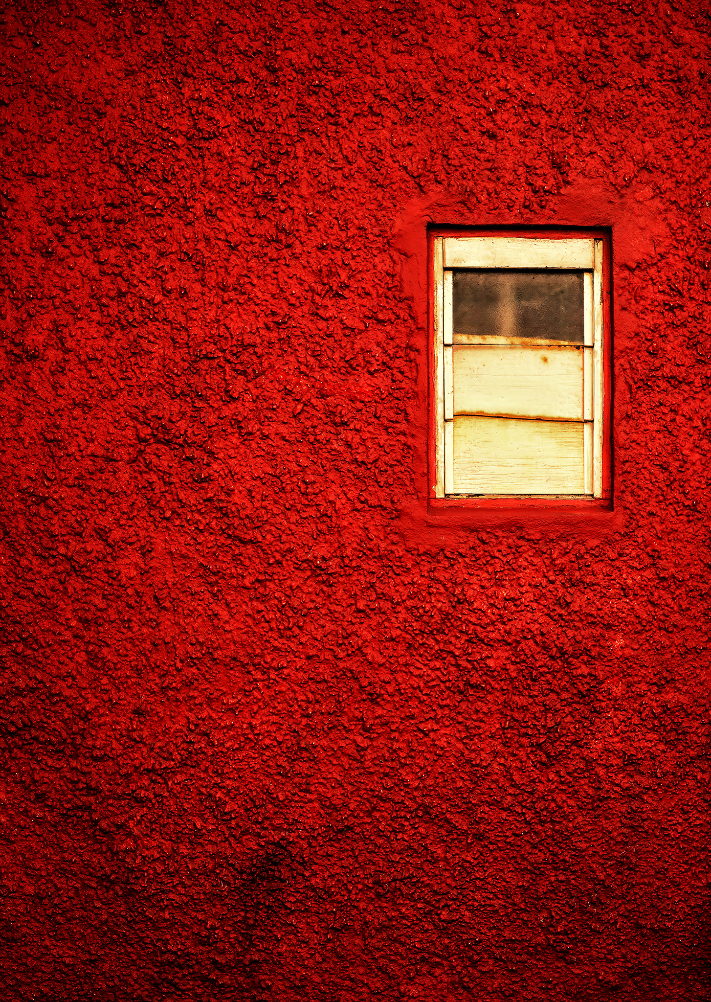
- Scungy Window. Salon. HONOURS I do wish all scungy windows were as beautiful as this one. You have cleverly positioned the window on the red background with a repeated ratio between the window and the overall image. The texture on the wall adds to the story whilst maintaining a reduced pallet. The graduated vignette increases the sense of neglect over time. Beautifully seen
-
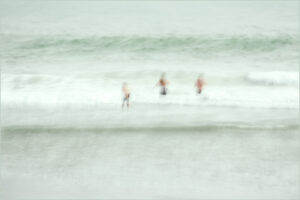
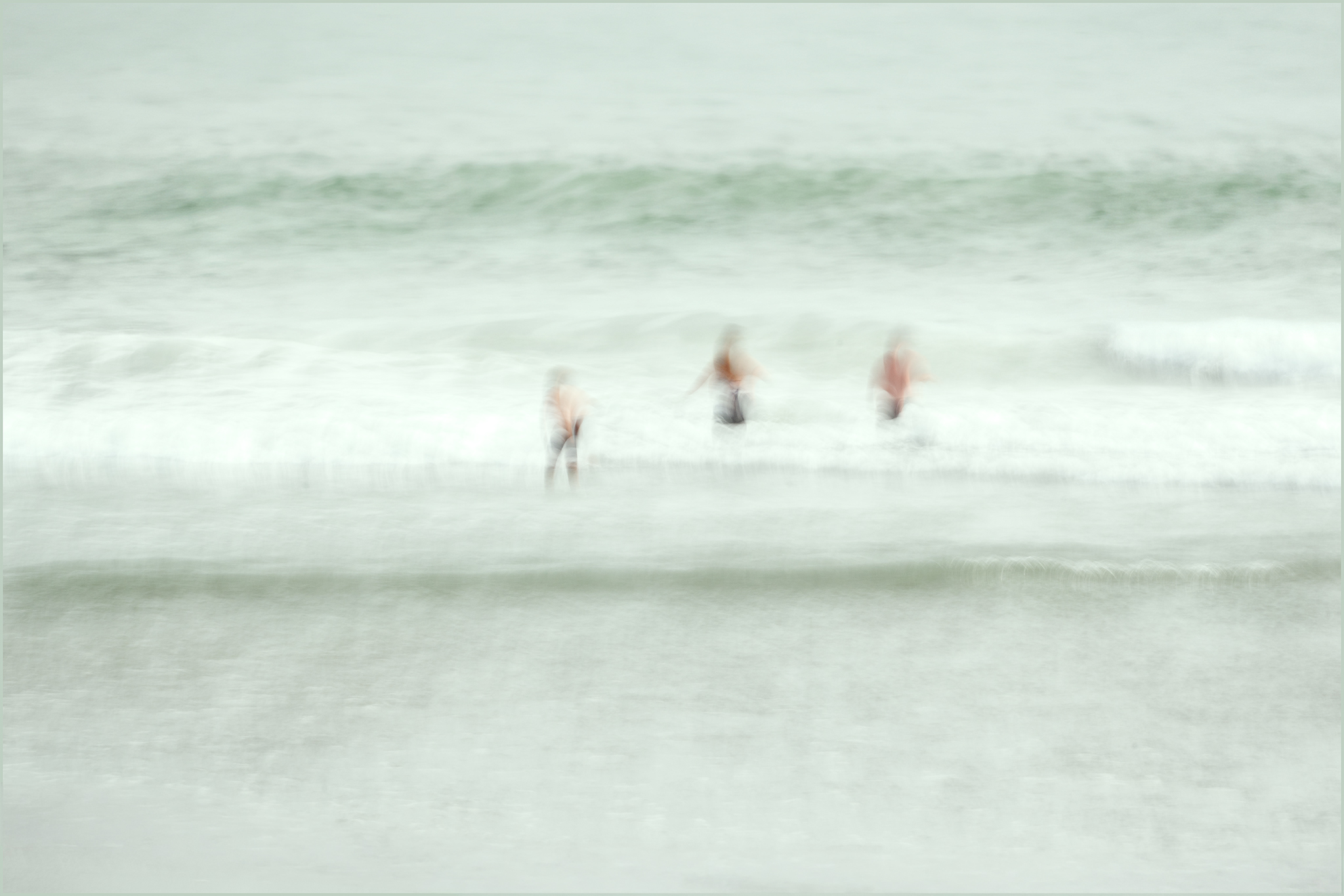
- 3 Swim in a Storm. Salon. ACCEPTED This is definitely an impressionist image that creates mood and story, but is it minimalism? While there is minimal detail in the people and the sea it doesn’t result in a minimalist image! For me it created conflict rather than tension. The strong horizontal lines in the water do create a strong element but I think the bottom wave dominates rather than the stormy wave at top of frame. Is it really a storm that may overwhelm the swimmers? The composition has the swimmers a bit too centrally placed in the frame and having 3 swimmers leads the eye around without a focus point. My thought for strengthening the image would be to Just have one swimmer a little lower in the frame with the sense of the wave towering above them.
-
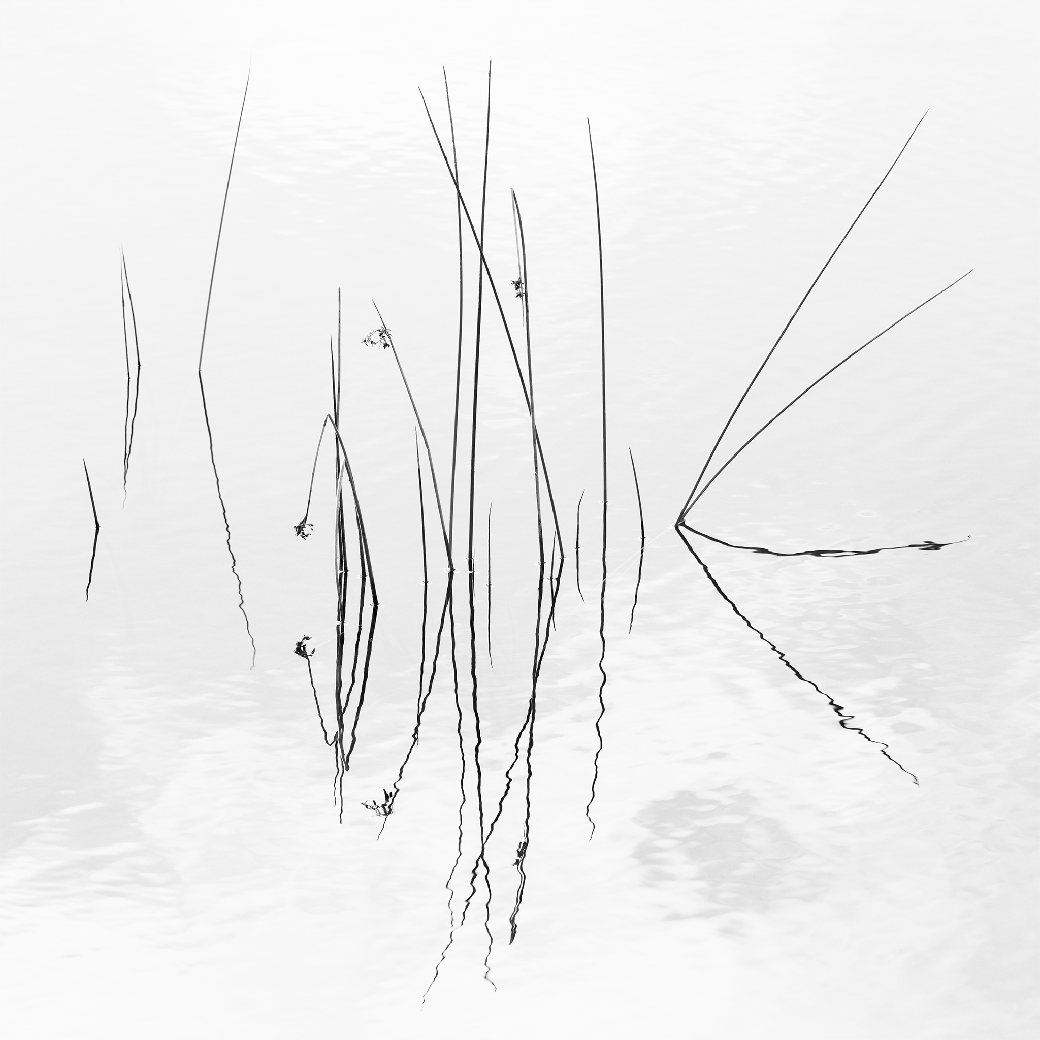
- Reed Reflections. Novice. HONOURS I love how you have edited this image to reduce any competition with the reeds. Though they fill the frame with their reflection they are delicate enough to remain minimal. A great use of high key editing. On my computer screen I couldn’t see where the image began and ended. A striking image.
-
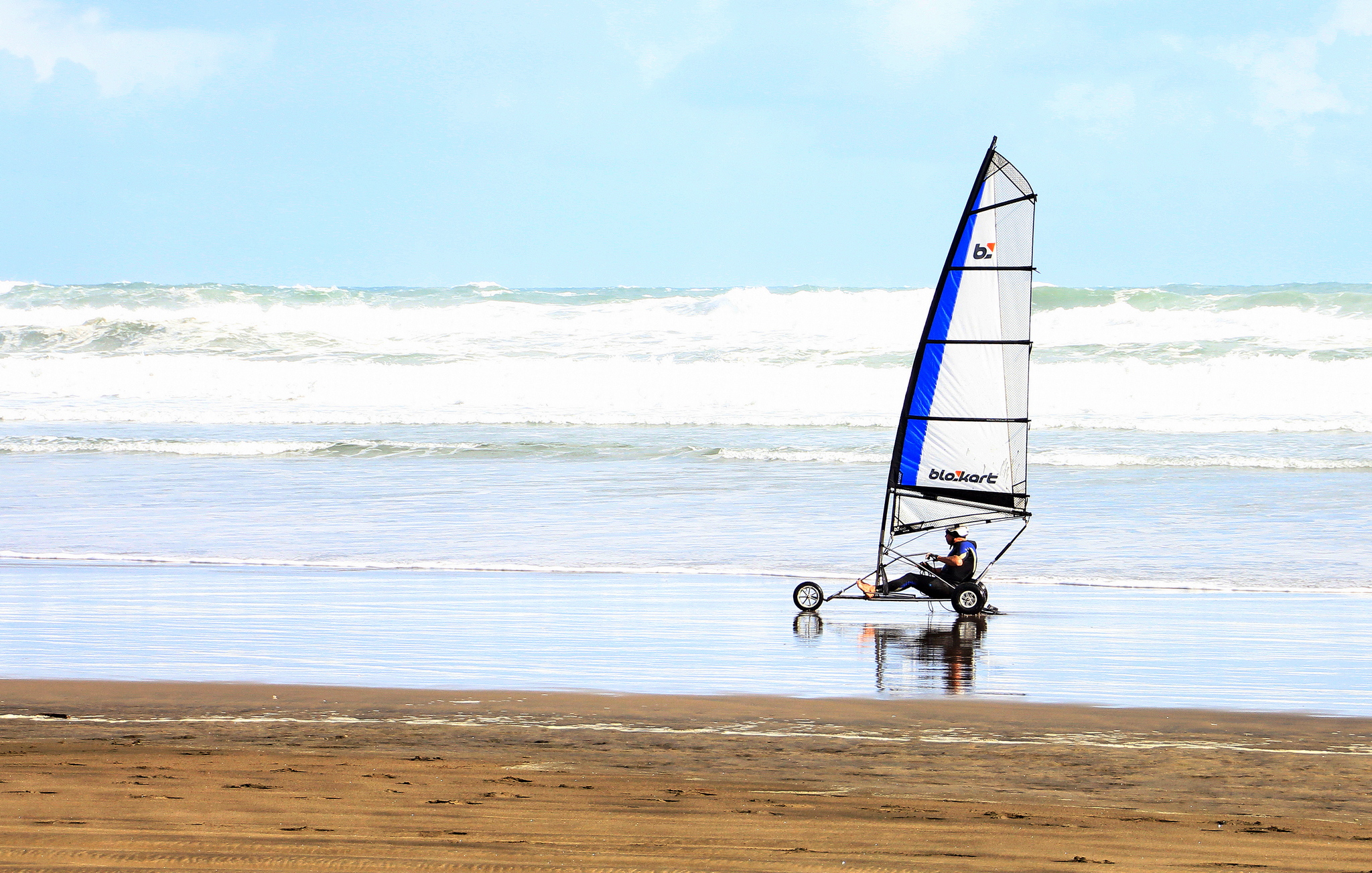
- Free Rider. Salon. MERIT. Zoom Zoom! A great panning capture of such an exhilarating activity. There is good use of negative space for the rider to ride into. For a minimalist competition there is quite a lot going on with the sea and sky. In this case the burnt out whites aren’t the issue, but it is rather busy. To reduce some distraction try cropping off the sand to remove an unnecessary colour element and if you crop a little from the right so the rider is behind the 1/3 you leave the rider even more free to fly.
-
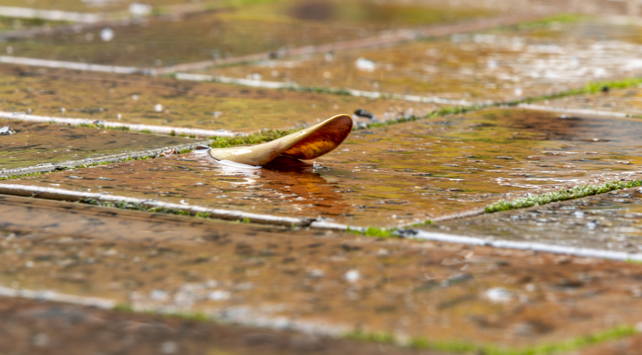
- A Wet Leaf. Salon. HIGHLY COMMENDED A well seen subject for this topic. I love the colours and contrast between the earthy oranges in the curved leaf and bricks, with the straight green mossy lines. The shallow depth of field has almost created a 3D effect with the leaf projecting out of the image. The leaf is a little bit soft and the white spots In the blurred areas do draw the eye away from the main subject. These could have been cloned out. The composition could be stronger if the leaf were not so central. There is some tension with the orientation and I almost feel as of the leaf is falling out of the image. (Is it only me?) A slight straighten would alleviate this. I love that you got down to the low perspective. Lovely image.
-
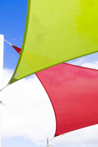
- Shade Sails. Salon. MERIT. A well seen subject with repeating shapes and strong primary colours. A great start for a minimalist image. To elevate this image in the category try cropping off the poles and even the anchors. It is still clear what the subject is without the extra element of the poles. It can then take the viewer perhaps out to sea and sky? Nicely done.

-
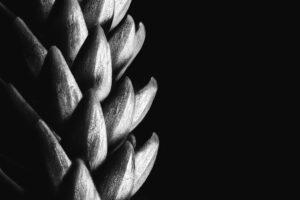
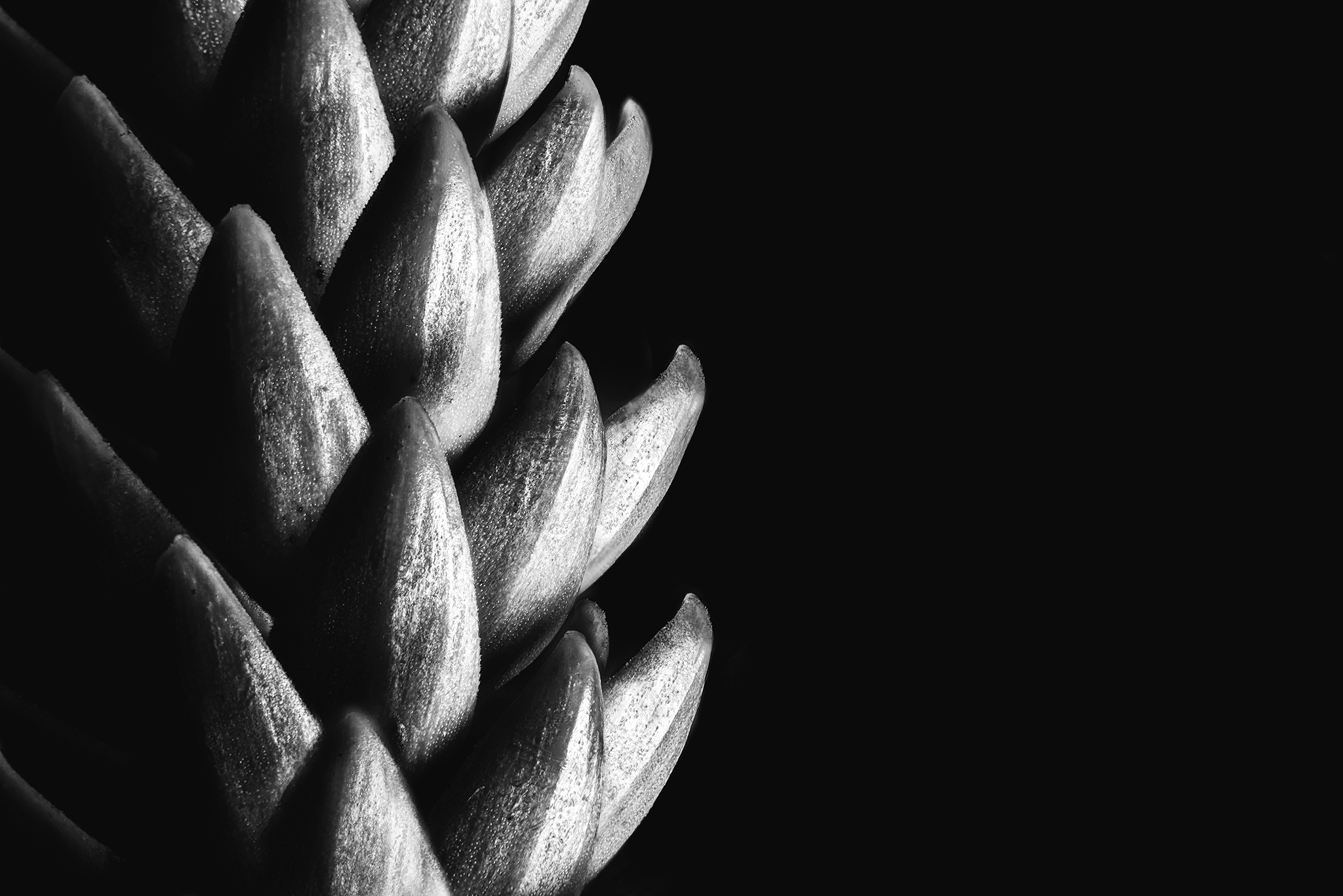
- Pine Seed. Novice. HONOURS. A well seen and beautifully constructed Image with the strength in the repeating shapes of the scales of the cone. Even with the number of elements the repetitive shapes maintains the Minimal brief. Well handled lighting creating a strong graphic image. Monochrome is a great choice.
-
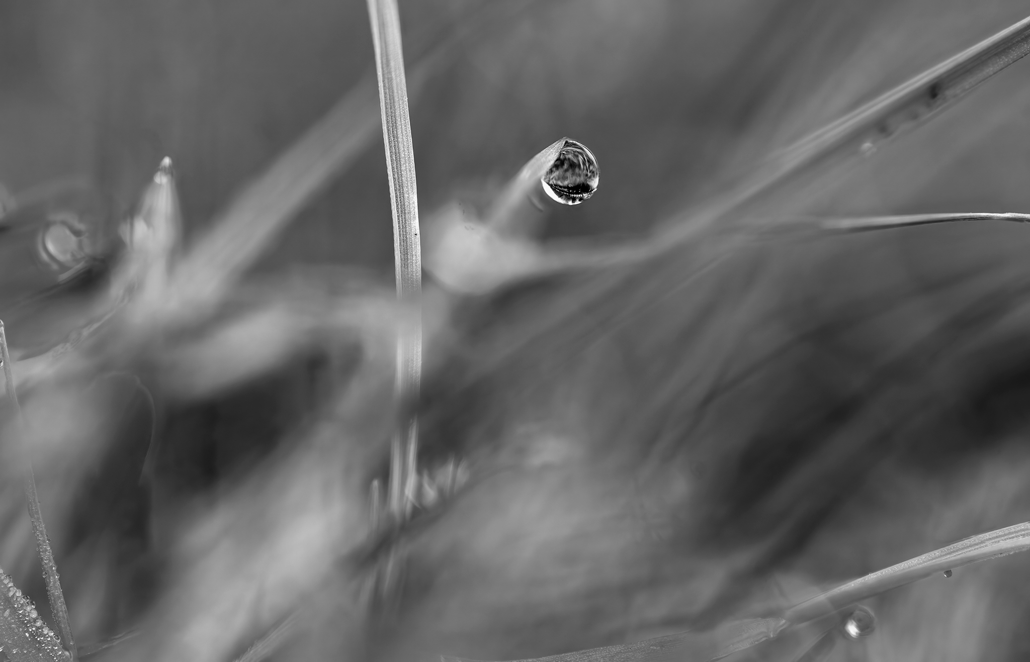
- Morning Dew. Novice. MERIT. This is a beautiful creative abstract image, well enhanced with monochrome and the shallow depth of field. For me, there are a few too many competing elements and lines for it to be strongly Minimalism. Whilst the dew drop as the star is immediately seen my eye started wandering to the other elements in the same field of focus, ie bottom left corner and bottom right. Applying the less is more tool, my thought is to try a portrait orientation with just the strong vertical and the dew drop and see what you think. I do love your eye and style.
-
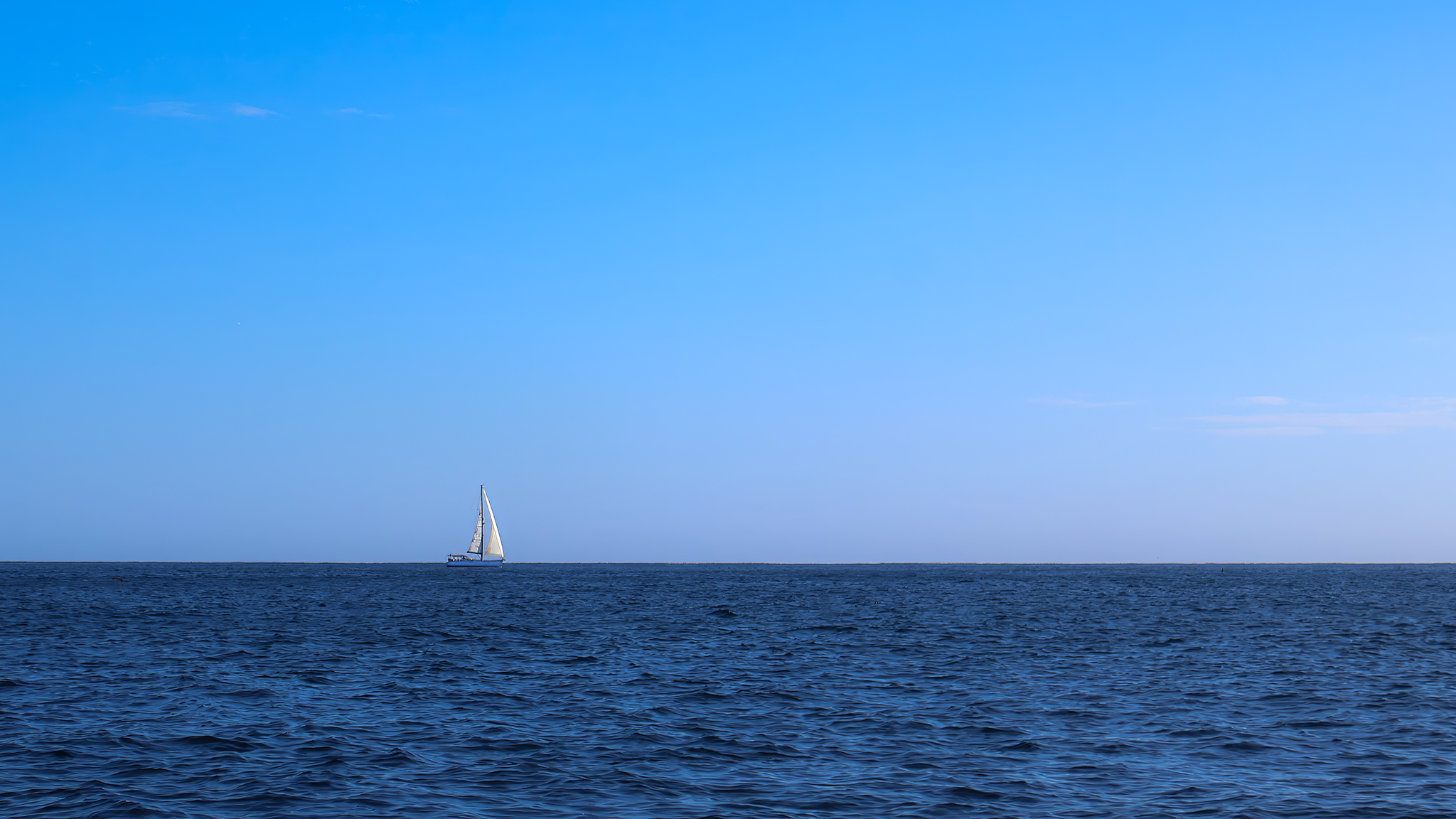
- Sailing Into Blue Stillness. Salon. ACCEPTED. The vast ‘Bigness’ of the sea and sky compared with the smallness of the yacht do tell the mariner’s story of sailing into the vast unknown. The colour palette is well restrained. The boat is clearly the most important element of the image. It is placed perfectly on both 1/3s. For me, it does lose strength by being so small and a bit lost on the light blue background. Maybe a bit too minimal in this case. Great Title.
-
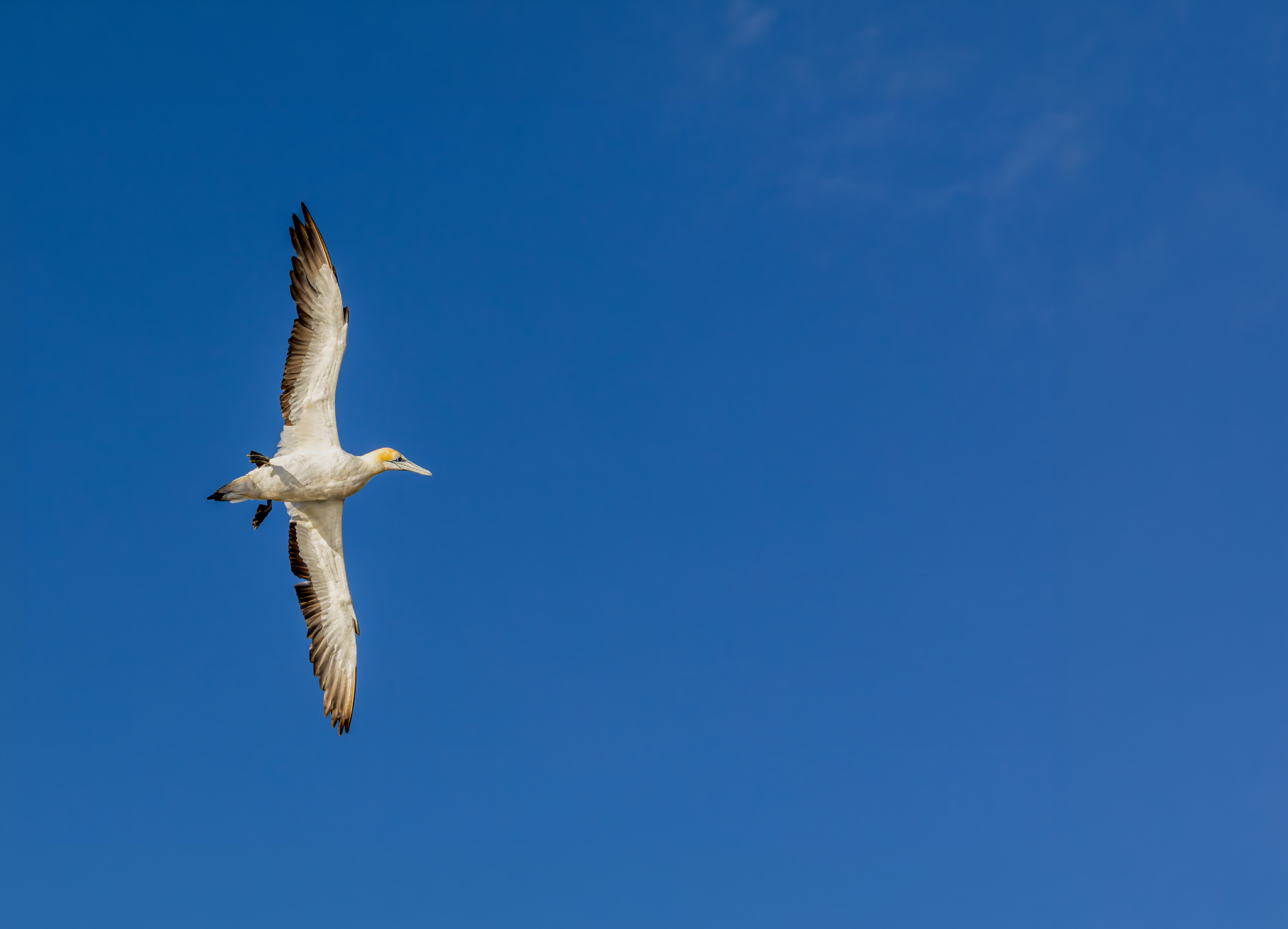
- Solitary Soar in Pressureless Sky. Salon. HONOURS. This is definitely a wow image. Look at the beautiful details with every feather defined, a clear eye, and even the shadow of the foot is clear. Good use of clear, negative space. Whilst not effecting the grade given, to move this from Fabulous wildlife photography to even better Minimalism try even more open space above the bird and maybe a tilt to the frame so the bird can truly soar diagonally and further in the pressureless sky. Still Fabulous.
-
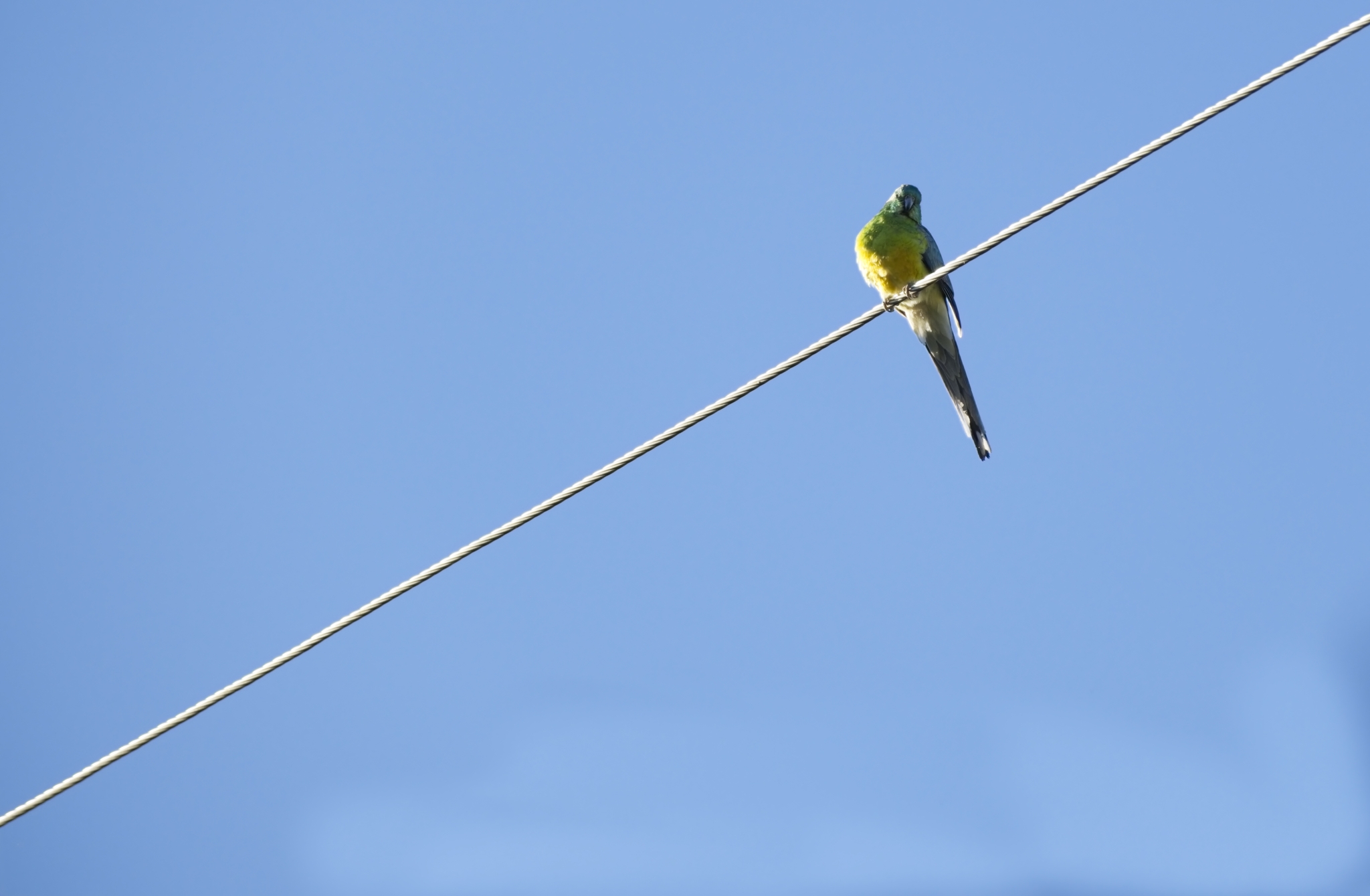
- Bird. Salon. HIGHLY COMMENDED This is a strong minimal image shot in challenging lighting conditions. You know you are being watched don’t you? I love the minimal colour palette with 3 connected colours from the colour wheel, from blue sky to green and yellow budgie. The diagonal perch dissects the image into 2 almost even halves. My suggestion is The Minimal image could potentially be even stronger, with tension increased, by changing the proportions and placing the wire less centrally. Try cropping some off the bottom. The wire placement is then less controlled and emphasises focus back to the budgie. Nicely seen and captured.
-
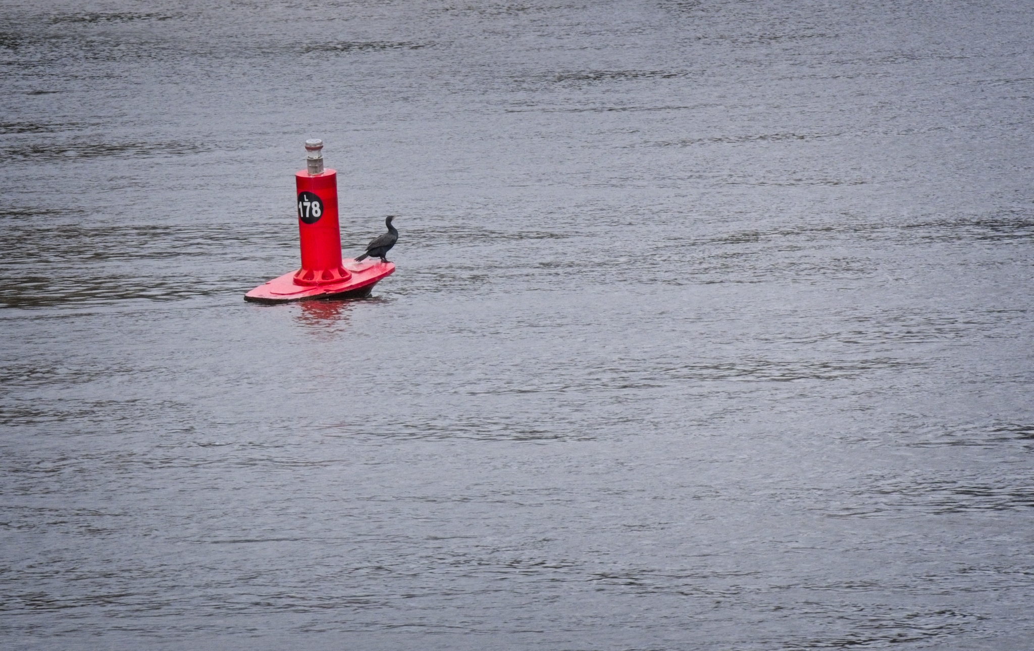
- Buoy. Salon. MERIT Quite striking first impression with the strong red of the Buoy on the rippled background and the black shag looking out into open space. In this case the rippled background is quite neutral in the image so doesn’t overwhelm the image. For me the image would be stronger with less space below the main subject, and more above, to better support the direction the shag is looking. If this doesn’t exist in the image file try cropping to a Panorama with less to the left and below the buoy.
-
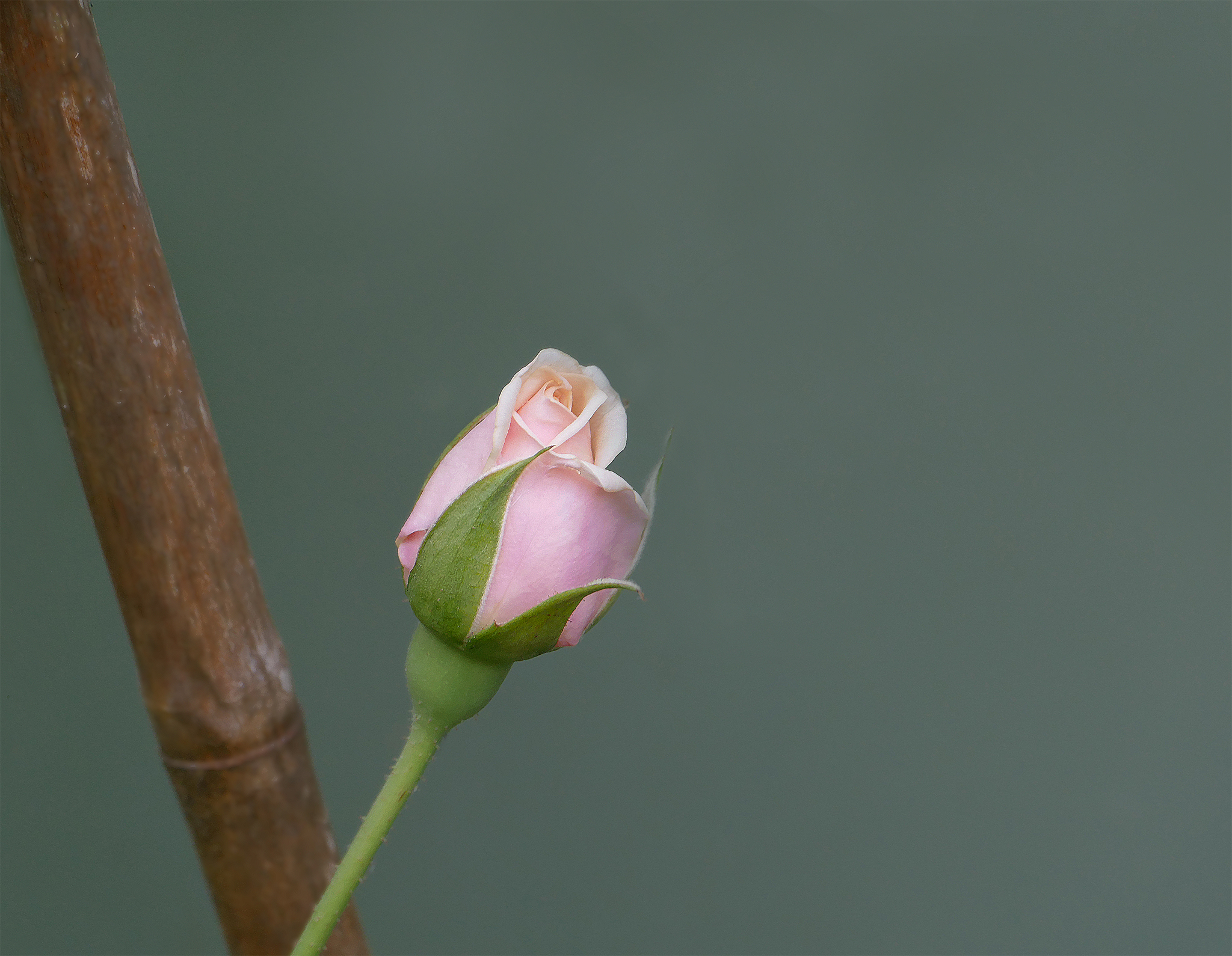
- Budding Beauty. Salon. ACCEPTED. It looks like you have intentionally set up for a Minimalism shot. Well done. Using a shallow depth of field is a good tool in minimalist photography so that was a good starting point. I believe the composition could be improved by removing the bamboo to just have the flower bud in the image. For me the bamboo confuses my understanding of your intended story of the budding beauty, and is a distraction. The current diagonal placement of the bud isn’t leading the viewer anywhere. Potentially straightening the flower to sit by itself on a vertical line would strengthen the image, with negative space above for it to grow into, or giving the bud a longer stem could enhance it’s fragility. Good effort. Minimalism isn’t easy.
-
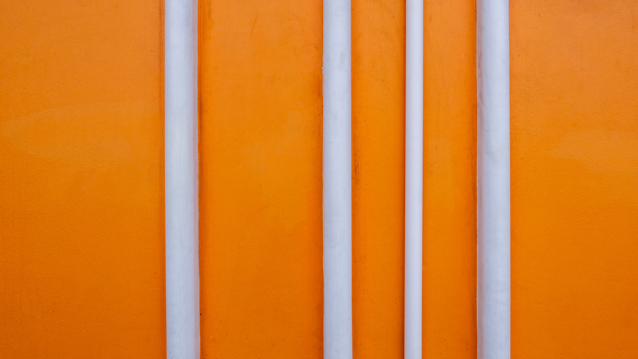
- Between The Lines. Novice. HONOURS. You can’t not react when you see this image. It Pops! I really like the strong colours and graphic nature with the two colours and repeated white forms working really well, with the variation in spacing and size creating a tension. A very good eye for minimalist balance.
-
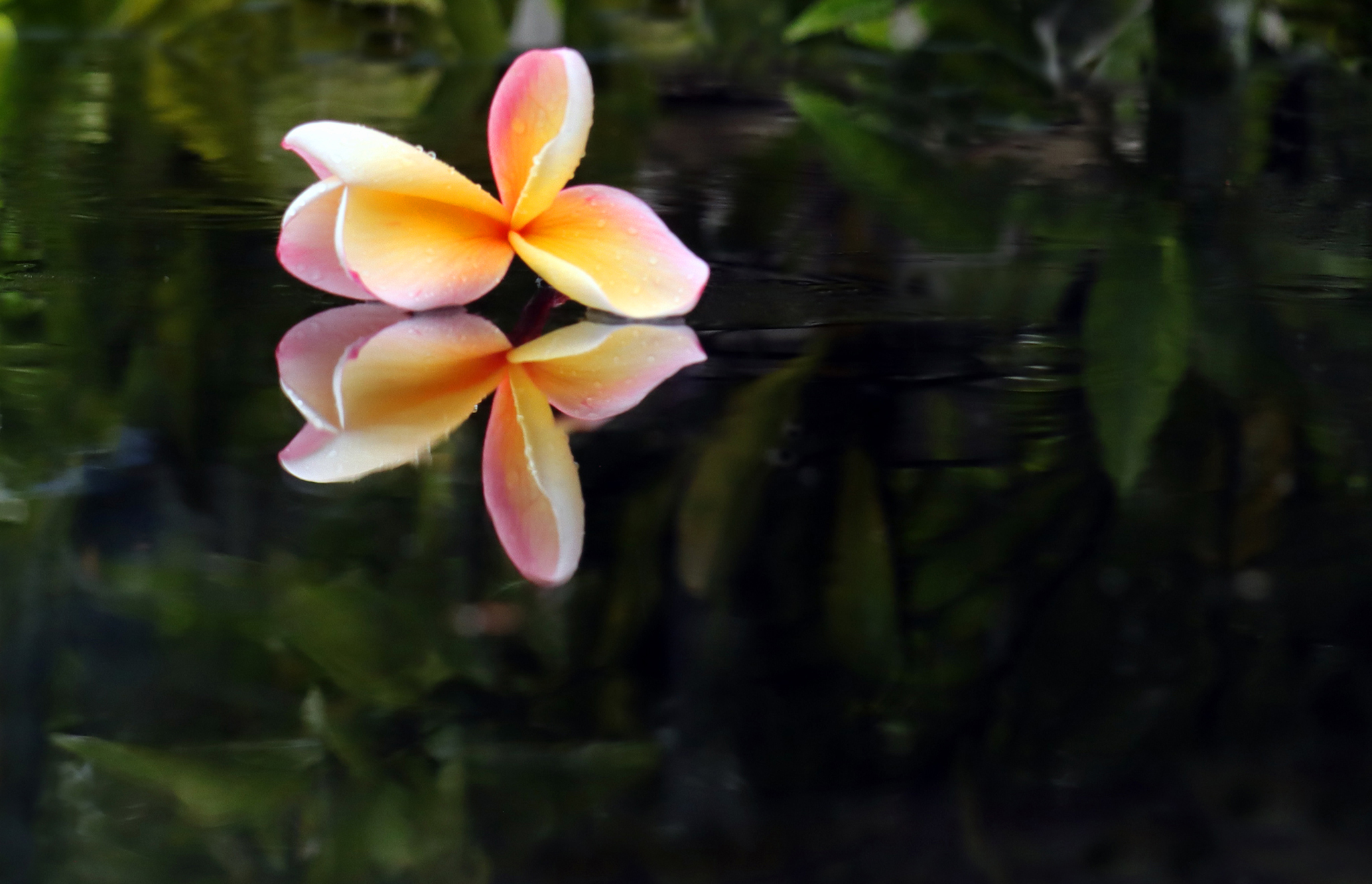
- Frangapani. Salon. MERIT. A lovely colour palette of a tropical flower on a dark background, capturing its beauty. As a minimalist image I had a few conflicts. Overall, the focus on the flower petals is very soft, and for me there is too much detail distracting in the background even with the shallow depth of field. Whilst on a vertical 3rd, as it is the placement of the flower Is too near the top edge of the image. Subject placement can intentionally create tension but in this case I feel it detracts from the anticipated harmony of this tropical scene. A large crop off the bottom to mirror the crop at the top, and reducing some of the background greenery would strengthen this as a minimalist image
-
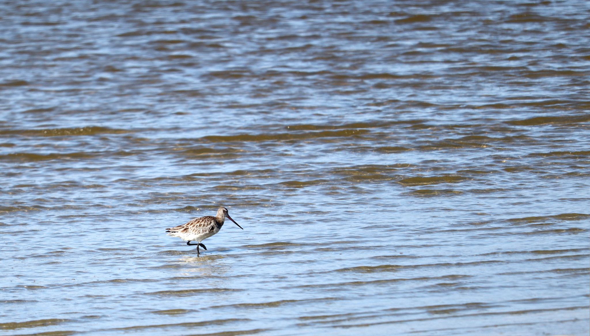
- Solitary Search For Dinner. Salon. ACCEPTED. I really love godwits, and wish I had been with you on your photography outing. As a minimalist image You could argue that it meets the suggestions by only including two elements, the Godwit and the sea. For me, the texture on the sea Is dominating the image rather than the godwit, which rather blends into the background, instead of being the intended star of the story. I love the texture on the godwit’s feathers and the potential is there. Perhaps a crop from the top to reduce a lot of the textured water, and to increase the sense of solitude a crop from the left. It would leave all that water in front of the godwit to search in.
-
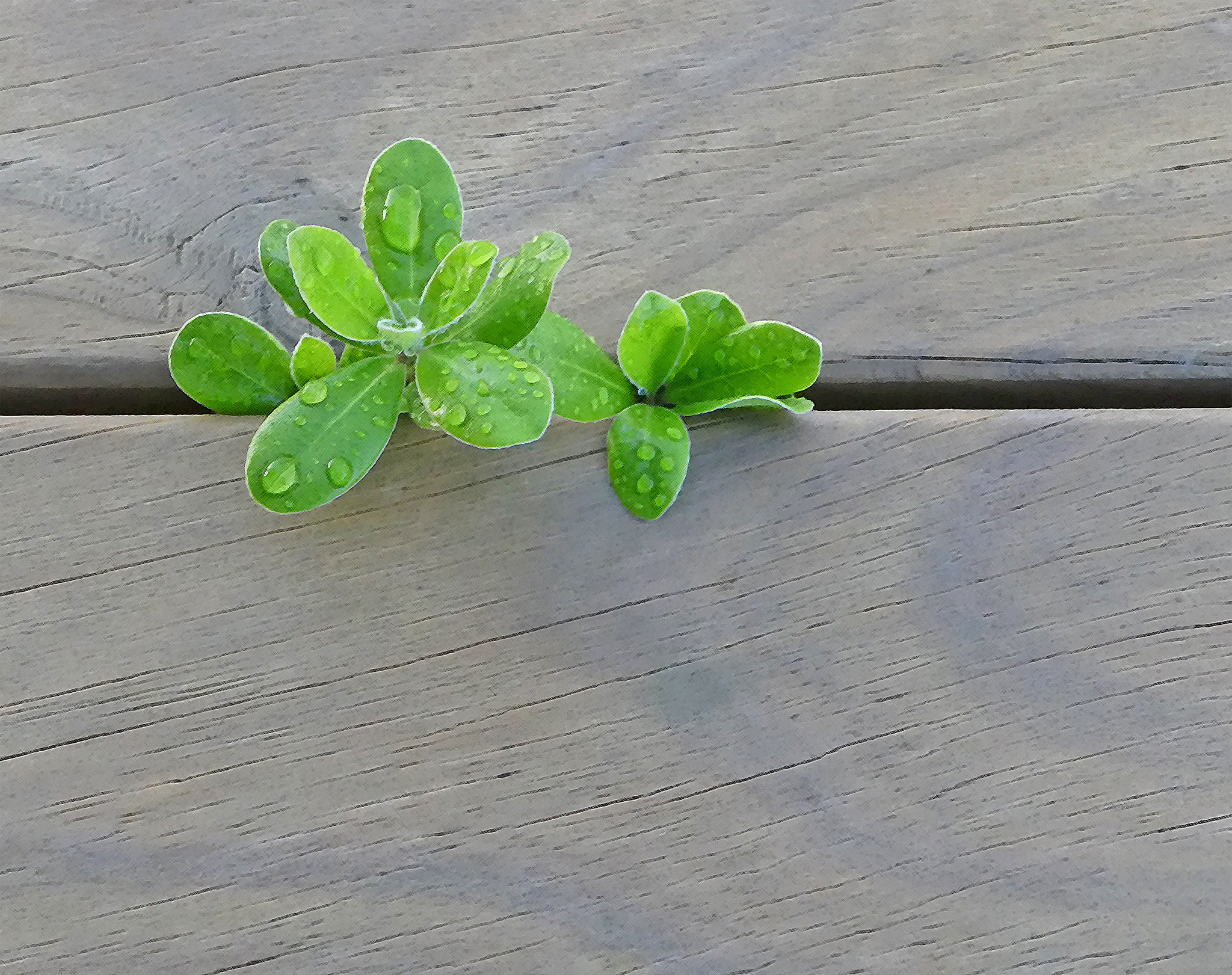
- Survival. Salon. MERIT. A well seen subject for minimalism The bright green works well on the muted background colour The strong horizontal is a useful element and in this case breaking the rules and putting it nearly through the middle of the image, in my opinion, would actually strengthen the end result by reducing the weight at the bottom of the image. A bit more negative space to the right would also support the minimalism. For me the filter over the image is another element which reduces the minimalism. It adds a layer that is a visual distraction. As it is it is still a pleasing image
-
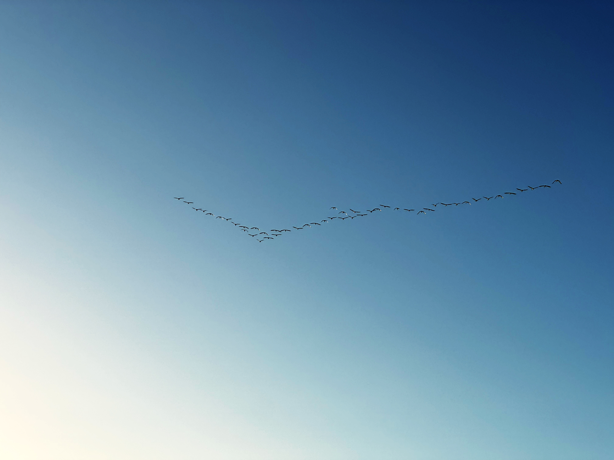
- Tick Formation. Intermediate. HIGHLY COMMENDED. How exciting to have seen this phenomenon in a clear blue sky. I really like the colour gradient. While there is some posterization, perhaps from over sharpening, in this image the suggested diagonal lines strengthen the image by supporting the Tick. Some cropping could move the birds’ position to be less central and reveal a little more detail, while still retaining the colour gradient through the sky and plenty of negative space. Nice image.
-
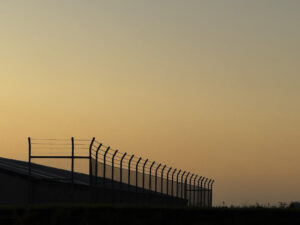
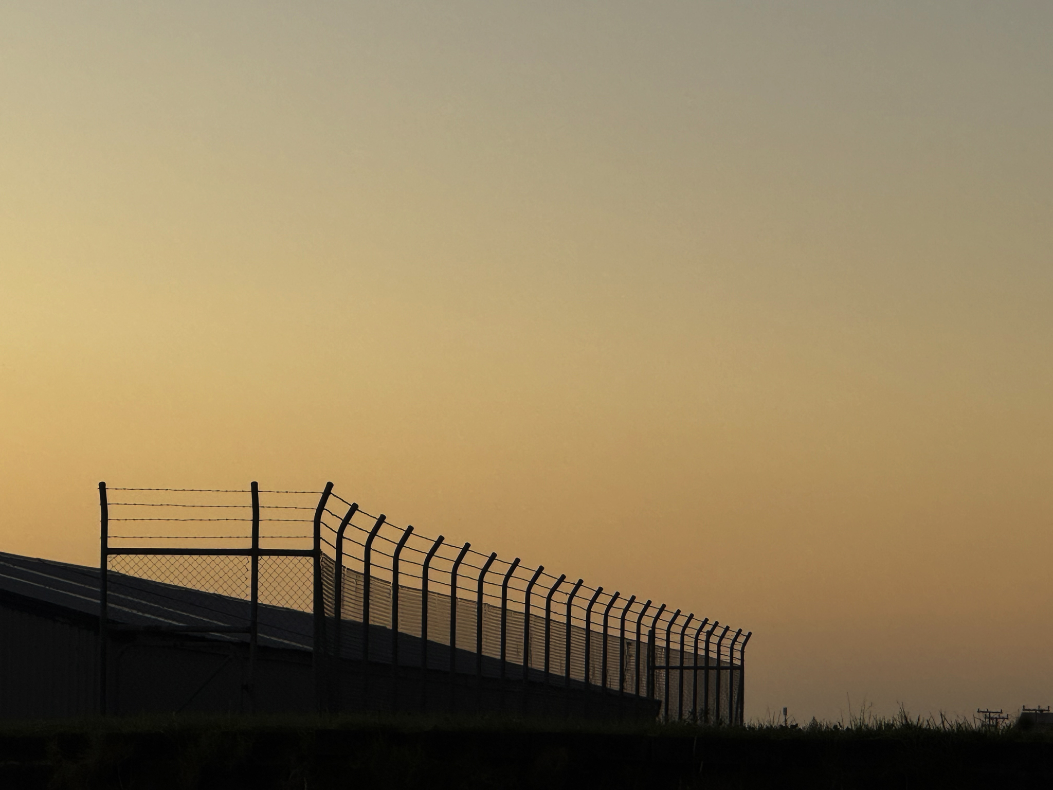
- Security. Intermediate. MERIT. A silhouette is a good start for minimalism especially with a monochrome sky behind. There is definitely tension in the story. What are we being kept out of? My suggestion is to clone, or even better crop, out the elements in the grass which distract the eye. To increase the minimalism and the story, a crop off the left to leave the diagonal stretch of fence and just the first post of the horizontal leaves the suggestion of a continuos fence. A portrait orientation with just the sky above the fence would be a stronger image while still conveying a story. Well seen and good effort.
-
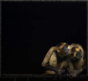
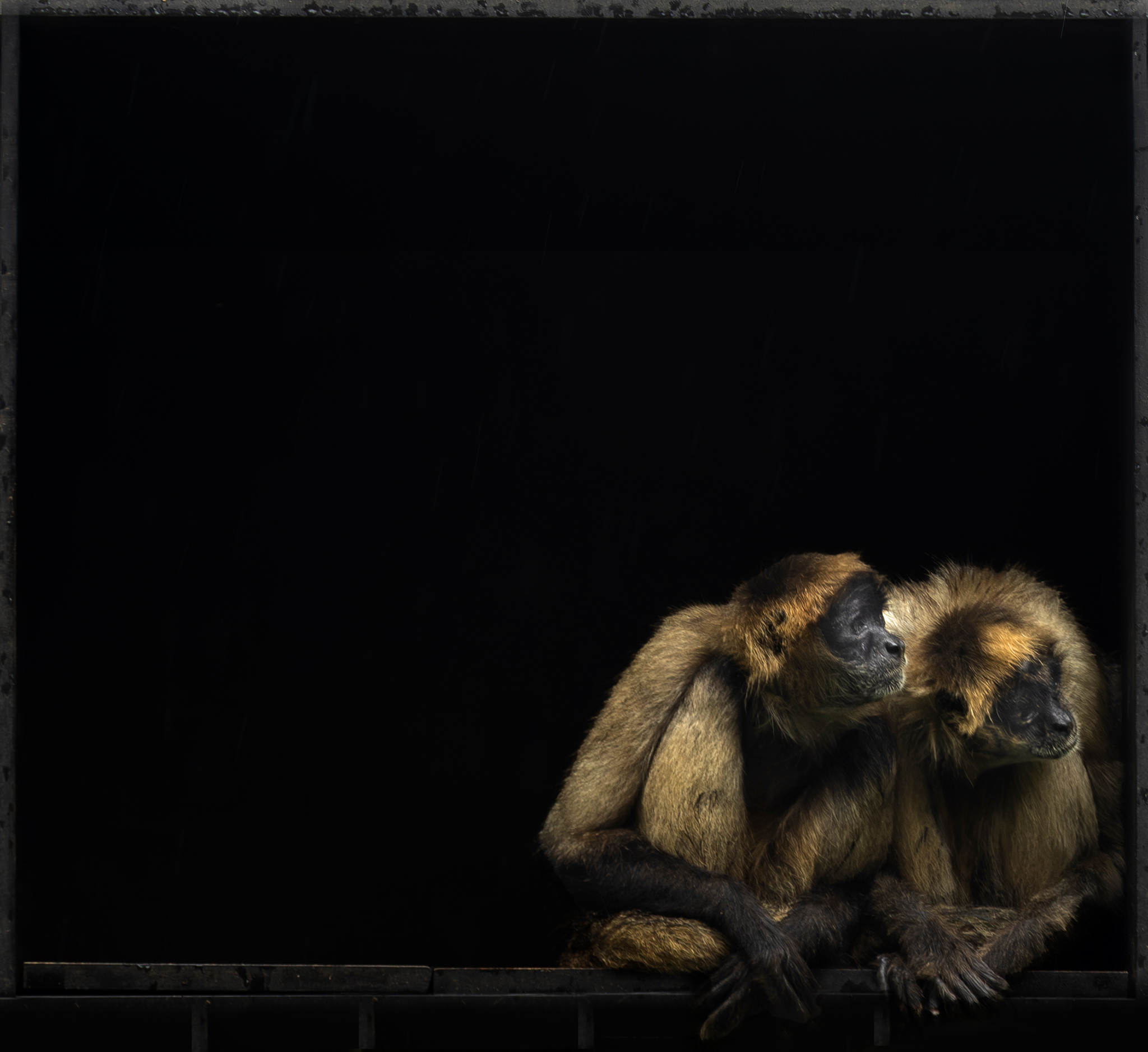
- Buddies. Salon. HONOURS. A captivating photo with a story to be told. The buddies huddled in the corner looking out of frame evokes a sadness of isolation and entrapment The negative space adds to the mood strongly. I played with changing the crop but the square treatment could be seen as the cage their lives are held in. The difficult lighting or processing to the black background has made the edges of the buddies a little undefined but does this really matter? I didn’t think so. Beautiful capture.