Judge: Helen McLeod
Dipl. Prof. Phot., Dipl.Dig.Phot., FPSNZ, GPSA, ARPS
Thank you so much for allowing me to view the photographic work of the members of your club.
I appreciate that it takes a lot of bravery to enter competitions – you are not only essentially baring your photographic soul to critique, but critique from a stranger. This is difficult to do and I applaud you all for doing so. It took me a long time to get to the point where I felt brave enough to go through the “competition process”. The suggestions and advice I received then and now, have helped my photographic journey immensely.
It appears from the images I have received that you have a strong group of photographers counted amongst your members. This is reflected in the quality of work and made my job difficult, for all the best reasons.
As you learn the results of this competition, please be mindful that this is only my opinion. I wasn’t present feeling what you were experiencing as you pressed the shutter button on your camera, and as such, am at a disadvantage as to the reasons behind why the image was captured. I have relied upon my interpretation of your imagery for this process.
I am happy to announce that the overall winner of the Portfolio Salon was the author of Set 5 and for the position of runner up, the author of Set 6. Congratulations to these photographers – an outstanding job!
Thank you once again for involving me in this competition.
-

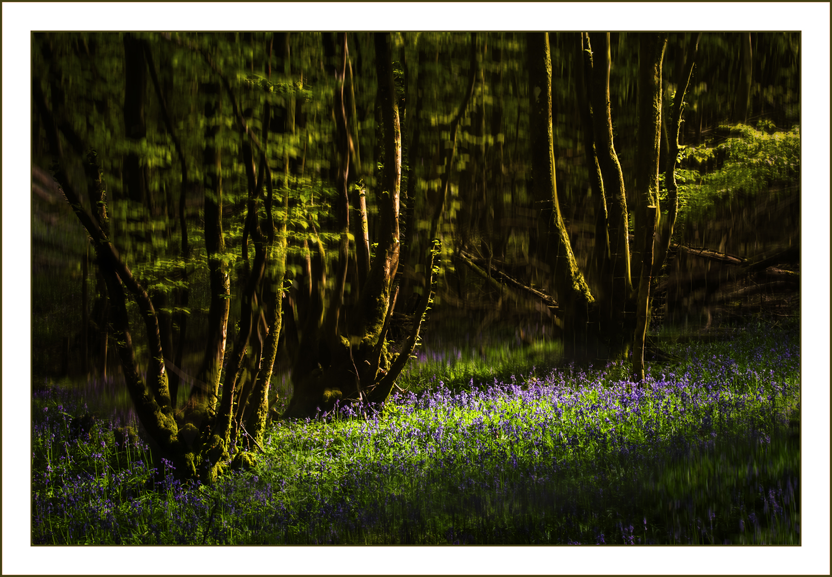
- 1a: Last Light in the Forest A calm scene at the end of the day with beautiful light hitting the tree trunks and illuminating the woodland flowers. This appears to me as though it could be a blend of an ICM capture with a more static rendition of the scene, as we can see some vertical blur occurring in the recesses of the forest. This has given us some separation of the foreground elements from the background. I really like the colour saturation occurring here. Accepted
-

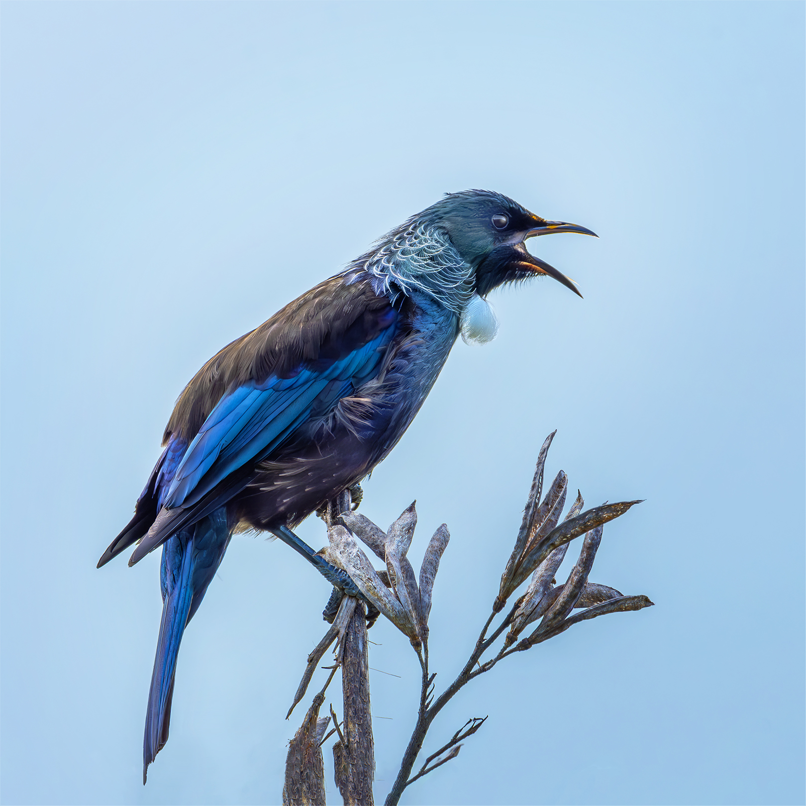
- 1b: Singing Tui You have captured a beautifully sharp subject, with lovely catchlights in its eye and the evidence of a feast of pollen around its beak. This is a stunning image, however, in my opinion, there is a blue colour cast occurring here that would be relatively easy to remove in post-production. This would return the very distinctive feathers under the chin back to white. The clear background emphasises your subject nicely. Accepted
-

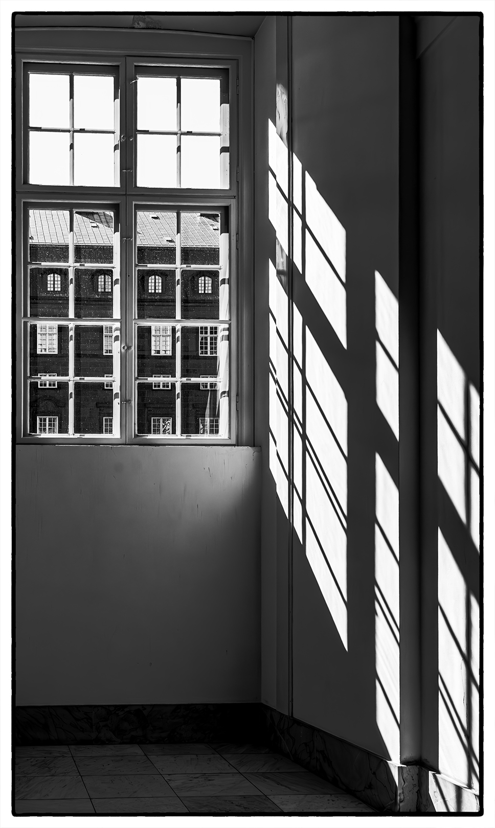
- Window Light I love the feel of voyeurism that this image gives me, which is enhanced by the sheer number of windows you can see from the foreground window. The play of the shadows on the right-hand wall adds another element of interest to my way of thinking, and you have managed to retain detail in them. The alignment of the windows in the building opposite through the foreground window panes really works for me too. All round a stunning image. Honours
-
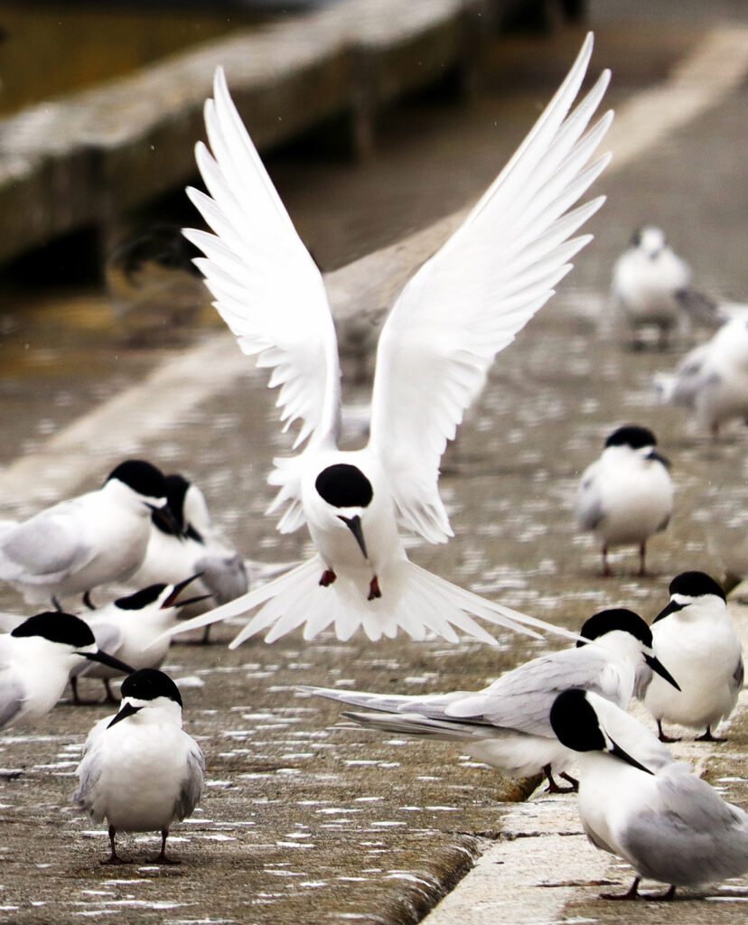
- 2a: Incoming Fairy Tern The stance of the landing Fairy Tern has been captured just at the right moment for me both with its look of concentration as it manoeuvres into place and its outstretched wings. The choice made of the aperture has resulted in a blurred background which has removed any potentially distracting elements. The contrast caused by the colour of these bird’s feathers makes them particularly hard to capture while still retaining detail in both the light and dark feathers. Here, I believe, you are losing detail in both the highlight and darks of your subject. Darker details can be brought back with the judicial use of post-production sliders, but once the highlights have been burnt out they are lost forever. I would suggest keeping an eye on your histogram when shooting, particularly at the highlights, to assist you out in the field. Not Accepted

-
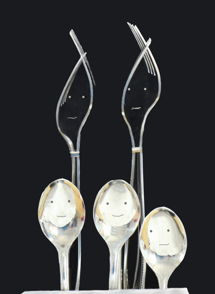
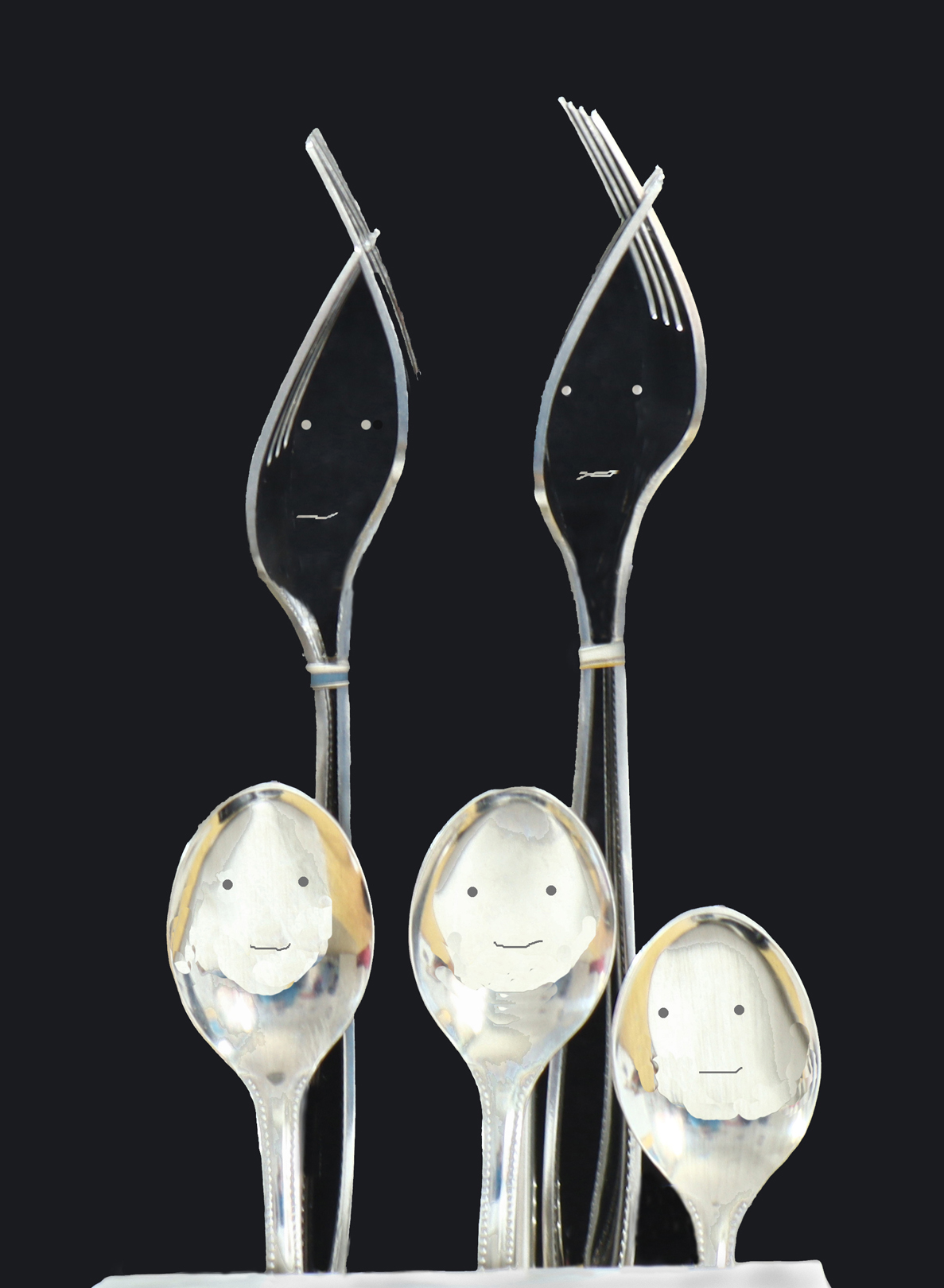
- 2b: The Cutlery Family What fun do we have here, with a portrait of the Cutlery parents and kids! It looks like you’ve had a heap of enjoyment here concocting this image. I’m not sure how you have achieved the faces of the spoon kids but I love the way the edges look like hair framing their faces just inside the bowl of the spoon. An interesting way of thinking outside of the box. Accepted
-

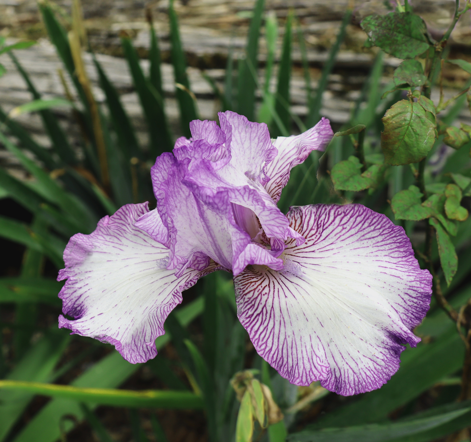
- 2c: Woodland Iris This is a lovely specimen of iris and your choice of aperture has nicely blurred the background which would otherwise have been quite a busy one, I think. I wonder if you had considered a tighter frame for this subject, either in camera, or if that wasn’t possible, then in your editing. I believe this would further enhance your subject by removing the background. Our eye would then be drawn deeper into your flower, allowing us to explore all its intricacies and finer detail just that bit more. Accepted
-

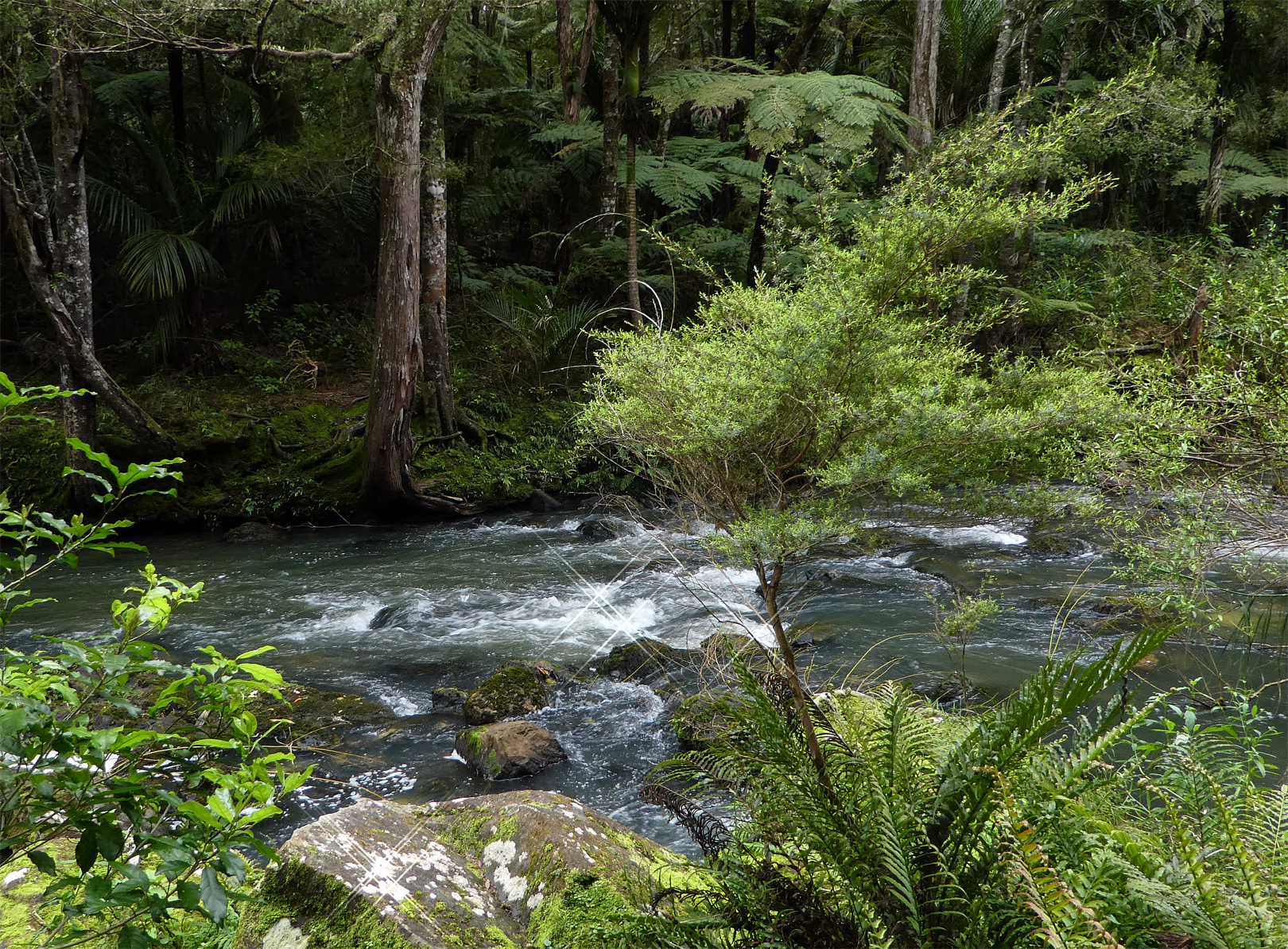
- 3a: Busy Bush Beauty We are lucky as kiwis, to have a beautiful country and to have scenes like this practically on everyone’s doorstep, if you want to explore it. For me, yes, this is a busy bush scene, but I feel you could have produced a stronger image by experimenting with the composition. My eye is drawn to the scrubby bush in the foreground which blocks the lovely river with its cascading water and the stunning forest we can glimpse in the background. In addition, I have trouble believing the specular highlights present in this image were truly there, as the lighting throughout the image doesn’t support their presence, especially on the dry rock. While I think you have the beginning of a lovely image, I don’t think it has realised its potential. Why not revisit this location if possible, and have another go at capturing its beauty? Not Accepted
-
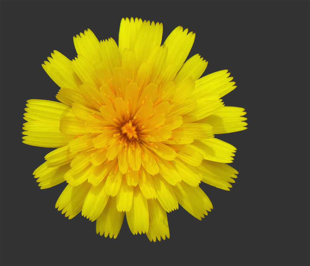
- 3b: Sunburst The plain background here with its more neutral tone, really sets off the sunburst effect of this flower. Your depth of field works really well here and the lighting gives a sense of three dimensionality. Did you consider cropping this to a square format with the centre centred on the middle of the bloom? I think the symmetry of your subject would lend itself to a 1:1 aspect ratio nicely and would enhance this image a little more. Accepted

-
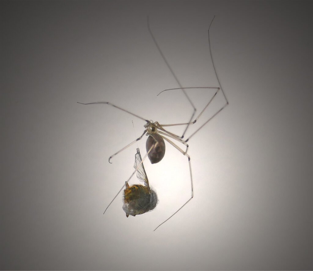
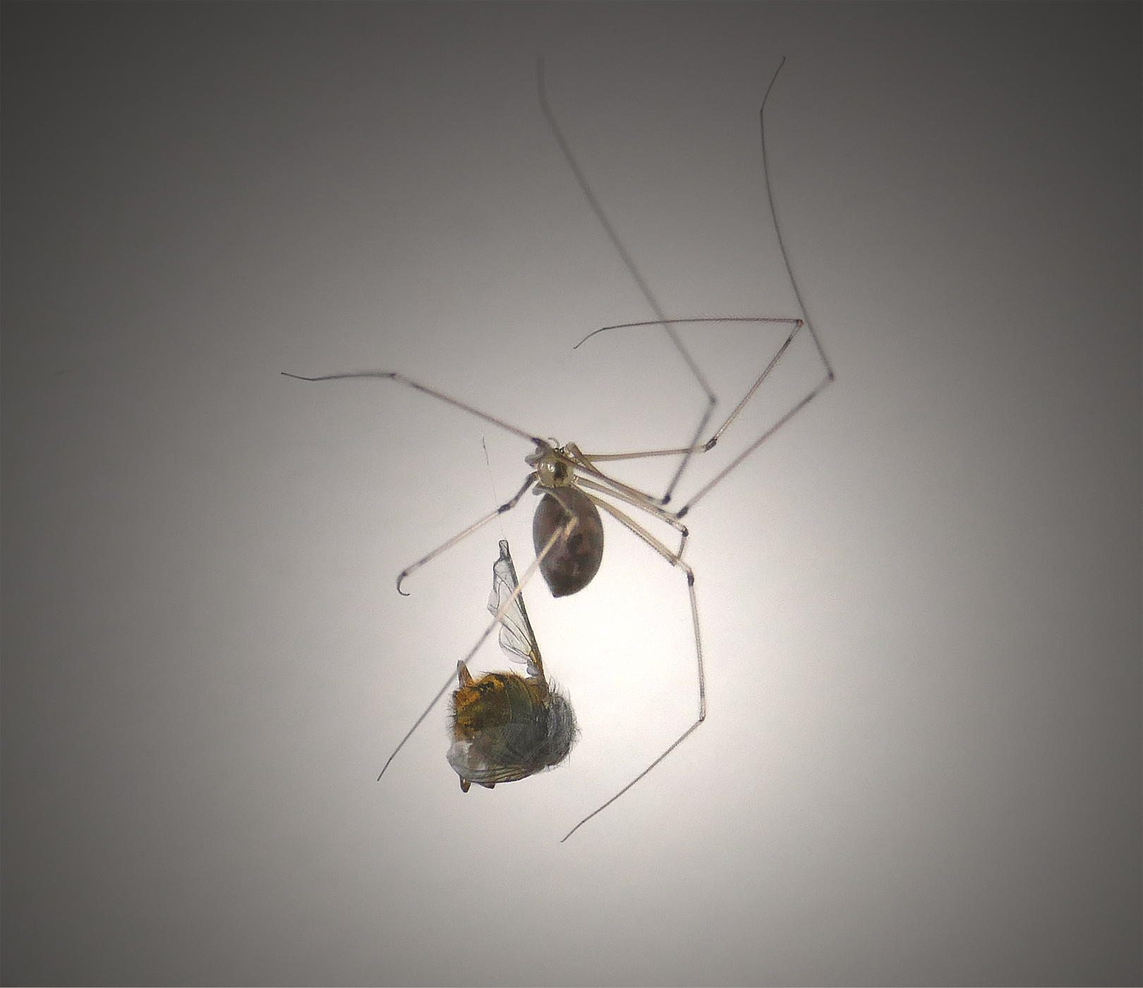
- 3c: Time for Dinner What a feast your spider has caught! This is a true case of the eyes being bigger than the tummy, in fact the whole meal is much larger than the predator. I love the position of the plane of focus as it allows both the fly and the important body parts of the spider to be in focus at the same time. This tells us the complete story in one frame. The highlight in the background also works well with your subject placement, emphasizing it even more. Merit
-

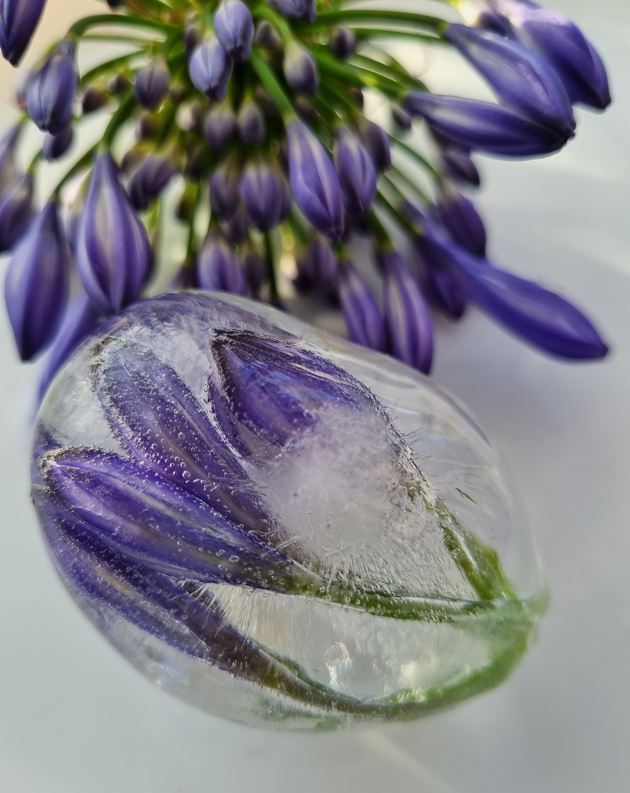
- 4a: Frozen Agapanthus I like the background agapanthus flower and the way it has been blurred so that, while we still know what it is, it plays a supporting role to the ice encased specimen. The shape of the ice is similar to the actual closed buds, so we get a repetition of shapes throughout the image. The light is soft and the surface upon which it has all been placed is muted and neutral, all of which enhances your subject. Accepted
-
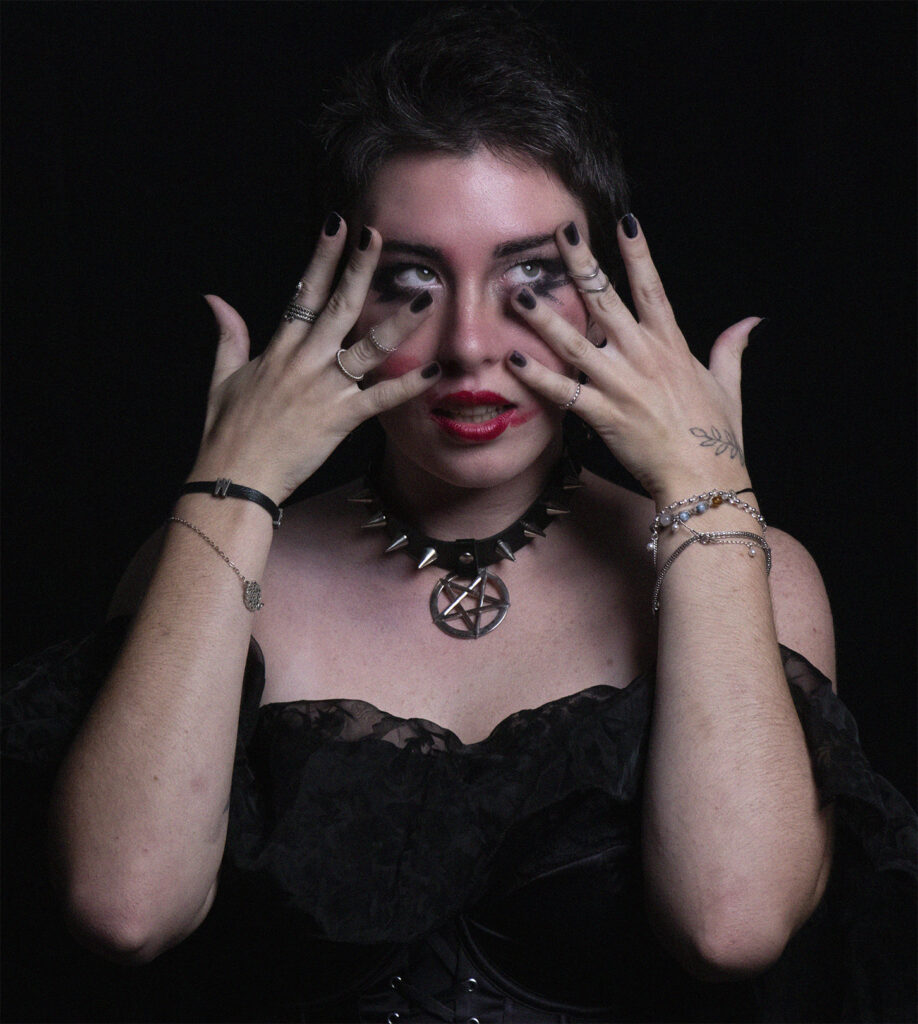
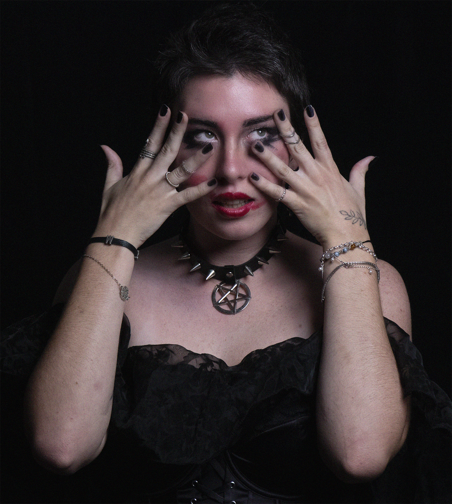
- 4b: Hands On You have captured lovely catchlights in her eyes and the low-key nature of this image has me feeling that something sinister is or could be at play here. To me, her jewellery and costume steer me towards thinking that maybe she is a modern-day witch. Beyond this the story gets confusing to me. The makeup appears as though it is smeared but this doesn’t look very realistic to me. I don’t understand why she has her hands up to her face, nor what the expression on her face is portraying. The image appears very grainy which is particularly evident over her skin areas. It feels to me as though you are halfway there with this conceptual photograph and would suggest formulating a definite story and then having another photoshoot session. Not Accepted
-

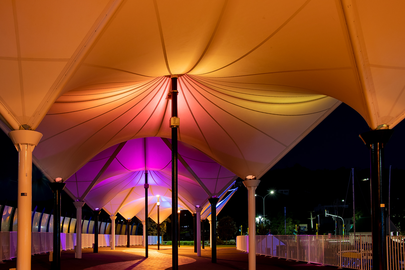
- 4c: Lights on Canopy Bridge The complementary colours being cast on the different canopy sections works really well and the light has been well handled here. The repeating patterns give a sense of depth as they recede into the distance. To strengthen your composition and to enhance your subject, I think you could consider a square crop – cropping in from the right and up from the bottom, placing the centre point of the front canopy toward the top right. In my view, the areas suggested to be cropped out aren’t adding anything to your image and are a little distracting. Removing them would keep our eye where your subject is and engage us for longer. Accepted
-

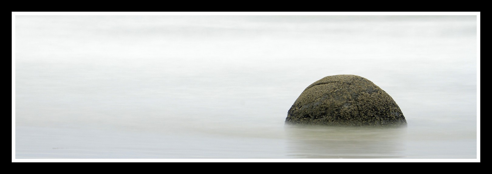
- 5a: Fine Art I love the simplicity of this image – in subject matter, its placement within the frame and of the tones. You have controlled the long exposure highlights competently and the resulting smoothing of the lapping water is a great juxtaposition against the hard surface of the rock. Honours
-

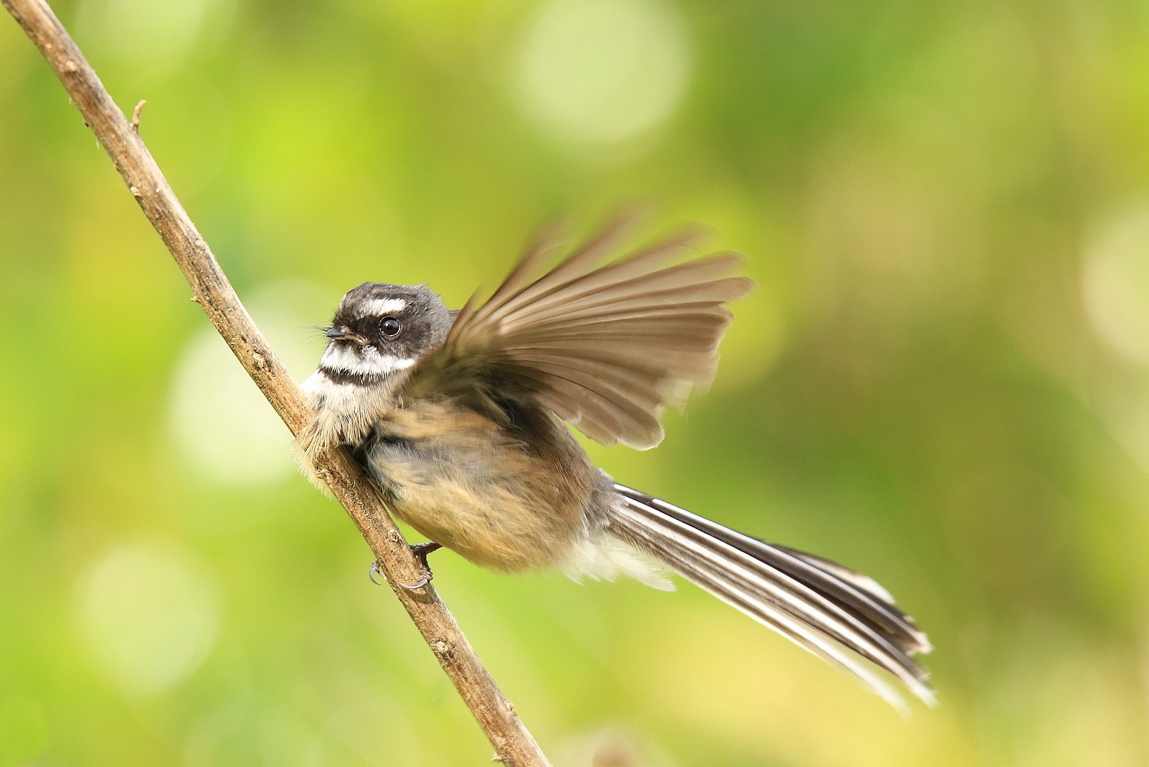
- 5b: In a Flutter These wee guys flit about so fast that they are difficult to capture so that you can obtain sharpness where we need to see it. You have done well here in doing so, yet still retaining that sense of movement or “flutter”. Your background has been handled nicely in terms of the highlights and amount it has been blown out of focus. Highly Commended
-
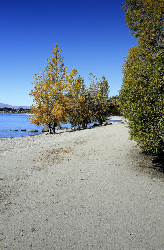
- 5c: Wanaka This image of the trees along the shore of Lake Wanaka appears to me as though it has been taken around mid-day, which has produced a high contrast image, and gives the appearance of being over sharpened. For me, the foreground is not adding anything to your image, nor is the very blue sky and would suggest a crop to remove these areas. This would focus our attention to the trees and the shoreline path that winds through the image. Not Accepted
-

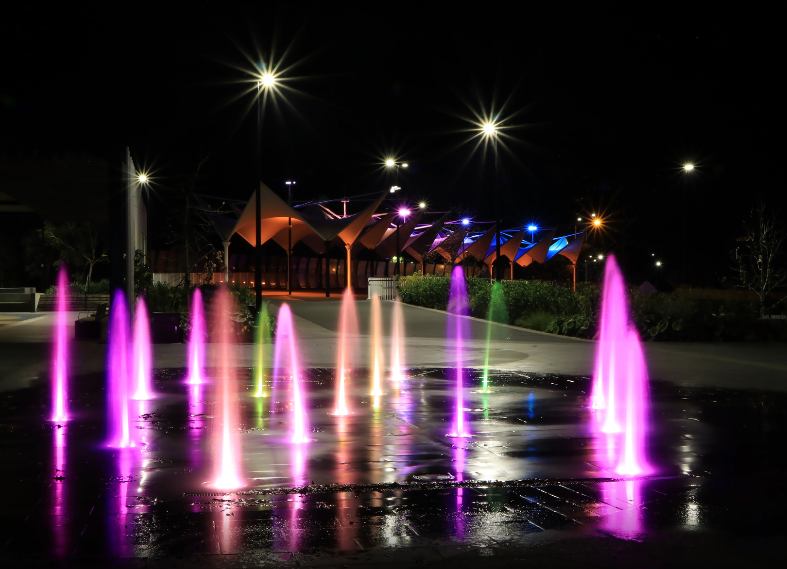
- 6a: Colours at Night I like the sculptural shapes caused by the play of the light within the water jets and the way your choice of aperture has caused the streetlights to have a starburst effect. The reflected coloured water adds another dimension to this image. Accepted
-
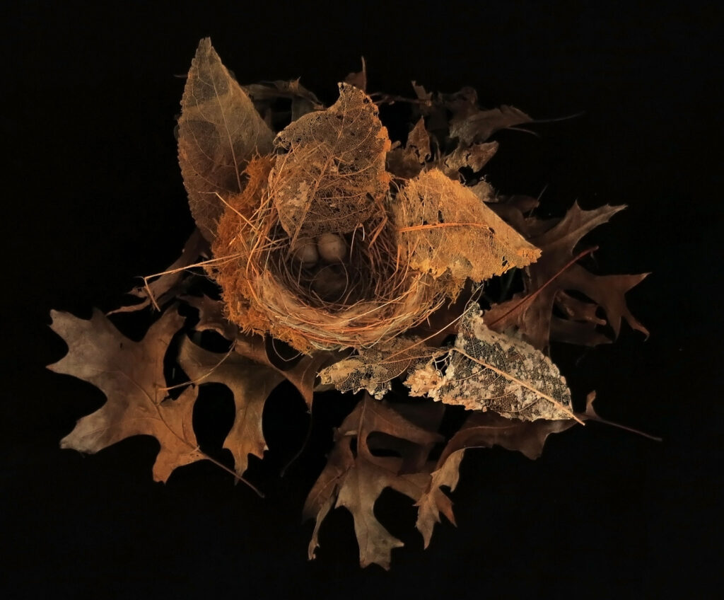
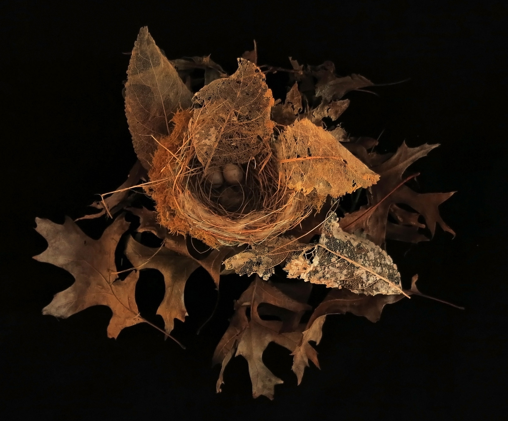
- 6b: Discarded Nest I wonder…a discarded nest or an abandoned one? Either way I love the tones captured here and the real sense of age from the skeletal leaves and the surrounding dead ones. The dark background adds to your story of abandonment, of unwantedness, of being discarded, no longer required. Merit
-
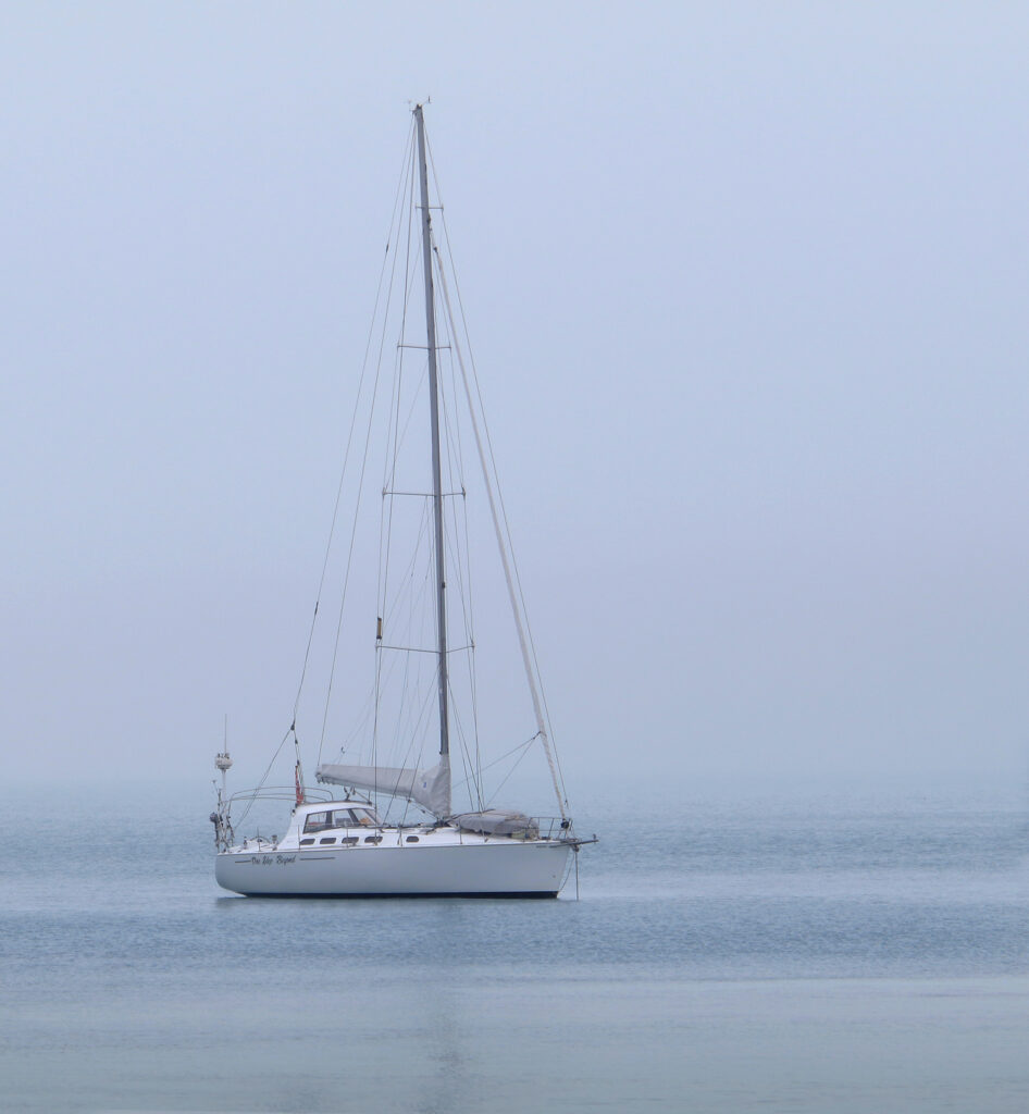
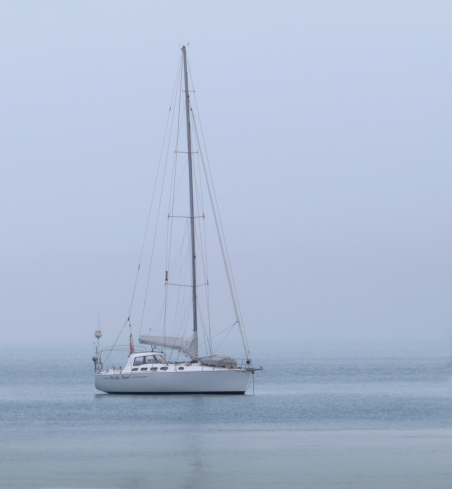
- 6c: Waiting for the Fog to Lift There are so many emotions you can get from an image in which fog has been captured – eerie, sinister, light, tranquil, lonely etc. I get a sense of tranquillity and calmness from this image. This in part for me, comes from the blue tone that has resulted. Your image is beautifully sharp over the boat, although I feel it looks a little flat. Your highlights could be boosted a little without losing the sense of the fog and the emotions associated with it. I believe this would give a little more three dimensionality to the yacht. Highly Commended
-
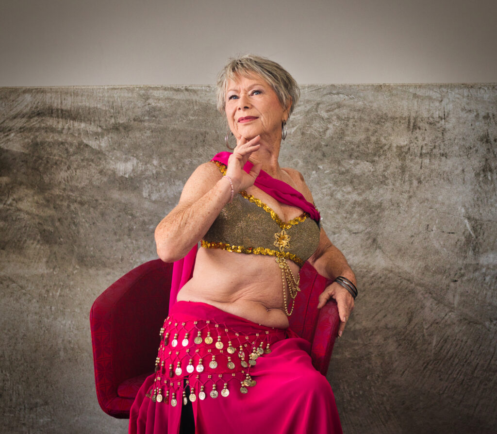
- 7a: Darelle Although I like the fact that the lighting is lovely and soft, and the chair Darelle is reclining in suits her costume, I am of the opinion that having her sit in this manner is not flattering to her. She doesn’t look comfortable, and her pose looks contrived to me. Darelle is obviously a character (I can see this in her eyes) and is wearing a belly-dancers outfit so why not utilize these and have her show us her talents? By doing so you remove the wall issue that is cutting through her head. For me, the story is in the fact that your subject is a dancer, and a belly-dancer at that. I’m sure the adornments on her costume and the movement that you could capture with them would tell the tale of what she loves to do…that of performing. Accepted
-

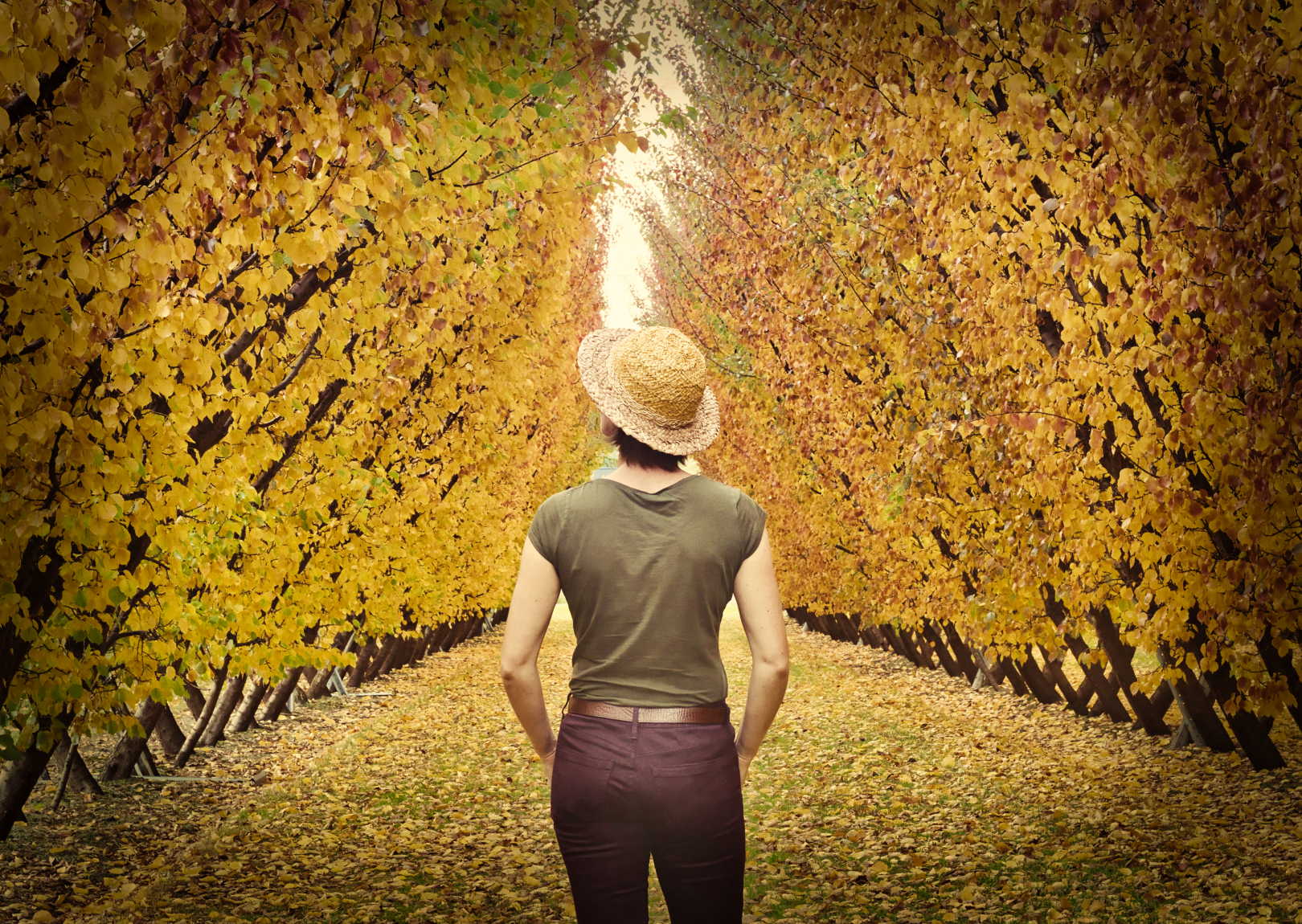
- 7b: In the Orchard Aren’t orchards wonderful places in be in autumn, with all their displays of colour and all the piles of dead and discarded leaves to go running (or as I call it, sloshing) through? You certainly have ventured here at the perfect time for this. Personally, I find your vignette a little too dark and evident for my taste. I think there is nothing wrong with the addition of vignettes but believe they should be subtle in their appearance. Accepted
-

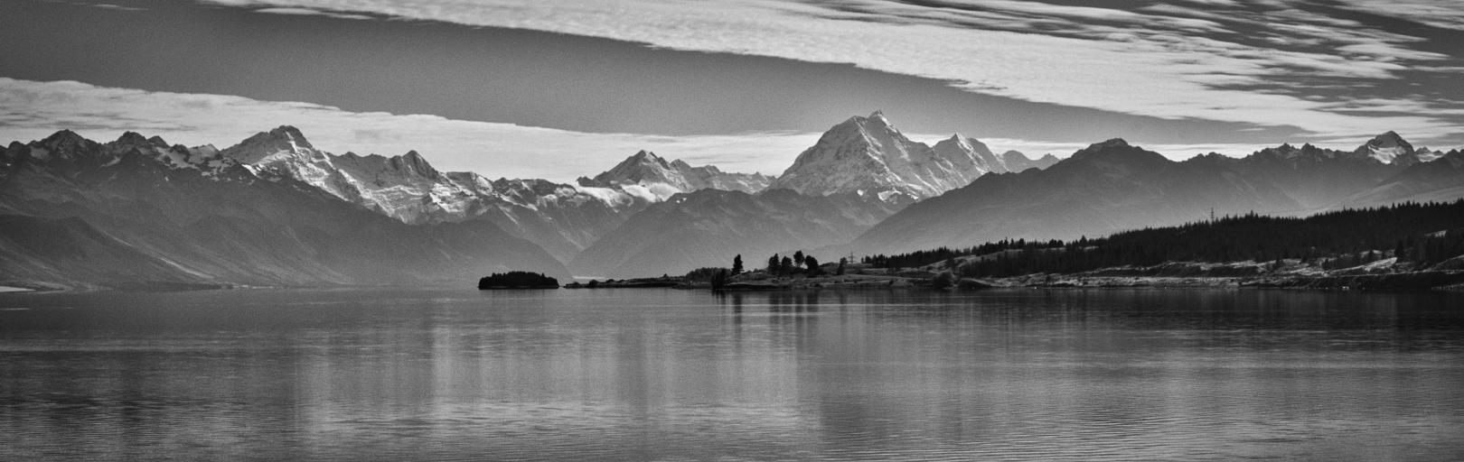
- 7c: Southern Vista I appreciate your panoramic aspect here as it gives me a real sense of the majesty of these mountains, and in particular, of Mount Cook. You get a real feel of depth here too, from the receding contrast as you travel through the image. Your conversion to a monochromatic image has worked well to enhance your story. Merit
-
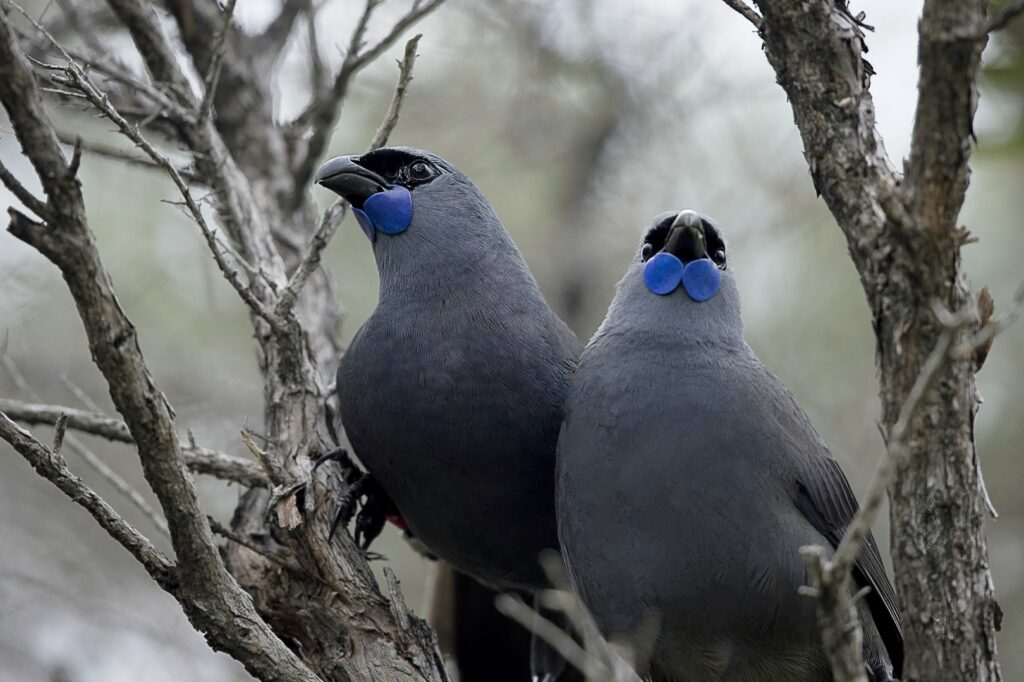
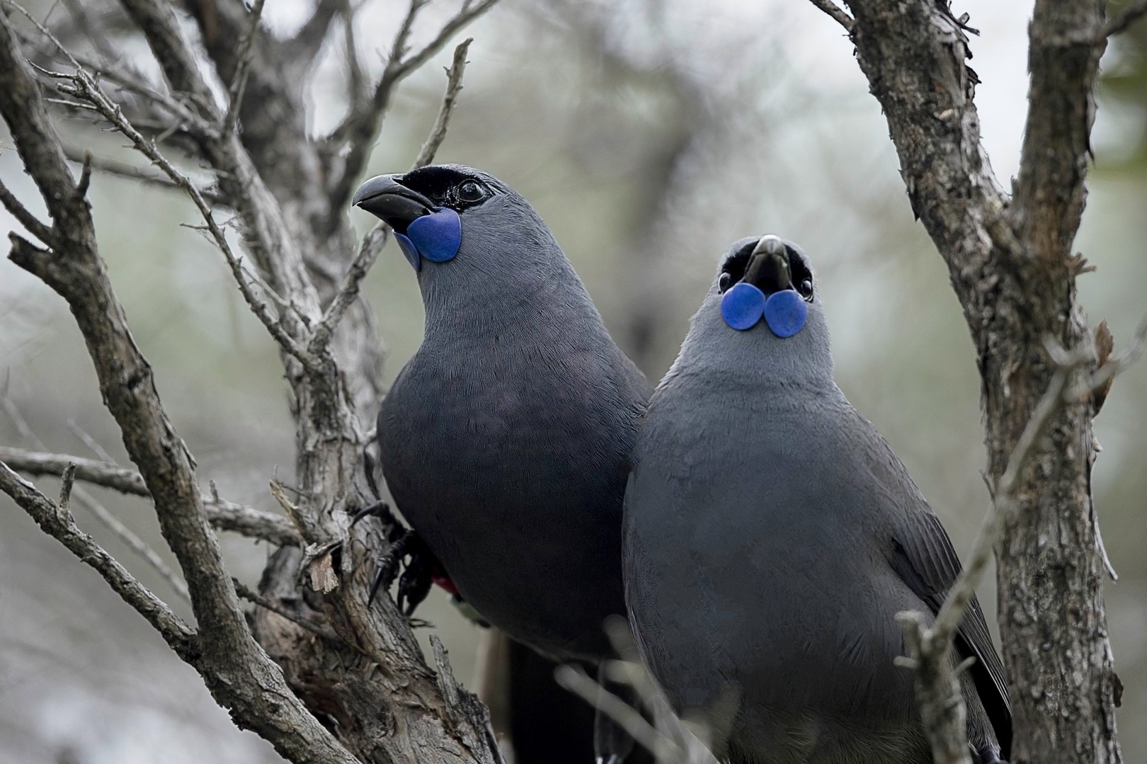
- 8a: Kokako Mates Wow! You are pretty lucky to photograph one of these birds, let alone two together. We down South here no longer see these species of bird – they are thought to be either extinct or in such low numbers that they are well hidden in very remote areas. Both of your Kokako are beautifully sharp and nicely separated from the background. There aren’t too many distractions in your scene pulling our eye away from your subjects. A lovely image. Highly Commended
-
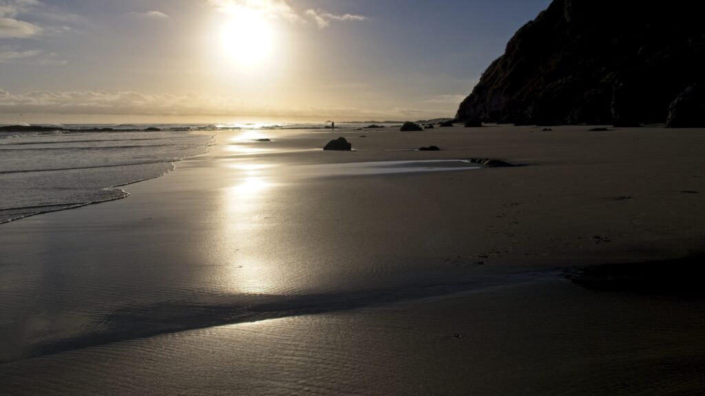
- 8b: Lonely Morning Beach Walk I certainly feel the loneliness you are portraying here, with the single figure off in the distance on a wide expanse of beach. The tones in this image are lovely and soft and the handling of the light has been achieved well. To enhance your sense of vastness and the isolation that this can bring, did you consider cropping out the sun? To my way of thinking, this would draw more attention to the solitary figure. I think your decision to include the bare sand in the foreground was a wise one to help give the feeling of being remote, isolated, lonely etc. Accepted

-

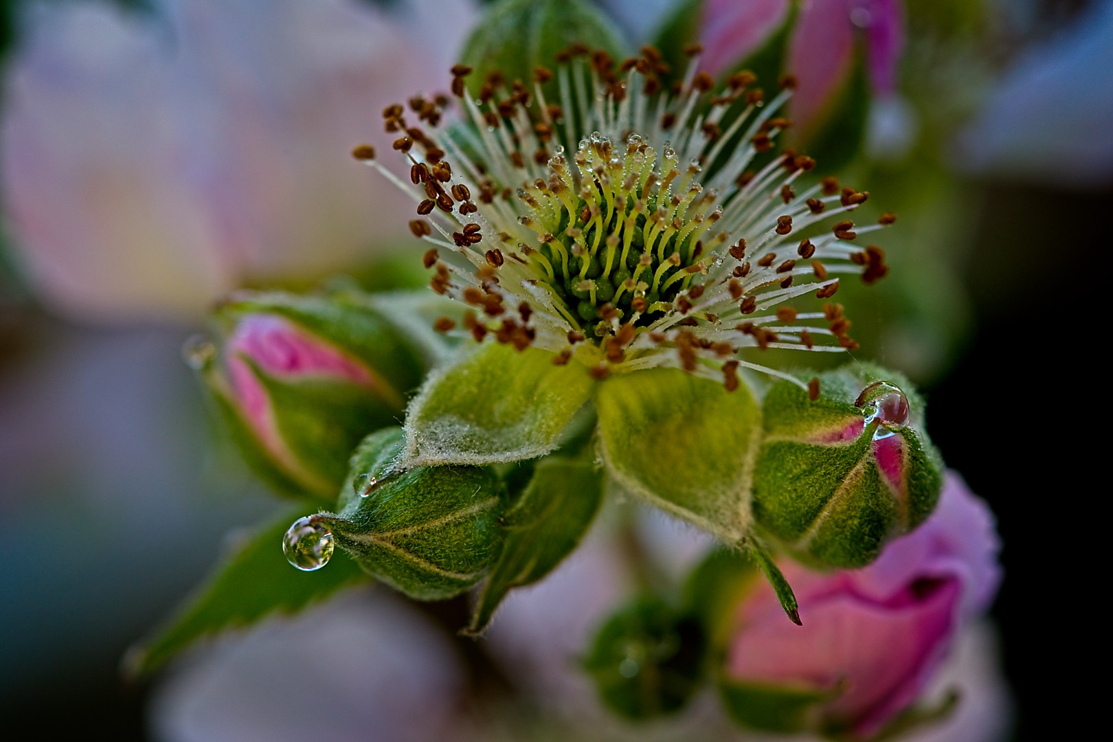
- 8c: Rose Buds The dew drops enhance this image for me. You have the stamens of your subject nice and sharp which draws my eye into the centre of the flower. You have also managed to arrange the focal plane to include the tips of the buds immediately adjacent to your bloom. The background is sufficiently blurred to both separate your subject, and so that we understand the surrounding components supporting your main character. Accepted